A Vision for Cognitive Wellness:
Kaern Health Supplements is more than just a brand; it’s a mission-driven endeavor to empower individuals to prioritize their cognitive well-being. With a clear focus on delivering science-backed solutions for optimal brain function, Kaern sought to establish a brand identity and packaging design that would embody its commitment to excellence and innovation in the wellness industry.
A Harmonious Fusion of Modernity and Functionality:
Our collaboration with Kaern began with a deep dive into their core values and objectives. Drawing inspiration from their dedication to efficiency and effectiveness, we set out to create a brand identity that would resonate with their target audience while conveying a sense of sophistication and trustworthiness.
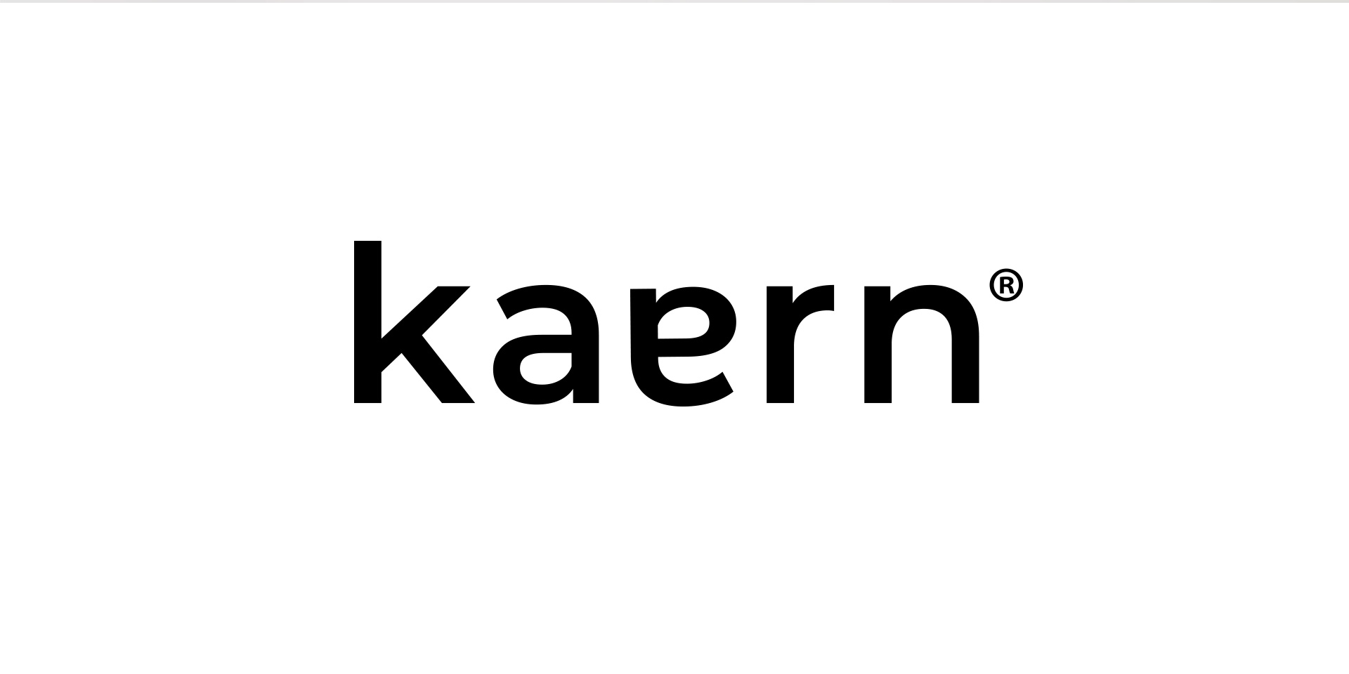
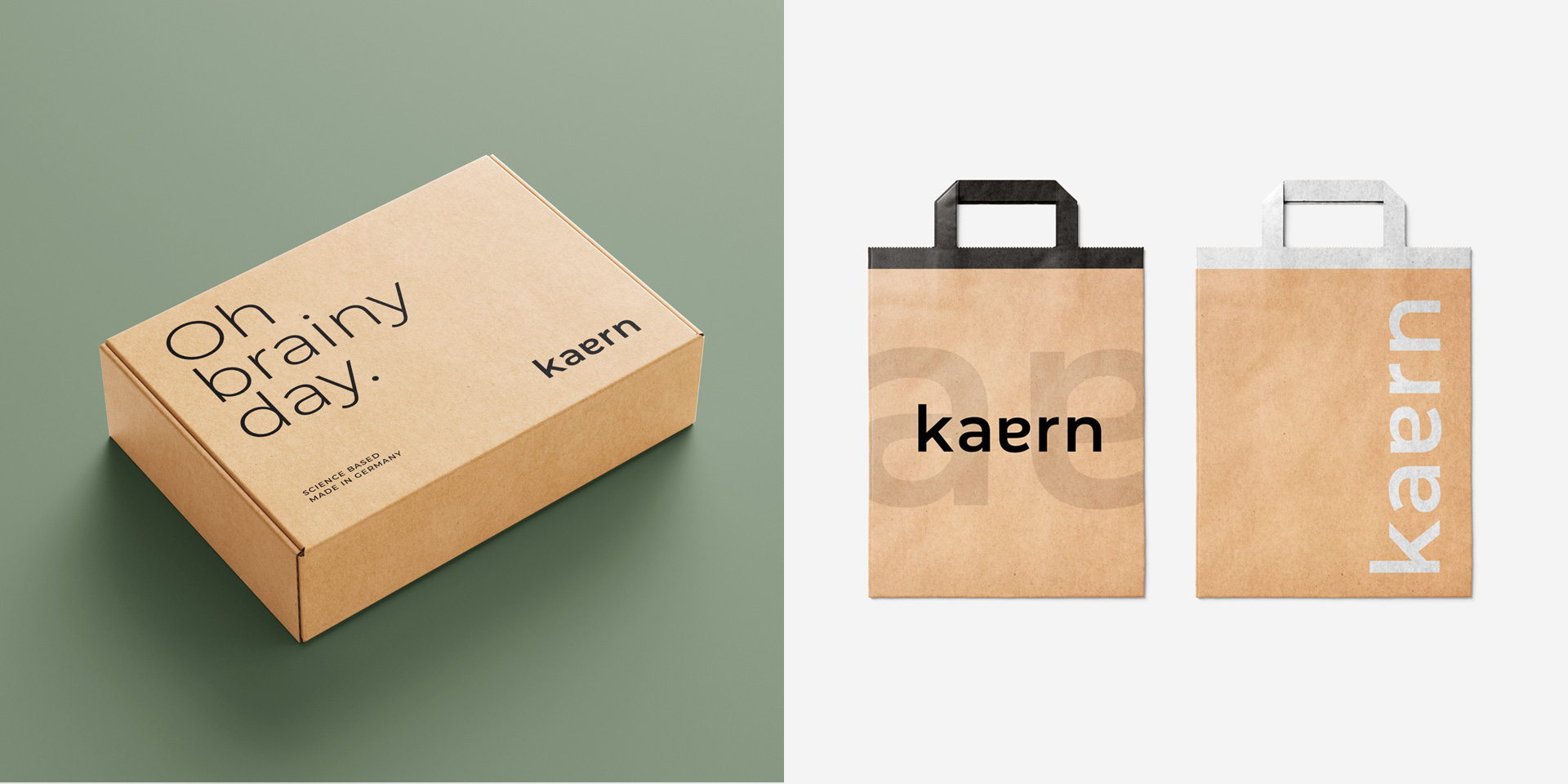
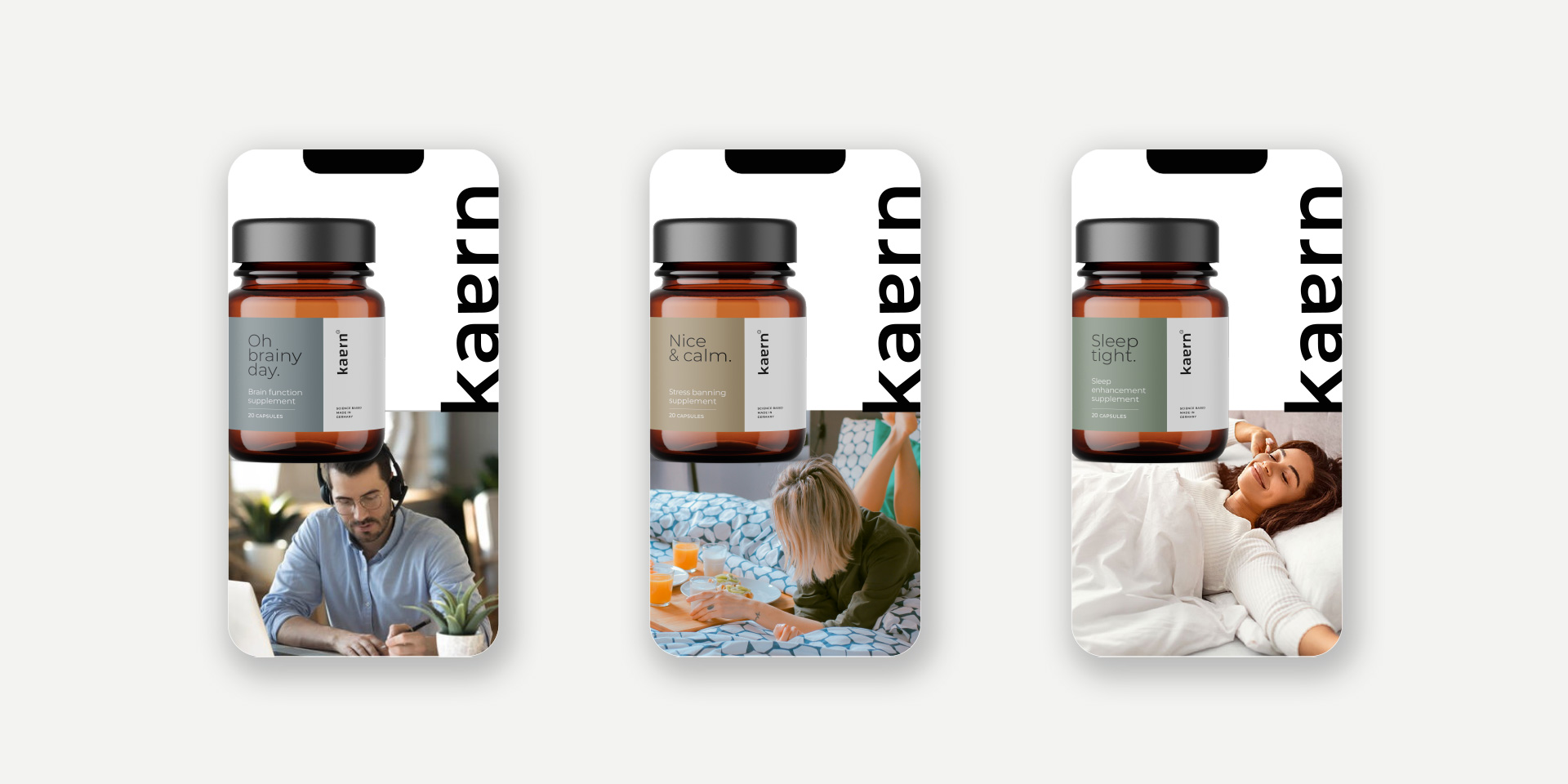
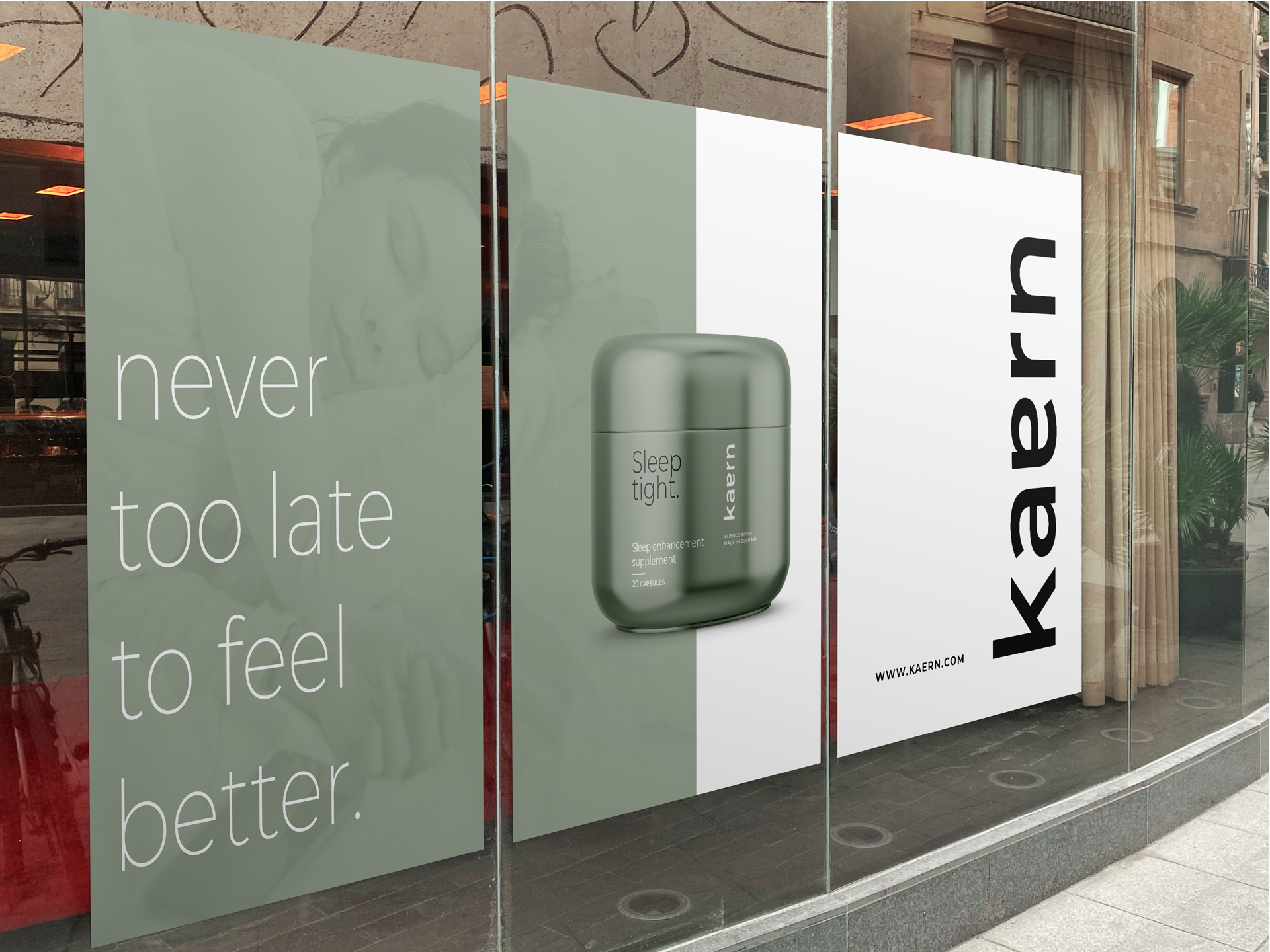
At the heart of Kaern’s brand identity is its logo – a masterpiece of contemporary design and precision. Crafted with sleek, geometric, and contemporary typeface, the logo symbolizes Kaern’s commitment to clarity and efficacy. Subtle tweaks to the characters “a” and “e” add a touch of personalization, balance, and symmetry, further enhancing the brand’s visual identity.
Simplicity and Functionality in Packaging Design:
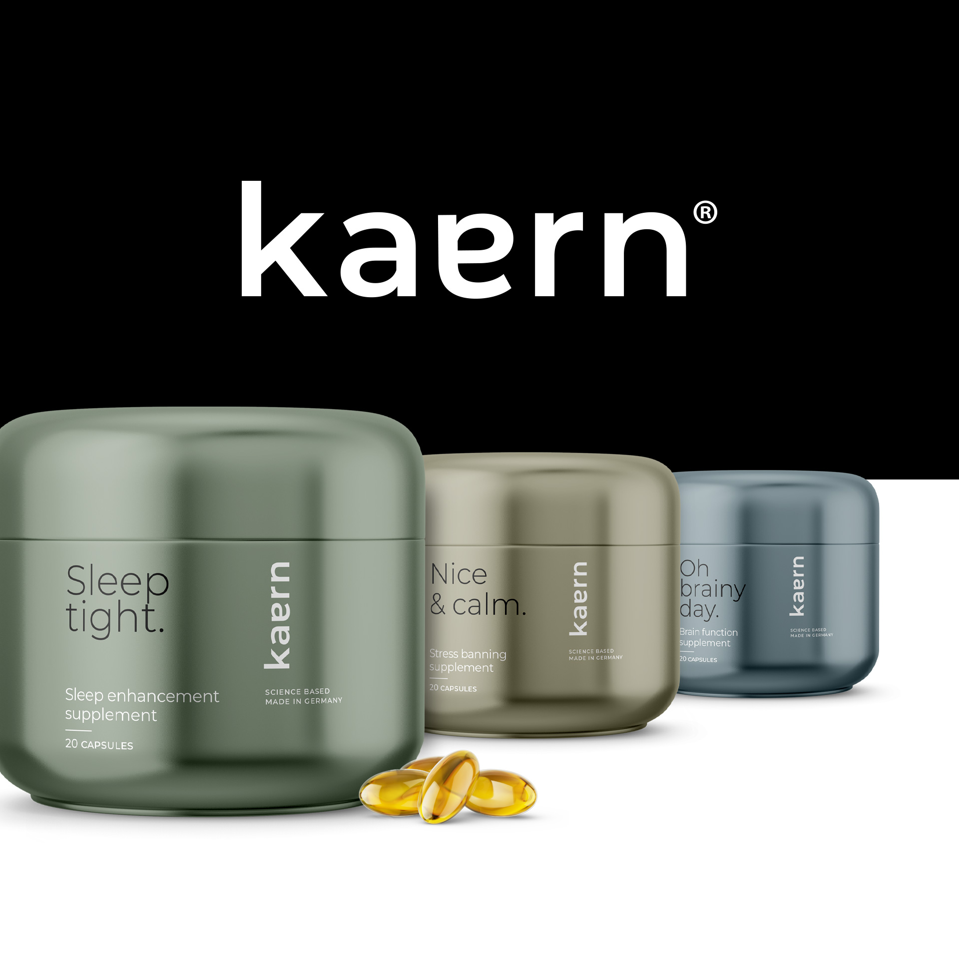
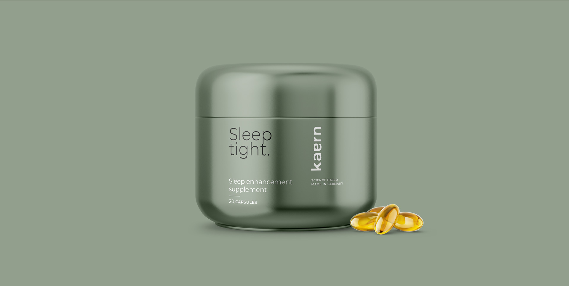
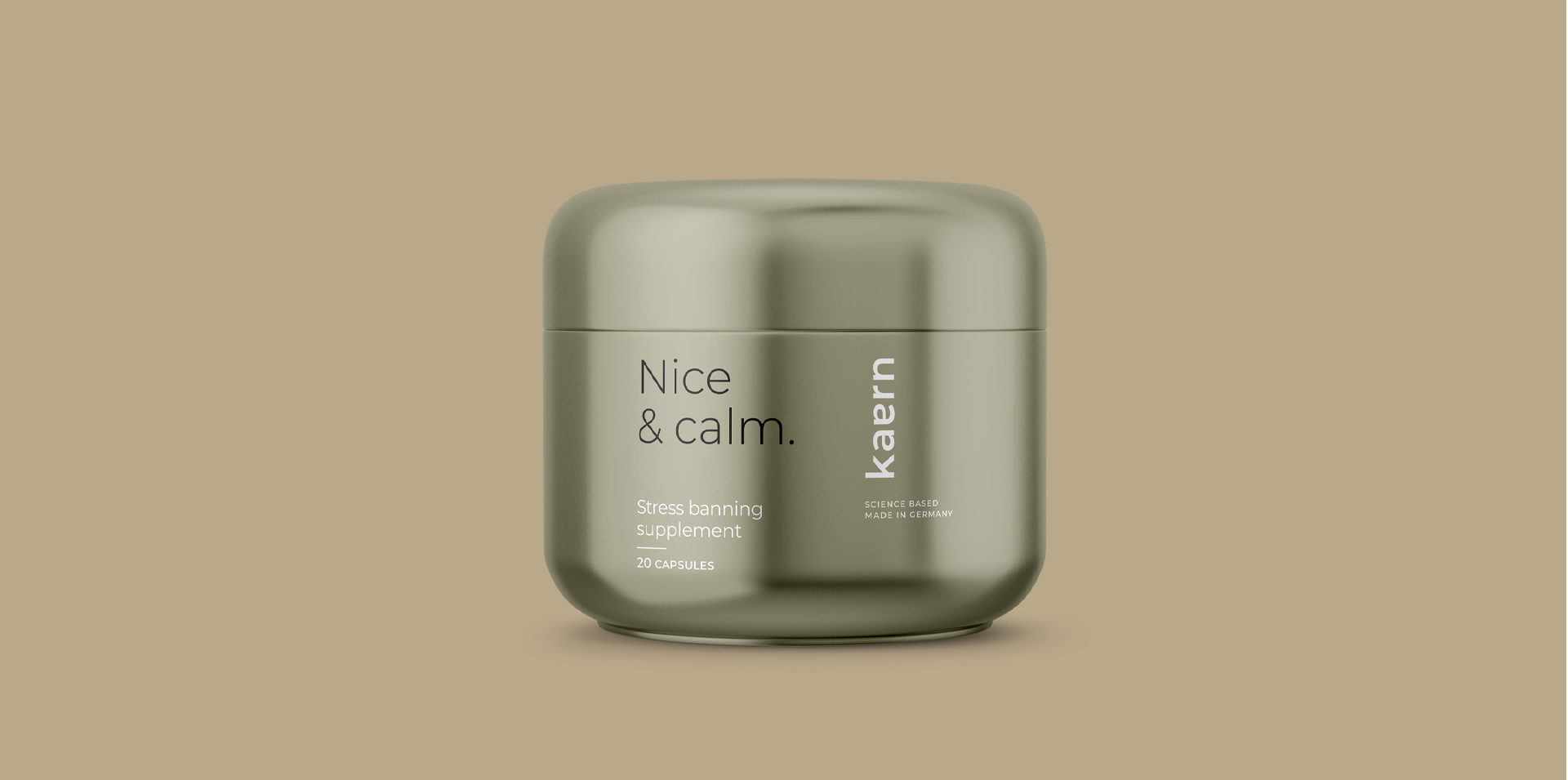
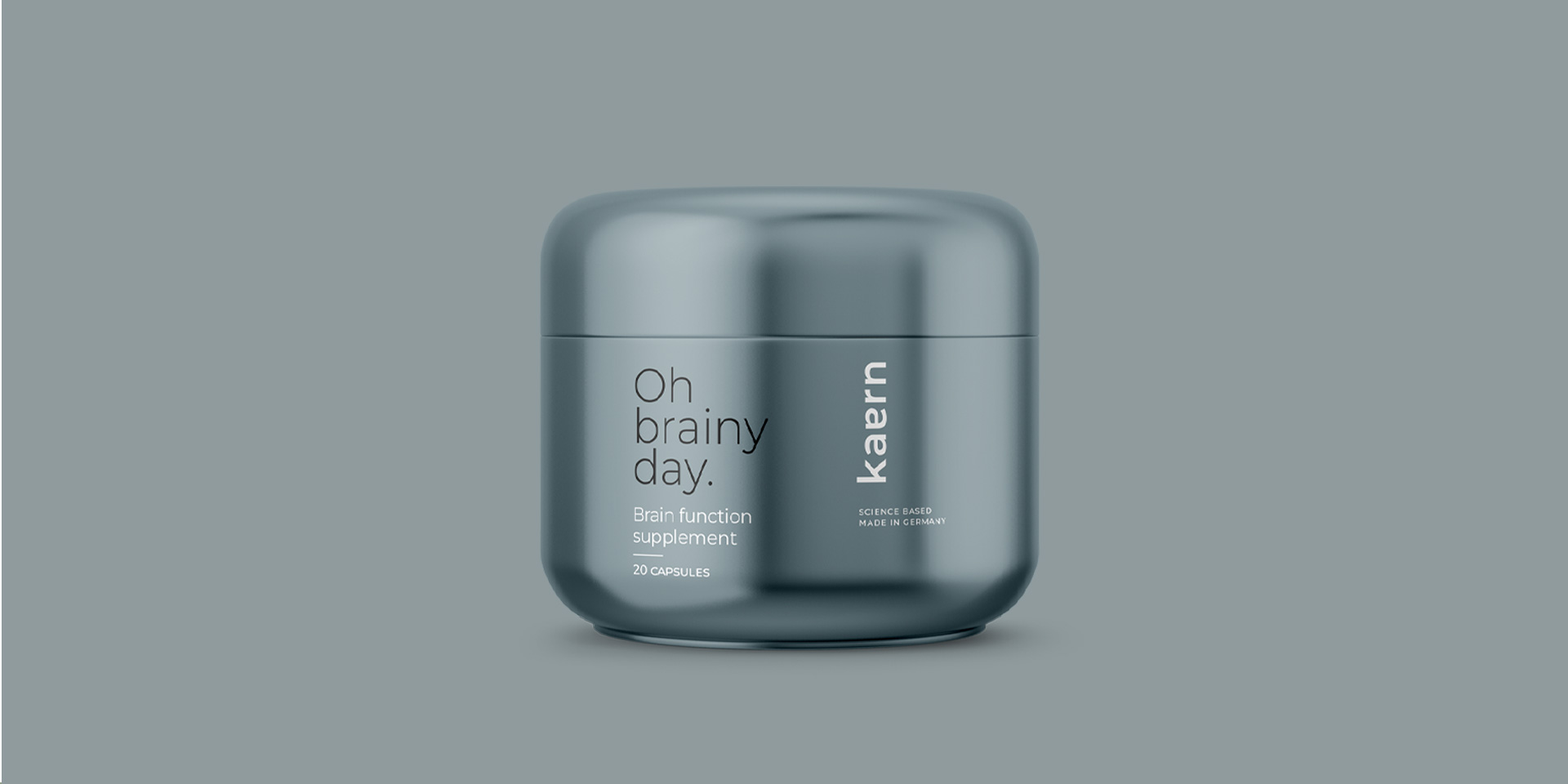
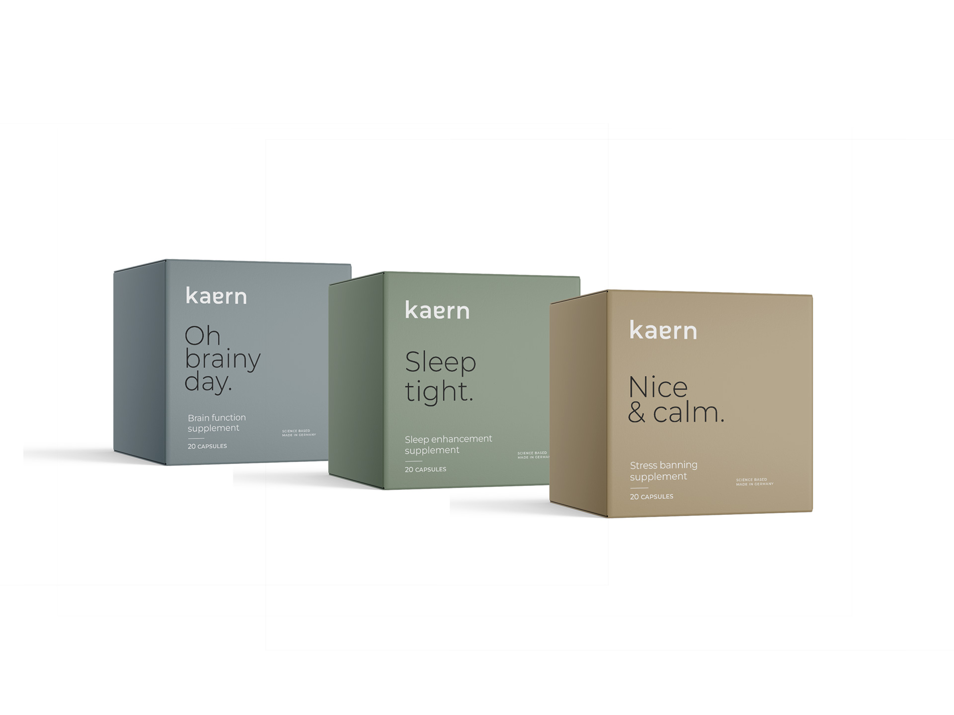
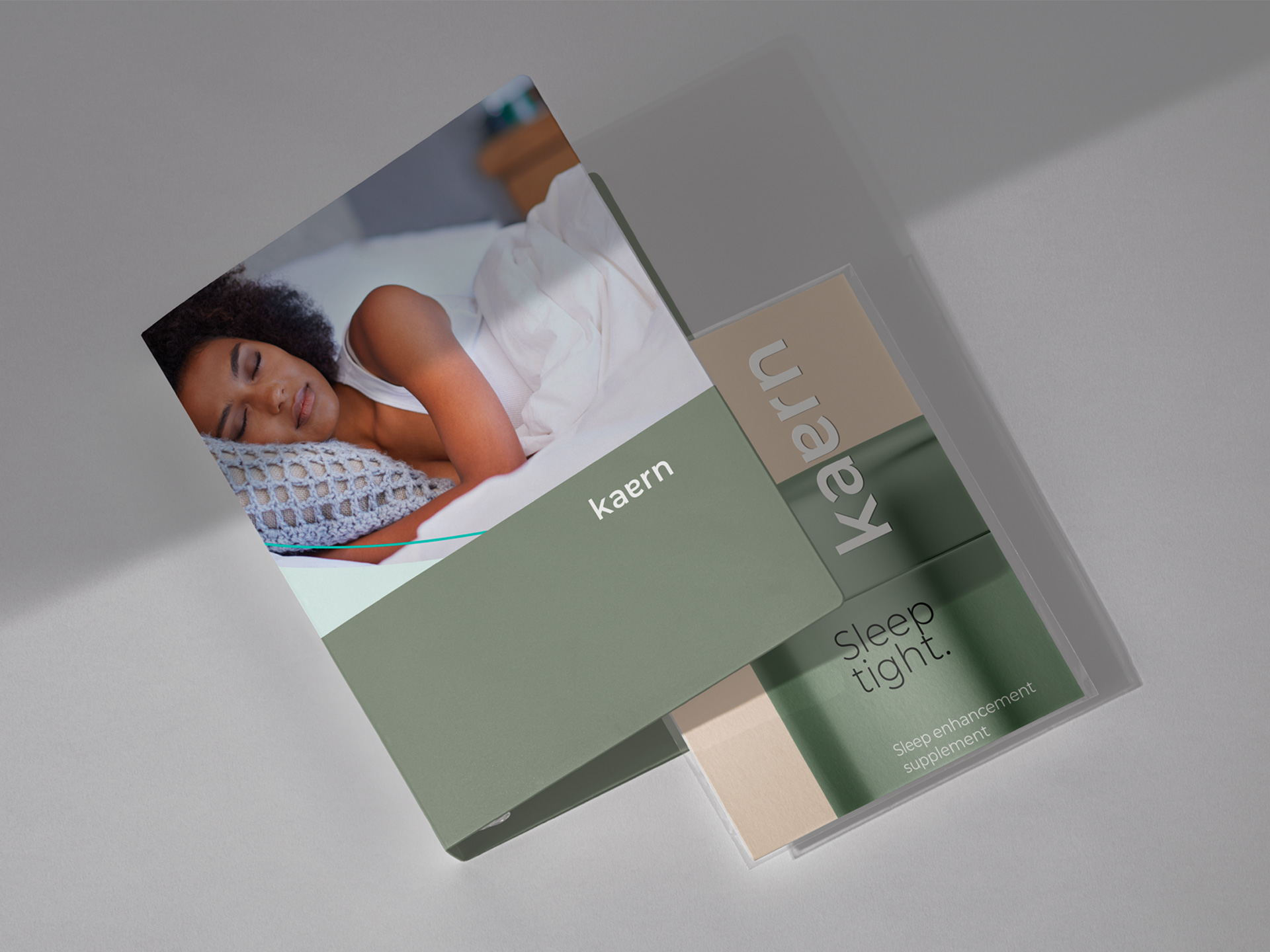
In parallel, our focus extended to packaging design, where we sought to mirror Kaern’s dedication to simplicity and functionality. Clean layouts, muted earthy tones, and bold typography were meticulously curated to create a sense of calmness and tranquility, inviting consumers to prioritize their cognitive well-being with Kaern’s supplements.
A Testament to Excellence and Innovation:
Through our collaboration with Kaern, we have succeeded in creating a brand identity and packaging design that not only captures the essence of cognitive wellness but also sets a new standard for excellence and innovation in the wellness industry. With a focus on clarity, elegance, and functionality, Kaern’s brand identity and packaging design serve as a testament to our shared commitment to elevating brands through thoughtful and impactful design solutions.
At Musen Design, we are proud to have played a part in bringing Kaern’s vision to life. As we continue to push the boundaries of design innovation, we look forward to partnering with brands that share our passion for excellence and our dedication to making a positive impact on the world.
CREDIT
- Agency/Creative: Musen Design
- Article Title: Serenity in Simplicity: Kaern’s Minimalist Brand Identity and Packaging Design by Musen Design
- Organisation/Entity: Agency
- Project Type: Packaging
- Project Status: Published
- Agency/Creative Country: Brazil
- Agency/Creative City: Porto Alegre
- Market Region: Europe
- Project Deliverables: Brand Creation, Brand Design, Brand Guidelines, Brand Identity, Brand Mark, Branding, Creative Direction, Design, Graphic Design, Label Design, Logo Design, Packaging Design, Packaging Guidelines
- Format: Box, Jar
- Industry: Pharmaceutical
- Keywords: minimalist typography muted colors
-
Credits:
Creative Director: Flavia Hocevar
Strategy Director: Daniela Herrmann


