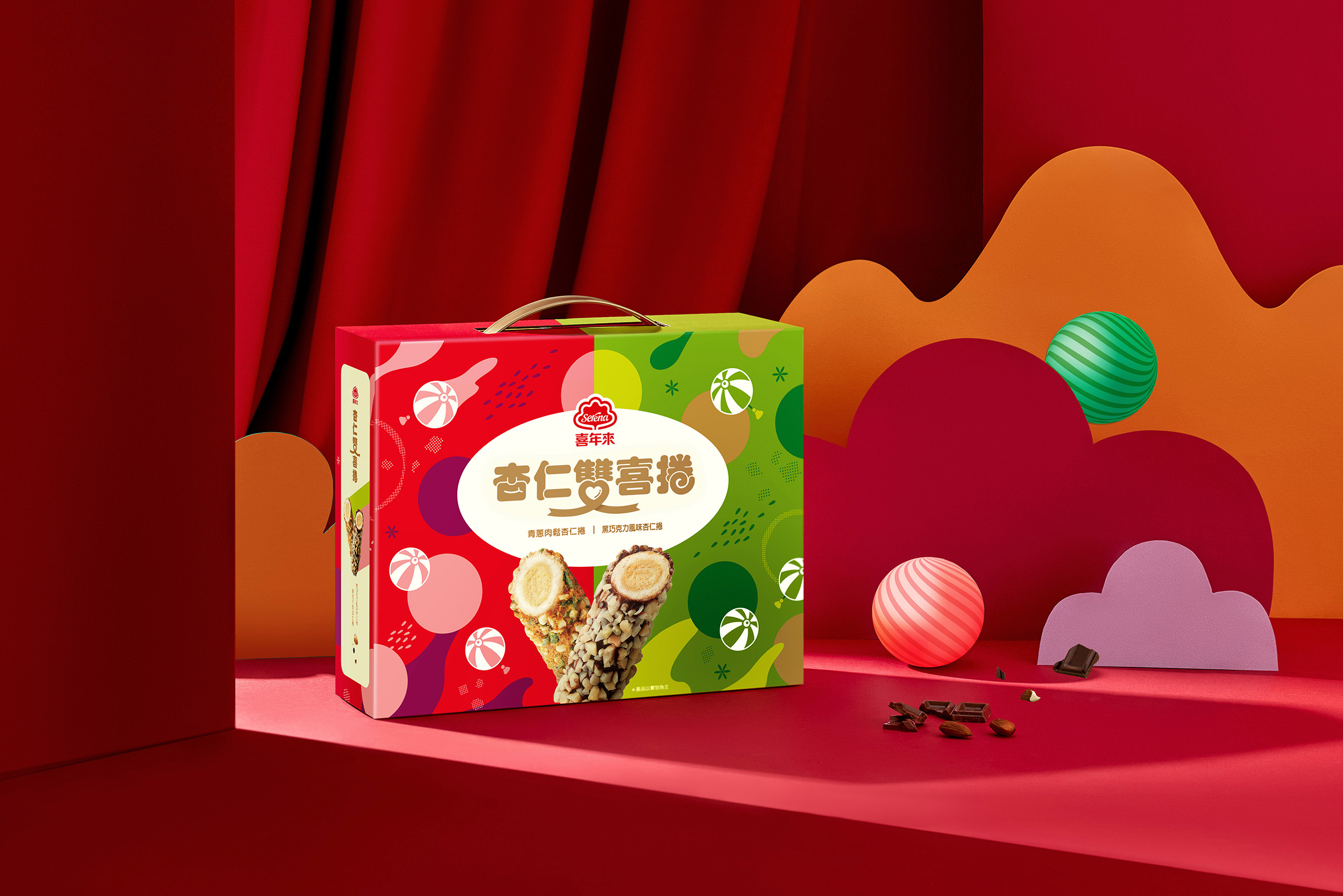
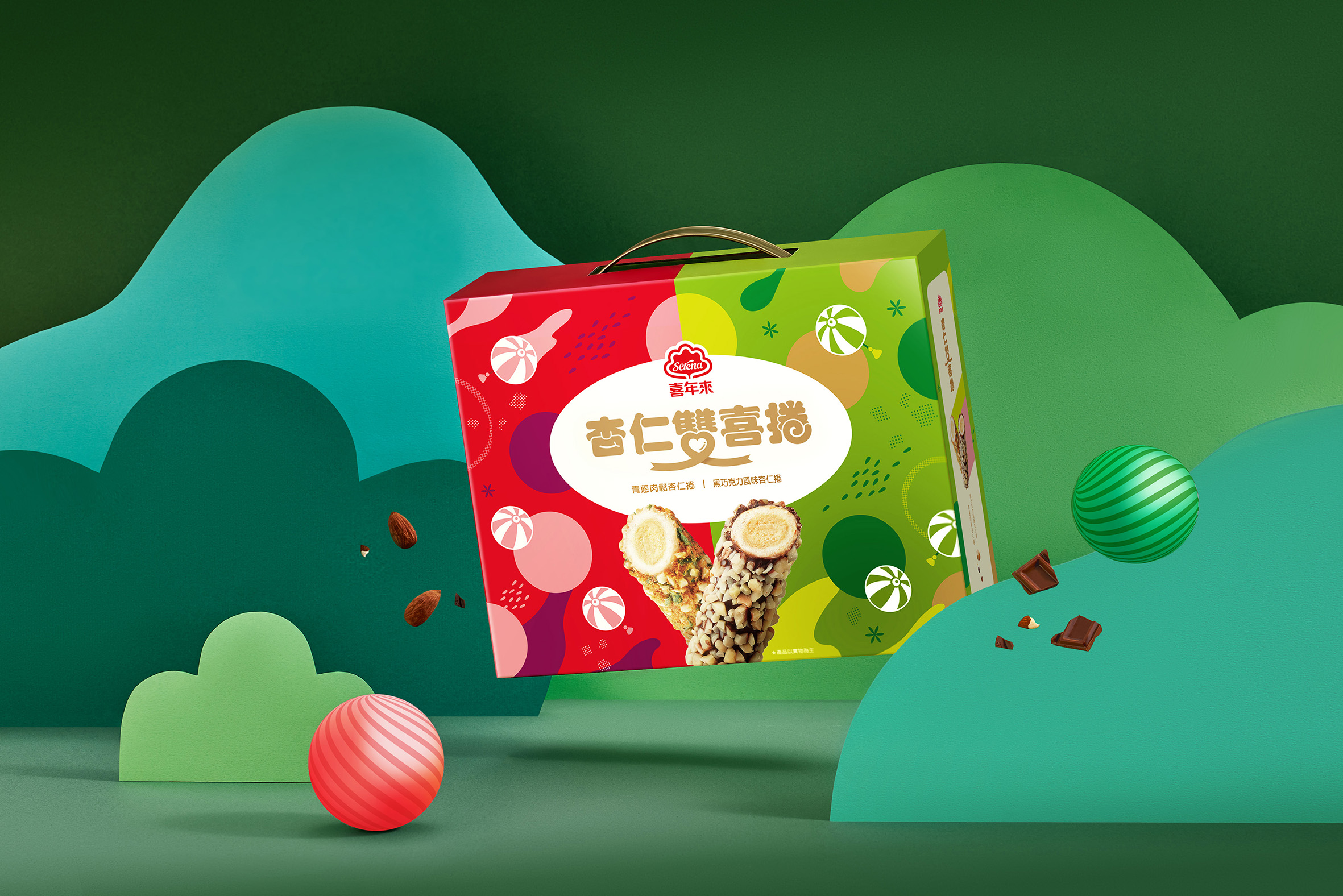
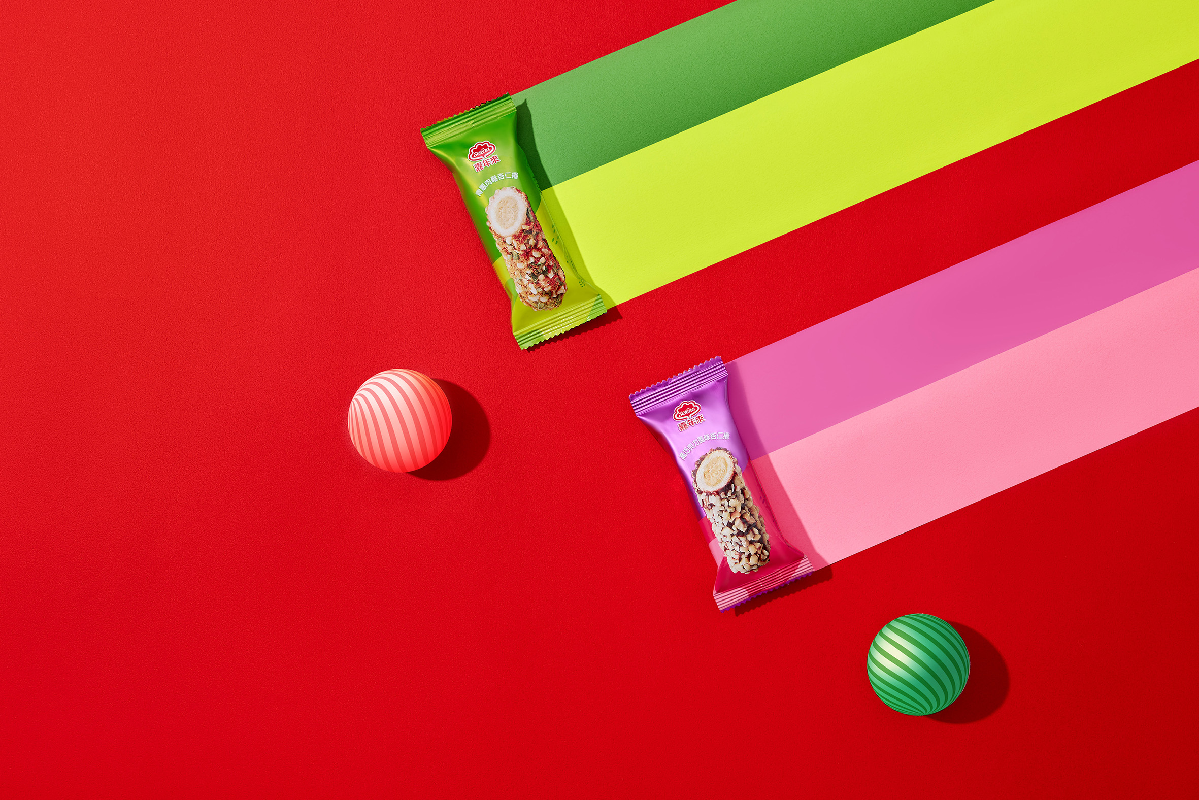
Design concept: The composition is divided into two to convey the meaning of double happiness. Red echoes the passion of dark chocolate, while green and fake gold show the vitality of green onions, creating a double joy of double arrival, while the circle has the association of fullness and reunion. With the addition of lanterns with candy textures, and finally combined with the imagery-style illustrations of the ingredients, it presents a joyful and colorful visual feast.
Standard font: The full round font echoes the shape of the biscuit. The font combines love, ribbons and delicious food. It has a ceremonial sense of carefully selected gifts when opening the box.
Color plan: The gift box cleverly combines the colors of the 7-11 channel (red, white, and green), considering that the audience is mainly young urbanites, and uses contrasting colors to create a colorful and lively New Year mood.
Imagine holding a cleverly designed package in your hands, which narrates the tale of “double happiness” through its artful division. This isn’t just packaging; it’s a visual feast. The passionate encounter of red with the dark chocolate and the lively pairing of green with gold instantly radiate dual delight and fervor.
This packaging ingeniously utilizes circular shapes, evoking thoughts of warmth and gatherings, while candy-striped lanterns and ingredient illustrations add a festive and colorful touch to the visual banquet. Opening this package, the rounded fonts, the “double” character melded with hearts and ribbons, all silently convey that this isn’t just a gift, but a carefully chosen blessing.
As for the color scheme, we boldly mixed the red, white, and green of 7-11, targeting the fashionable urban youth. Through the contrasting colors, we aimed to create a youthful and vibrant festival atmosphere, ensuring that everyone who opens it can feel the joy of the festival and the vitality of the new year.
In short, this packaging is not just a container; it’s a comprehensive sensory experience. From colors to layout, from typography to illustrations, every detail is meticulously designed. The goal is to make you feel the joy and surprise of a carefully selected gift while enjoying delicious treats. So, next time you see such packaging, remember, it’s not just about the food inside; it’s also about a passion for life and a pursuit of beauty.


CREDIT
- Agency/Creative: onebook design studio
- Article Title: Serena Almond Double Happiness Roll Gift Box 7-11
- Organisation/Entity: Freelance
- Project Type: Packaging
- Project Status: Published
- Agency/Creative Country: Taiwan
- Agency/Creative City: Taichung
- Market Region: Asia
- Project Deliverables: Brand Design, Food Photography, Packaging Design
- Format: Blister-Pack, Box
- Industry: Food/Beverage
- Keywords: onebook design studio
-
Credits:
designer: fang ren huang


