


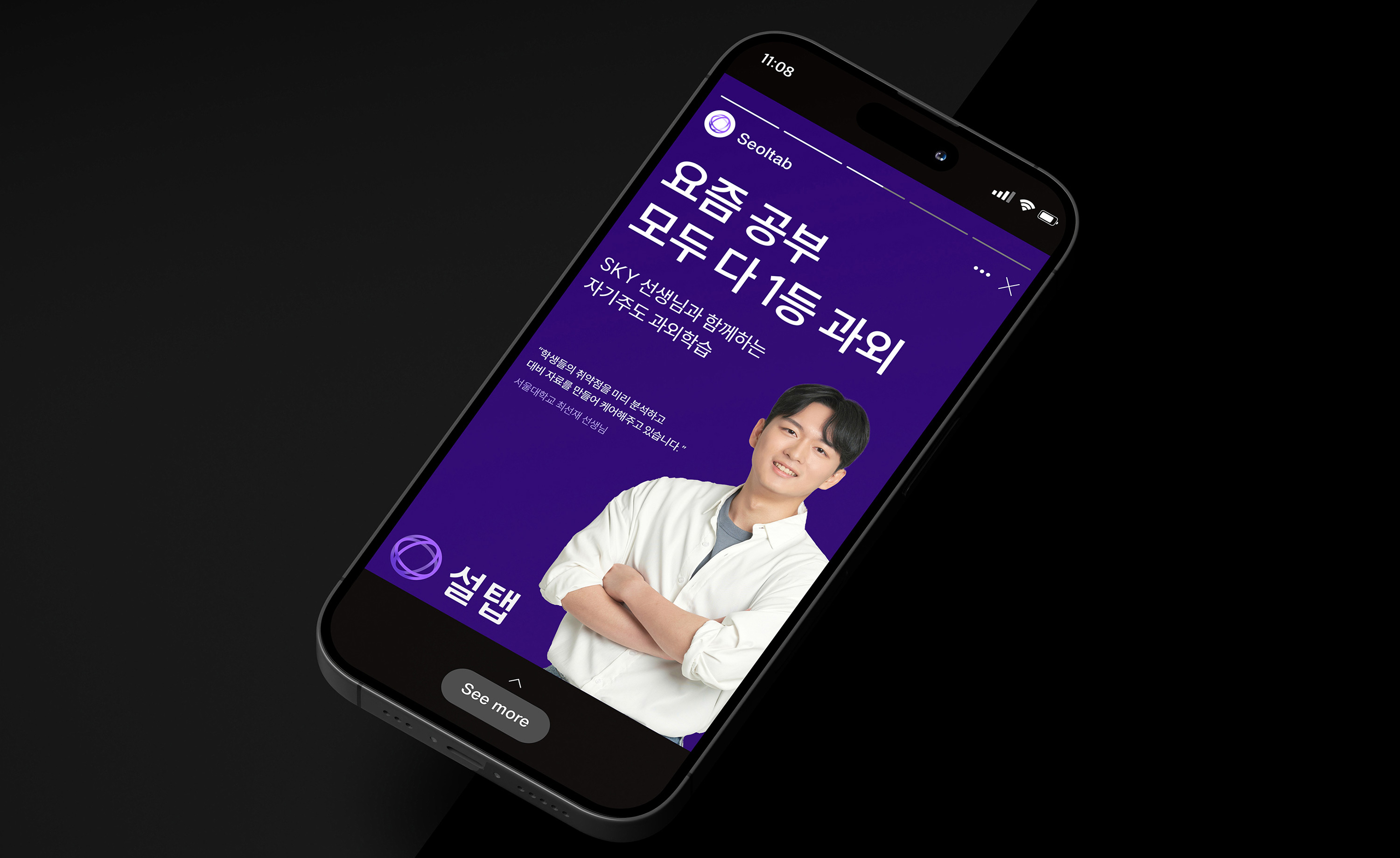
Operated by Onui, Seoltab is an educational platform that provides non-face-to-face tutoring services for middle and high school students. It is a personalised learning platform leveraging both Human Touch (HT) and Digital Transformation (DT). Bringing offline tutoring sessions to the online space, Seoltab facilitates 1:1 tailored non-face-to-face learning services for students and teachers, overcoming the constraints of time and space. Through a blended learning approach that combines the advantages of 1:1 interactive teaching and digital instruction, Seoltab assists students in discovering their strengths and developing specialised knowledge and skills. Even without direct physical meetings, Seoltab considers the preferences and levels of students to match them with verified top tutors. Utilising AI, Seoltab enables personalised curriculum development for each student, allowing effective learning management. Seoltab aims to empower students with tailored interactions, helping them gain self-efficacy through personalized experiences. It fosters a positive attitude towards problem-solving and cultivates the ability for self-directed learning, even without direct face-to-face interactions.
Due to differentiation from other education platform brands and the expansion of its business scope, Seoltab recognised the necessity for rebranding. Since its launch, Seoltab had emphasised the non-face-to-face tutoring service nature to appeal to customers and convey its brand image. However, it struggled to establish distinct values beyond functional aspects, unlike traditional private education brands. With the emergence of similar services, there were limitations in the service approach, and the lack of a clear brand philosophy and direction hindered effective customer communication. Seoltab aimed to strengthen its brand identity through a visual identity renewal and establish proactive communication methods with consumers. YNL Design developed a visual identity system throughout the project to clearly convey the brand values Seoltab sought, visually representing Seoltab’s blended learning approach.
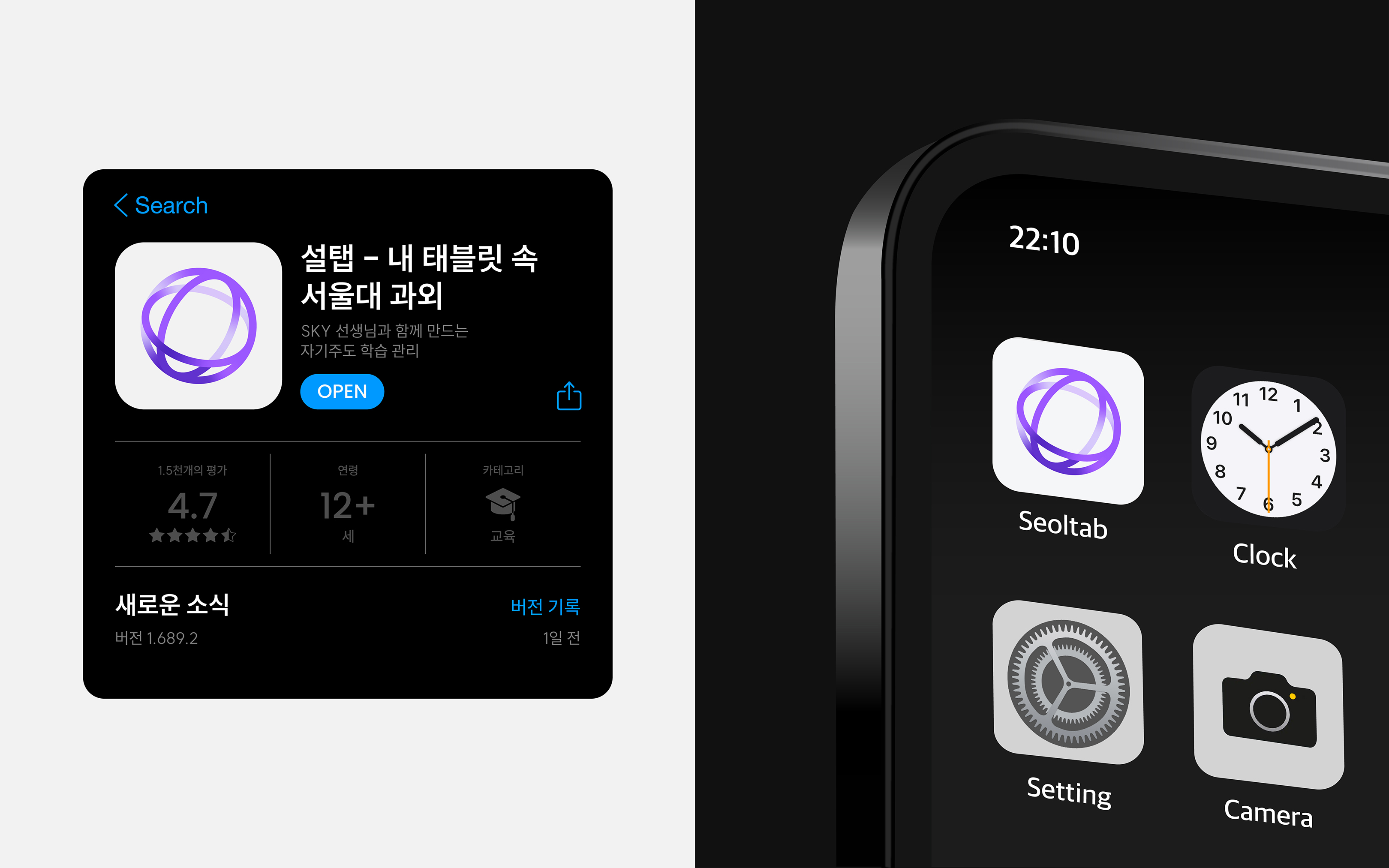
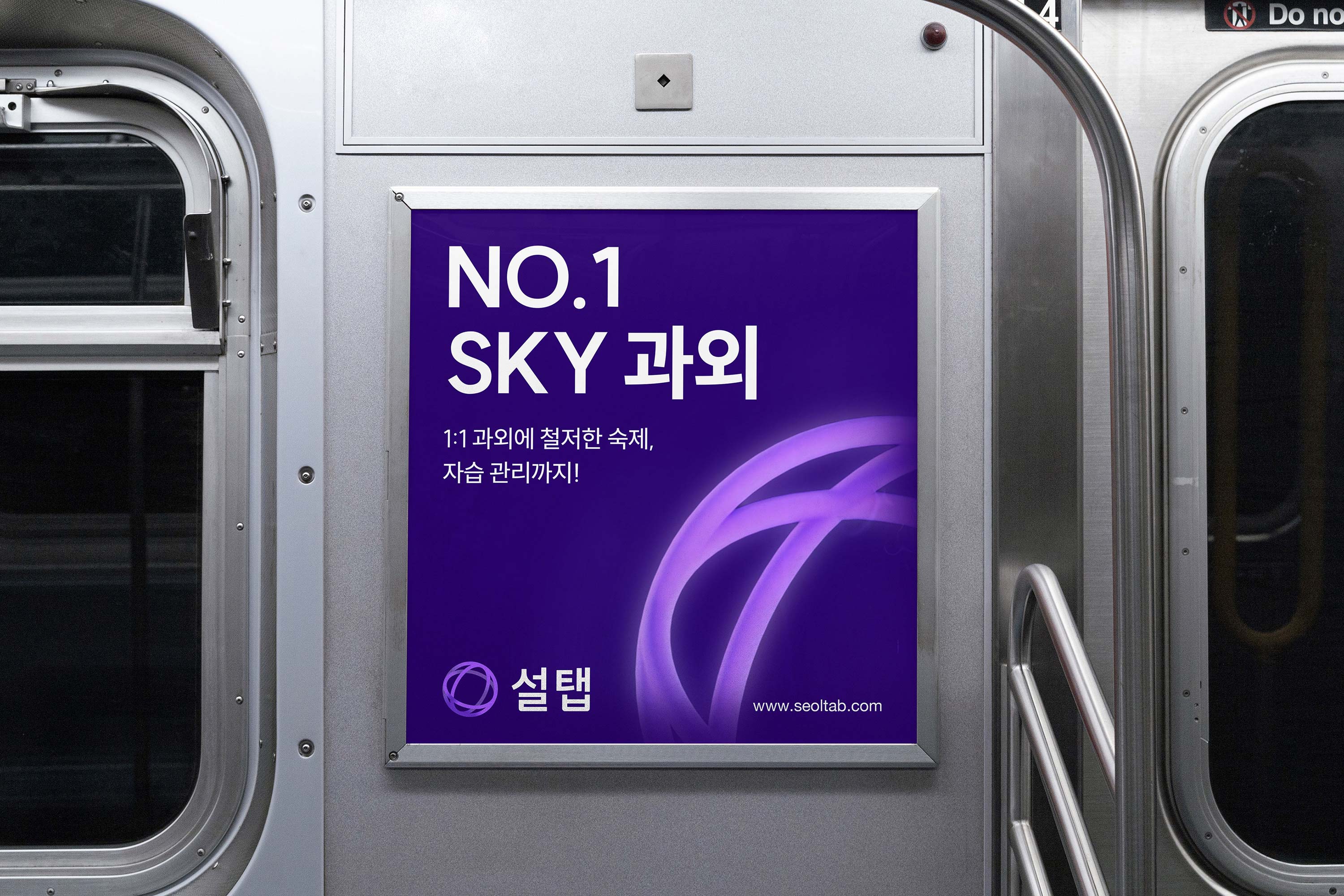
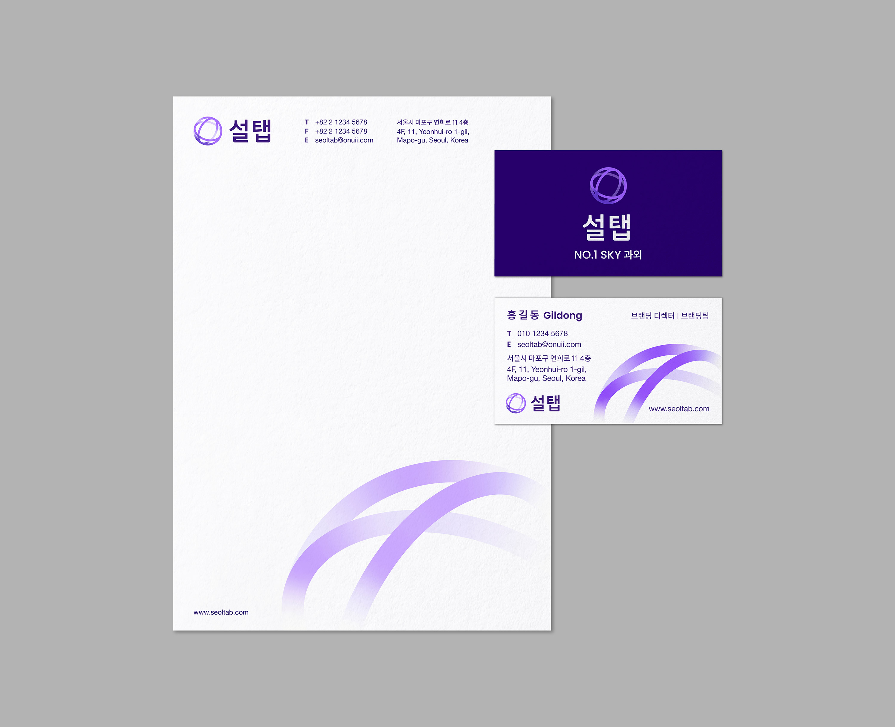
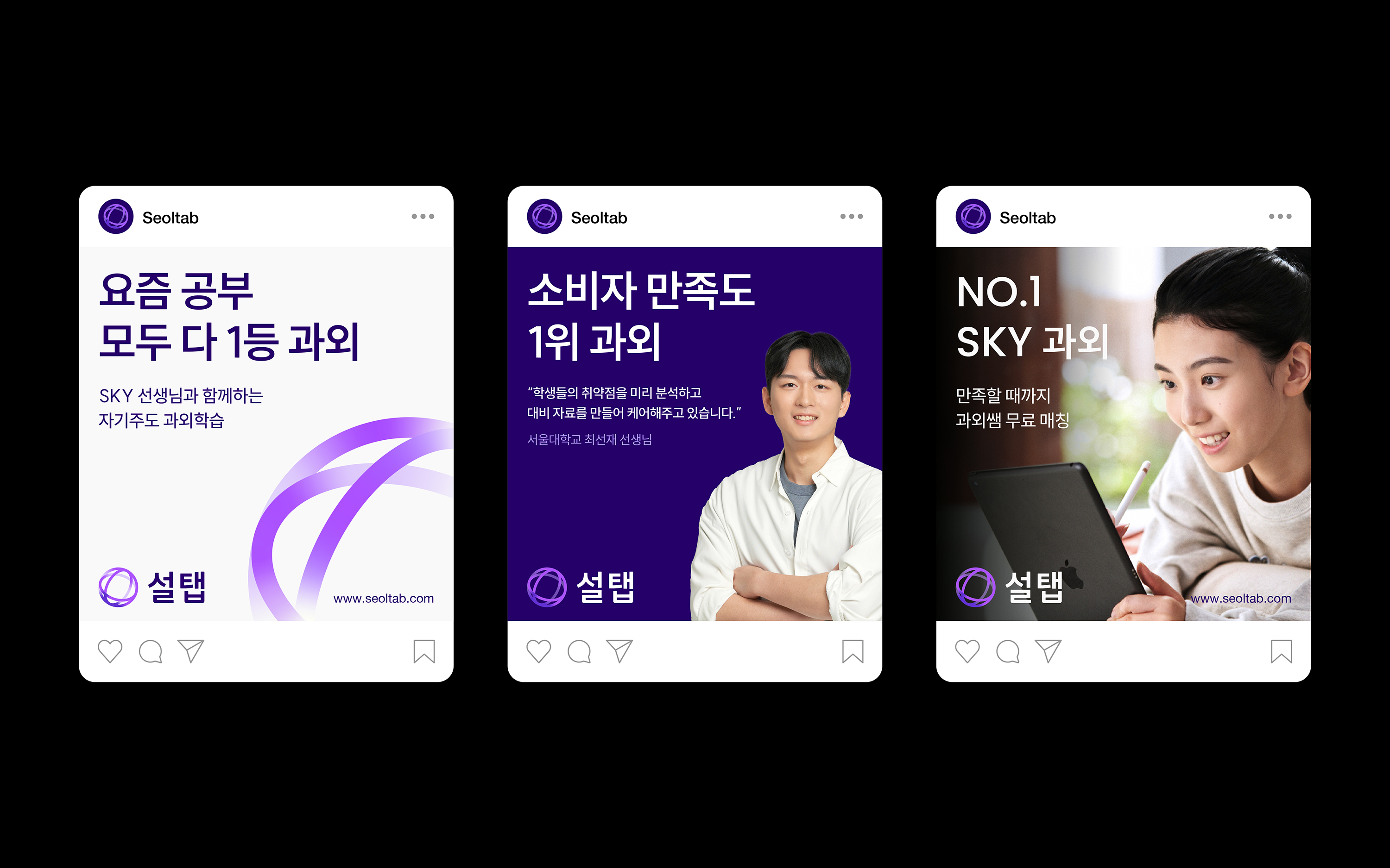
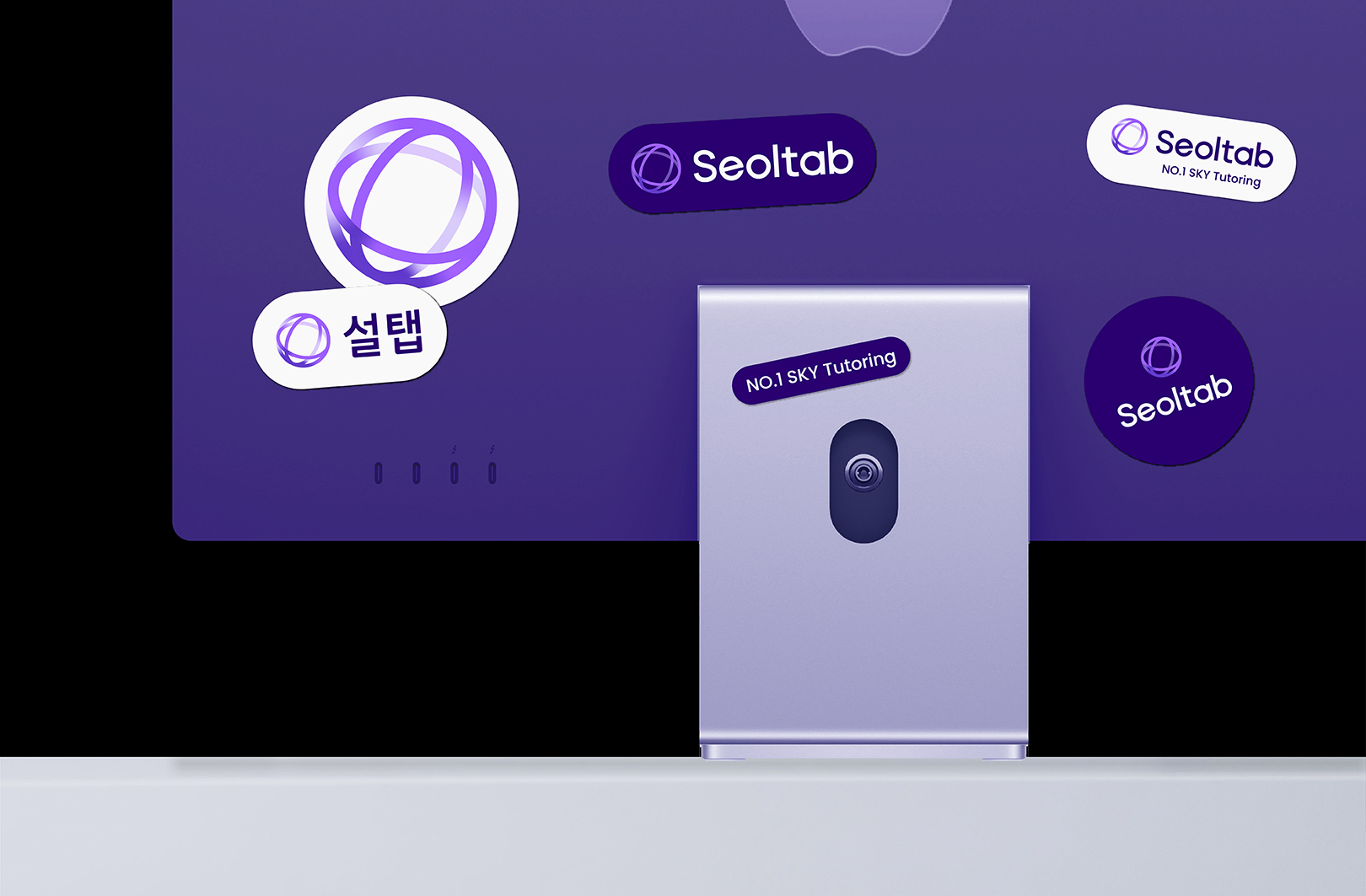
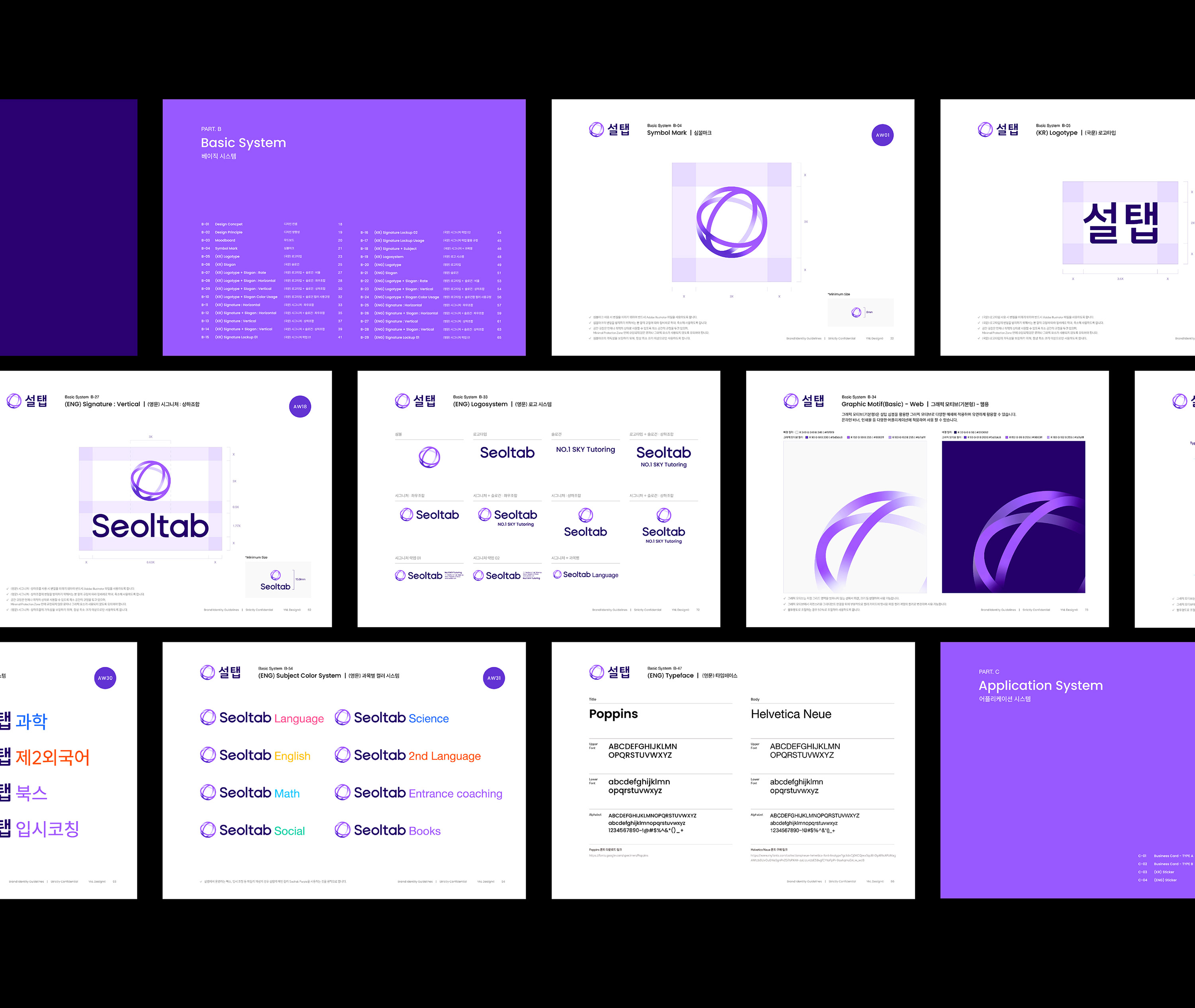
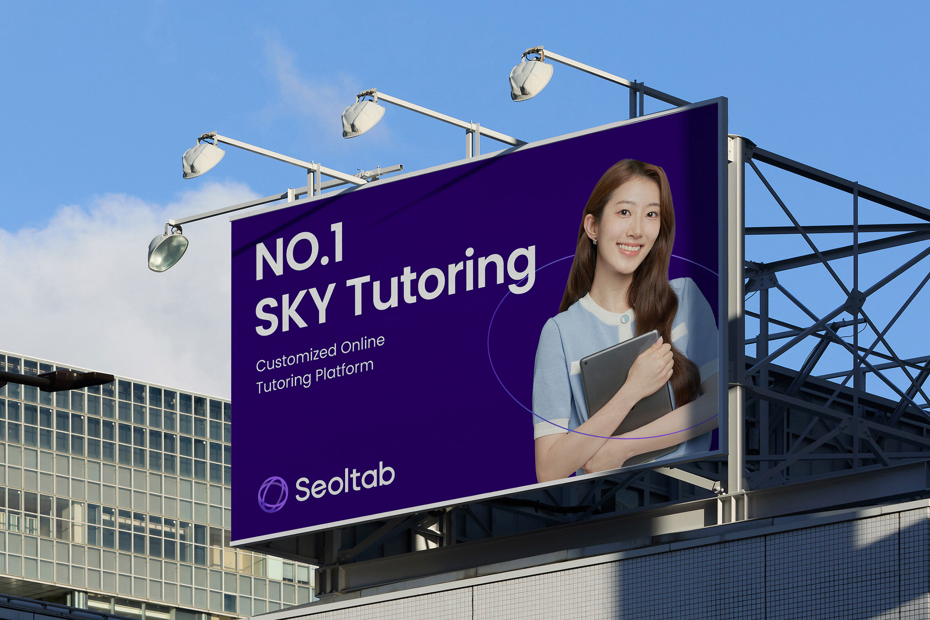
YNL Design developed the visual identity with the design concept “The Microcosm in Universe,” comparing the brand essence of Seoltab to the mysterious and vast galaxy, where numerous lights gather. The previous symbol, representing ‘S’ for Seoltab in handwritten style, emphasized the Seoltab service. The newly developed symbol features three intersecting circles, symbolising a single planet, representing the microcosm of each student’s infinite potential. It signifies the discovery of something tangible, like finding the unseen potential of students. The 3D logo format conveys a sense of space and depth, highlighting the symbolic representation of the three circles, representing classes, textbooks, and management—the essential elements through which Seoltab discovers the potential of each student. The Seoltab logotype, primarily used in the digital realm, was developed to be visually comfortable and concise. It follows a geometric and organized grid structure to convey a systematic and trustworthy image. Rounded edges throughout the logotype contribute to a human touch (HT) aspect, delivering a soft overall image. Seoltab’s colors visually express blended learning. Human Touch (HT), representing interaction with people, uses warm colours, particularly red symbolising the heart, while Digital Touch (DT), representing a rational and technical aspect, is represented by the blue colour. The blended combination of HT and DT results in Seoltab using purple as its main color for brand identity. Purple symbolizes the universe and, functionally, reduces eye strain for students and teachers studying on iPads, ensuring excellent usability. To facilitate user understanding and convenience in the expanding Seoltab system, a subject-specific colour system was established. Seoltab’s graphic motifs, extending from the symbol, offer flexibility for application across various platforms and applications.

CREDIT
- Agency/Creative: YNL Design
- Article Title: Seoltab’s Rebranding Journey with YNL Design: Blending Tradition and Technology
- Organisation/Entity: Agency
- Project Type: Identity
- Project Status: Published
- Agency/Creative Country: South Korea
- Agency/Creative City: Seoul
- Market Region: Asia
- Project Deliverables: 3D Motion, Brand Creation, Brand Design, Brand Guidelines, Brand Identity, Brand Redesign, Brand Strategy, Branding, Creative Direction, Design, Identity System, Logo Design, Motion Graphics, Rebranding
- Industry: Education
- Keywords: YNL Design, 3D Motion, Brand Creation, Brand Design, Brand Guidelines, Brand Identity, Brand Redesign, Brand Strategy, Branding, Creative Direction, Design, Identity System, Logo Design, Motion Graphics, Rebranding
-
Credits:
Creative Direction: Liz Yoona Lee
Brand Design: Heejae Choi
Brand Design: Minji Seo


