Sensodyne is launching a new premium range extension with new product Clinical White. With strategy and creative execution by global agency Marks, the product combines the tooth sensitivity expertise the brand is known for with a clinically proven solution for whiter teeth.
The ambition of the new release was to increase relevance across a wider segment of people suffering from teeth sensitivity. Sensodyne realised the opportunity in ‘whitening’ category trends to attract people who prioritised whitening over sensitivity and were willing to pay a premium for it. The brand now offers a product that delivers the desired whitening effects with the added benefit of Sensodyne’s protective and restorative formulas.
James Houghton, Global Senior Design Director at Sensodyne owner Haleon, says: “Clinical White marks the creation of a new tier of product that will enhance and elevate the Sensodyne brand. Our challenge was launching a clinically proven whitening toothpaste for sensitivity that appealed to a more aesthetically minded whitening audience willing to pay a premium for a product exuding quality. It was crucial that the design created a holistic and future-proof approach, building solid foundations for a premium, efficacious and disruptive experience that’s true to the Sensodyne brand.”
Meaningful and distinctive
Every detail of the design had to be meaningful and distinctive, while conveying Clinical White’s unique proposition. It was crucial to communicate the proven benefits and expertise of the Sensodyne brand to an aesthetically minded consumer in a unique way.
The design strategy uses the brand’s expert and nuanced understanding of the language of science and aesthetics, while also borrowing the visual codes of beauty, to create a premium brand experience.
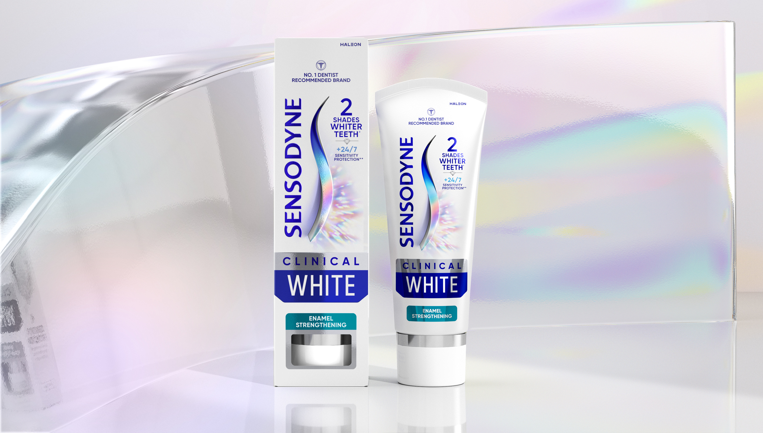
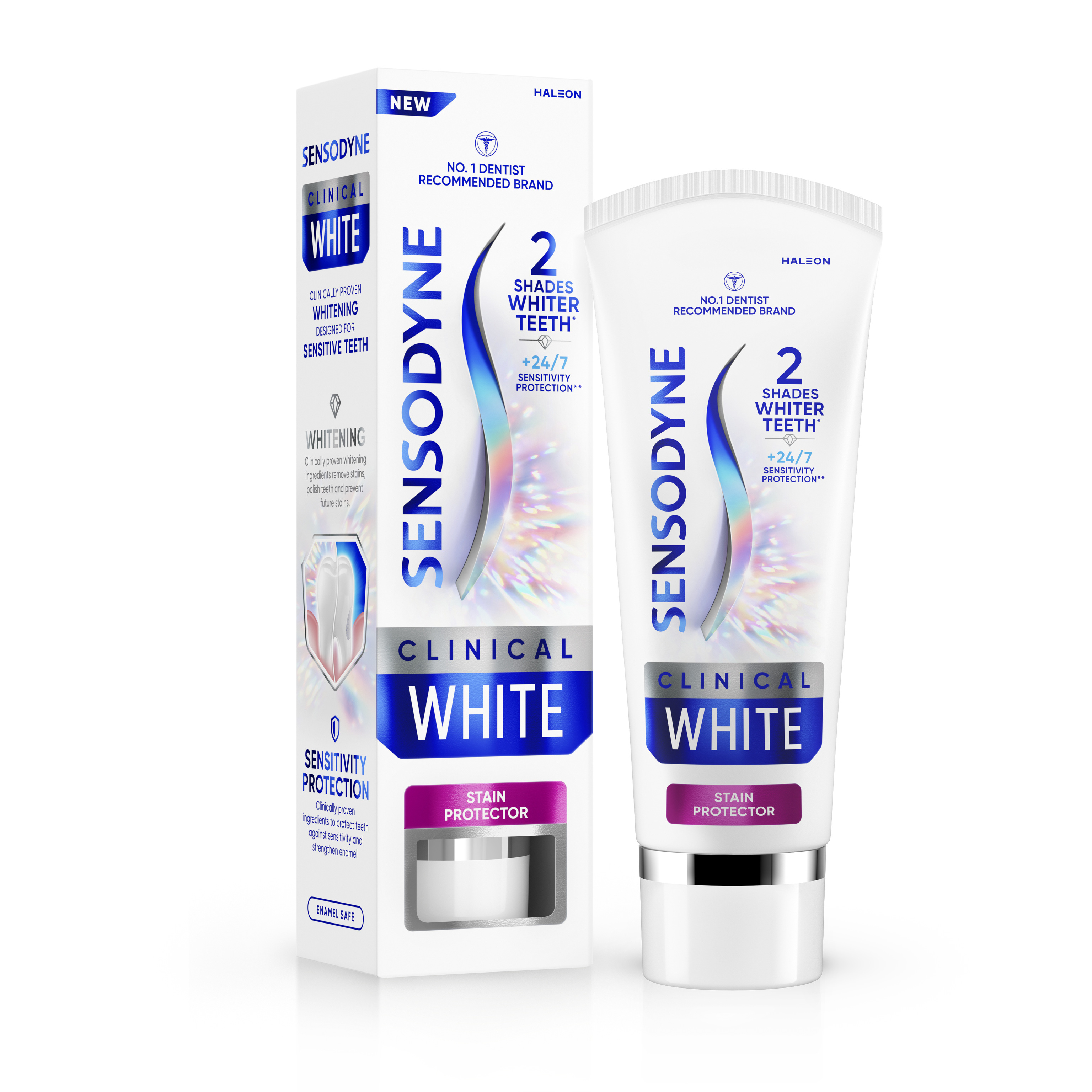
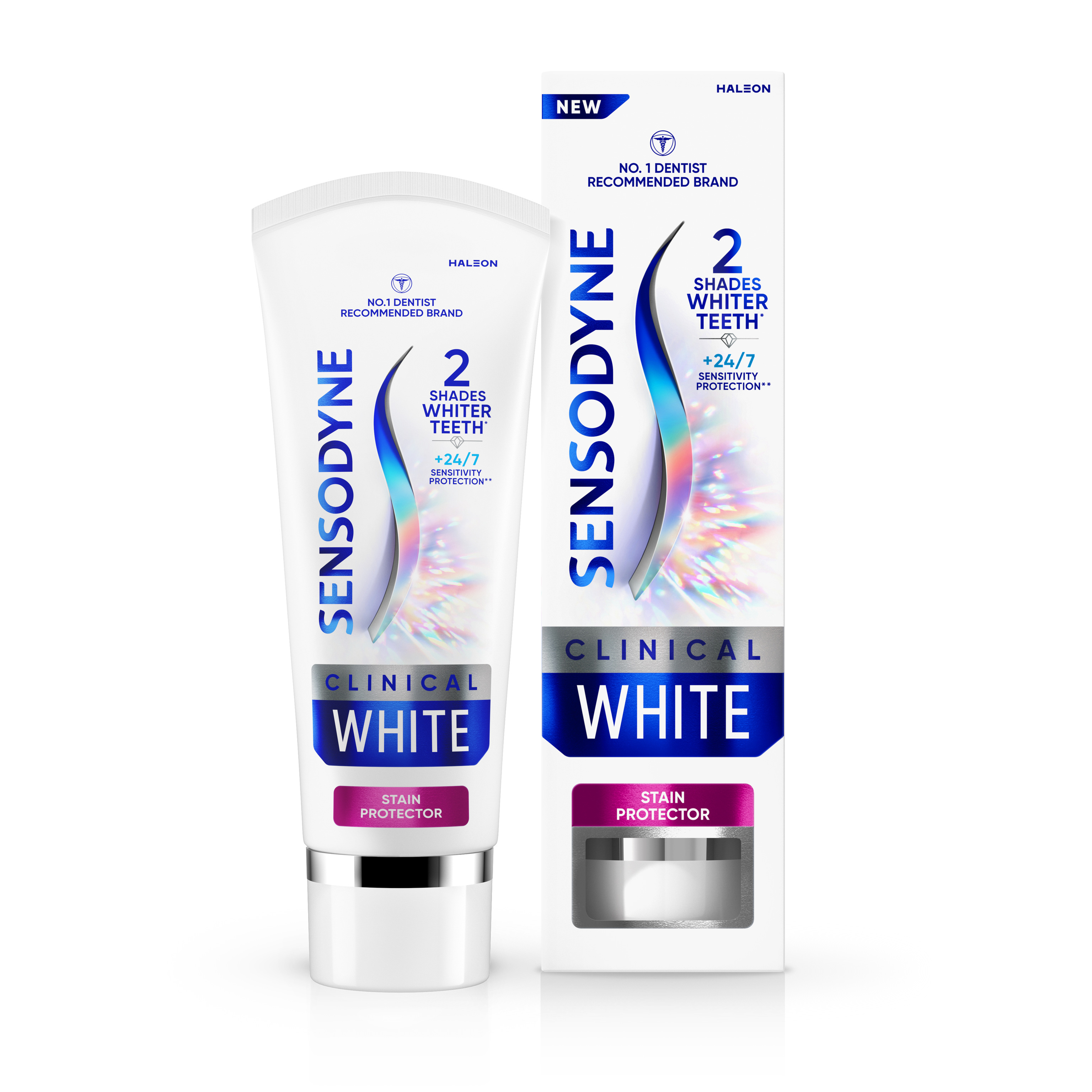
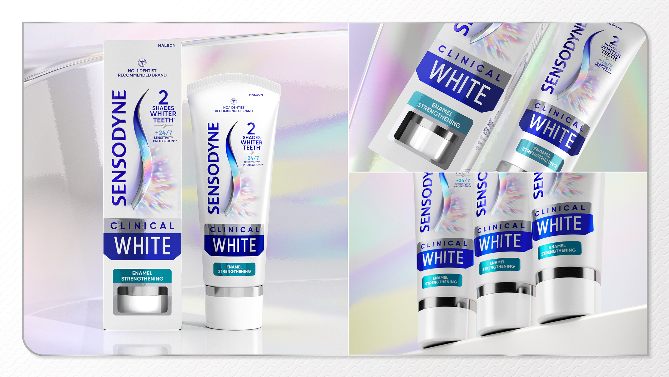
Leveraging vertical packaging and enhanced premium print finishes, it is built around the iconic Sensodyne ‘S’. For Clinical White, it is redrawn in a new signature version that divides the pack horizontally to highlight to the key benefits of the product. The overall visual expression of the new product conveys the modern, simple, elegant and ‘top tier’ that people are willing to pay more for.
Matt Kerr, Executive Creative Director at Marks, says: “We really wanted to enhance the product experience – including its visual execution and packaging design – to convey the expertise and assurance of the Sensodyne brand while also elevating the product and signalling its superior solution. The design needed to stand out on shelf but also celebrate the product in the bathroom through its premium cues, positioning it alongside adjacent categories such as beauty, perfume and other wellness products.”
Signalling top tier
The traditional Sensodyne blue in the top half of the pack denotes the enduring promise on sensitivity, and the space below the signature “S” outlines the additional benefit of the product. In this case, a spectral radiance print finish reflects the pearly white promise of Clinical White. Dialling up cues signalling beauty and wellness, it also highlights premiumness and a place of elevation that the brand has not played to before.
The creative execution includes a suite of core product assets such as a refined colour palette, with an addition of metallics and a new mode of action visualisation, which lifts it above the existing range. Overall, the design conveys clarity, cleanliness and a brightness that enhances stand-out and desirability in a meaningful way.
Kashif Amin, Global Experience Design Manager for Sensodyne adds: “We had a great holistic opportunity to define this premium range in terms of long-term vision. It needed to be effective on launch but over time build memory structures with the new offering and accommodate new stories as further products are added. The design system and creative execution does so perfectly.”
Sensodyne Clinical White is currently being rolled out in the UK, with USA to follow in the coming months. It is supported by digital assets and a campaign that builds excitement around the product’s unique offer while highlighting authenticity of message and claims.
CREDIT
- Agency/Creative: Marks
- Article Title: Sensodyne Taps Into Consumers’ Growing Dedication to Tooth Whitening With Clinical White, the First Product in a New Premium Range, Designed by Marks
- Organisation/Entity: Agency
- Project Type: Packaging
- Project Status: Published
- Agency/Creative Country: United Kingdom
- Agency/Creative City: London
- Market Region: Global
- Project Deliverables: Brand Design, Packaging Design, Product Design
- Format: Box, Tube
- Industry: Health Care
- Keywords: Sensodyne, Toothpaste, Packaging Design, Packaging, Branding, Premium
-
Credits:
Executive Creative Director: Matt Kerr


