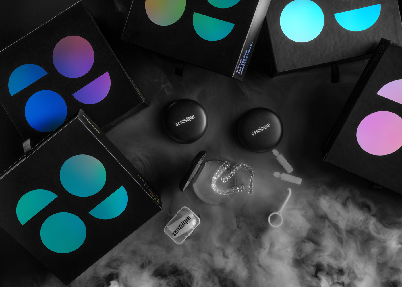
Profaligner is a medical device company that makes the future brighter through modern and effective clear aligners. They do believe that everyone deserves the perfect smile so they reinvented and developed the way orthodontic and restorative treatment is presented and delivered to thousands of people around the world. Profaligner’s mission is to make people smile more and be more confident.
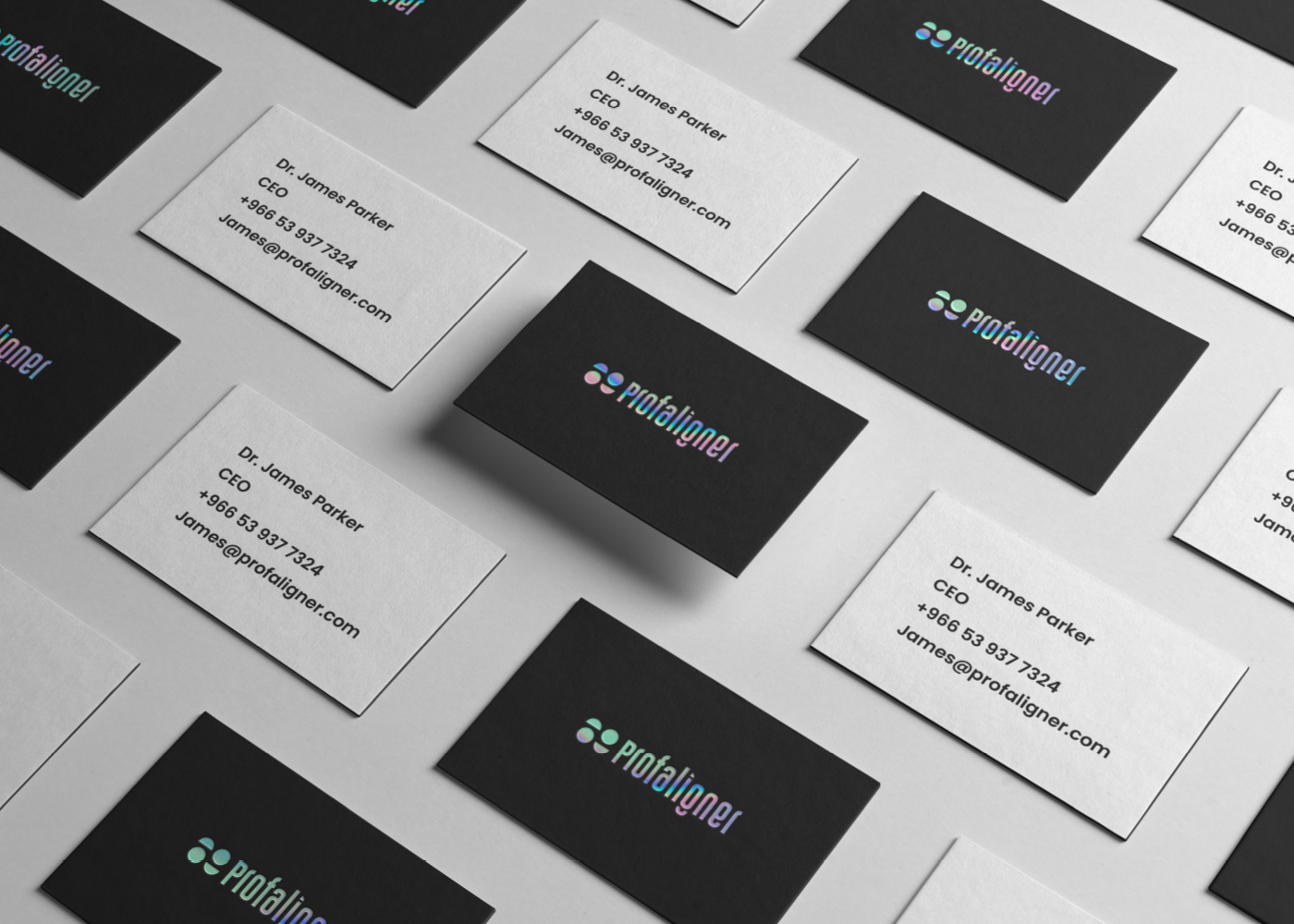
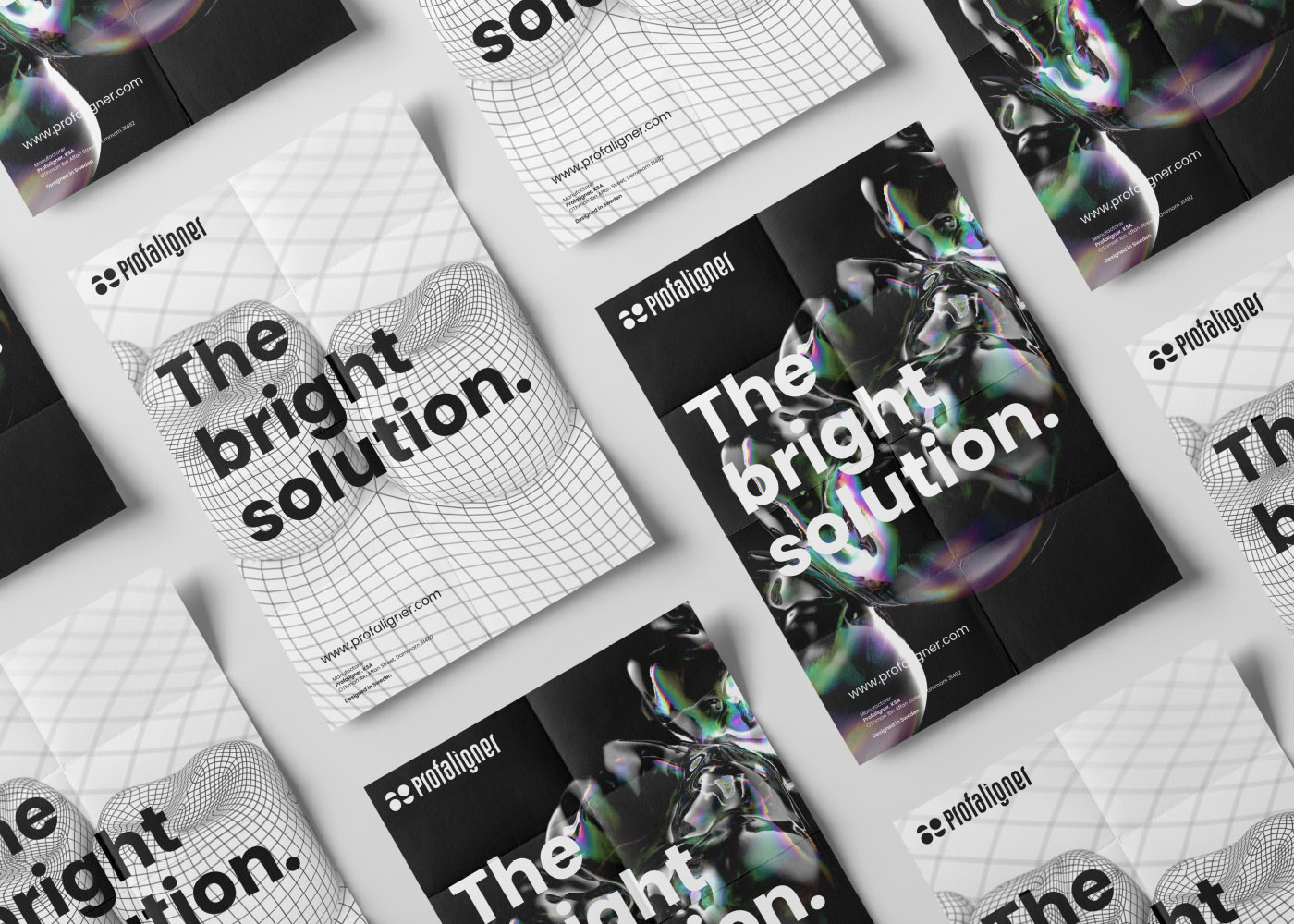
We at Selwaye Design & Branding Studio helped Profaligner redesign its identity to be modern, Confident and Unique. Standing out in the market was our top priority. We managed to design a new, modern yet minimalistic logo using unique colour palettes to give the brand more visibility and memorability. We focused on reflecting what the brand stands for and communicate its values through the new identity and the new packages.
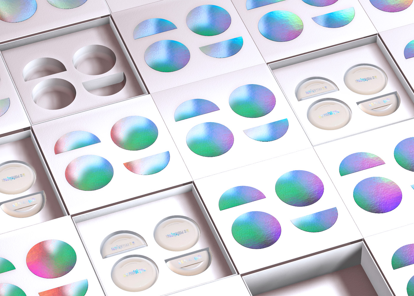
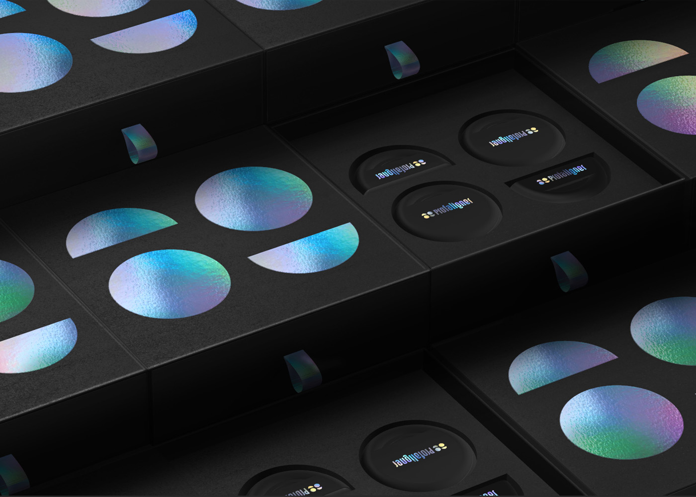
The challenge was to create a memorable identity to help Profaligner stand out in the market and make it easier for Profaligner to reach its target audience. The solution was a new visual identity that was designed to reflect modernity, confidence and Uniqueness. We used Holographic palettes to help Profaligner stand out and create memorable identity and packaging for their products.
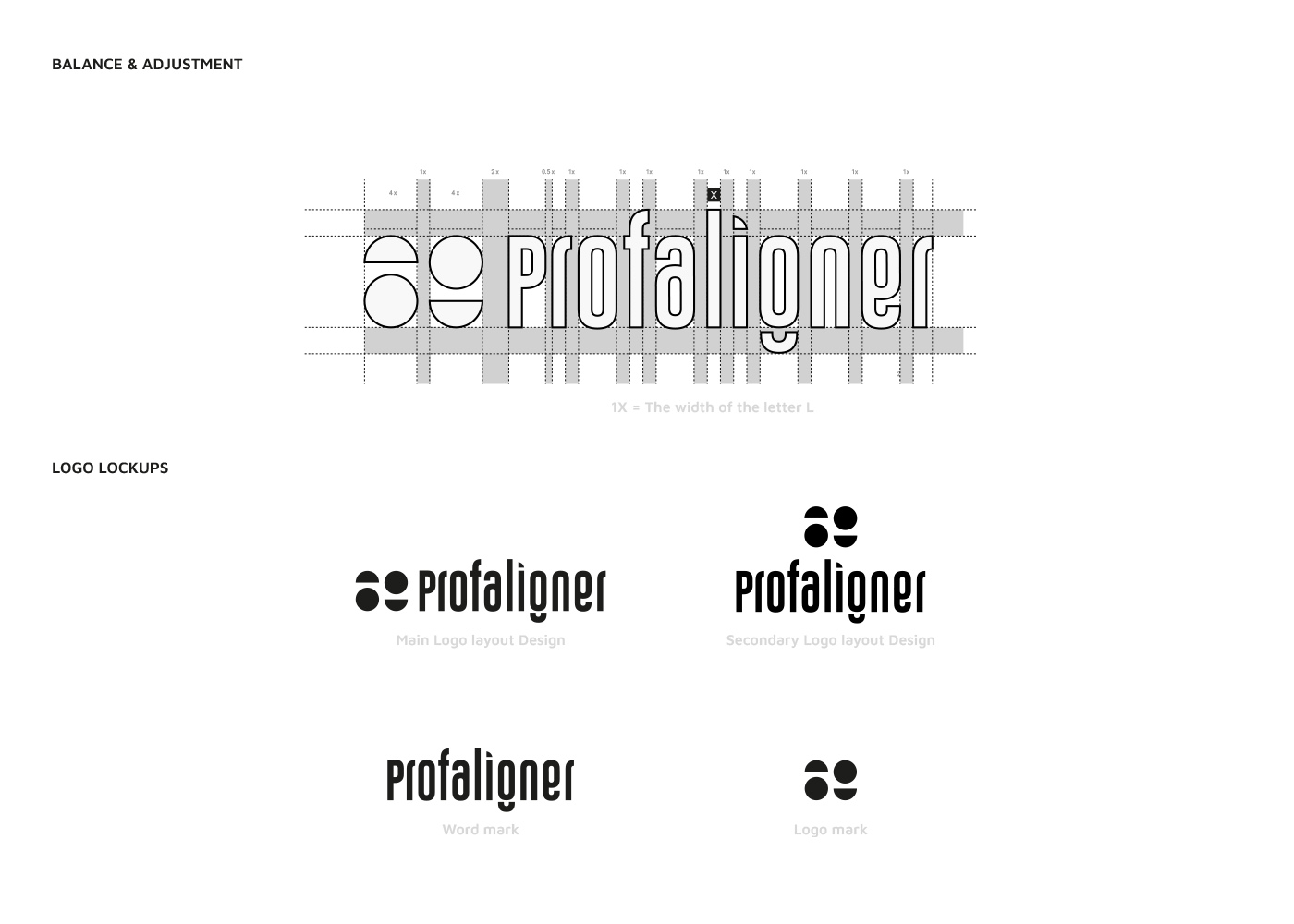
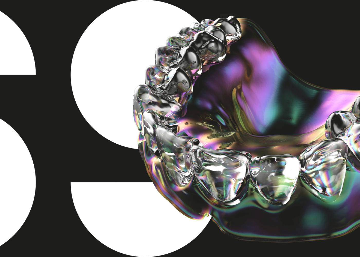
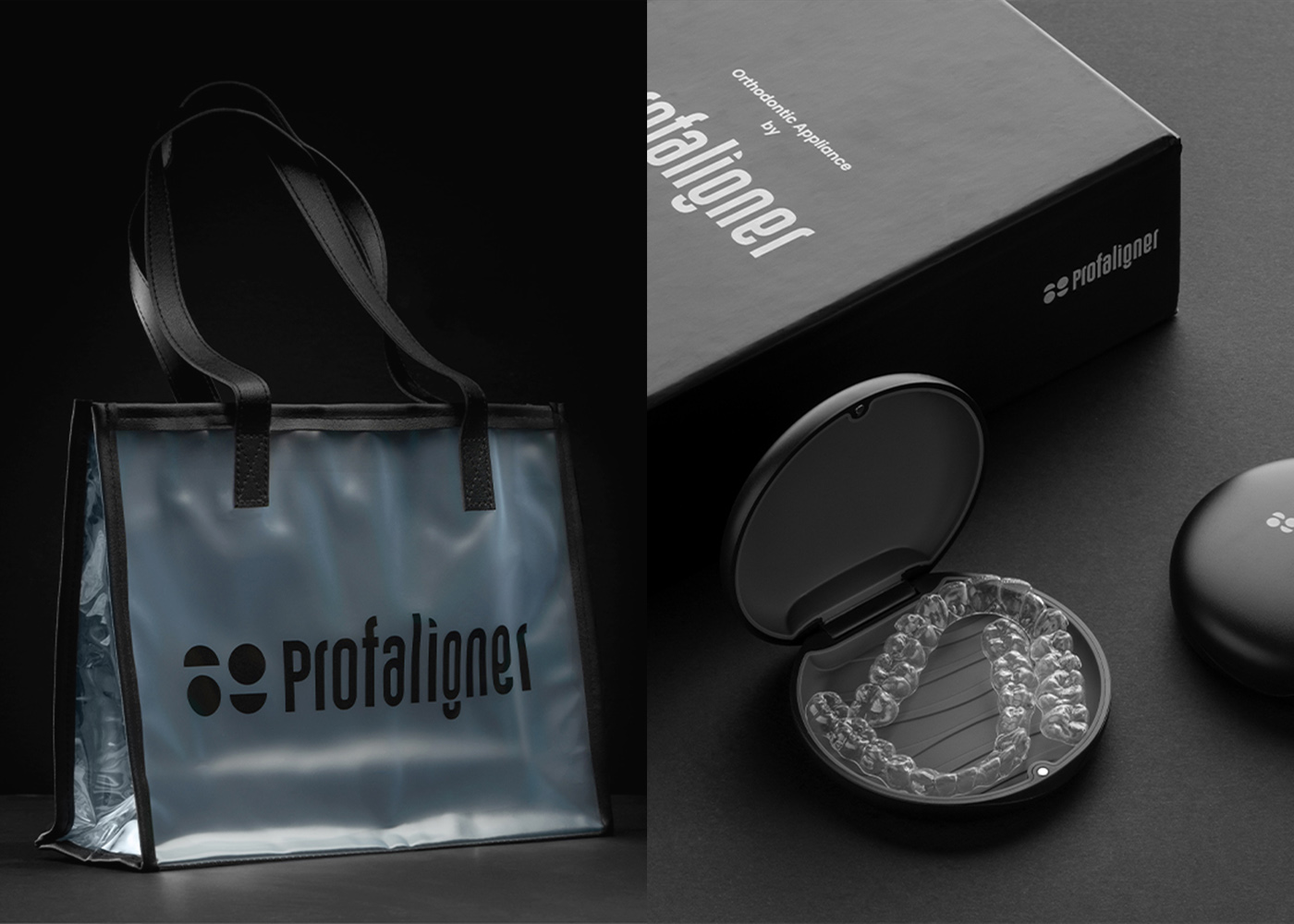
The Profaligner logo is a combination of a logo mark and a logotype. The logo mark consists of two circles and two half circles which represent the smile/face and perfection. The logotype was customized to reflect the brand personality and mirror their values as a modern, friendly and elegant brand. The logo is responsive and can be used in different contexts and applications.
When it comes to the colours, black and white together with the Hologram/Iridescence colour palettes are the primary colours of Profaligner. The Hologram/Iridescence palettes are our conceptual colours that differentiate our brand from the others and reflect our modernity and futuristic vision visually.
The packaging was designed to add value to the product, reflect modernity and elegance and of course suit the client’s needs.
CREDIT
- Agency/Creative: Selwaye Studio
- Article Title: Selwaye Studio Create Profaligner Identity and Packaging
- Organisation/Entity: Agency
- Project Type: Identity
- Project Status: Published
- Agency/Creative Country: Sweden
- Agency/Creative City: Selwaye Studio
- Market Region: Asia, Europe, Global
- Project Deliverables: Brand Creation, Brand Design, Brand Identity, Brand Redesign, Creative Direction, Packaging Design
- Industry: Health Care
- Keywords: WBDS Agency Design Awards 2021/22
- Keywords: Clear, Aligner, Packaging, Profaligner, Medical, Dentist, Dental
-
Credits:
Creative Art Director / Project Manager: Moe Selwaye
Motion designer: Motaz Faysal
Art Director: Waseem Kadoura
Photographer: Ali Arbes


