You Might Just Get It – Putting the Cult in Gen Z Resale with Selleb
Watch. Drop. Bid. Win. US-based digital platform Selleb is in the market to own the next generation of cult fashion resale. Forget Depop-trickle downs, the pieces curated by this sister-founded brand are second-hand collectables from Gen-Z influencers – imagine Zendaya’s Met Gala dress, Logan Paul’s boxing glove, a North Face puffer once worn by Kendall Jenner. The highest bidder doesn’t just win the product but something far more valuable: cult status. To own is to be known.
Regular Practice picked up this gamified brand story from words-first agency Sonder & Tell. In it, the idea of ‘celebrity’ was stretched from untouchable to ownable. Not just for megafans and stans, Selleb would be for anyone who wants a piece of it. The thrill of playing for it. If you get it, that is. And Regular Practice needed to create a trendsetting visual identity to match the pace: on the pulse, in the know and with a laid-back hype that spoke to a young, hard-to-impress audience.
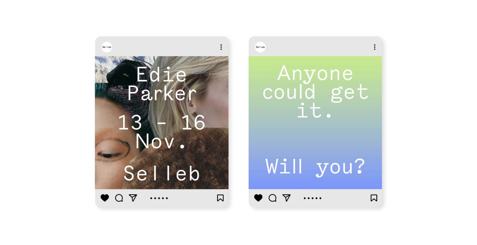
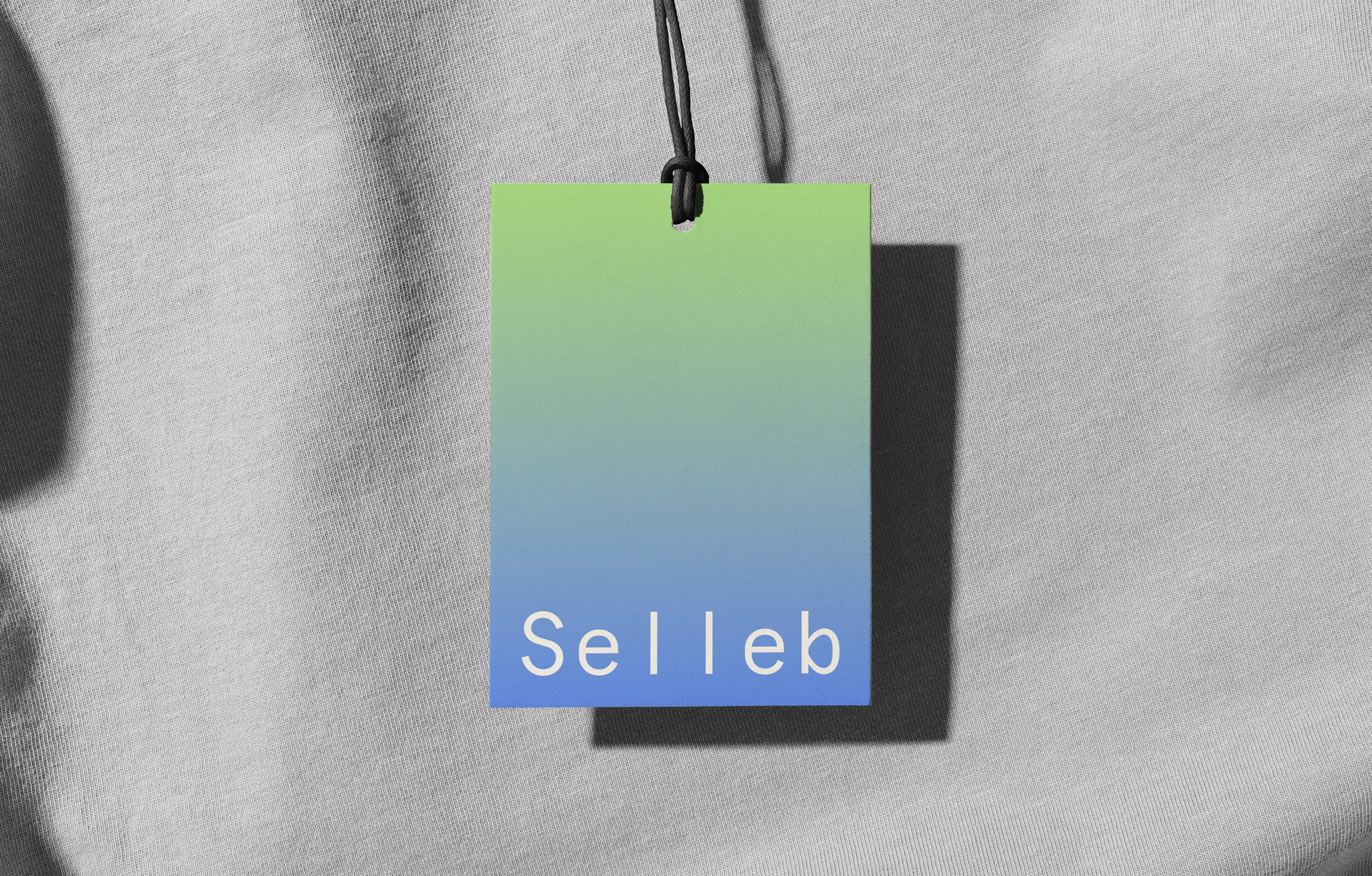
The result? A set of brand guidelines and graphic standards that are tech savvy, effortlessly cool and deeply rooted in the wannabe-enigmatic customer. The personality – that sense of ‘extraness’ – is sprinkled throughout: wavelike animations make copy jump from the page; typographical moments catch the eye; colour gradients run from the homepage to new drops. It’s surprising, delightful and not at all try hard. Just like the founders Chloe and Clarie Lee.
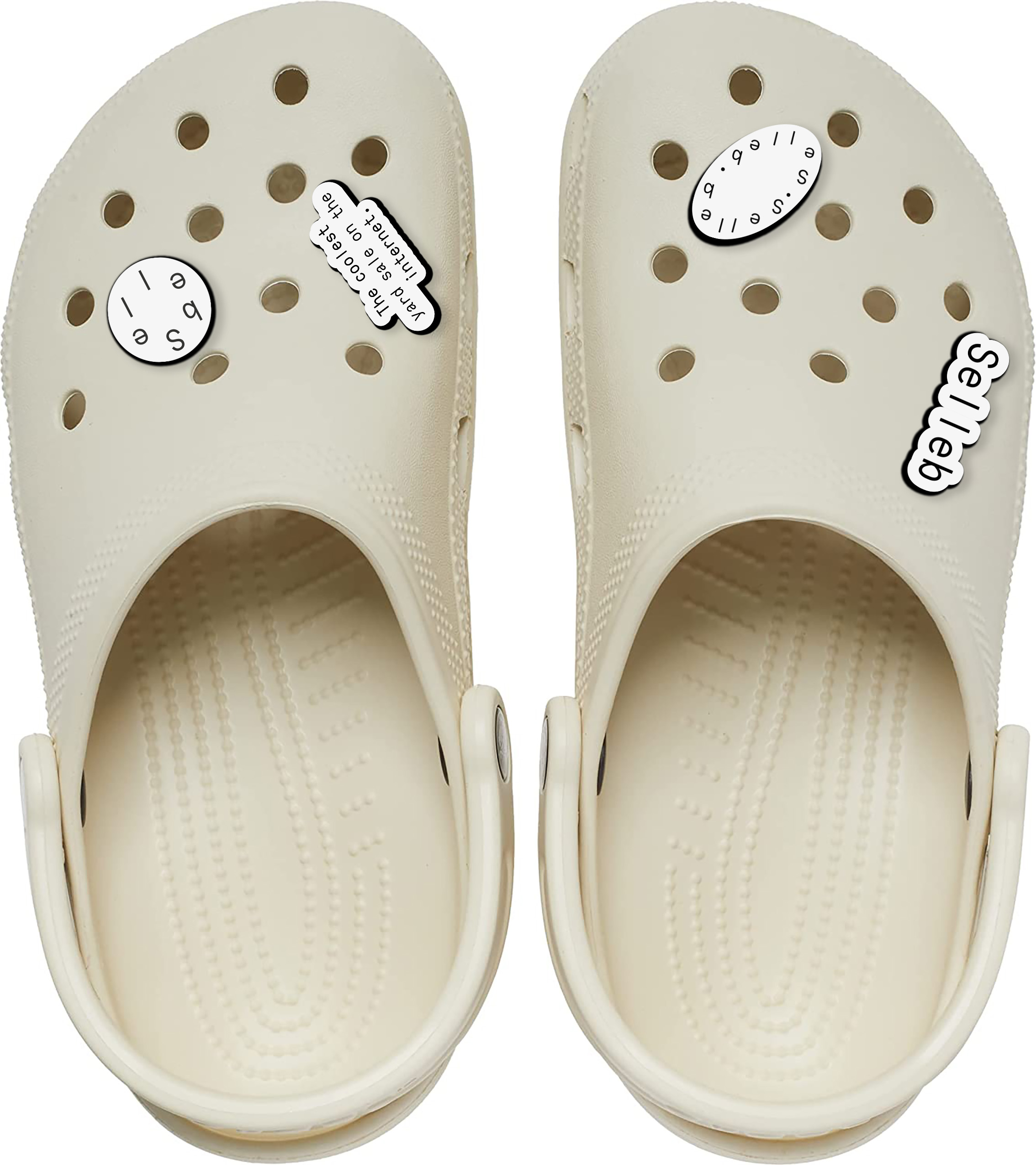
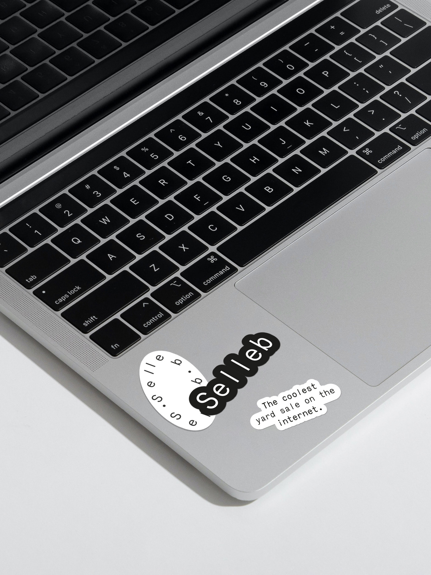
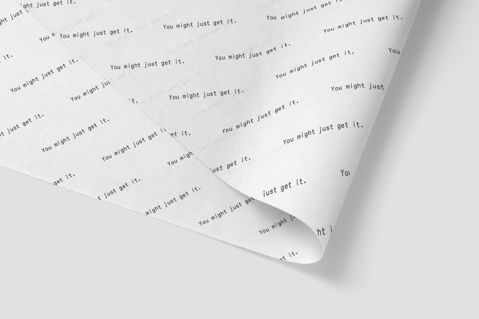
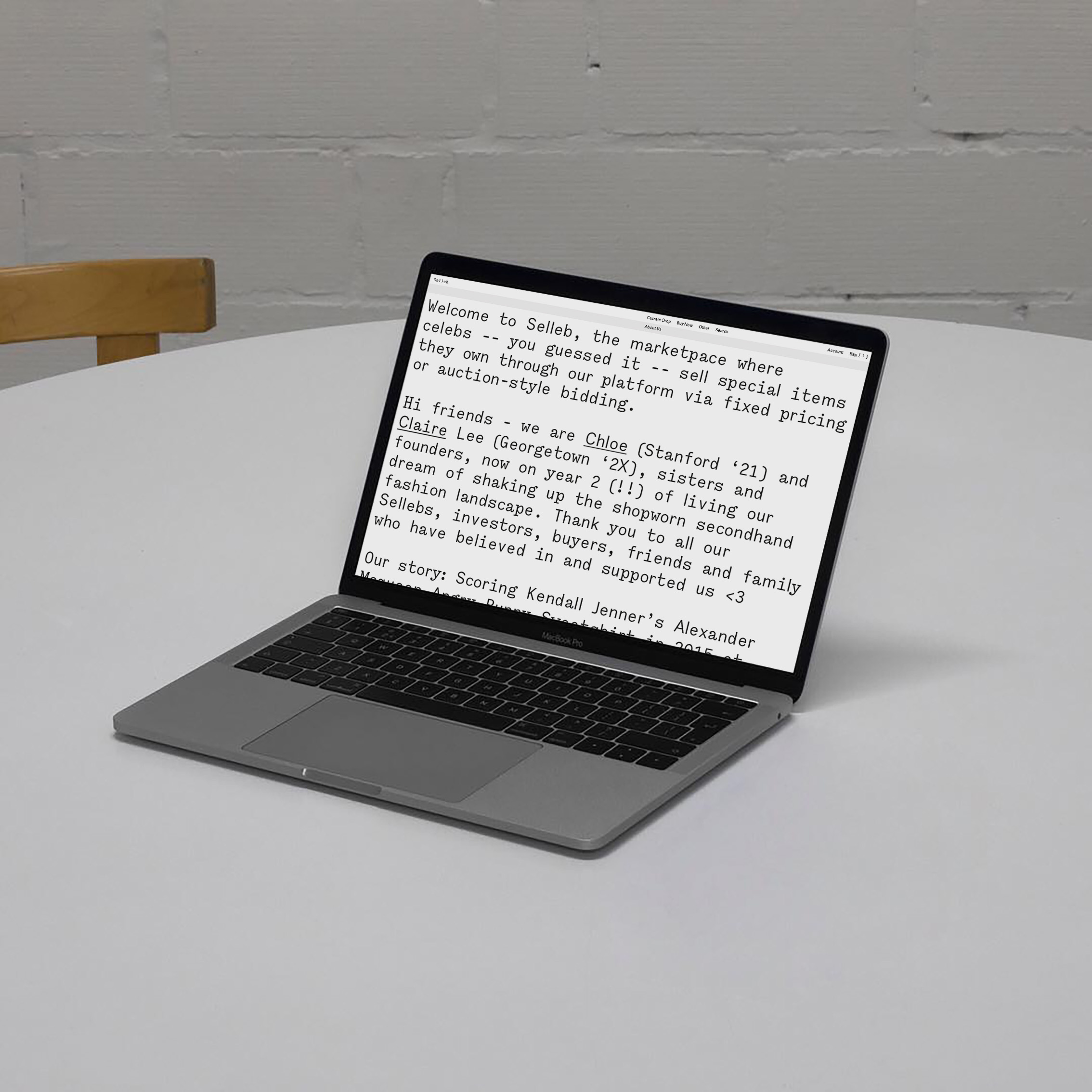
There’s a slick dance between the verbal identity and the way that plays out across physical collateral. Hit the homepage and words drop from the top of the screen. A bank of pithy straplines is woven through the customer experience: ‘You might just get it.’ ‘Win what they want.’ ‘The coolest yard sale on the internet.’ A spaced-out wordmark maintains that sense of chill when collage-style images dial up the extra.
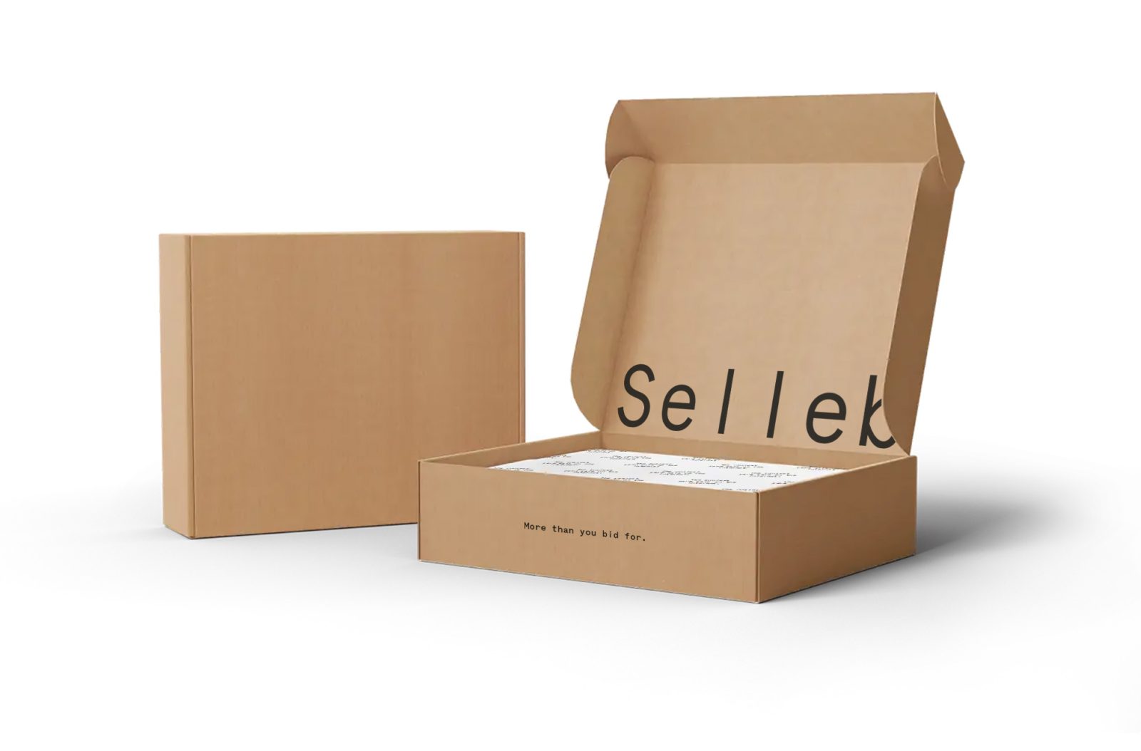
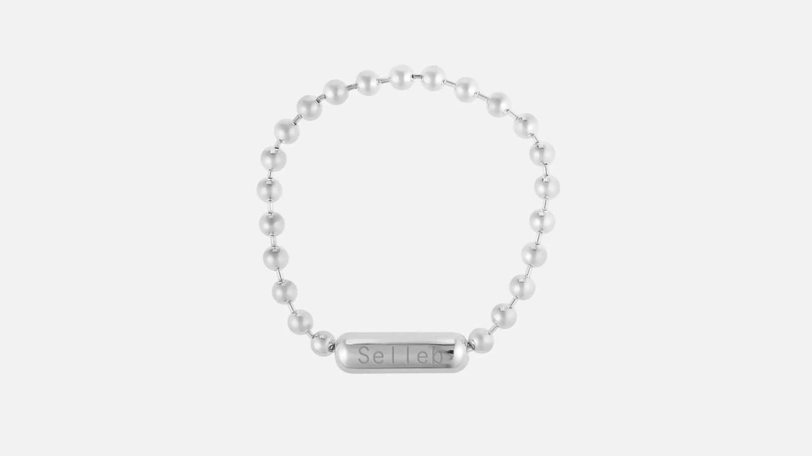
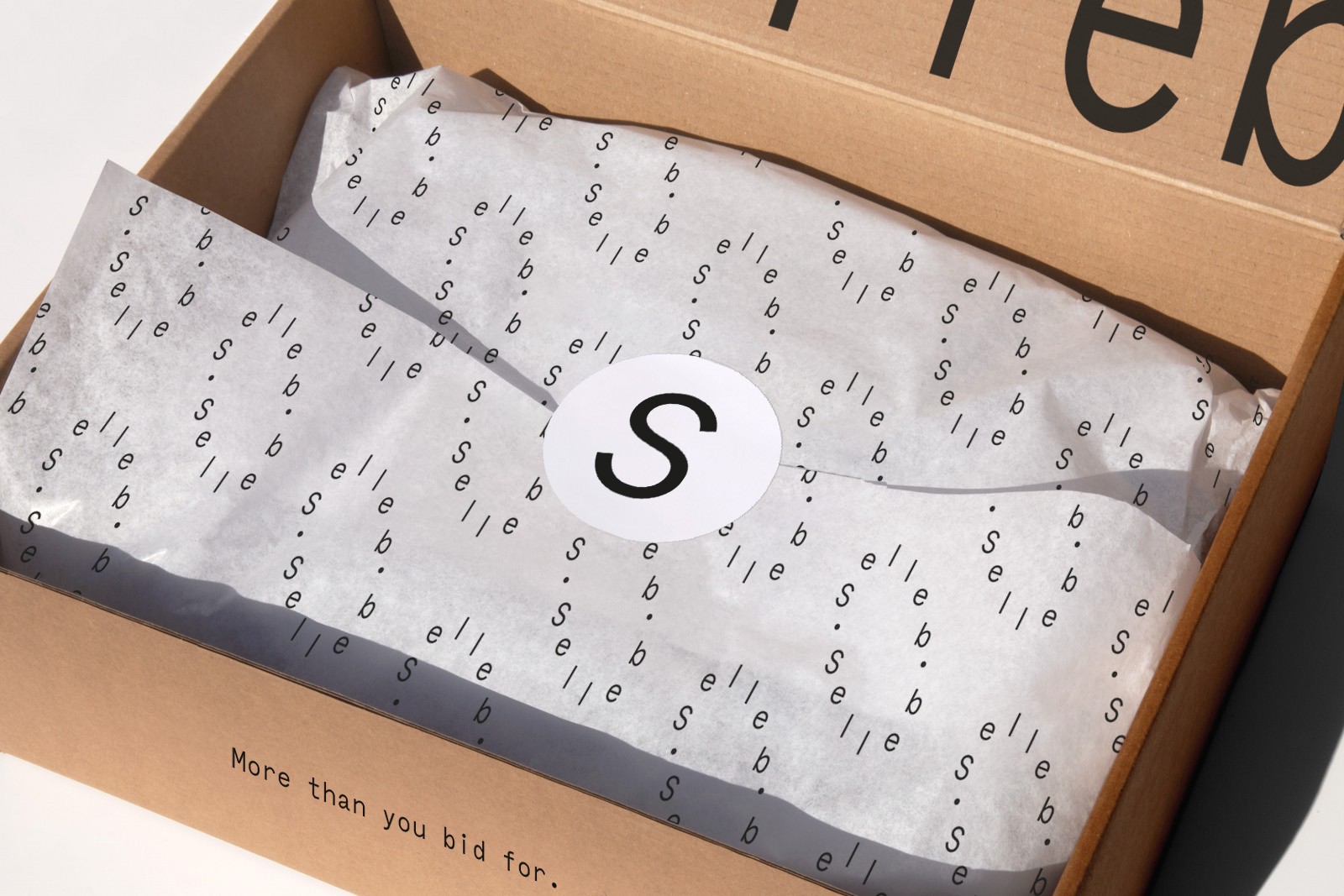
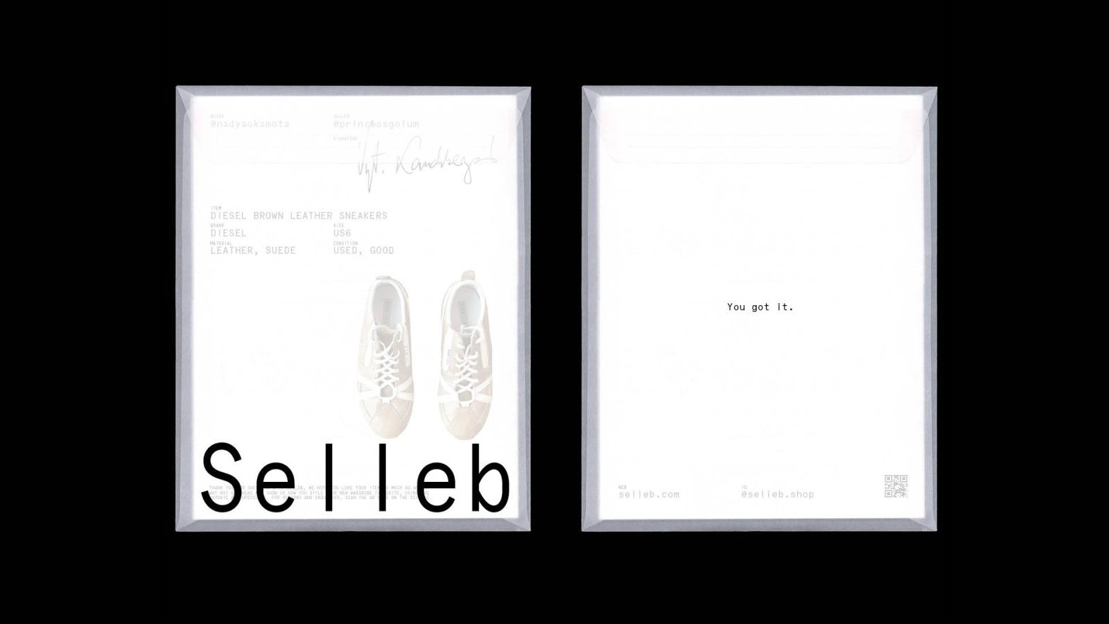
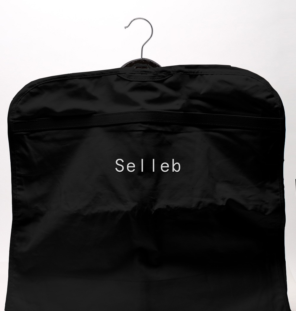
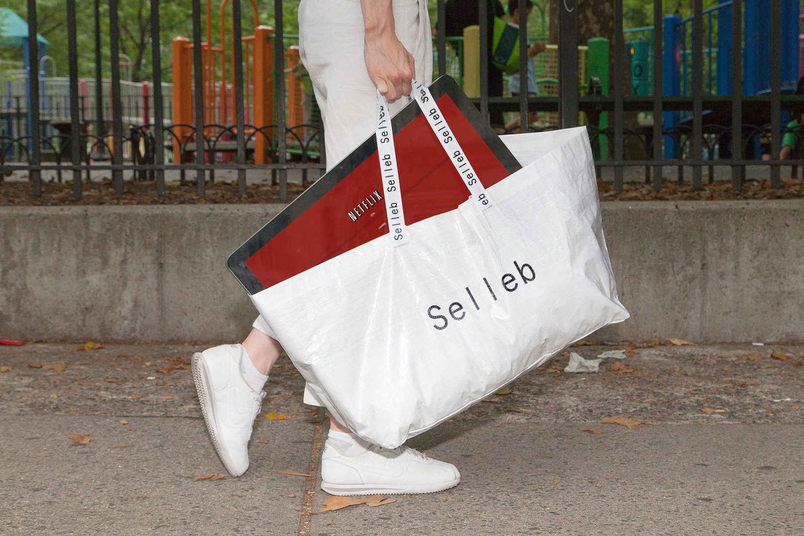
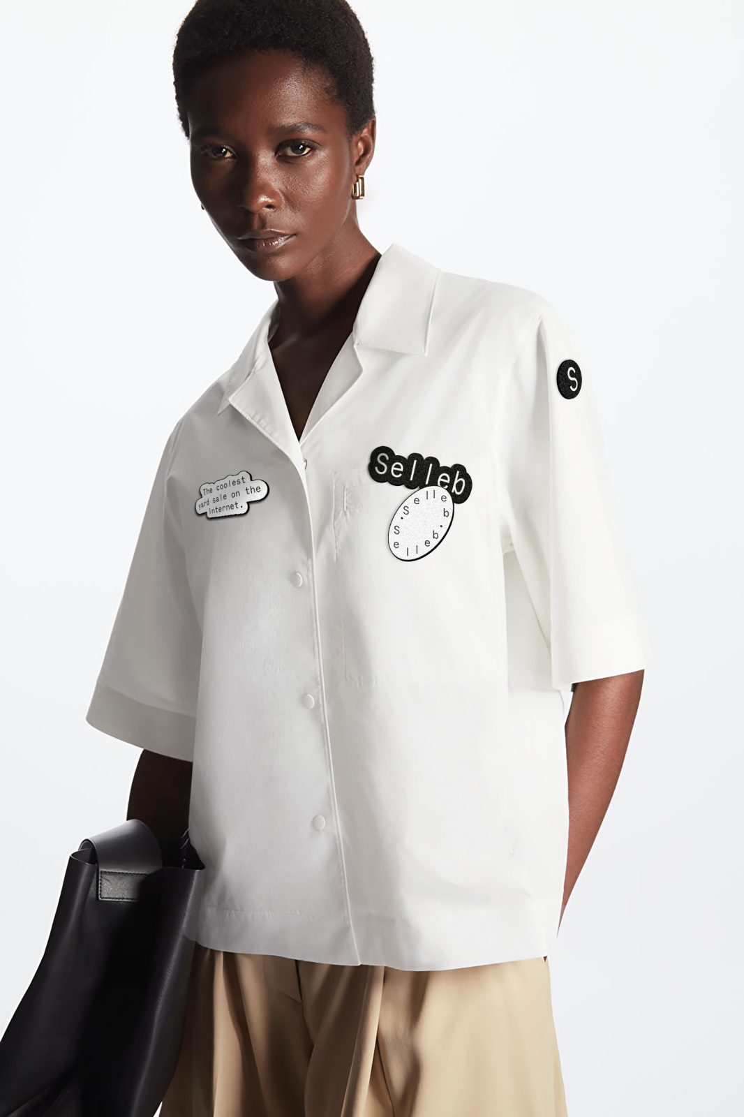
Design works hard to draw customers into the Selleb world – mimicking that real-life relationship by revealing more character further into the customer journey. Microcopy decorates the box-opening experience, from the inside of the lid to the tissue paper, the dustbag and the envelope containing a receipt scrawled with a handwritten signature. The uncluttered logo becomes a more abstract ‘Selleb Circle’ in applications such as t-shirts and stickers where the brand personality is already familiar. Click around on the website or social and it’s likely you’ll see its GIF echoing the circular motion of the resale economy.
From product drops to pop-up assets and merch, Selleb is an interactive resale experience, making customers – the ‘Next Sellebs’ – as much a part of the product’s story as the ‘Sellebrities’ the brands partner with. And where many competitor platforms default to functionality, Regular Practice has successfully injected a Gen-Z personality at every touchpoint of that world too.
CREDIT
- Agency/Creative: Sonder & Tell , Regular Practice
- Article Title: Selleb Brand Redesign
- Organisation/Entity: Agency
- Project Type: Identity
- Project Status: Published
- Agency/Creative Country: United Kingdom
- Agency/Creative City: London
- Project Deliverables: Brand Redesign
- Industry: Retail, Technology
- Keywords: WBDS Agency Design Awards 2022/23
-
Credits:
Brand Strategist: Alex Ames
Senior Writer: Rae Boocock
Account Director: Hilary Lovell
Graphic Designer: Sam Saruhan
Designer: Julia Luckman


