
Kashkovskaya Oksana OK DEsign studio – Liqueur Black Milk
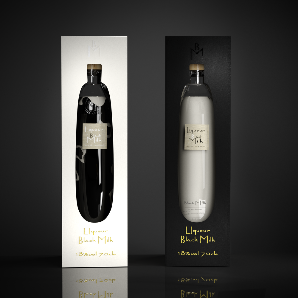
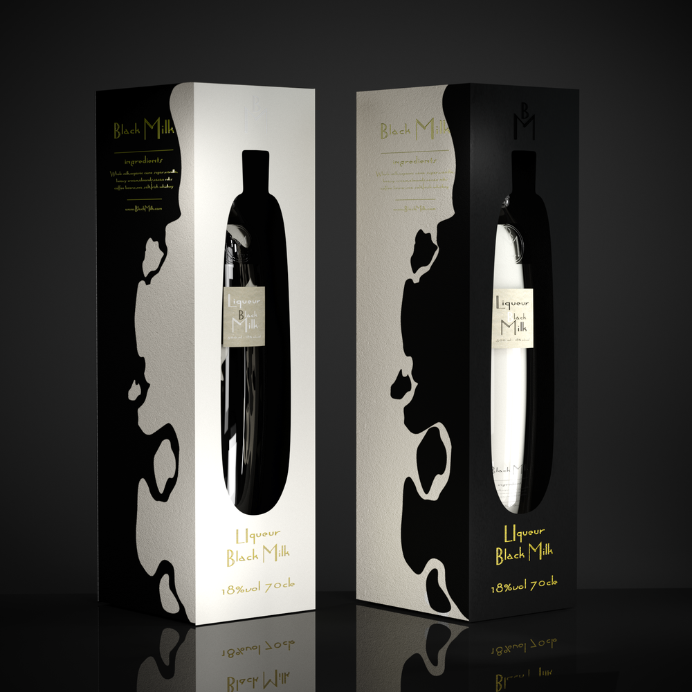
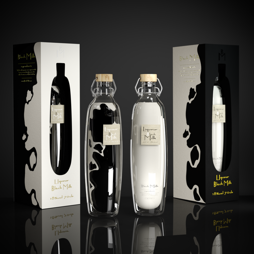
“The general interest and unique of this package is that this design has the two common but at the same time separately design sides.This is depends on what the exteriority of package to choose such type of colour will be visible. The packaging contains two unusual sides, if look at the black package side can see the white face of bottle if choose the white colour of packaging the black side of bottle will be the general tint.The graphic shapes of package have reflections of bottle design forms.
From first sight it looks as package and bottle of milk product.But not all so easy!This is original package is the milk liqueur. One package, two sides, two designs.Black or white, what will you choose?The first type of package was looked different.First step of sketch the bottle had more simple form and after researching was decided create more soft shapes that made the unusual and organic form for this bottle.The main graphic element is the cow spots.They are also exist on the package and bottle.
The inspiration for this design was the simple milk product. The general idea was to create something unusual design that looks very simple and at the same time has two interesting ideas to show the milk side – white colour and the liqueur – black colour at the same time.At the nature exist two clean colour as white and black.It gived the main idea to interact this two absolutely opposition colour and compound it at one product with common design idea.
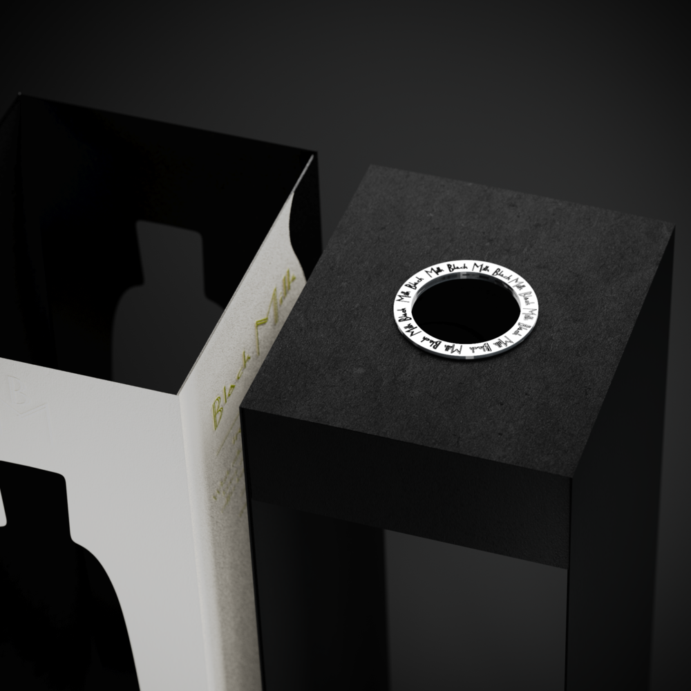
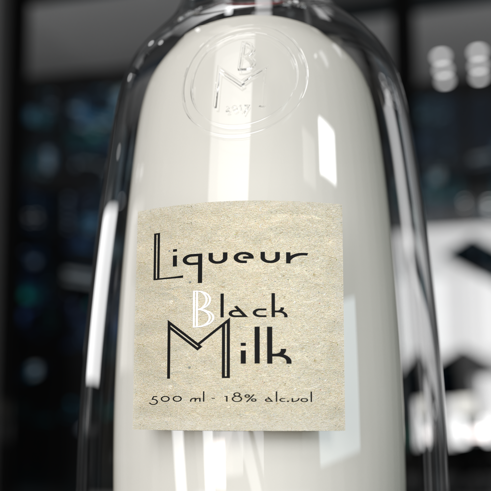
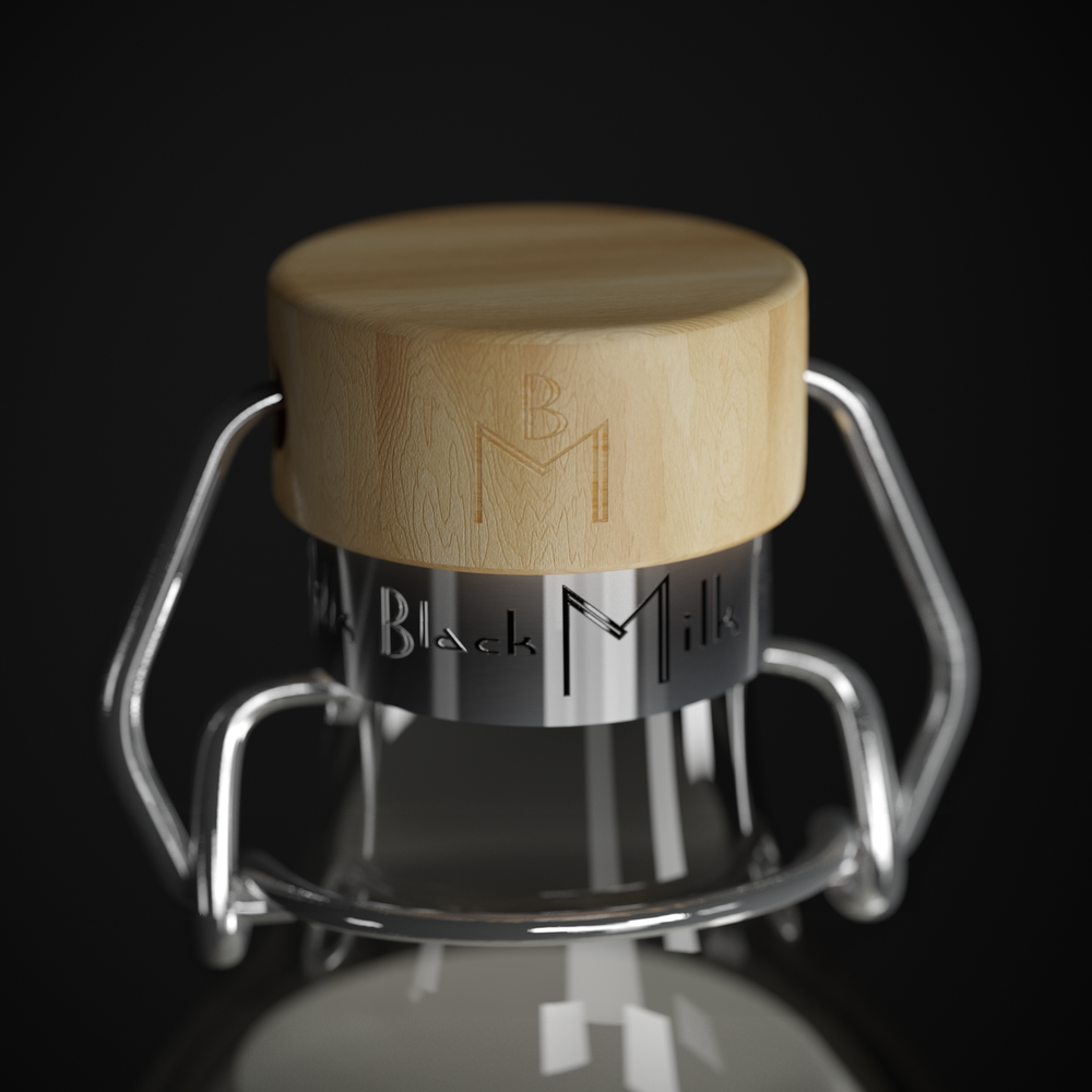
For this packaging design was used the natural paper of middle thickness without glossy coating only with mat surface that indicate on the natural technology creation of this package.For the lid was used the wood that is also indicate on natural materials and overal to add the locking cap with silver iron metal.The material for bottle is glance borosilicate double wall glass.The label use very simple natural paper only with name of product and indication of product destination.
The main challenge was to create interesting design of packaging used only original name of product and interaction with two simple colors as black and white.This was the main intrigue to show the product under different angles of design,to show something new.The lable on the bottle from sipmle natural paper that give imagination about simple milk product.This is package amalgamate interesting design decision as contrast color black and white,two designs and looks as milk but it’s liqueur.
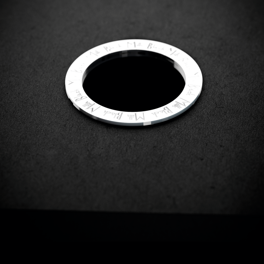
For this packing very convenient function is used to pull out a bottle from packing it is necessary to pull for the silver ring on the top part of the box and after just enjoy the liqueur.”
CREDIT
- Agency/Creative: Kashkovskaya Oksana OK DEsign studio
- Article Title: Self Published New Brand and Packaging Design for Russia Black Milk Liqueur
- Organisation/Entity: Freelance Promotional / Self Published
- Project Type: Packaging
- Agency/Creative Country: Russia
- Market Region: Europe
- Format: Bottle, Box
- Substrate: Glass, Metal, Pulp Carton, Pulp Moulded, Pulp Paper, Wood


