


Today, self-hypnosis app reveri has launched a new brand identity crafted by Mother Design to mark its entry into the UK health-tech category. Reveri was co-founded by world-leading psychiatrist Dr. David Spiegel, and Silicon Valley investor and technology leader Ariel Poler, starting in the US in 2020. Now, with an ever-growing community of ambassadors and advocates, reveri has its sights set on rapid UK and global growth.
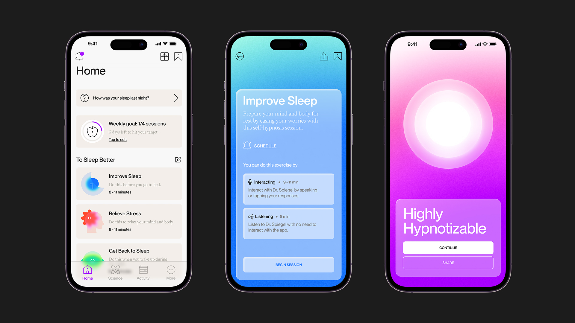
Reveri approached Mother Design to create a new brand identity that broke down the traditional conventions of the wellness industry and communicated the brand proposition – defining self-hypnosis as an impactful new category. The resulting visual identity highlights the positive outcomes and tangible benefits of the discipline with clarity and immediacy, while also supporting the functionality and user interface of the product at the heart of the brand.
A heightened state of focus
At the core of Mother Design’s strategic approach was the recognition that self-hypnosis represents a state of heightened focus, rather than a loss of control. The strategic positioning of reveri sets out to reshape the narrative surrounding self-hypnosis, encouraging a fresh perspective that recognises its inherent value and power as a tool for personal empowerment and growth. By challenging prevailing stereotypes, reveri aims to break free from the limitations imposed by societal stigmas and negative connotations and the notion of self-hypnosis as a last resort.
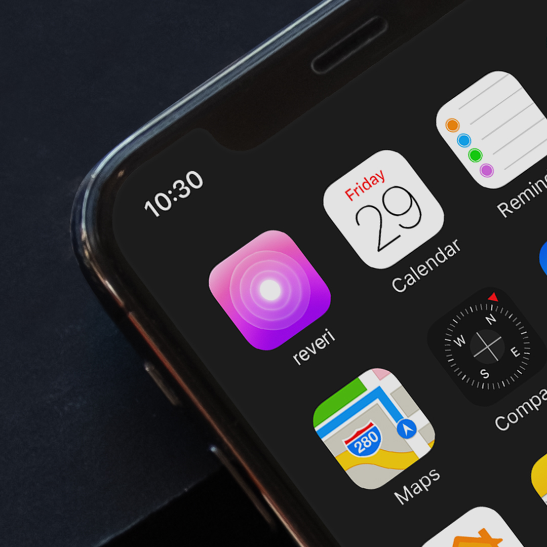
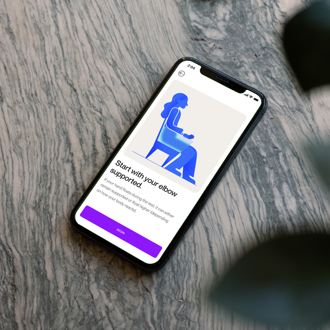
The visual design builds on this concept of clarity and focus, using it to define the entire brand world and permeating all aspects of the user experience; from the in-app interface to reveri’s own channels such as website and social. It is articulated through blur treatments across the logotype, gradients in the colour system and the use of extreme depth of field in art direction.
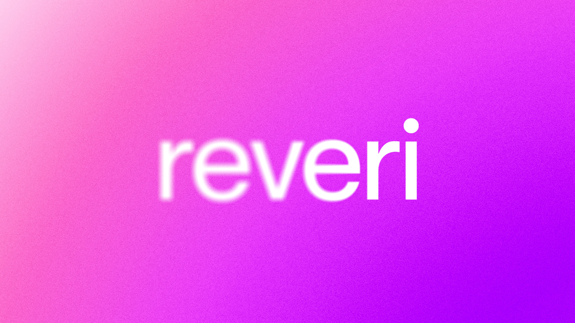
The reveri logotype is also designed to evoke a sense of ‘work in progress’ embodying the spirit of personal growth and transformation. It serves as a constant reminder that every individual within the reveri community is a work in progress, continuously evolving and transforming their lives in profound and meaningful ways. It is set in lowercase to put emphasis on the tittle of the ‘i’, with its blur treatment providing a clear point of focus. The logo is accompanied by a supporting symbol, the ‘reveri beacon’, expressing a sense of ‘light at the end of the tunnel’.
A growing community
Harry Edmonds, Creative Director at Mother Design, says: “With this project, we had to cut through the conventions of the wellbeing sector and establish a visual language that was not only distinctive in the category, but felt new across the broader design landscape. It also needed to avoid the tropes of self-help tools by diverging from the familiar pastel hues that saturate the wellness industry, so we explored a bold and unconventional colour palette.
“As well as the philosophical aspects of the brand, which were largely communicated through a visual language that leans into emotive cues, we needed to design for a product – the reveri app. It had to be both functional and practical without the design language getting in the way of simplicity.
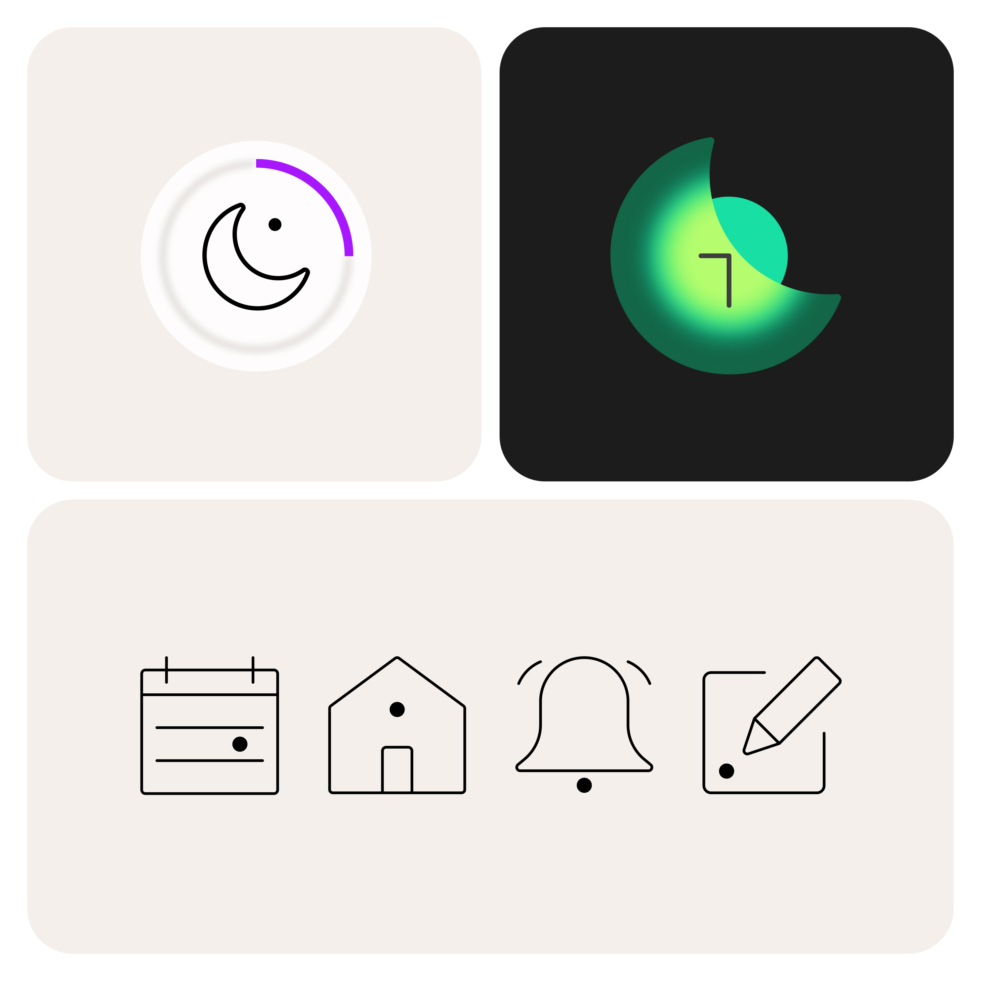
“We carried the concept of ‘focus’ across everything – from the photography, that’s shot with a long lens and shallow depth of field for clear points of focus between the subjects and their surroundings, to the iconography and illustration and of course the logotype; which resolves to clarity from a blur treatment and is set in lowercase to put emphasis on the ‘tittle’ (the dot above the i).
“We hope that this new visual identity and brand system helps reach many more people and offers them the same relief and control that the growing community is already benefiting from.”
Louise Troen, Chief Marketing Officer at reveri, adds: “At reveri, we’re determined to challenge the misconceptions of hypnosis, because we know and have seen through our community how immediate the benefits can be. Building a brand ecosystem which allowed us to communicate the power of this incredible practice was vital, in parallel with making the in-app experience as easy to navigate as possible. I have spent my career building brands that challenge the status quo, and reveri is no different. The work that Mother Design has done will enable us to bring our vision to life, and we couldn’t be more proud to showcase it to our community – both new and existing”.
CREDIT
- Agency/Creative: Mother Design
- Article Title: Self-hypnosis App Reveri Launches Major Rebrand by Mother Design to Mark Its Global Growth Ambitions
- Organisation/Entity: Agency
- Project Type: Identity
- Project Status: Published
- Agency/Creative Country: United Kingdom
- Agency/Creative City: London
- Market Region: Global
- Project Deliverables: App Design
- Industry: Health Care
- Keywords: Wellness, App design
-
Credits:
Creative Director, Mother Design: Harry Edmonds


