


Building Brand Works with Layered with Mythology – Selene Aegean Bistro
Selene is a new Aegean bistro where branding and design work hand in hand to create an immersive dining experience. Glasfurd & Walker named the restaurant and developed its brand world, drawing on the Greek goddess of the moon as a reference point. The result is not a literal retelling of mythology but a layered, atmospheric identity that ties the moon, the sea, and the tides together in subtle, contemporary ways.
“Selene shows how mythology can inform branding without being literal — each detail builds another layer of narrative, inviting guests into a story that unfolds through discovery.” – Phoebe Glasfurd
Naming and Narrative
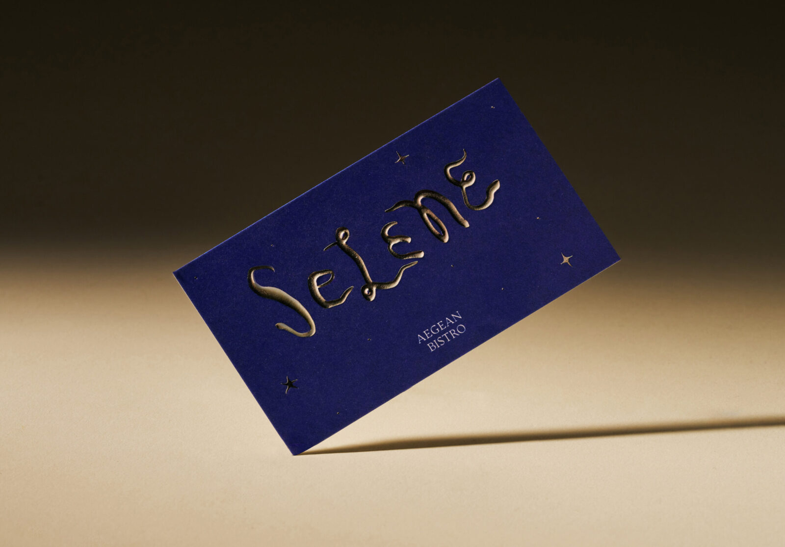
Glasfurd & Walker created the name Selene and built the brand narrative around it. The goddess of the moon is never shown directly but is suggested through mood, materials, and detail. Mythology here works instinctively: more atmospheric than illustrative, more felt than explained.
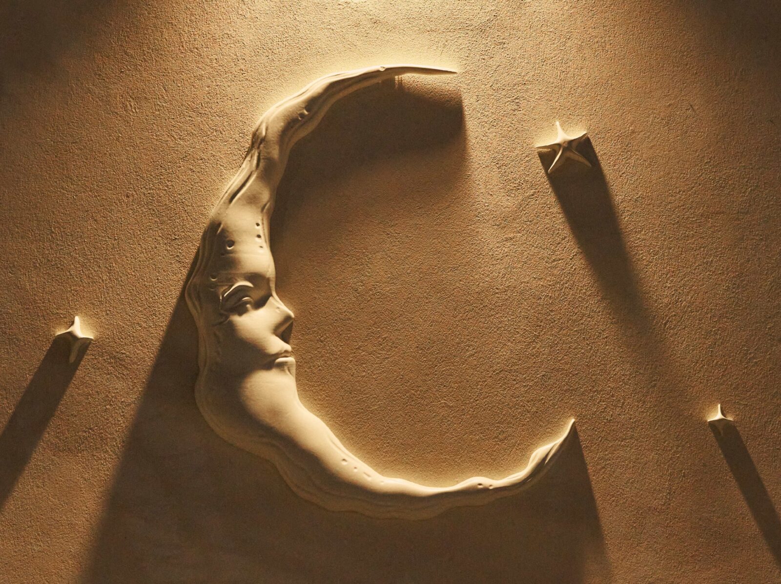
The Entry
A large moon sculpture marks the building, a surreal yet understated emblem. Its scale and permanence suggest something both ancient and modern, setting the tone for what’s inside: a restaurant that operates with its own rhythm, anchored by myth but expressed through design. To the left of the door, an illuminated pearl serves as another beacon, nodding to the world of the sea and its sense of quiet magic.
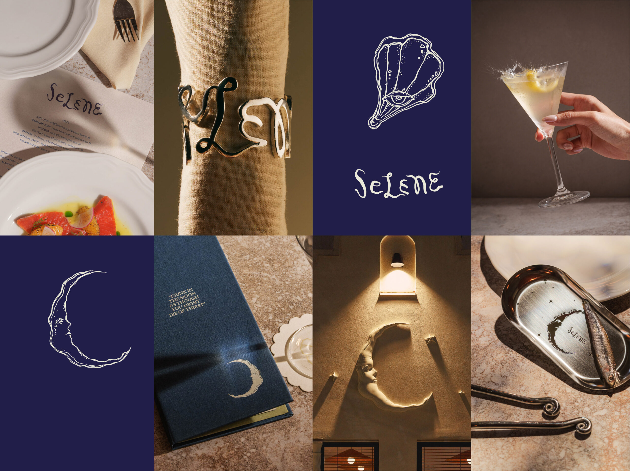
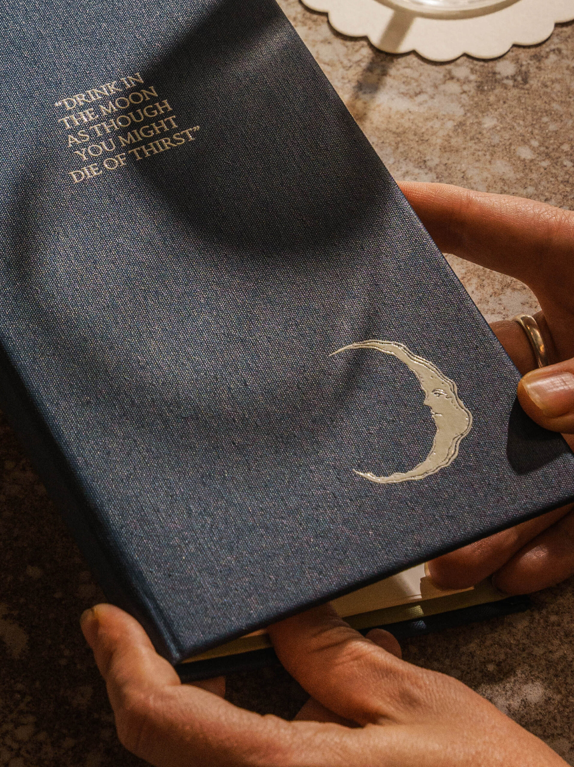
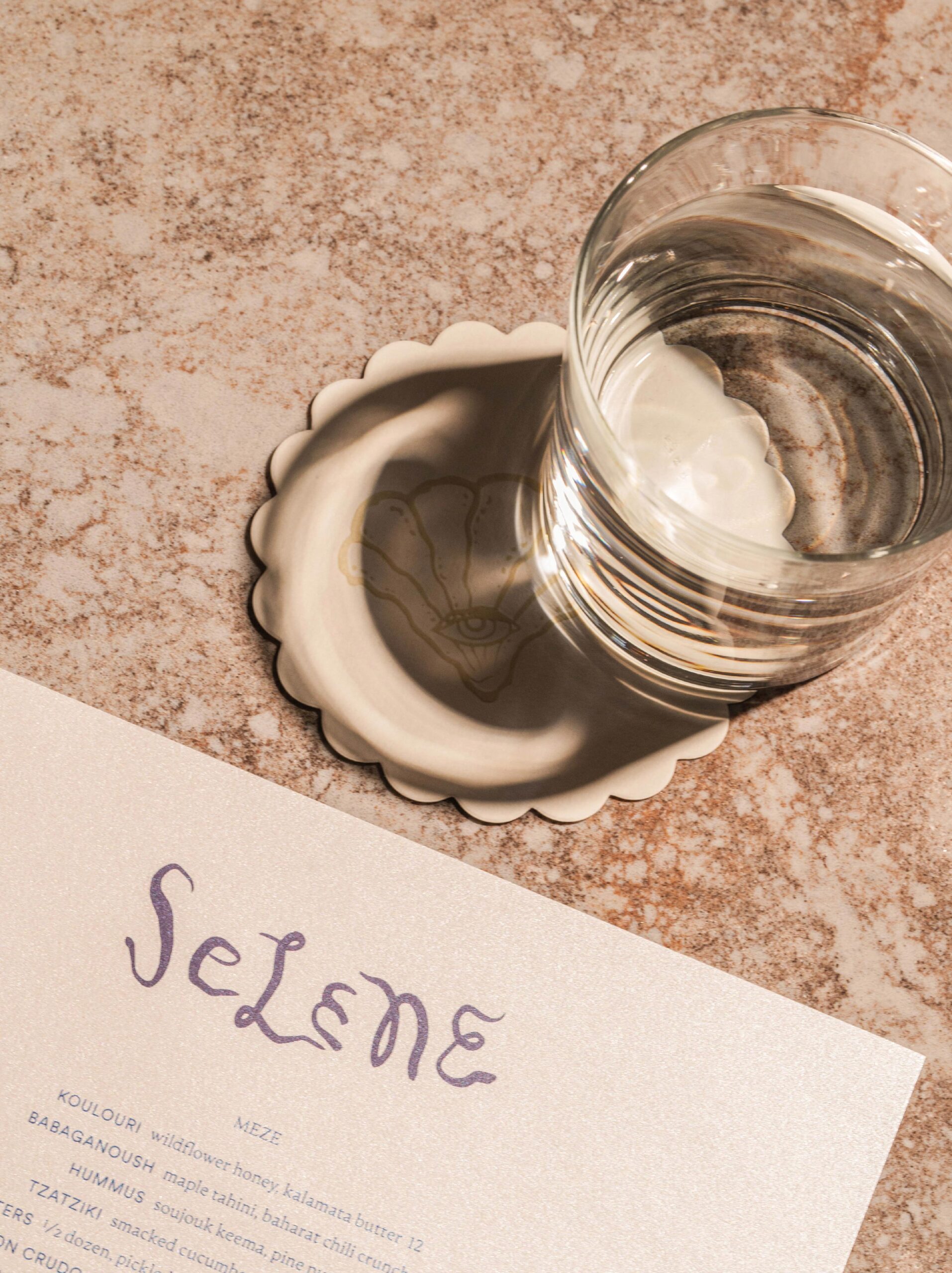
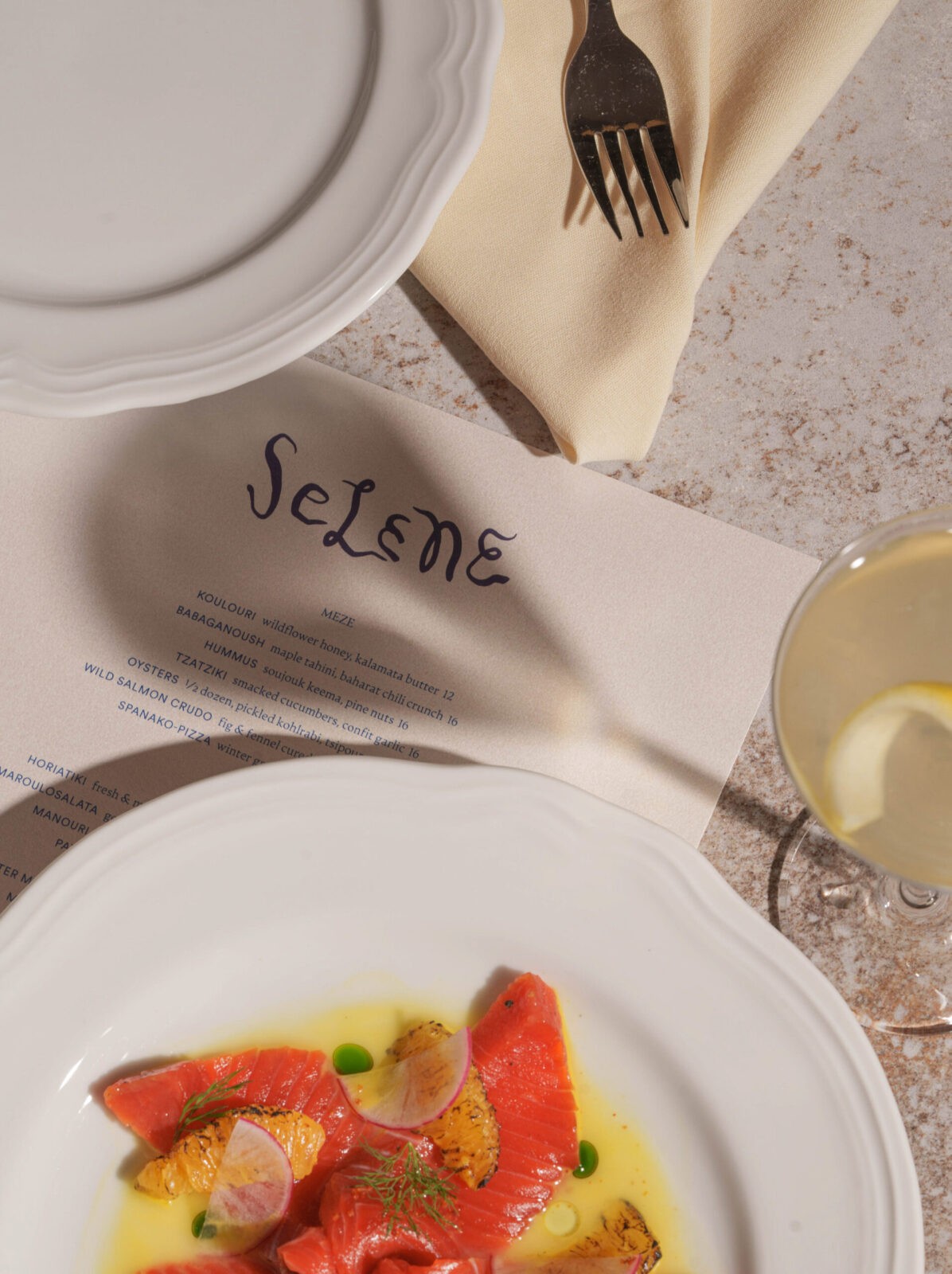
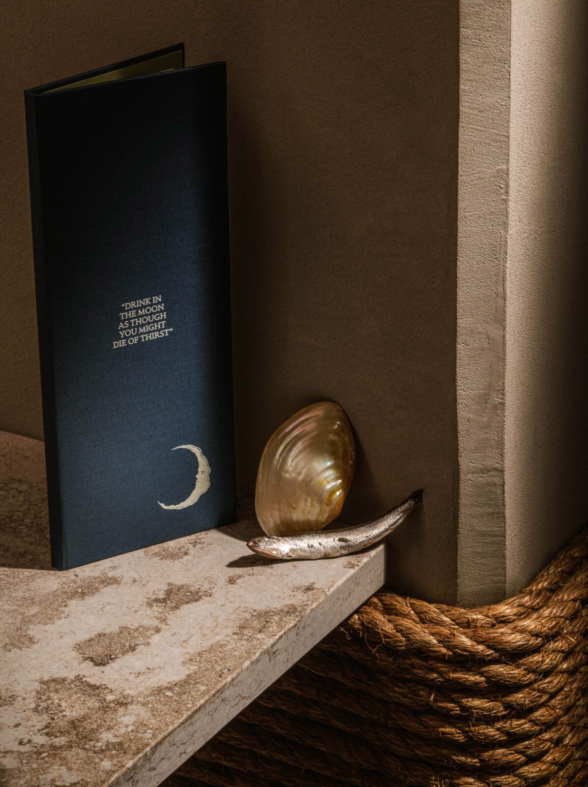
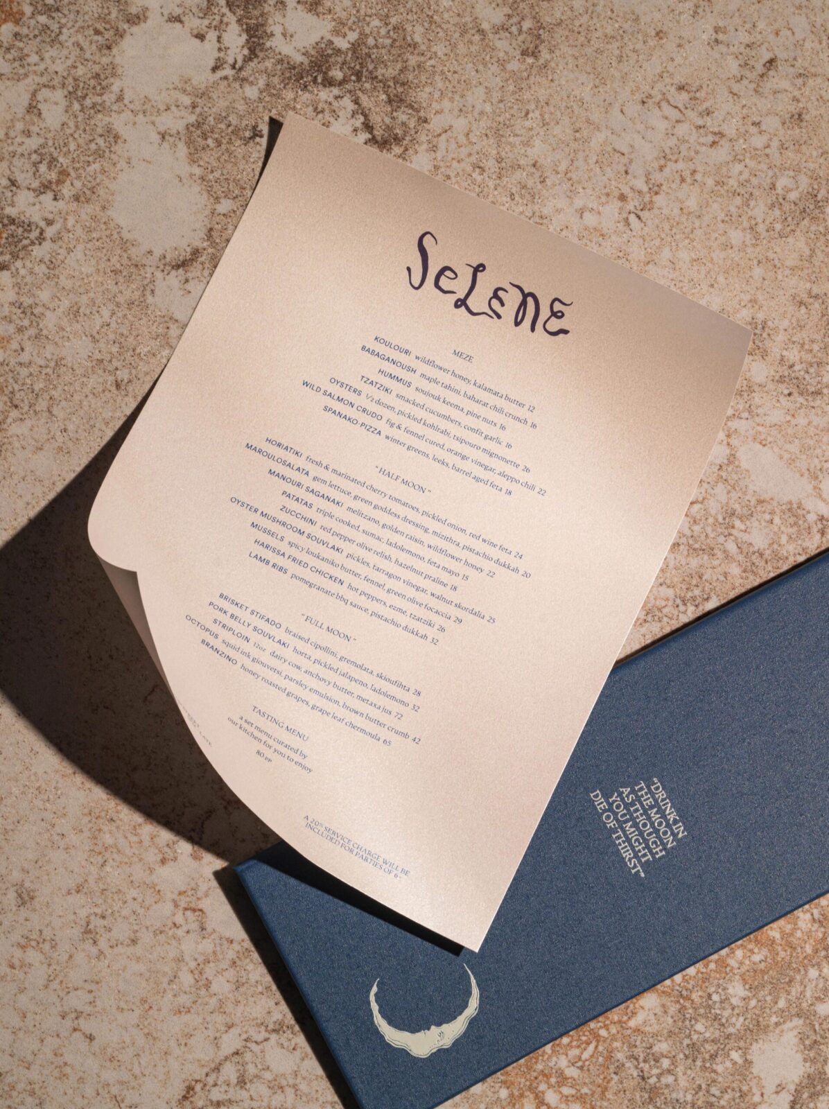
Menus and Print
Menus are printed in midnight blue, with pearlescent paper revealed inside, shimmering like shells under light. They open with the line Drink the moon as though you might die of thirst — an invitation that sets the mood before a dish arrives. The combination of deep colour and subtle shimmer reinforces the brand’s themes of sea, tide, and lunar pull.
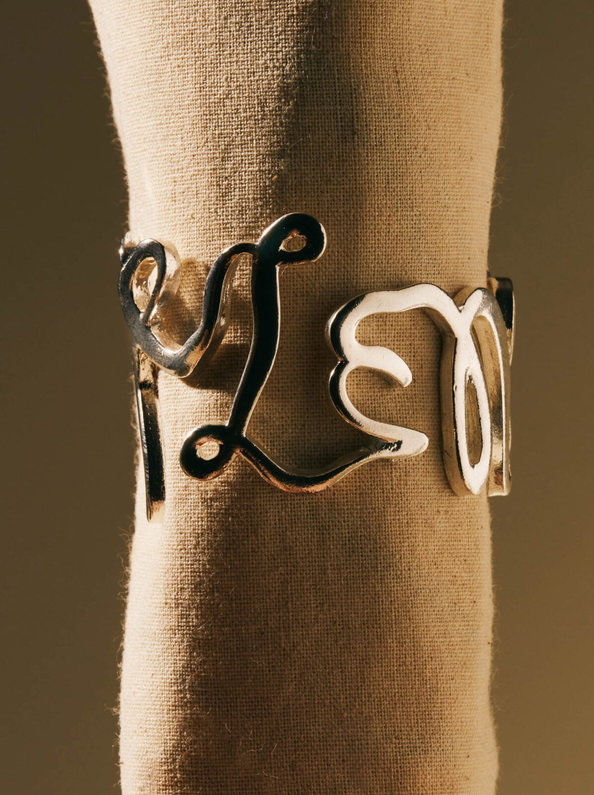
Logo and Brand Details
The restaurant’s handwritten logotype, inspired by the brushwork of Greek artist Alekos Fassianos, is central to the brand identity. Its wave-like lines extend into physical touchpoints: silver napkin rings carry the mark, catching light like jewellery and turning a logo into a tactile, almost personal object. Small details like these are constantly photographed, collected, and even pocketed by guests — part of the charm of Selene’s experience.
““At Selene, even the napkin rings carry the story. Cast in silver from the handwritten logo, they’re constantly photographed and shared — small details that extend the brand far beyond the table.”
Local artist Enterra contributed a series of illustrations — pearls, shells, eyes, and moons — that repeat across surfaces and touchpoints, ensuring the mythological thread runs consistently throughout.
Coasters and Printed Details
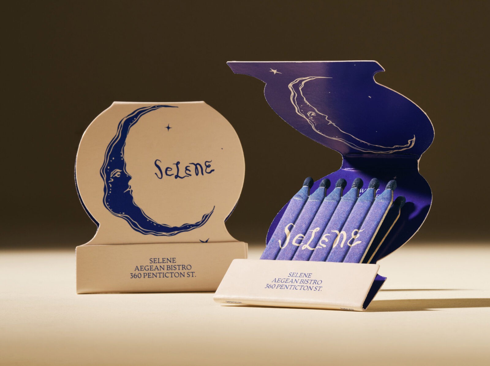
Coasters, edged in soft scallops, carry illustrations of eyes, pearls, and shells. Referencing the evil eye and the sea’s watchful presence, they add another layer of symbolic meaning. These motifs appear across the restaurant, subtle but deliberate, reinforcing the brand language. Matchbooks, cut in the shape of the moon, reveal the night sky. When lit, each flame sparks like a star — a small but intentional cue that adds to the layered narrative.
Frescoes
Glasfurd & Walker worked closely with still-life painter Emiko and interior designers &Daughters on the placement of frescoes throughout the restaurant. Each was positioned to extend the story, functioning as narrative layers within the space rather than simple decoration.
Material Detail
The colour palette is drawn from moonlight and the deep sea — not the bright blues of the Aegean, but richer, more luxurious tones. Deep navy anchors the identity, paired with pearlescent textures that shimmer like shells under shifting light. Silver accents catch and reflect the glow, adding a sense of depth and refinement. Embossed details and layered textures give menus, coasters, and printed materials a tactile quality, ensuring the brand feels as considered to the touch as it looks to the eye. The result is a visual and material language that feels atmospheric, elegant, and unmistakably Selene.
Even the bar top participates in the narrative. Water-cut with the rippling logotype, it carries the language of tides and movement into the architecture itself. This approach shows how branding extends beyond graphics into material form.
A Cohesive Brand World
Glasfurd & Walker’s approach ensures that Selene never relies on explanation. It is a brand world where mythology is ambient, layered, and deeply integrated, making the experience instinctive, transportive, and whole.


CREDIT
- Agency/Creative: Glasfurd and Walker
- Article Title: Selene Aegean Bistro Unveils an Immersive Dining Identity by Glasfurd and Walker
- Organisation/Entity: Agency
- Project Status: Published
- Agency/Creative Country: Canada
- Agency/Creative City: Vancouver
- Market Region: BC
- Project Deliverables: Brand Creation, Brand Design, Illustration
- Industry: Hospitality
- Keywords: WBDS Agency Design Awards 2025/26 , Branding, Restaurant


