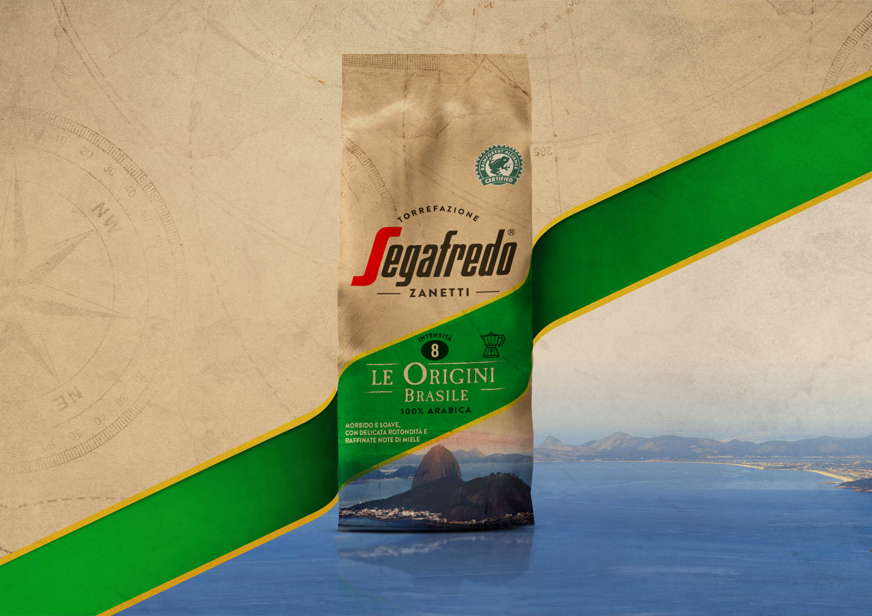
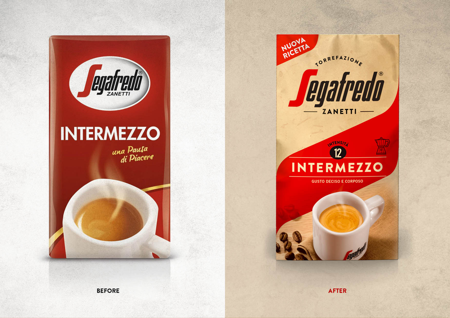
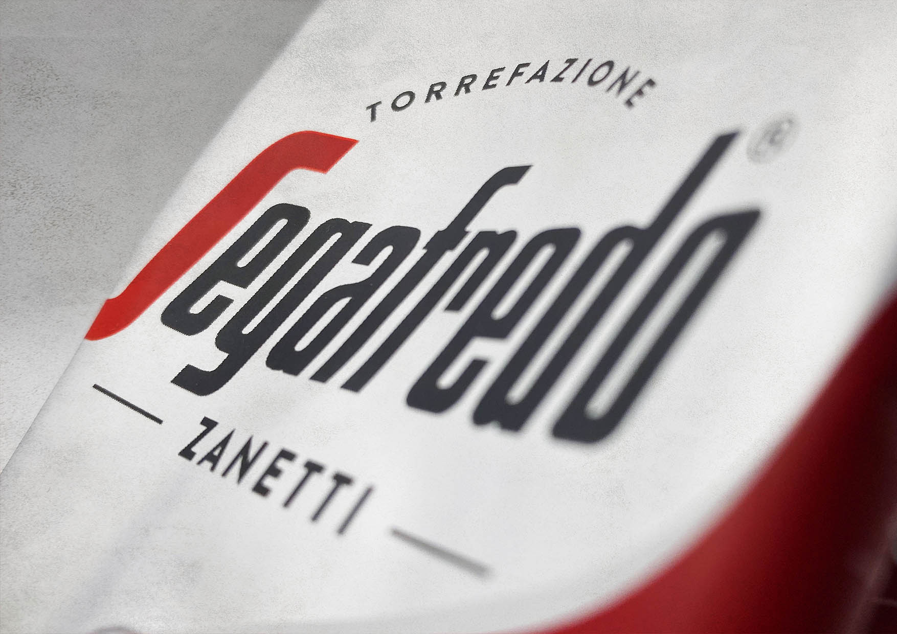
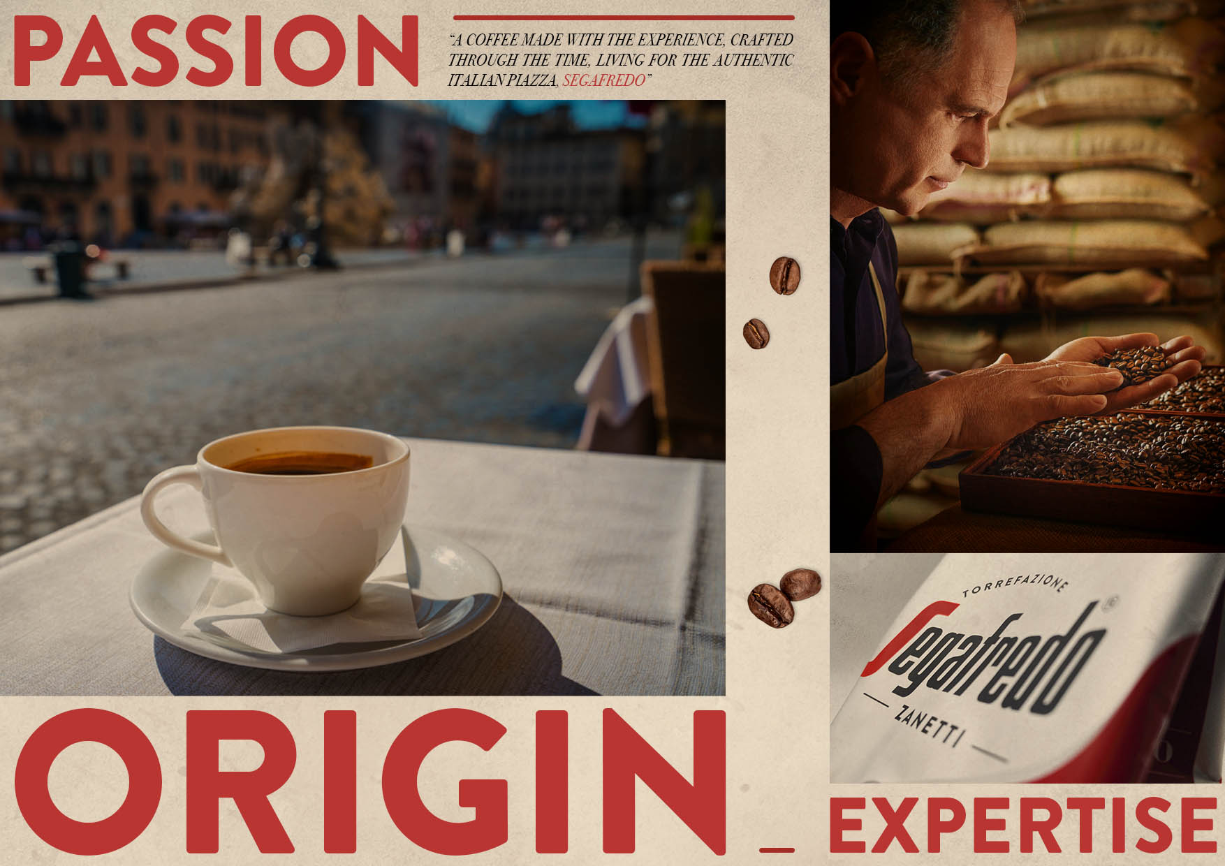
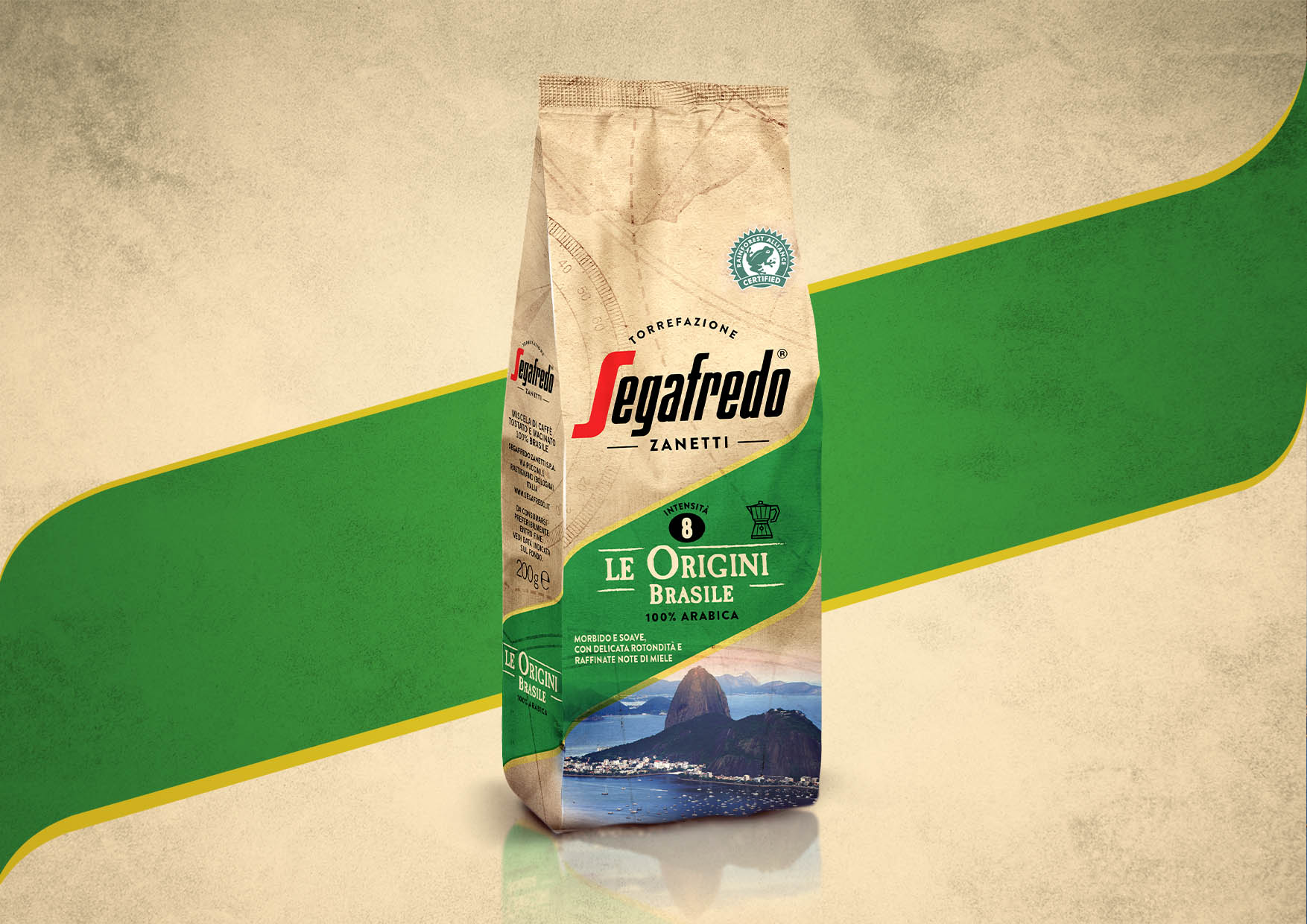
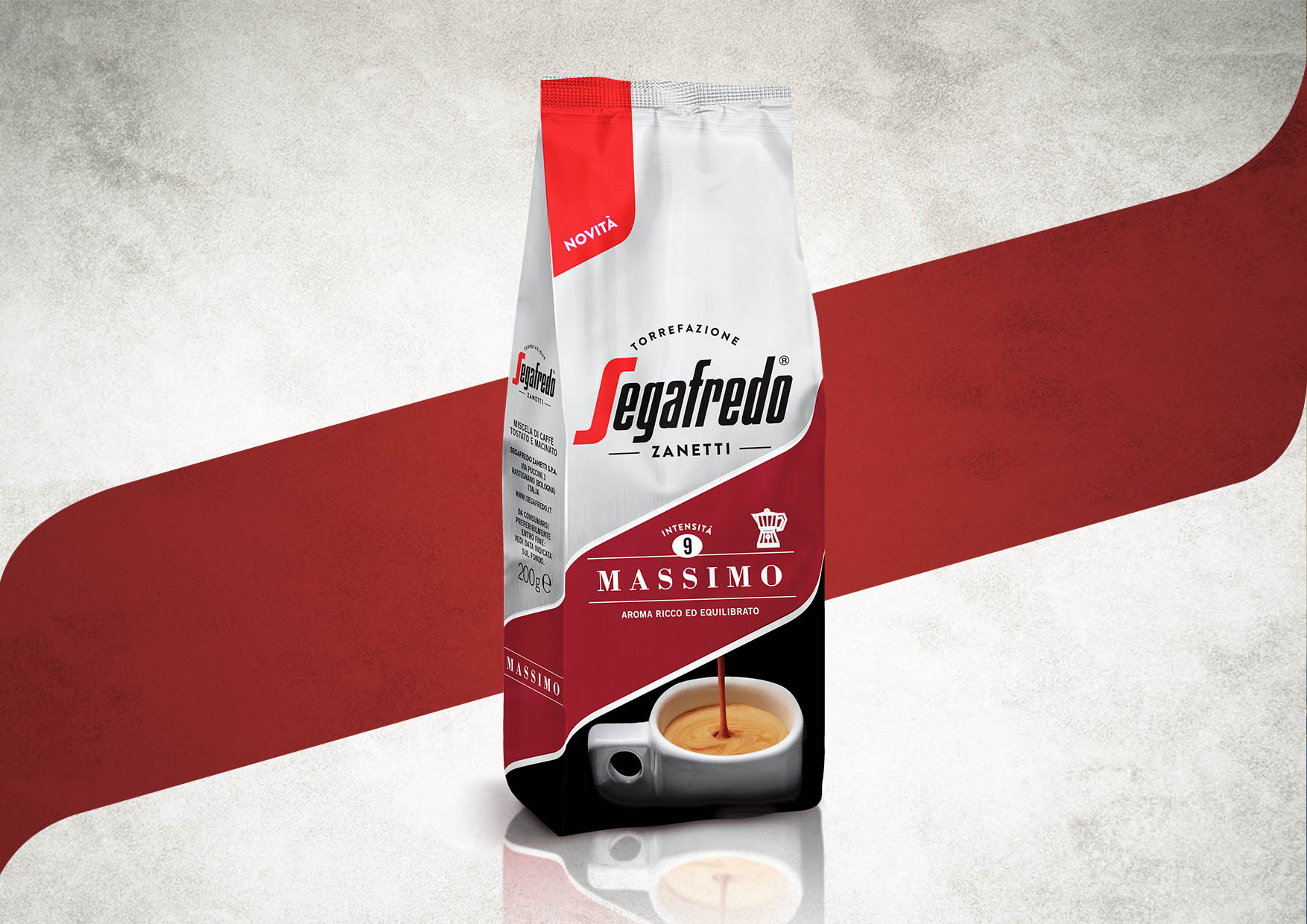
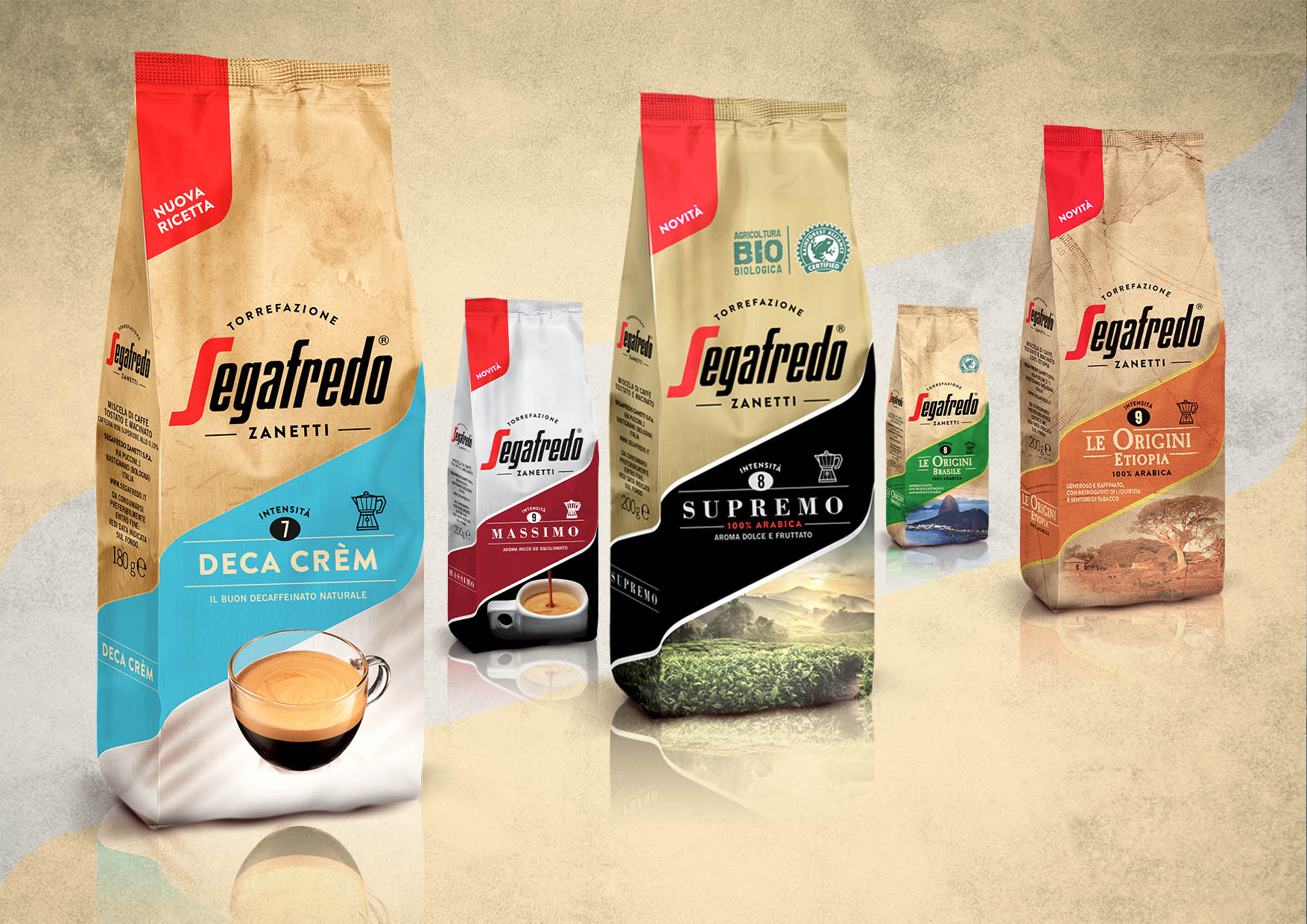
Segafredo is an historical brand that boasts great recognition both in Italy and abroad. However, the company had not communicated for a very long time and the brand had partly lost its identity. We aimed at creating a new, strong identity that would enable consumers to relate to the brand again. We leveraged the company’s superior experience in selecting and roasting coffee. To do so we stressed the word “Torrefazione” (roasting) on the logo and gave more legitimacy to the “Zanetti” signature, emphasizing the tradition and expertise of the company. The “S” on the logo itself also inspired the new system, which is built on a slightly wavy band. The general feel of the pack recalls the bags once used in roasting shops.
CREDIT
- Agency/Creative: Break Design
- Article Title: Segafredo New Identity
- Organisation/Entity: Agency, Published Commercial Design
- Project Type: Packaging
- Agency/Creative Country: Italy
- Market Region: Global
- Project Deliverables: Brand Architecture, Brand Identity, Brand Redesign, Brand Rejuvenation, Brand Strategy, Branding, Graphic Design, Identity System, Packaging Design, Photography, Rebranding, Tone of Voice
- Format: Bag
- Substrate: Plastic
FEEDBACK
Relevance: Solution/idea in relation to brand, product or service
Implementation: Attention, detailing and finishing of final solution
Presentation: Text, visualisation and quality of the presentation


