


Every branding agency will tell you the same thing: “Keep it simple. Make it scalable. Think global.”
So why did I design a Palestinian bakery logo around an old man’s face? Because the most powerful brand icons aren’t swooshes or geometric abstractions. They’re PEOPLE.
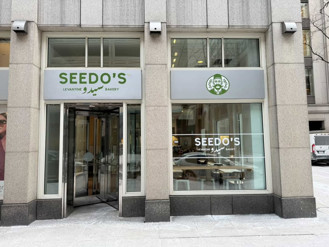
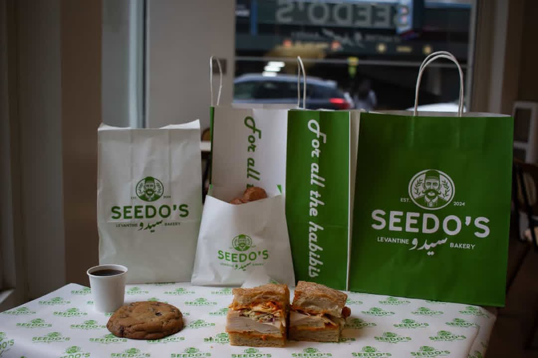
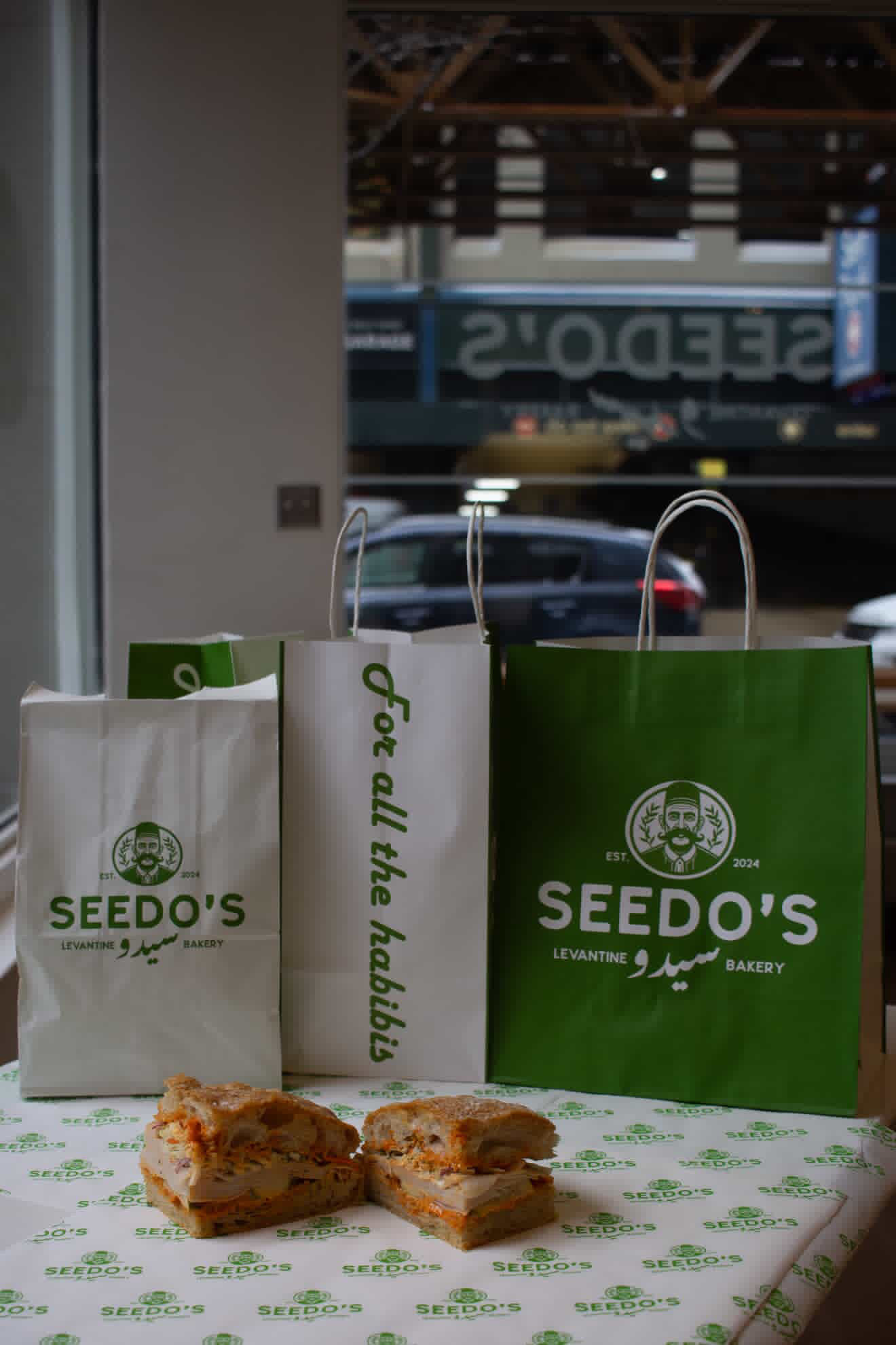
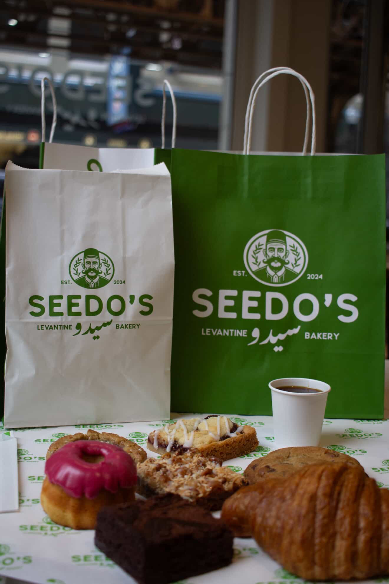
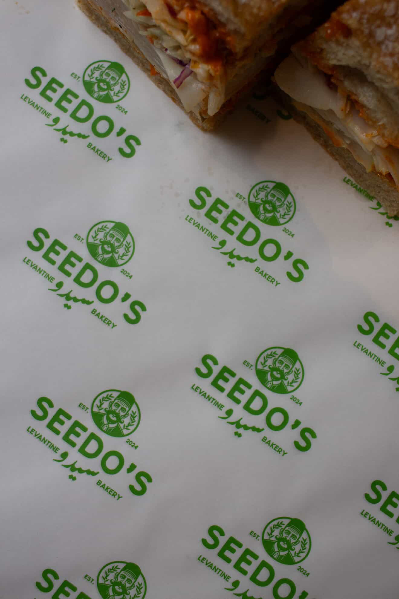
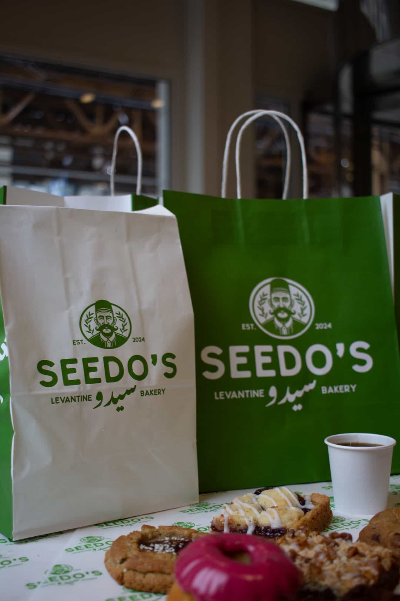
Meet Seedo. In Arabic, “Seedo” means grandfather. And this grandfather isn’t a mascot. He’s a memory. A man of the land. The oven. Old wisdom passed down through generations of bread-making in Palestine.
When I designed this brand, I wasn’t thinking about “scalability.” I was thinking about my own grandmother’s kitchen. The smell of za’atar. Olive oil on warm bread. Hands covered in flour. I was thinking about what gets LOST when we strip culture out of branding in the name of “clean design.”
When you see a human face, your brain responds differently than to an abstract mark. You feel RELATIONSHIP. You feel STORY. You feel like someone REAL made this for you.
For Seedo’s Levantine Bakery, that face is a Palestinian grandfather. Warm. Weathered. Wise. A face that says: “This bread was made the way my family made it. The way we’ve always made it. The way we’ll keep making it.”
In a world of faceless corporations and venture-backed food startups with sterile sans-serif logos… A grandfather’s face is RADICAL. It says: We’re not trying to be everything to everyone. It says: We’re preserving something. It says: We’re honoring someone.
Design isn’t just aesthetics. It’s PRESERVATION.
For Palestinian culture, for any culture being erased, marginalized, or forgotten, A logo can be an act of memory. A brand can be an act of resistance.
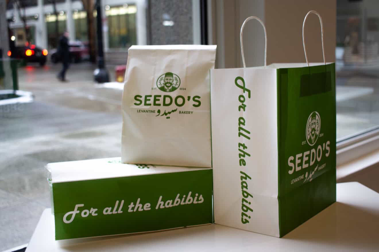
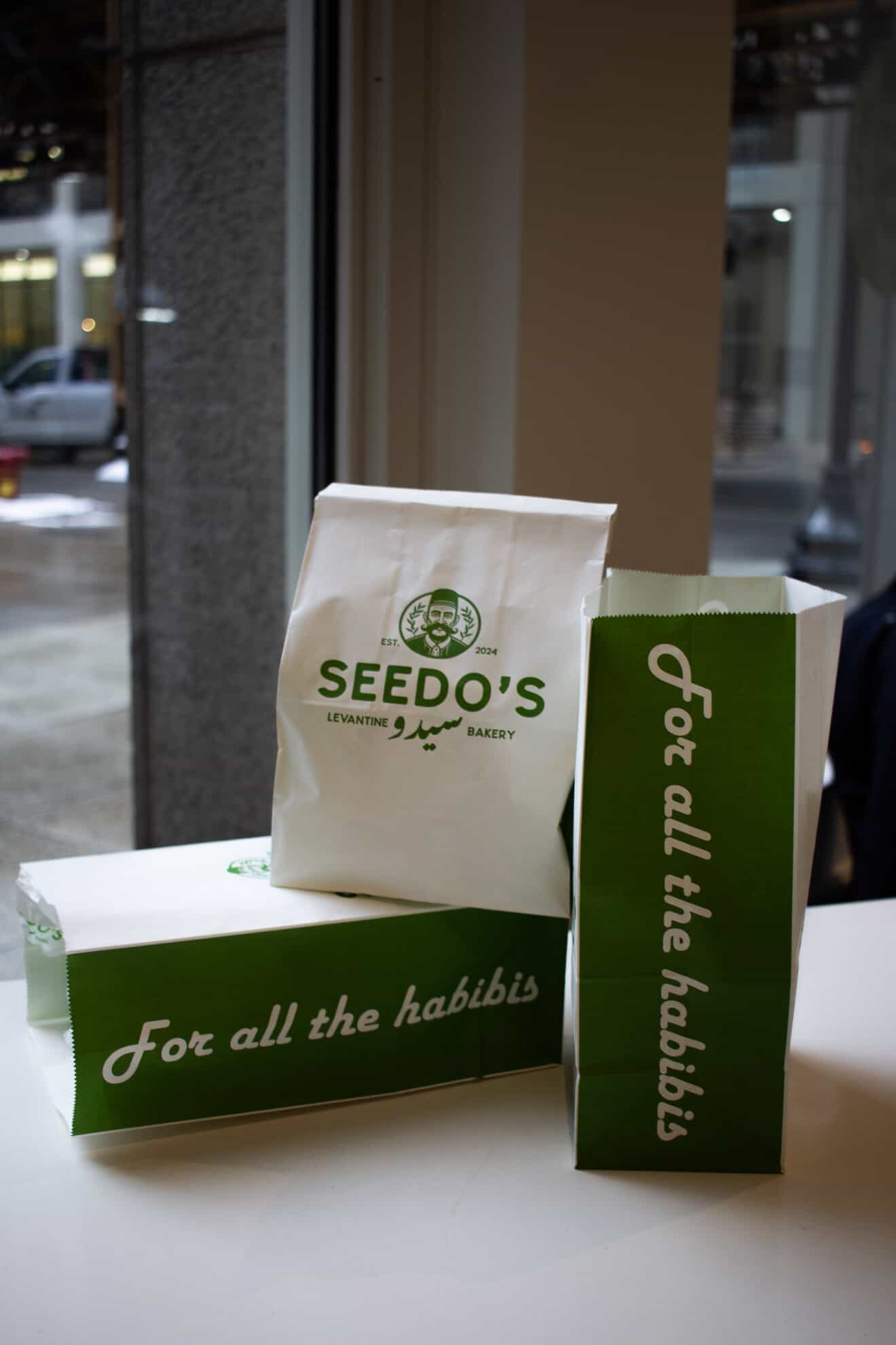
Seedo’s isn’t just a bakery brand. It’s a love letter to heritage. It’s proof that the most strategic branding choice is sometimes the most human one. And it smells like za’atar and olive oil.
CREDIT
- Agency/Creative: Mokalache
- Article Title: Seedo’s Levantine Bakery Branding by Mokalache
- Organisation/Entity: Freelance
- Project Type: Packaging
- Project Status: Published
- Agency/Creative Country: Spain
- Agency/Creative City: Barcelona
- Market Region: North America
- Project Deliverables: Art Direction, Brand Design, Brand Identity, Packaging Design
- Format: Bag, Box, Cup, Sleeve
- Industry: Food/Beverage
- Keywords: bakery , levantine , palestinian , mascot , heritage , identity
-
Credits:
Branding Designer: Mo Kalache


