


Sustainable. Pure. Quality.
Inspired by pure, Nordic nature, Seabed Nordic develop products that are beneficial — to the body and the planet — and deliver high-quality culinary experiences through innovative and refined seafood products. Their vision is to preserve the Nordic marine ecosystem through sustainable management of marine resources, such as sea urchins.
One of the biggest obstacles to the development of a sustainable sea urchin industry is a reliable and economically viable harvesting method. More efficient harvesting and storage of sea urchins will have significant implications for the ecosystem, both for the regrowth of kelp forests and increased biodiversity. Seabed Nordic are exploring new tools and methods for breeding sea urchins in their natural habitat, where they have access to specially developed feed and can grow faster without compromising the kelp forest.
Challenge: to reinvent the existing Seabed Innovation brand, to position it for international expansion — and to develop a sub-brand that sits within the luxury seafood segment.
Solution: A revised name and new brand identity for the main brand, that draws on the positive associations of Nordic nature and lifestyle — and the development of a separate product brand that fits nicely into a brand architecture that can easily be expanded according to future needs.
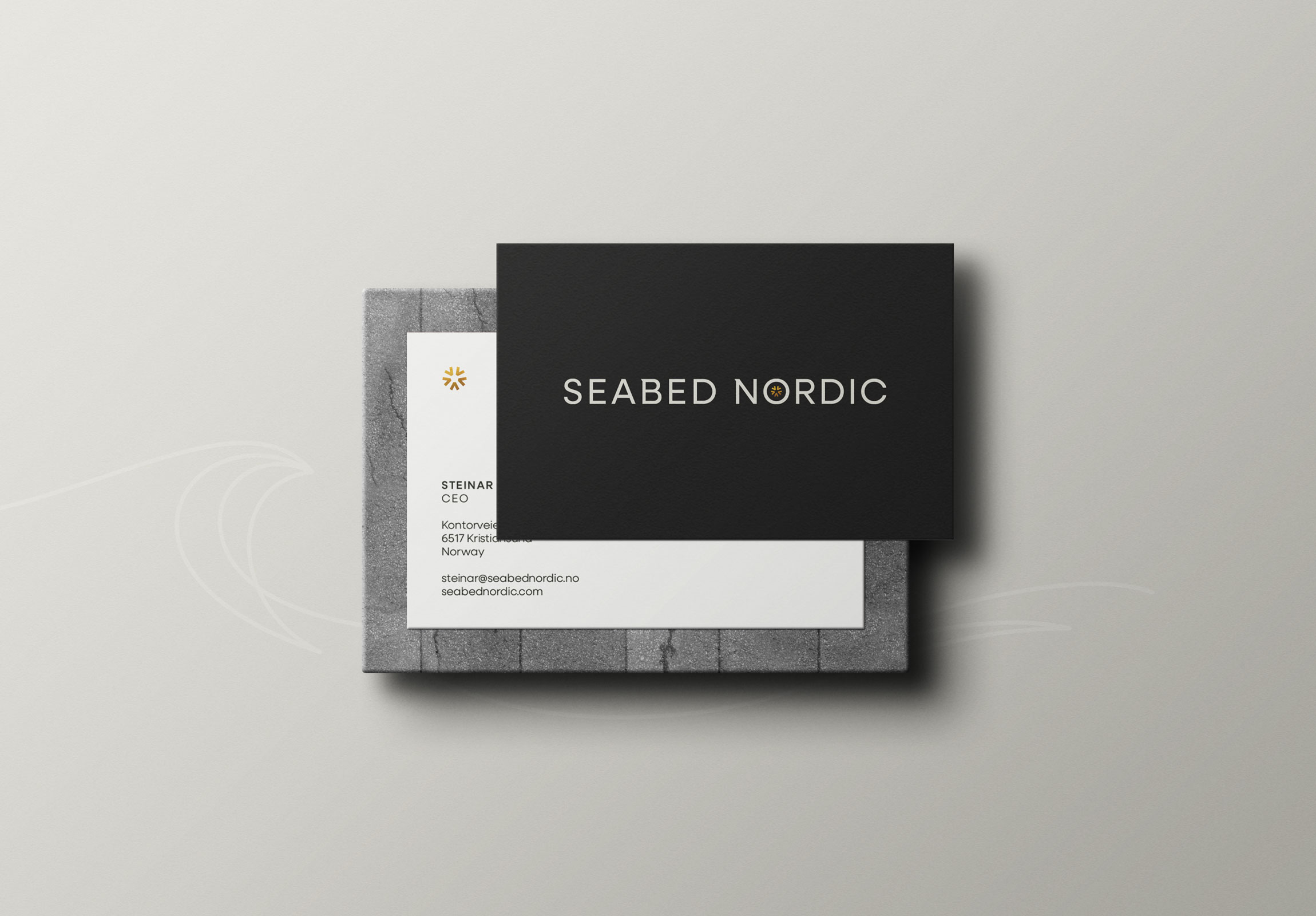
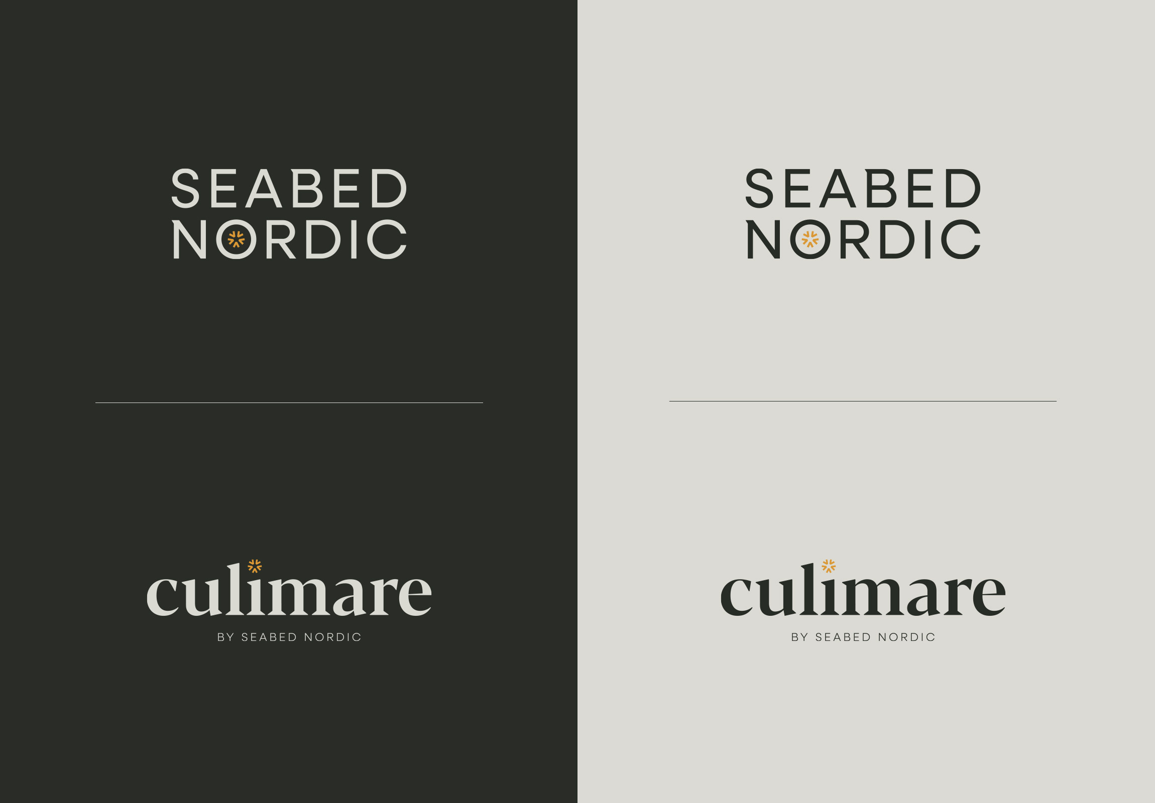
At the forefront of the brand identity is a typographic logo set in Neulis Sans, a geometric sans serif typeface. To add visual interest and aid brand recognition, some letterforms have been tweaked, and the brand icon is placed inside the letter O.
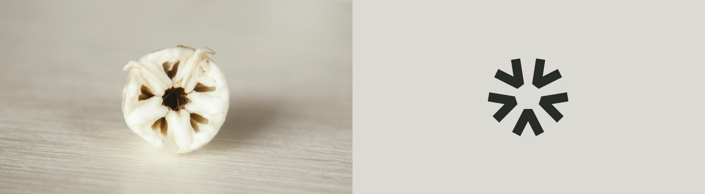
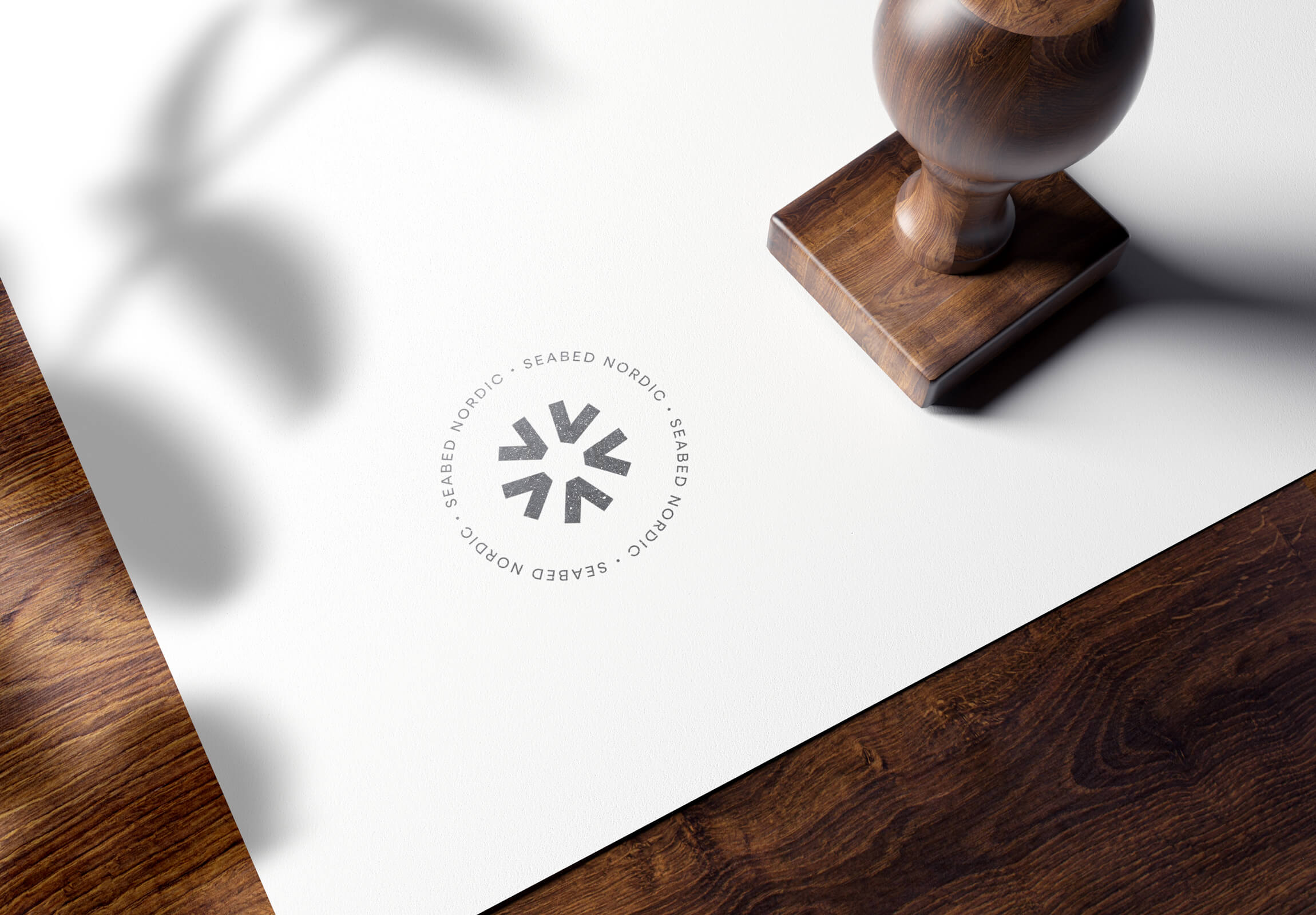
The urchin’s mouth was first described in detail by the Greek philosopher Aristotle, earning it the nickname “Aristotle’s lantern.” This intricate framework of muscles and five curved teeth with triangle-shaped tips, inspired the design of this stylised brand icon. The brand icon is also used as a stand-alone element, and is accompanied by elegant wave shapes.
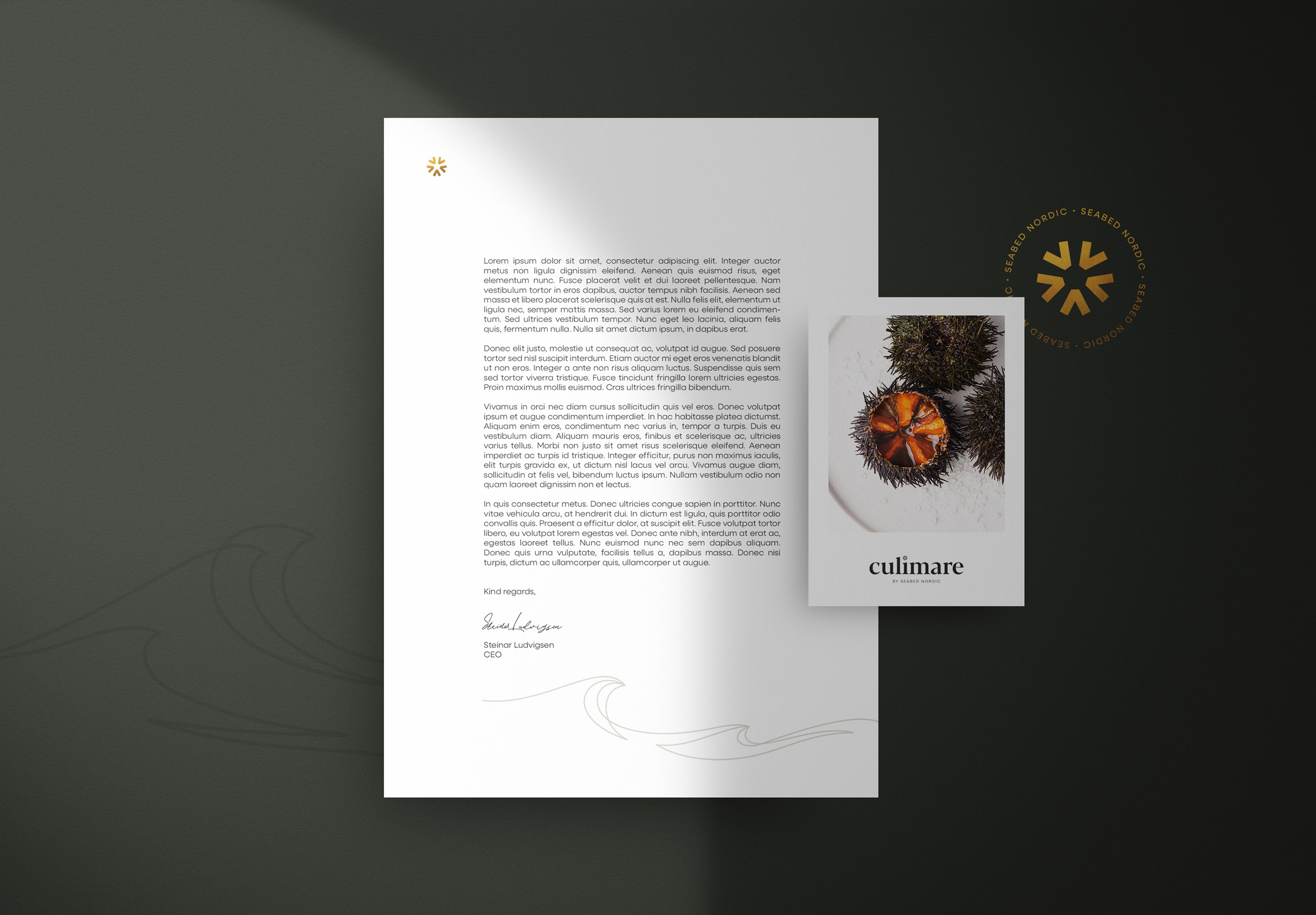
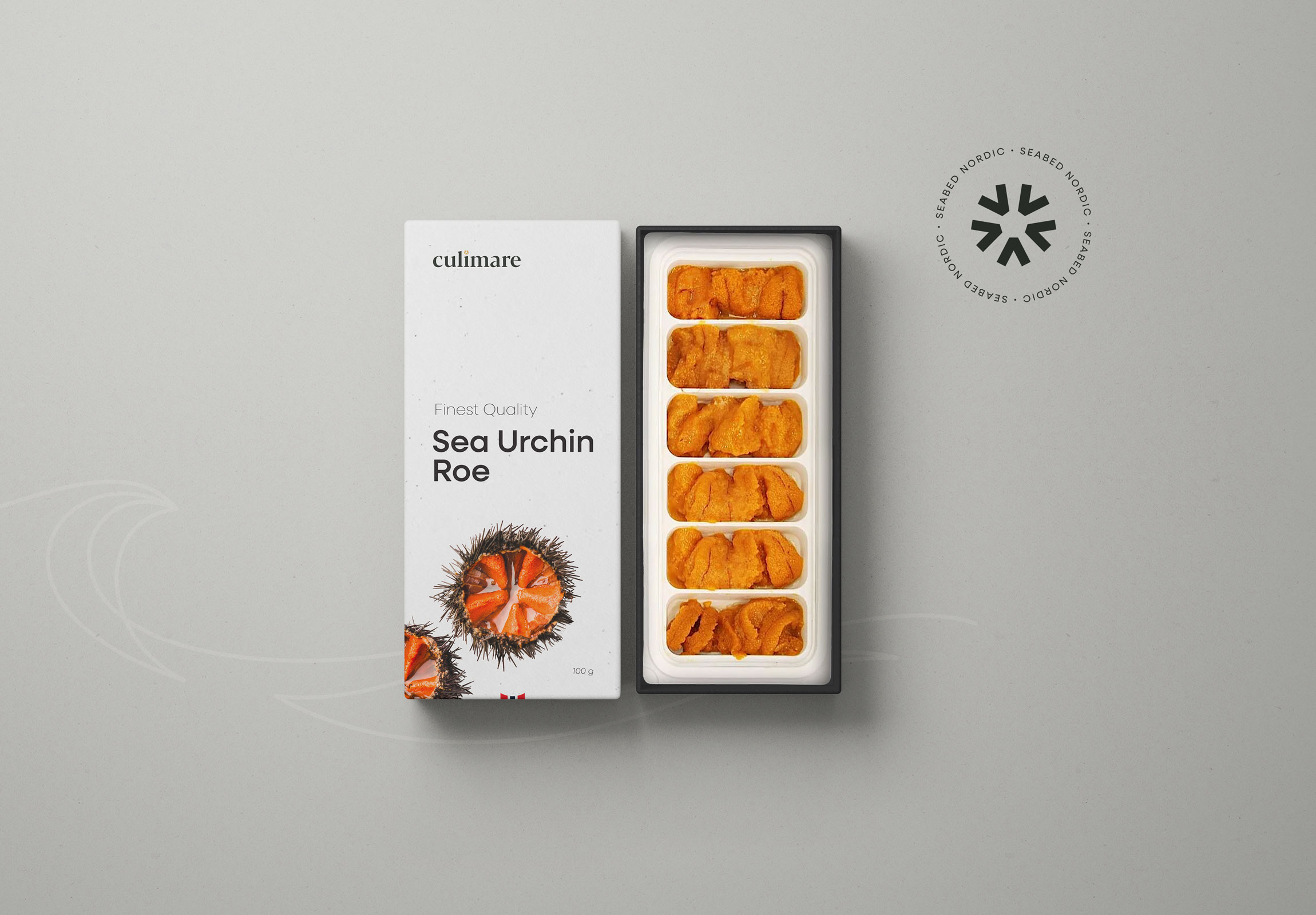
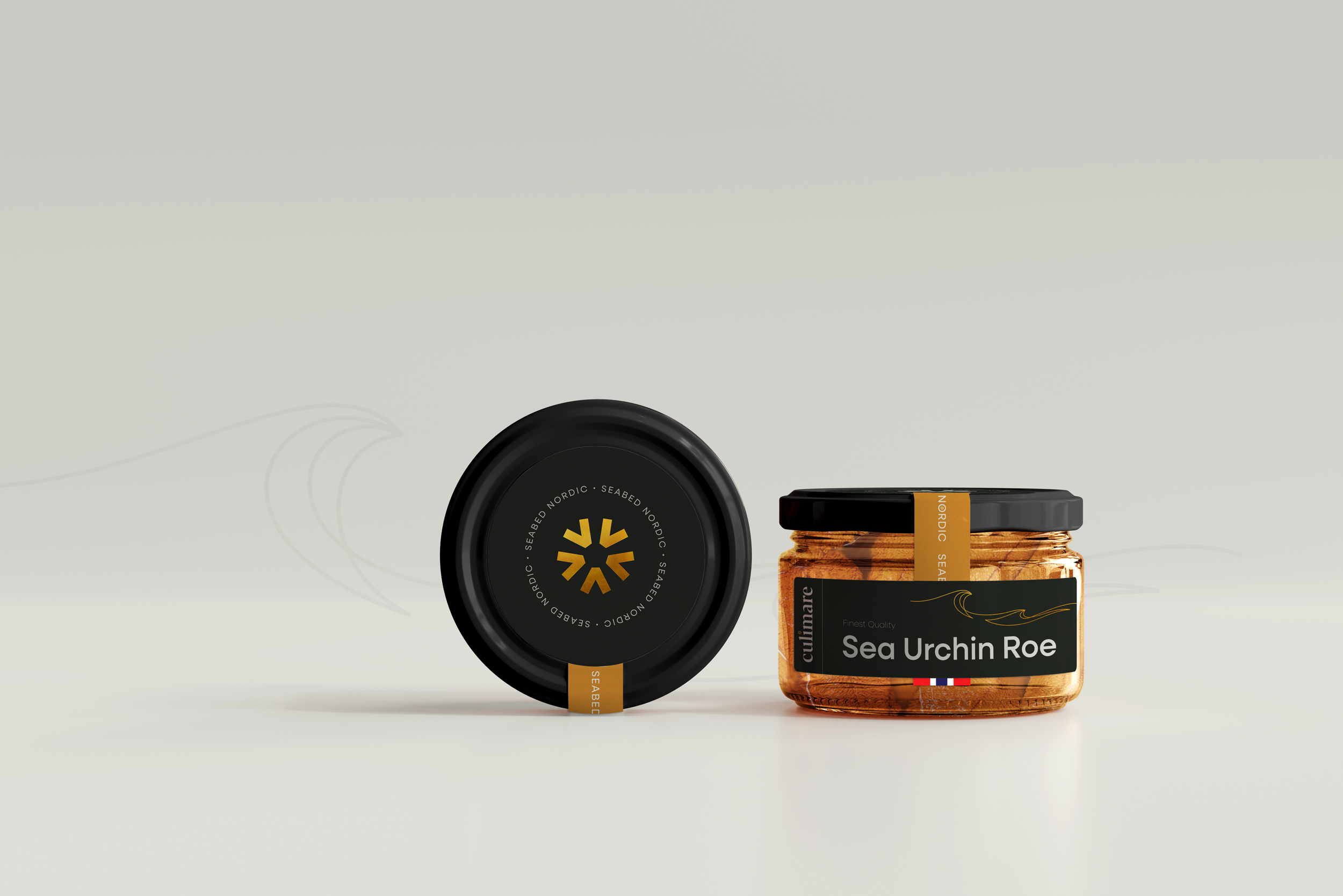
Culimare is a product brand nested under the Seabed Nordic umbrella. The name stems from the words culinary + mare [latin: ocean] — a fitting name for a seafood product that tastes exquisite, and is prepared with great care. The icon is carried over from the main brand, tying the two together nicely, while the Culimare wordmark features a distinct wedge serif (Blacker Display).
The sombre colour palette of muted black and a soft, chalky white is teamed with tactile, uncoated paper stock for an understated Nordic aesthetic. Ochre and gold details used sparingly, add warmth and a hint of luxury.
Packaging is kept simple, in line with the overall understated aesthetics of the brand. This allows the high-end product to be the star of the show, and fits nicely within the luxury segment.

CREDIT
- Agency/Creative: Petchy
- Article Title: Seabed Nordic Dives into Global Waters with Strategic Rebrand by Petchy
- Organisation/Entity: Freelance
- Project Type: Identity
- Project Status: Published
- Agency/Creative Country: Norway
- Agency/Creative City: FREI
- Market Region: Global
- Project Deliverables: Brand Architecture, Brand Design, Brand Guidelines, Brand Identity, Brand Naming, Brand Strategy, Branding, Creative Direction, Logo Design, Packaging Design
- Industry: Food/Beverage
- Keywords: branding, brand identity, brand strategy, sea urchin, sustainable, seafood, aquaculture, culinary, delicacy, luxury, premium
-
Credits:
Strategic Brand Consultant & Creative Director: Solveig Petch


