13 Thirteen Design – Caulker’s Dark Rum
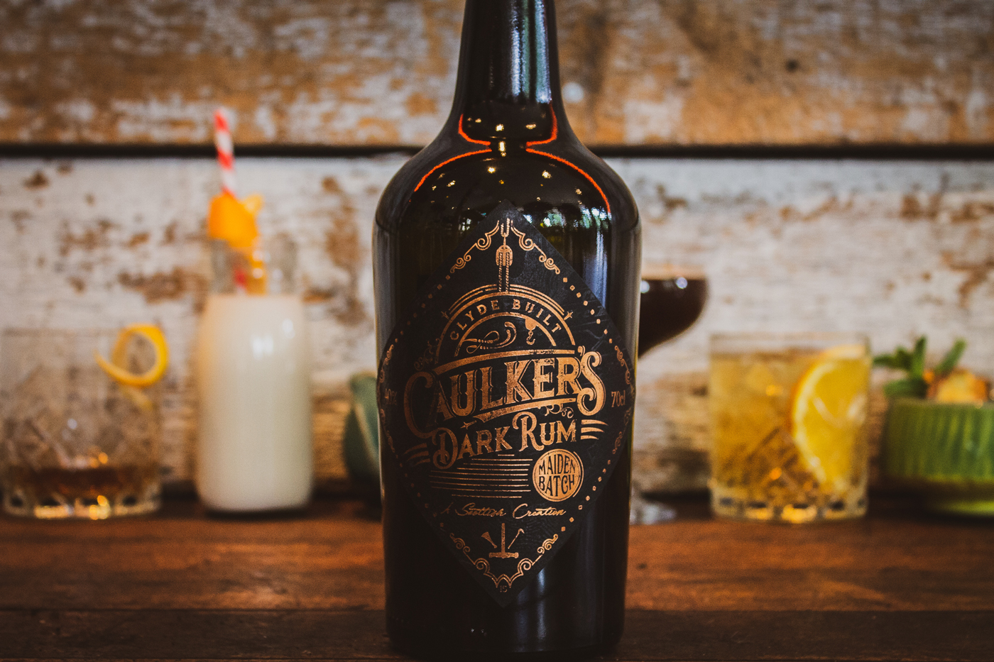
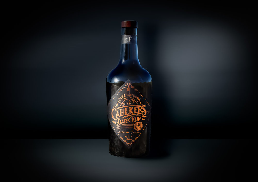
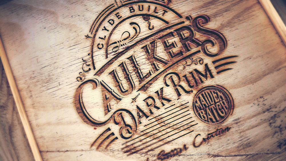
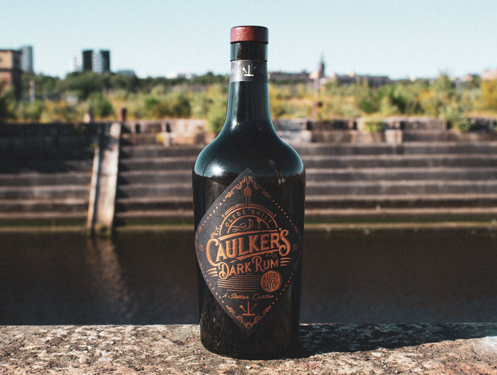
The task here was to create a name, story and brand for a new Scottish Creation and deliver it across all mediums including label design, photography and social media. A tie in between the great shipbuilding era on Glasgow’s River Clyde aside the booming rum trade of the West Indies was the outcome. Between sailors and their famous tots on board and the consumption of rum in the shipyards, the crossovers were aplenty.
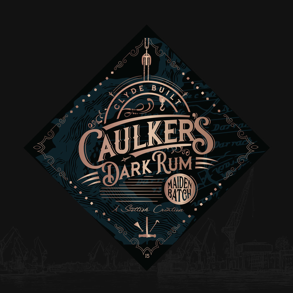
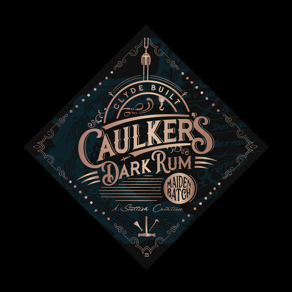
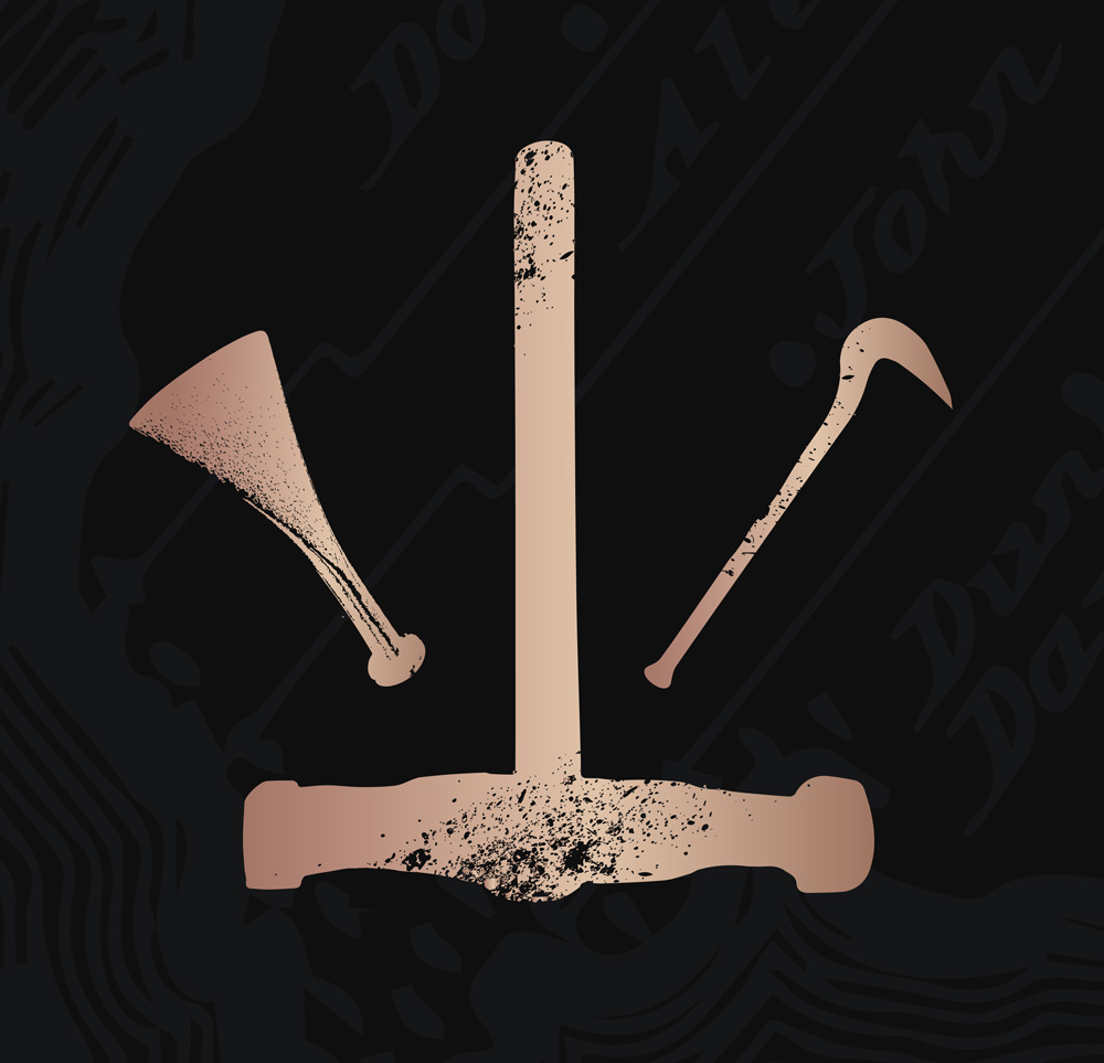
The design led from here, championing the shipbuilding era, the throwback styles and design elements including custom font and Caulker’s tools icon. The hard worn, hard working, gritty and determined nature of the shipyards led more of the design along with the strong copper rust style finish. The ageing of metal was a key lead here to bring the afore mentioned’s age into effect, to represent and understand the time gone by whilst also romanticising the time. This was further aided by more intricate and detailed parts juxtaposing the harshness of other design elements to give a true representation of the sometimes grim but always romanticised time.
Concept Creation, Name Selection, Story Build, Logo Design, Labels Design,Copywriting, Photography, Website Build, Social Media, Images + Storytelling.

CREDIT
- Agency/Creative: 13 Thirteen Design
- Article Title: Scottish Dark Rum Company Taking Inspiration from the Shipbuilding Era on The River Clyde
- Organisation/Entity: Agency Commercial, Published
- Project Type: Packaging
- Agency/Creative Country: United Kingdom
- Market Region: Global
- Format: Bottle
- Substrate: Glass


