About the concept
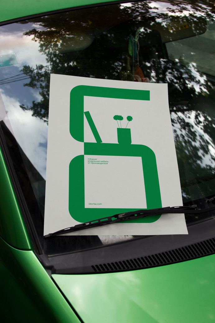
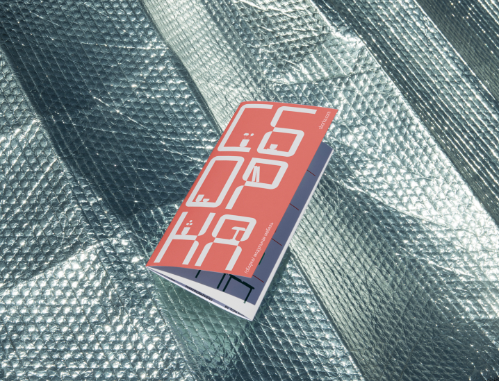
Sborka (Russian for assembly) is a modular furniture brand. The visual identity is based on a custom font that turns into modular furniture.
Typeface
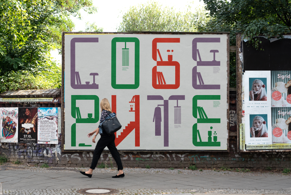
While making the font, I tried to express the essence of modular furniture. The result was a custom-made ‘Angle’ typeface based on modules that form the characters while also embracing other furniture elements and forms.
The typeface is the main character. Just like bulky furniture commands a space, it is designed to be a centerpiece and to occupy as much space as possible, so that the details of the typeface can be better seen. Therefore, it is mostly used on posters and in headers and is accompanied by a neutral Roboto font.
Graphics
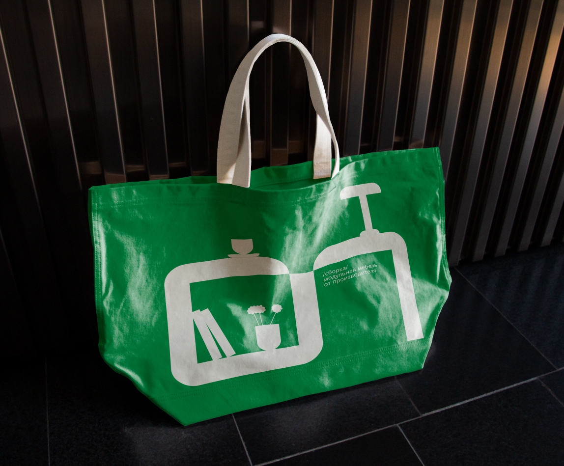
In an attempt to further research the notion of what modular furniture actually feels like in everyday life, various objects were added. We can see vases, books and cups that create an atmosphere of a cozy lived-in place that feels real.
Interaction of Typeface and Graphics
As modular furniture is designed to adapt to various needs, we can see how the font-furniture is used in multiple contexts: in the hall, living room, library or even bathroom. It creates a narrative around the furniture and helps to tell stories of people using it. Therefore, SBORKA is where the rational and the emotional meet — the typeface and the objects form a graphic ‘toolbox’ for the whole project.
The result is an incredibly adaptable product — font-furniture characters can be used separately and fill the whole space or be mixed together into bigger objects like closets.
Colors
Apart from the white background, the color scheme consists of three main colors: red, green, and purple. It shows two main things. First, practical, is that the furniture can be painted in different colors. Second — the emotional context of using it. Modular furniture suites well in both bright interiors, as statement pieces, and in calm places, gently merging into interiors. Moreover, bright green and red freely interact with boxes, bags and other construction mediums.
In brief
SBORKA is designed to be seen as a friendly yet efficient brand. It refrains from turning into a sterile environment like a lab or a warehouse while still promising organization and structure in day-to-day life by adding a personal touch in its design.


CREDIT
- Agency/Creative: Alexandra Chulkova
- Article Title: Sborka Modular Furniture Brand Identity Concept
- Organisation/Entity: Student
- Project Type: Identity
- Project Status: Non Published
- Agency/Creative Country: Russia
- Agency/Creative City: Moscow
- Market Region: Europe
- Project Deliverables: Art Direction, Brand Creation, Brand Identity
- Industry: Retail
- Keywords: WBDS Student Design Awards 2023/24
- Keywords: font, custom font, branding, furniture, identity
-
Credits:
Designer: Alexandra Chulkova
Educational Institution: HSE Art and Design School


