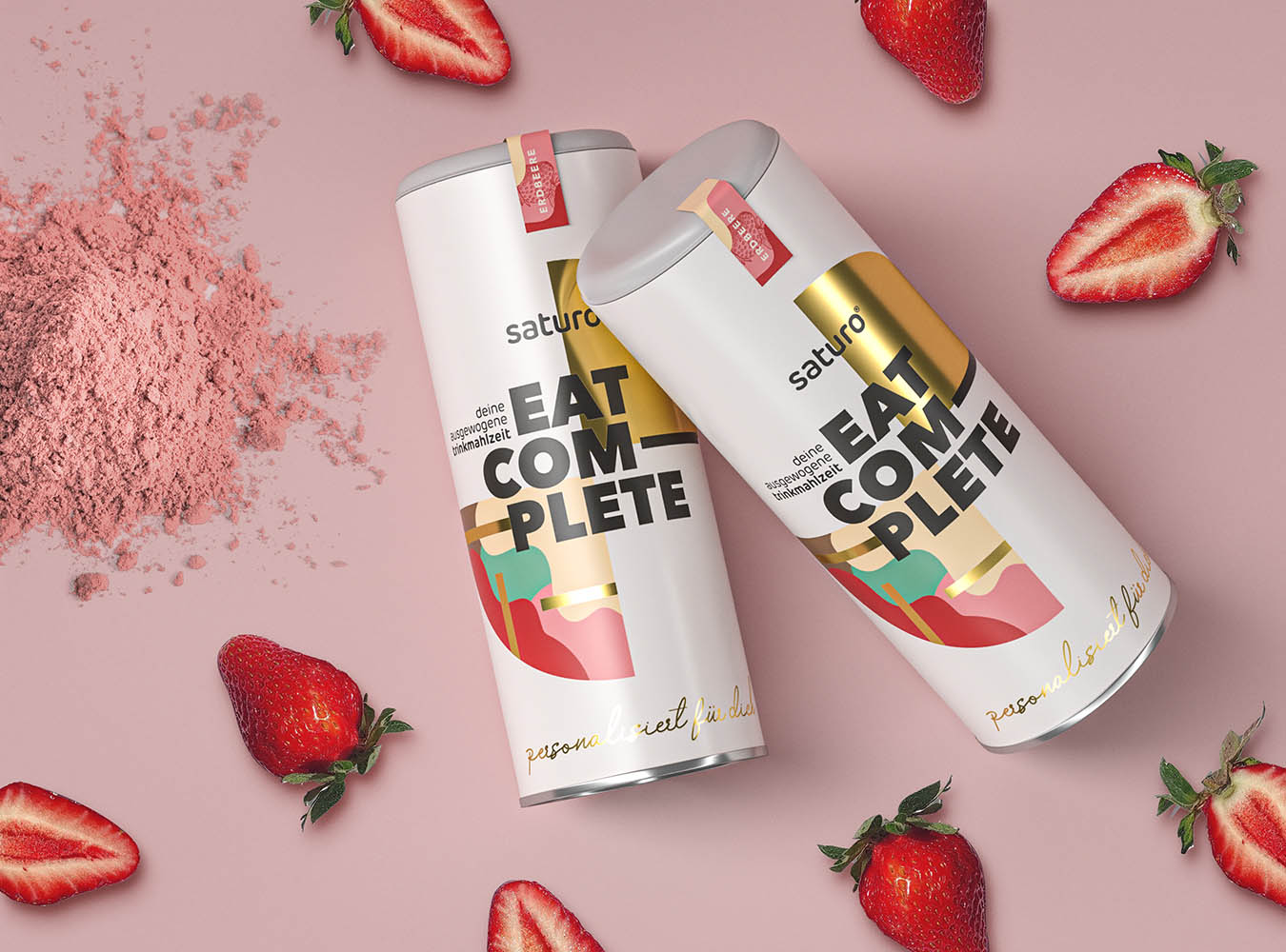
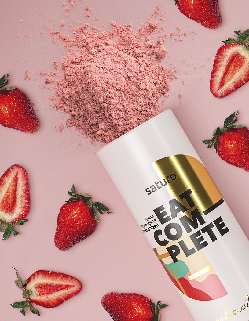
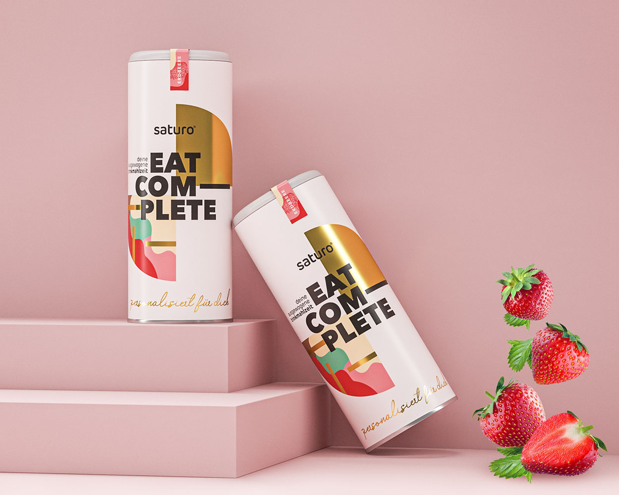
For Saturo, a forward-thinking supplement company, we crafted a sophisticated tube packaging design that embodies minimalistic and modern principles. The focus was on creating a visually clean and streamlined look, while integrating distinctive design elements that convey the dynamic nature of the product itself. Central to the design is a unique pattern inspired by the motion of protein mixing. These subtle, fluid lines wrap around the packaging, creating a sense of movement and energy that alludes to the active ingredients and the product’s functionality. This thoughtful detail brings a sense of life to the otherwise minimalistic design, adding depth and interest without compromising on simplicity.
To further elevate the visual impact, gold foil accents were incorporated throughout the design. The foil adds a touch of elegance and sophistication, emphasizing Saturo’s premium quality and making the packaging stand out in a competitive market. This reflective finish catches the light, drawing attention to the brand name and key design features while reinforcing the luxurious feel of the product. The gold foil elements complement the modern minimalism, creating a perfect balance between understated and eye-catching.
Another important aspect of the Saturo packaging design is personalization. Given that Saturo offers a customizable supplement experience tailored to individual needs, it was essential for the packaging to reflect this uniqueness. The design highlights personalization by allowing subtle variations that make each package feel distinctive while maintaining a cohesive visual identity across the entire product line. This approach ensures that while every customer receives a product that feels uniquely theirs, the brand remains instantly recognizable and consistent.
The tube design itself was carefully considered for both form and function. Its sleek, cylindrical shape not only looks modern and professional but also ensures practicality and ease of use. The compact size makes the product ideal for on-the-go lifestyles, appealing to health-conscious consumers who value both convenience and style. By combining elegant aesthetics with functionality, the packaging enhances the overall user experience, making it memorable and enjoyable.
Every detail in the design was meticulously curated to create a sense of harmony and sophistication. The interplay of minimalistic elements with dynamic patterns and luxurious foil accents results in a package that feels both contemporary and high-end. This balance mirrors Saturo’s mission to deliver high-quality, personalized supplements that cater to modern consumers. From the smooth finishes to the careful placement of design elements, every aspect of the packaging speaks to the brand’s commitment to excellence and innovation.
The result is a packaging solution that not only stands out on the shelf but also resonates with Saturo’s target audience, who appreciate clean design and premium quality. The visual language communicates the brand’s core values of customization, modernity, and superior quality, leaving a lasting impression on consumers. By drawing inspiration from the motion of protein mixing and integrating gold foil for a touch of elegance, the packaging tells a story of energy, refinement, and individuality.


CREDIT
- Agency/Creative: Studio Zak
- Article Title: Saturo Packaging Design by Studio Zak Combines Modern Minimalism with Dynamic Energy
- Organisation/Entity: Agency
- Project Type: Packaging
- Project Status: Published
- Agency/Creative Country: Italy
- Agency/Creative City: Rome
- Market Region: Europe
- Project Deliverables: Packaging Design
- Format: Tube
- Industry: Food/Beverage
- Keywords: supplements, whey, packaging, gold foil, minimal, pattern
-
Credits:
Creative Director: Paula Pozza
Photos © Copyright: Studio Zak


