


Located in Los Angeles, Satori Labs specializes in the extraction and sale of high-purity cannabis oil, catering to both companies and end consumers. Their extraction process is carried out in state-of-the-art laboratories, using cutting-edge technology and highly specialized chemical professionals to ensure superior quality and purity in every batch of oil produced.
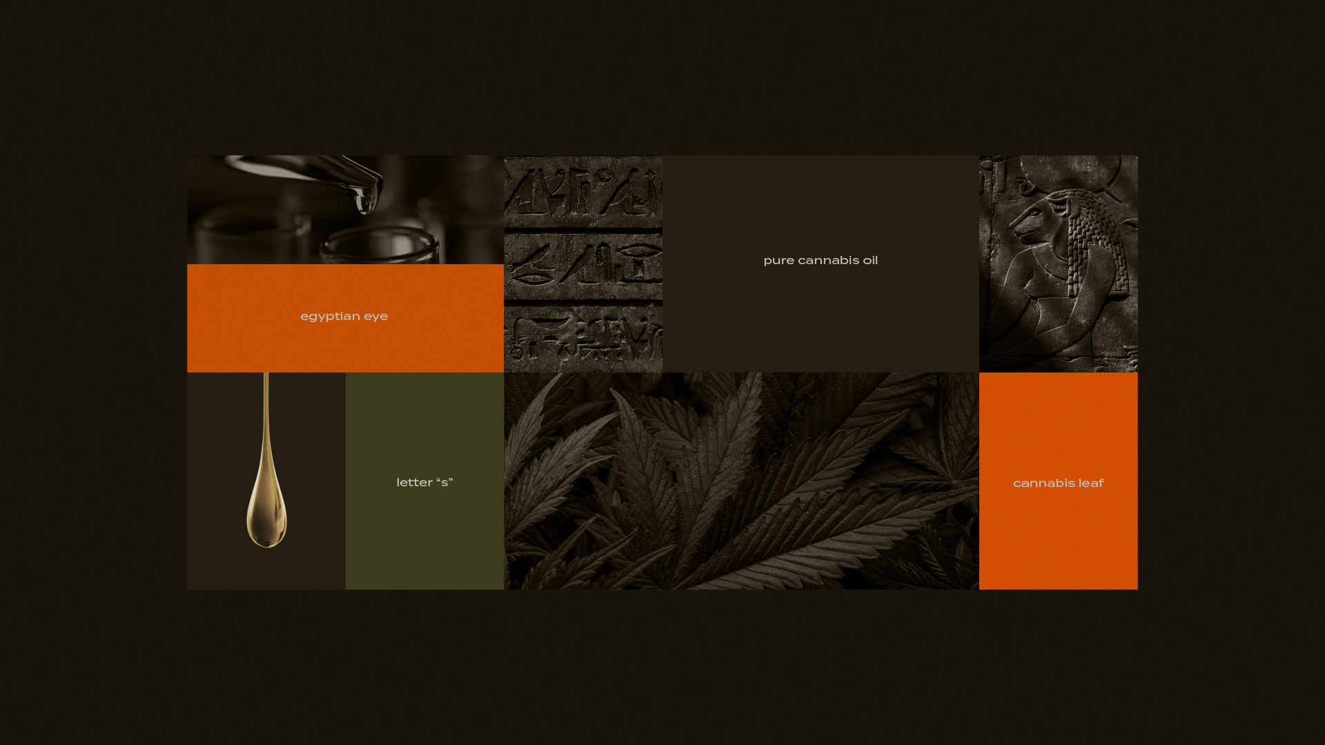
The brand’s identity draws inspiration from ancient Egyptian civilization, particularly its historical connection to cannabis cultivation and symbolic visual language. A key element in Satori Labs’ logo is the Eye of Horus, a symbol deeply associated with protection, healing, and purity. This connection is meaningful, as the phases of the moon, once linked to successful agriculture, played a crucial role in the cultivation of cannabis and other medicinal plants. The Eye of Horus, often seen as a representation of light, wisdom, and power, naturally aligns with the brand’s purpose of delivering a refined and powerful product.
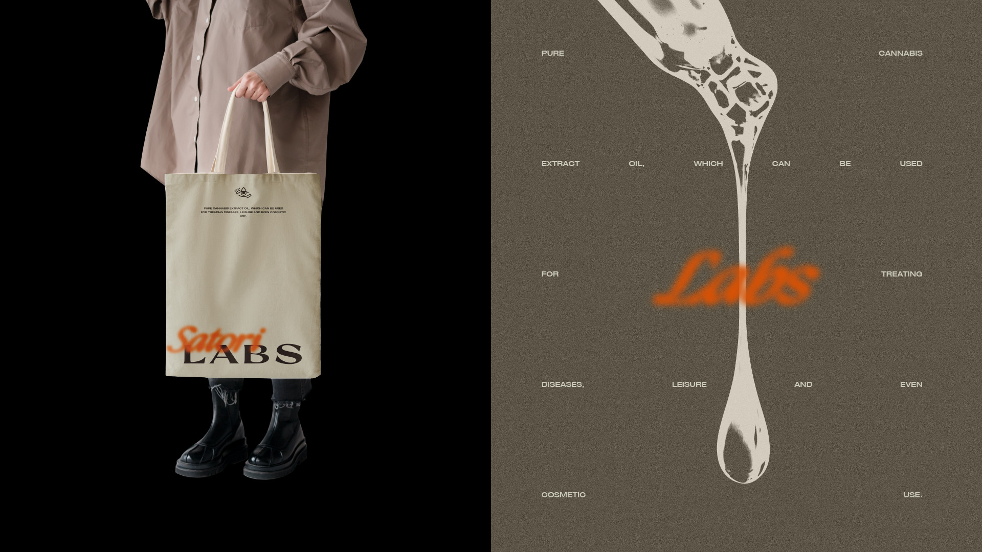
The logo also incorporates an “S” shape and a drop of oil, subtly forming a three-part cannabis leaf, reinforcing the essence of the brand. This balance between ancient symbolism and modern extraction technology is a defining trait of Satori Labs.
To contrast with the historically rich logo, the visual identity is designed to be clean, minimal, and highly adaptable, ensuring universal appeal to both corporate clients and retail consumers. The typography integrates elements inspired by Egyptian symbols, featuring irregular bases and pointed serifs, adding uniqueness while maintaining clarity.
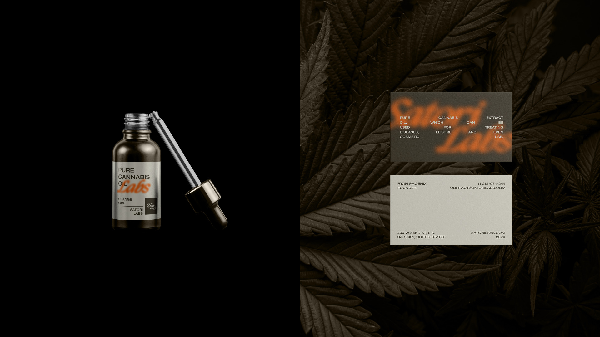
A carefully curated color palette blends cool and warm tones, ensuring versatility across different touchpoints, including packaging for the dropper product line, where a clean, sophisticated layout was implemented. This design strategy results in a modern, impactful brand that seamlessly merges history, innovation, and purity, effectively communicating Satori Labs’ technological excellence and cultural depth.


CREDIT
- Agency/Creative: Matheus Ferreira & Co.
- Article Title: Satori Labs Visual Identity and Packaging by Matheus Ferreira & Co.
- Organisation/Entity: Agency
- Project Type: Identity
- Project Status: Published
- Agency/Creative Country: United States
- Agency/Creative City: Lençóis Paulista
- Market Region: South America
- Project Deliverables: Art Direction, Brand Design, Brand Identity, Design, Label Design, Packaging Design
- Industry: Pharmaceutical
- Keywords: Logo Design, Cannabis Oil, Health, Brand, Brand Identity, Visual Identity, Brand Design
-
Credits:
Art Director: Matheus Ferreira


