


Introduction: Sweet Lavka, a chain of stores dedicated to sweets, embarked on a transformative journey to develop a distinctive brand identity and packaging design. With a mission to unite the world through the universal language of flavors, Sweet Lavka sought to celebrate cultural diversity and foster understanding among its customers. This case study explores the creative process behind the development of Sweet Lavka’s logo, brand identity, and packaging design, reflecting the essence of “SweetLavka – taste of this world”.
Brand Concept and Positioning: Sweet Lavka’s core ethos revolves around the belief that exploring diverse sweets from around the globe enables a deeper connection with people and cultures. The brand positioning, encapsulated in the slogan “SweetLavka – taste of this world”, embodies this philosophy, inviting customers on a sensory journey of discovery and delight.
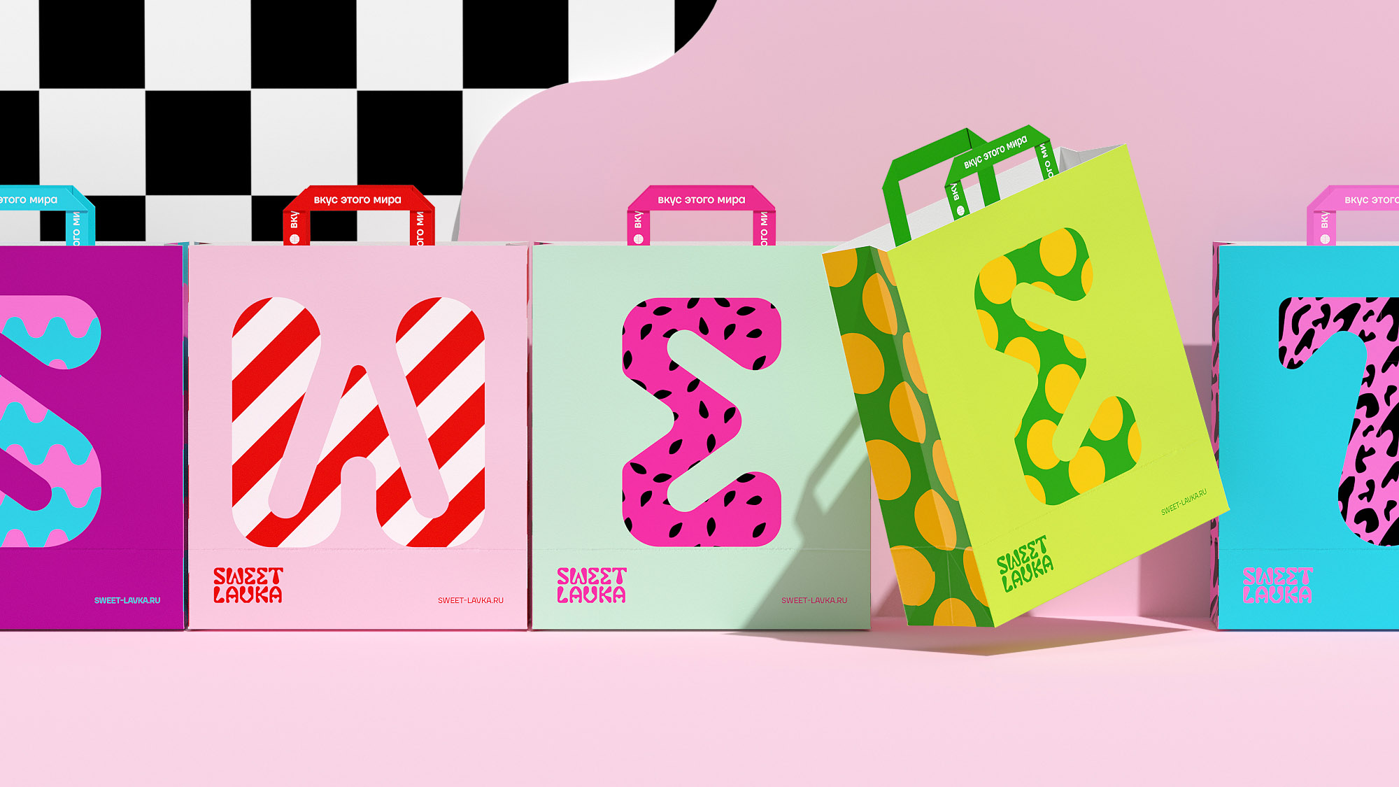
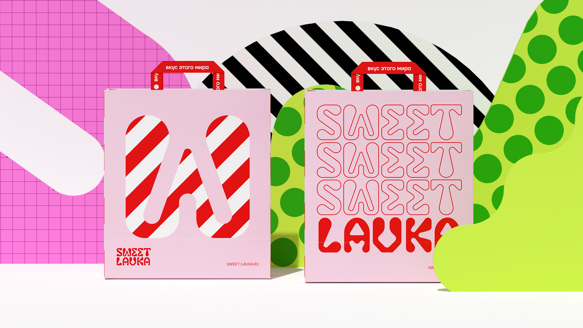
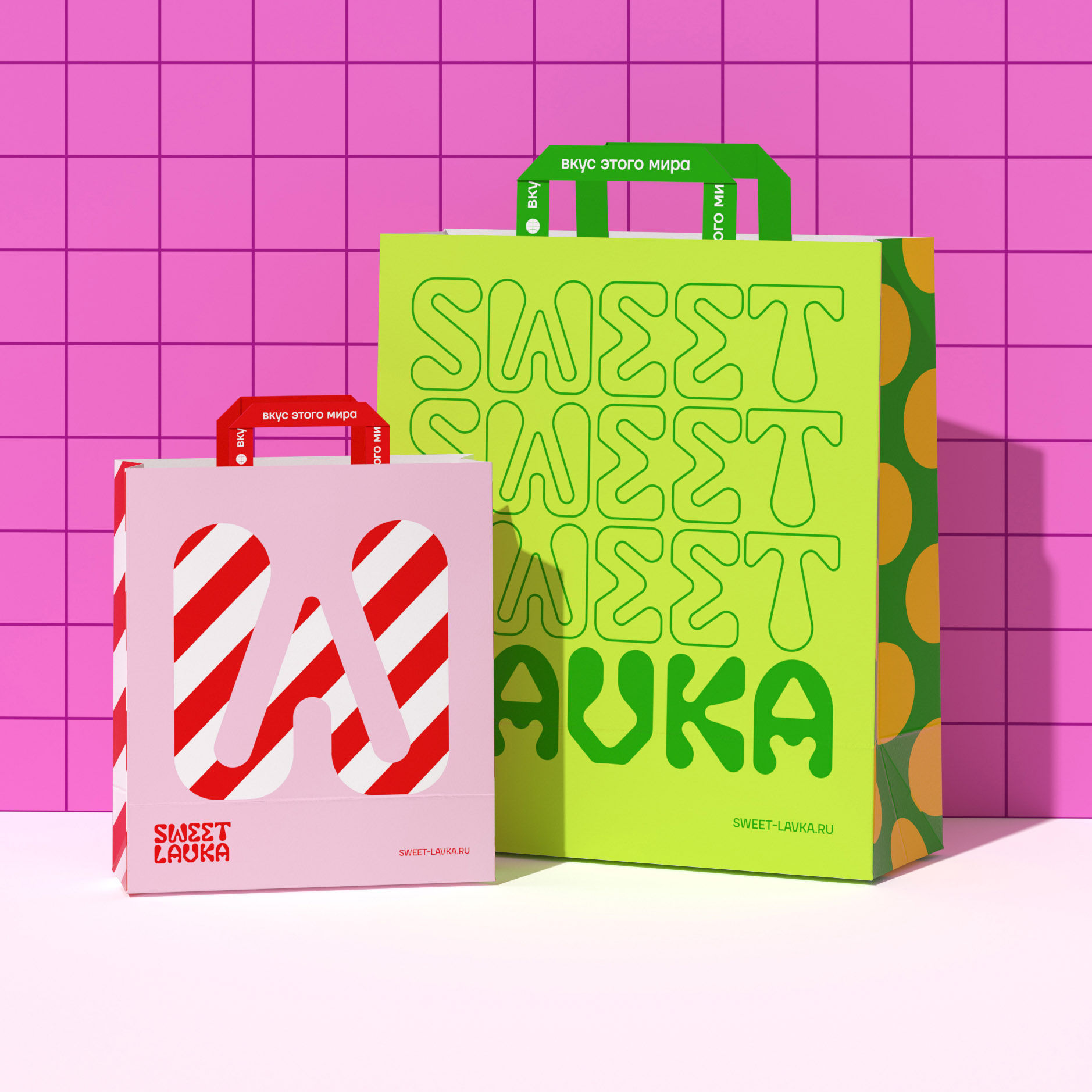
Logo Design: The logo of Sweet Lavka is a bespoke lettering that exudes sweetness and modernity. The droplet-like and rounded forms of the letters evoke a tactile sensation akin to indulging in a delectable treat. This design choice reflects the essence of the brand, capturing the joy and excitement of exploring new and unusual flavors.
Brand Identity: The brand identity of Sweet Lavka is a vibrant tapestry of colors and patterns, evoking a sense of festivity and wonder. These elements not only convey the euphoria of savoring sweet delights but also serve as visual cues for the brand’s lively personality. By blending unconventional letter shapes with vivid patterns and colors, Sweet Lavka creates a visually captivating experience that resonates with its audience.
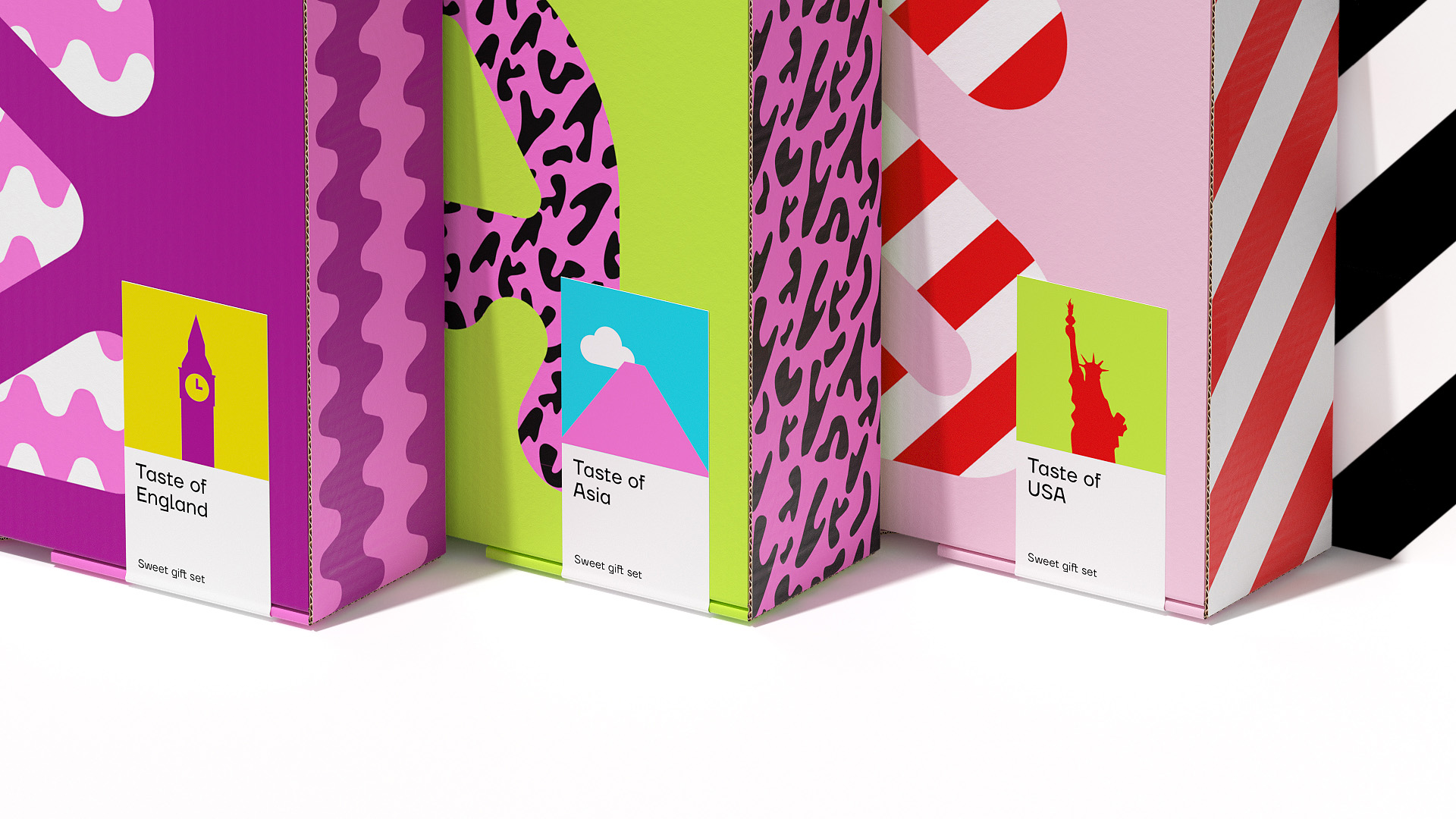
Packaging Design: In addition to the logo and brand identity, Sweet Lavka’s packaging design plays a crucial role in enhancing the customer experience. To differentiate between sweets from various countries and create distinct zones within the stores, outlines of iconic landmarks were incorporated. This thoughtful detail not only adds an element of adventure to the brand but also aids customers in navigating the diverse range of products available.
Conclusion: Through meticulous attention to detail and a deep understanding of its brand philosophy, Sweet Lavka has successfully crafted a captivating identity that celebrates cultural diversity and fosters a sense of curiosity and connection. By embracing the “taste of this world”, Sweet Lavka invites customers to embark on a journey of discovery, one sweet indulgence at a time.


CREDIT
- Agency/Creative: Sasha Kischenko
- Article Title: Sasha Kischenko Crafting a Vibrant Identity for Sweet Lavka’s Chain of Stores through Branding and Packaging Design
- Organisation/Entity: Agency
- Project Type: Identity
- Project Status: Published
- Agency/Creative Country: Georgia
- Agency/Creative City: Batumi
- Market Region: Europe
- Project Deliverables: Brand Identity
- Industry: Food/Beverage
- Keywords: Sweets, candy, shop
-
Credits:
Designer: Sasha Kischenko


