Brand Concept: Sapo’s Kitchen, a true Work and Company project, encapsulates the essence of joy and connection through its culinary offerings. Work and Company has seamlessly integrated branding, naming, design, and illustrations to bring Sapo’s Kitchen to life, ensuring that every aspect resonates with the brand’s core philosophy.
Mission and Experience: At the heart of Sapo’s Kitchen lies a profound belief in the transformative power of food. It is not just about nourishing the body but also about feeding the soul. Sapo’s Kitchen aims to create an unparalleled experience—a fusion of traditional Latin patterns, vibrant colours, and meticulously handcrafted typography that elevates every encounter with the brand.
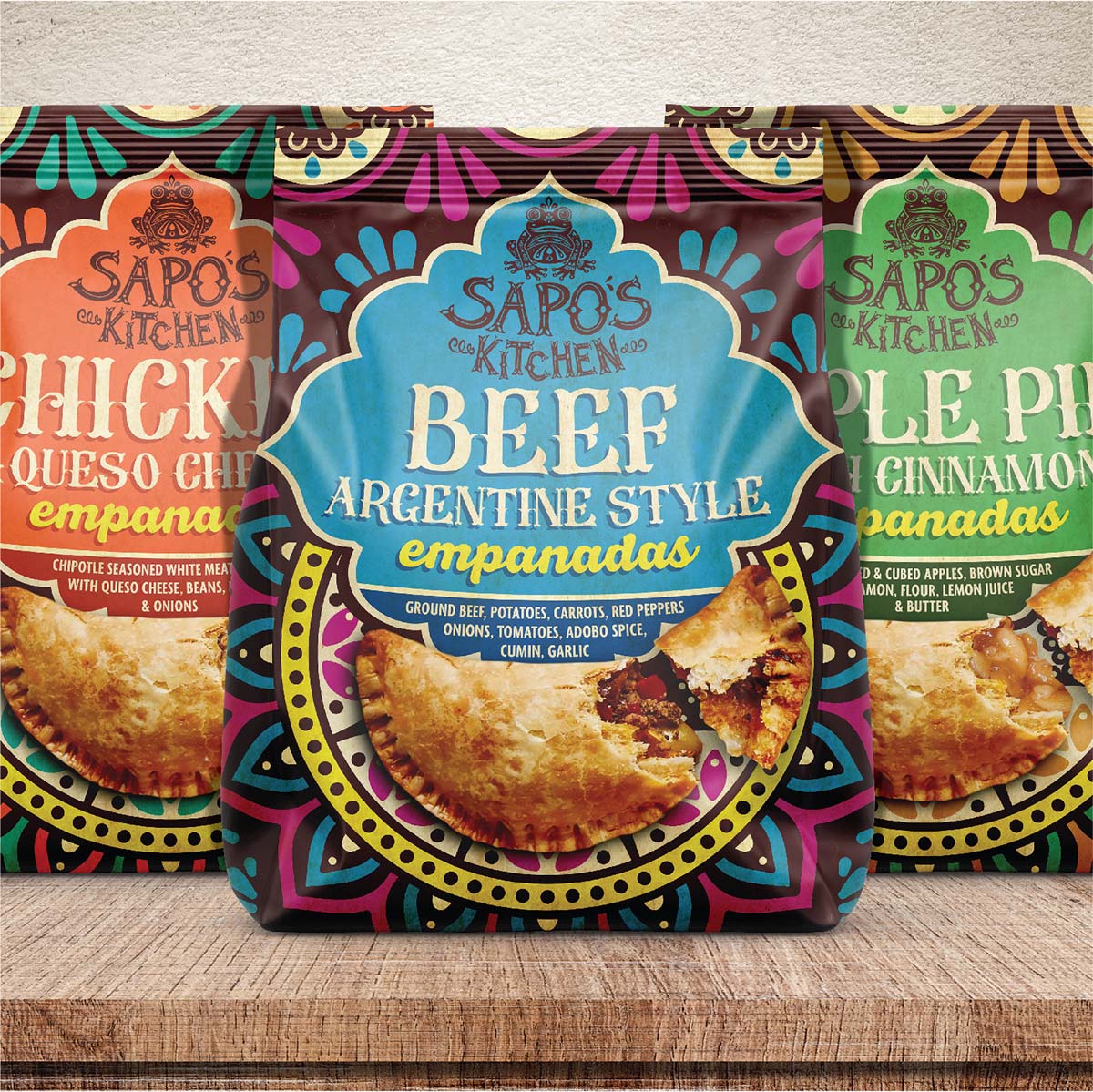
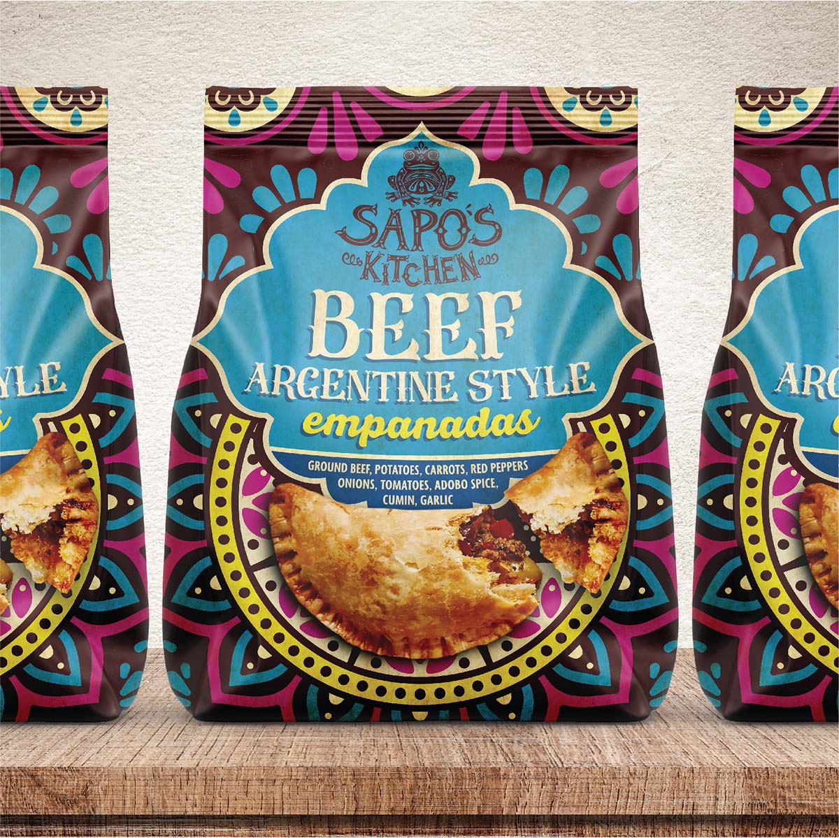
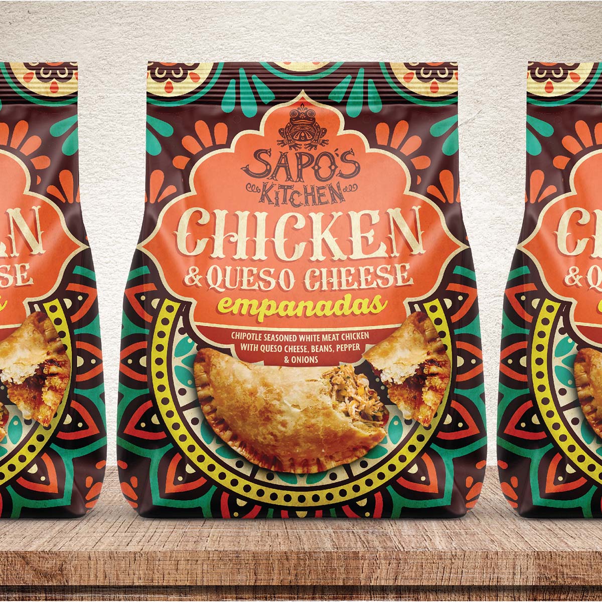
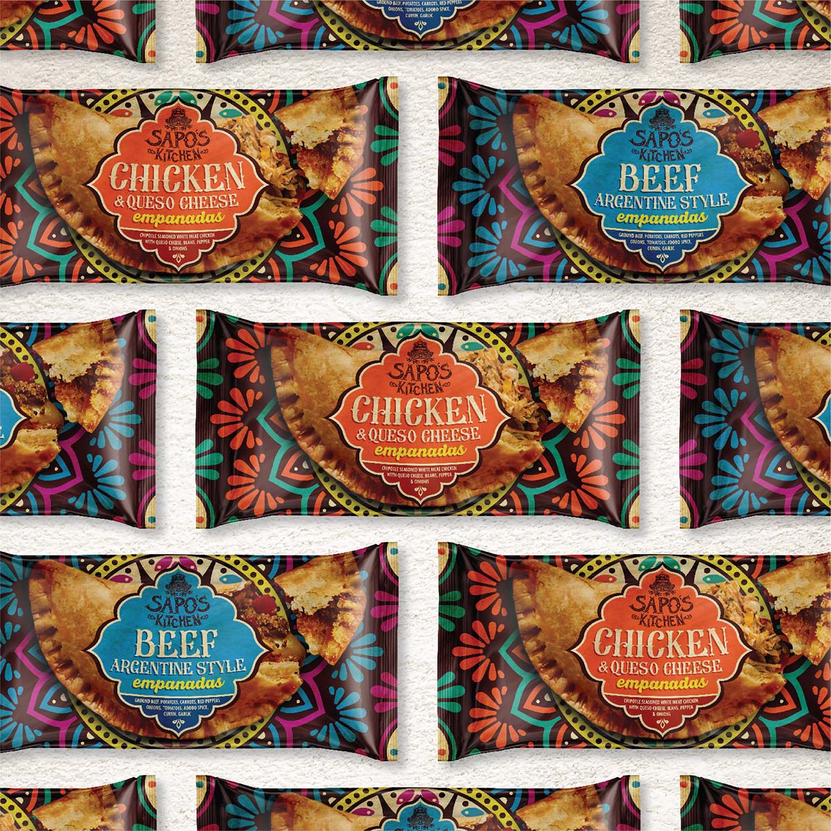
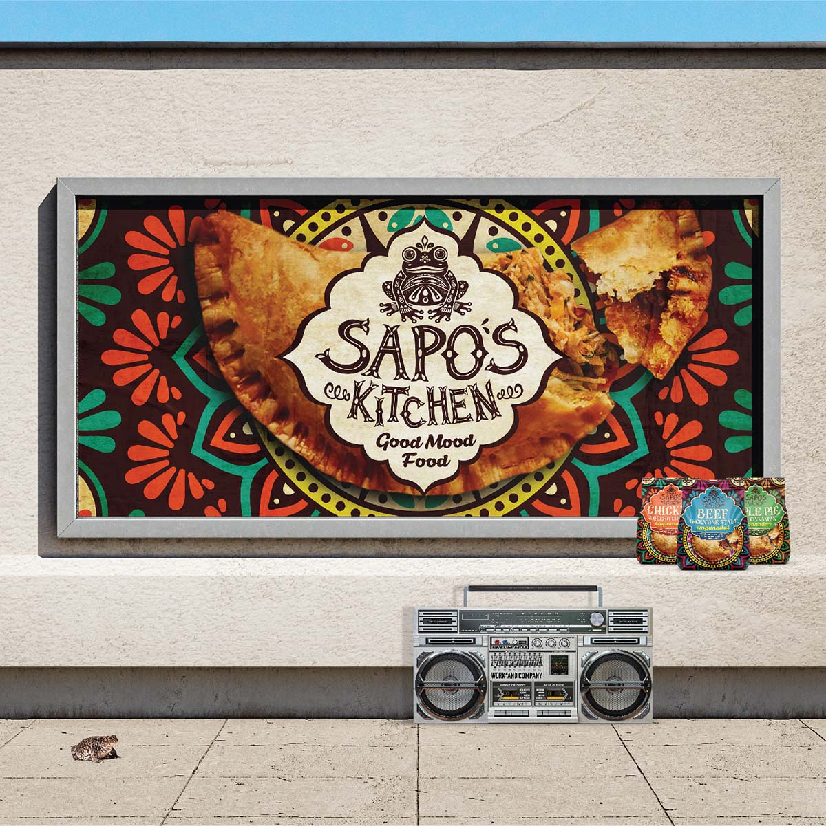
Design Aesthetic: The Sapo’s Kitchen brand is a visual feast, an eclectic fusion of traditional Latin elements that seamlessly blend with modern design principles. The use of vibrant colors, intricate patterns, and artisanal typography adds a touch of craftsmanship to the brand, creating an atmosphere that is both lively and sophisticated.
Good Mood Food Mantra: Sapo’s Kitchen stands by the mantra of “Good Mood Food,” where every dish is crafted with the intention to bring joy to the table. Each bite is an experience, resonating with the lively and colorful essence of Latin flavor. It’s an invitation to join a culinary journey that marries tradition with a modern twist, where flavors dance on your taste buds, and every bite becomes a celebration.
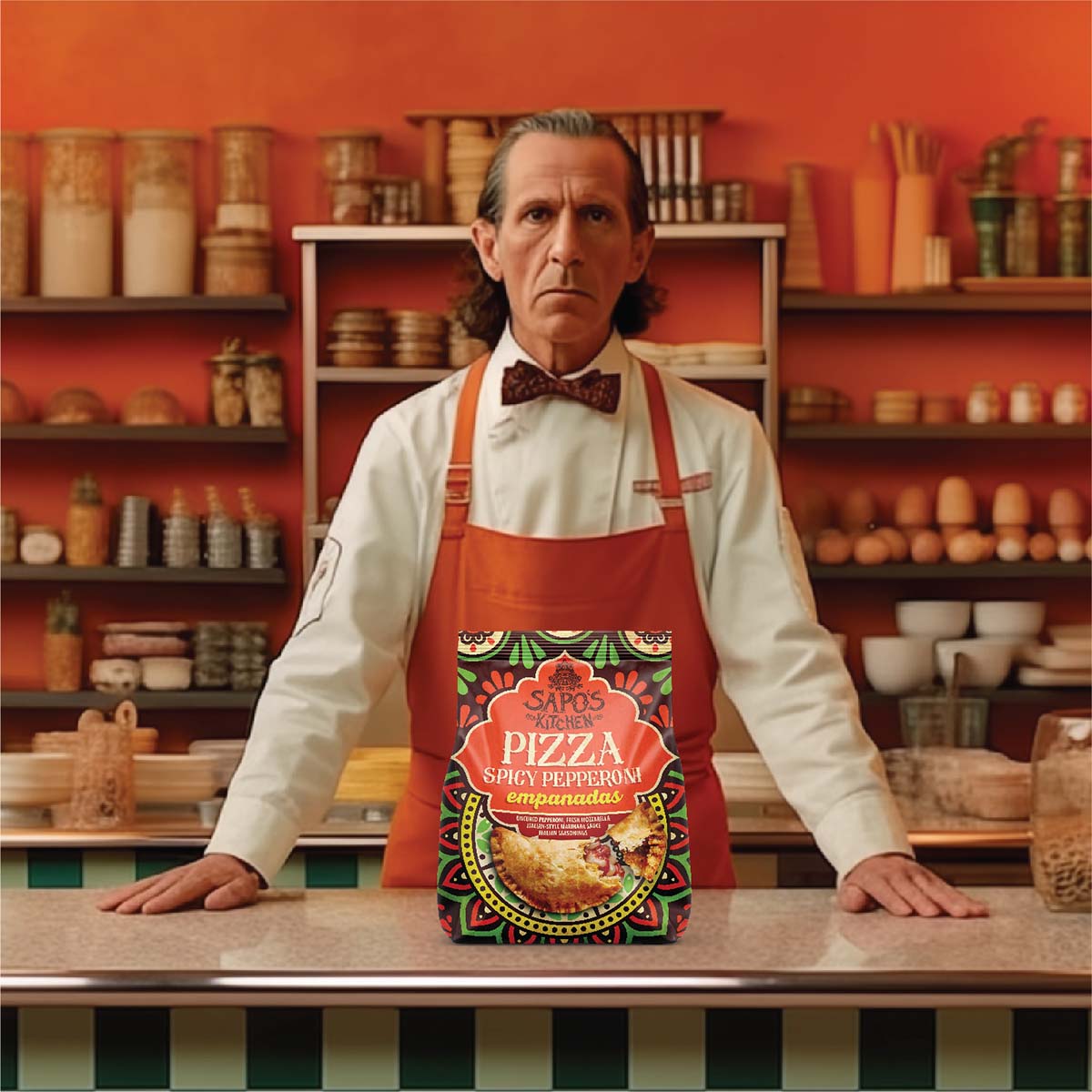
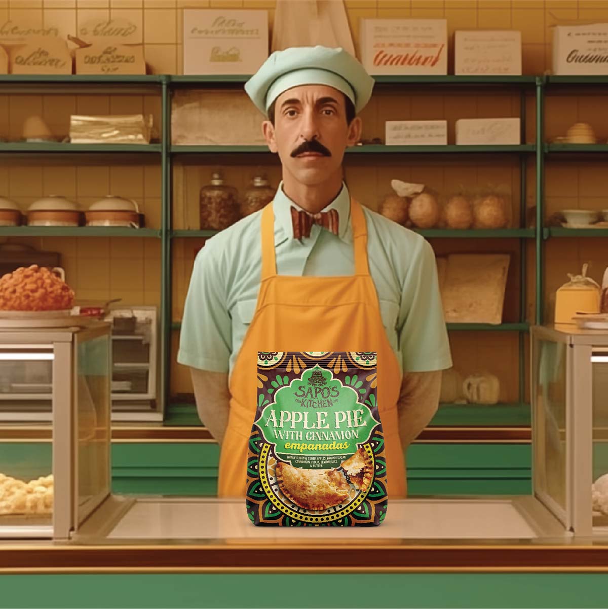
A Celebration of Tradition and Modernity: Sapo’s Kitchen invites you to partake in a celebration of tradition and modernity. The brand’s design, from the packaging to the illustrations, reflects the dynamic fusion of old-world charm and contemporary flair. It’s an immersive experience where every detail speaks to the passion and dedication that goes into each culinary creation.
Sapo’s Kitchen by Work and Company is not just a brand; it’s a vibrant tapestry of flavours, colours, and emotions. Join us in this culinary adventure where every moment is infused with the spirit of celebration and the joy of “Good Mood Food.”


CREDIT
- Agency/Creative: Work and Company
- Article Title: Sapo’s Kitchen Concept Packaging Design Range by Work and Company
- Organisation/Entity: Agency
- Project Type: Packaging
- Project Status: Non Published
- Agency/Creative Country: United States
- Agency/Creative City: New York
- Market Region: North America
- Project Deliverables: Branding
- Format: Bag
- Industry: Food/Beverage
- Keywords: Food, snacks, latin, empanada
-
Credits:
Designer: Gene Portnoy


