Erick Santos is an engineer and interior designer from Porto Alegre.
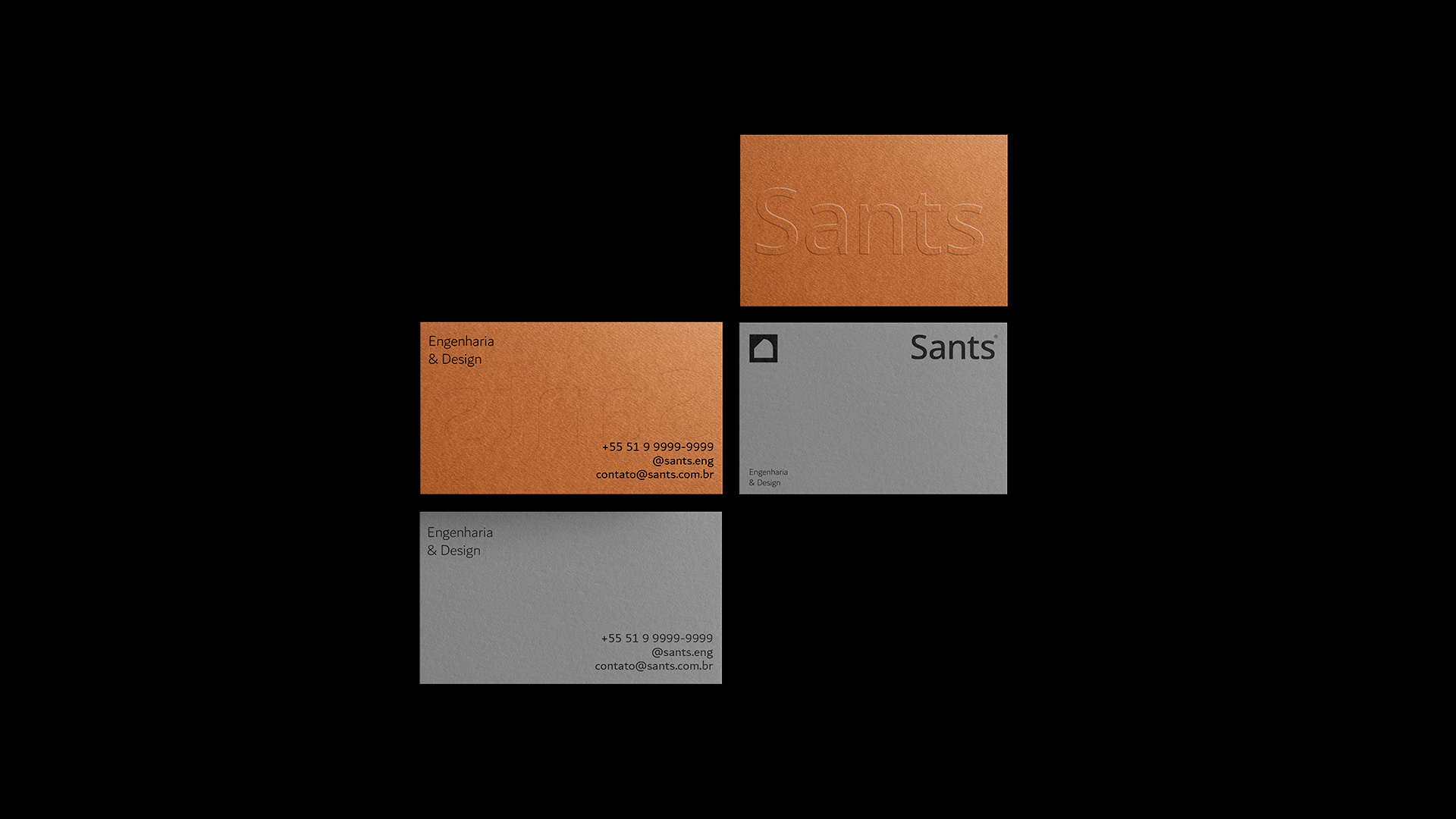
For this visual identity, a minimalist approach was taken, with a serious, modern and memorable look in a way that can encompass
high class clients who are willing to invest in a project
Premium engineering and interior designer.
The inspiration for the project came from the unique form of expression of the contemporary style. Characterized by its straight lines, rounded shapes, and use of neutral colors, its attributes contributed to add to the context and concept in creating the GRID.
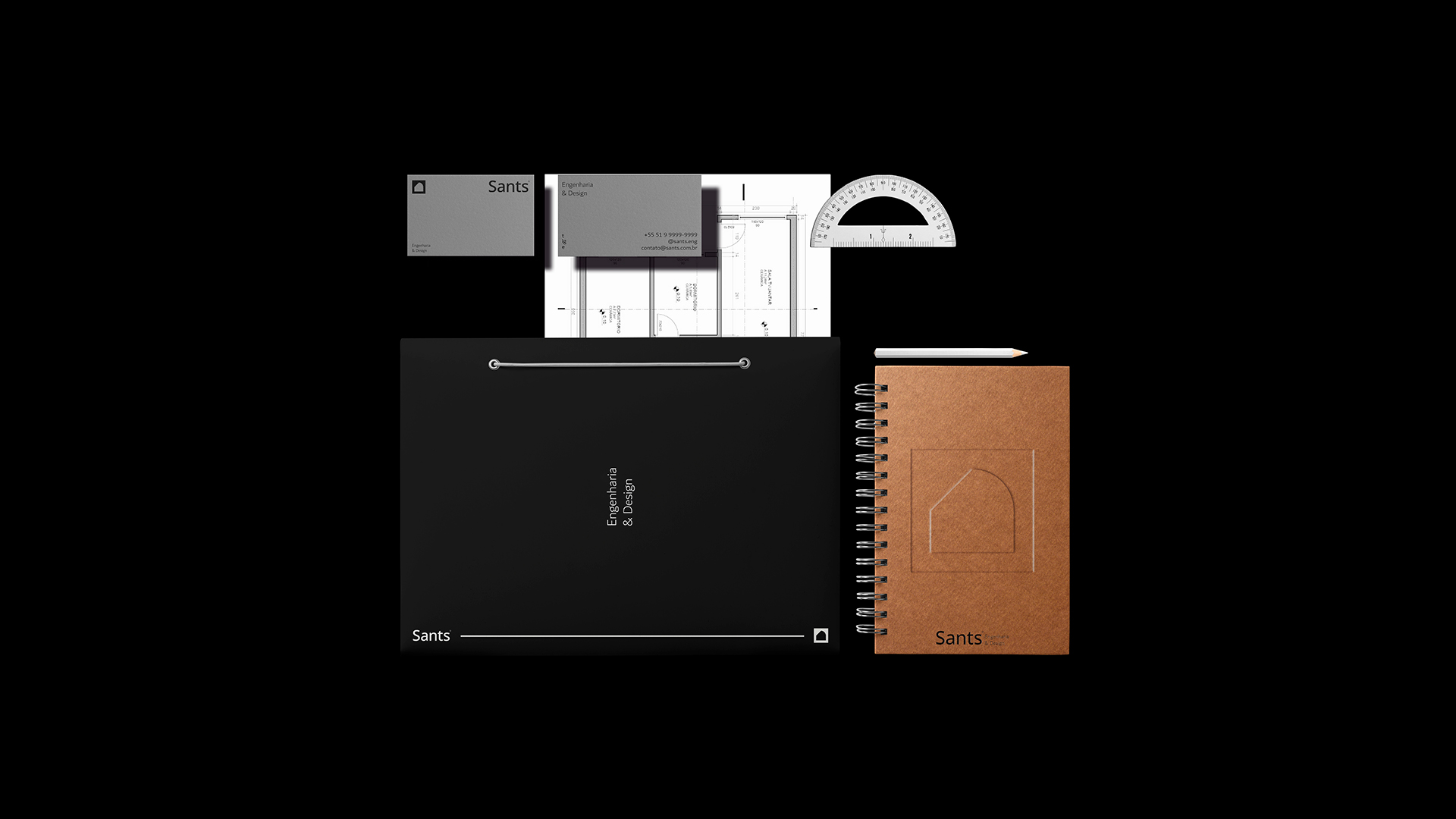
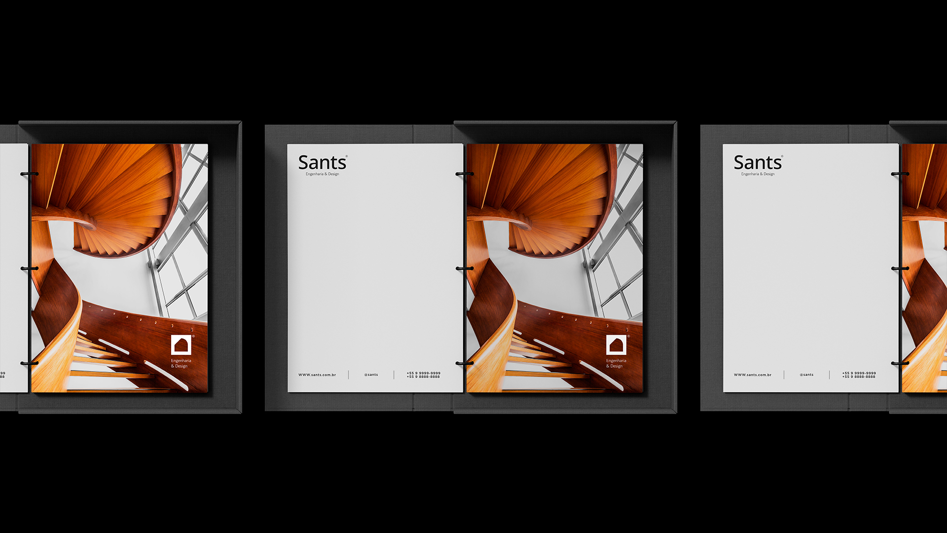
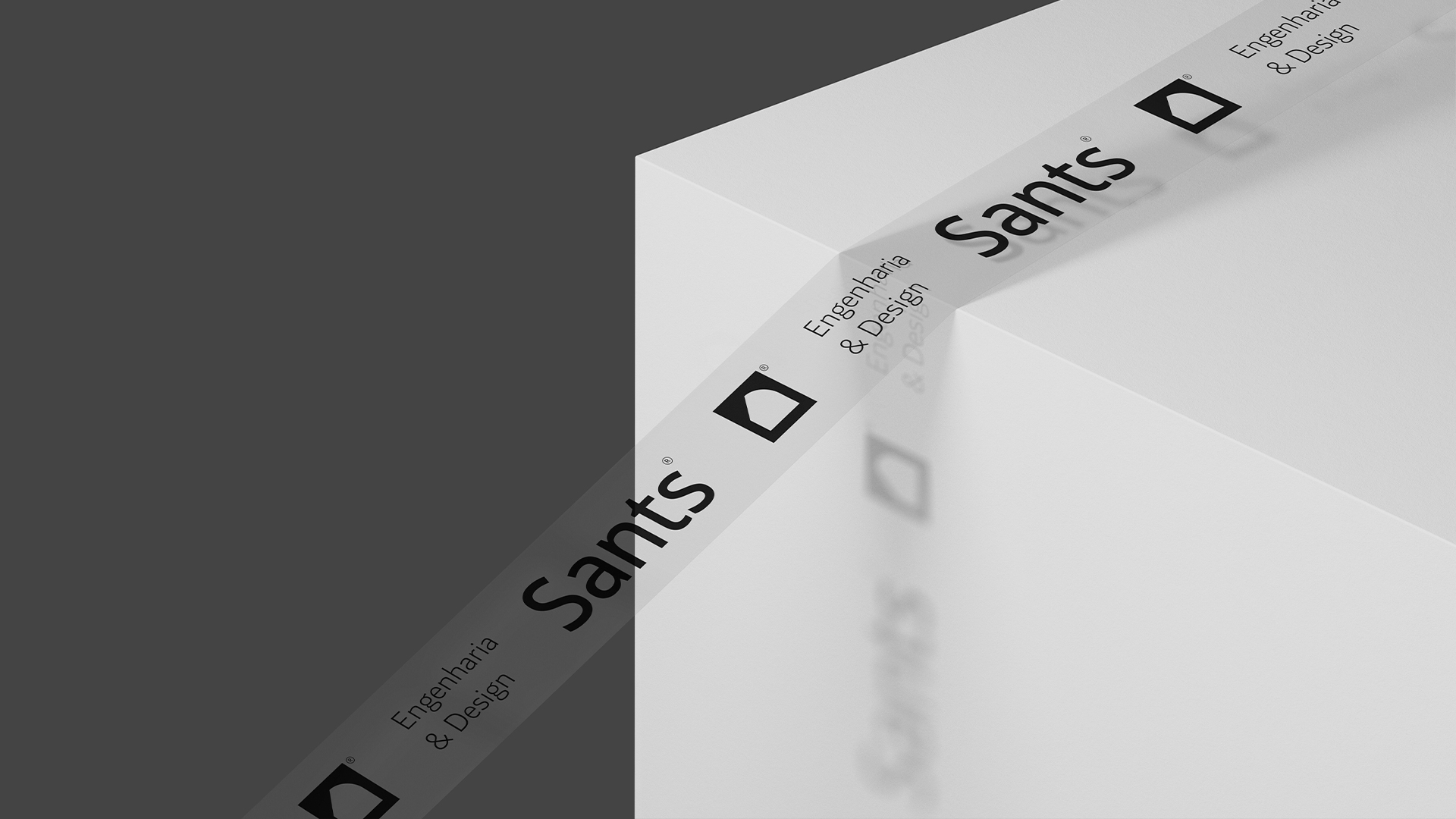
The symbol was made using the gestalt technique, alluding to the two main inspirations: door and window of a floor plan project.
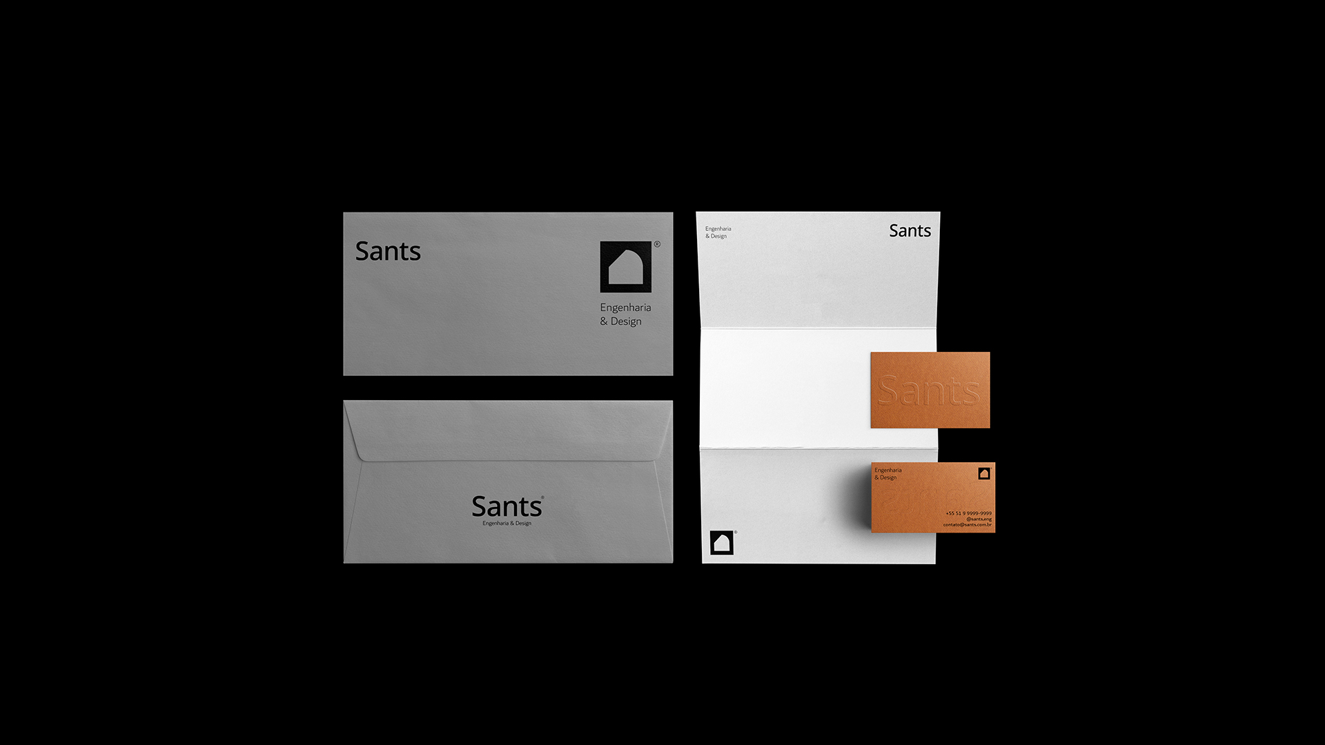
The logo is based on a modular grid that not only contributes to the application of the brand, but also for all visual identity interactions. The concept explores several possibilities of application and design on panels or posters, always reinforcing the meaning.
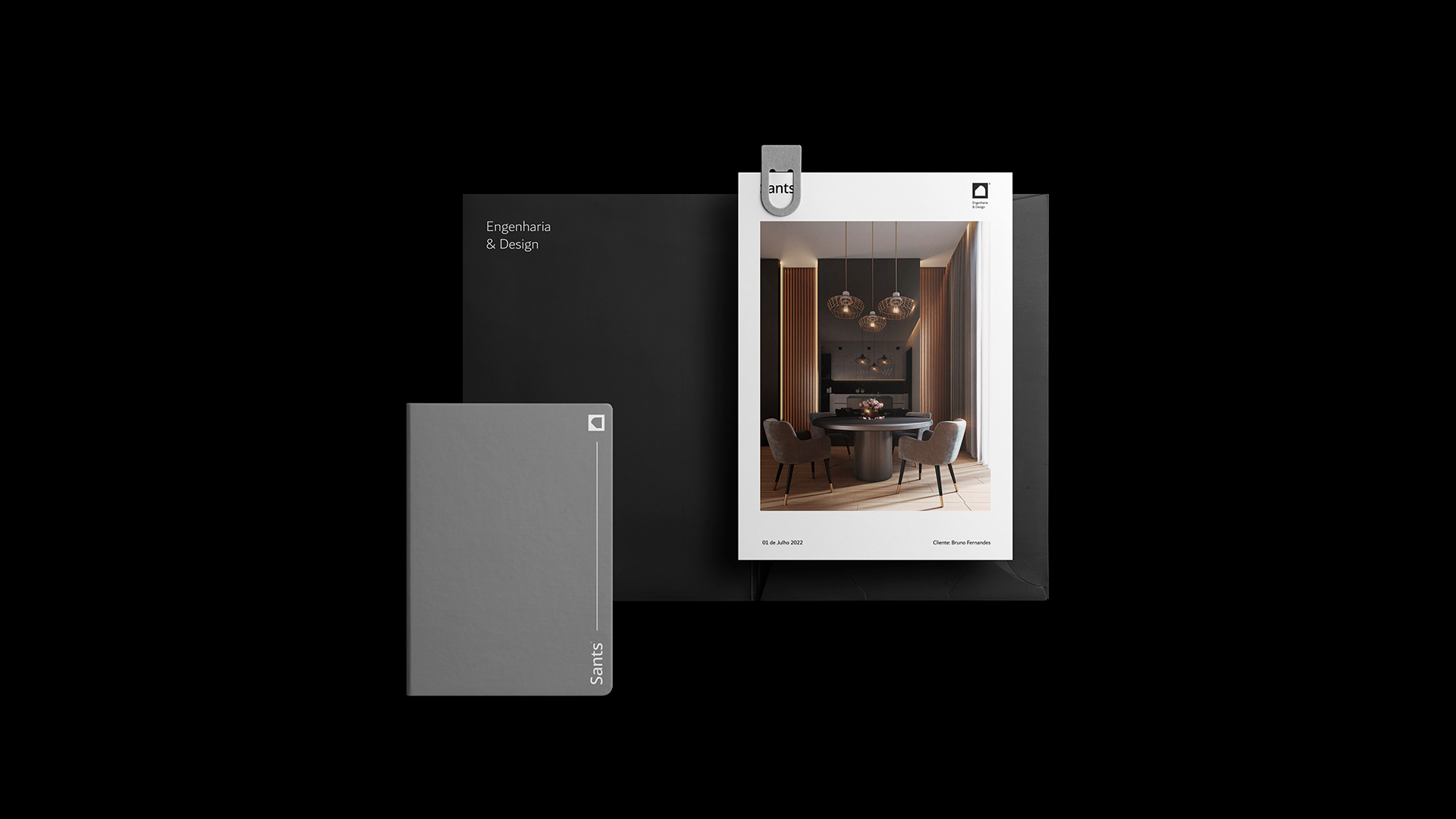
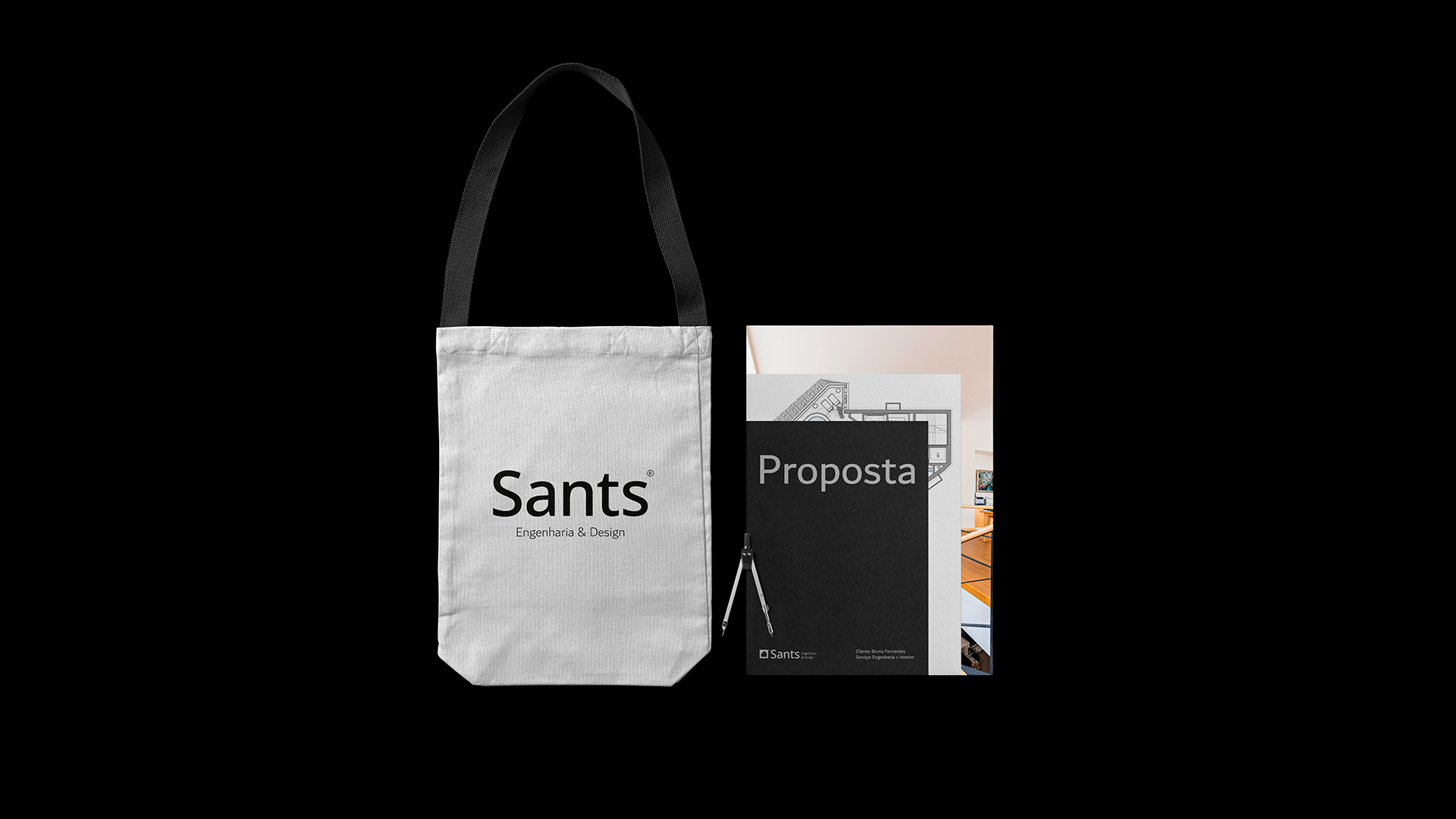
It is these applications in different types of materials or textures that enhance the beauty of the entire Communication.
Creativity is a characteristic that this project essentially explores, It uses shades of gray – light and dark – for its main purpose, and Kraft highlights the project.
These colors reinforce the credibility and confidence of the work, achieving a perfect balance. Sants believes that design plus engineering is a tool to transform and position companies to the next level. In essence, this is what Sants is.

CREDIT
- Agency/Creative: Bruno Fernandes
- Article Title: Sants Brand Design
- Organisation/Entity: Freelance
- Project Type: Identity
- Project Status: Published
- Agency/Creative Country: Brazil
- Agency/Creative City: Porto Alegre
- Market Region: South America
- Project Deliverables: Brand Creation
- Industry: Construction
- Keywords: architecture, brand identity, Civil Engineering, Construction Civil, interior design
-
Credits:
Art Director: Bruno fernandes alexandre


