


Paolo De Angelis – Sans Serif Beer
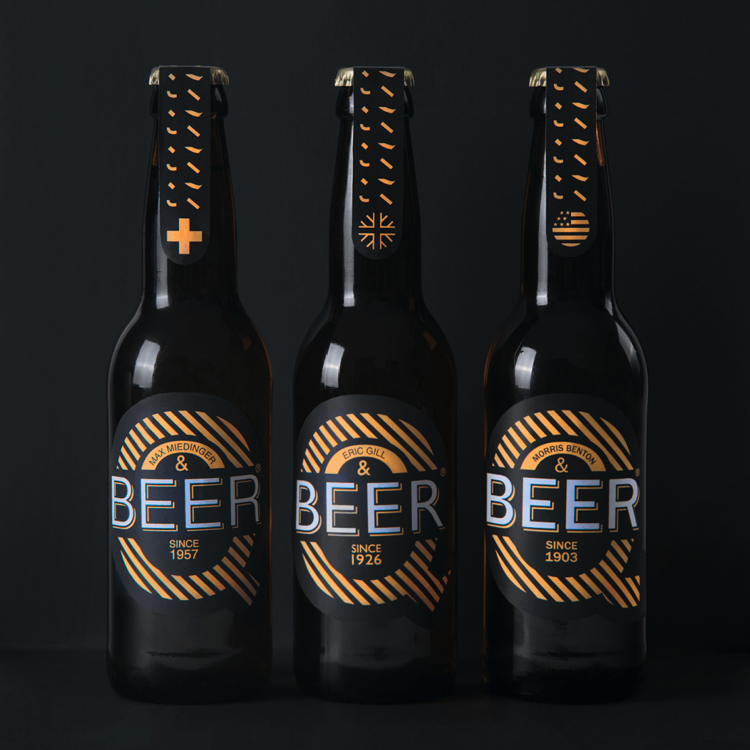
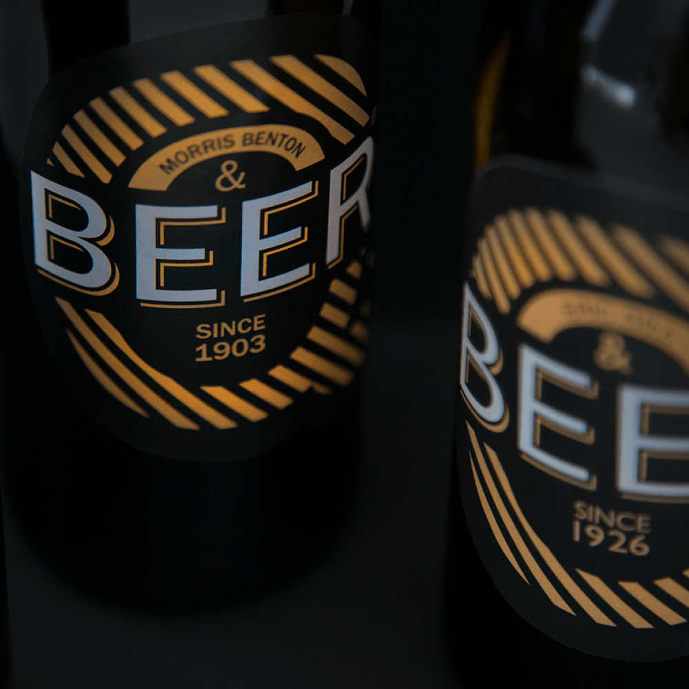
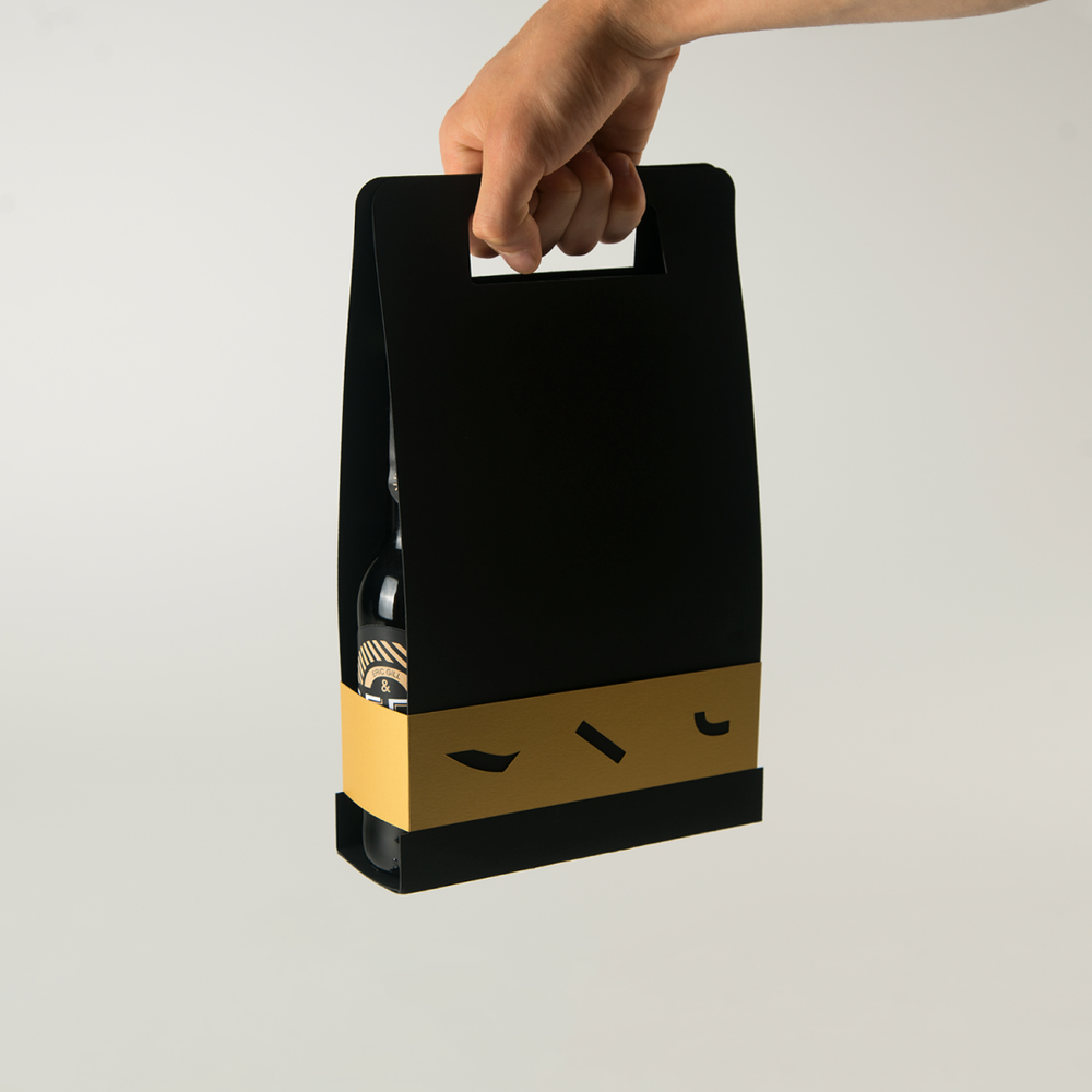
The project was born as a tribute to type designers. Starting from some sans serif characters and analyzing the respective designers, a line of beer labels has been created whose visual is set on the difference of the letter Q (especially the tail of the Q) of the various characters. Subsequently, a packaging was created whose gold closing band also shows the reason for the tails of the Q.


CREDIT
- Agency/Creative: Paolo De Angelis
- Article Title: Sans Serif Beer Logo and Packaging Design
- Organisation/Entity: Student Commercial, Published
- Project Type: Packaging
- Agency/Creative Country: Italy
- Market Region: Europe
- Format: Bottle
- Substrate: Glass
FEEDBACK
Relevance: Solution/idea in relation to brand, product or service
Implementation: Attention, detailing and finishing of final solution
Presentation: Text, visualisation and quality of the presentation


