


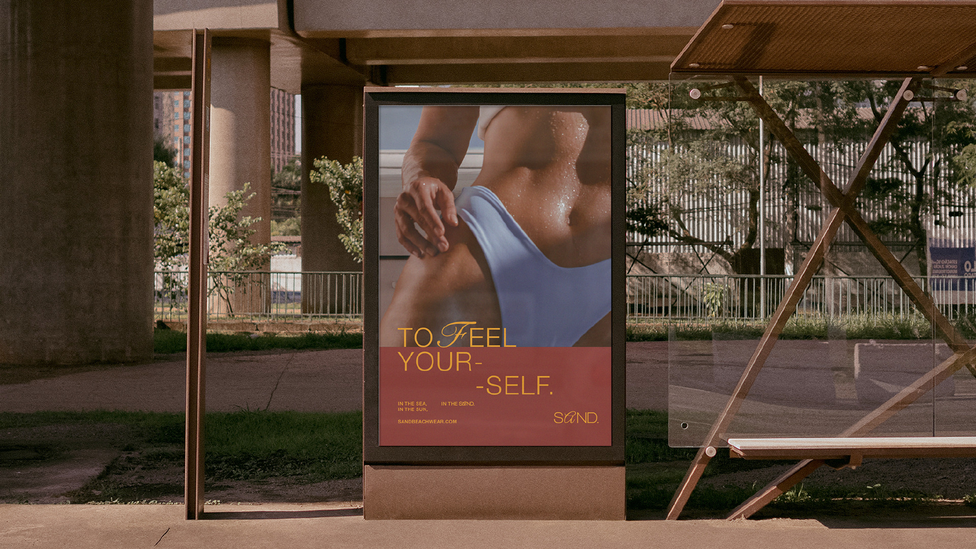
SAND. is a bikini and swimwear brand that comes in a wide range of sizes and shapes, made to embrace the bodies of those who wear them. With a store and production in Búzios, Rio de Janeiro, the brand’s products are created with light and resistant fabrics, ready to withstand the intense heat on the Brazilian coast.
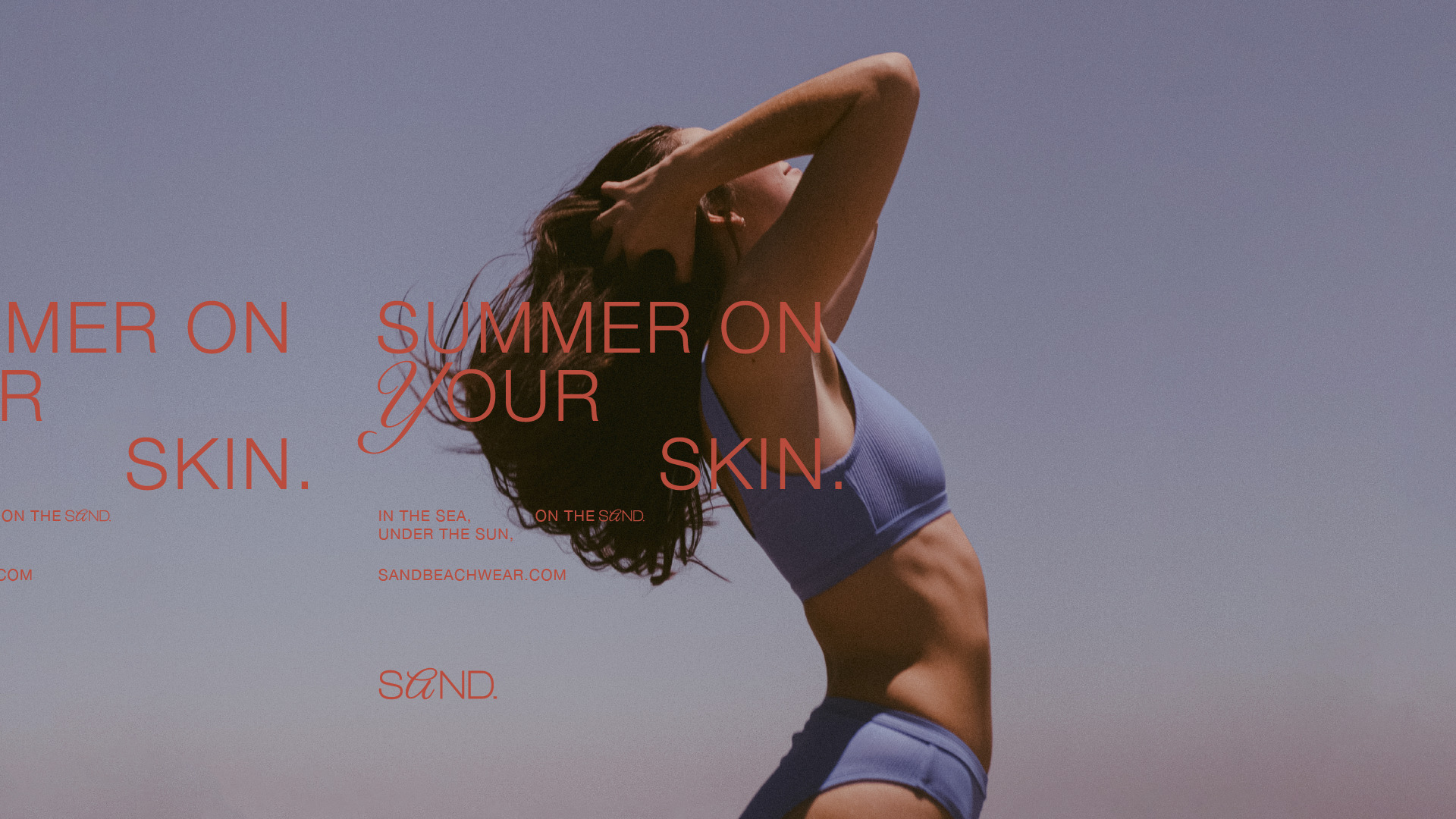
How to translate Brazilian beaches and products created to be used especially on them? What is between people and the sea? What unites the intense heat, the crystal-clear salt water and the wind that refreshes those who dare to take a dip or those “just looking to get a little bit of sun”?! The sand! The one that hugs the feet of those who go for a run, or sits on a chair under an umbrella and even comes out wet after a swim in the sea.
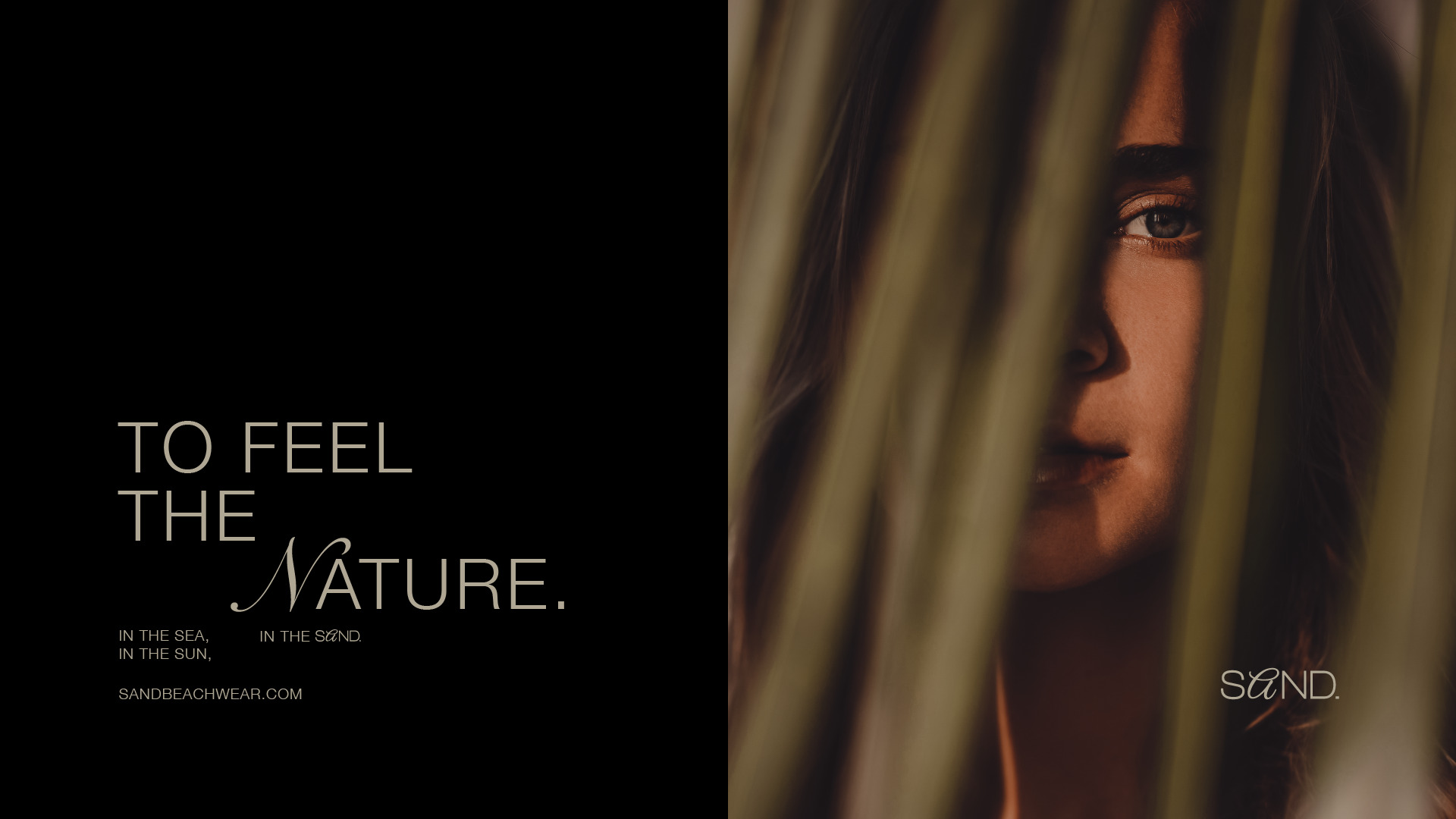
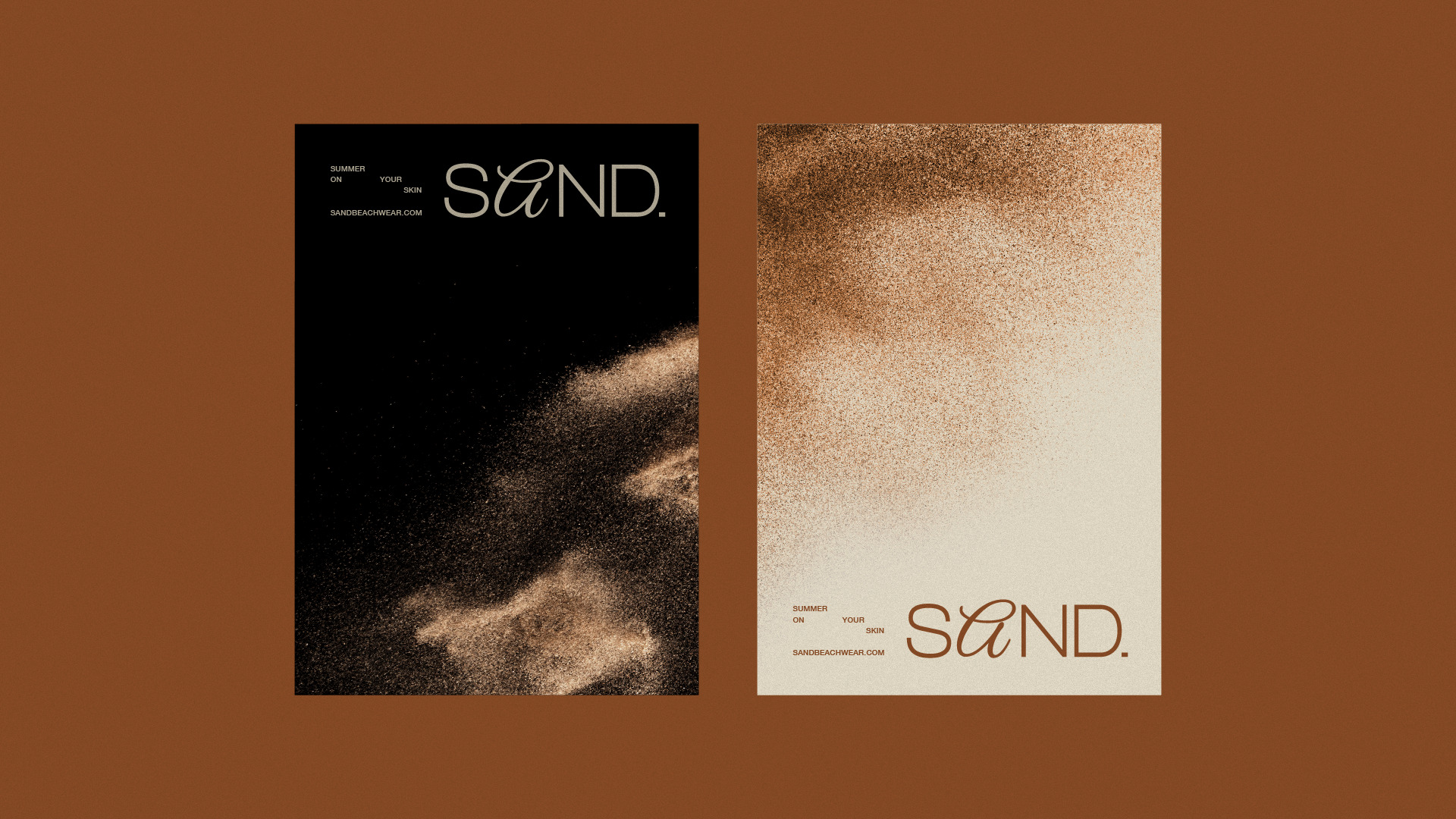
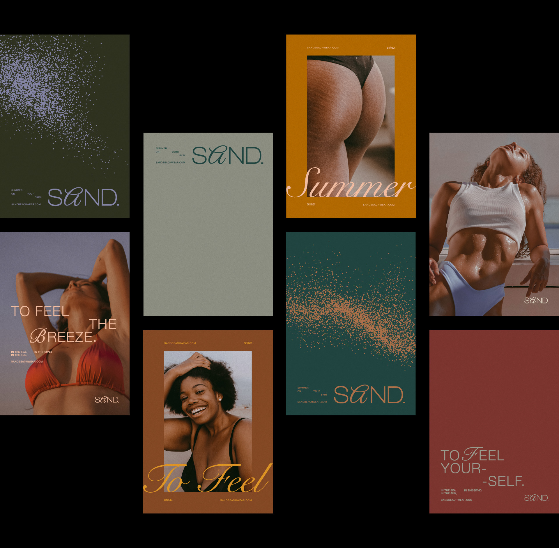
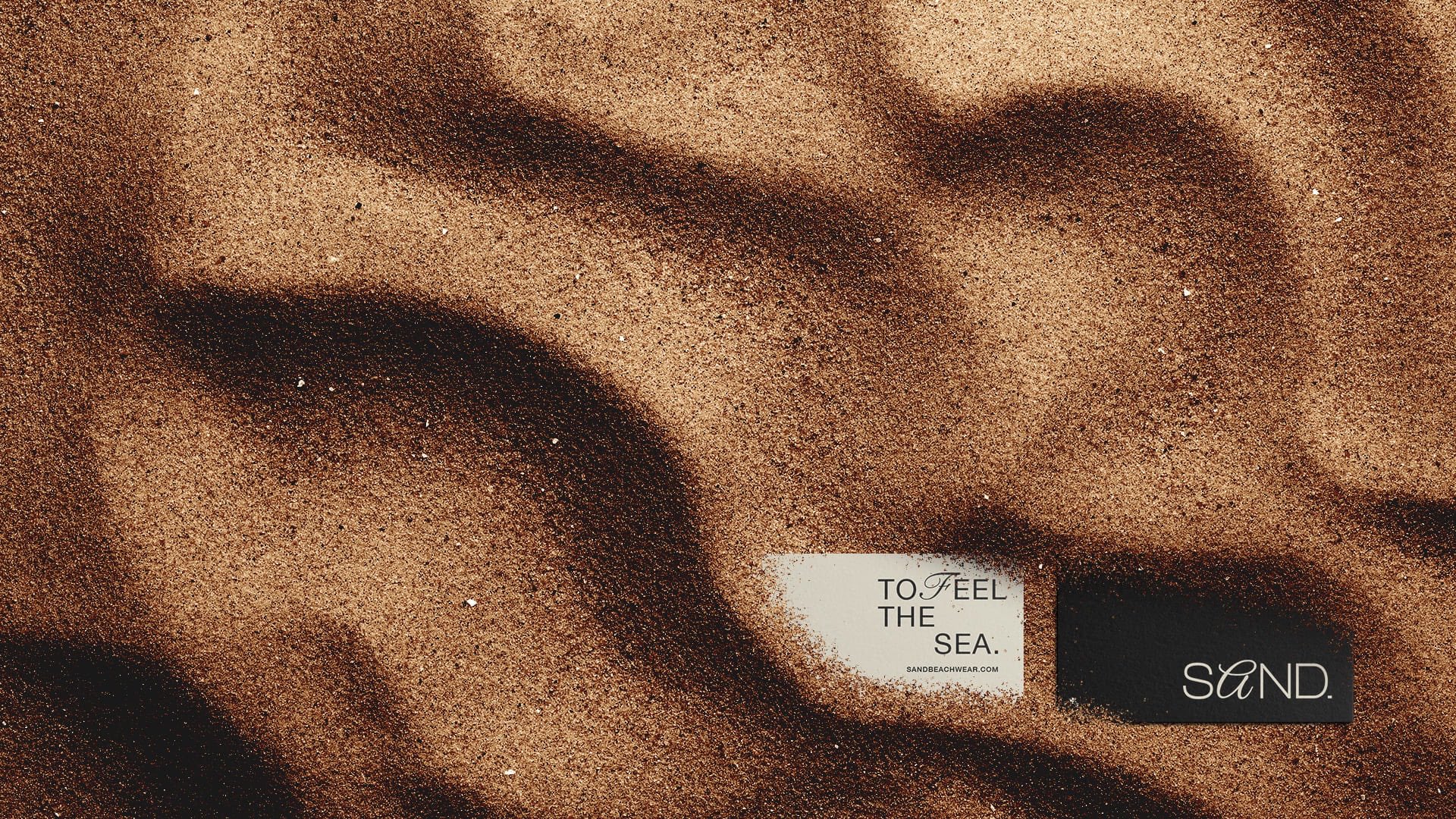
It was based on the sands of Brazilian beaches that SAND was born., and all its visual identity that communicates and values: diversity, calm, restlessness and sensations.
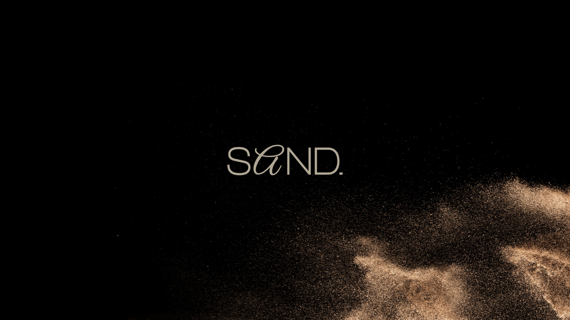
We chose to develop a logo to represent SAND. graphically by the versatility and presented possibilities that a logo made only by typography gives to the brand. The concept behind it follows the idea of representing the diversity and uniqueness of Brazilian bodies, and that’s why the logo is built using two typographies, one dominant and another that becomes a kind of “non-standard”. For this, a traditional sans serif typography and a cursive font were used, which is used not only in the logo, but also in the titles of institutional texts.
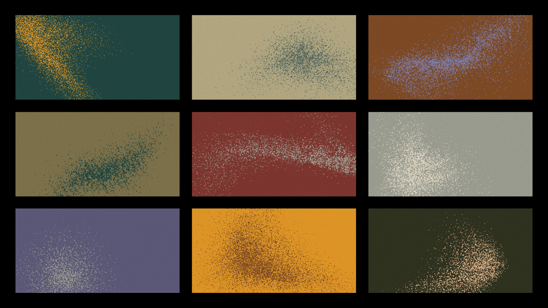
The color palette created for the brand follows the same concept applied in the creation of the logo, that is, we have a palette that has multiple colors, with tones and undertones that, precisely because of its plurality, creates the possibility of exploration through countless combinations between such colors for possible new collections, campaigns, etc., for example.
The visual identity created to embrace the logo and color palette is more literal. For this, textures of sand grains were created in applications with a flat bottom, in order to be used as elements of identity and expression, since there are different forms and sizes of grouping of these “grains”. The idea through these textures is to transmit the sensations of lightness, calmness, warmth and freshness, peace, etc.
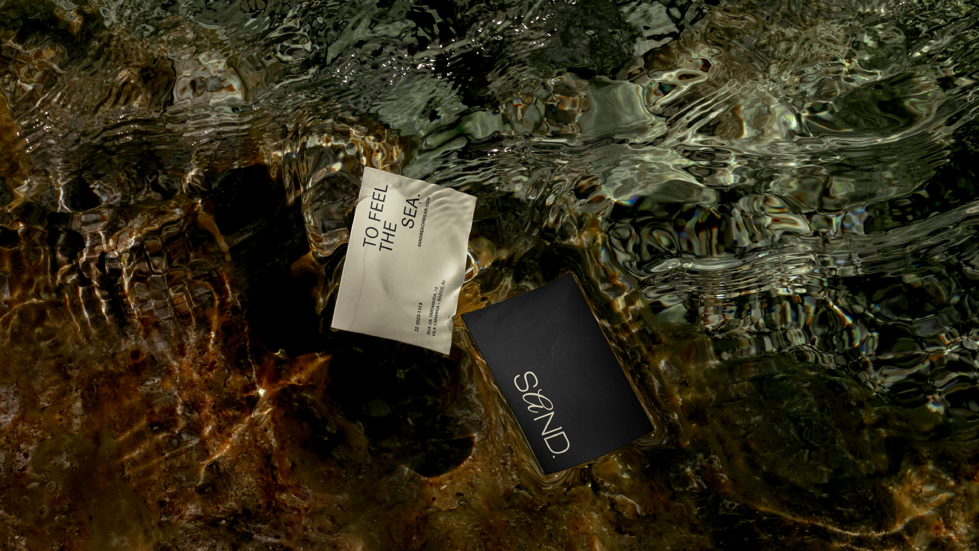
The result is a unique and extremely versatile visual identity, plural, made to communicate and represent the countless types of Brazilian bodies with their colors, textures and sizes, so that each graphic piece is unique, and that each product worn also makes the even more unique people, each with their own characteristics.

CREDIT
- Agency/Creative: Matheus Ferreira & Co.
- Article Title: Sand Visual Identity by Matheus Ferreira & Co.
- Organisation/Entity: Agency
- Project Type: Identity
- Project Status: Published
- Agency/Creative Country: Brazil
- Agency/Creative City: Lençóis Paulista
- Market Region: South America
- Project Deliverables: Art Direction, Brand Design, Brand Identity
- Industry: Fashion
- Keywords: Logo Design, Beach, Swimwear, Swim, Houses, Brand, Brand Identity, Visual Identity, Brand Design
-
Credits:
Art Director: Matheus Ferreira


