


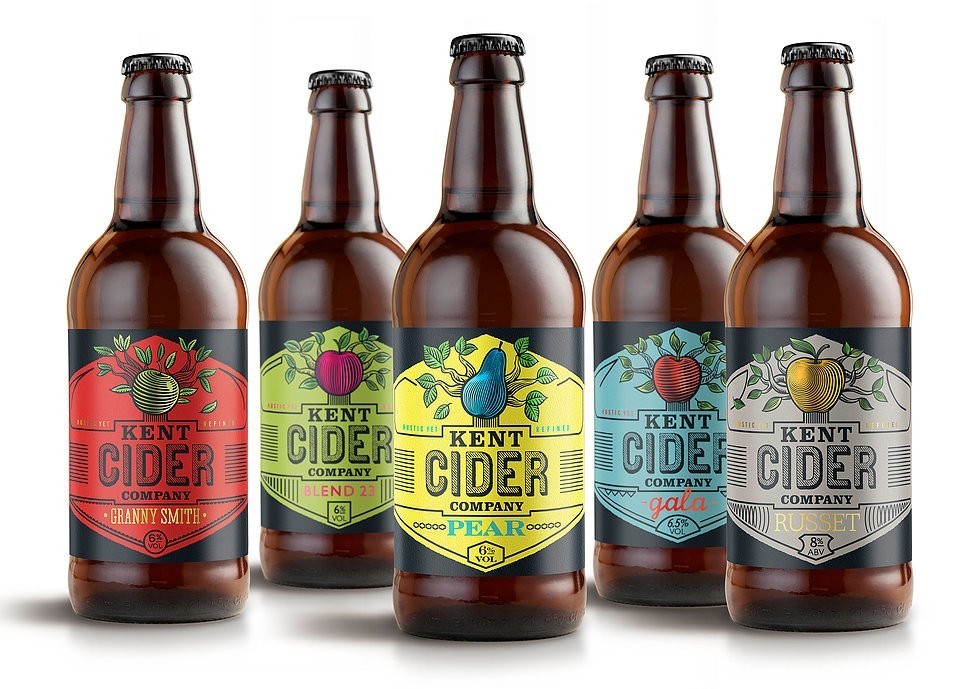
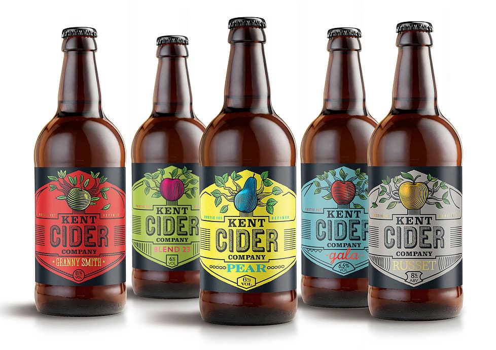
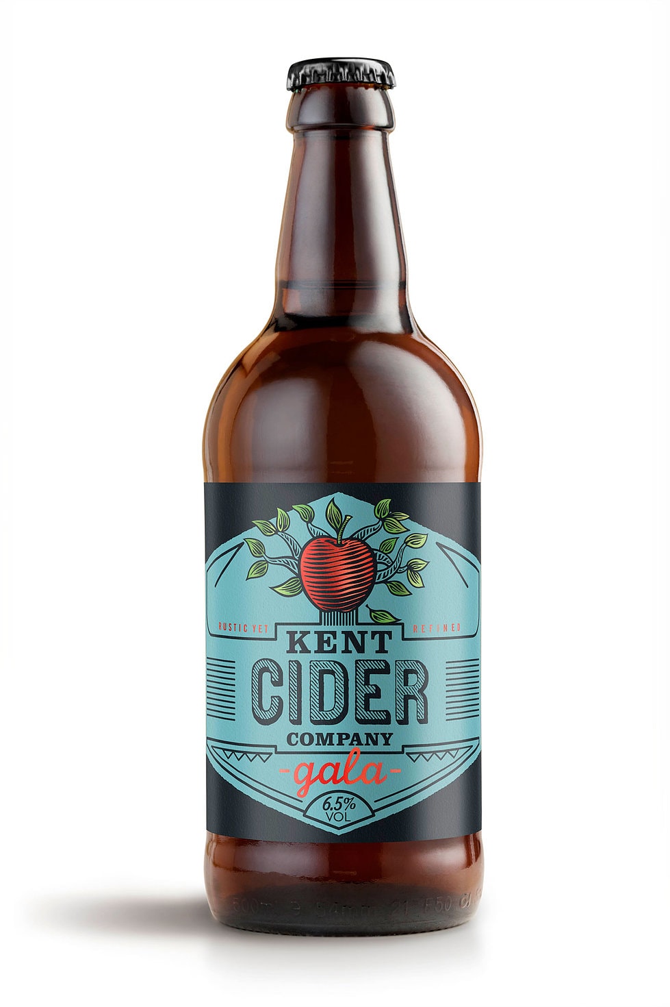
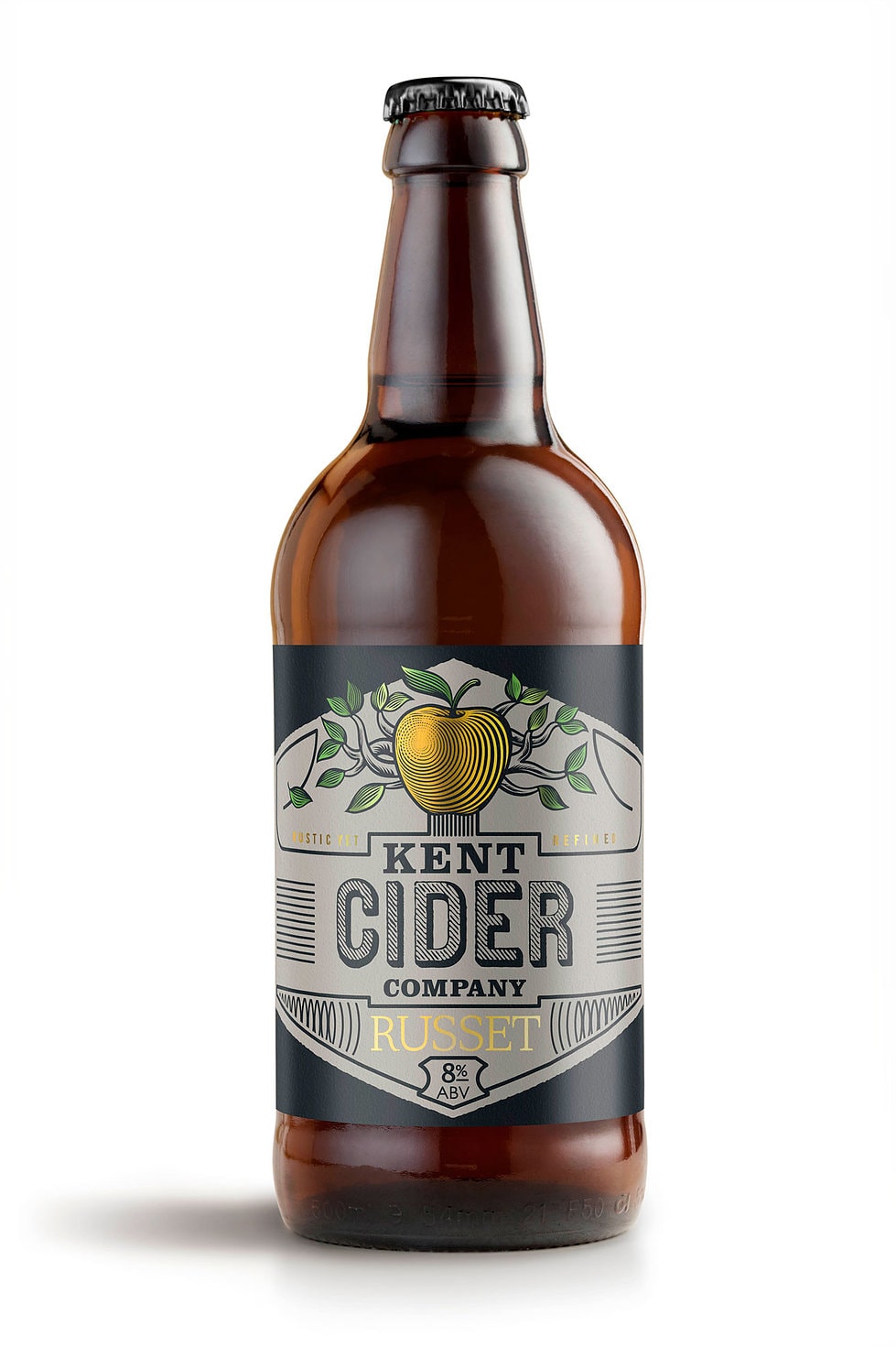
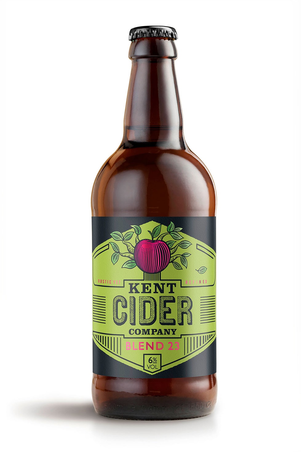
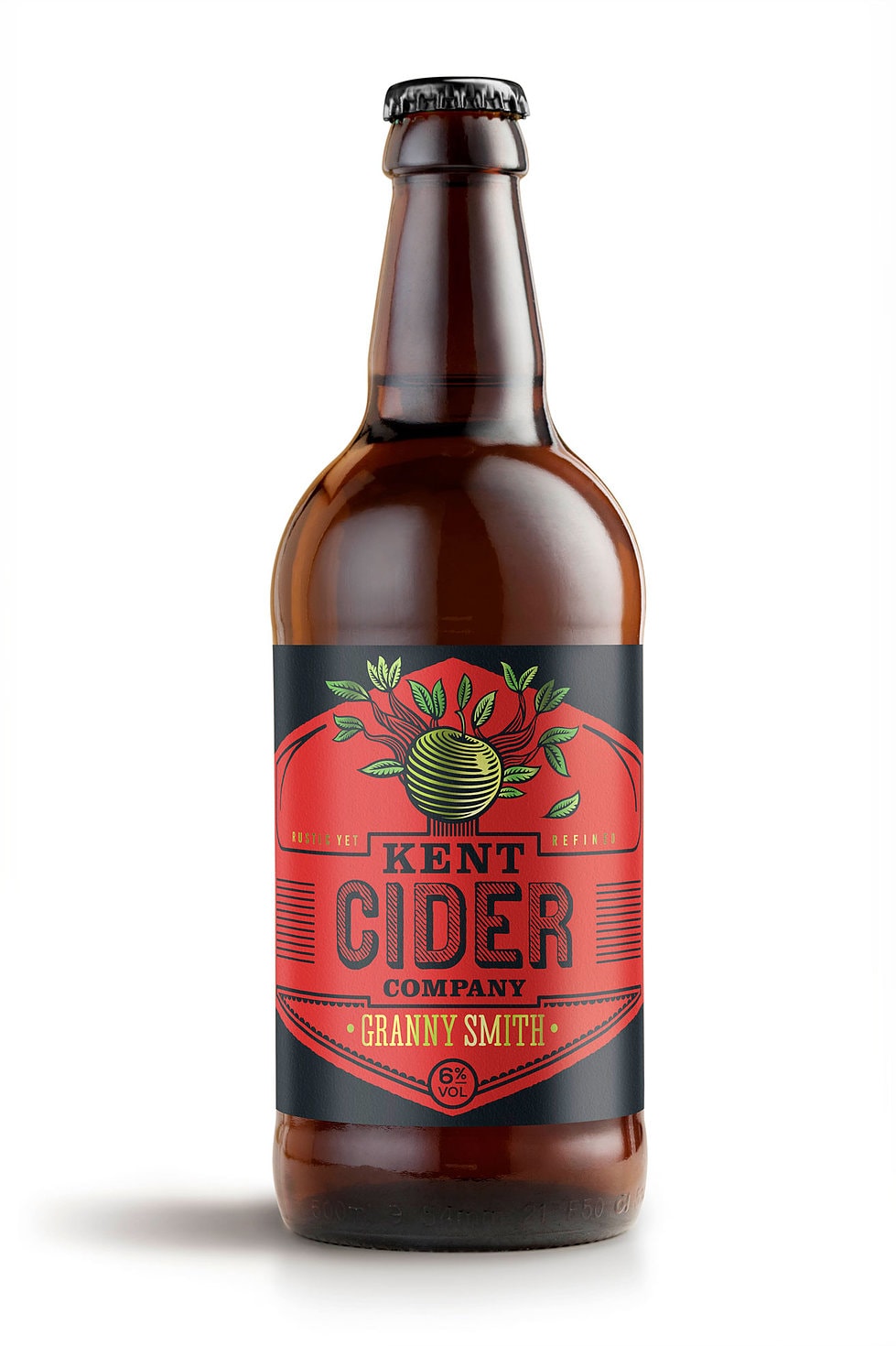
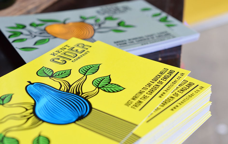
“The Kent Cider Company is proud of its traditional methods of production, but its outlook is more contemporary than most Cider brands. The redesign reflects this while giving it a more vibrant and upbeat personality.”
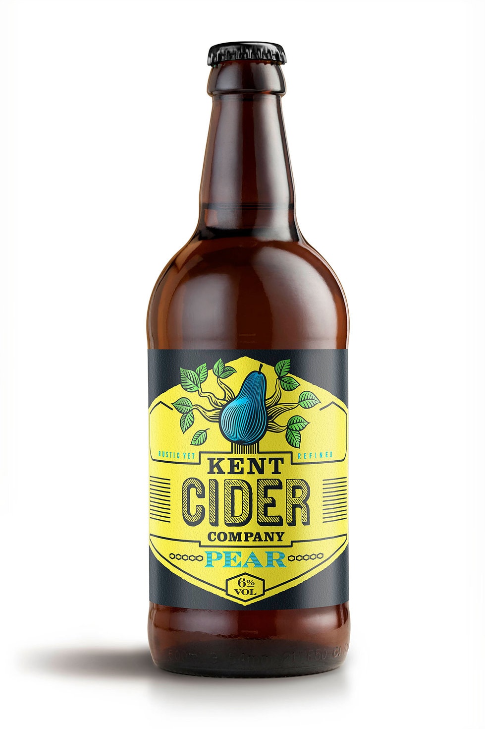
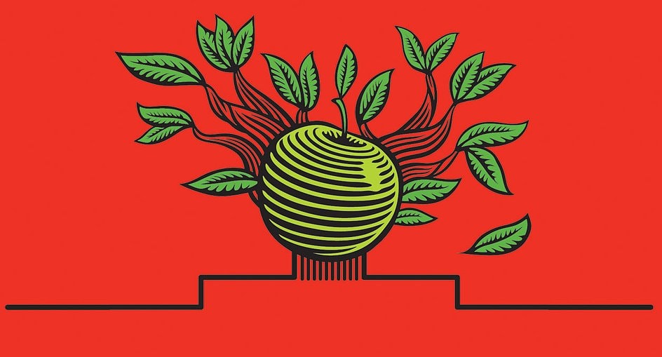
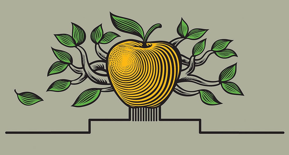
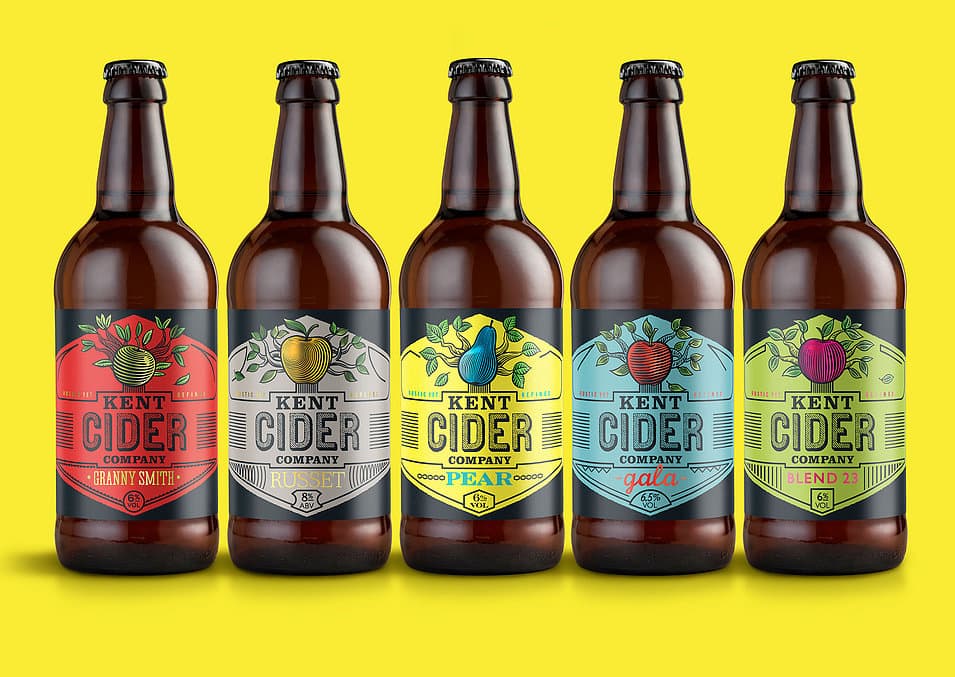
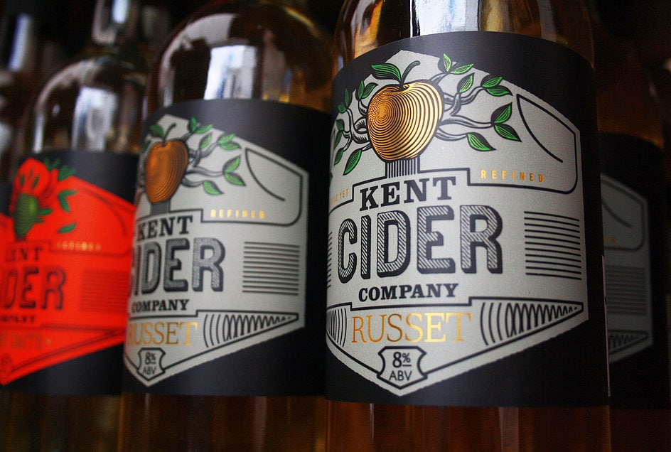
“Navigation was difficult with the previous design so each variant was made more distinctive, starting with its own stylised tree, each bearing one huge fruit to communicate the single variety used in production. All the information below is held within its roots.
A hexagonal shape, inspired by the corners of apple crates, was also introduced to create a more distinctive badge, to which bold vibrant colours were added.
The detail continues to the bottom of each label. The Russet variant for example is also known as ‘old leather coat’ due to its rough skin. This is reflected in the illustration and the supporting graphic elements, such as the Alcohol volume holding shape which is also the sign for leather.”


CREDIT
- Agency/Creative: Sand Creative
- Article Title: Sand Creative – Kent Cider Company
- Project Type: Packaging


