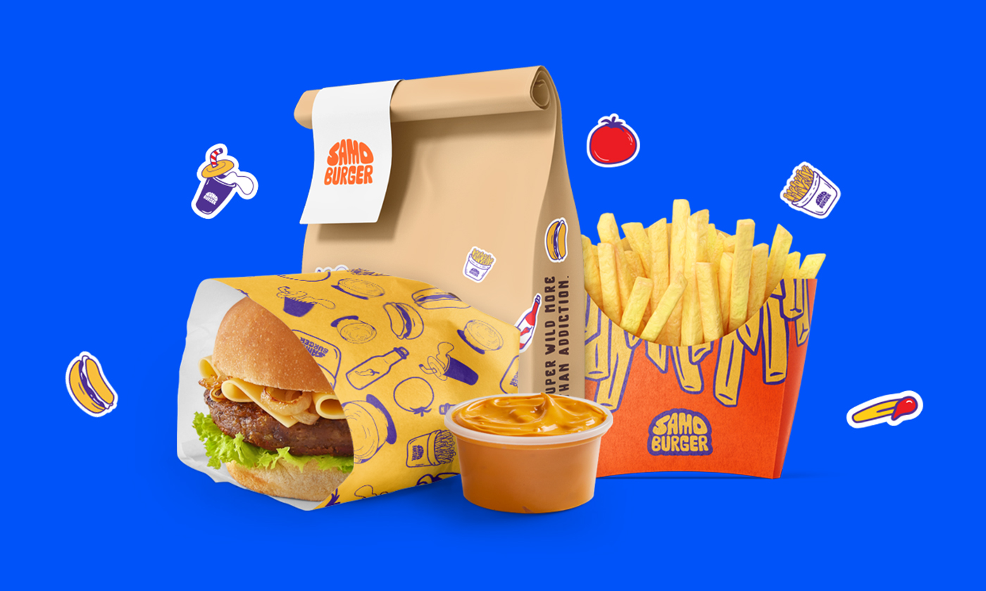
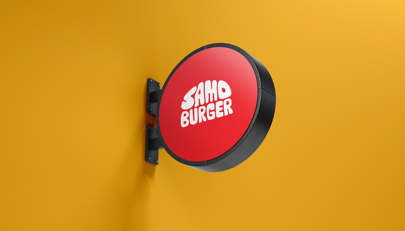
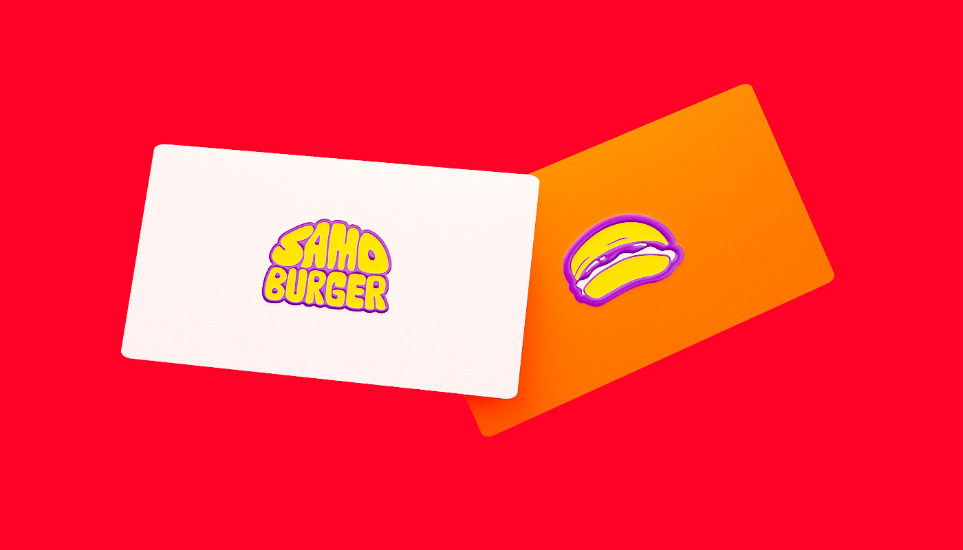
The brand identity is simply based on The Shape of the huge burger that is not perfect with some zigzags and free line so that it shows The Shape of the burger and the cheese on it and sold a state of hunger. The visual identity brings an urban and handmade brand, with Non-straight forms shapes present in the symbols and logotype.
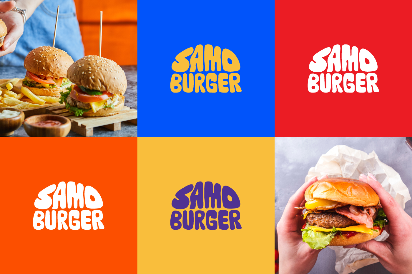
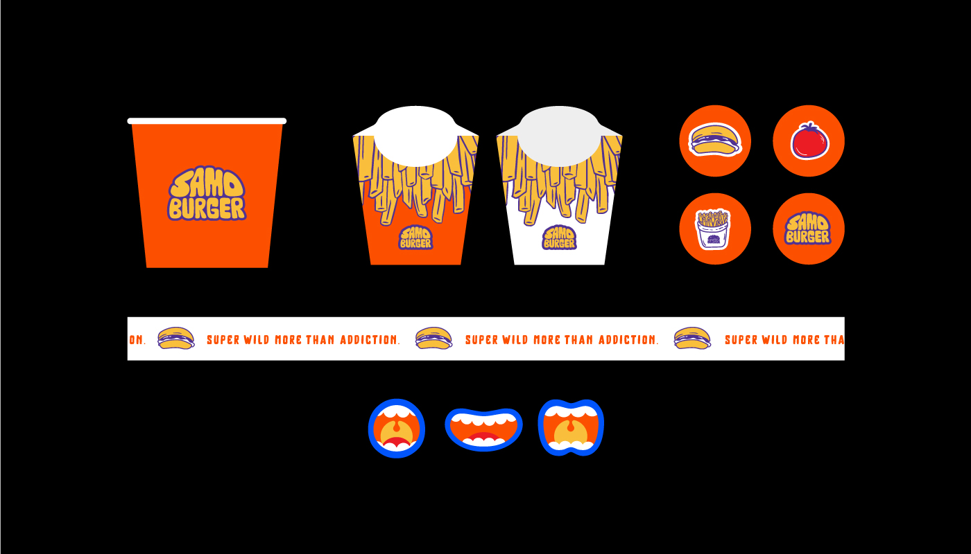
The colours are designed based on the spirit of hunger as well, and this is represented by red, orange and yellow, with the presence of colours creating a kind of contrast. The colours bring solid characteristics to the brand. The red colour refers to the processes with the fire and arouses hunger and desire to eat, which is fundamental to accentuating the restaurant’s flavour. Yellow refers to emanating warmth, joy, happiness and optimism. Blue refers to “together” with the colours mentioned above; it brings back the memories of the 50s and 60s, which also served as inspiration for creating the entire visual identity. It also conveys confidence.
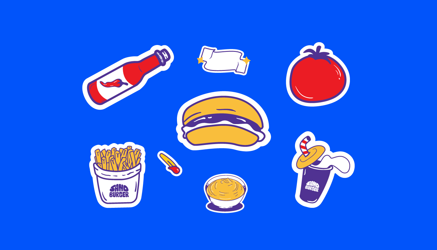
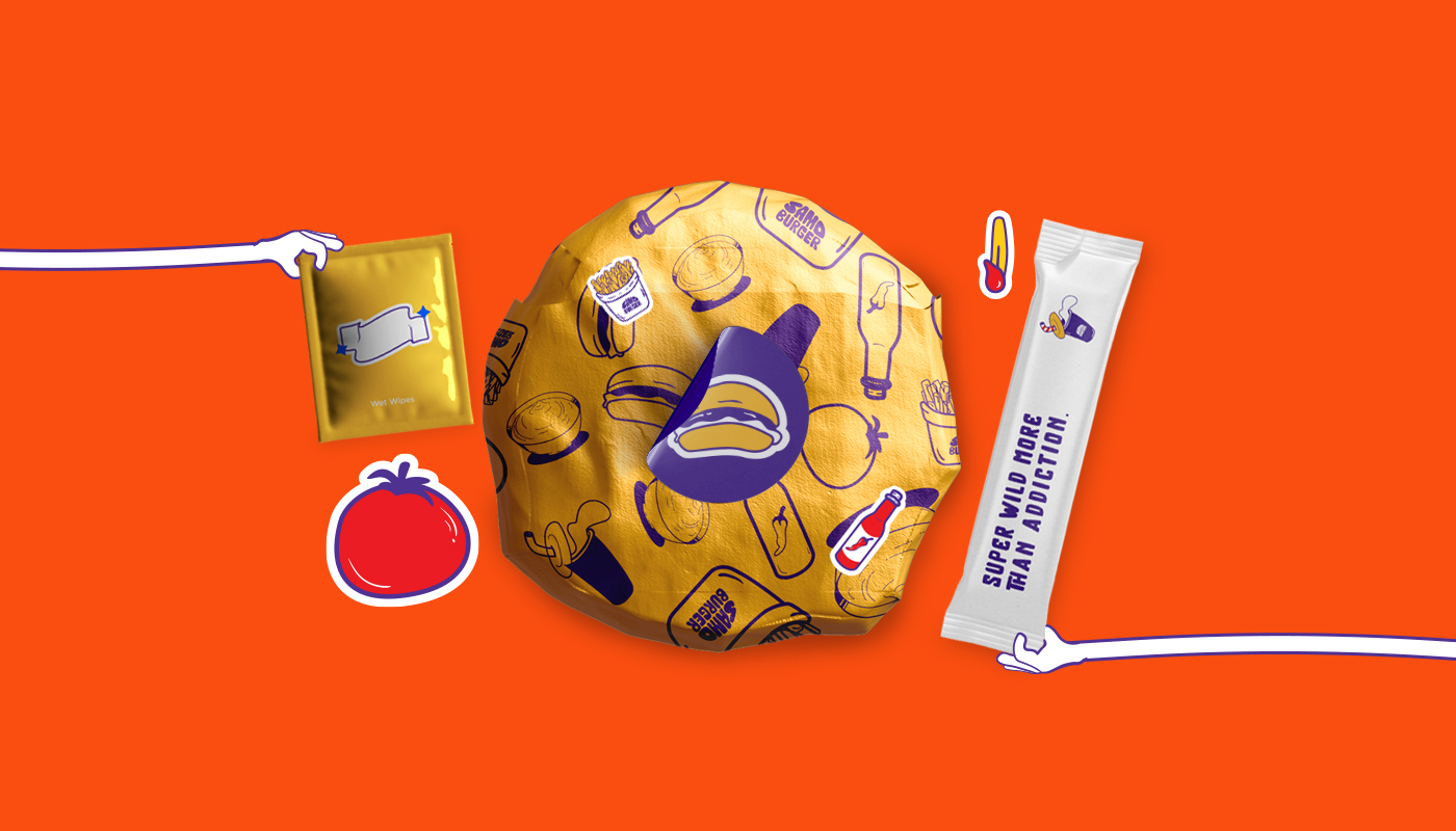
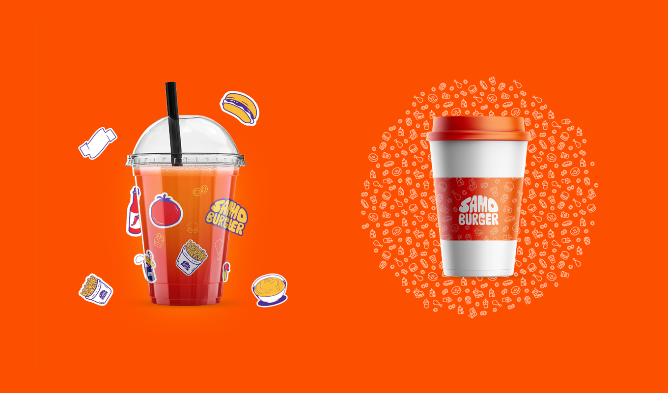
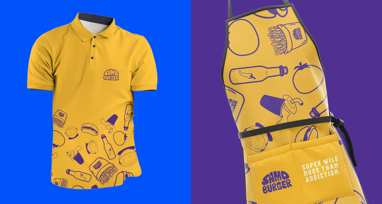
The graphics and illustrations are based on free line style and solid colours. We have designed some drawings as stickers used on paper products and others and can also be used in other things such as phone cases and cars, which makes the place a unique identity to be present with others and their pleasure.
Identity relies more heavily on illustrations and colours than photographed photos. This gives freedom to designers later to design and draws strange shapes characterized by hunger, which distinguishes the restaurant from what is around it.
CREDIT
- Agency/Creative: HazemMahdy
- Article Title: Samo Burger Brand Identity
- Organisation/Entity: Freelance
- Project Type: Identity
- Project Status: Published
- Agency/Creative Country: Egypt
- Agency/Creative City: Tanta
- Market Region: Middle East, Global
- Project Deliverables: 2D Design, Animation, Brand Design, Brand Identity, GIF Animation, Logo Design
- Industry: Food/Beverage
- Keywords: Burger, Brand identity, food, eat
-
Credits:
Art Director: Hazem Mahdy


