Auge Design – Sammontana UAU!
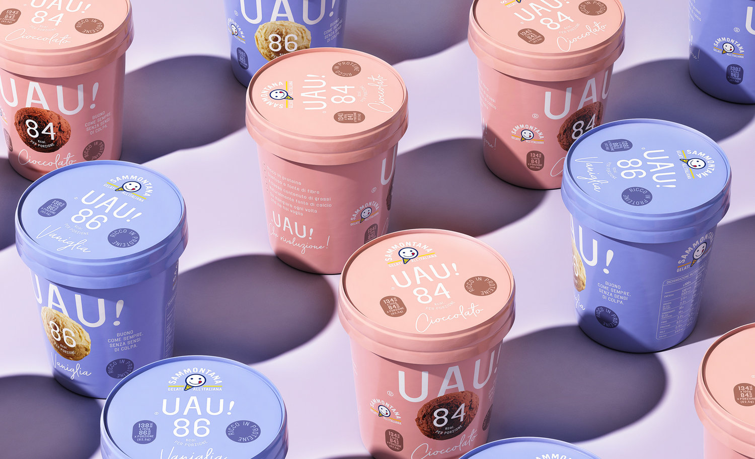
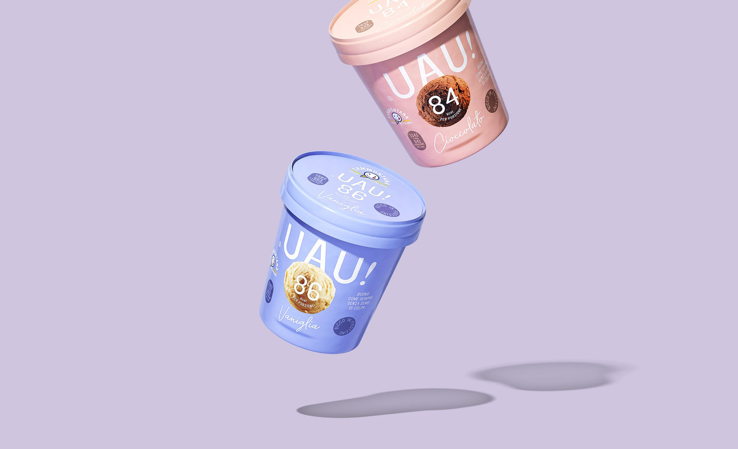
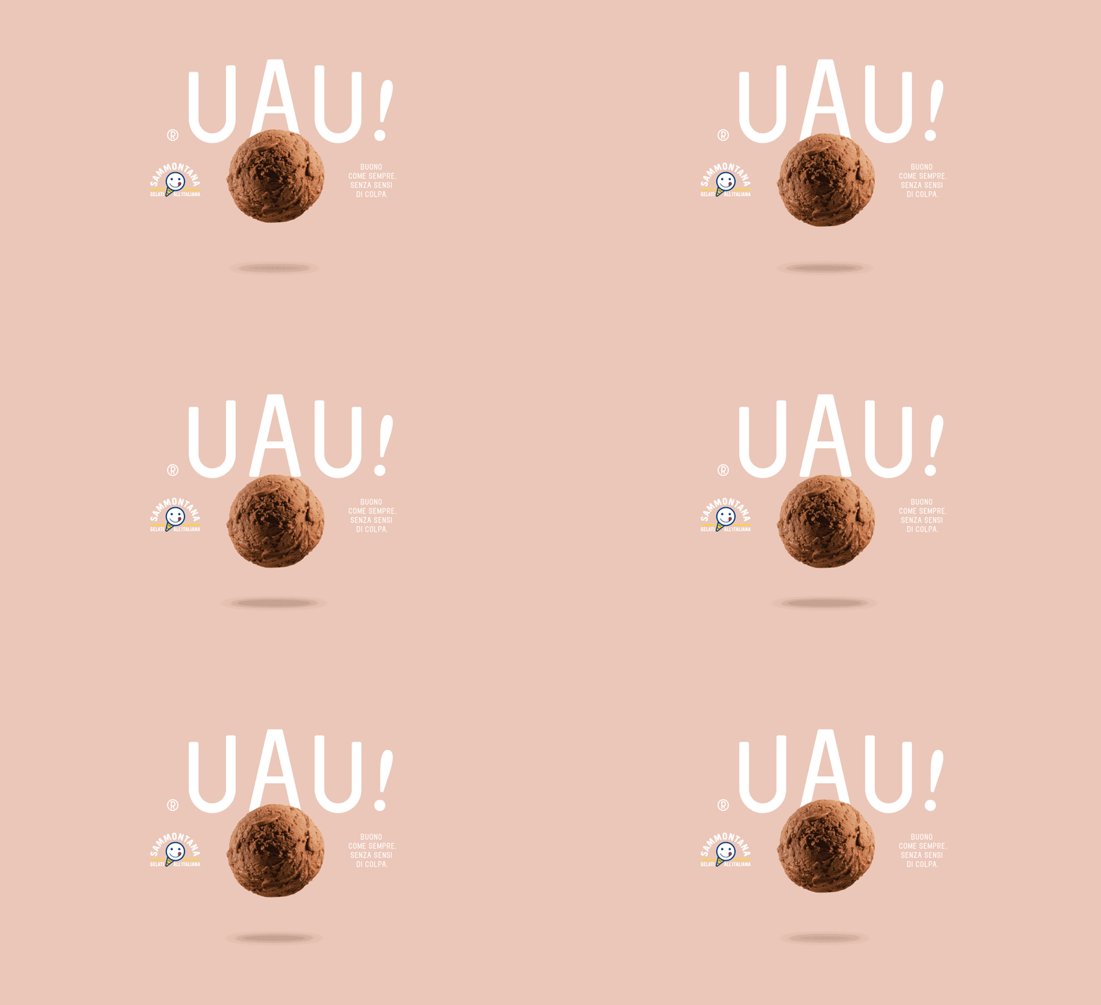
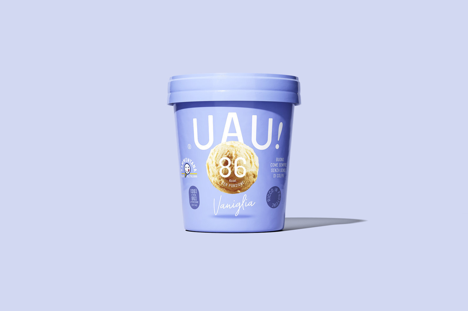
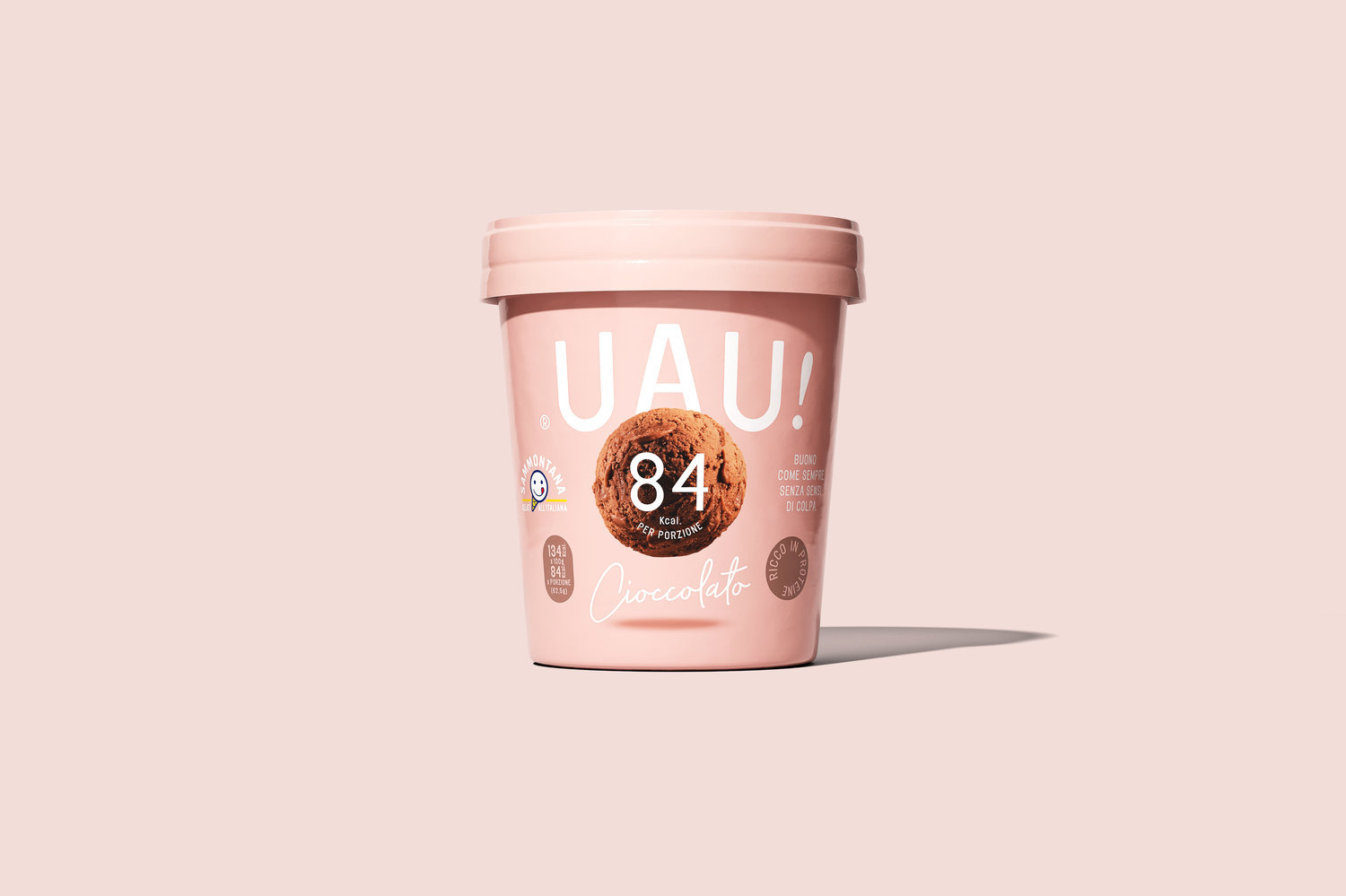
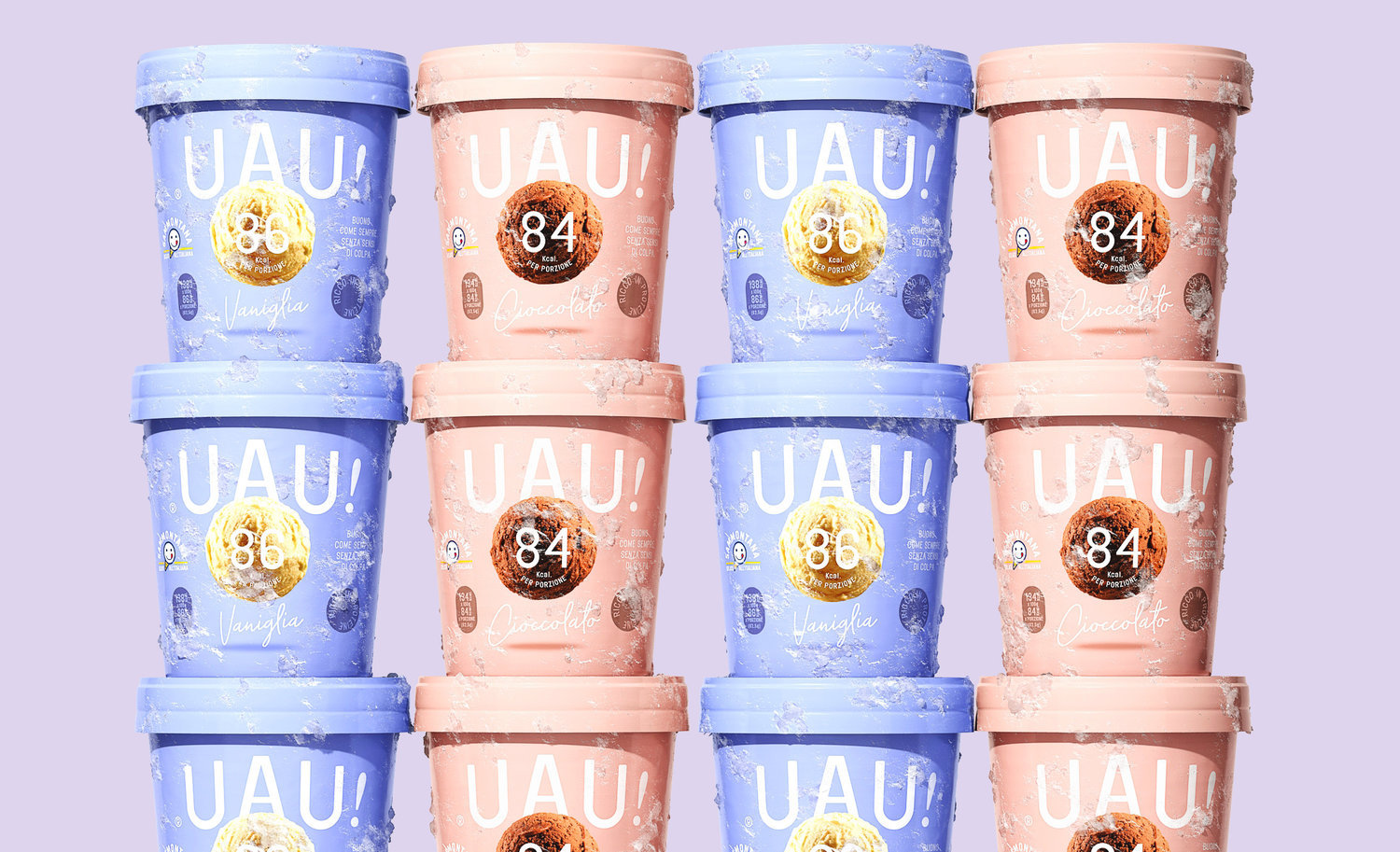
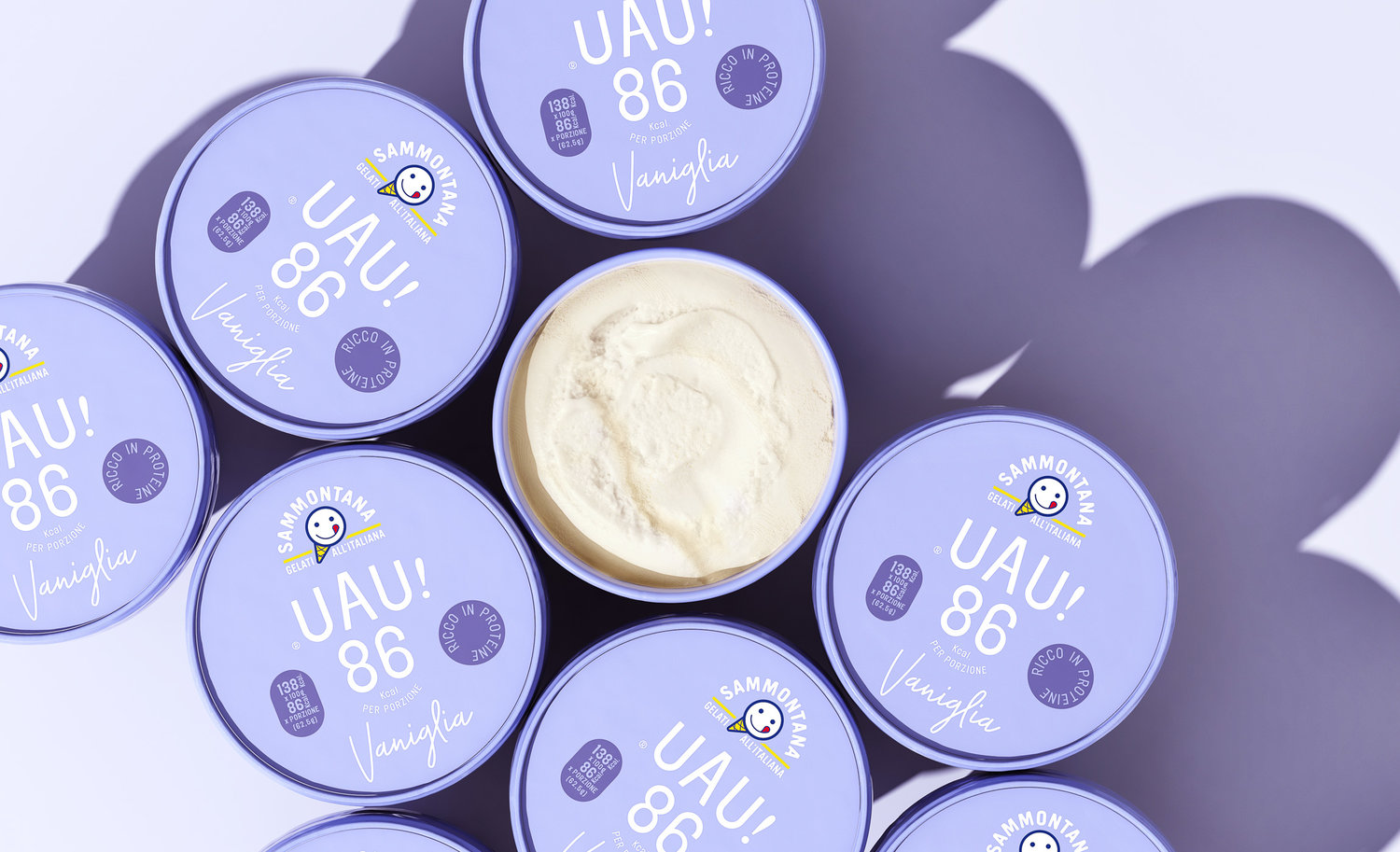
We gave birth to a whole product identity through the creation of naming, the logo design, the shooting art direction and finally the packaging design of this new creation by Sammontana: UAU! An ice-cream with a high-protein and low-calories recipe, tasty as always but lighter than ever.A levitating ice-cream ball visual narrates the lightness of the product in a self-explaining manner, while a white and pure typography plays around the packaging, contrasting with the pastel colours of the backgrounds. Every element of the design reflects aspects of lightness and taste, from the chromatic choices to the light typographic approach.Lightness and taste of the product are exalted by the photographic art direction choices adopted in the packaging design development, while the sophisticated colour palette used conferred it a contemporary and international look.The playful approach of the naming is an unexpected communication choice in the Italian packaging scenario.
CREDIT
- Agency/Creative: Auge Design
- Article Title: Sammontana UAU!
- Organisation/Entity: Agency, Published Commercial Design
- Project Type: Packaging
- Agency/Creative Country: Italy
- Market Region: Europe
- Format: Cup
- Substrate: Pulp Carton


