The Samhian brand was produced in collaboration with returning clients Gravity Drinks. Gravity develops brands to appeal to a discerning consumer, whose intention is to curate a collection of high quality liquids. Premiumness is a key part of their purchase decision and the core of the brief was to develop a scotch whisky brand that balances traditional premium cues with an edge of the contemporary. The product is for export and distribution into Asian markets, primarily Taiwan, China, Hong Kong, and Macau. The client’s research showed that age statement and the feeling of being truly ‘Scottish’ is a major pull for the consumer.
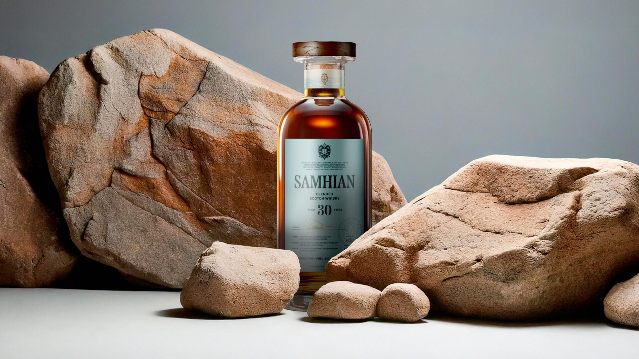
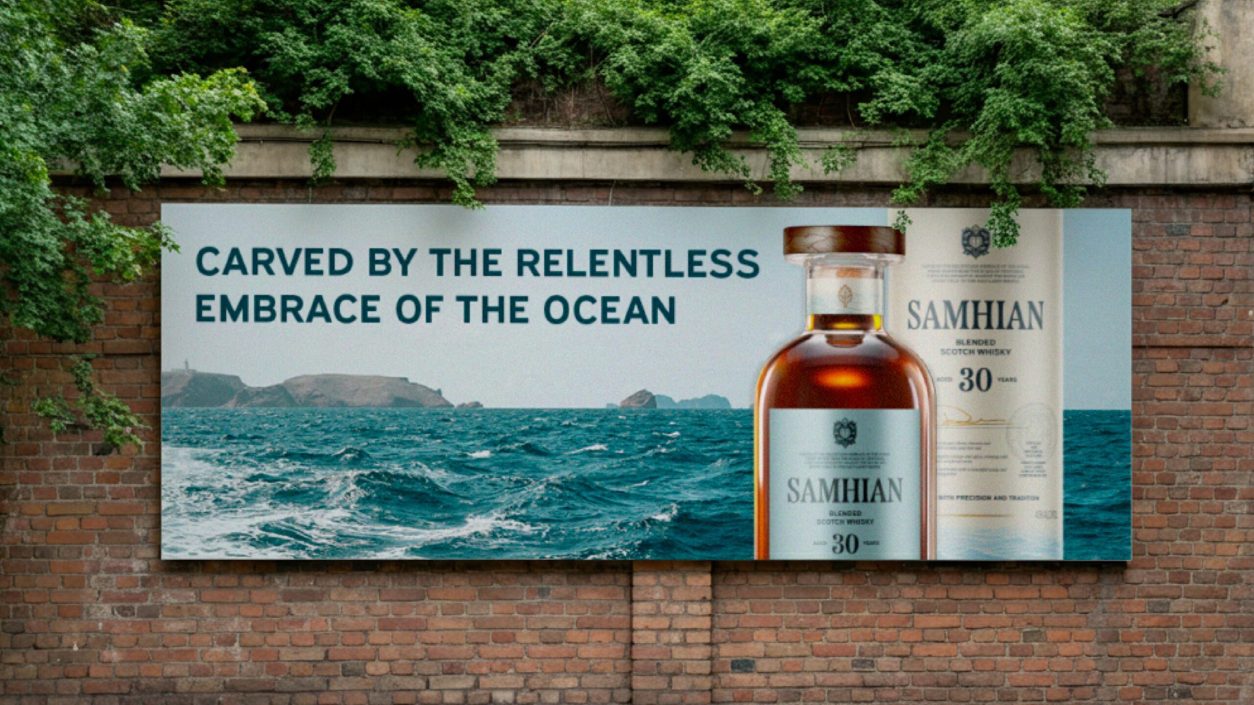
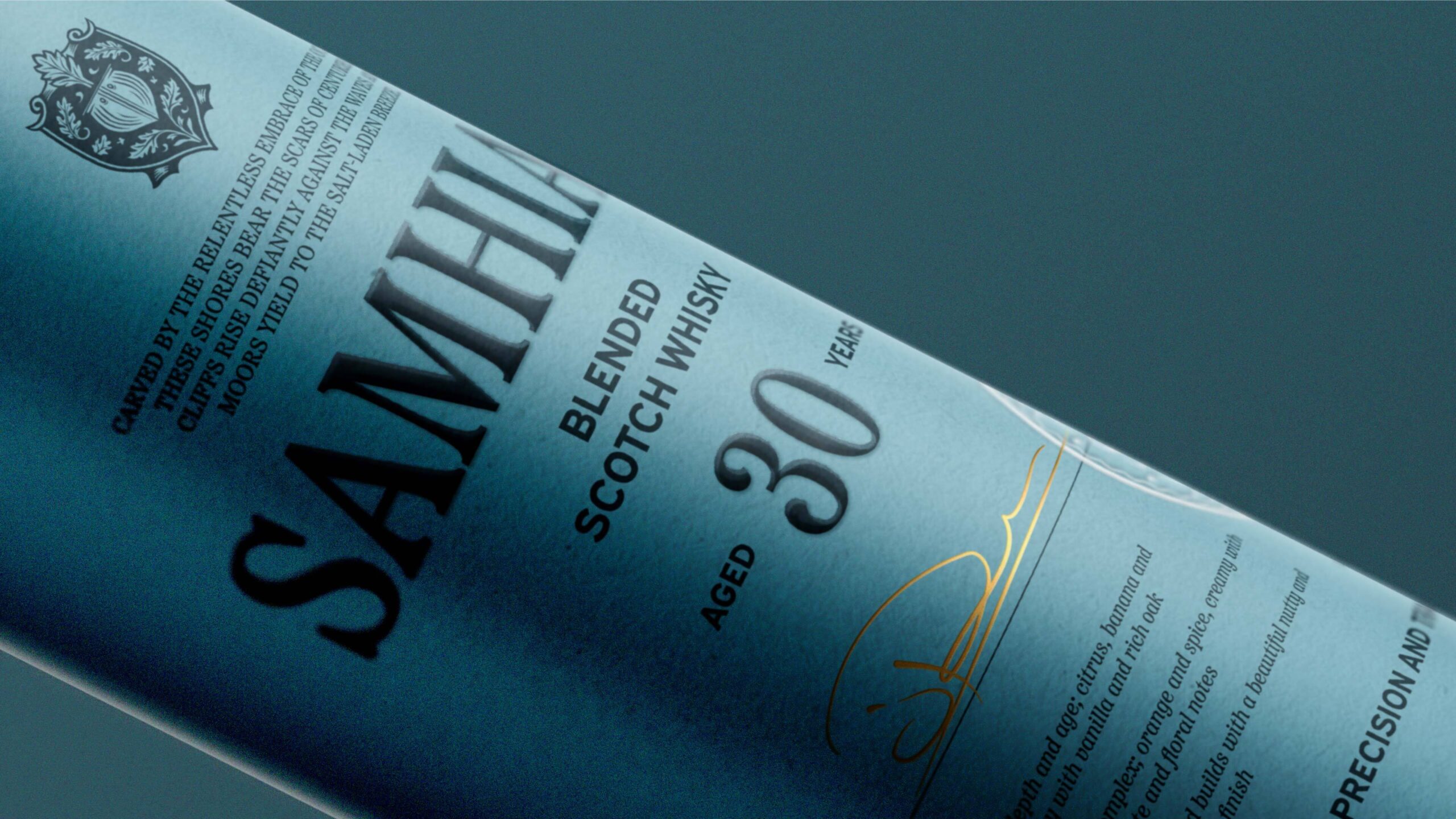
Having carefully sourced a 30 year old liquid, Gravity came to us for support with identity, bottle and tube packaging, copywriting and naming, that lands the quality of the liquid through brand. To ensure connection with the consumer, we conducted category semiotic research to pull out the cues that felt the most aligned with the scotch category, and dialled these up, in order to connect with the consumer. Putting the age statement front and centre, beneath a classic serif wordmark, allows for a traditional hierarchy that is familiar and informative, and feels inherently ‘scotch’. The label is given category stand-out and modernity through the use of full flood colour in a blue that is less common in the category. Paired with copywriting that establishes the feel of the rugged and theatrical Scottish coast, the blue evokes a feeling of the bracing cold that the Asian consumer recognises as a key feature of Scotland. Paired with the warmth of the liquid, this makes for a drinking occasion that reminds you of coming in from the cold to a rich malt – all adding to the sense of authenticity. Working within the constraints of an off-the-shelf bottle, we designed an additional neck label to add a layer of detail and give the sense that every element has been considered, and to ensure the stock bottle was a little more unique.
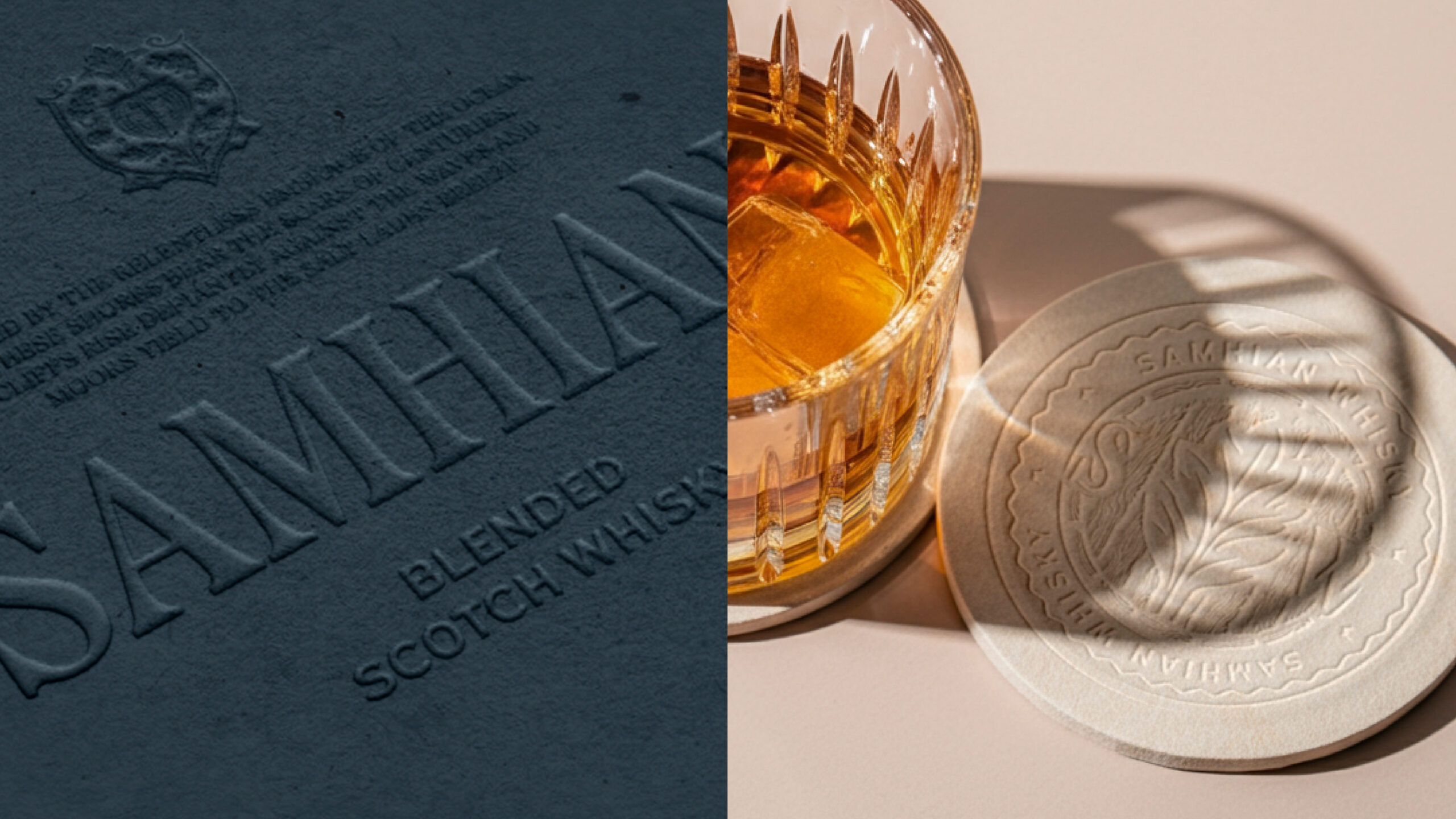
A traditionally coded crest, stamp asset, founder’s signature, and copy about the distillation and bottling, all contribute to the consumer’s understanding that this liquid has been crafted over time, and is rooted in the tradition of scotch whisky making.
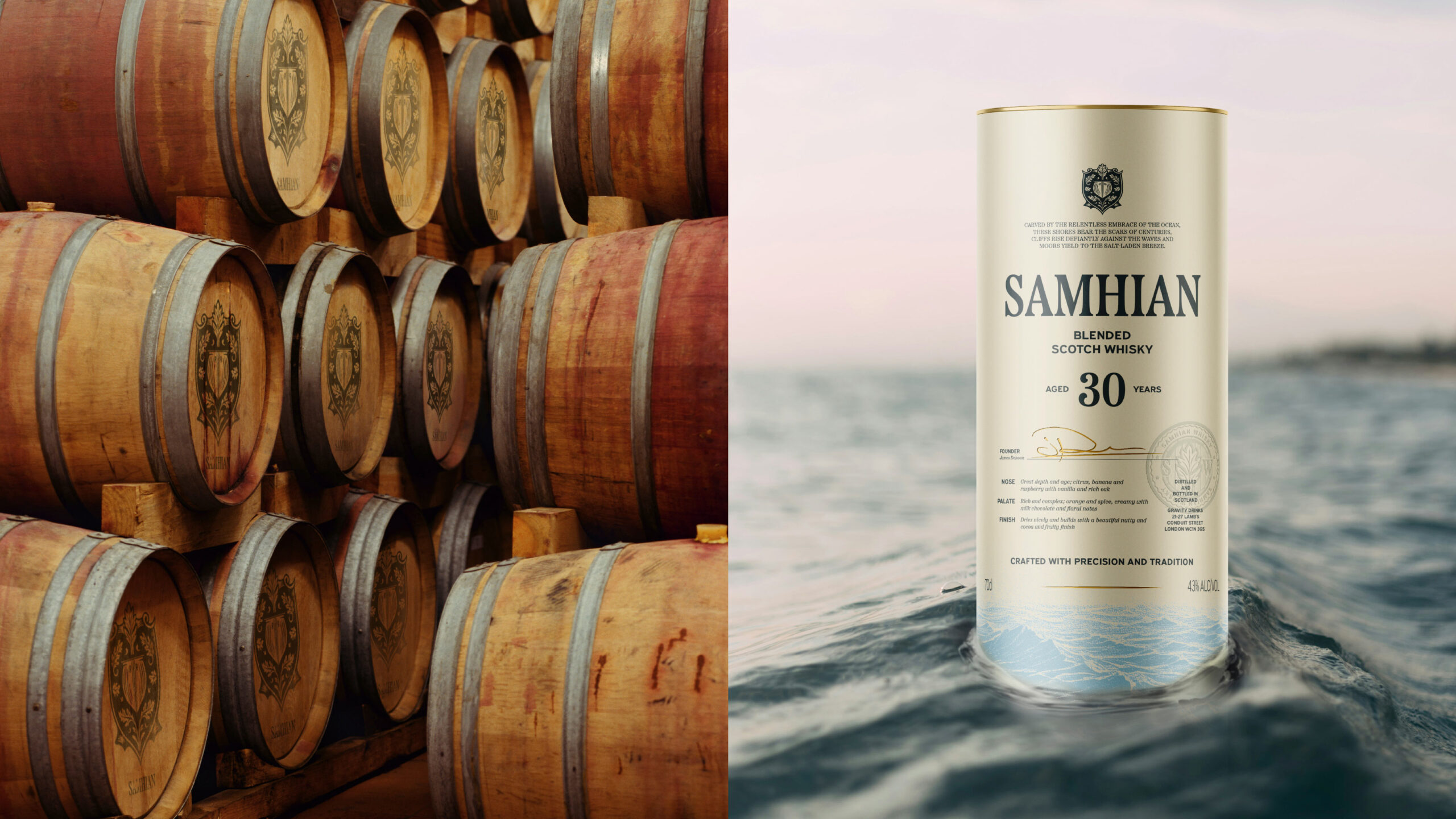
The presentation tube is classic in layout and proves that this is an excellent gifting opportunity, as well as a dram to savour for the buyer themselves. Presented in a dramatic brand-world, the client was guided to continue to emphasise the feeling of the Scottish landscape throughout all collateral and marketing.
CREDIT
- Agency/Creative: Kingdom & Sparrow
- Article Title: Samhian: Blended Scotch whisky Brand Identity Creation by Kingdom & Sparrow
- Organisation/Entity: Agency
- Project Status: Published
- Agency/Creative Country: United Kingdom
- Agency/Creative City: Falmouth
- Market Region: Asia
- Project Deliverables: Art, Art Direction, Brand Architecture, Brand Creation, Brand Design, Brand Guidelines, Brand Identity, Brand Mark, Branding, Copywriting, Design, Graphic Design, Identity System, Label Design, Logo Design, Packaging Design, Packaging Guidelines
- Industry: Food/Beverage
- Keywords: WBDS Agency Design Awards 2024/25 brand branding packaging design scotch blended whisky export bottle lab
- Keywords: WBDS Agency Design Awards 2024/25 brand branding packaging design scotch blended whisky export bottle lab


