Sambucus is a non-profit cooperative and a social insertion company. They provide professional opportunities to people with socio-occupational difficulties.
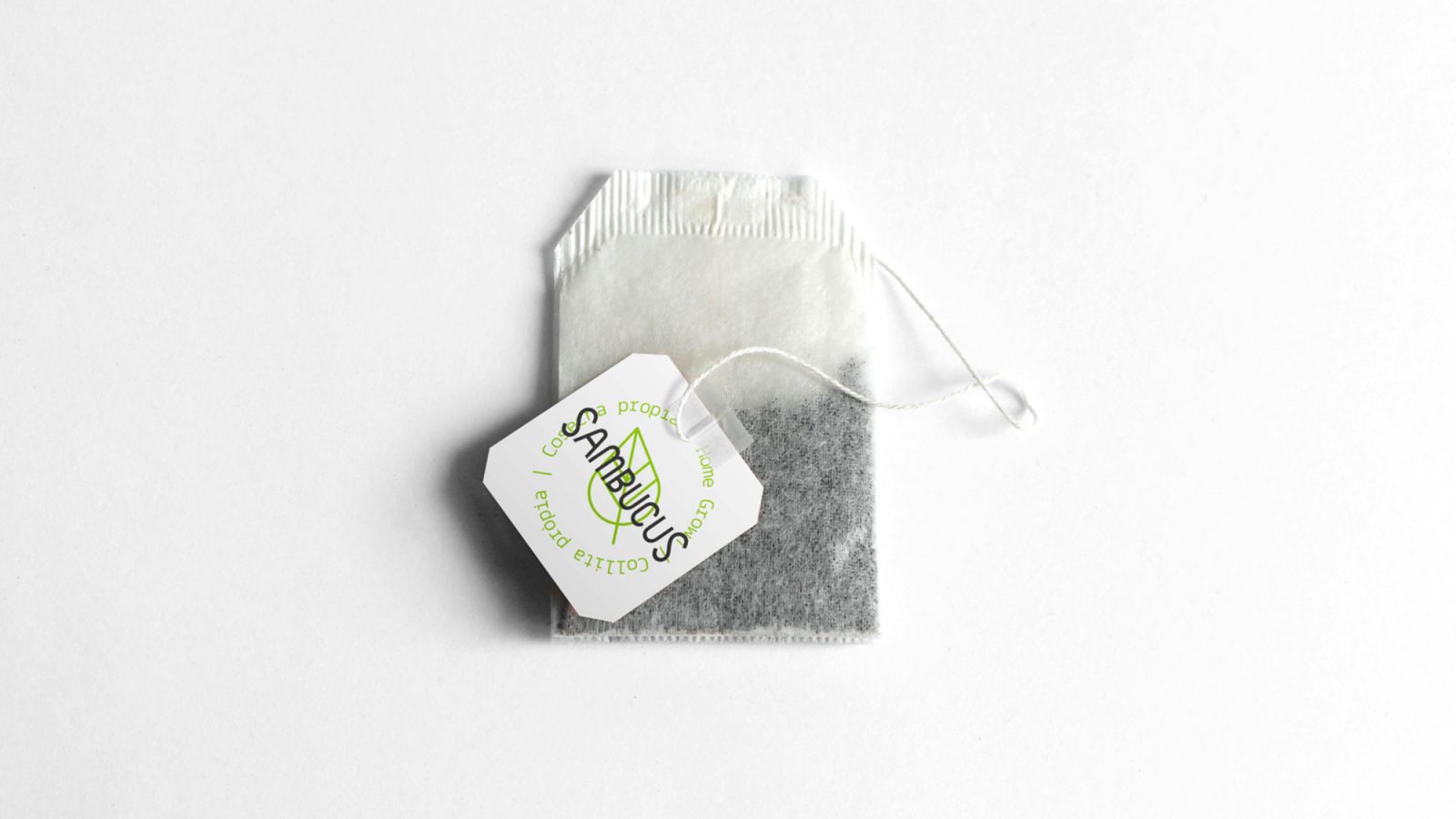
They reached out to us to create the graphic design for the labeling and packaging system of their loose leaf and tea bag ecological infusions.
The first step of our work was their slogan. We had to summarize their philosophy and way of working in one powerful sentence. We think that ‘From the earth to the cup creating opportunities’ gives a very graphic image of their work.
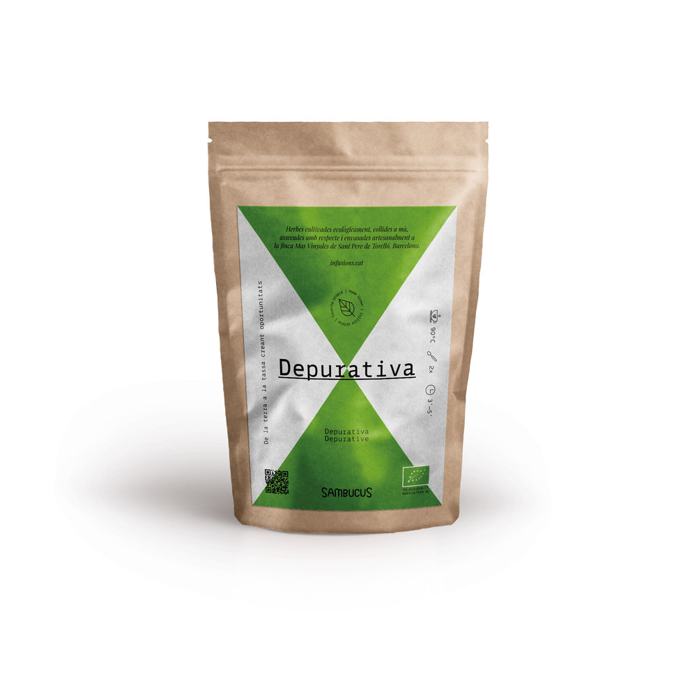
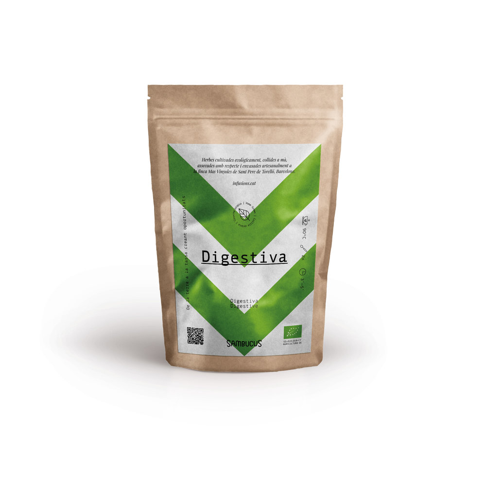
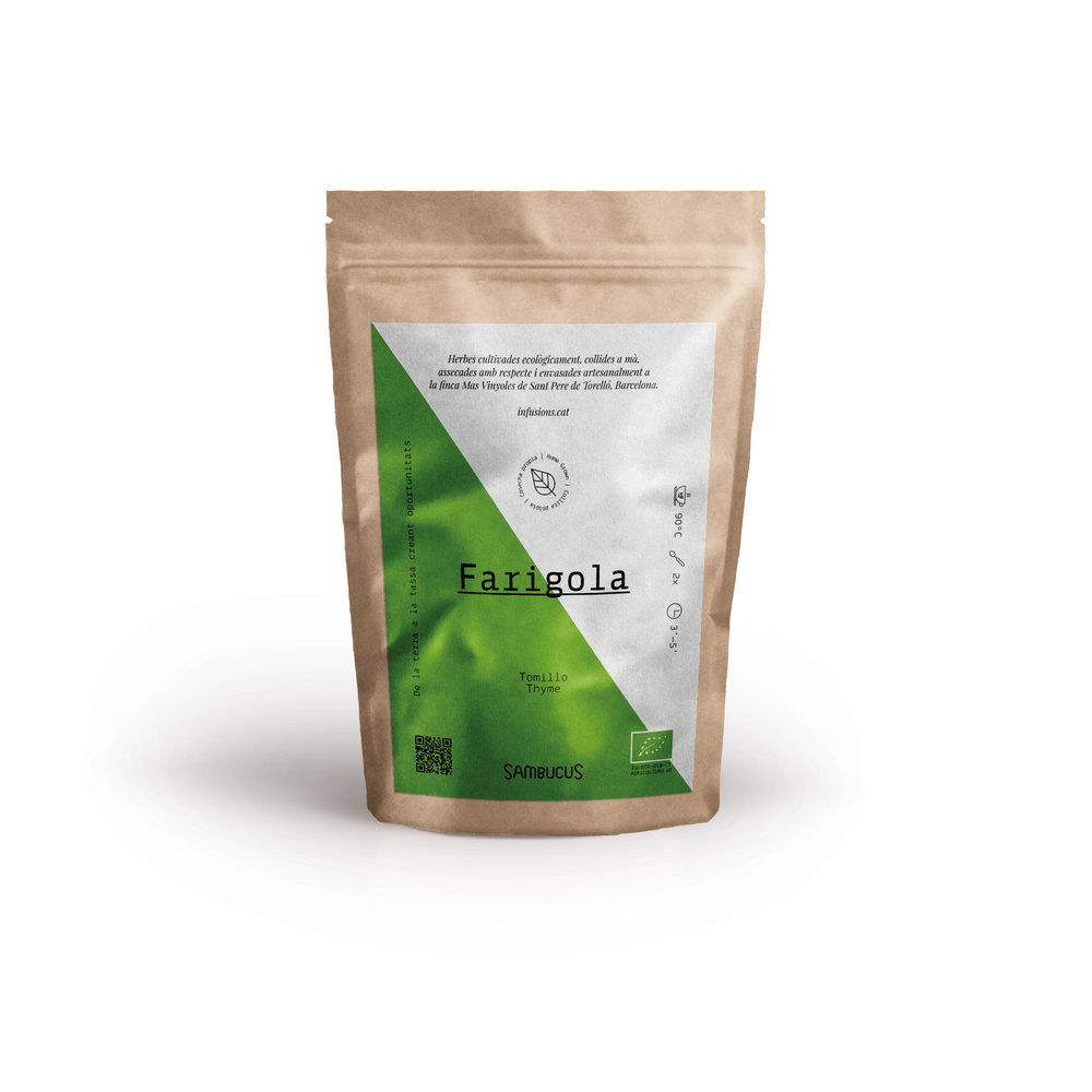
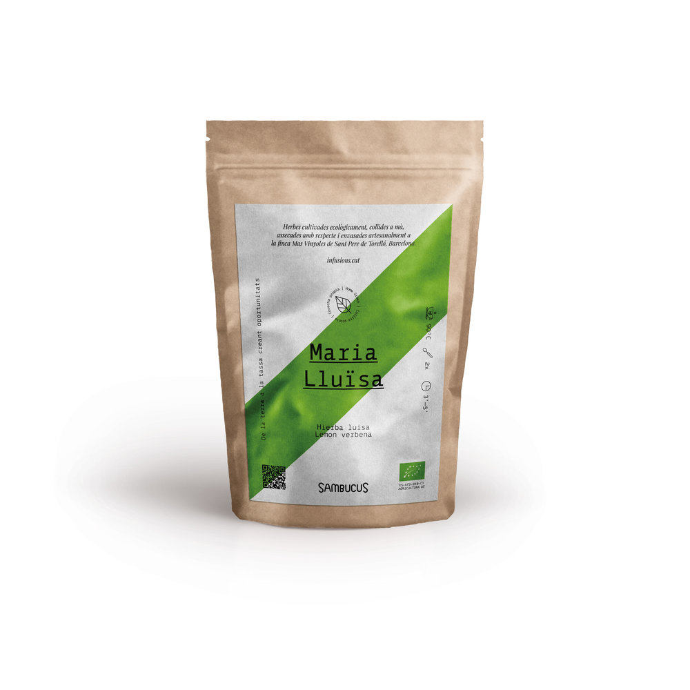
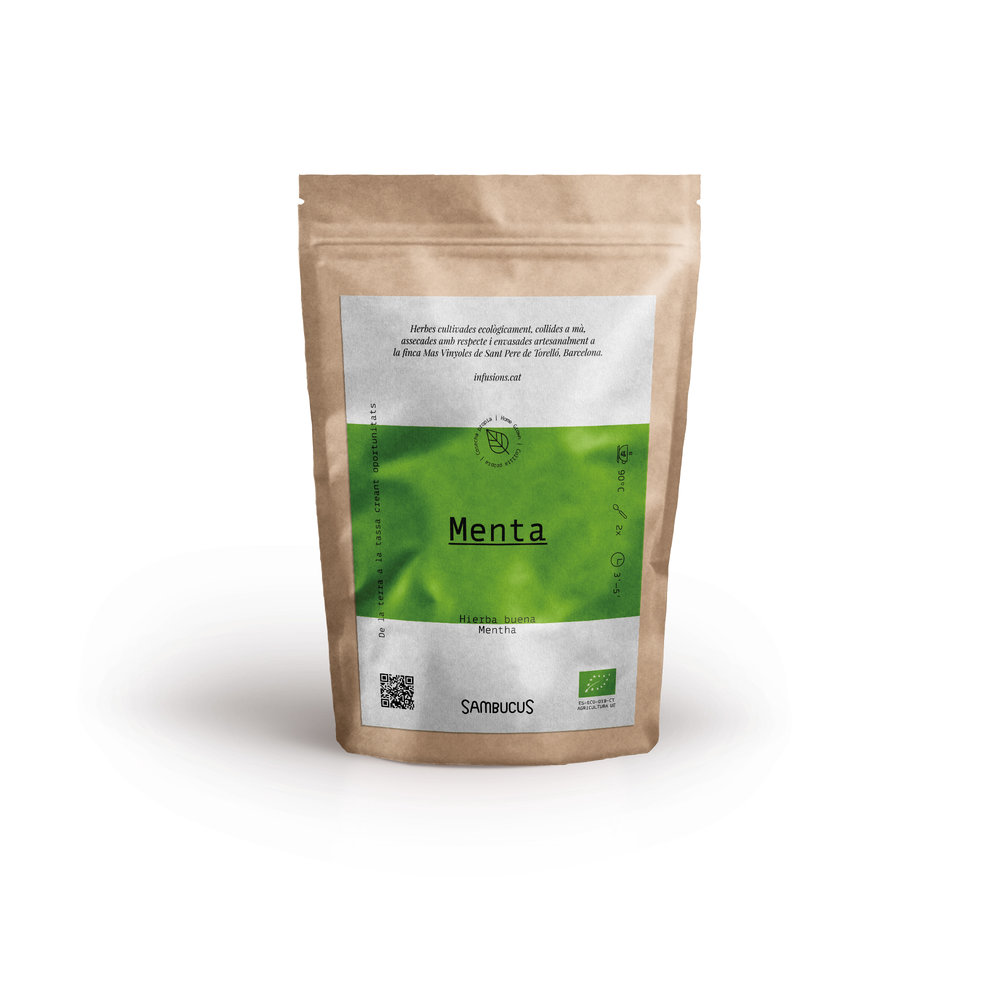
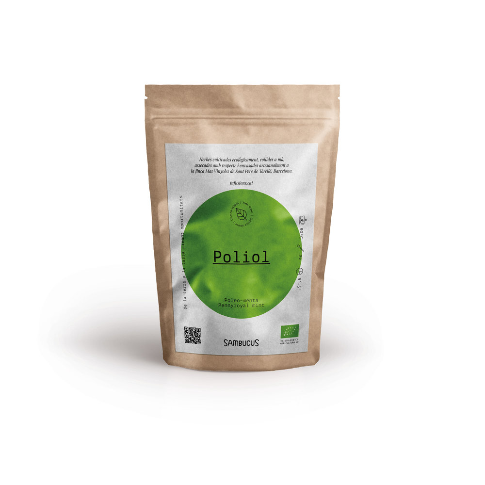
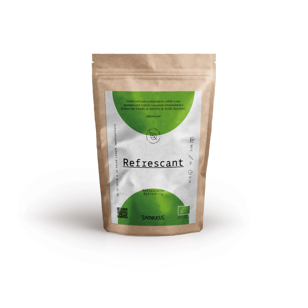
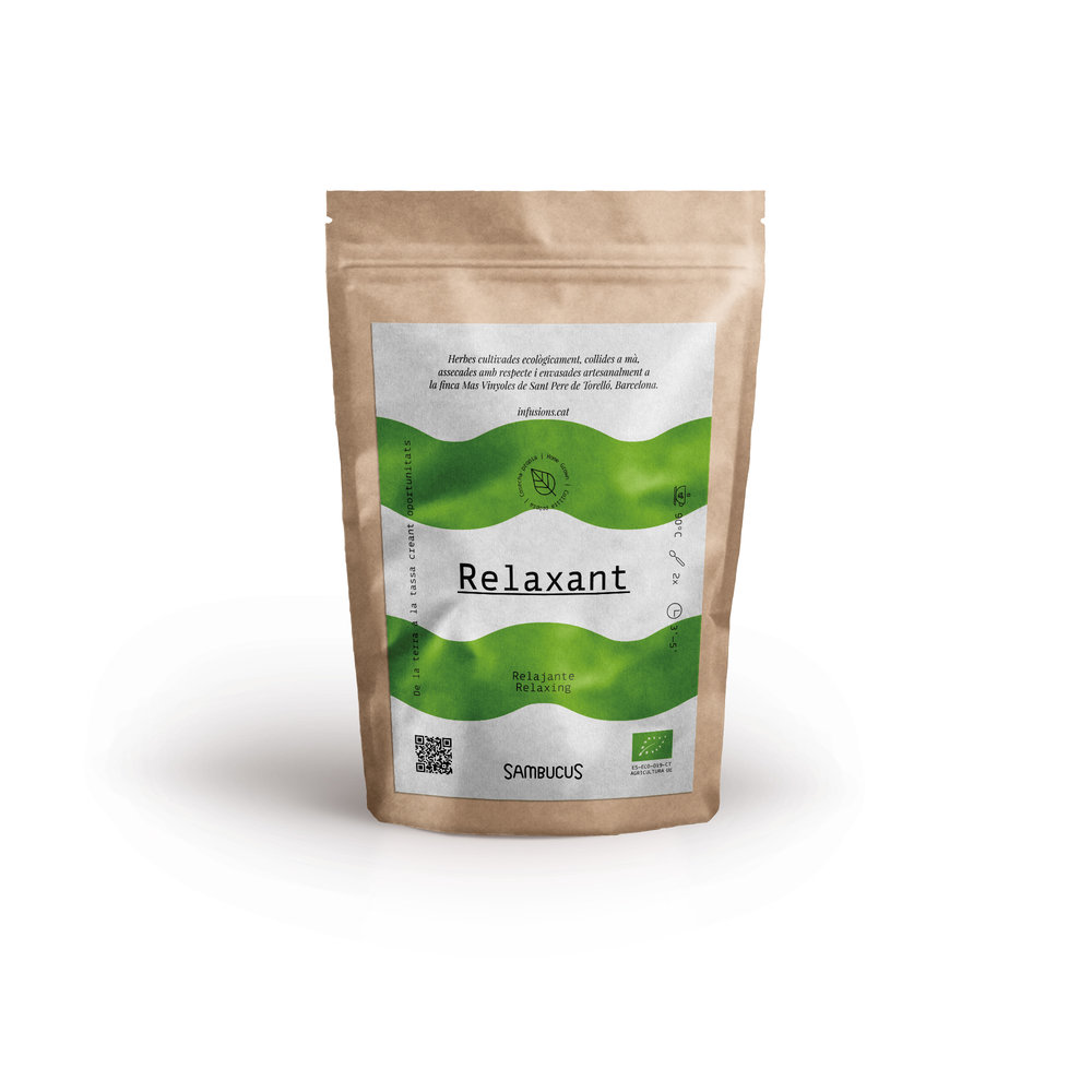
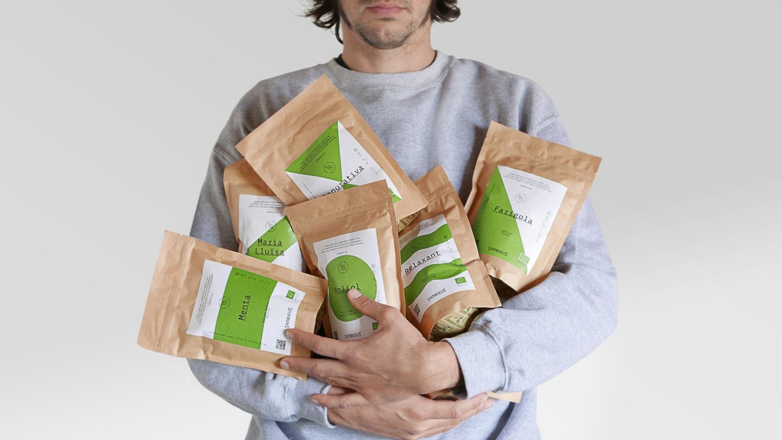
The second step of the project was to provide movement to their packaging. To do so, we decided to play. We played with minimalist graphics. We played with and an intense use of color. We kept on playing. We played with geometry, we played with organic shapes and we played with sensations. The result was a collection of labels which helps to differ each infusion type.
In their range of infusions, they offer pure and mixture beverages. We used that also to remark the difference between one pack type to another. We used a one unique shape for pure herbs or the combination of two shapes for the mixtures.
Their packaging process is handmade, so it was also important to provide a range of labels ready to be sticked to the same bag.
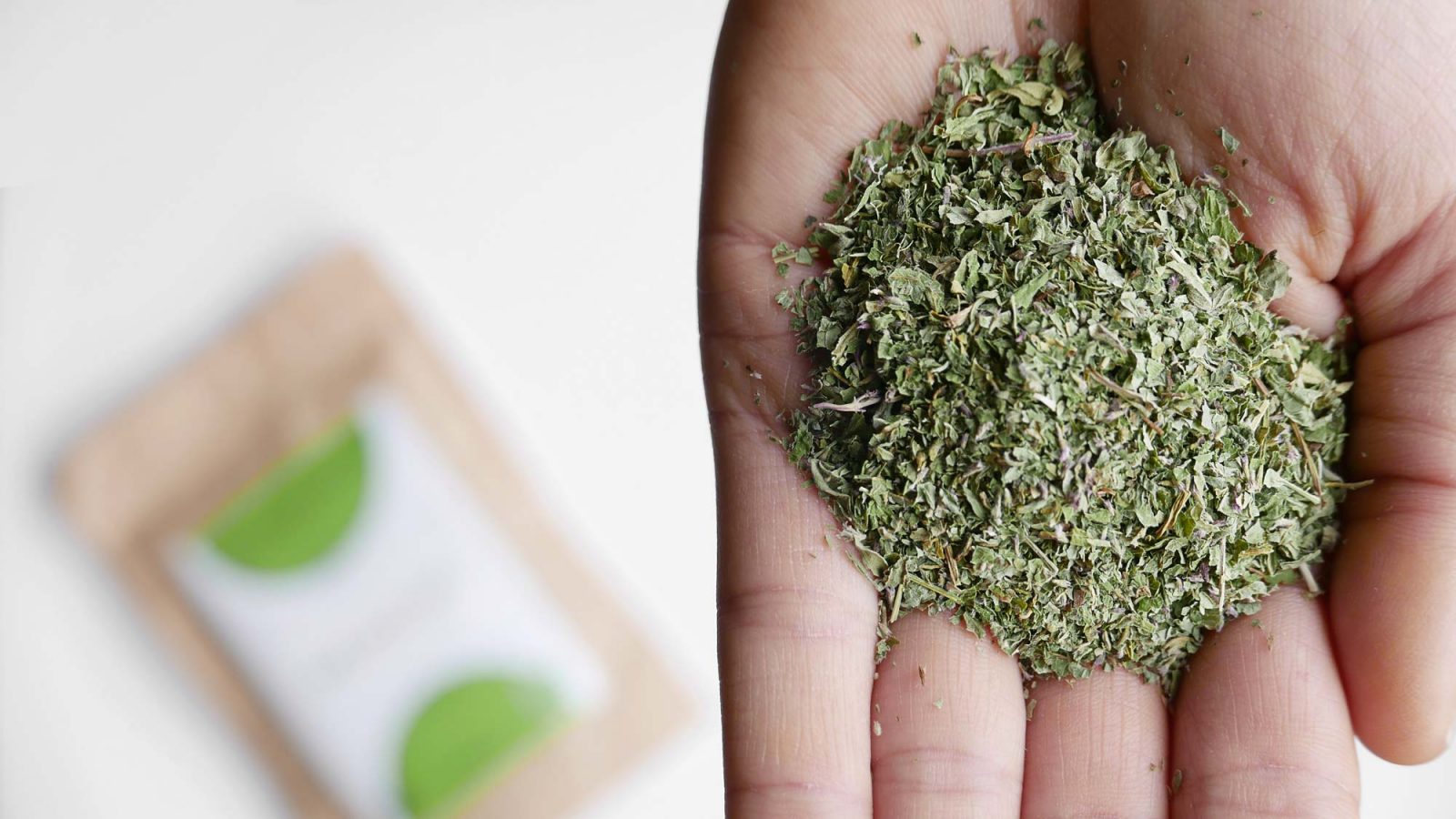
Sambucus grows about 40 species of plants organically and ecologically. Plants are cut by hand, dried in the solar dryer and packaged by hand. Their infusions do not travel. Herbs go from the field where they were grown to the dryer in a 10 minutes walk. After that, within 3 days, are dry and stored for good organoleptic properties preservation.

CREDIT
- Agency/Creative: Alucina. Branding & Design
- Article Title: Sambucus – Ecological and Conscious Herbal Teas
- Organisation/Entity: Agency, Published Commercial Design
- Project Type: Packaging
- Project Status: Published
- Agency/Creative Country: Spain
- Market Region: Europe
- Format: Bag, Blister-Pack, Cup, Pot, Pouch
- Substrate: Pulp Paper


