Overview
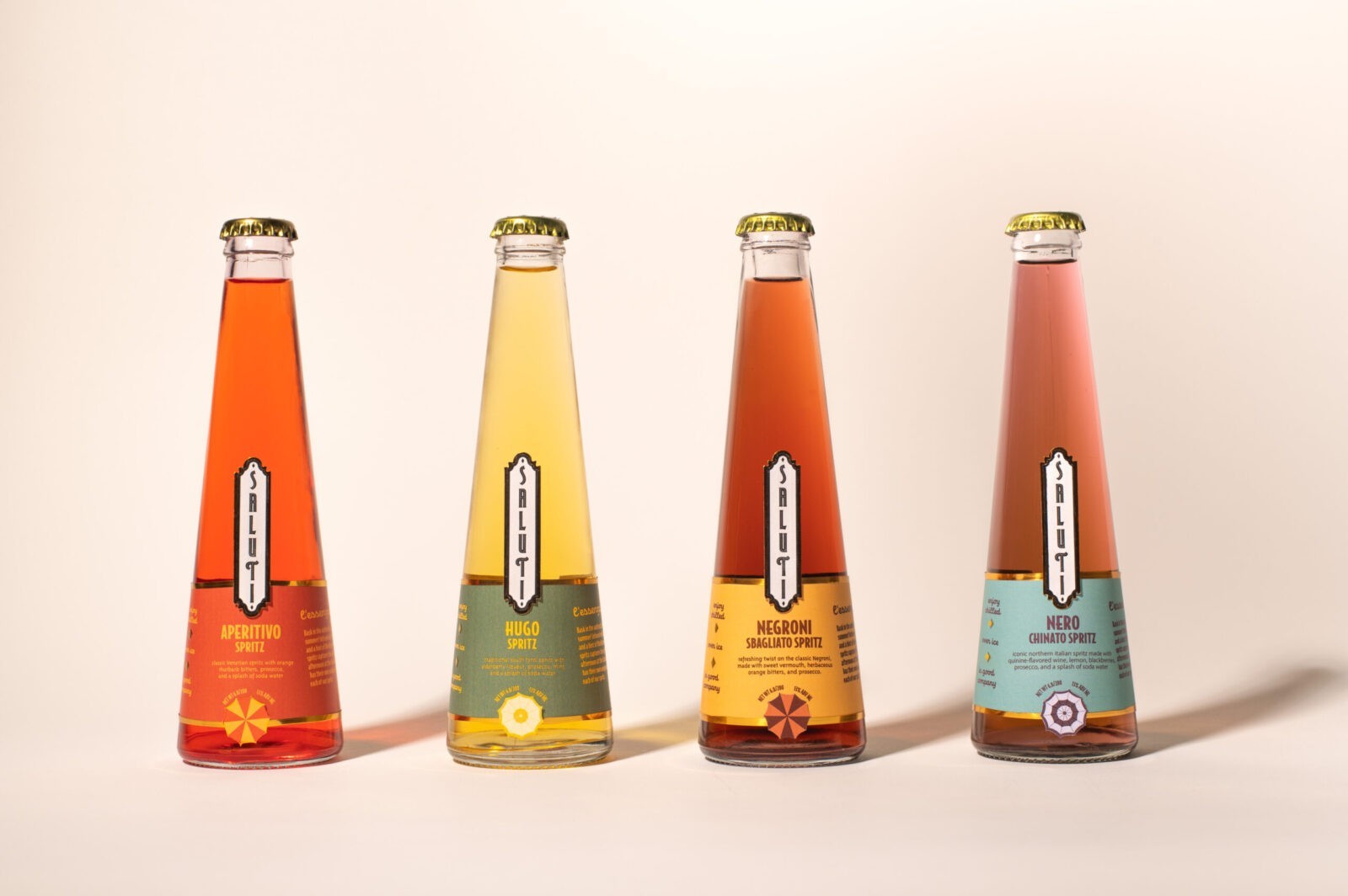
Saluti is a bottled Italian spritz brand dedicated to capturing the essence of the vintage Italian summer lifestyle, evoking the spirit of celebration and togetherness. The brand’s mission is to transport consumers back to the peak of the 1960s, while also drawing on the lingering elegance of the art deco period from the late 1930s. Saluti’s target is a modern, cosmopolitan audience that appreciates sophistication and timeless style. The packaging is designed to exude boldness and elegance, with typography and color choices inspired by the unique lidos that dot the Italian coastline.
Research
The design process began with an extensive exploration of popular vintage Italian advertisements from the late 1950s to 1960s. These advertisements provided a rich source of inspiration for the brand’s color palette and visual identity. After identifying a unique substrate for the label, the logo development and label exploration commenced. The goal was to create a brand identity that seamlessly blends vintage charm with modern sophistication.
Final Design
The final logo for Saluti features a vertical format with a vintage badge shape, integrated into the label system with gold foil accents. This design choice reflects the brand’s commitment to sophistication and timeless elegance, while also ensuring that the logo stands out on the shelf.
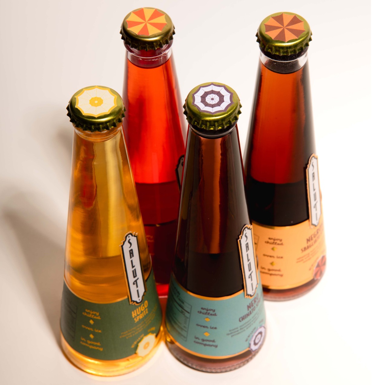
An umbrella motif, inspired by those found in vintage Italian beach scenes, is incorporated into the label design as a key graphic element. This motif adds a nostalgic touch and reinforces the brand’s connection to the classic Italian summer lifestyle. The umbrella graphics are also featured in various forms and colors on the product’s cap, providing a cohesive and playful design detail.
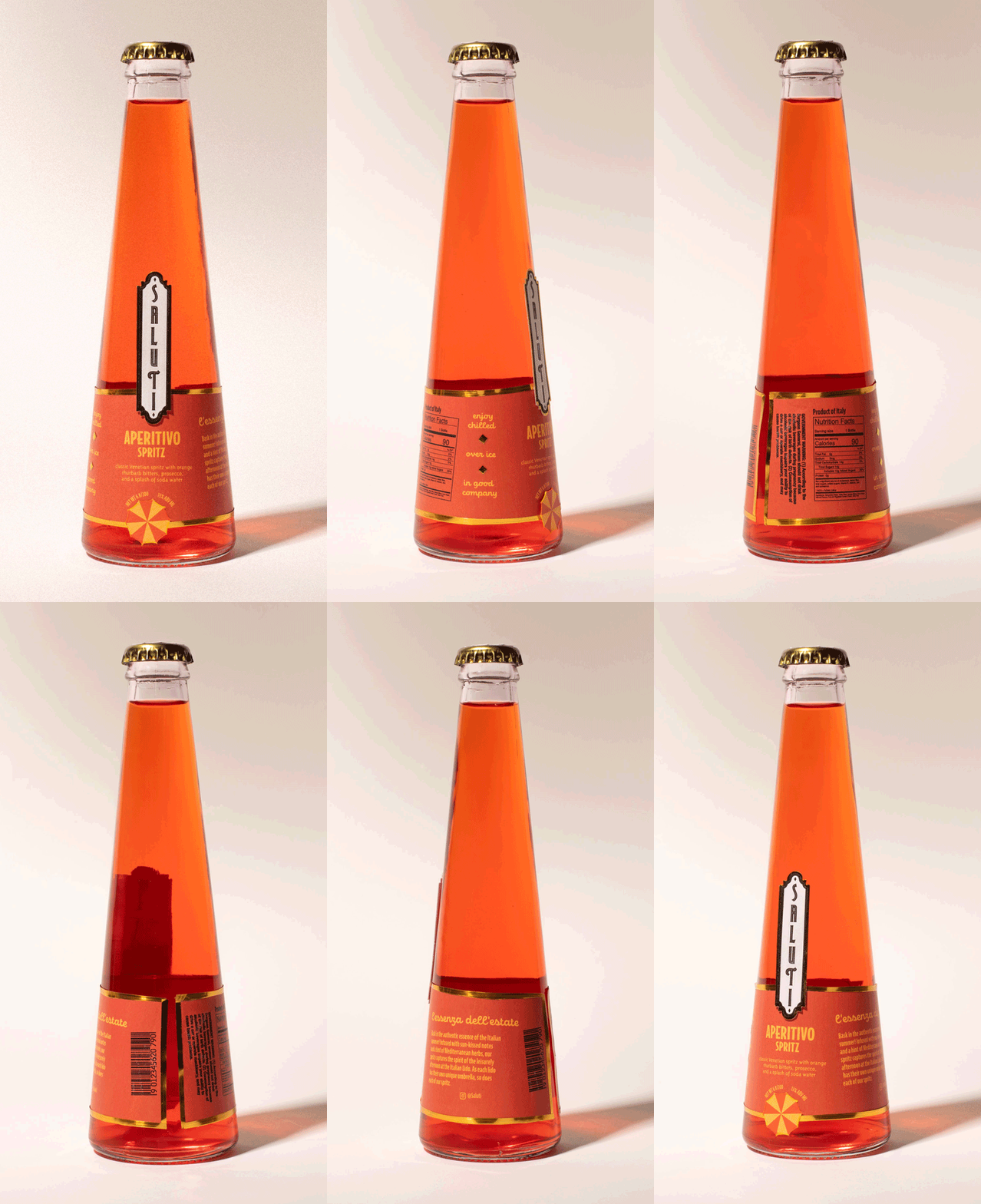
The label system itself is a standout feature, utilizing multiple overlapping pieces and custom die-cuts that give the bottle a distinctive and elevated presence on the shelf. This intricate label design not only showcases the unique shape of the bottle but also adheres to the brand’s mission of maintaining the integrity and authenticity of its vintage inspiration.
Engagement
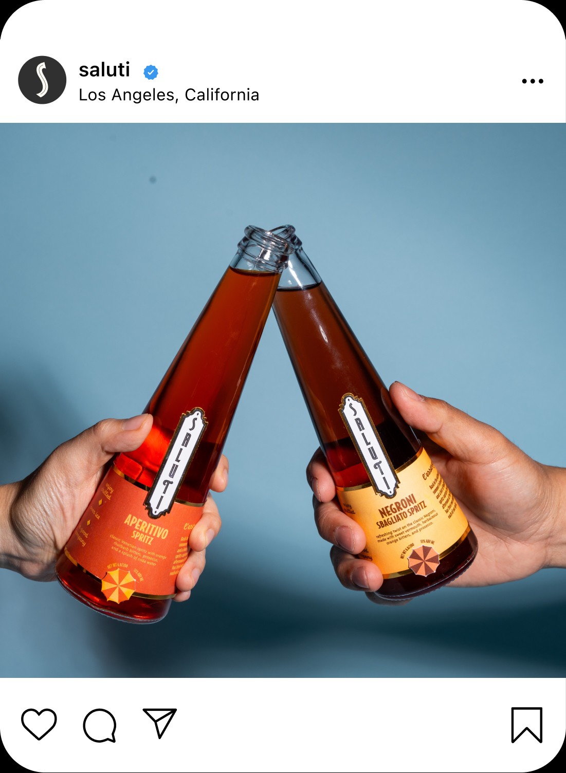
Saluti’s social media presence, particularly on Instagram, is designed to be aesthetically beautiful and engaging, perfectly flaunting the brand’s identity. From posts to stories, the content reflects the fun and elegant lifestyle that Saluti embodies, appealing to a modern audience while paying homage to its vintage roots.


CREDIT
- Agency/Creative: Robi Ruocco
- Article Title: Saluti’s Vintage-Inspired Branding Captures the Essence of Italian Summer Elegance by Student Robi Ruocco
- Organisation/Entity: Student
- Project Status: Non Published
- Agency/Creative Country: United States of America
- Agency/Creative City: San Diego
- Project Deliverables: Packaging Design
- Industry: Food/Beverage
- Keywords: Packaging Design: Product Creation , WBDS Student Design Awards 2024/25
- Keywords: WBDS Student Design Awards 2024/25


