


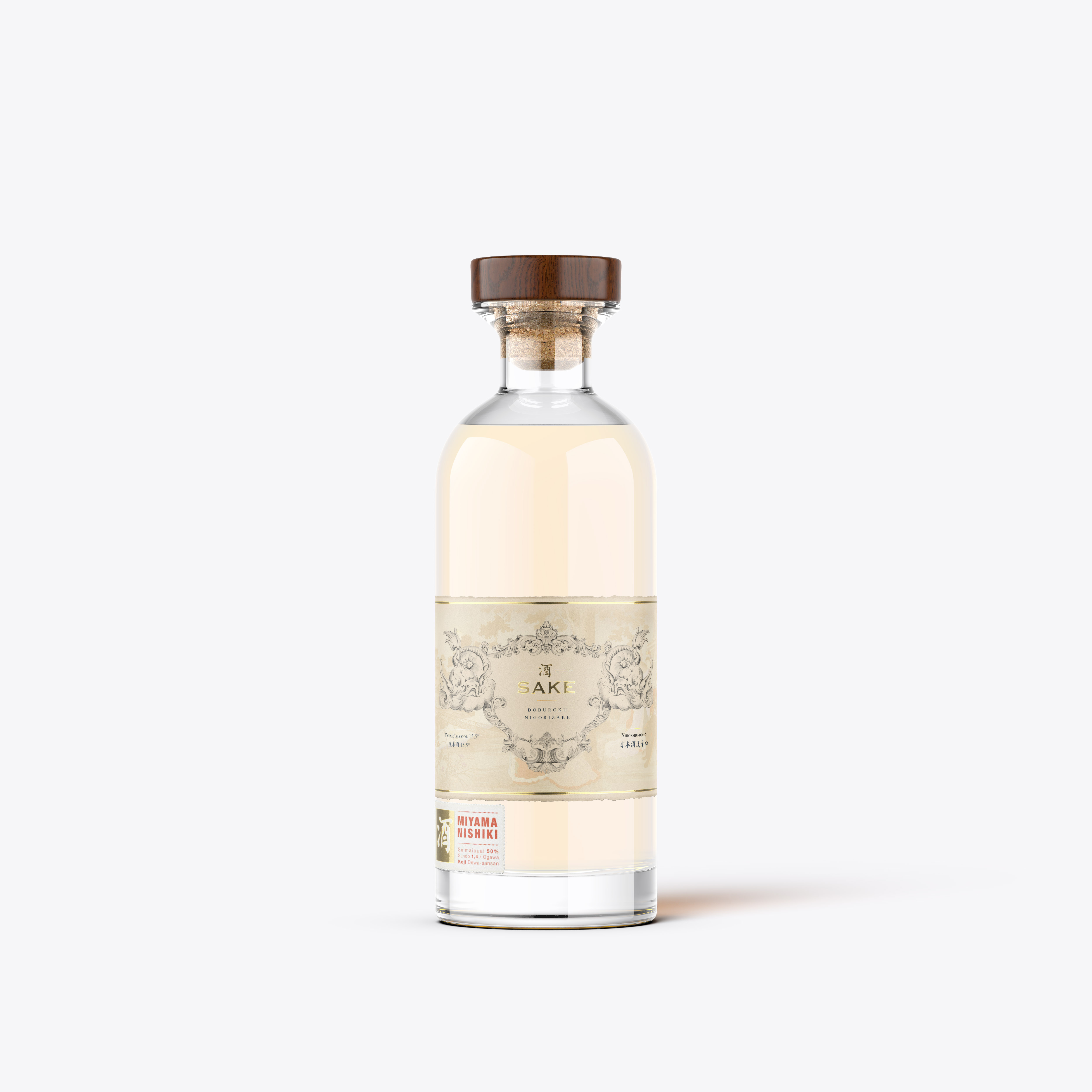
The Doburoku also called Nigorizaké (means “cloudy”) is an unfiltered sake, created according to ancient methods. This sake, little known to the general public has the distinction of being very soft and low alcohol, its consumption remains very marginal around the world.
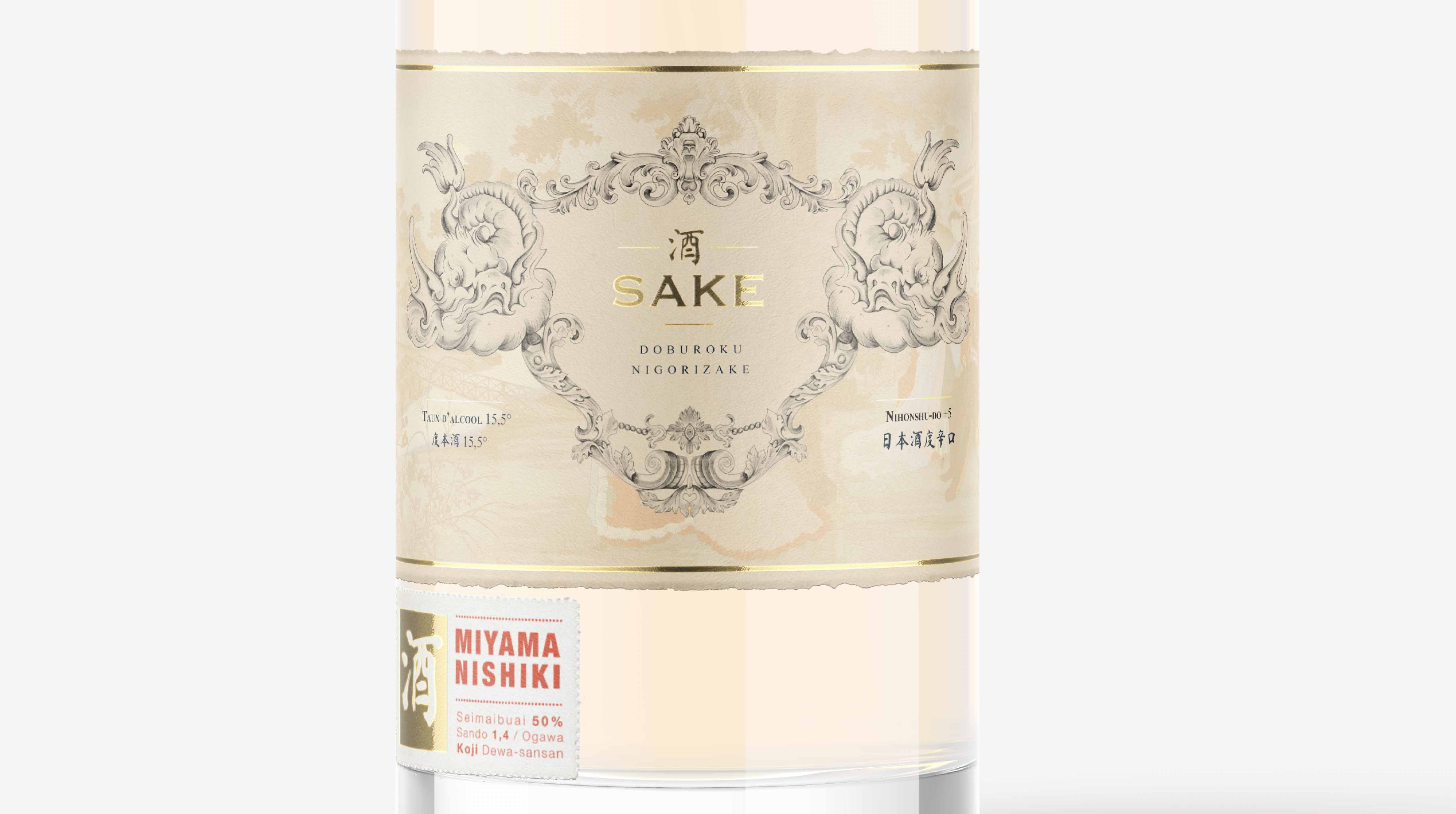
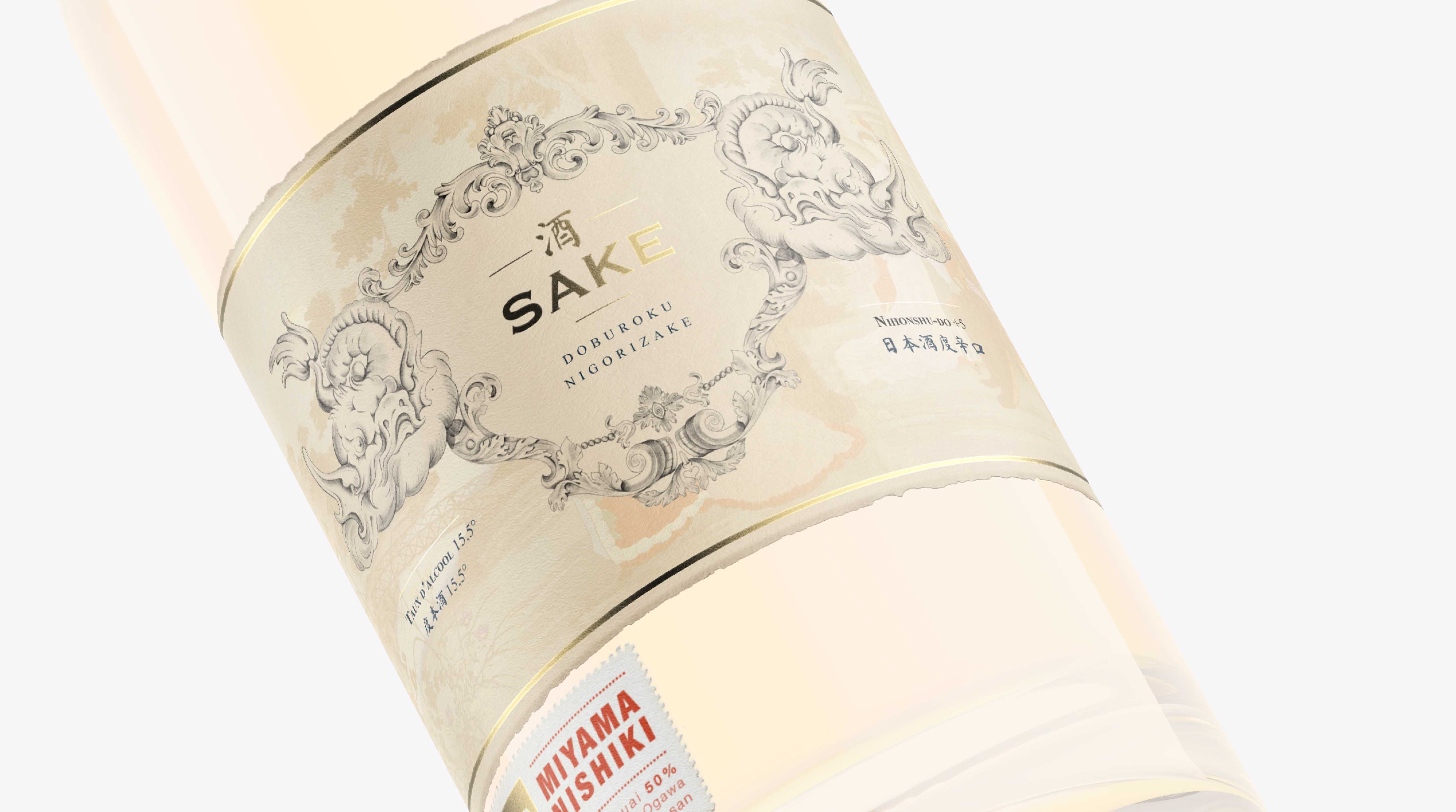
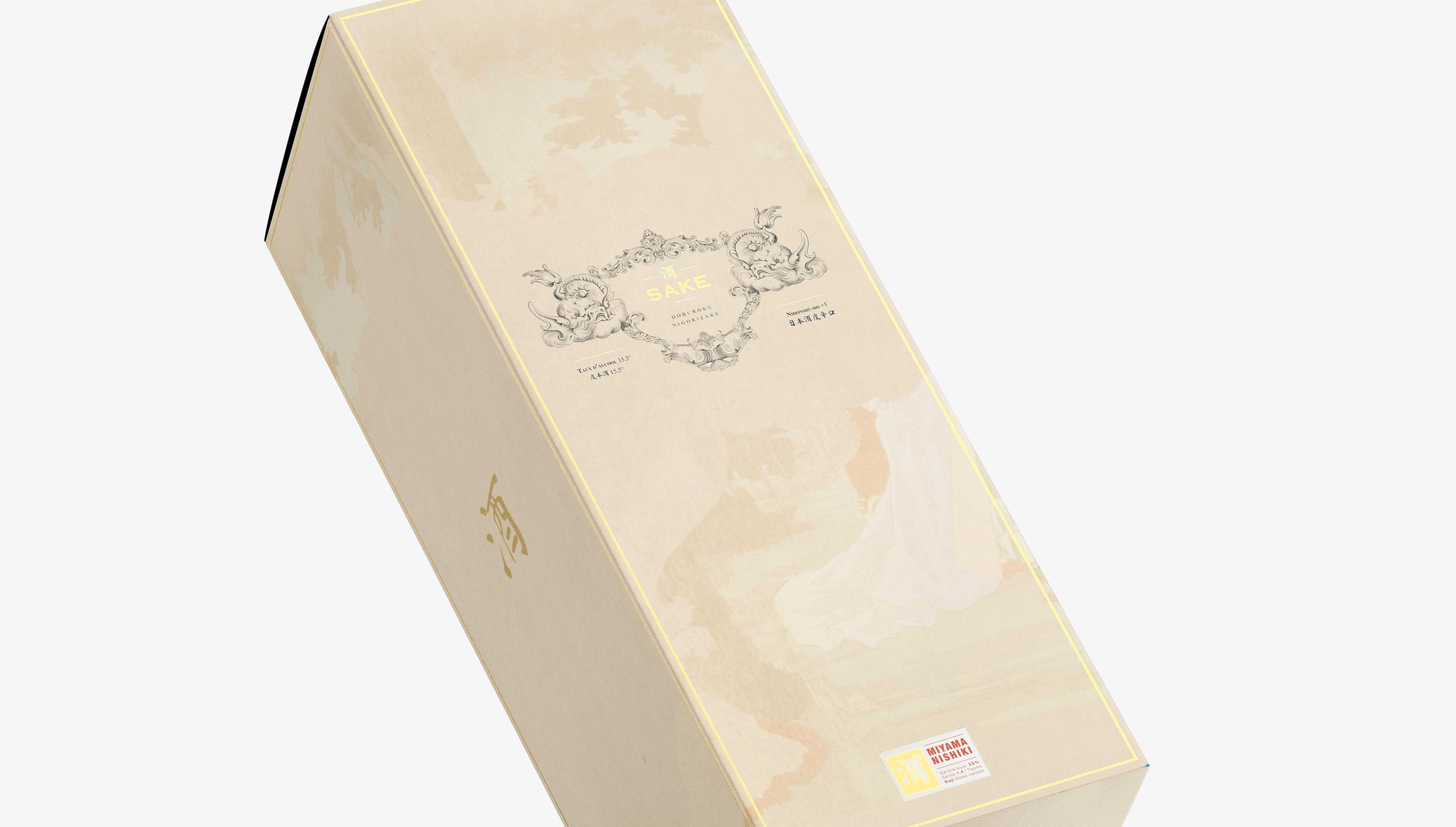
For the creation of this Design, it was important to graphically translate the cloudy appearance of the “Doburoku”. For this I made the choice to make hand-made illustration, using different types of gray pencils to bring softness in the line and in the gradients. llustrating a fish on a cloud also reinforces this idea, making the link between the elements “water” and “Air”.
The choice of colors and paper was also important in this process to best
reflect the rarity and quality of this product.
You can see in the background a traditional print illustrating a party scene because for a long time the consumption of this drink was reserved for Shinto temples and rural festivals fertility related to rice planting.

CREDIT
- Agency/Creative: Studio Zephyr.
- Article Title: Sake Doburoku – Nigorizake
- Organisation/Entity: Freelance, Published Self Promotional Design
- Project Type: Packaging
- Agency/Creative Country: France
- Market Region: Europe
- Project Deliverables: Brand Identity, Brand Strategy, Branding, Illustration, Packaging Design, Research
- Format: Bottle
- Substrate: Glass Bottle


