Axis is a design company specializing in the design and construction of exquisite homes, operating in the architecture and construction industry with a focus on creating sophisticated residential spaces. Developing the brand image for Axis involves blending artistic vision with strategic branding. Their mission of infusing modern European aesthetics into their projects guided every step of the design process, resulting in a cohesive and elegant visual identity that truly represents the essence of Axis.
Modern European design is characterized by its simplicity, elegance, and functionality. It often features clean lines, minimalistic forms, and a careful balance of form and function. This style is the perfect match for Axis, as it aligns with their commitment to creating sophisticated and functional living spaces. To capture this essence, the design focused on three key aspects: minimalism, elegance, and functionality. Minimalism involves stripping away unnecessary elements to highlight the essential features of the design. Elegance was achieved by using refined and timeless design elements that evoke a sense of sophistication. Functionality ensured that the visual identity was not only aesthetically pleasing but also practical and versatile across different platforms and mediums.
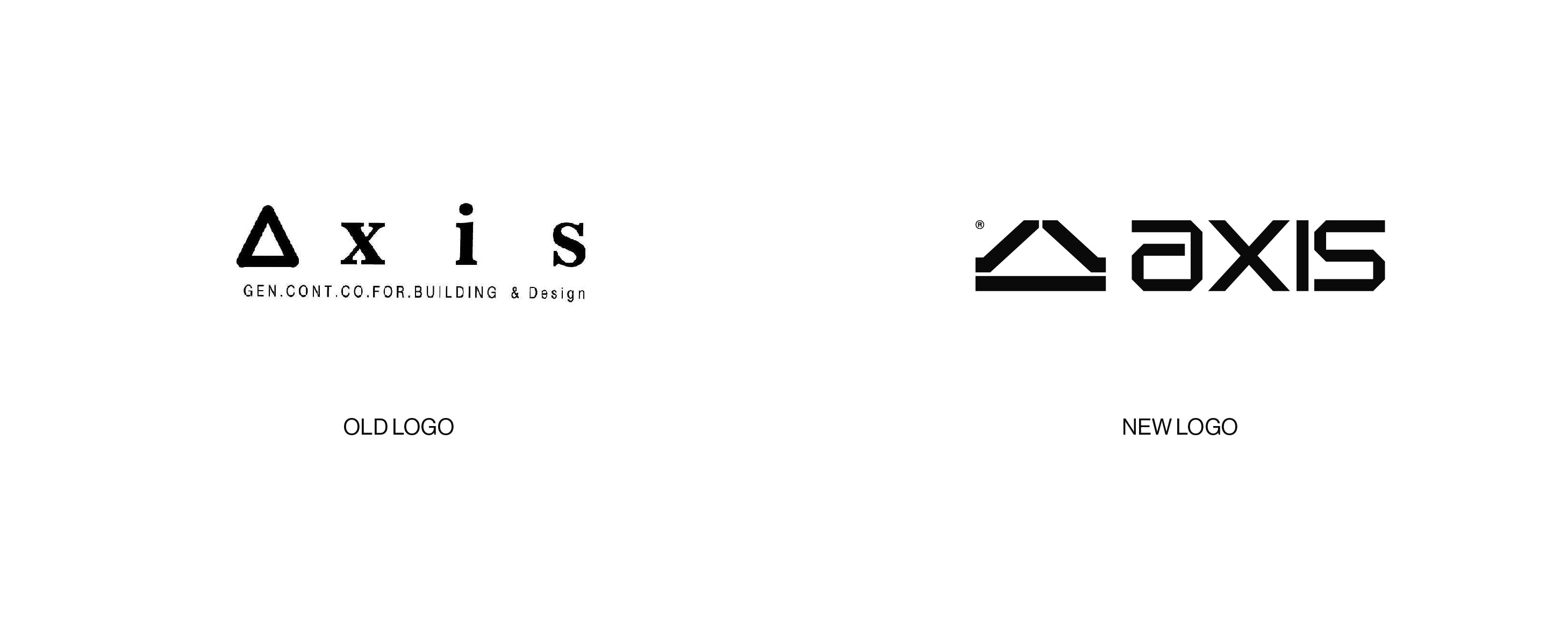
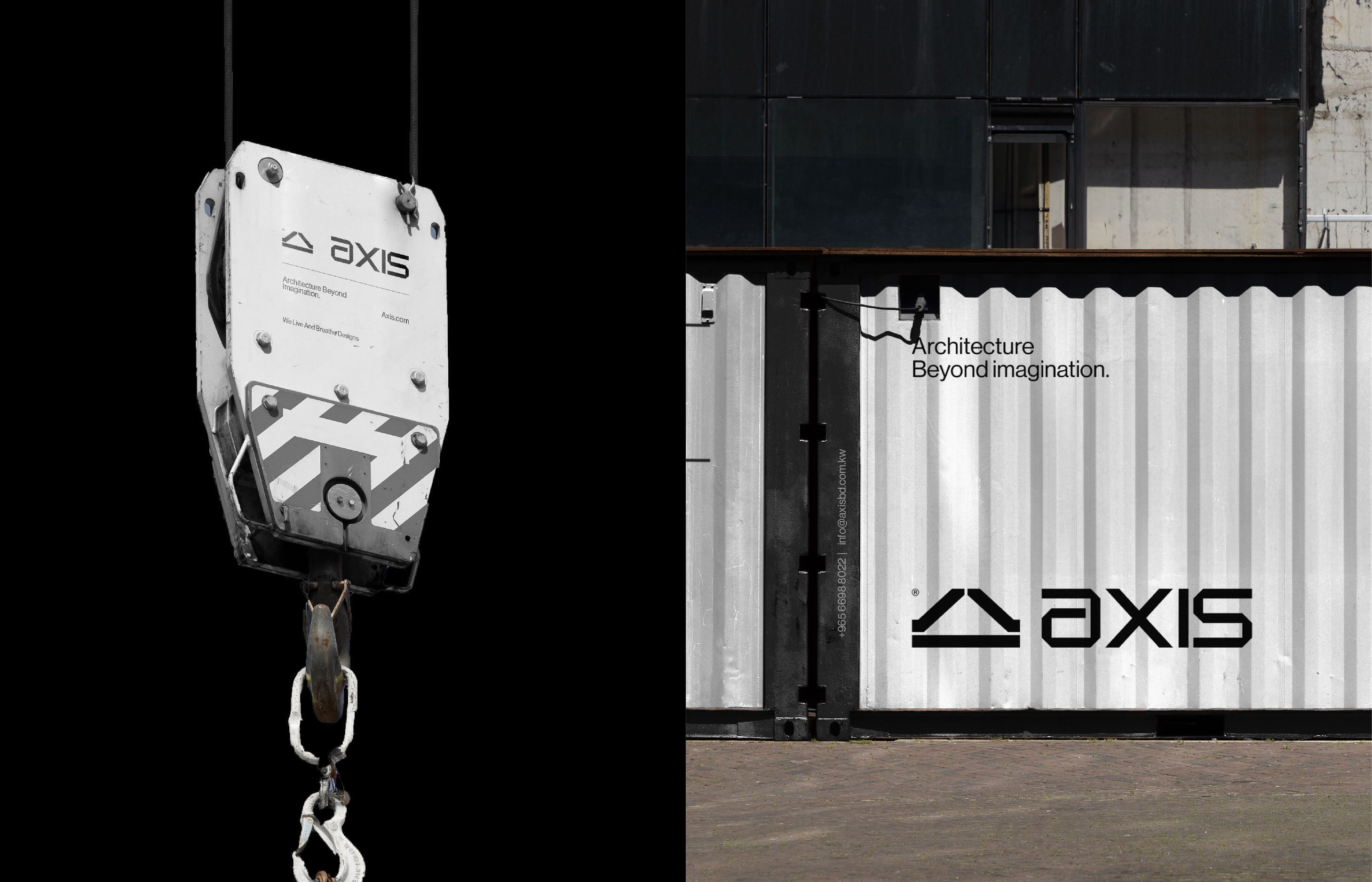
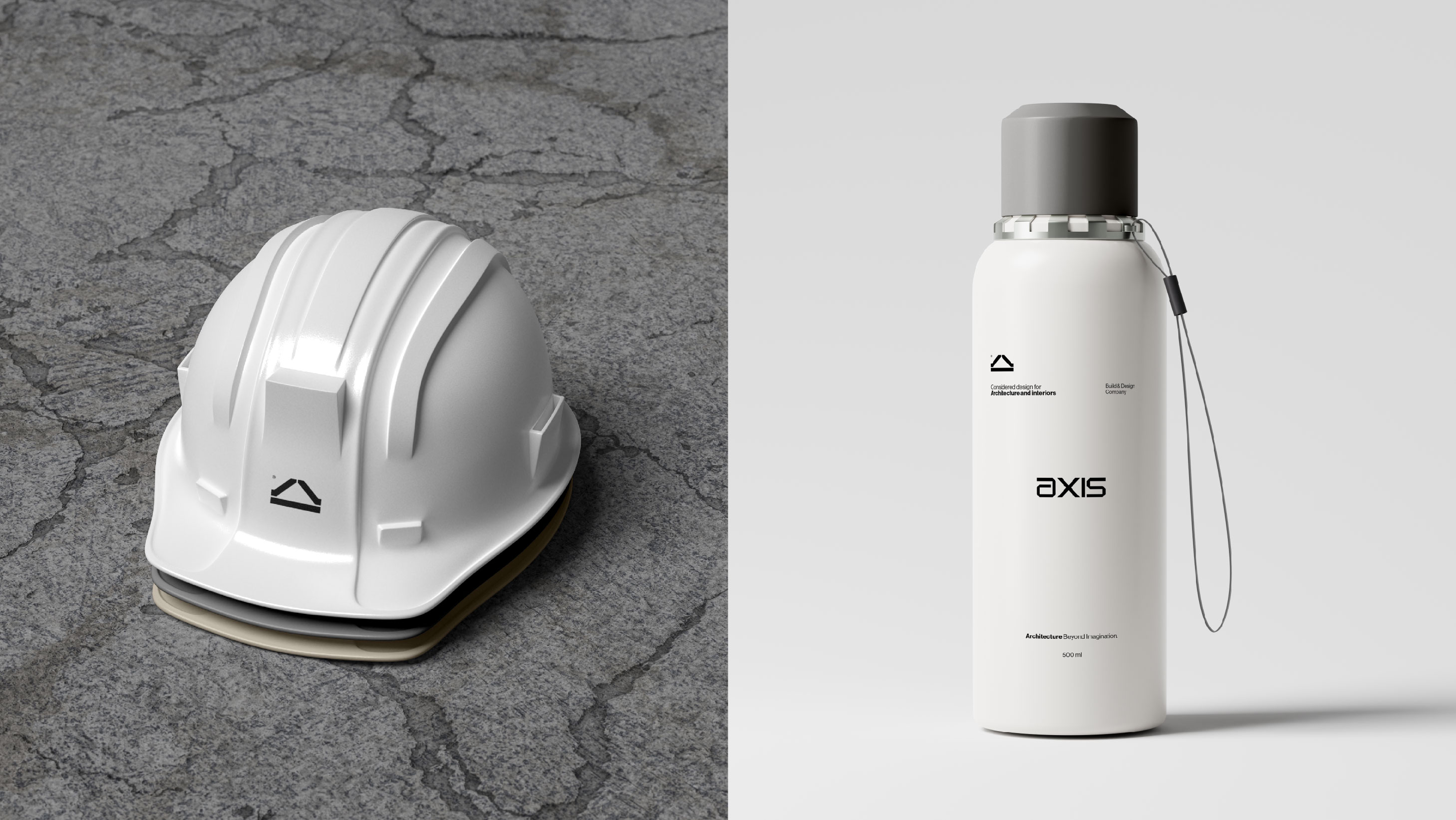
The logo is the cornerstone of any visual identity, and for Axis, the aim was to create something that was both abstract and deeply connected to their work. An abstract design featuring a triangle-shaped icon was chosen, inspired by the traditional shape of European houses, subtly linking the logo to Axis’s core expertise. The triangle is a powerful geometric shape, often associated with stability and strength. By using this form, the logo conveys the reliability and solidity of Axis as a company. The abstract nature of the logo allows it to be versatile and modern, fitting seamlessly into the contemporary aesthetic that Axis champions.
Typography plays a crucial role in conveying a brand’s personality. For Axis, a modern and clean font was selected to complement the abstract logo. However, to ensure that the typography was truly unique to Axis, several modifications were made to the chosen font. These adjustments were subtle but significant, adding a touch of originality and ensuring that the font harmonized perfectly with the overall design.
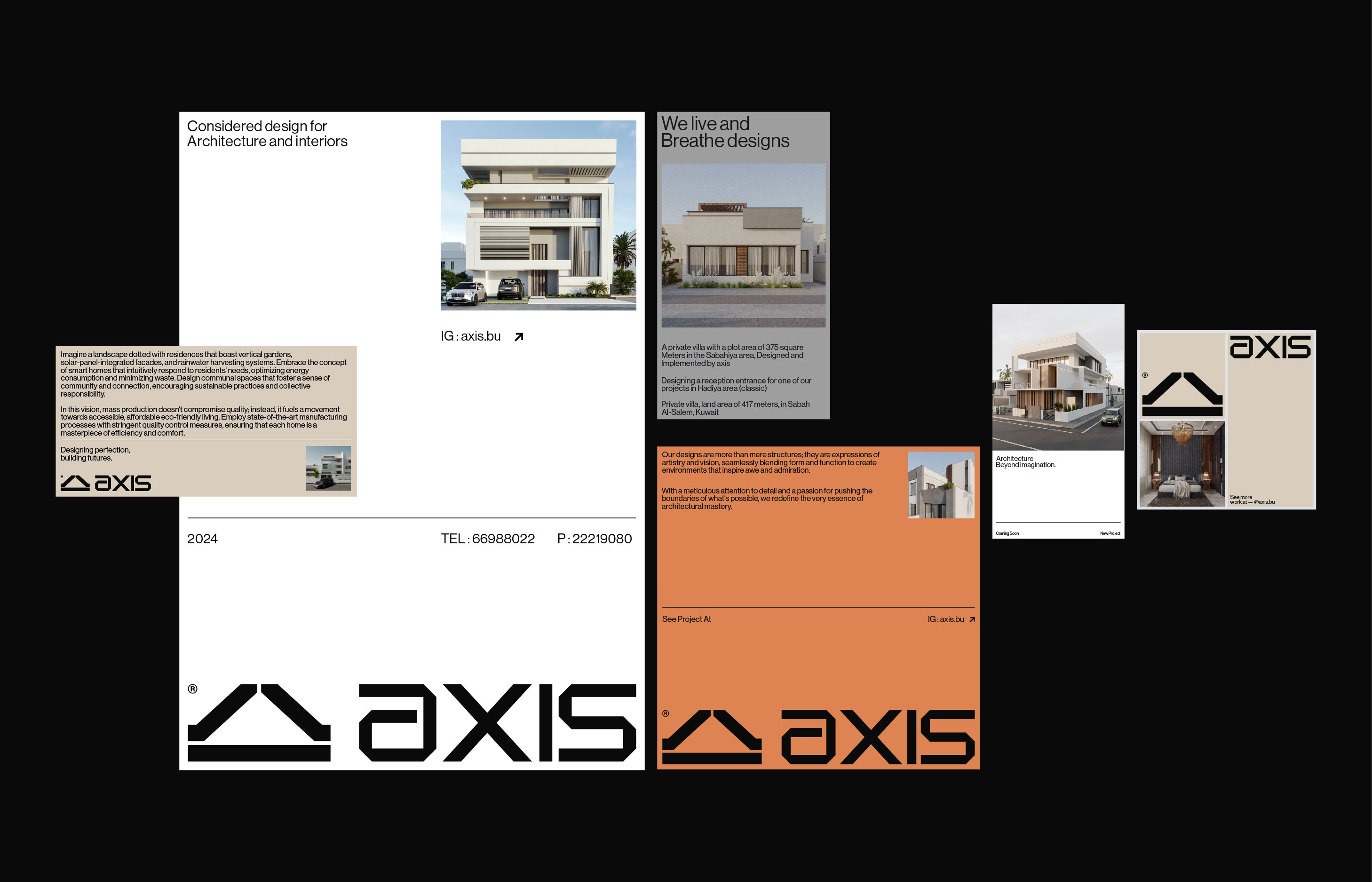
Color is a powerful tool in visual identity design, capable of evoking emotions and setting the tone for a brand. For Axis, a primary color palette of white, black, grey, and beige was chosen. These colors are timeless and sophisticated, reflecting the modern European style that Axis embodies. White symbolizes purity, simplicity, and modernity. Black represents elegance, power, and sophistication. Grey conveys neutrality, balance, and understated elegance. Beige adds warmth and a touch of classic sophistication. To add a dynamic and lively element to the palette, green and orange were introduced as secondary colors. Green symbolizes growth, harmony, and freshness, aligning with the idea of creating living spaces that enhance the quality of life. Orange represents creativity, enthusiasm, and energy, reflecting the innovative spirit of Axis.
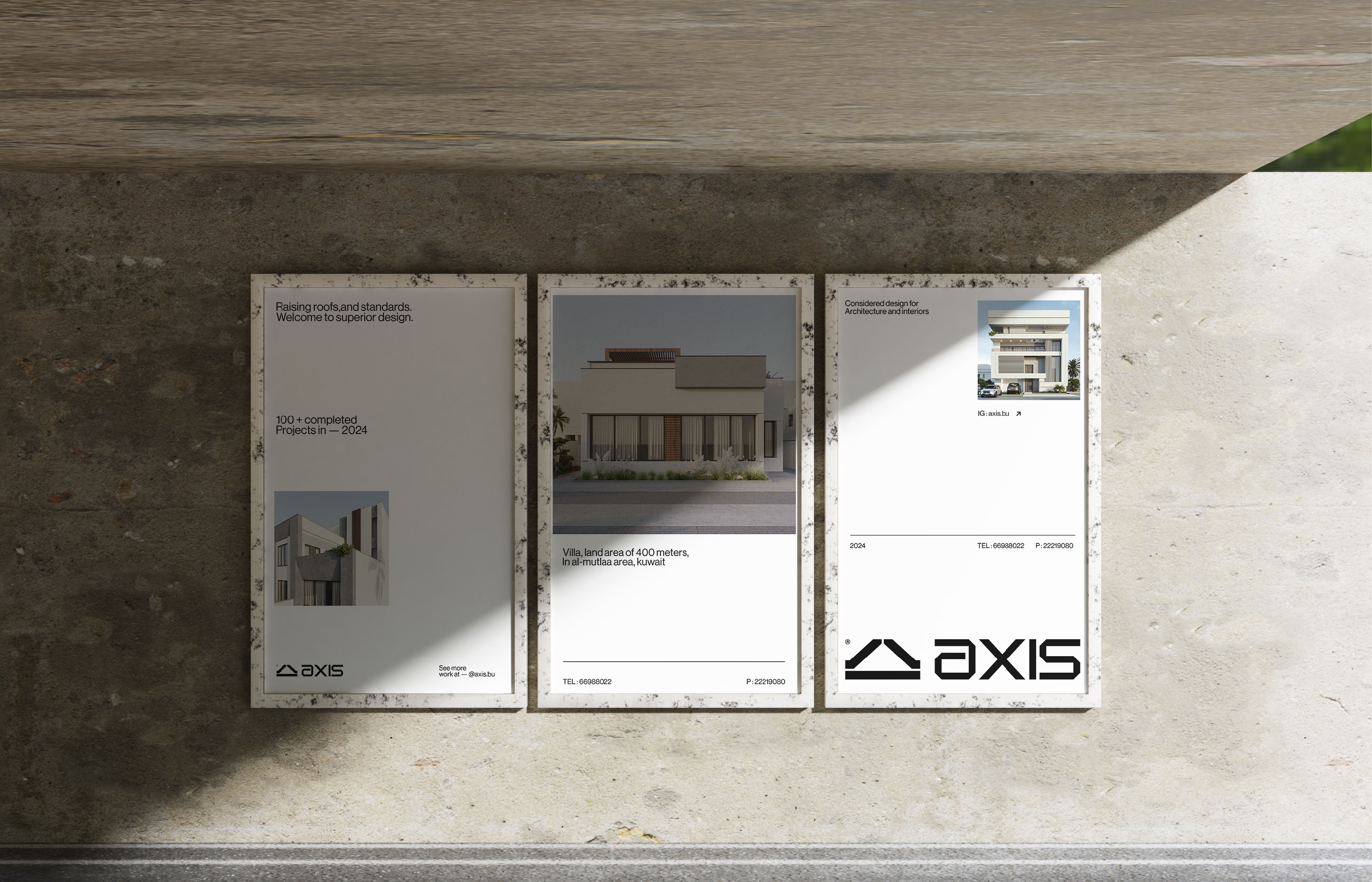
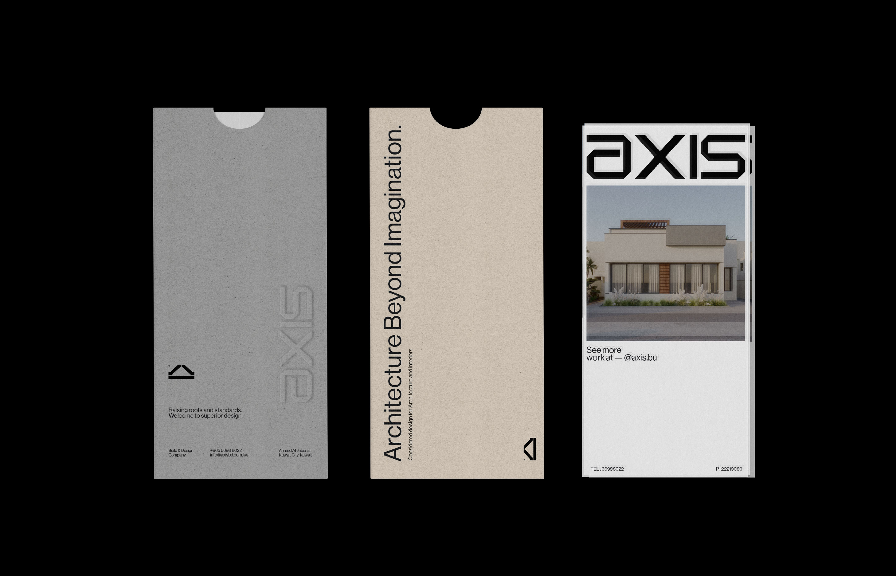
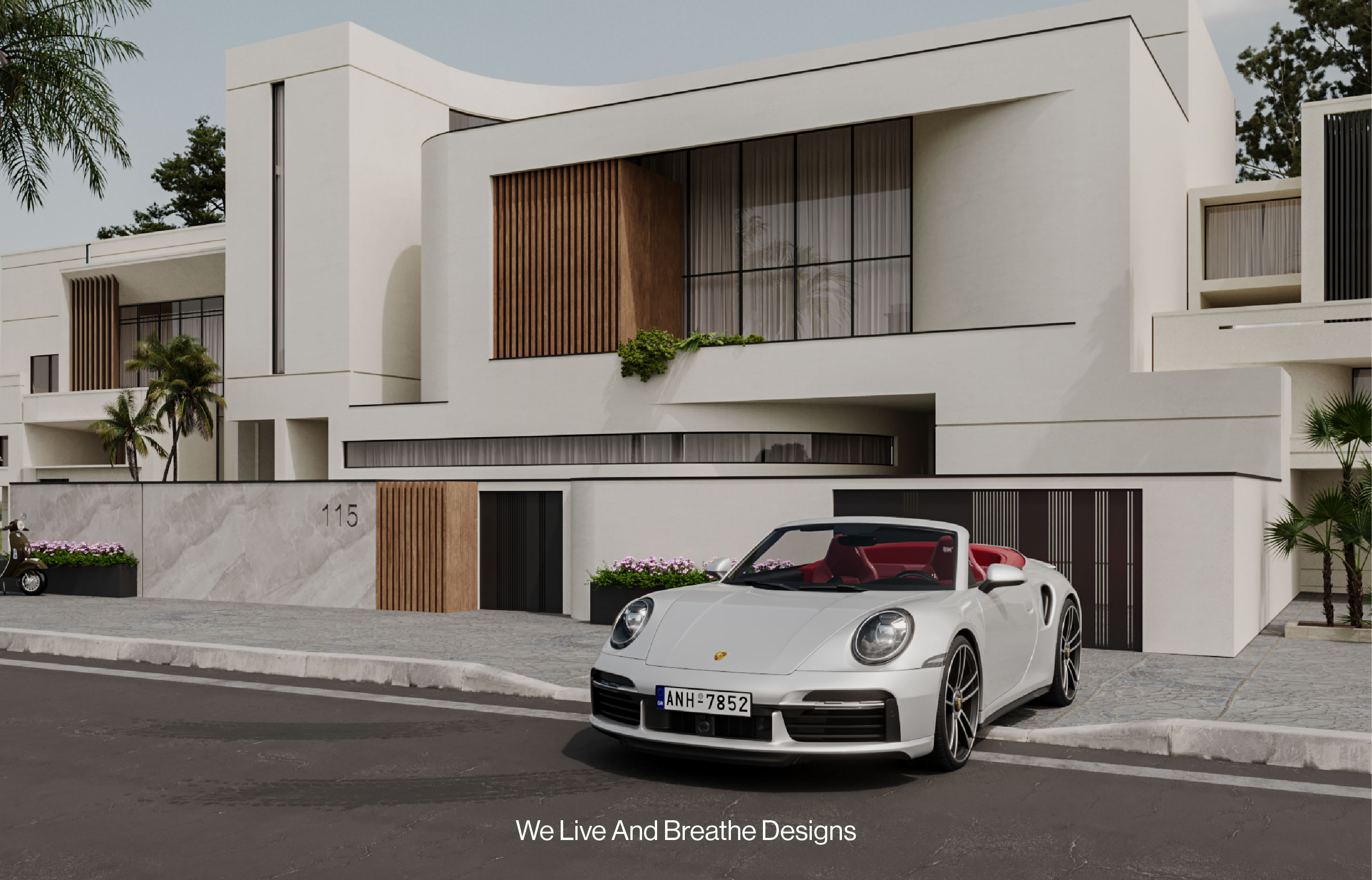
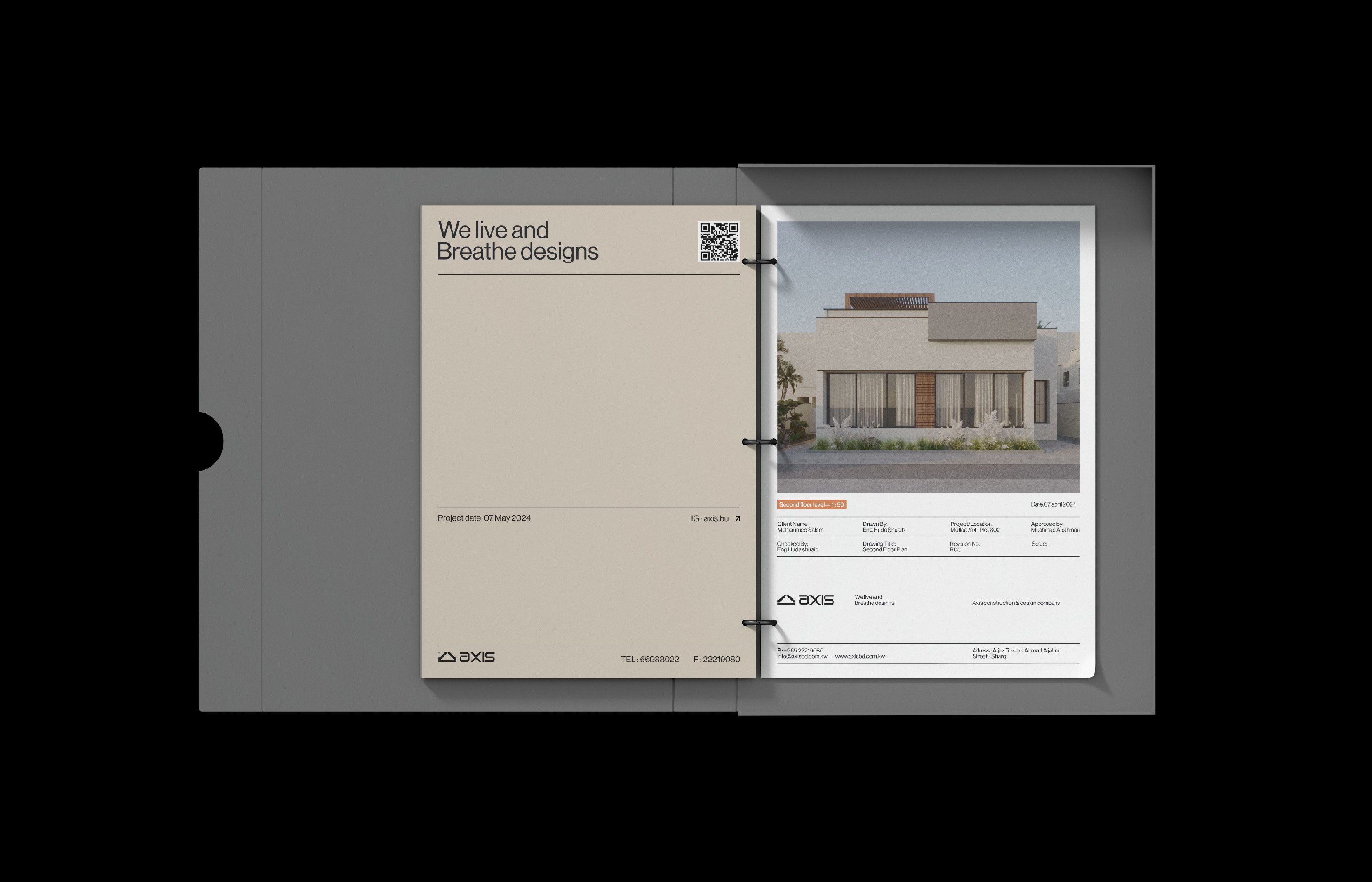
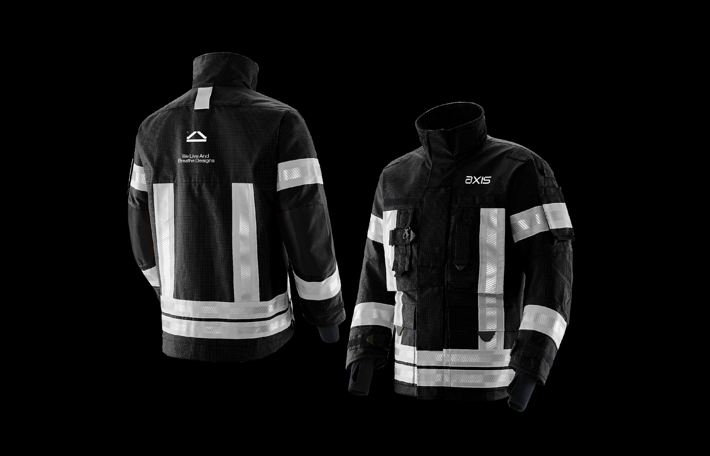
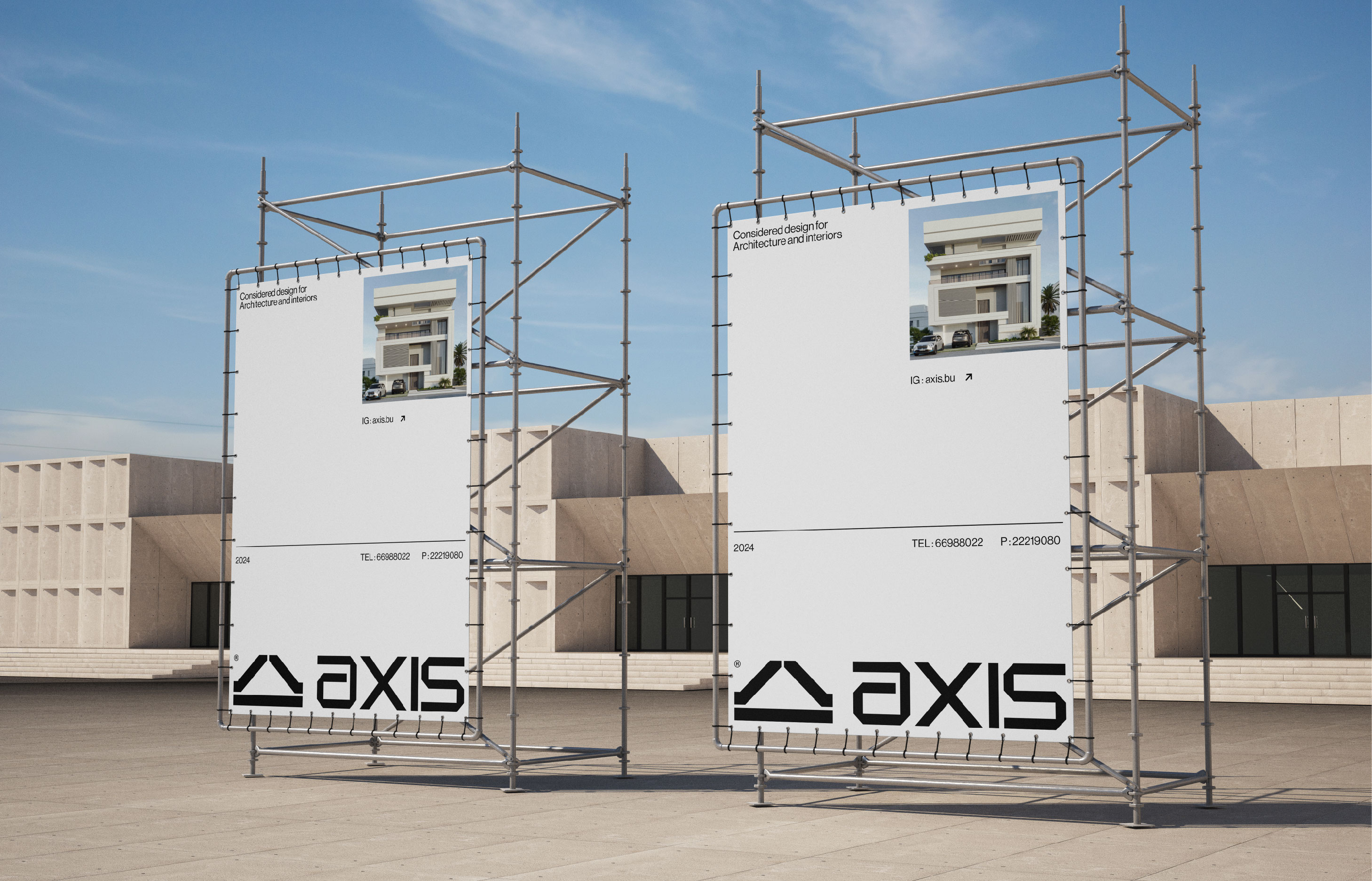
A visual identity is only as strong as its implementation. Ensuring consistency across all touchpoints is crucial in building a recognizable and trusted brand. For Axis, this meant applying the visual identity across various mediums, including business cards, stationery, the company website, social media, and marketing materials. Every application was carefully designed to maintain the integrity of the visual identity. The abstract logo, modified typography, and carefully selected color palette were used consistently to create a cohesive and professional brand image.
Designing the visual identity for Axis involves blending modern European aesthetics with strategic branding principles. The result is a visual identity that is both elegant and functional, capturing the essence of Axis and setting it apart in the competitive design industry. The goal is always to create a visual language that not only looks beautiful but also tells a compelling story. For Axis, this story is one of sophistication, reliability, and innovation—values that are now reflected in every aspect of their visual identity.
CREDIT
- Agency/Creative: Safa Khamis
- Article Title: Safa Khamis Creates Branding for Axis Design and Architecture Firm
- Organisation/Entity: Freelance
- Project Type: Identity
- Project Status: Published
- Agency/Creative Country: Oman
- Agency/Creative City: oman
- Market Region: Europe, Middle East, North America, Global
- Project Deliverables: Art Direction, Brand Identity, Brand Redesign, Branding, Identity System, Logo Design, Typography
- Industry: Construction
- Keywords: WBDS Creative Design Awards 2024/25 , brand identity, graphic design, identity, brand system, logo, visual identity, re-branding
-
Credits:
Creative Art Director, Brand Designer: Safa Khamis


