Maradd is a Brand for Adventurers and Remote Workers
Maradd is more than just a reseller of high-quality backpacks; it’s a brand that embodies the spirit of exploration and the comfort of returning home. Specializing in premium backpacks, Maradd caters to a unique audience—people who travel frequently, those who embrace new challenges and adventures every day, and remote workers who carry their essentials wherever they go. Maradd’s offerings are designed not only for rugged journeys but also for everyday functionality, providing a stylish, reliable option for people who work from anywhere.
The Challenge: Connecting the Brand’s Meaning to Its Audience
The name “Maradd” has a deep, intrinsic meaning—“going back home” or “returning to places you love.” This evokes a sense of nostalgia, comfort, and familiarity, yet the brand’s target audience is dynamic, always moving, and craving new experiences. The challenge was to connect this sense of homecoming with the thrill of exploring new places and the functionality of Maradd’s products. We needed a branding concept that would resonate with adventurers and remote workers alike, allowing them to relate to Maradd not just as a product but as an experience that reflects their lifestyle.
Our goal was to make Maradd’s branding a bridge between these two ideas: the excitement of exploring the unknown and the comfort of finding familiarity in those experiences. We wanted people to see Maradd as not just a bag brand but as a reliable companion that ties together the emotions of adventure and the warmth of homecoming.
The Solution: Translating “Maradd” into a Relatable Brand Experience
To address this challenge, we developed a cohesive branding strategy that visually and emotionally resonates with Maradd’s audience. Here’s how we approached it:
Color Palette Inspired by Nature
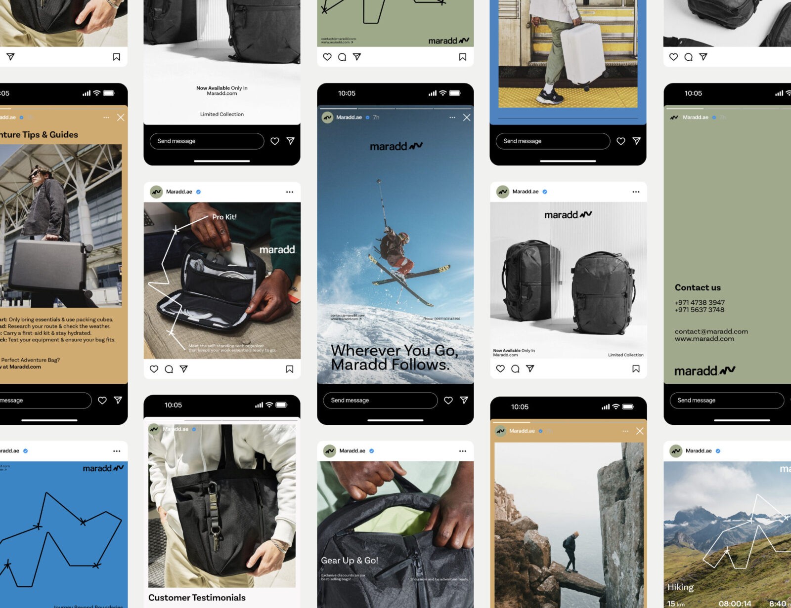
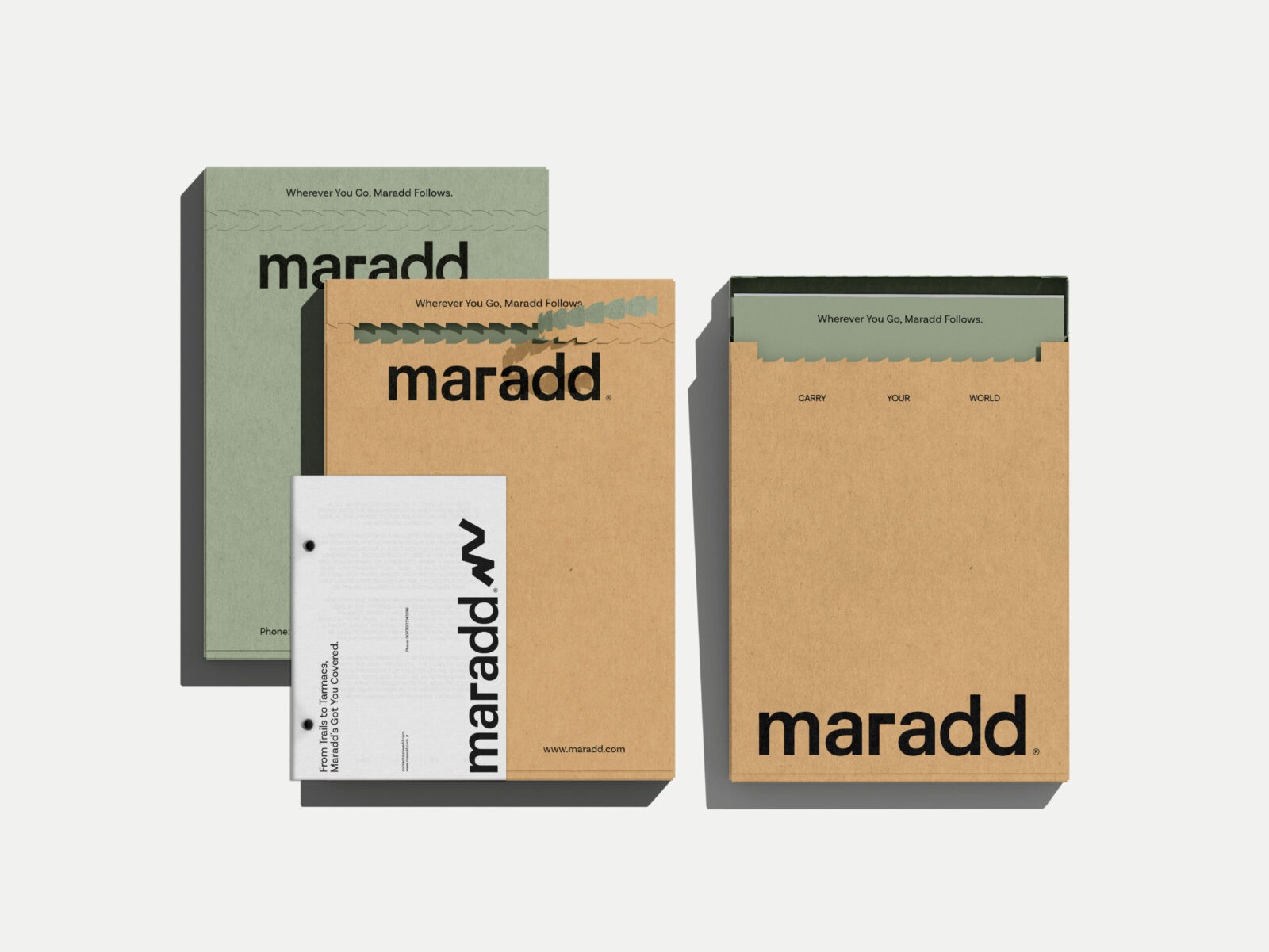
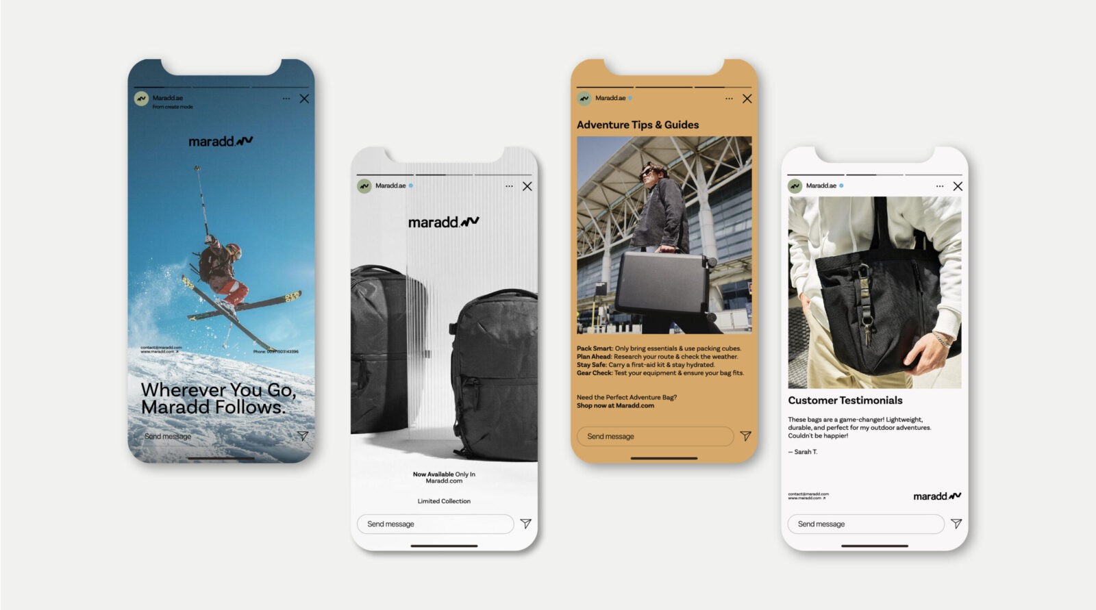
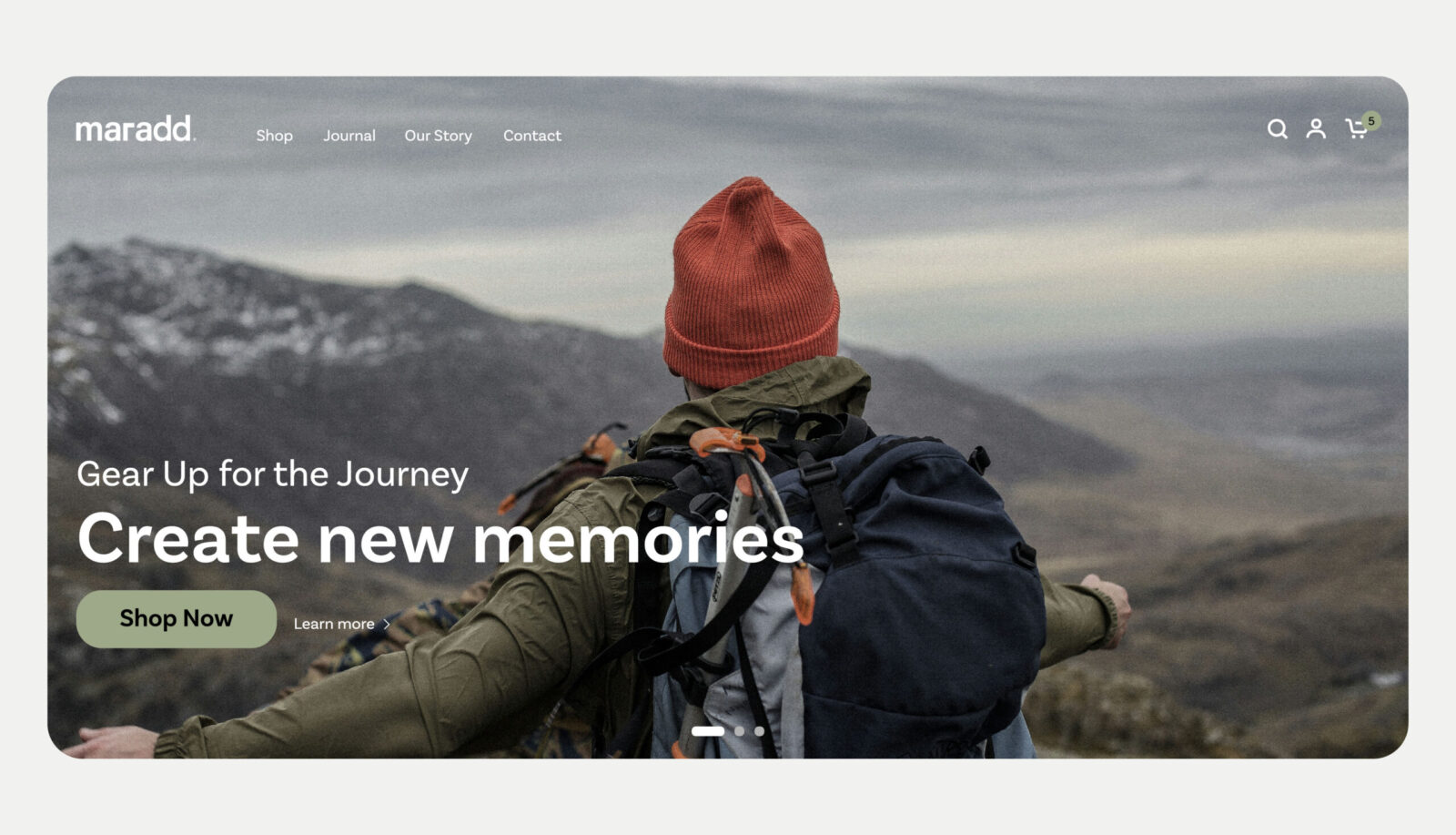
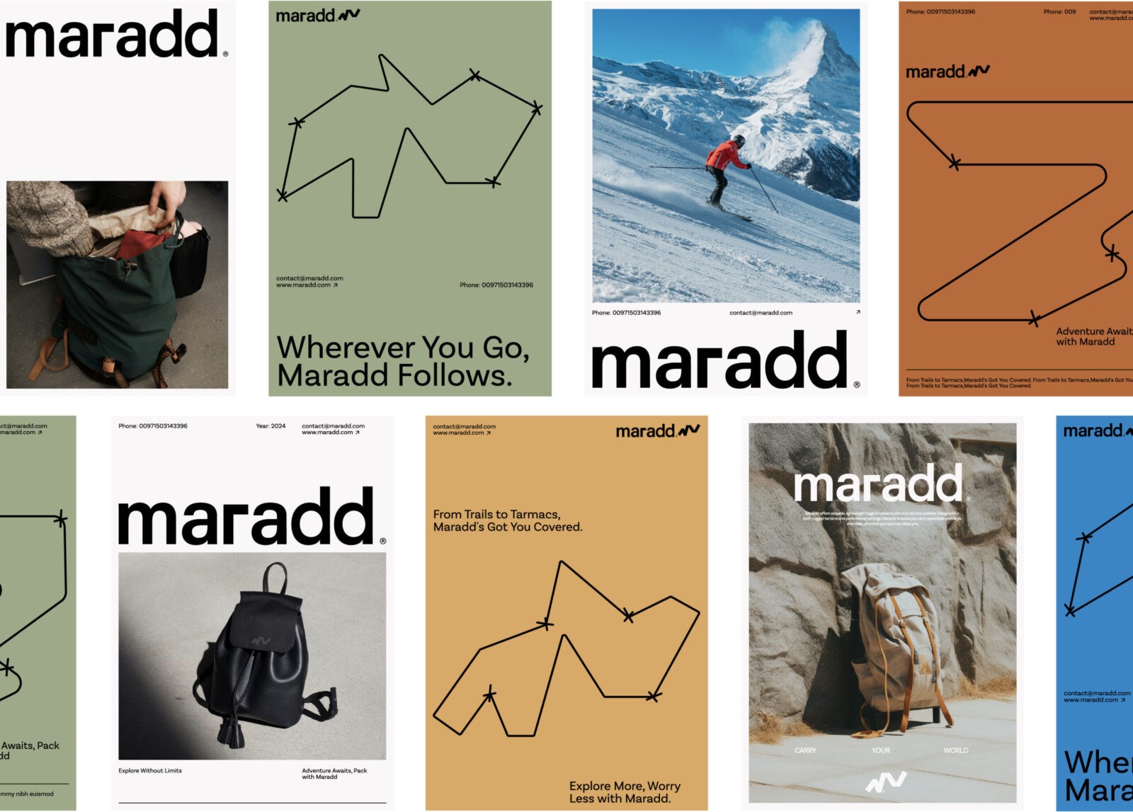
Since Maradd’s target audience consists of adventurers, travelers, and those who spend a lot of time outdoors, we chose a color palette inspired by nature. Earthy greens, deep blues, and warm browns are central to Maradd’s identity, representing the landscapes and environments their audience frequently encounters—forests, mountains, oceans, and deserts. These colors serve to connect the brand to nature, evoking a sense of grounding and familiarity that aligns with the brand’s essence of “returning to places you love.”
By grounding the brand’s colors in natural hues, we created a visual connection between the product and the places it’s meant to accompany. This palette not only appeals to Maradd’s audience but also reinforces the brand’s commitment to durability, quality, and functionality, traits that are essential for anyone navigating unpredictable terrains or working remotely from different locations.
Graphic Elements Representing Adventure and Journey
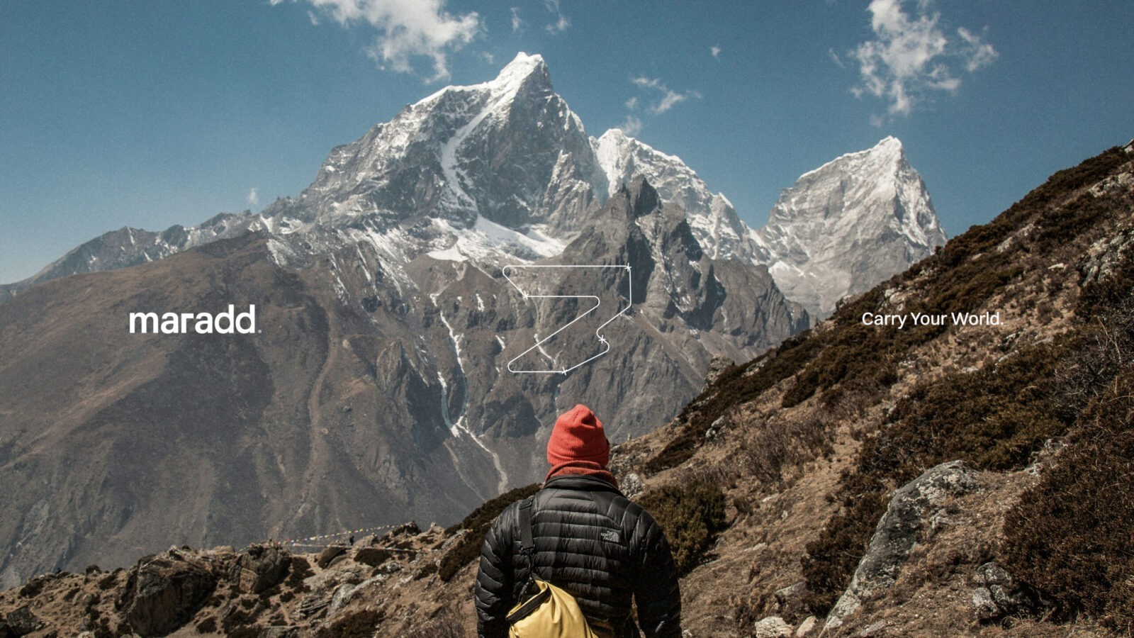
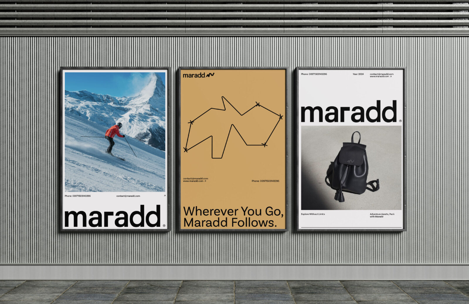
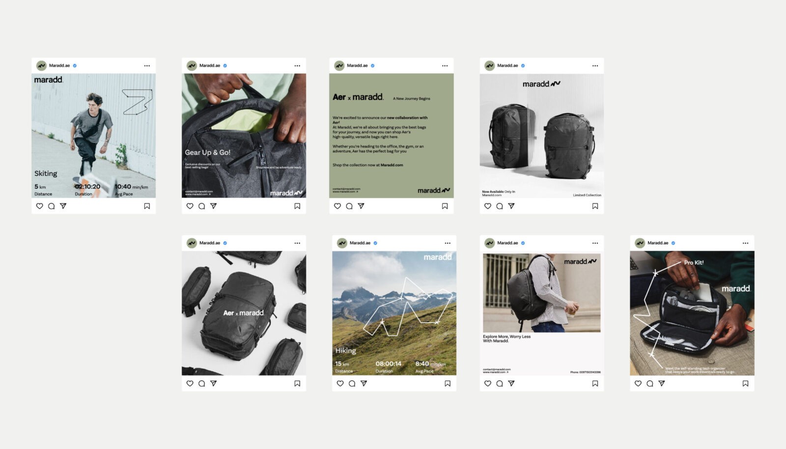
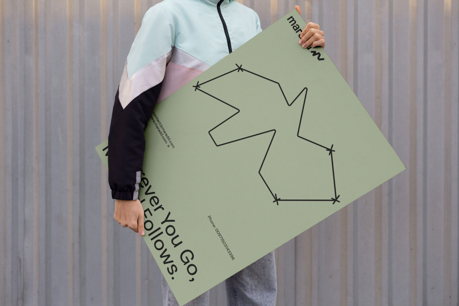
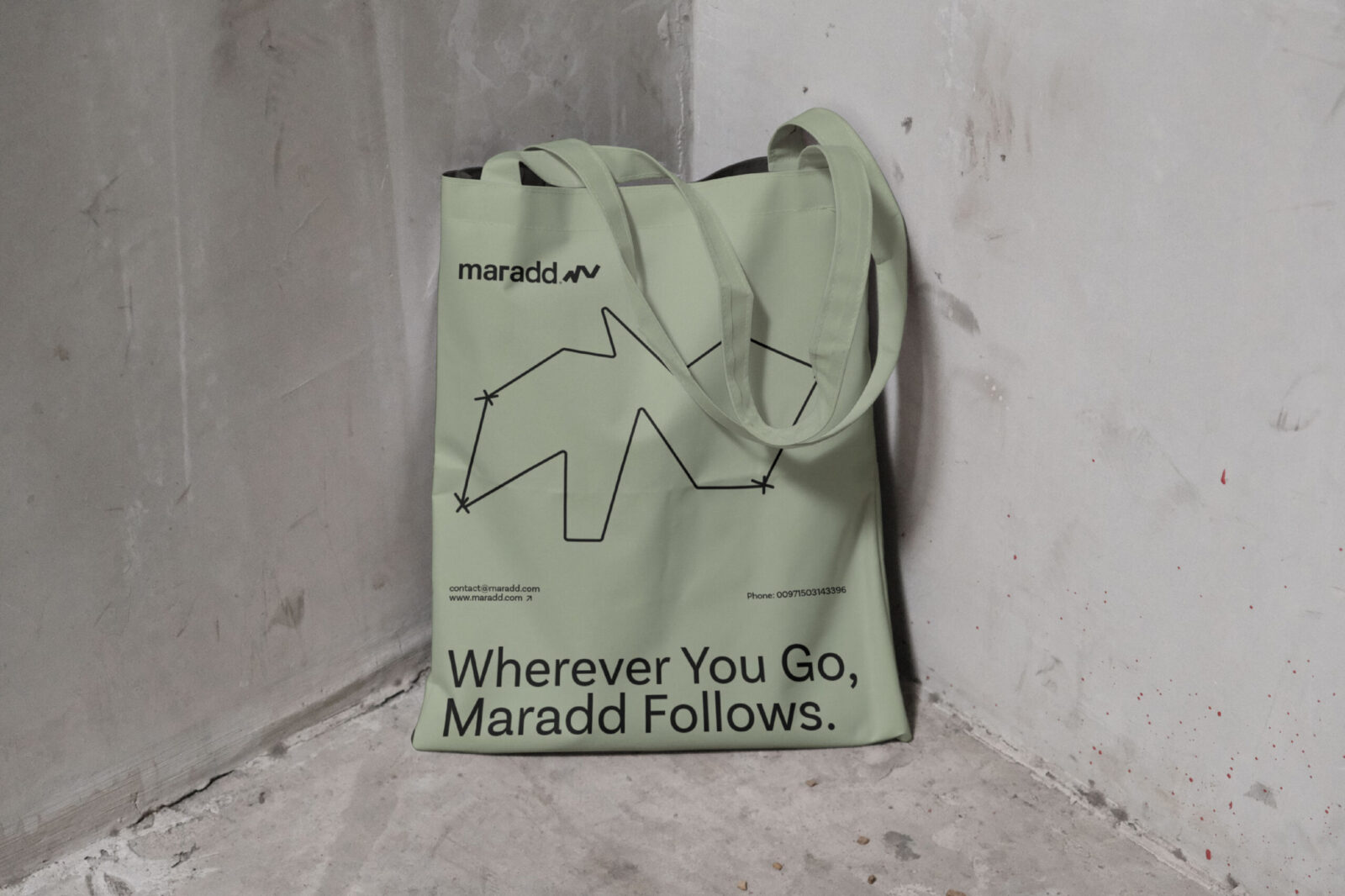
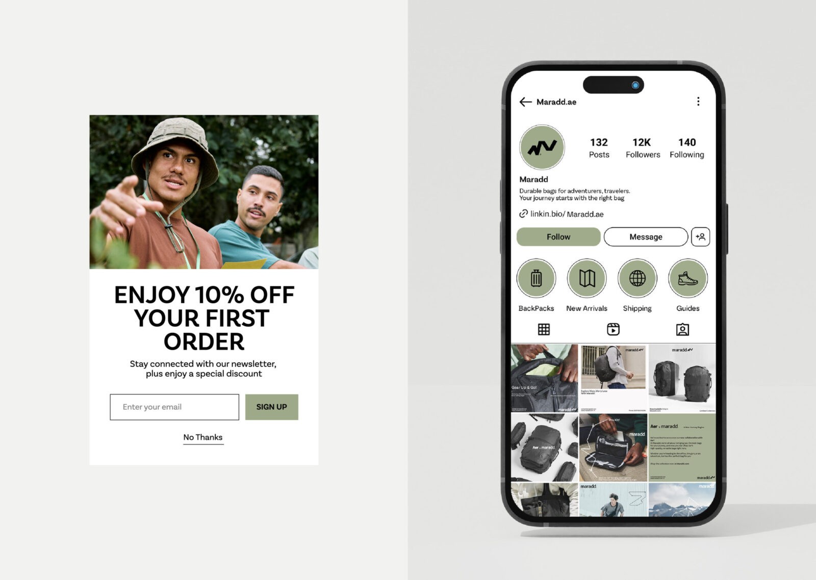
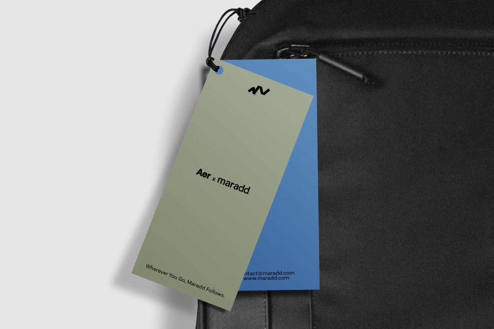
We incorporated custom graphic elements that symbolize trails, pathways, and routes—visual metaphors for the journey itself. These elements are designed to appear as part of Maradd’s branding across various materials, including packaging, promotional items, and social media. They evoke a sense of direction, exploration, and movement, visually telling the story of “finding your way” back to something meaningful.
This touch serves to link the adventurous spirit of the audience with the concept of homecoming. It’s a subtle nod to the fact that every journey, no matter how adventurous, ultimately brings you back to where you feel a sense of belonging.
Clean, Structured Layout for Clarity and Adaptability
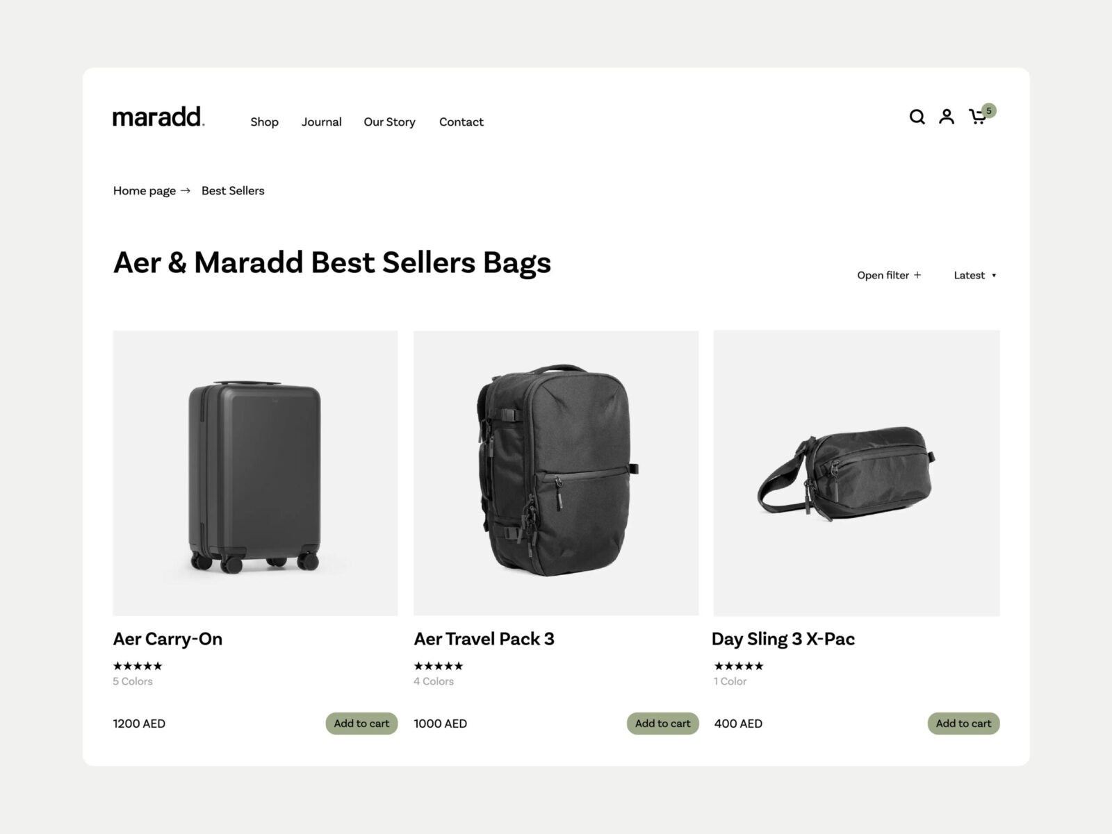
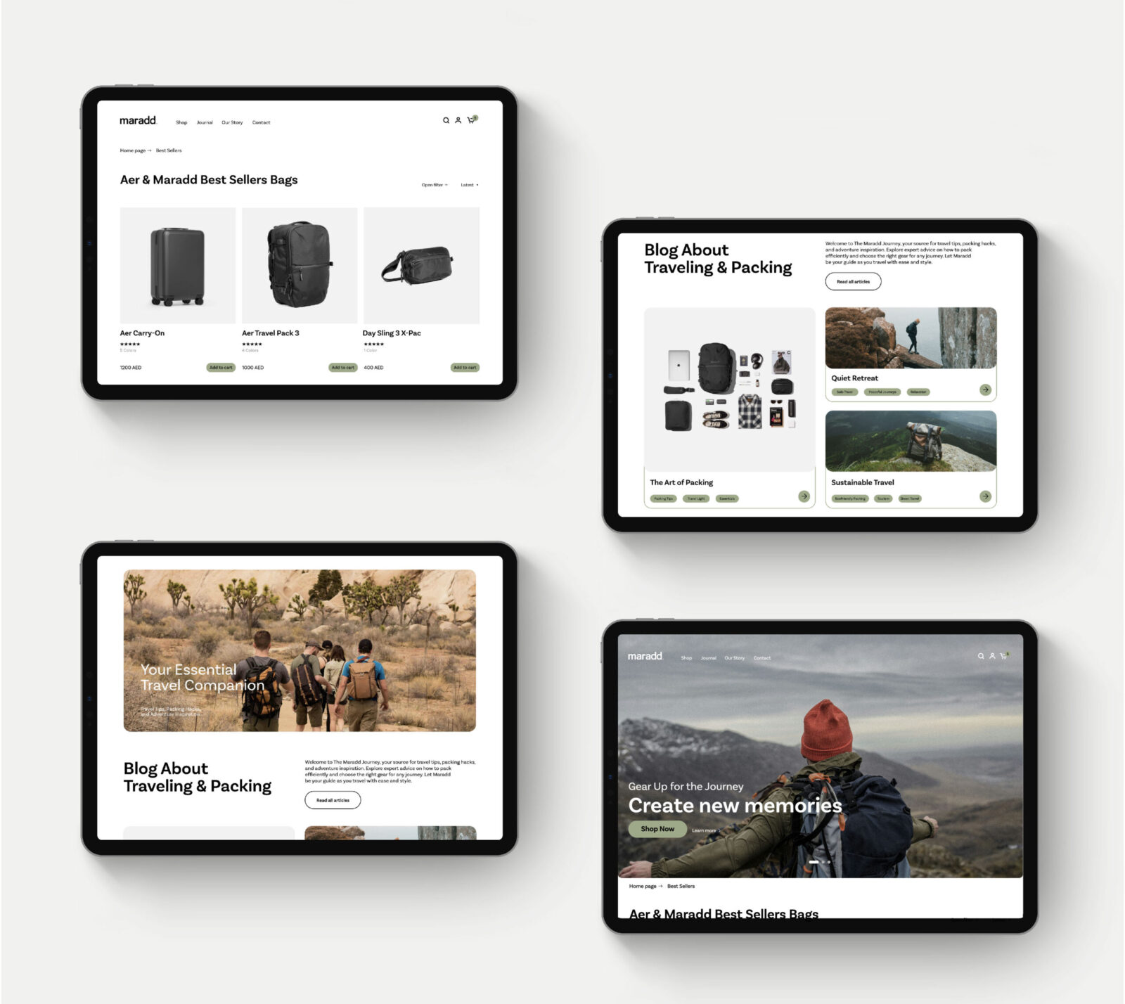
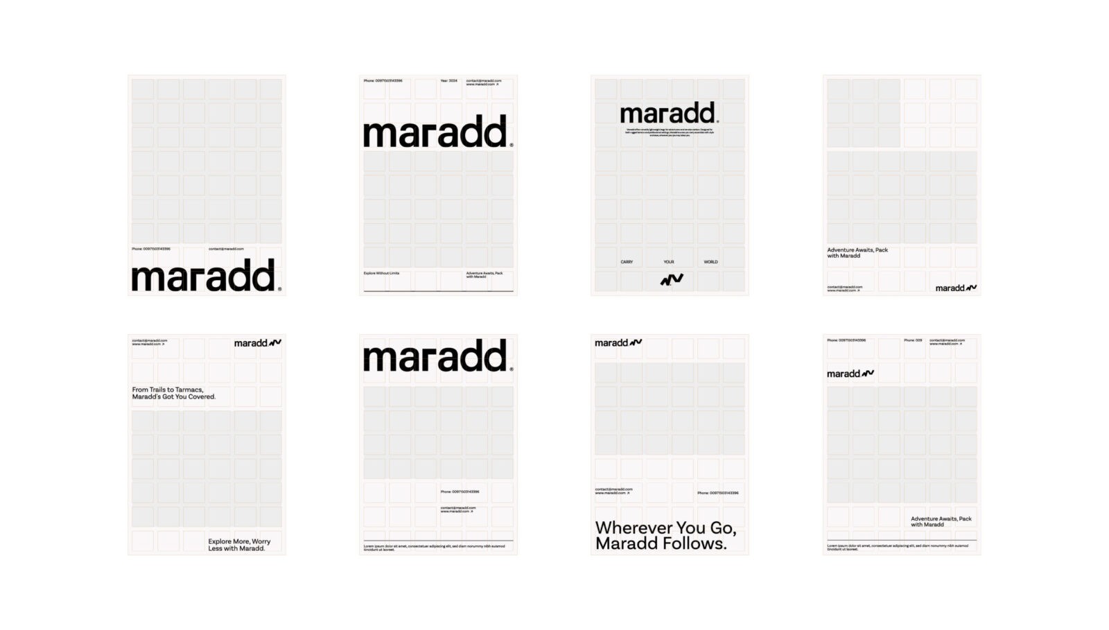
We designed a clean, grid-based layout to serve as the foundation of Maradd’s visual identity. This layout is not only visually appealing but also highly functional, allowing for easy adaptability across different media platforms. This structure keeps the focus on key brand messages and product highlights, ensuring that Maradd’s content is always presented in a cohesive, professional manner.
The structured layout complements Maradd’s brand values of simplicity, reliability, and practicality qualities that travelers and remote workers highly value. It reflects the organization and functionality of Maradd’s products, which are meant to make life easier for those who are always on the go.
Brand Messaging that Resonates Emotionally
To make Maradd’s brand relatable, we created a messaging that speaks directly to the emotions of its audience. Taglines like “Wherever You Go, Maradd Follows” or “Explore More, Worry Less with Maradd” encapsulate the essence of the brand. They reflect the idea that Maradd isn’t just a bag, it’s a reliable companion that’s with you on every journey, always bringing you back to where you feel at home.
This messaging reinforces the brand’s dual appeal: it’s adventurous enough for thrill-seekers and grounding sufficient for those who long for comfort and familiarity.
Bringing It All Together
By combining natural colors, journey-inspired graphic elements, a clean layout, and emotionally resonant messaging, we created a cohesive brand identity that captures Maradd’s essence. The result is a brand that resonates with its audience on multiple levels, offering both the excitement of exploring new places and the reassurance of returning to what’s familiar.
With this branding, Maradd stands out as more than just a reseller of high-quality backpacks. It becomes a symbol of adventure, reliability, and a connection to home—making it the ideal choice for travelers, adventurers, and remote workers who seek both functionality and meaning in the products they use. This identity allows Maradd to not only meet the practical needs of its audience but also to connect with them on a deeper, more emotional level.
CREDIT
- Agency/Creative: Safa Khamis , Hamza Ouaziz
- Article Title: Safa Khamis and Hamza Ouaziz’s Branding for Maradd Evokes the Spirit of Adventure
- Organisation/Entity: Creative
- Project Status: Published
- Agency/Creative Country: Oman
- Agency/Creative City: Muscat
- Project Deliverables: 3D Art, Animation, Brand Creation, Brand Design, Brand Experience, Brand Guidelines, Brand Identity, Brand Mark, Brand Naming, Brand Tone of Voice, Brand World, Branding, Creative Direction, Design, Digital Art, Graphic Design, Identity System, Logo Design, Motion Graphics, Poster Design, Research, Tone of Voice
- Industry: Retail
- Keywords: WBDS Creative Design Awards 2024/25
- Keywords: WBDS Creative Design Awards 2024/25


