


Sacred Foods is a new company offering more than just a healthy snack.
When they came to us we immediately saw an opportunity for them to connect directly with today’s wellbeing consumer.
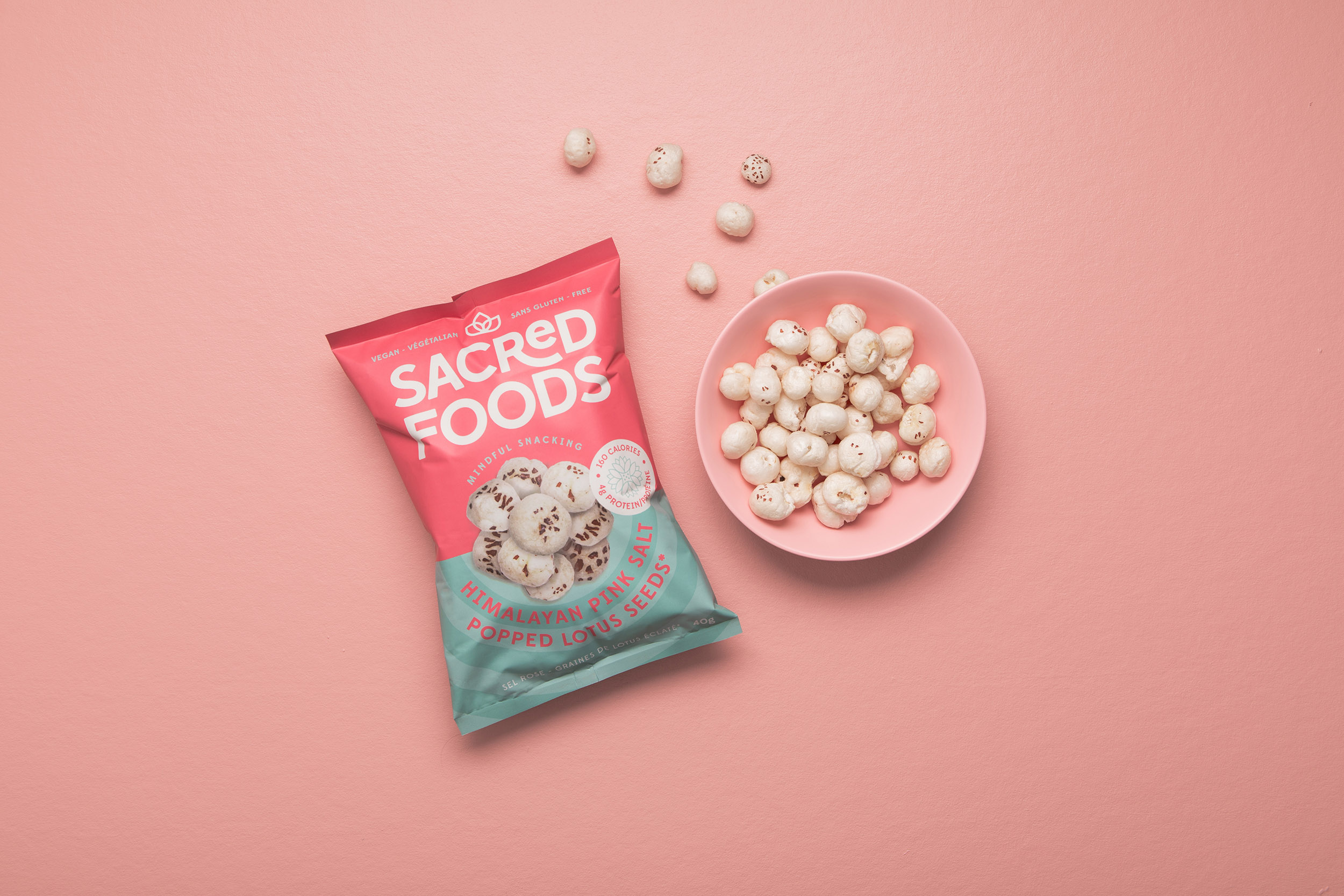
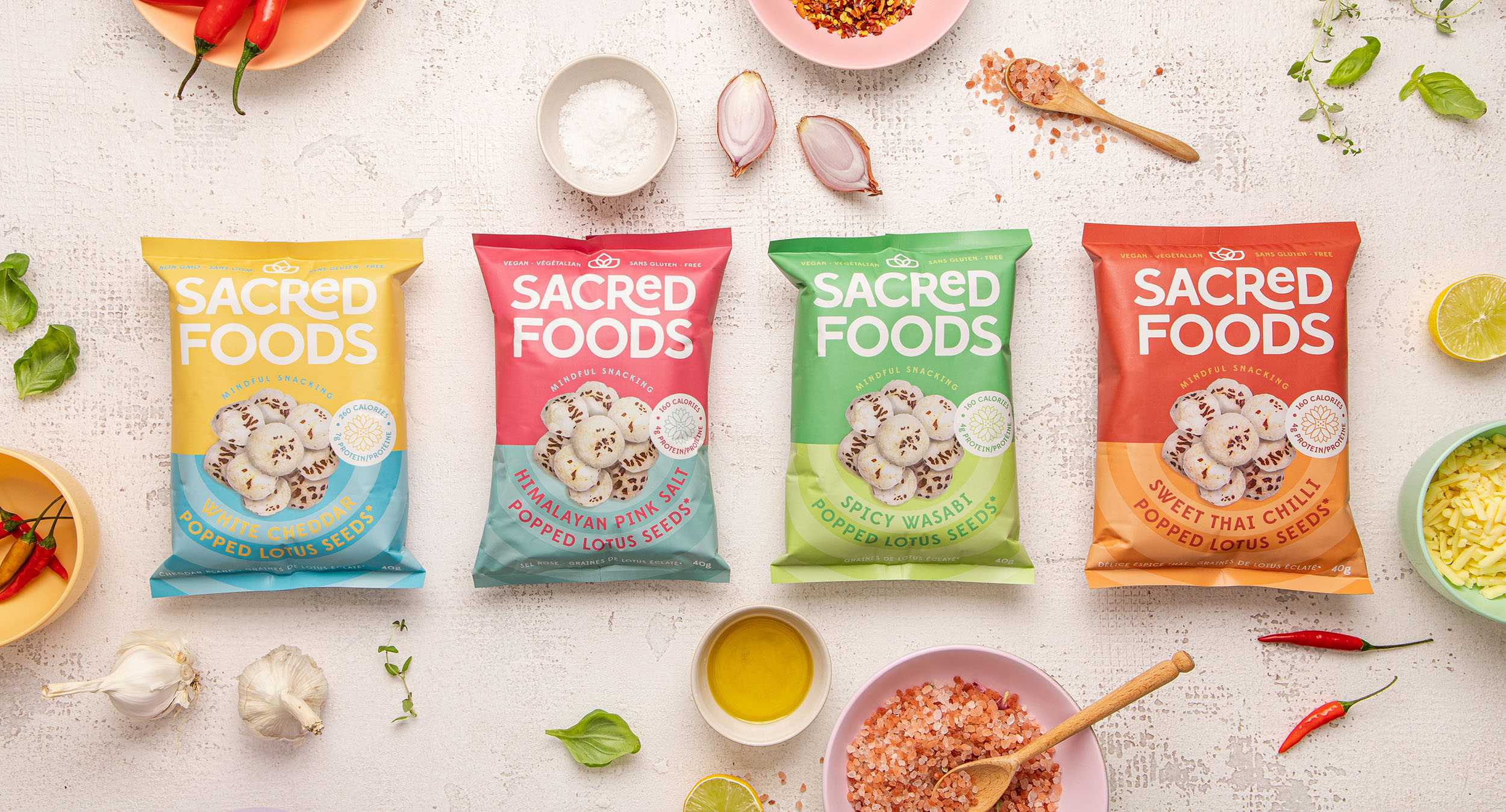
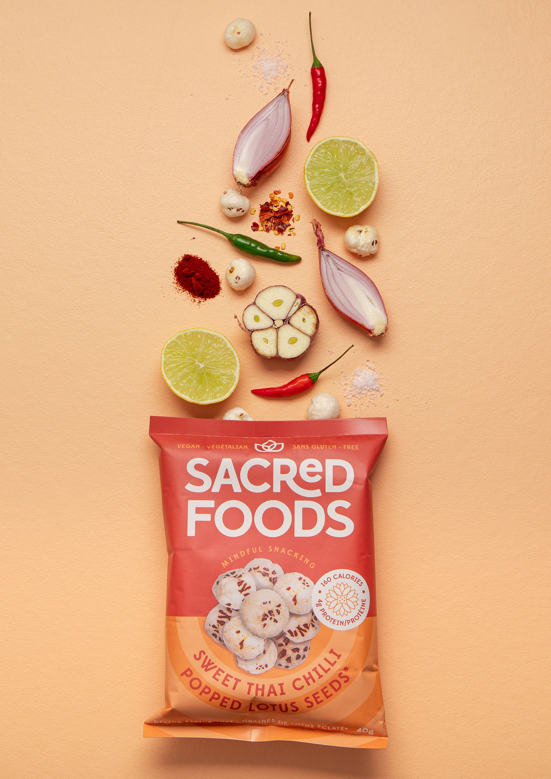
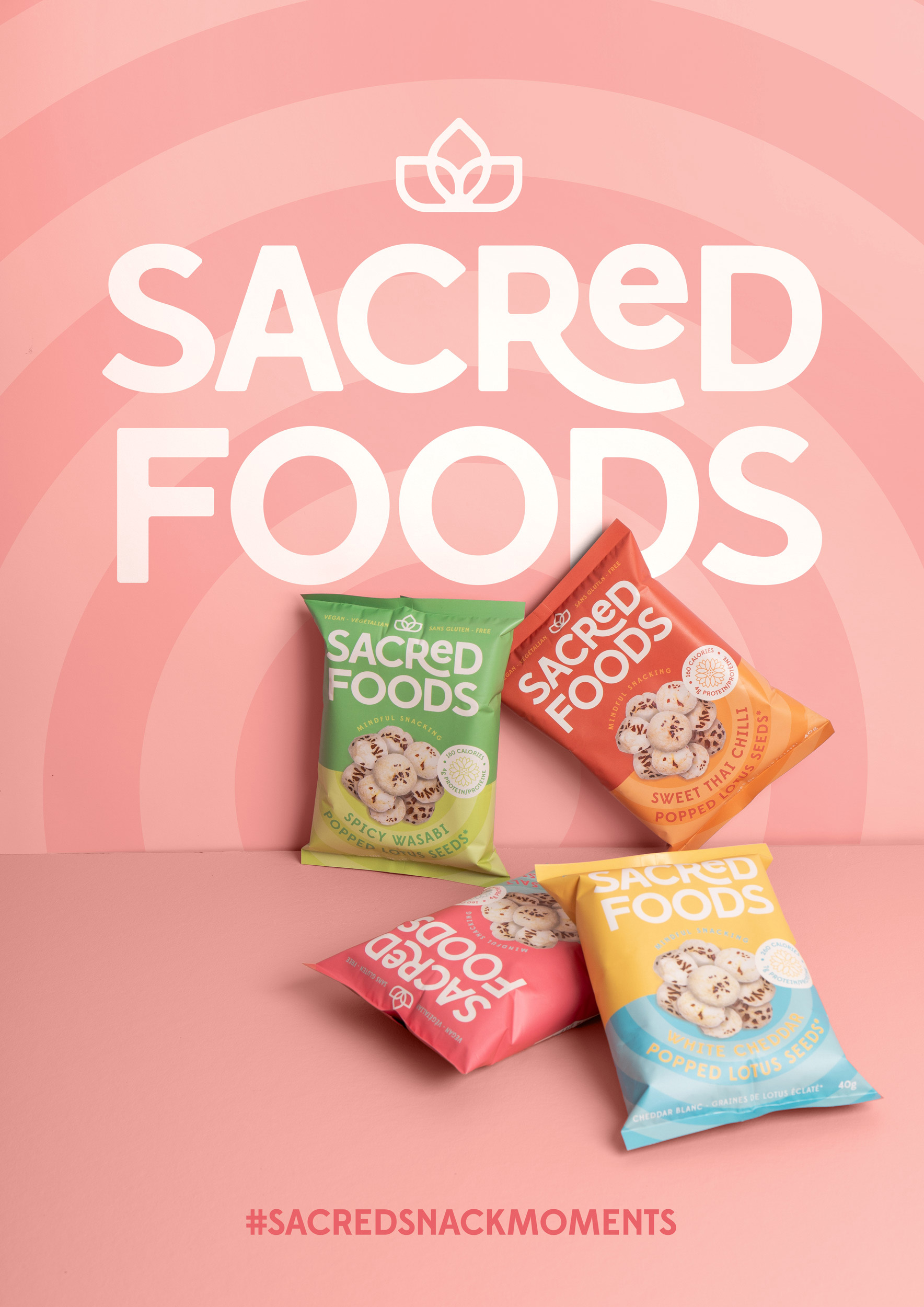
Founder Anamika launched with nourishing popped lotus seeds, the snack of her childhood in India. The lotus represents the harmony of nature, culture, spirituality and science that she wanted to her mindful snacking company to embody.
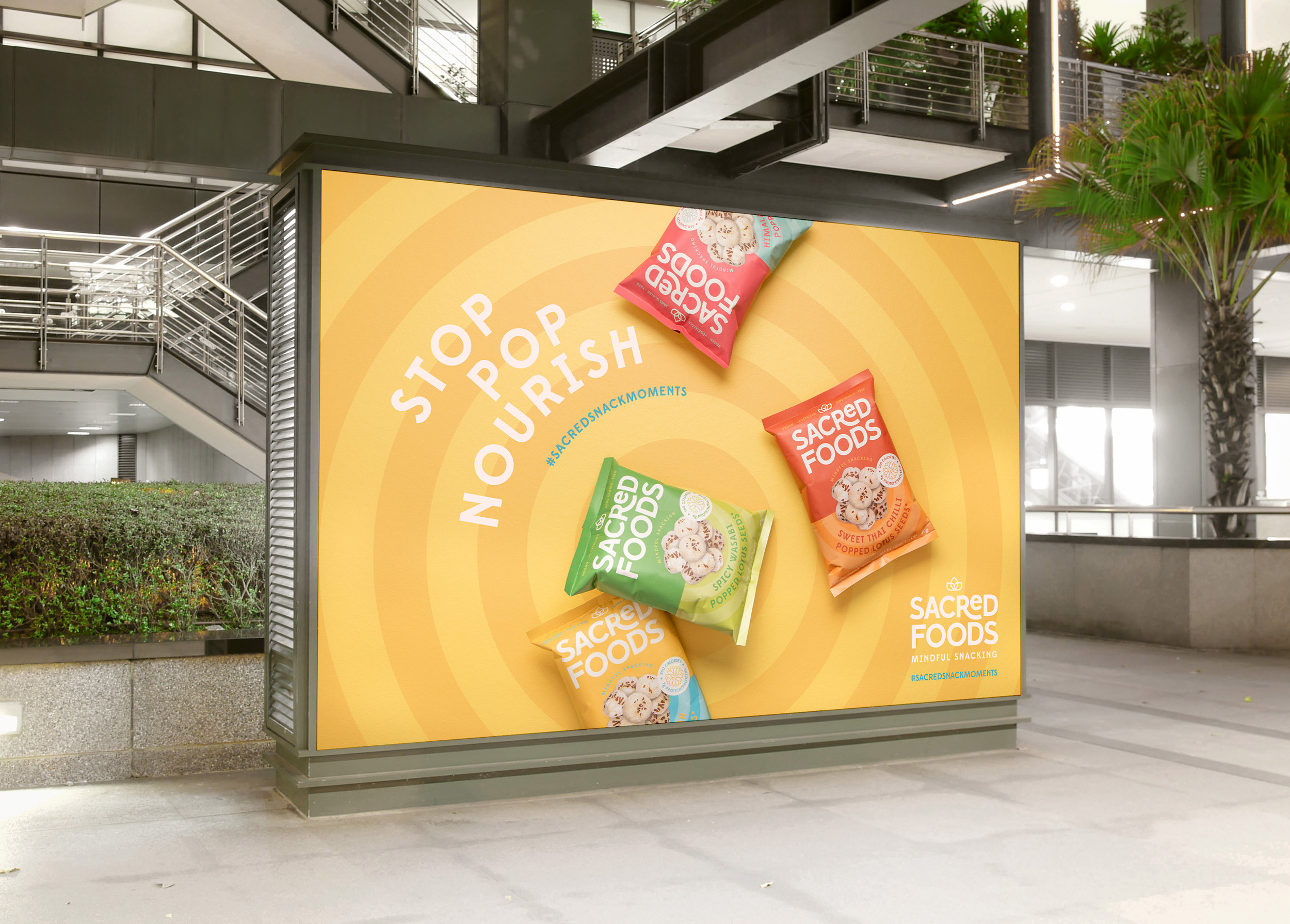
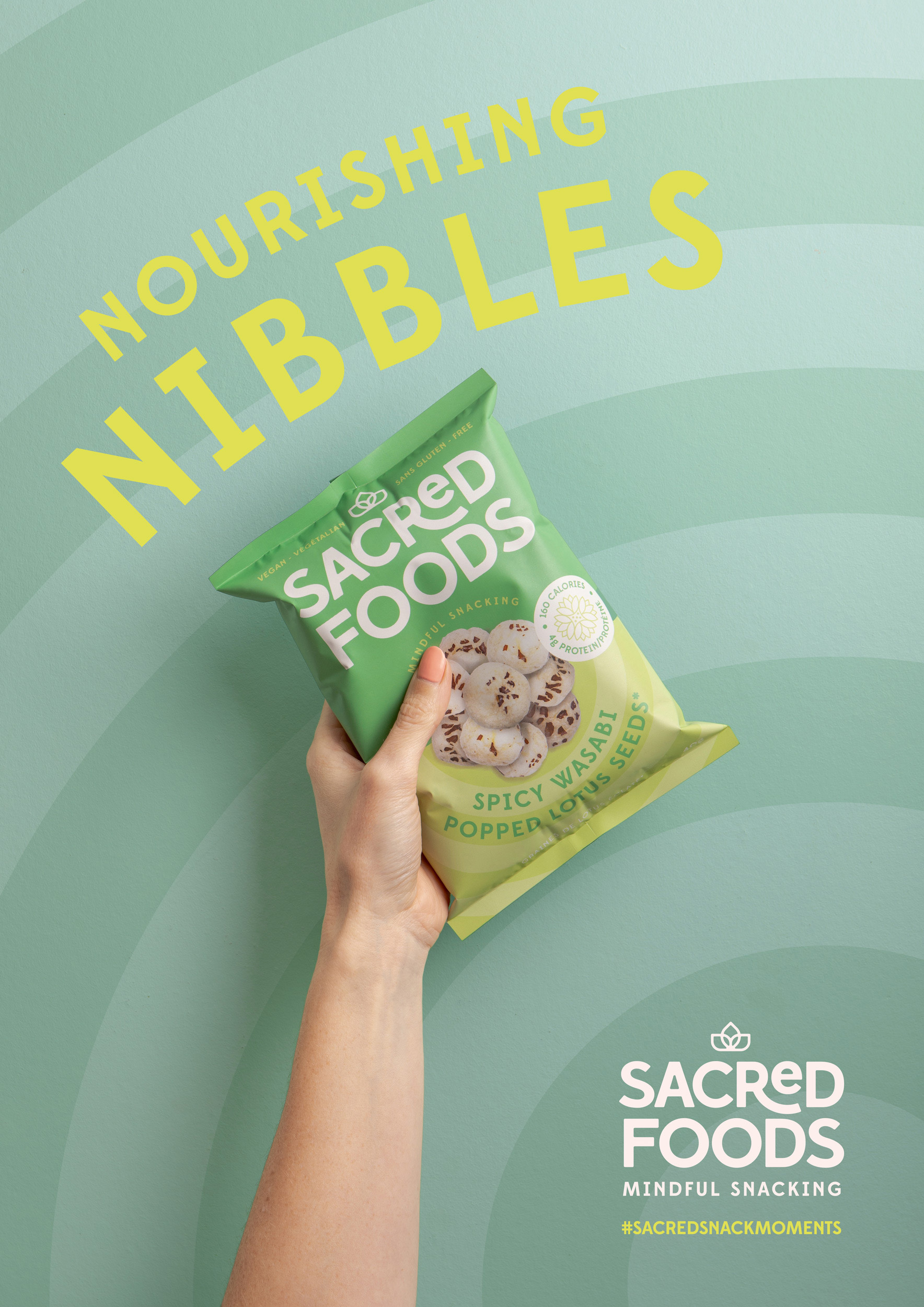
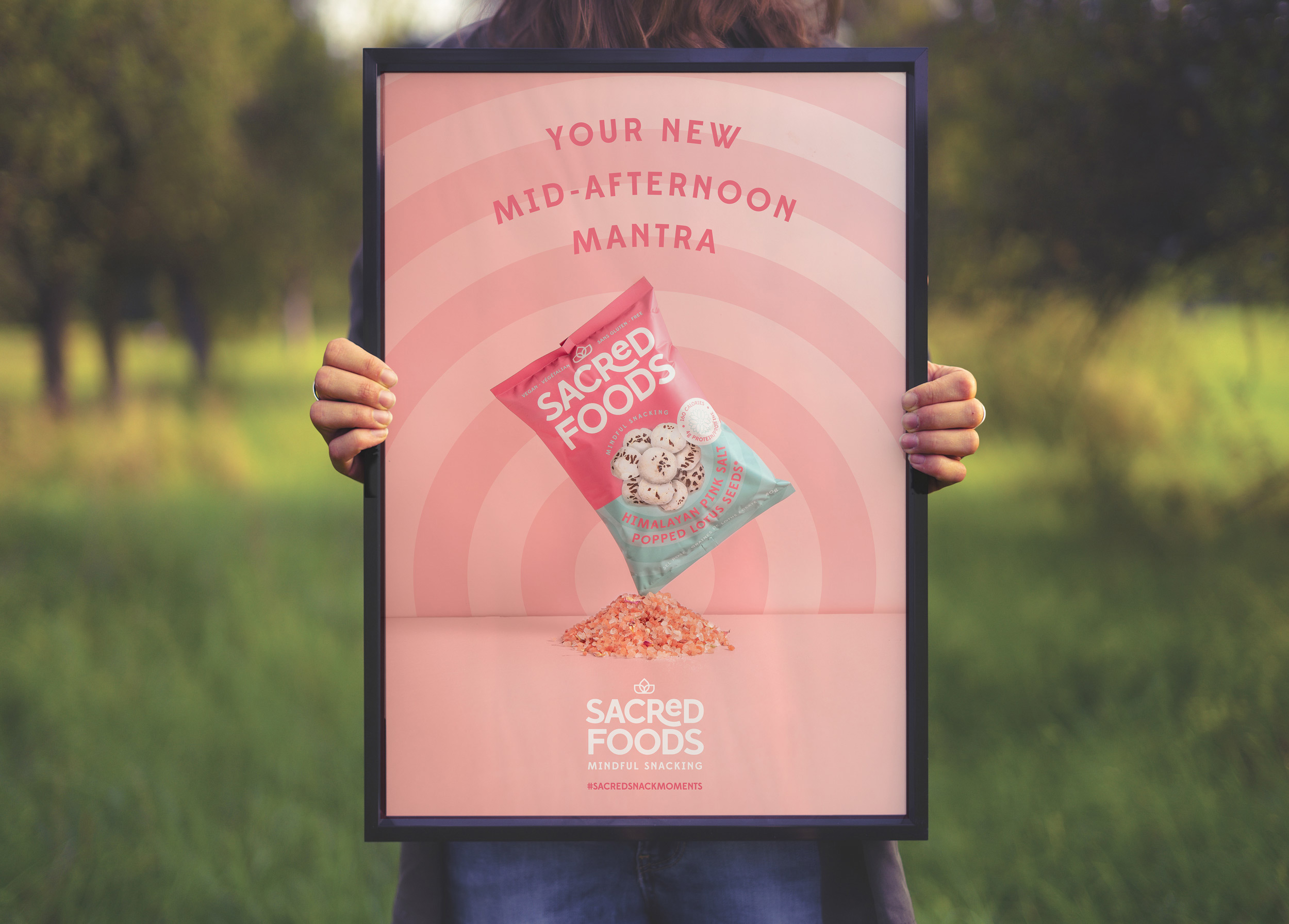
Based on this we developed a brand around the lotus flower that was steeped in clarity, balance and positivity. It is built to fit conveniently into consumers’ lives, attitudes and beliefs.
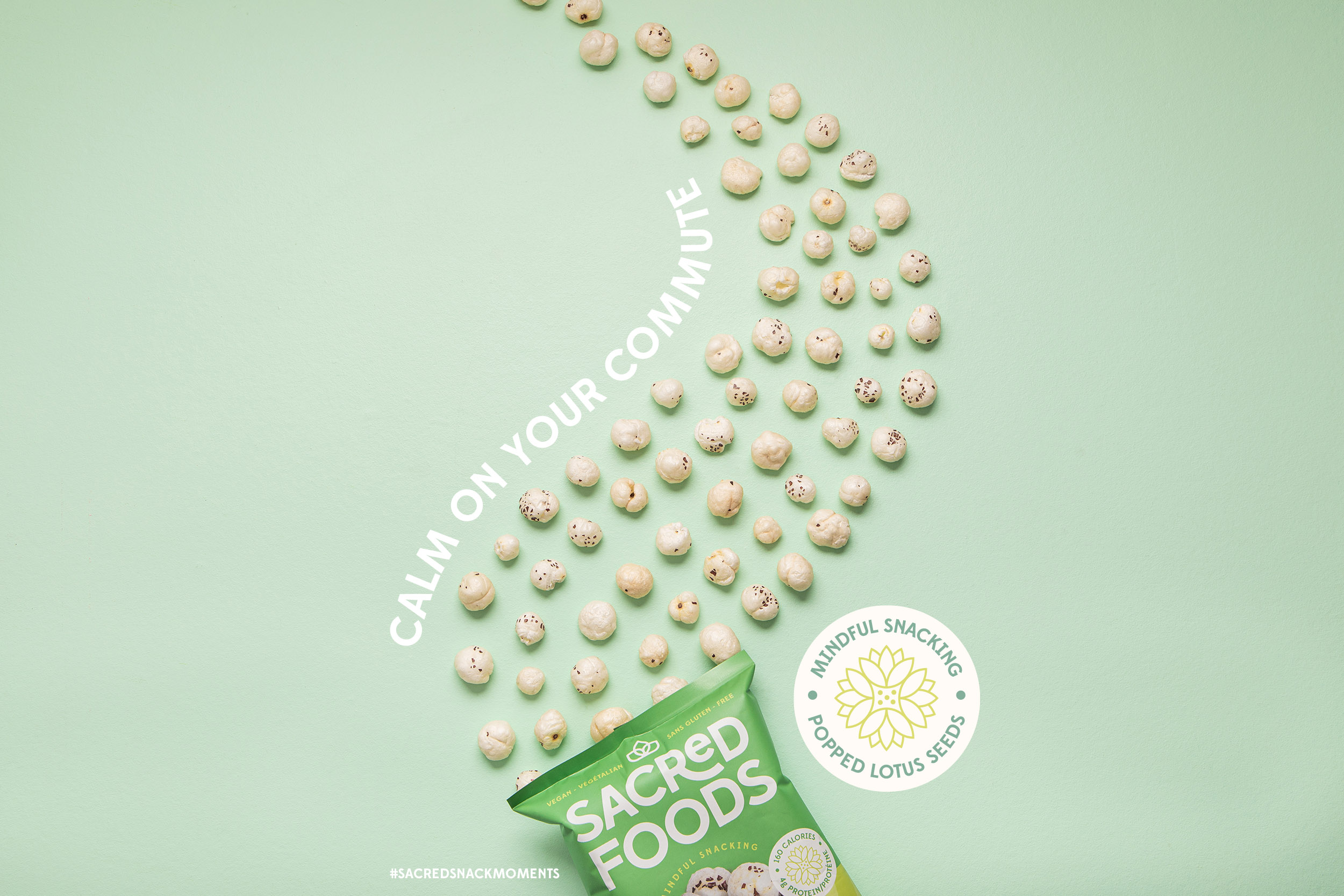
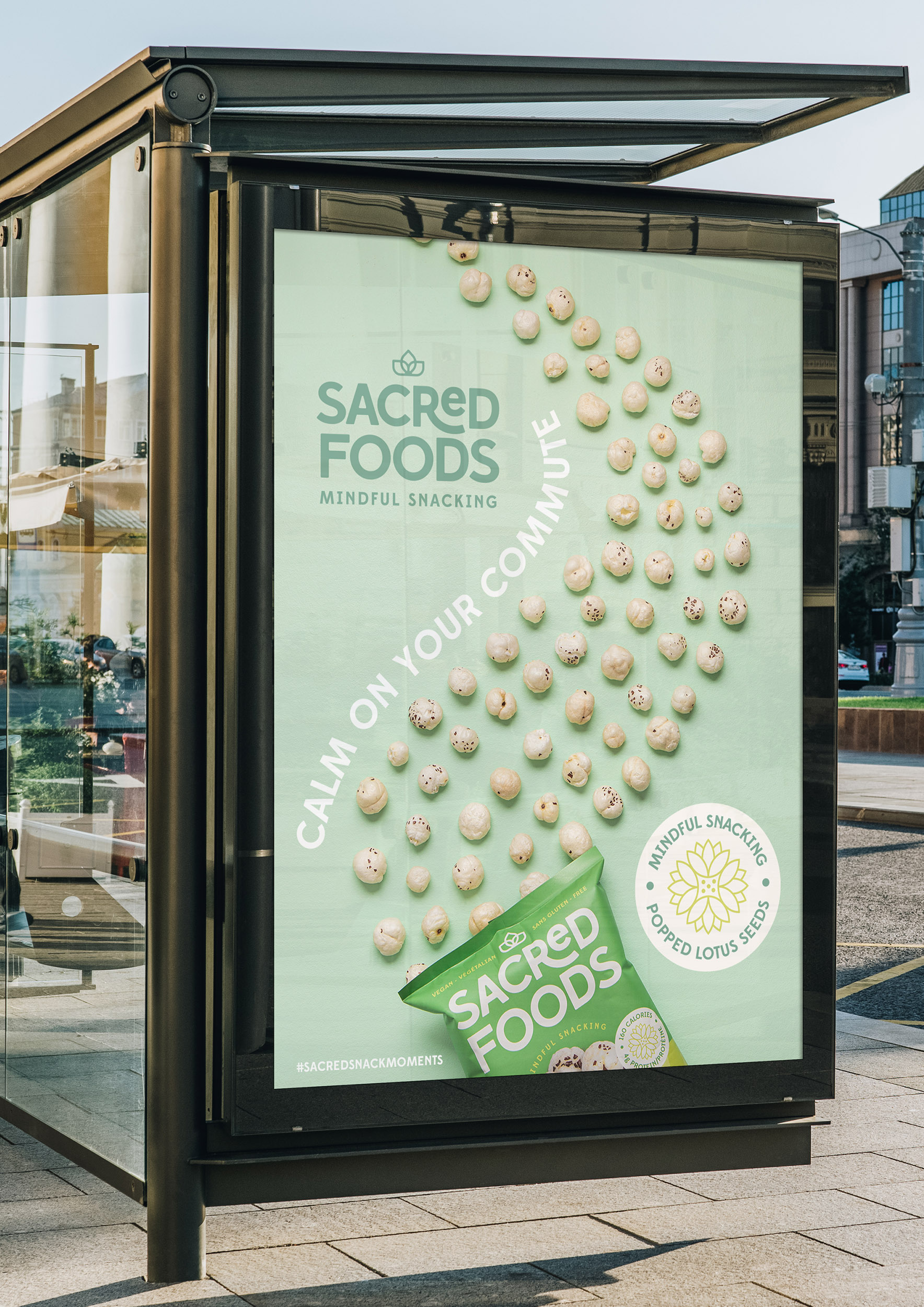
The vibrant colour palette and radiating lines promote a feel-good personality with modern, clear typography to balance clarity and honesty with flow and positivity.
We created a feel-good brand that connects with consumers and makes their mindful choices easy.
CREDIT
- Agency/Creative: Kingdom & Sparrow
- Article Title: Sacred Foods, Mindful Snacking
- Organisation/Entity: Agency, Published Commercial Design
- Project Type: Packaging
- Agency/Creative Country: United Kingdom
- Market Region: North America
- Project Deliverables: Brand Creation, Brand Guidelines, Brand Identity, Brand Strategy, Branding, Graphic Design, Research
- Format: Flow-Pack
- Substrate: Plastic


