Sacrebleu! is a new bar in Strasbourg, installed on a dynamic and young square, a stone’s throw from the city center and its mythical cathedral. The atmosphere is friendly and you can meet there for a breakfast, for the dish of the day or for an aperitif with friends thanks to its large terrace.
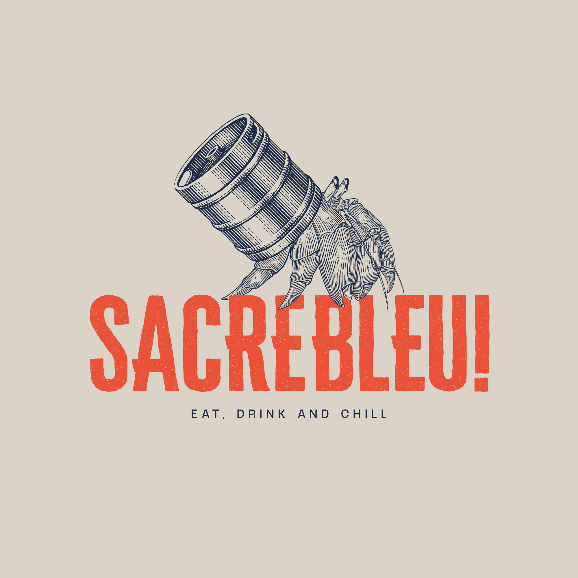
For the logo, we wanted to create a strong, fun and immediately recognizable symbol. For this, it was obvious that we had to create a mascot.
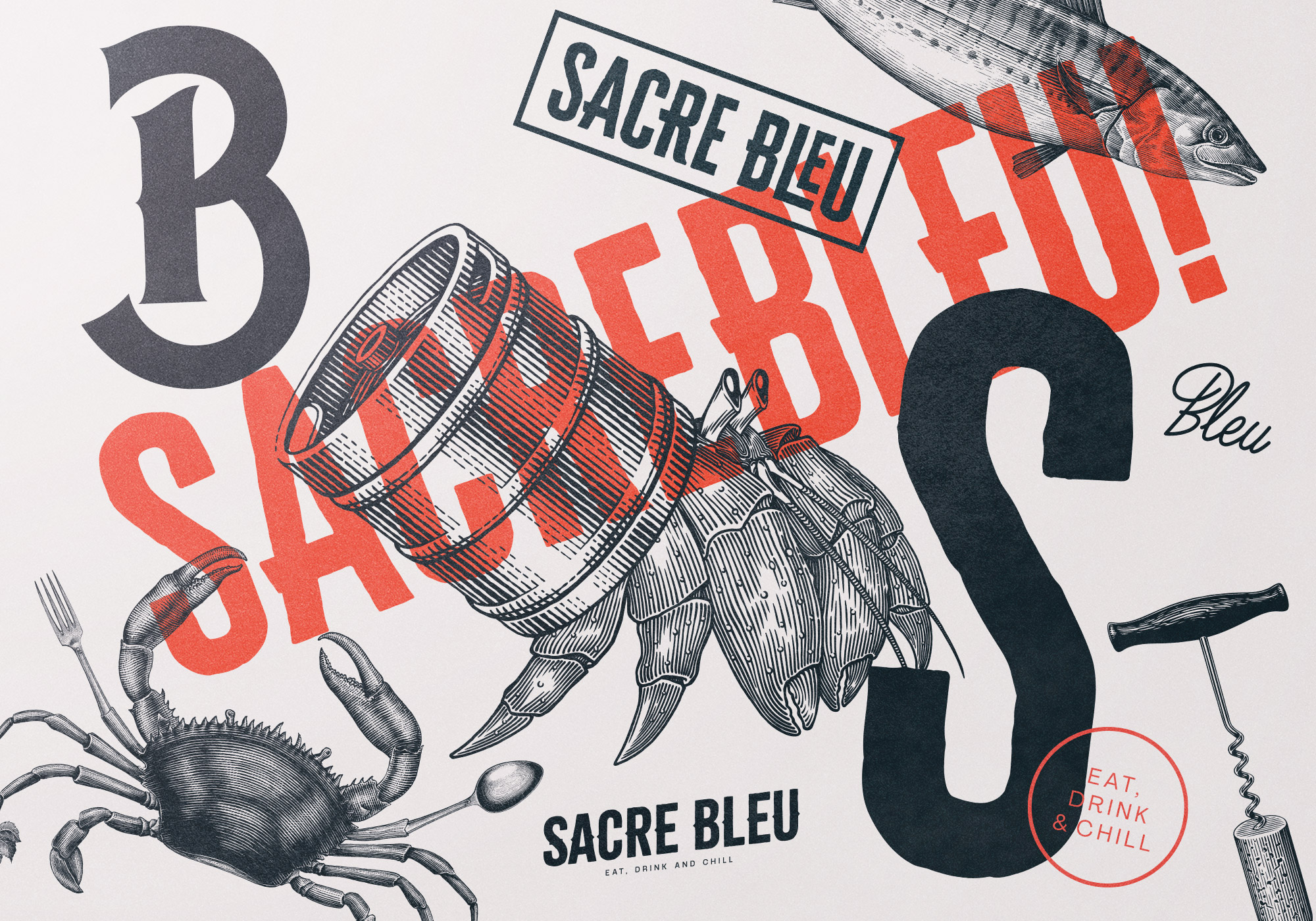
So we turned to the idea of the hermit crab. More than a simple shellfish with a funny and original look, it gets its originality from its shell. Indeed, if he loses it, he can use a substitute object to replace it and thus find a new habitat. Thus, we replaced our mascot’s shell with a beer barrel representing the bar. The message is clear: the Sacre bleu is a place where you feel at home. To go into a little more detail about the logotype, a contemporary typography has been specially designed, with a used treatment that can remind you of a buffer effect. Beyond the aesthetic aspect, this gives material and depth.
The mascot has been drawn with lines, in an engraving style, a rather old style but which is again fashionable and very present in the world of beer.
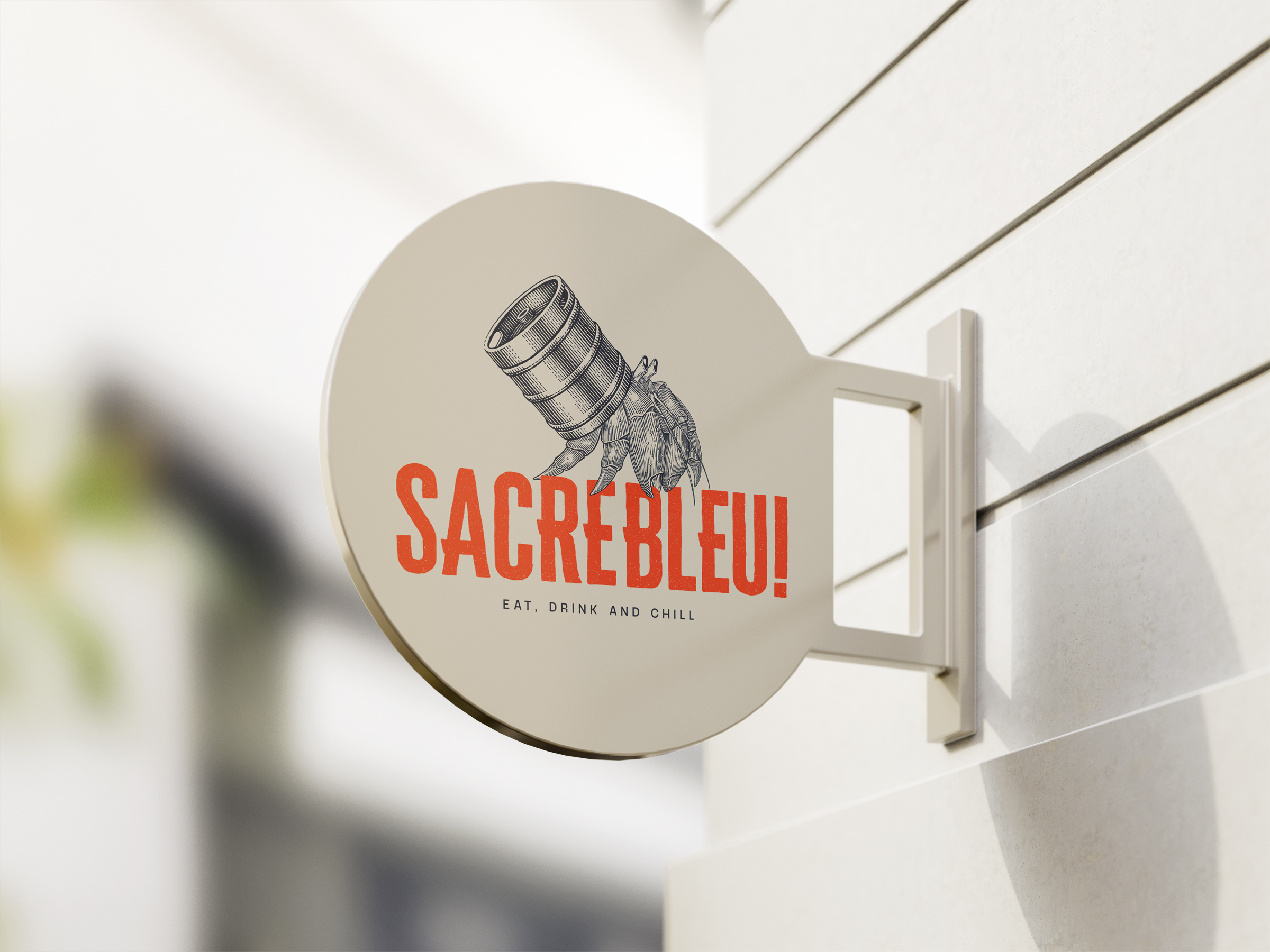
Concerning the colors, a very contrasted range has been created. The illustration is in dark blue, very close to black to have a very present impact in the logotype. The name is in range, very powerful to have a real contrast. Finally, to link the whole, a beige background was chosen. The claws of the hermit crab come to catch the typography so that the elements blend perfectly together.
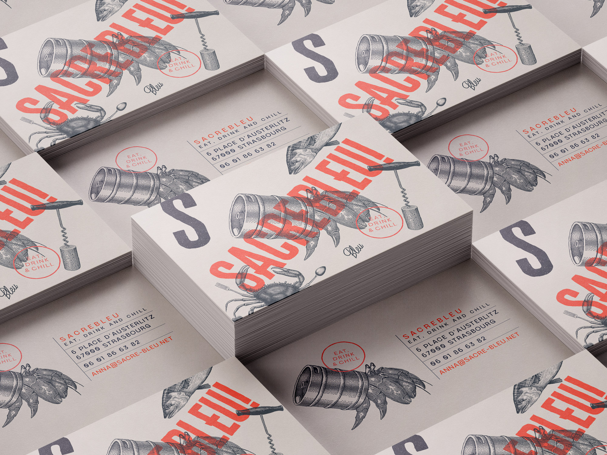
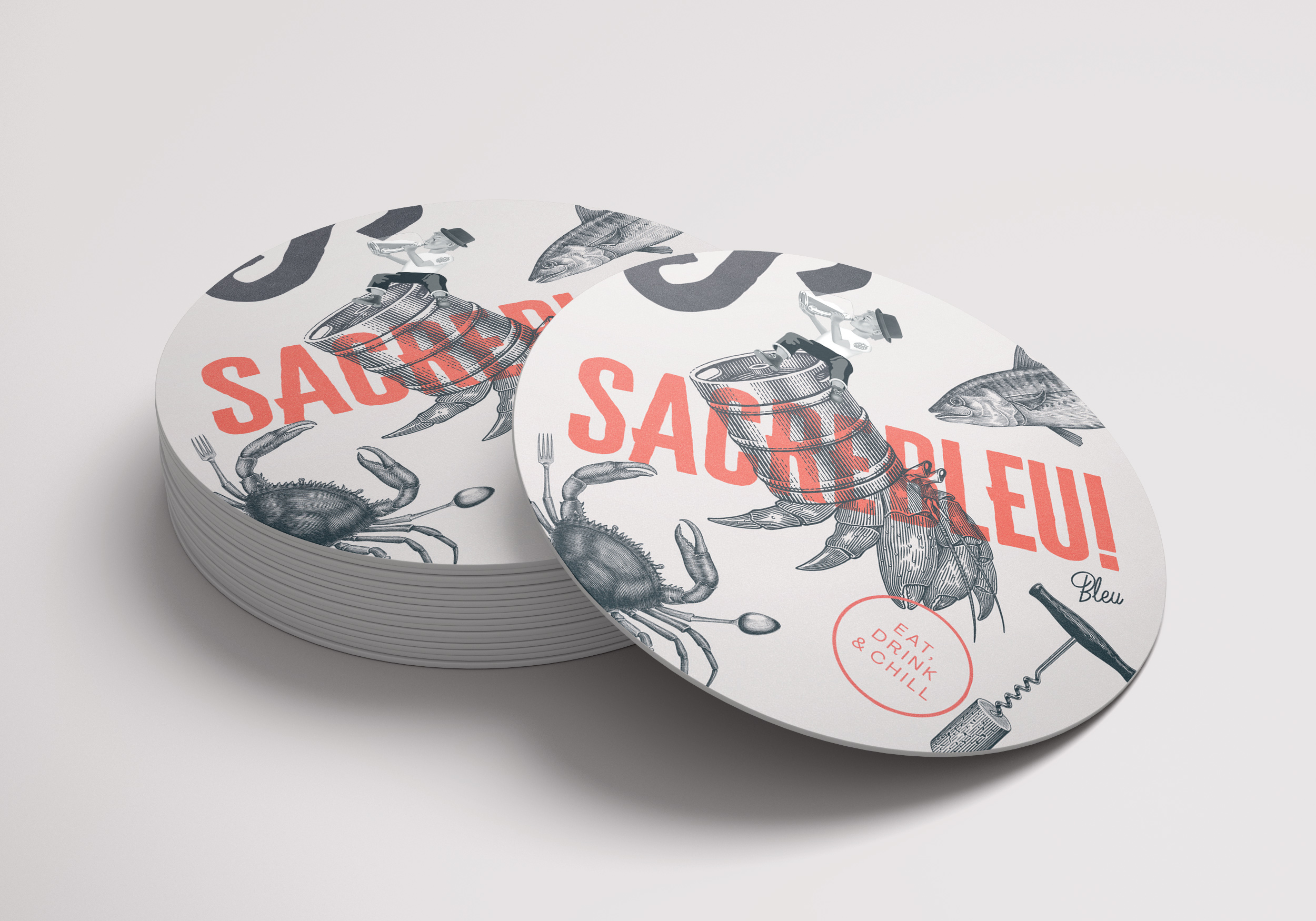
In addition to this logotype, a real graphic universe has been created for the declensions. For this we have kept elements from previous research tracks, especially the crab which has been diverted. Some of the extremities of its legs are replaced by accessories and elements found in bars, namely a corkscrew, a fork, a spoon.These elements refer to the waiters who set up the bar room. According to the declinations, the elements will be placed in a more or less present way to enrich the graphic proposal of the whole.To sum up, all these elements make it possible to constitute a strong, contemporary and original identity for a place that is as much as it is.
CREDIT
- Agency/Creative: Buckwild
- Article Title: Sacrebleu Bar Branding by Buckwild
- Organisation/Entity: Freelance, Published Commercial Design
- Project Type: Identity
- Agency/Creative Country: France
- Market Region: Europe
- Project Deliverables: Brand Creation, Brand Identity, Graphic Design, Illustration, Research
- Industry: Food/Beverage
- Keywords: identity design bar graphism illustration branding food strasbourg restaurant


