


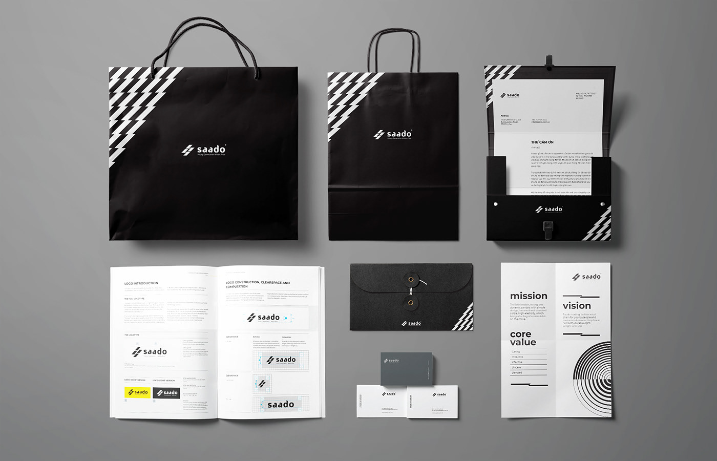
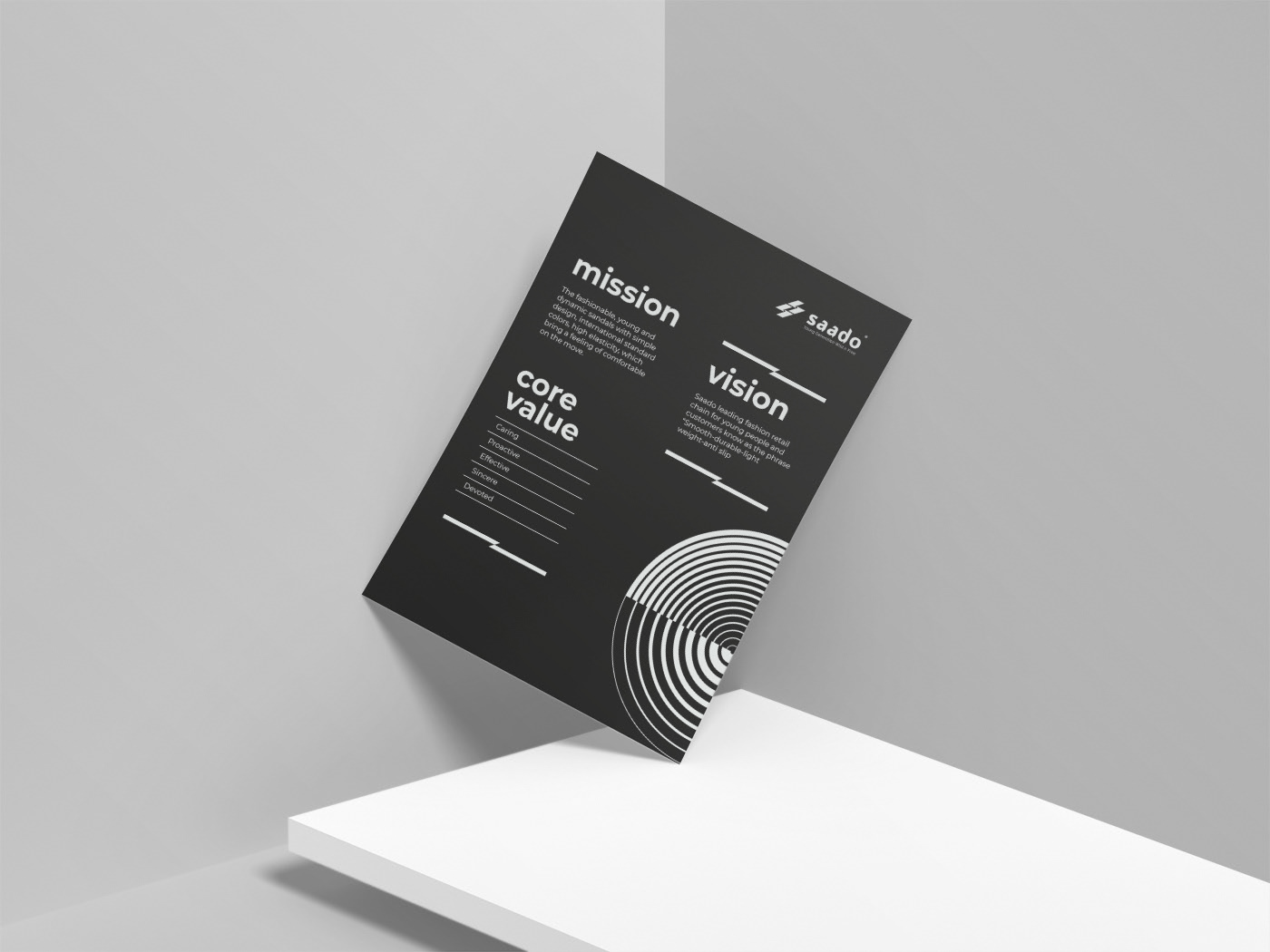
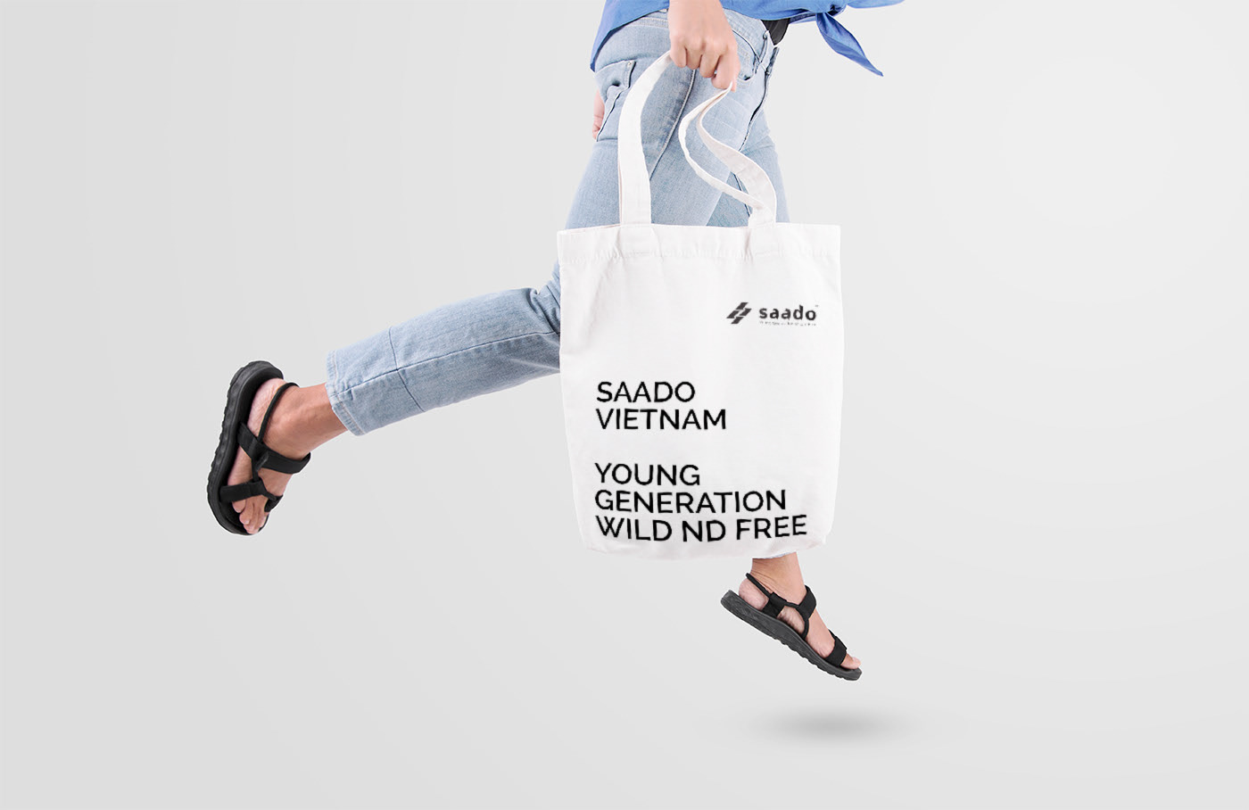
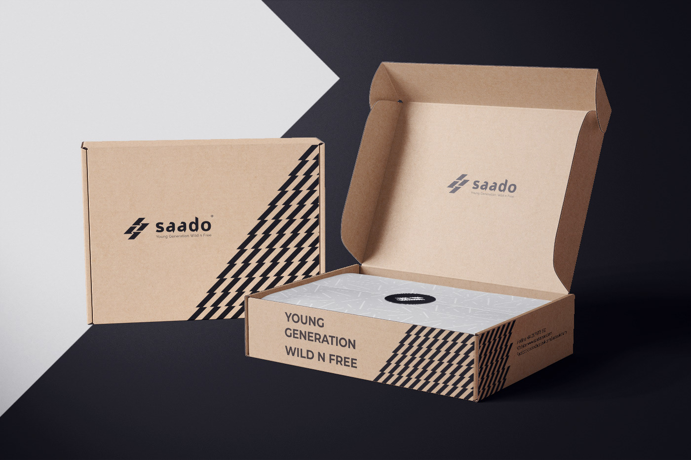
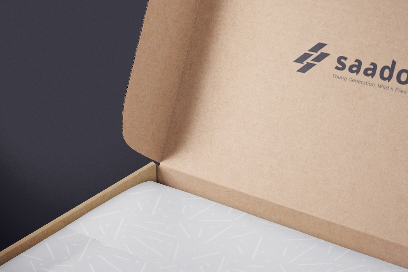
Challenge: SAADO wishes to become the first Vietnam global brand of footwear fashion to be known by customers with the phrase of ‘light & global’. Business philosophy: Customer – centric, service – minded and customer experience at heart.
Strategy: The logo has 5 letters (SAADO), 2 syllables, easy to pronounce and easy to remember.
Two letters ‘a’ which is stretched instead of Sado, which is SAADO, more balanced in design layout and symmetry.
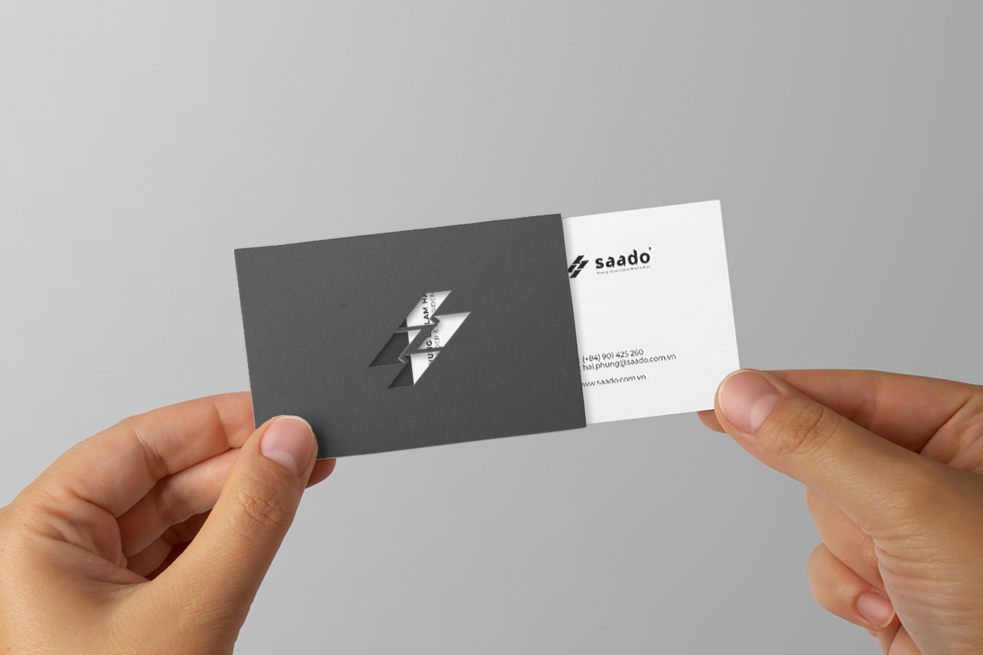
Logomark: The abbreviation of the letter ‘S’, ‘S’; can be interpreted as Vietnam, the land strip of the ‘S’. ‘S’ is stylized with four numbers 1, mean leading. The 2 letters ‘S’ is going upward, that is, the vision will be directed to the Asia Market.


CREDIT
- Agency/Creative: emoBreaker Agency
- Article Title: Saado Vietnam Brand Identity
- Organisation/Entity: Agency, Published Commercial Design
- Project Type: Identity
- Agency/Creative Country: Vietnam
- Market Region: Global
- Project Deliverables: Brand Experience, Brand Identity, Brand Strategy, Branding, Research
- Industry: Fashion
- Keywords: SAADOVIETNAM, VUPHAM, BRANDIDENTITY
FEEDBACK
Relevance: Solution/idea in relation to brand, product or service
Implementation: Attention, detailing and finishing of final solution
Presentation: Text, visualisation and quality of the presentation


