


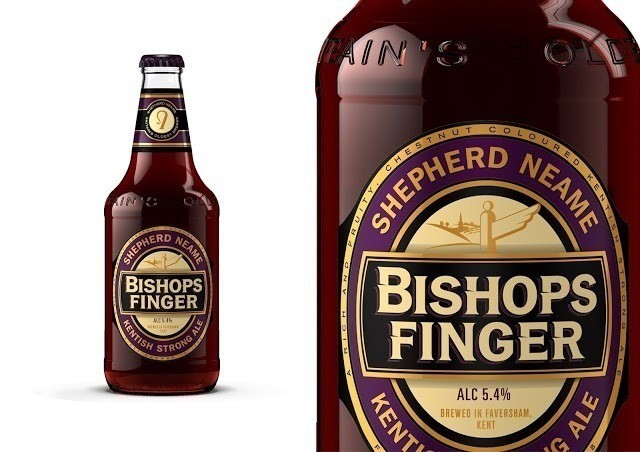
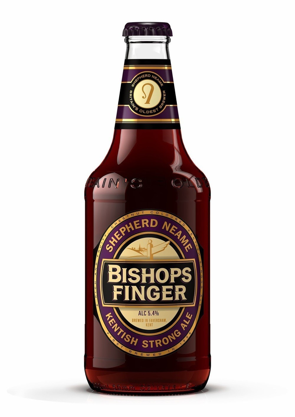
SAA Design refinement of this packaging label and their colour usage are truly remarkable. The fusion of purples compliments the reflective browns and plums found in the product itself create a mouth watering product.
Shepherd Neame can proudly claim to be Britain’s oldest brewer but with increasing competition in the market, Bishops Finger needed to re-establish it’s position as the beer with pedigree and proven credentials.”It’s a flagship brand for the company – it’s a beer for connoisseurs, the serious beer drinker”, remark SAA: Who were asked to evolve the packaging to refresh this positioning. “The fundamental equities that make Shepherd Neame products recognisable against the competition have been retained and refined”, say SAA. The meaning behind the name has been illustrated with a motiff (The Bishops Finger signpost to direct Pilgrims from the Cathedral cities of Winchester to Canterbury) but the style is dry and not comic or jokey. The premium ‘codes’ have been dialled up, by using a richer purple and a warmer gold. Bishops Finger looks serious, more grown up than the competition, and further enhances the values of the company and it’s many years of brewing heritage.
CREDIT
- Agency/Creative: SAA Design, Kent
- Article Title: SAA Design – Shepherd Neame Bishops Finger
- Project Type: Packaging
- Substrate: Glass, Pulp Paper


