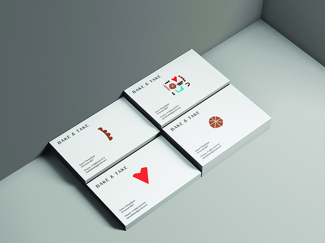
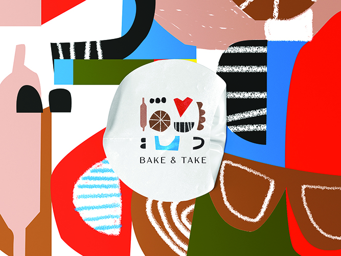
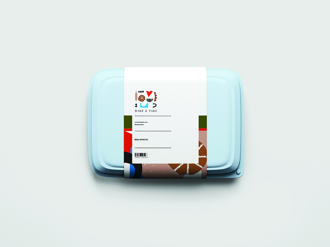
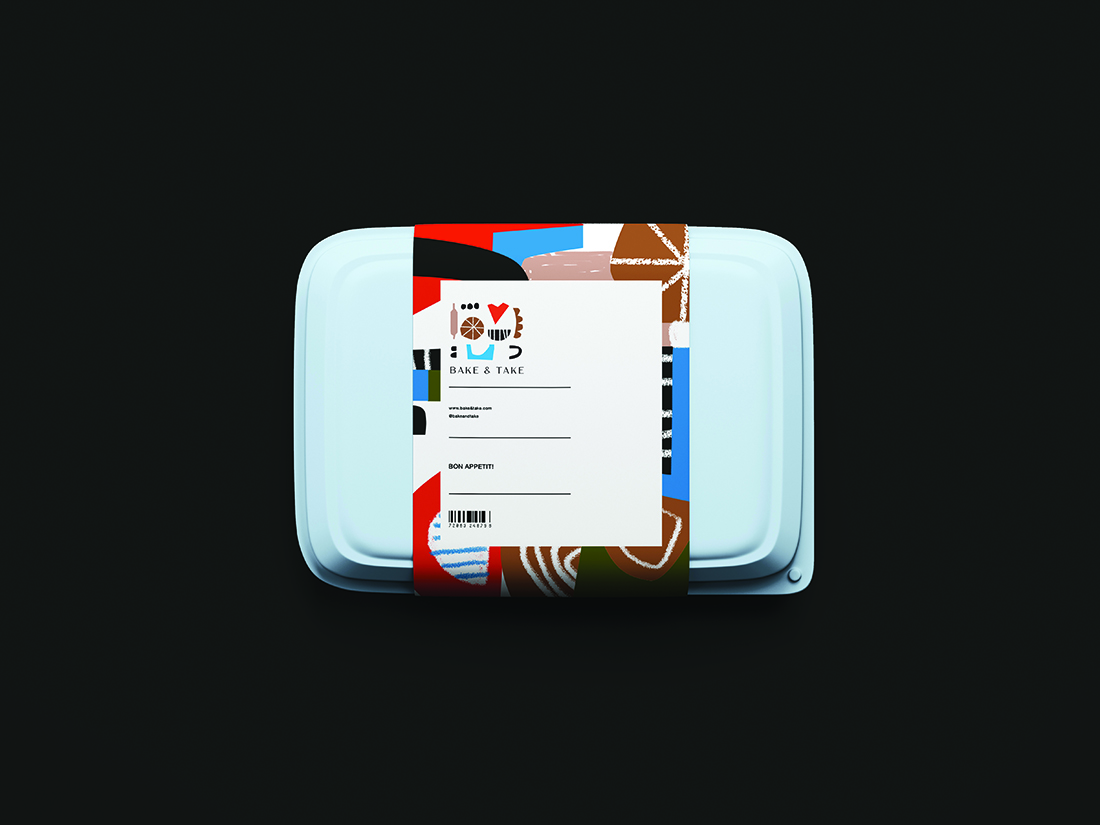
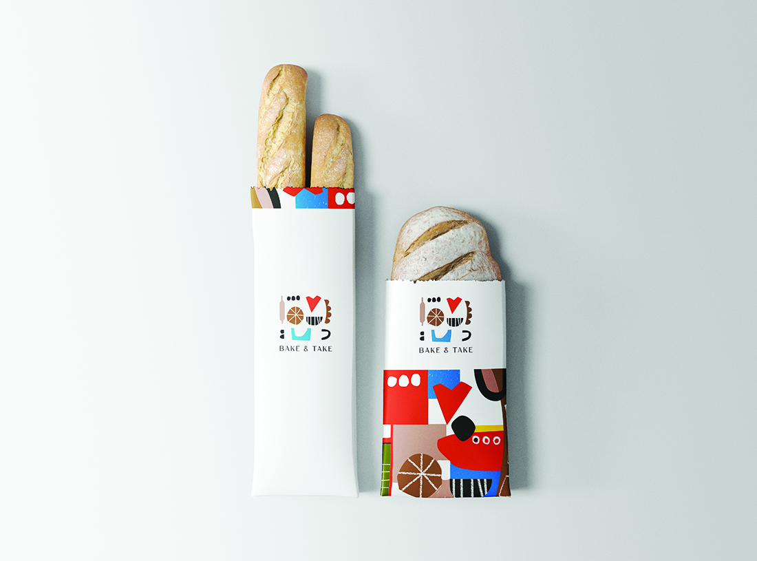
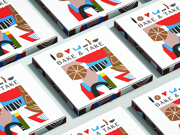
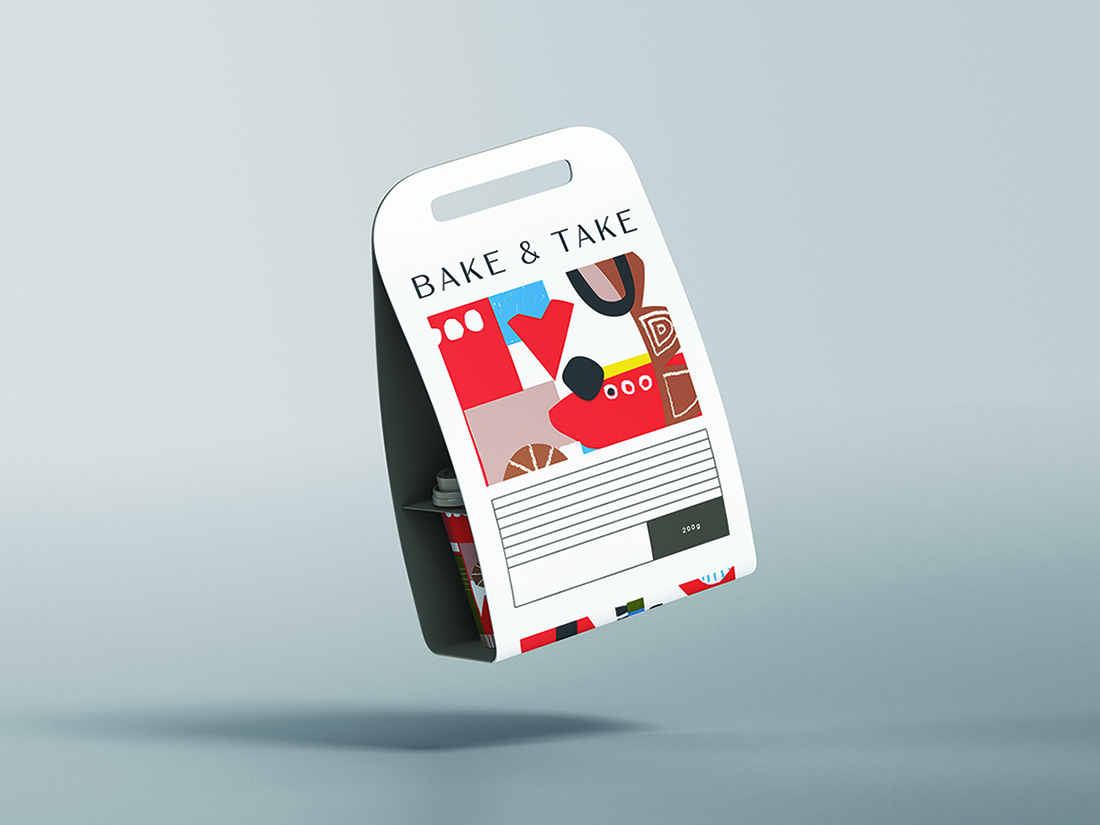
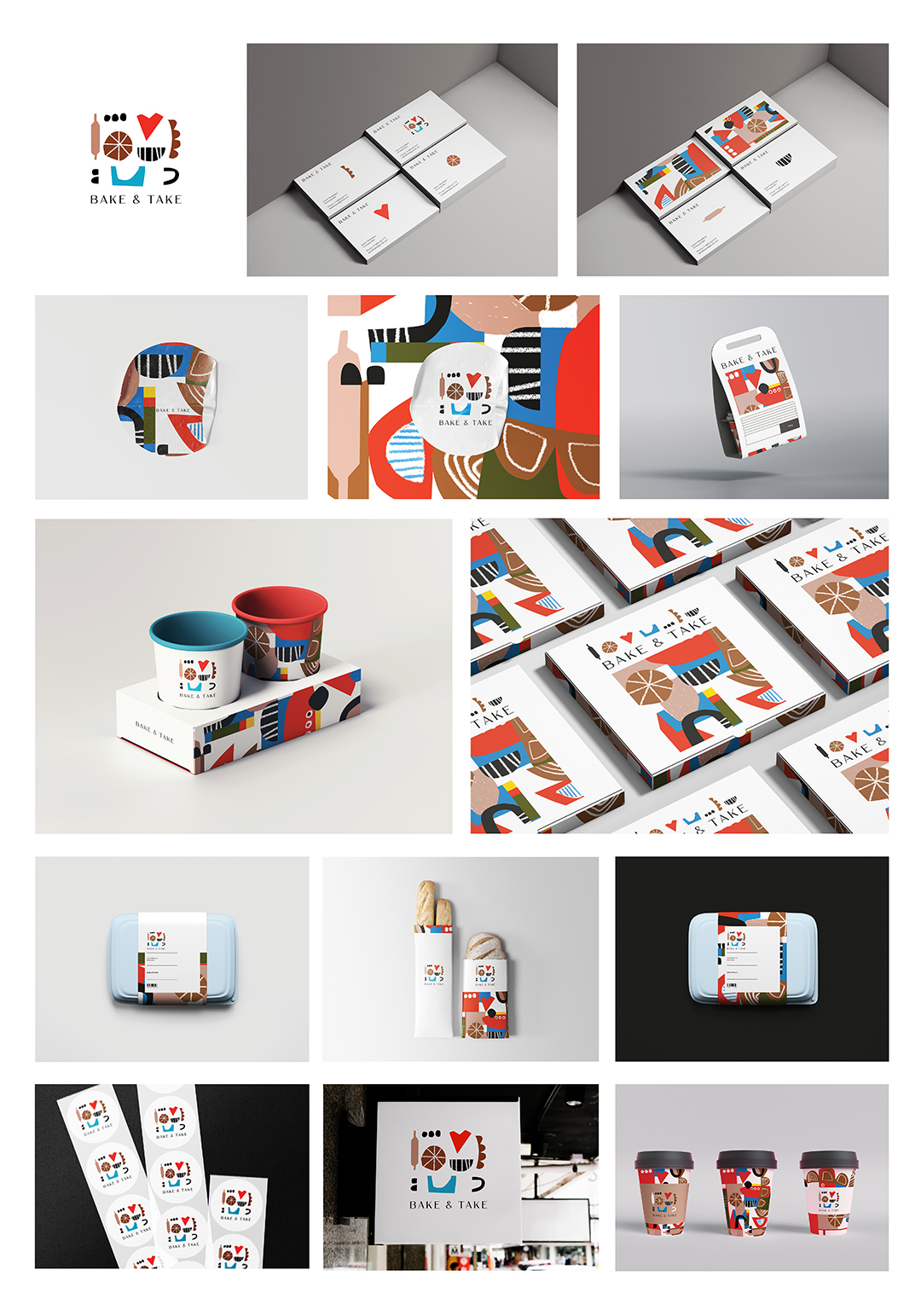
The identity was developed for the Bake and take bakery. Basically, this bakery prepares takeaway food. You can buy it directly at the bakery or order it home, that’s why it is so important that the corporate identity is recognizable. The idea was to make a bright and memorable design. While I was developing this corporate identity, the aim was to get away from standard bakery identity solutions (such as minimalistic logo, brown and beige color.) So for “Bake & take” bakery bright, non-standard colors were taken (red as leading, white, brown, blue and black as complementary), and the entire corporate identity was built on simple forms that resemble various baking tools (rolling pin, forms that look like pieces of cake, tools, plates).
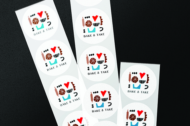
The logo was created from these elements, while the font used is minimalistic. All these elements make up the logo are like an application or a child’s drawing, which brings us back to childhood, where grandmother baked pies. All these forms add up to an abstract pattern that can be used in different media. It was important to strike a balance here: some media are minimalistic, using only fragments of patterns, while others are filled with additional graphics entirely. This creates an interesting communication with the user, the brand becomes recognizable, but all media do not have the same print, they differ from each other. A design was developed for takeaway food packaging, for coffee cups, business cards, stickers, signboards, boxes and other printing media.

CREDIT
- Agency/Creative: S.OS design
- Article Title: S.OS Design Creates Identity for Bake & Take Bakery
- Organisation/Entity: Freelance
- Project Type: Identity
- Project Status: Published
- Agency/Creative Country: Russia
- Agency/Creative City: Санкт-Петкрбург
- Market Region: Europe
- Project Deliverables: Graphic Design
- Industry: Food/Beverage
- Keywords: cafe, food, bakery, coffee, colors, abstract, identity
-
Credits:
Graphic designer: Aleksandra Ostapenko


