


Canadian fashion retailer RW&CO. unveils rebrand developed in partnership with global strategy and design studio Dalziel & Pow.
RW&CO. had initially approached Dalziel & Pow to work on a new store design, but the project quickly evolved into a brief to transform the RW&CO. brand, to become the most loved and trusted for dynamic, modern lifestyles. The new positioning is designed to engage a new generation of fashion-conscious consumers, elevate RW&CO.’s status as a fashion authority, and boost its brand presence in Canada.
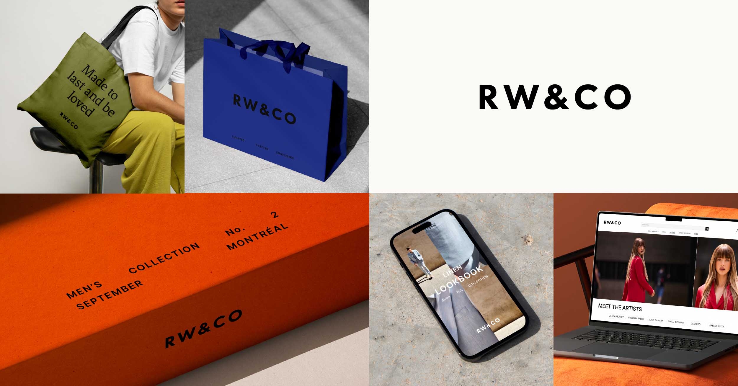
The new positioning reflects RW&CO.’s core values of trust, quality and curated style, and has been developed to give a single, cohesive identity across all its touchpoints and collections, whether they’re aimed at men or women. The new brand identity gives RW&CO. the ability to tell different stories with consistency yet allows for more dialled up brand expression.
A new black and white logo better reflects the brand’s personality — confident, considered, and precise – while bringing everything into a consistent typeface and removing the punctuation of the previous logo. Dalziel & Pow carefully adjusted the spacing and proportions to create a calm, balanced feel that is modern and inclusive, speaking confidently to all genders and all styles. The identity is designed to be adaptable across a wide range of touchpoints, from garment labels, to signage, to digital applications.
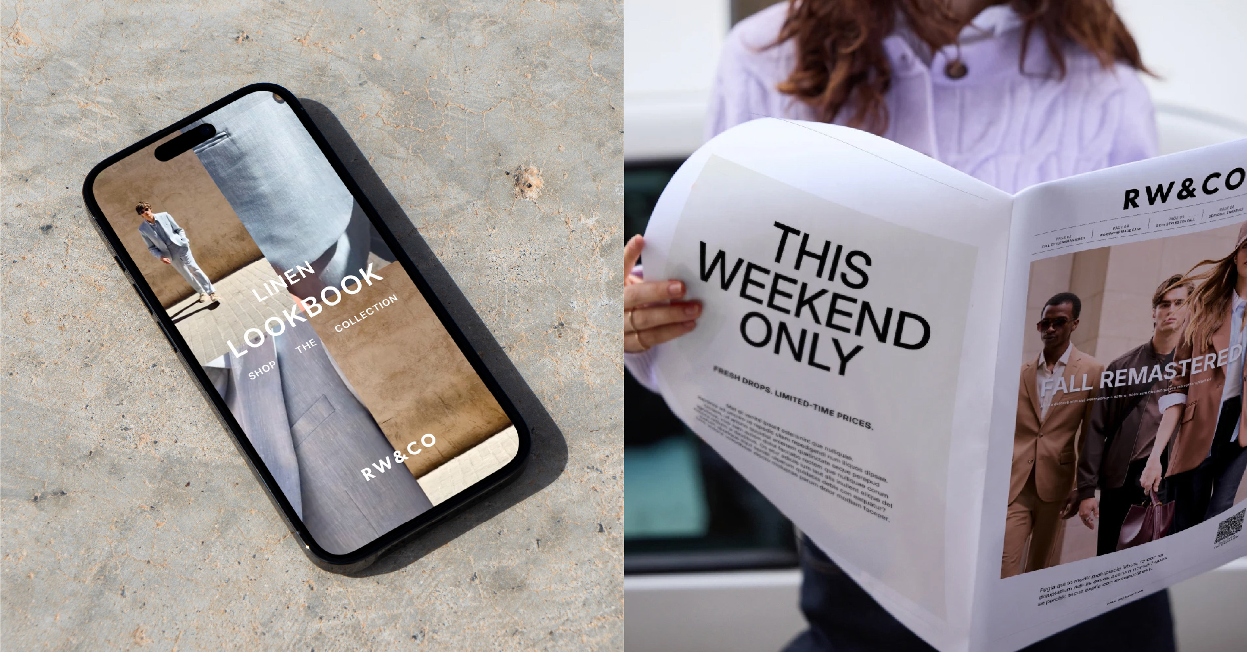
Alongside the new brand mark, D&P developed a new typographic approach, together bringing a simple, refined approach to both brand and product messaging.
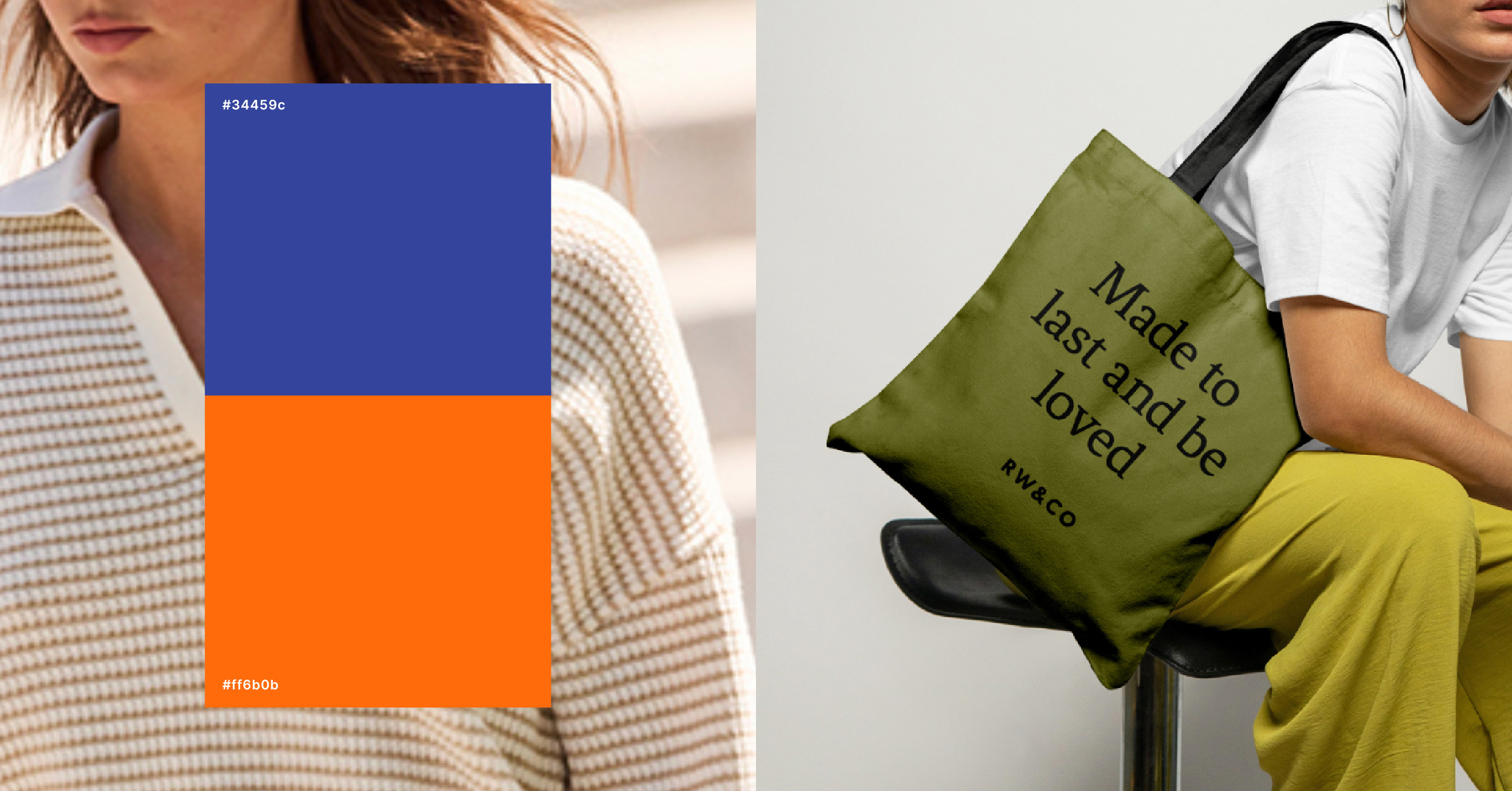
In addition to the black and white of the RW&CO. logo, to elevate its presence in the Canadian fashion category, the rebrand also introduces an expanded colour palette. This includes simple and refined core colours for elevating communications and key messaging, with a supporting palette of richer colours for moments of dialled-up expression, such as packaging and shopping bags – adding personality, recognisability and impact. A clear approach to colour usage was defined, bringing consistency and clarity to messaging across all platforms.
Tying in with the brand’s purpose of empowering people to write their own style story, there will also be more of a focus on inspiring storytelling in brand communications, with imagery showing how people actually live their daily lives in the clothes, and how they move, connect and express themselves in an authentic way. Marketing materials will incorporate more street photography, also emphasising the brand’s approach to curated lifestyles, while an increase in the use of close-up details to give shoppers a sense of the high-quality fabrics and finish which characterise RW&CO.’s clothing.
The refresh also introduces a new tone of voice that is self-assured, refined and conversational, using empowering, authentic and uplifting language.
RW&CO. operates over 80 stores nationwide and is a mainstay of Canadian shopping centres. The refreshed identity also lays the groundwork for an upcoming evolution of the in‑store experience, to be revealed later this year.
Mathieu Bouchard, Director of Marketing and Partnerships, RW&CO said: “We’re laying the groundwork for a more focused and ambitious approach to marketing – one that truly reflects who we are, what we stand for, and where we’re heading. Our goal is to build a marketing strategy that not only drives growth, but also deepens our connection with the audiences that matter most.”
Ali Shams, Creative Director, RW&CO said: “Our imagery captures real life in motion — clear, dynamic, and rooted in how people live today. Influenced by urban settings and what’s current, every frame offers context for how the garments move and belong in everyday life. Whether it’s a quick scroll or a deeper browse, we deliver a balanced take on style and story.”
Oliver Ellis, Associate Creative Director at Dalziel & Pow, added: “This rebrand was a true collaboration with the in-house team – their insight into the brand’s DNA was invaluable. Fashion evolves constantly, so it is important to craft an identity that can grow with the brand while staying true to its core. We wanted the new visual language to reflect the quality and attention to detail that already exists in the product, but wasn’t always visible. This is just the beginning — we’ve built a strong platform that will evolve over time, and it’s exciting to imagine where it will go next.”

CREDIT
- Agency/Creative: Dalziel & Pow
- Article Title: RW&CO. Partners With Dalziel & Pow for New Brand Platform and Visual Identity
- Organisation/Entity: Agency
- Project Type: Identity
- Project Status: Published
- Agency/Creative Country: United Kingdom
- Agency/Creative City: LONDON
- Market Region: North America
- Project Deliverables: Brand Architecture, Brand Design, Brand Experience, Brand Guidelines, Brand Identity, Brand Mark, Brand Redesign, Brand Refinement, Brand Rejuvenation, Brand Strategy, Brand Tone of Voice, Branding, Creative Direction, Design, Graphic Design, Retail Design, Tone of Voice, Visualisation, Web Design
- Industry: Retail
- Keywords: WBDS Agency Design Awards 2025/26 , RW&CO. Dalziel & Pow, visual identity
-
Credits:
PR: Alie Griffiths


