


Forma Station Studio – Rusto Coffee
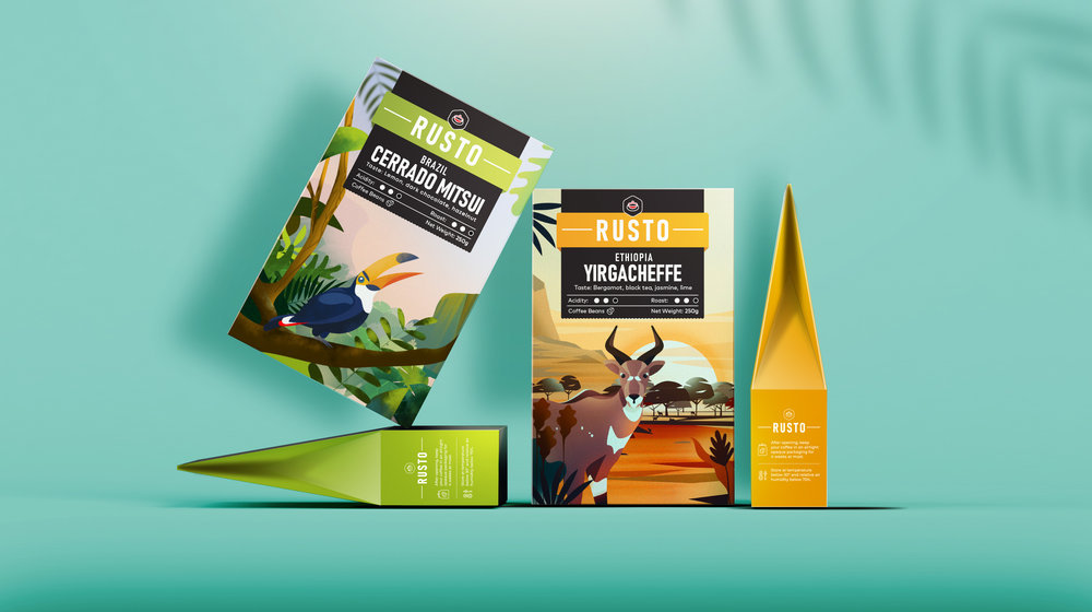
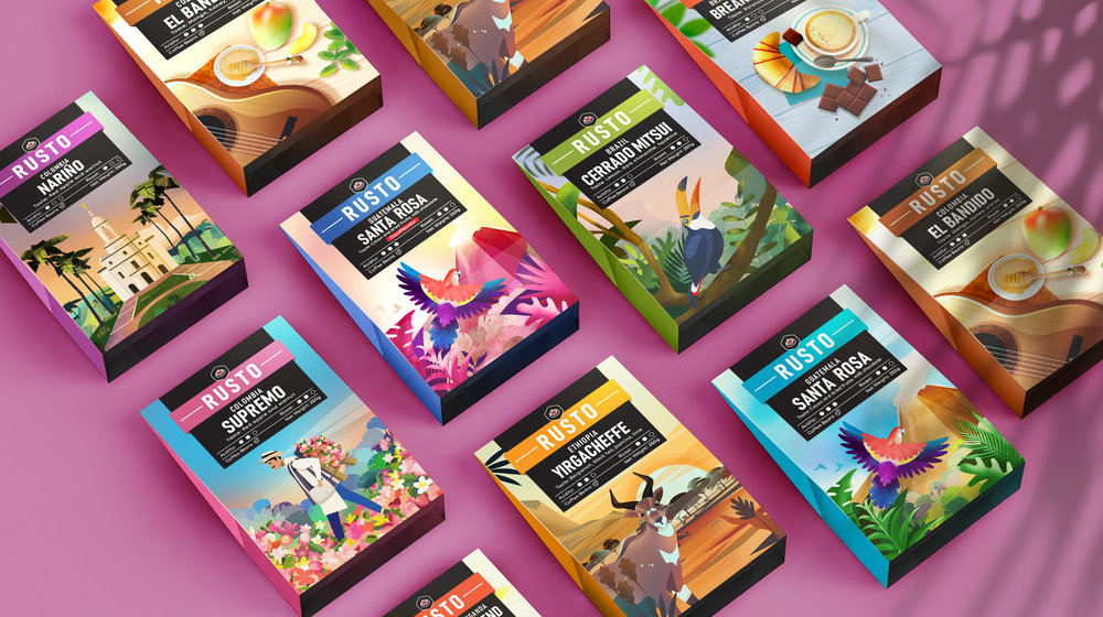
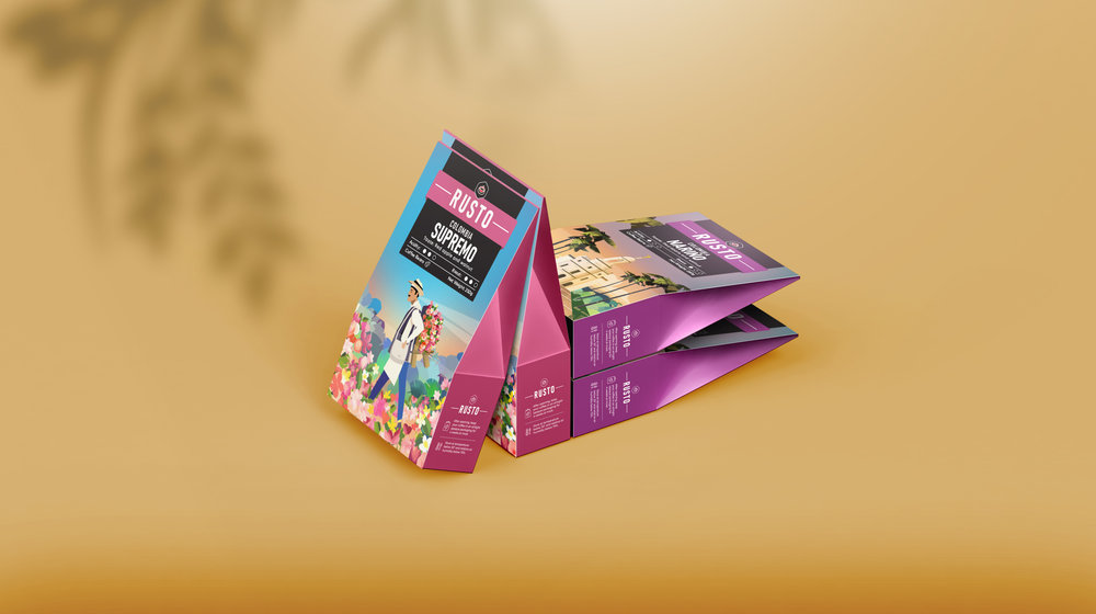
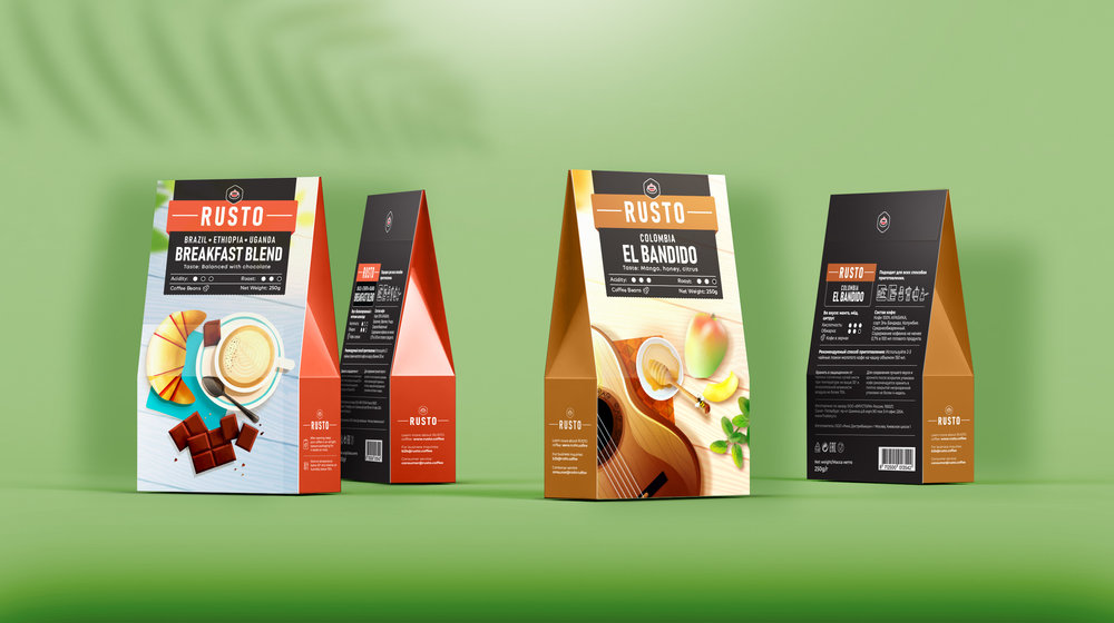
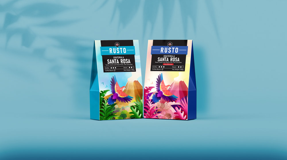
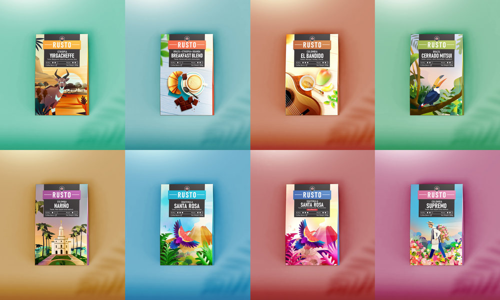
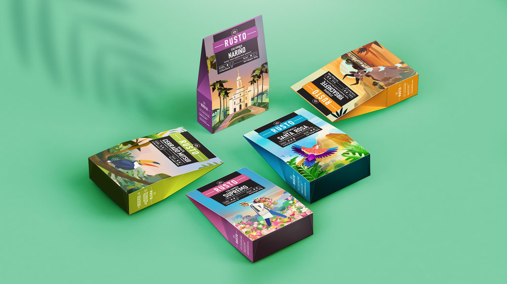
The task: We were approached to make the package design for a series of coffees in the upper price segment for the Russian market. We decided to broaden our task and update the identity of the brand redesigning the logo too.The solution: First of all we researched thoroughly every country where the various coffees originated from. As a result we used symbolic for the countries elements in the illustrations – animals, plants, traditions, buildings etc.For example we used the Mountain Nyala for Ethiopia, Medellin’s Flower Festival for Colombia. We depicted the Toucan for Brazil and a volcano and a parrot for Guatemala. We also color coded the coffees in order to differentiate between the various types. The color code is in the logo and the sides of the package. For the logo we used a simple bold font completed with a delicate coffee cup symbol on top. Consequently it became more noticeable and readable.The result: We worked in a collaborative way with Rusto’s owner to get to the final result. Overall we used bright colors and illustrations that are predominant in order to increase the coffee’s visibility on the shelf. This way we managed to make Rusto an accomplished and modern brand that stands compared to it’s competition.
CREDIT
- Agency/Creative: Forma Station Studio
- Article Title: Rusto Coffee Package
- Organisation/Entity: Agency, Published Commercial Design
- Project Type: Packaging
- Agency/Creative Country: Bulgaria
- Market Region: Africa
- Format: Wrap
- Substrate: Pulp Carton


