


“Kalinkino” brewery — a small production in an ecologically clean area of Russia. Both traditional and experimental beers are brewed here. The products are sold in the brewery’s own stores, which are located in Kuzbass, neighboring regions and in central Russia.
Our task was to develop a graphic concept for the packaging of branded beer.
Beer is a very conservative category, which can be seen in the design of both bottles and labels. The most common technique in bottle design is the presence of a large number of edges of the rigidity of abstract shapes. There are too many such solutions, they are not remembered and create a lot of visual noise.
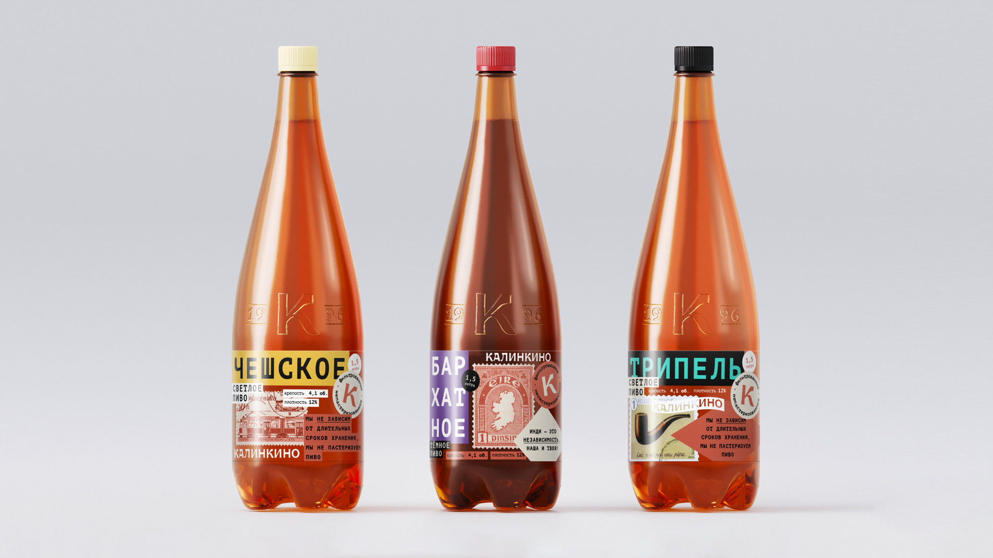
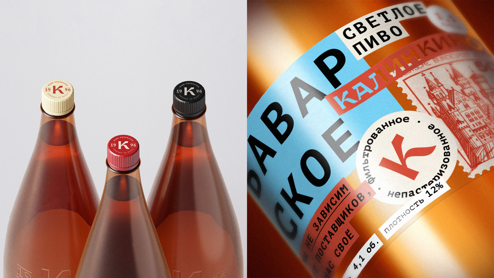
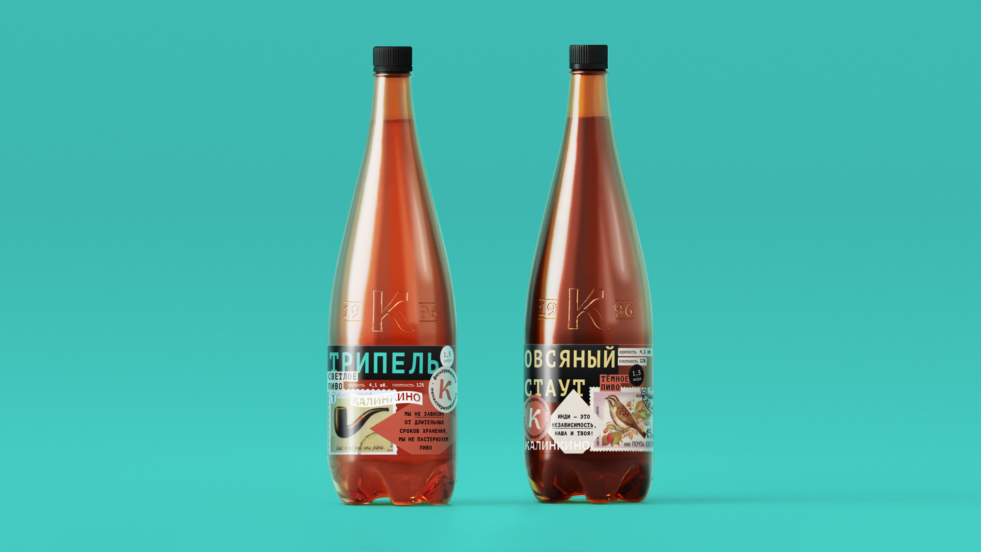
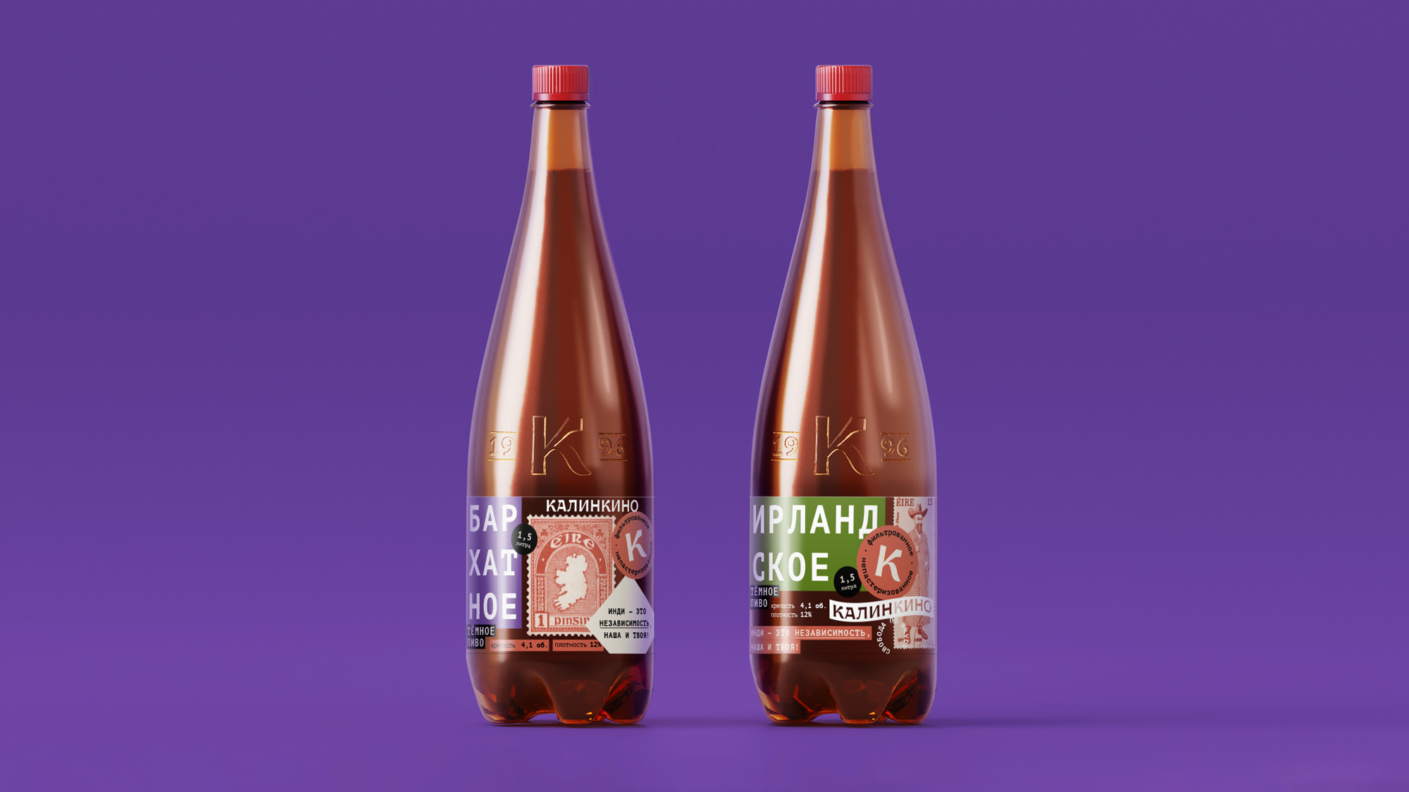
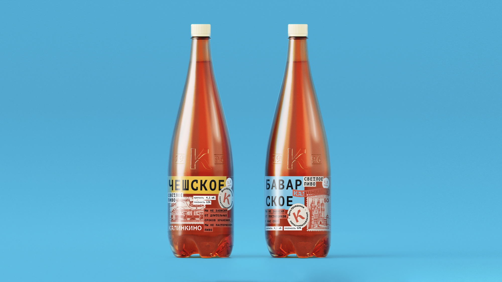
We have developed a unified branded bottle that is consistent with the principles of the company and its indie philosophy. The bottle is not considered separately by consumers, the perception always takes place in the context of the label design, an integrated approach is important here. The bottle design is versatile and minimalistic. It looks the same laconic in different colors of plastic and with different labels. A cleaner look allows you to stand out on the shelf with the competition. The selected laconic shape easily adapts to different bottle sizes and remains ergonomic.
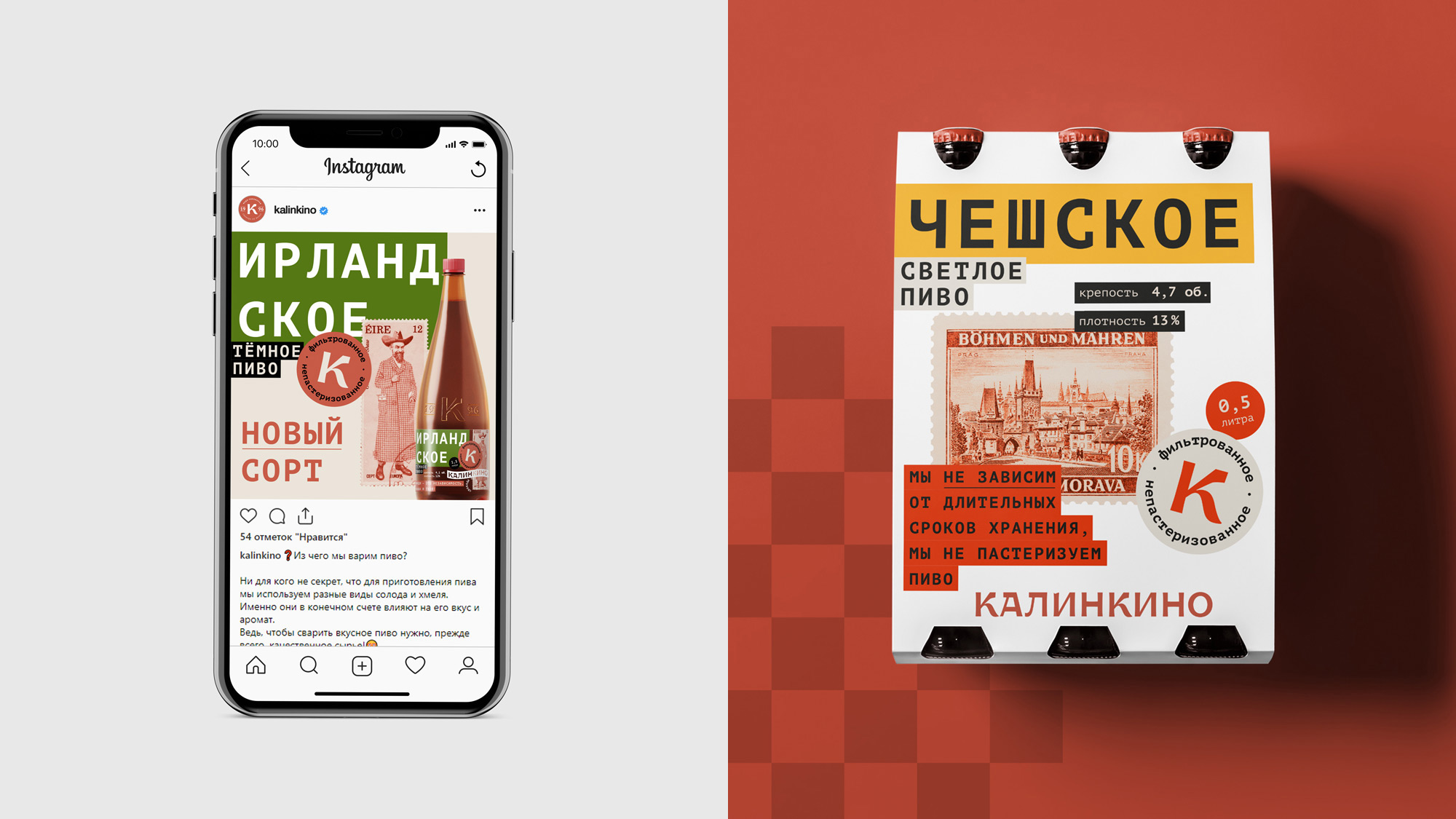
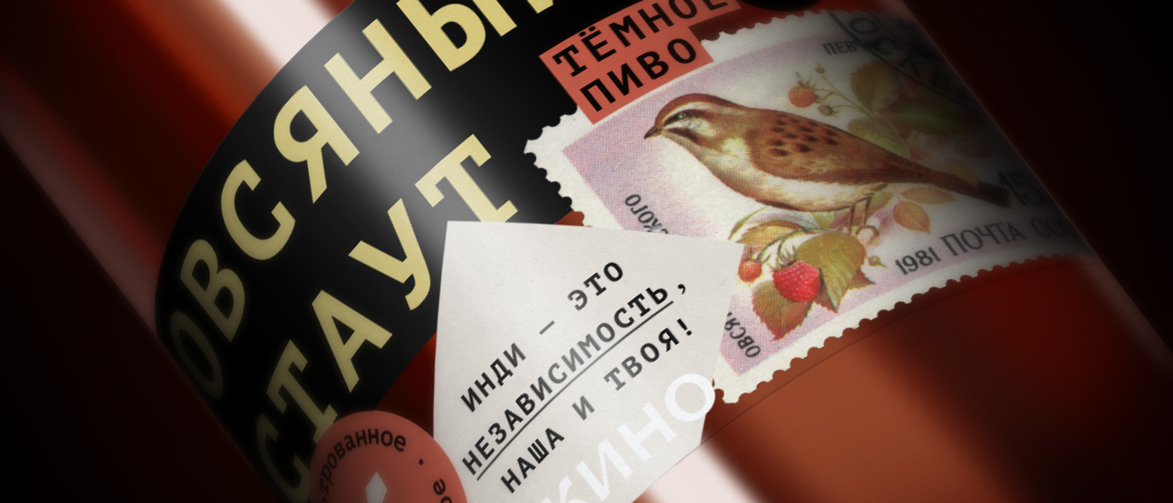
The design of the labels is based on the principle of a collage that imitates a variety of different stickers pasted on a bottle. This effect is achieved by printing the label on a transparent film. Stickers are one of the elements of indie culture, well understood by the core of the target audience. This technique helps to solve several problems at once: making new labels while expanding the assortment, communicating the values of the Kalinkino indie brewery, detaching from competitors.
Despite the external chaos, the ruler has several constants, with the help of which the composition of labels is built. For example, the location of the name of the beer brand, the inscription “Kalinkino”, the round logo and the image of the brand. The brand is always indirectly related to the type of beer and symbolizes freedom of movement, communication between different cities and countries, as well as something intimate and man-made, like personal correspondence. In addition, geo-referencing is one of the main markers of beer style. The design of brands has long since passed into the category of art, just like the production of beer.
On the reverse side of the label, in addition to the mandatory elements, there is a short version of the Kalinkino manifesto. Consumers can read it after purchase and experience the indie brewery’s philosophy over a glass of signature beer.


CREDIT
- Agency/Creative: Dvan Slova Branding Agency
- Article Title: Russian Agency Dva Slova Creates Packaging Design for Kalinkino Beer
- Organisation/Entity: Agency, Published Commercial Design
- Project Type: Packaging
- Agency/Creative Country: Russia
- Market Region: Asia
- Project Deliverables: Brand World, Branding, Packaging Design, Research
- Format: Bottle
- Substrate: Plastic


