


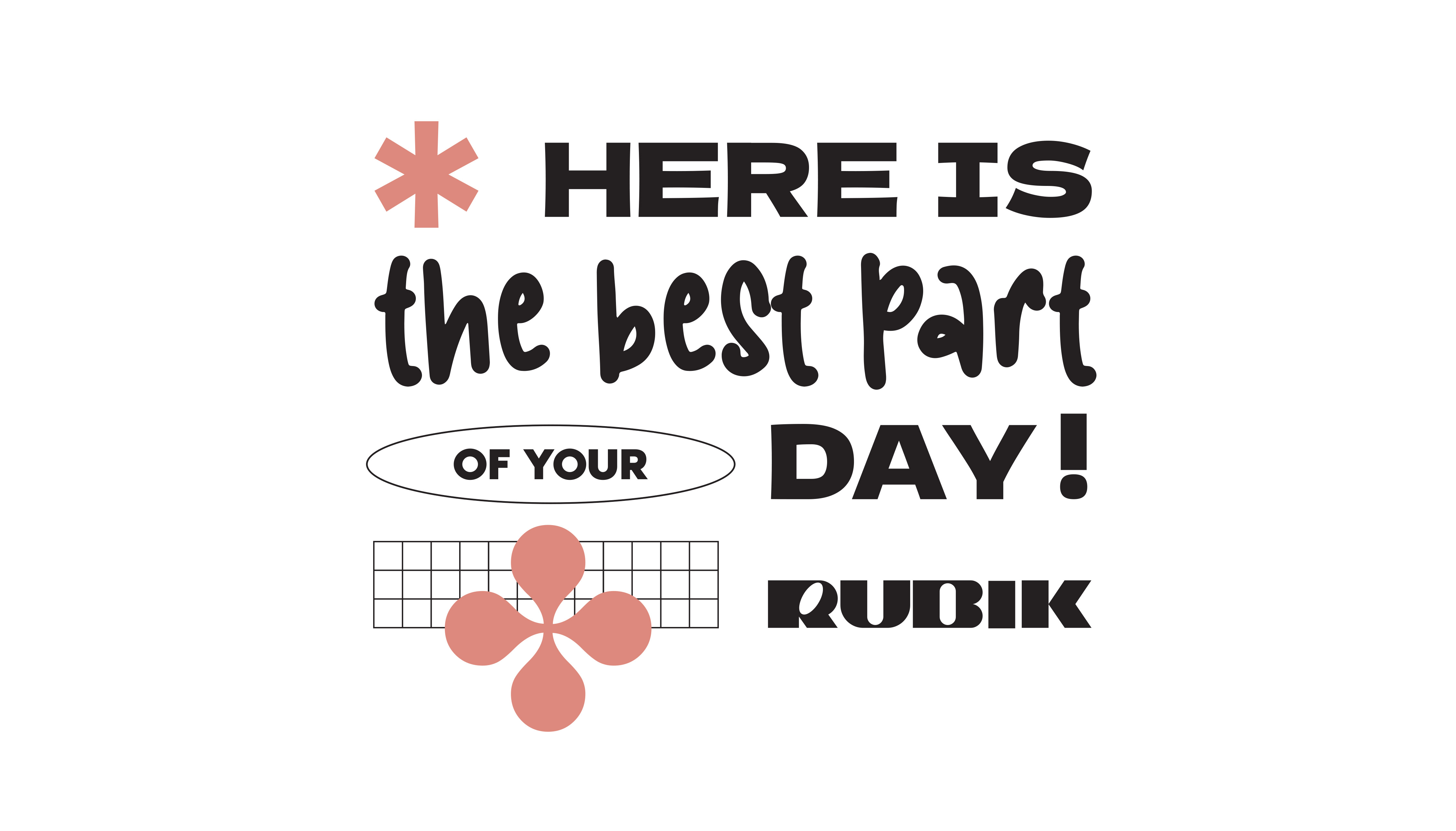
Rubik is more than just a coffee and brunch bar—it’s a daily destination designed to disrupt the ordinary and energize the senses. Situated in the heart of Larissa, Rubik brings a twist to the everyday ritual of coffee drinking through a bold, expressive visual identity that captures the essence of its name. Inspired by the geometric precision and playful complexity of the Rubik’s Cube, the brand identity takes a graphic approach rooted in dynamic typography, layered layouts, and unexpected design gestures.
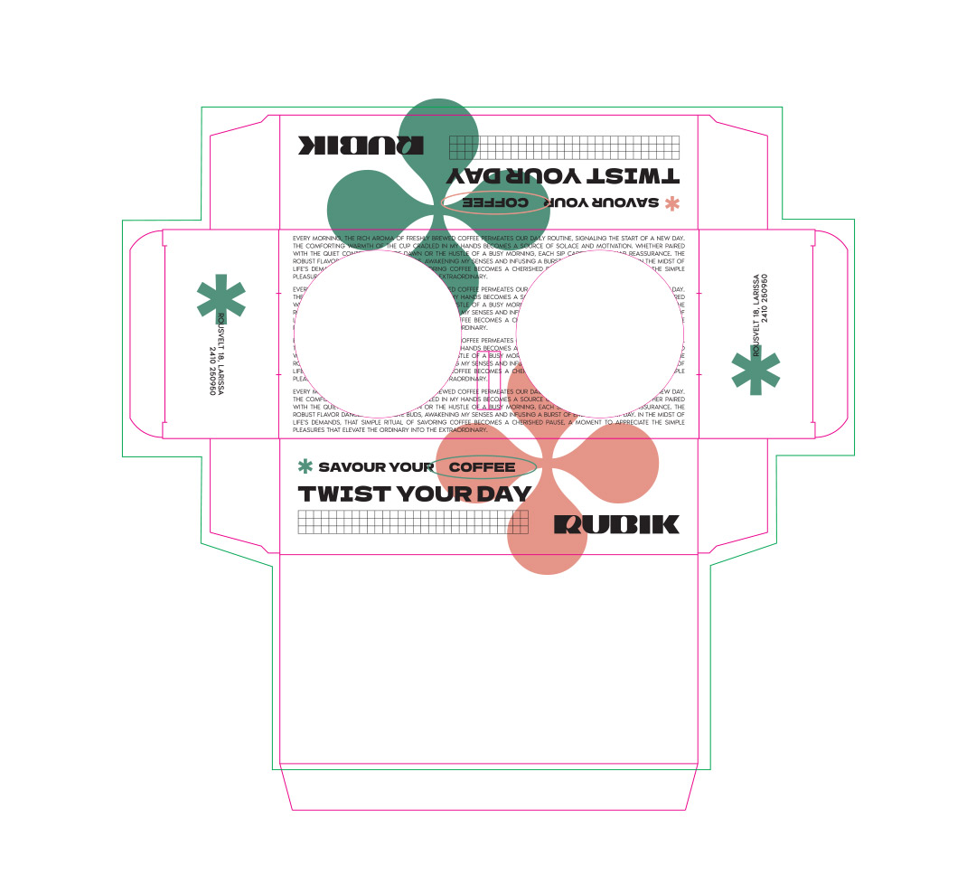
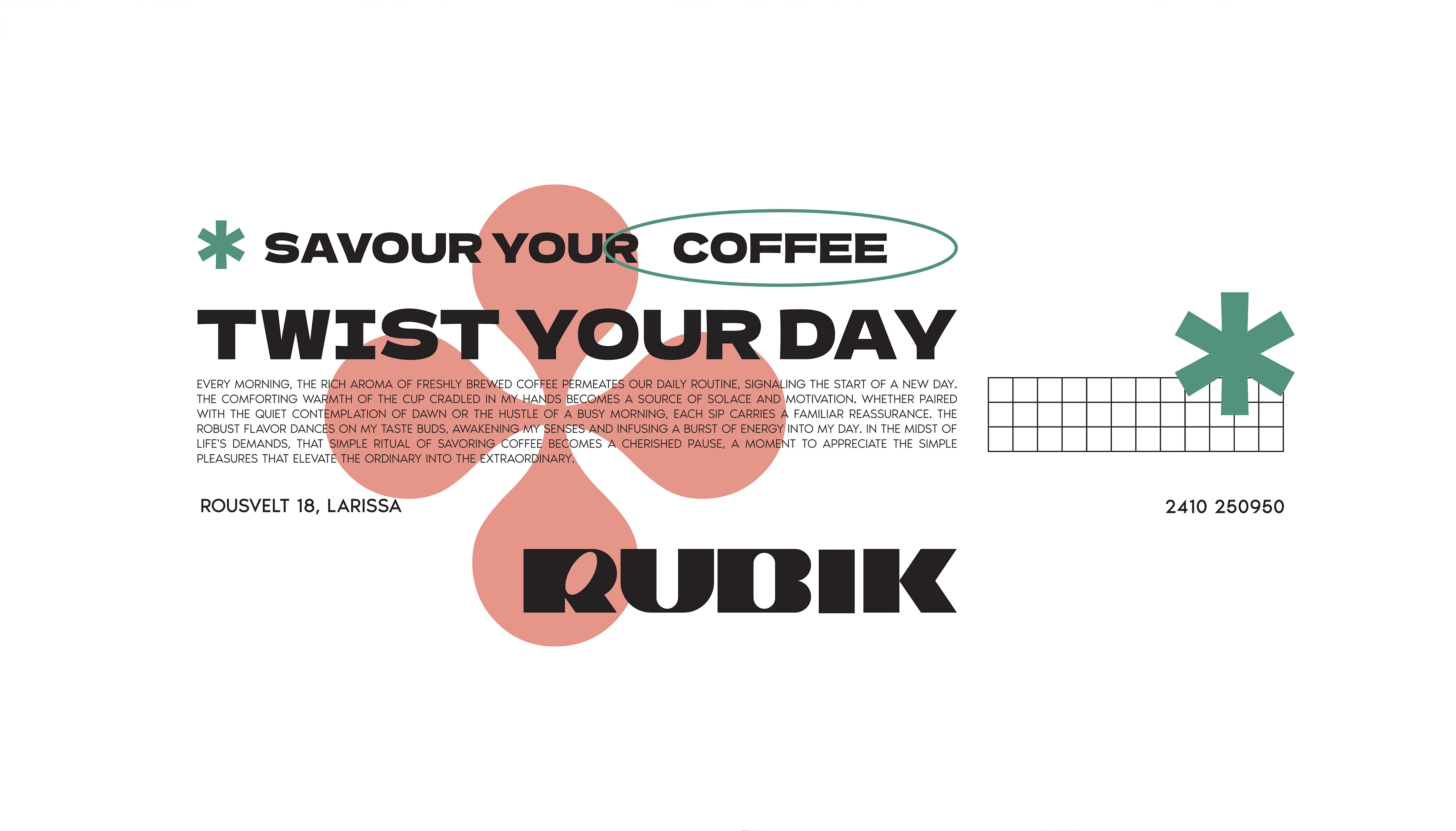
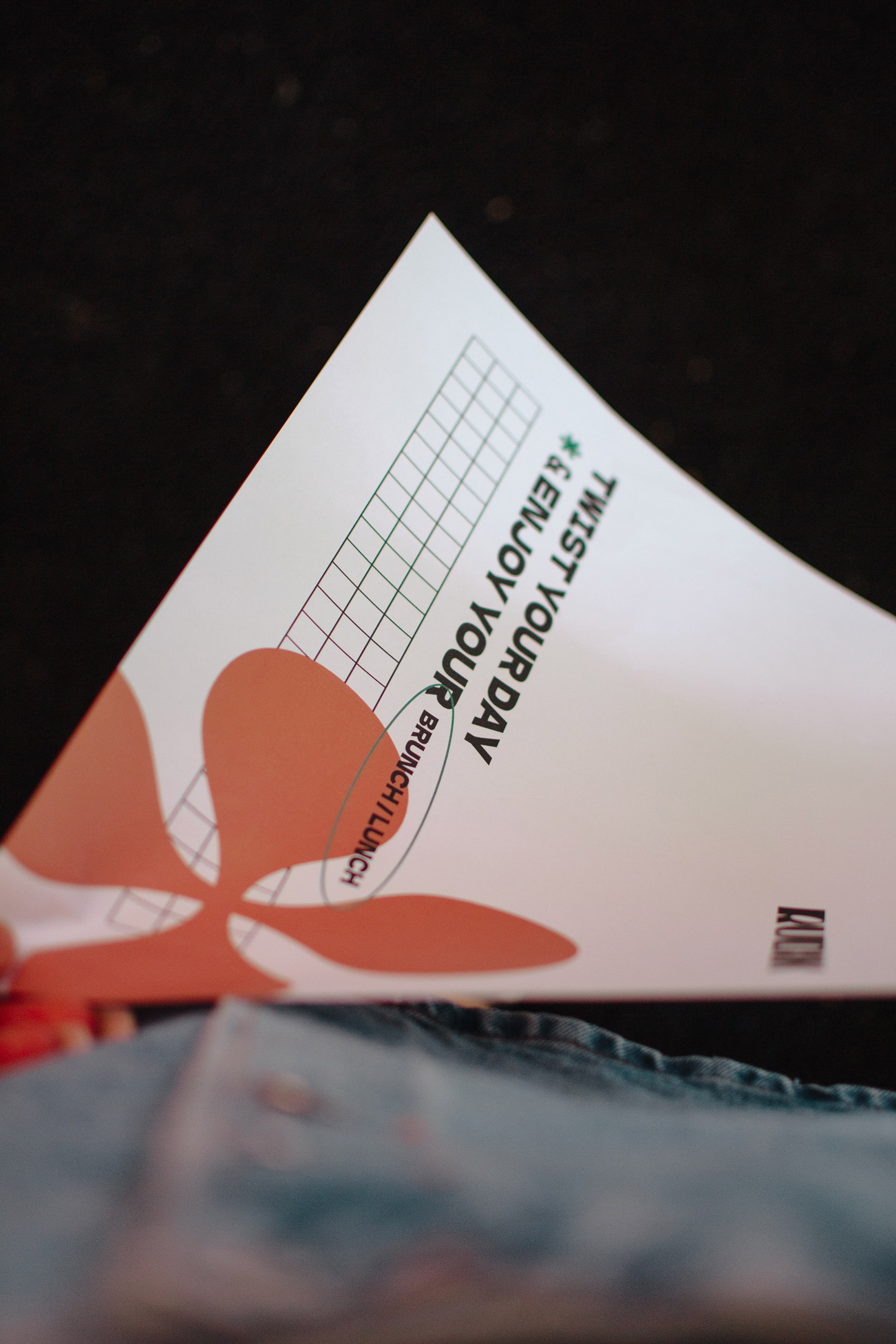
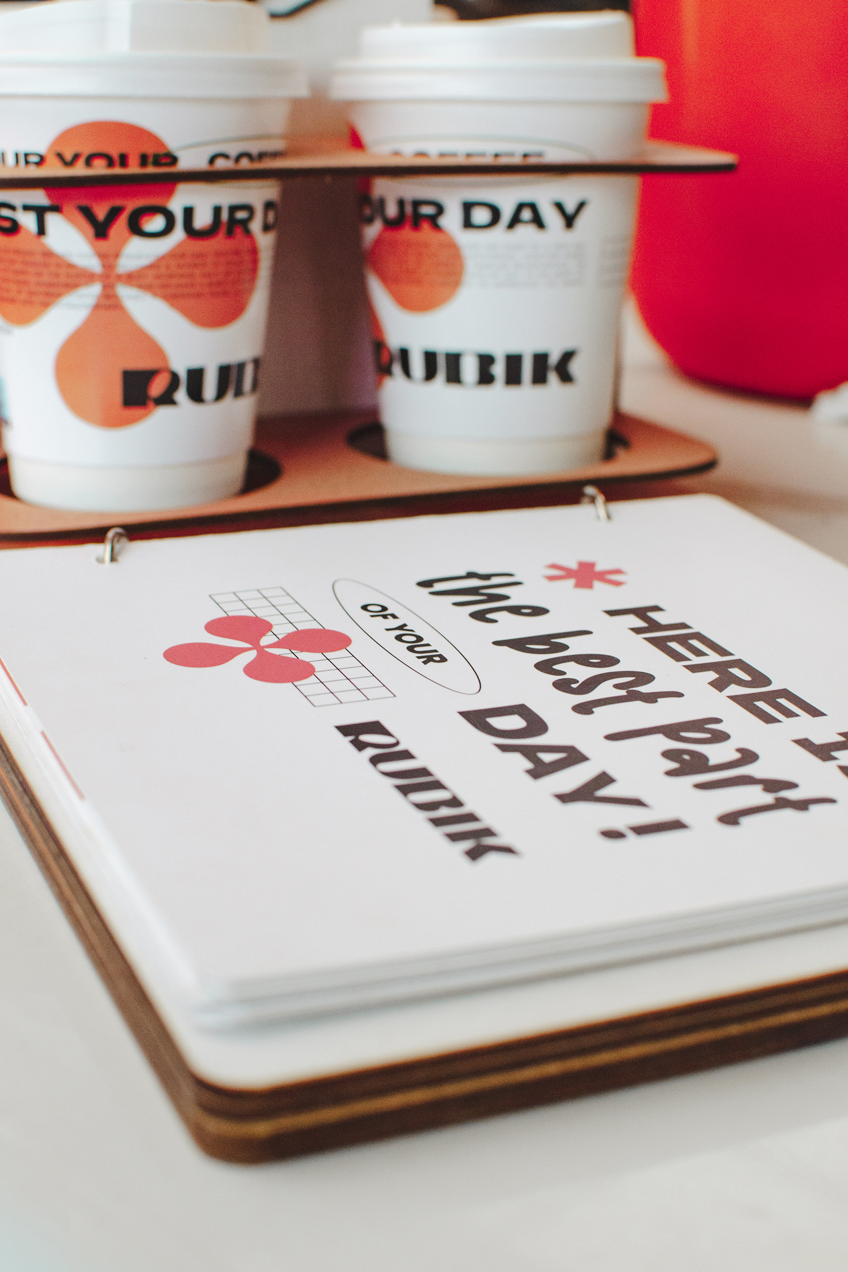
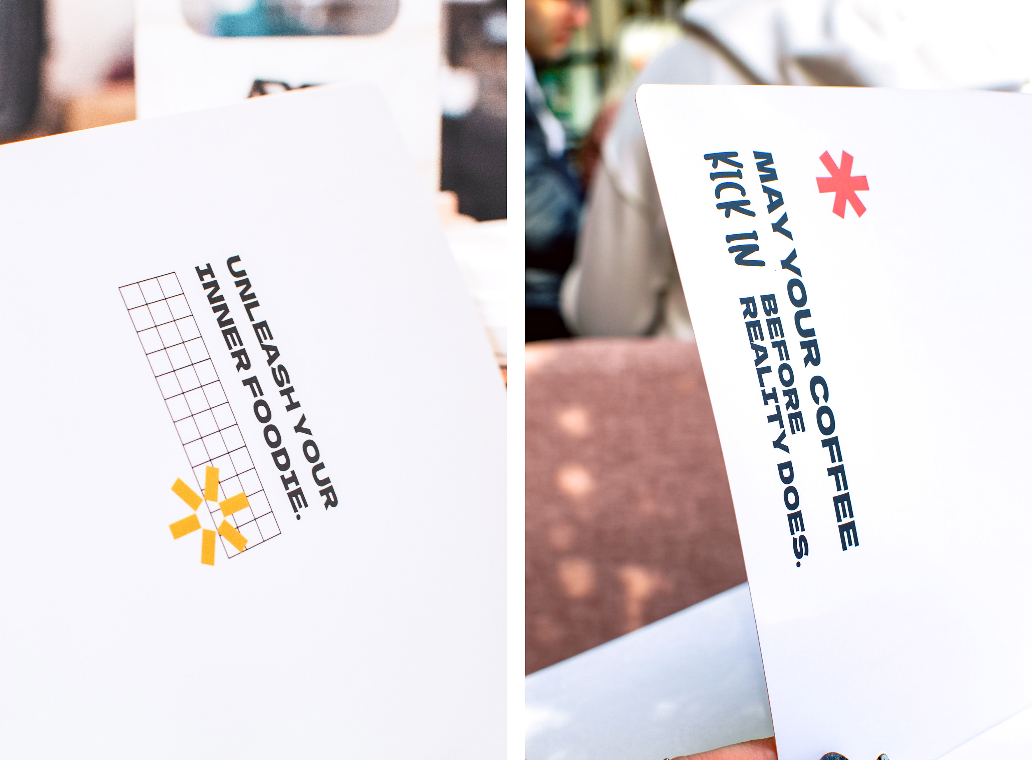
The core concept, “Twist Your Day,” becomes both a slogan and a visual directive—encouraging customers to embrace small, joyful disruptions to their routine. Typography plays a starring role: sharp, monolithic letterforms sit beside editorial-style text, creating a contrast that mirrors the mix of comfort and stimulation coffee provides. The asterisk symbol, used prominently throughout, serves as a visual cue for discovery, while graphic grids and oversized punctuation elements lend the brand a confident, modular feel.
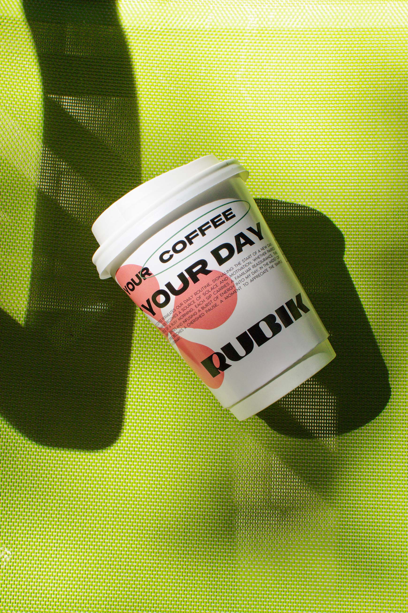
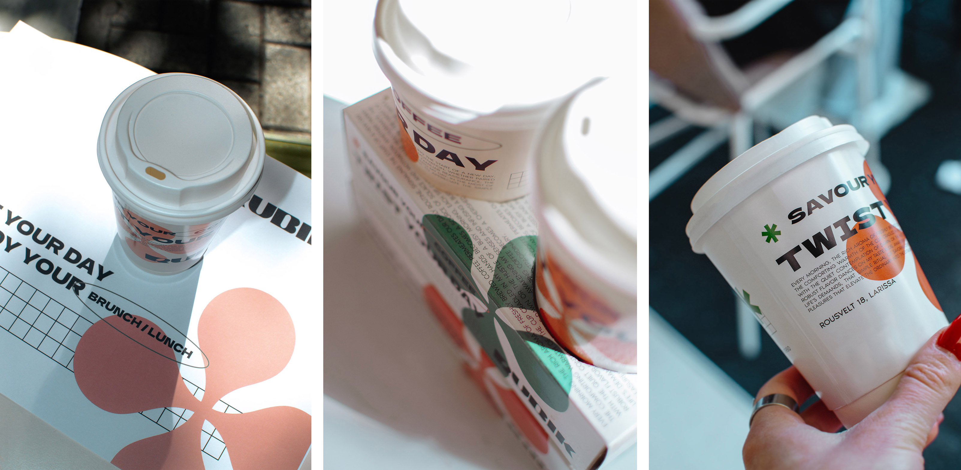
The packaging design, particularly the takeaway coffee cup, is a key expression of the identity—functioning as a handheld poster that wraps the brand’s voice around a tactile, everyday object. On the cup, the tagline “Savour Your Coffee” is paired with “Twist Your Day” in bold type, with intentional visual layering to create movement and curiosity. The red abstract figure-eight shape adds fluidity and balance to the otherwise structured grid system, echoing the flow of a poured espresso shot.
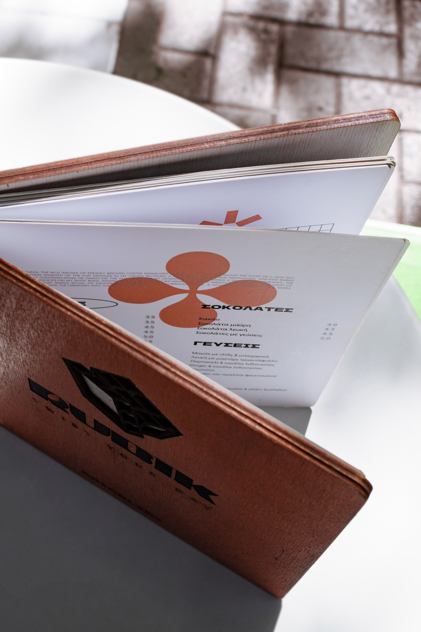
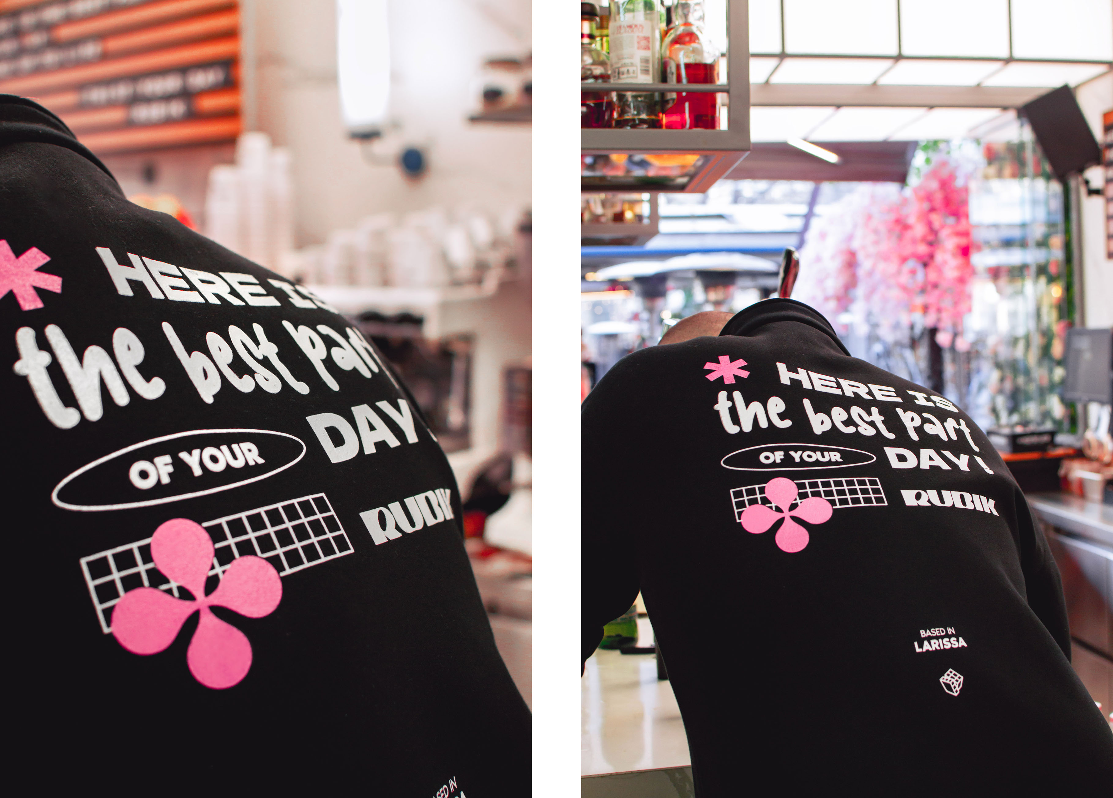
Rubik’s tone is modern, expressive, and slightly rebellious—perfect for a place where design-minded individuals can enjoy a moment of calm or a burst of creative fuel. The brand experience extends across signage, menus, merchandise, and digital platforms, creating a seamless visual language that’s both grounded and full of surprise. Every detail is designed to make the ordinary coffee break feel like an extraordinary act of self-expression.
CREDIT
- Agency/Creative: Nicole Dimopoulou
- Article Title: Rubik Brand Identity by Nicole Dimopoulou
- Organisation/Entity: In-House
- Project Type: Identity
- Project Status: Published
- Agency/Creative Country: Greece
- Agency/Creative City: Larissa
- Market Region: Europe
- Project Deliverables: Brand Design, Graphic Design, Packaging Design, Typography
- Industry: Hospitality
- Keywords: graphicdesign, illustration, packaging, typography, coffee, branddesign
-
Credits:
Photography: Nicole Dimopoulou
Store: Rubik


