


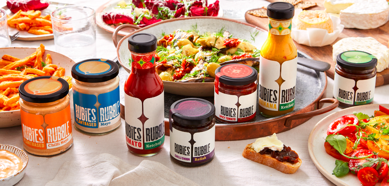
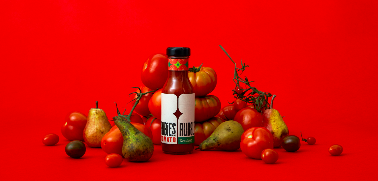
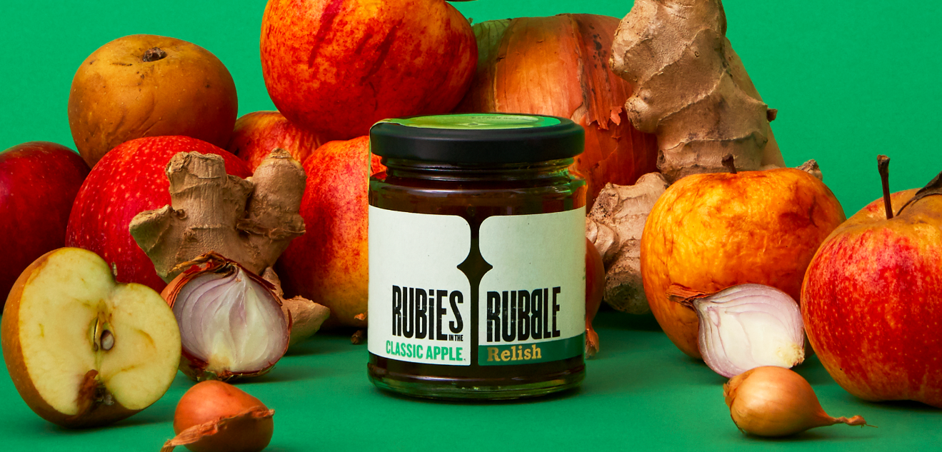
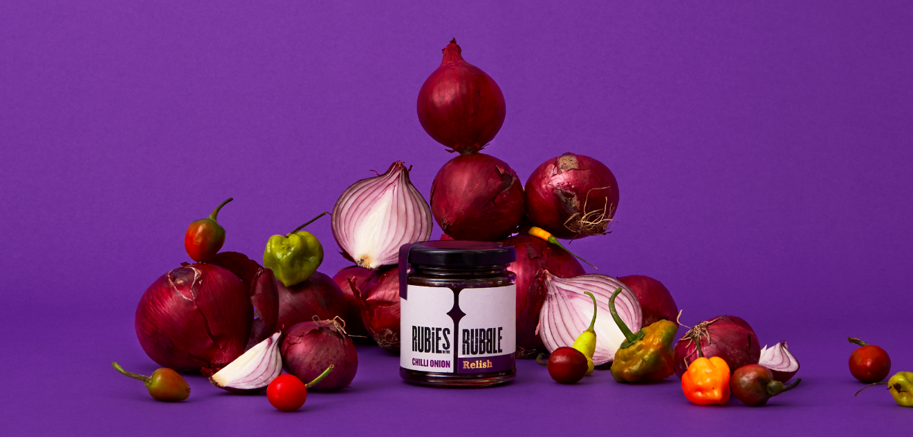
Creating condiments from fruits and vegetables that would have otherwise gone to waste, Rubies in the Rubble are a brand with an idea that needed to grow beyond the farmer’s market. They picked Pearlfisher to create an identity that was less niche and communicated the great message at their heart more clearly.
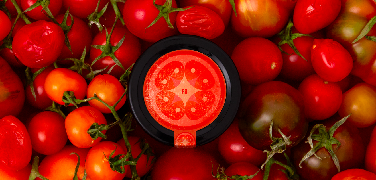
With the creative idea of ‘relish the discovery’ as our starting point, we explored a design language that retains some familiar category cues while pressing into new territory, both reassuring consumers and appealing to their inner curiosity. All of this while celebrating both the deliciousness of the product and the driving purpose of the brand in a bolder, more stand-out way.
The fruit of our labour is a positioning, identity and tone of voice that helps Rubies shift from a quietly positive brand to one that is, as our new tagline puts it, packed with purpose.
CREDIT
- Agency/Creative: Pearlfisher
- Article Title: Rubies in the Rubble
- Organisation/Entity: Agency, Published Commercial Design
- Project Type: Packaging
- Agency/Creative Country: United Kingdom
- Market Region: Europe
- Project Deliverables: Brand Identity, Brand Redesign, Brand Strategy, Branding, Identity System, Packaging Design, Photography, Rebranding, Tone of Voice
- Format: Jar
- Substrate: Glass Jar


