


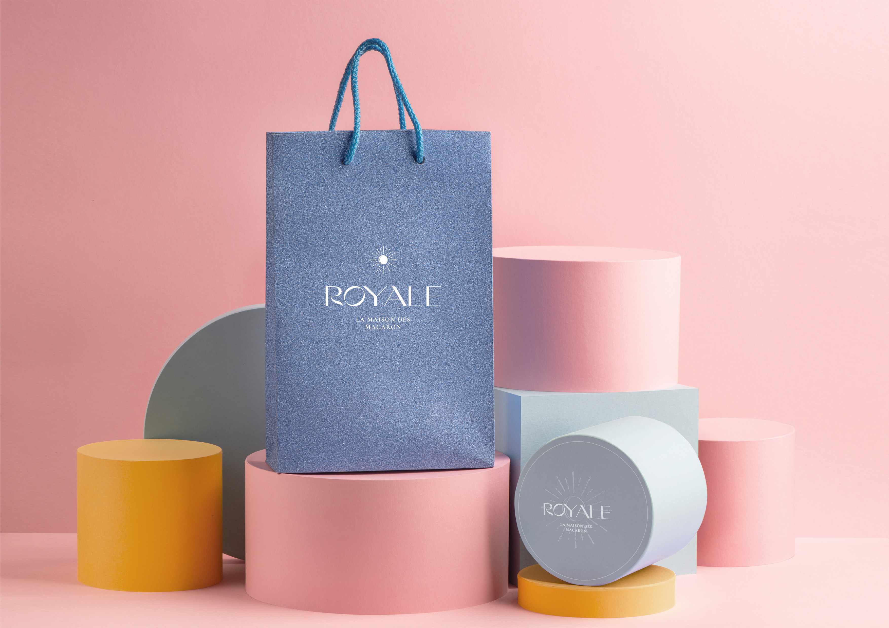
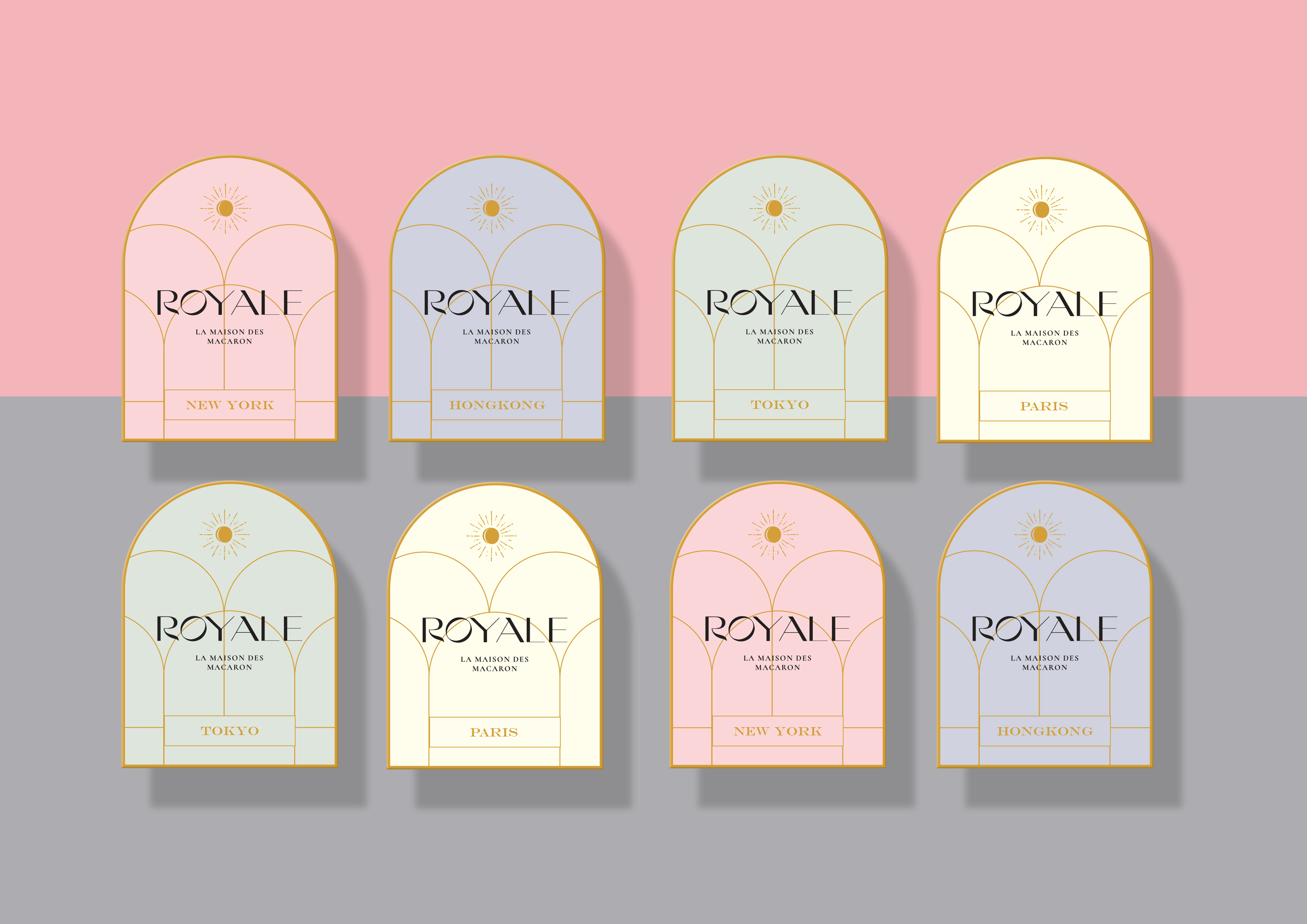
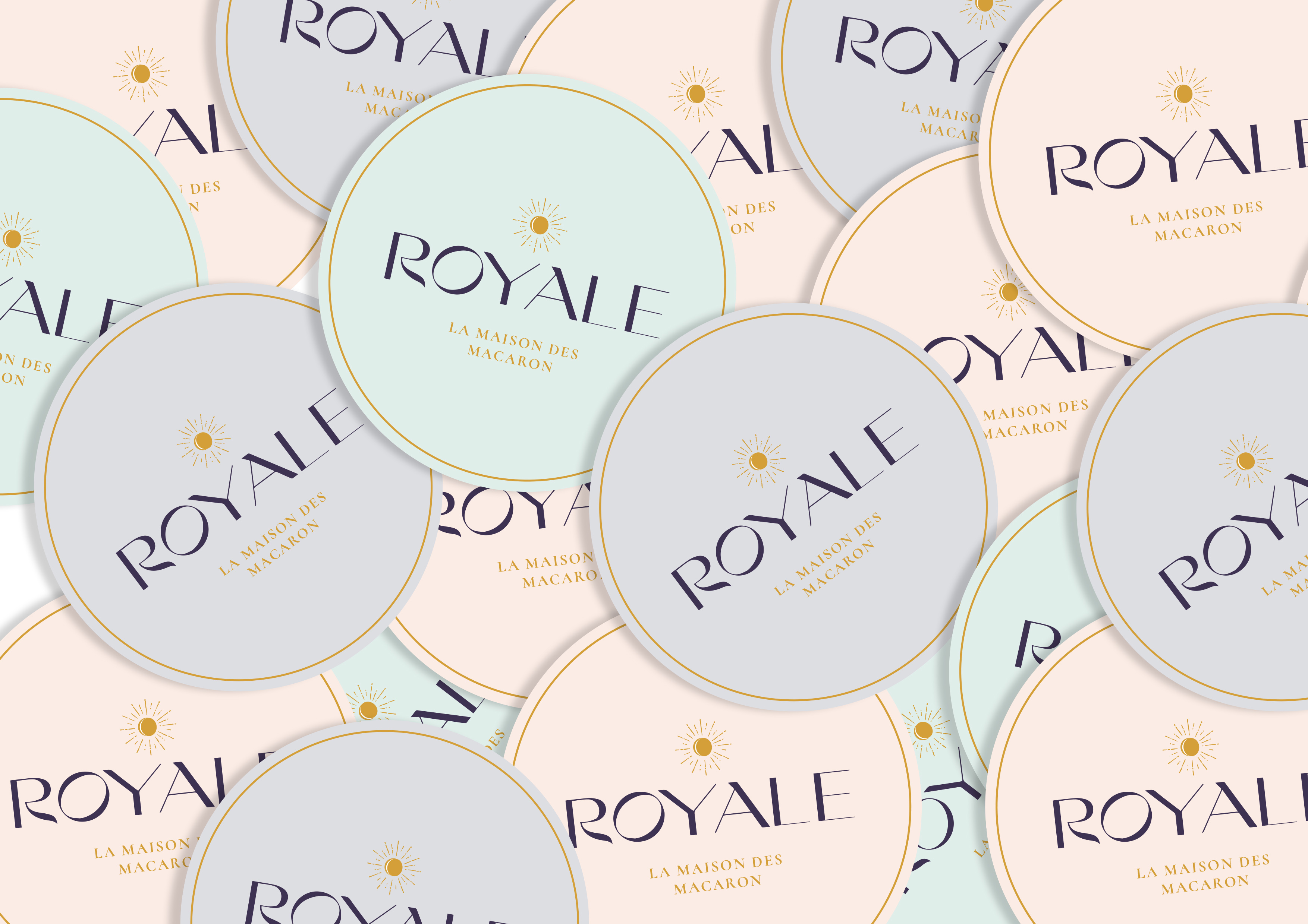
Macaron has become a symbol of social status for some. Therefore Macaron is always identified as a luxurious noble desert. And we help Charlotte – owner of Royale who has expanded his business in several cities around the world. We help Charlotte to have a premium and consistent brand. The use of pastels is inspired by macarons and luxury colors in Paris.
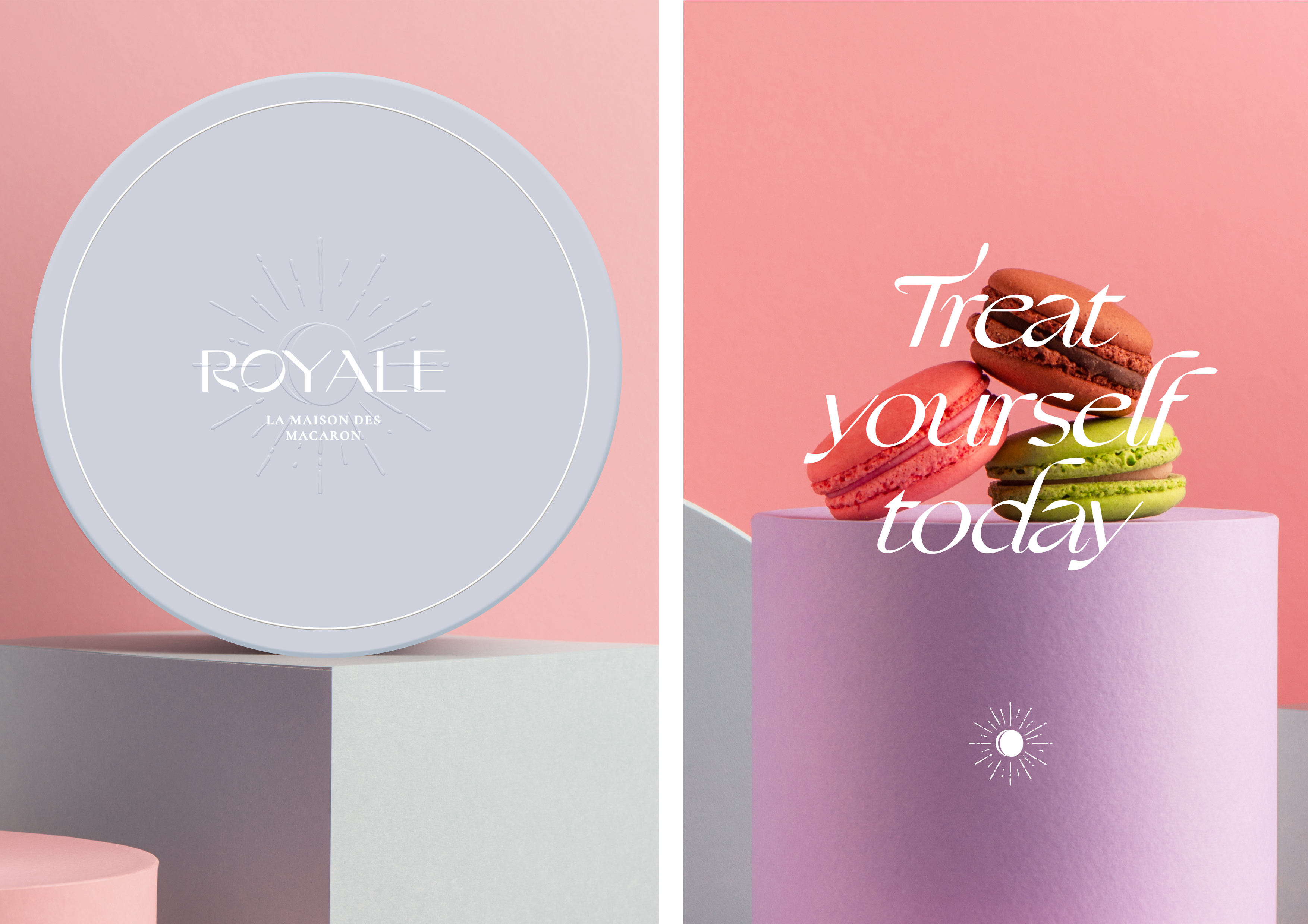
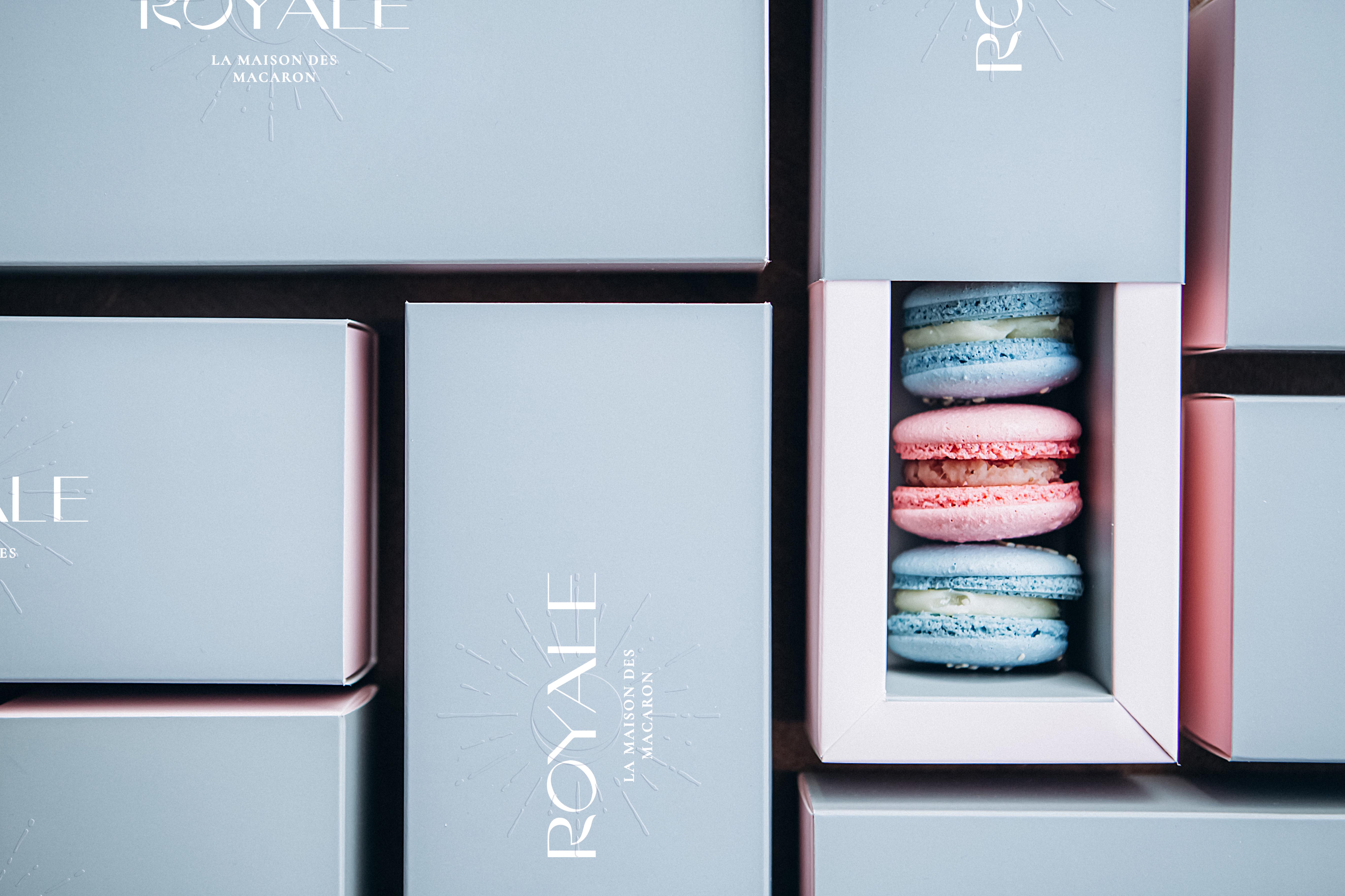
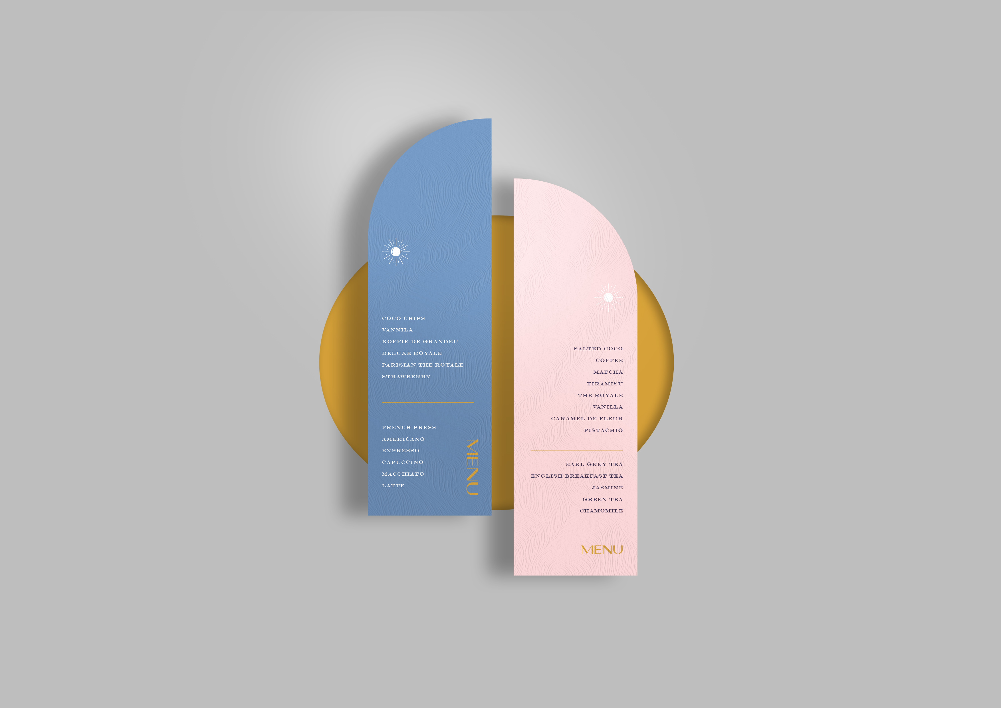
The packaging design that is deliberately packaged in an exclusive and simple manner adds to the elegance and beauty of the Royale brand. And also the use of several embossed finishes for the Royale monogram with the aim of symbolizing the sophisticated & elegance of the Paris-originating brand.
![]()
![]()
CREDIT
- Agency/Creative: Nero Atelier
- Article Title: Royale La Maison Des Macarons Designed by Nero Atelier
- Organisation/Entity: Agency, Published Commercial Design
- Project Type: Identity
- Agency/Creative Country: Indonesia
- Market Region: Multiple Regions
- Project Deliverables: Brand Experience, Brand Guidelines, Brand Identity, Brand Naming, Brand Strategy, Brand World, Branding, Graphic Design, Identity System, Illustration, Packaging Design, Product Naming, Research, Tone of Voice
- Industry: Food/Beverage
- Keywords: Macarons, Paris, Hongkong, Tokyo, France, Sweet, Cookies
FEEDBACK
Relevance: Solution/idea in relation to brand, product or service
Implementation: Attention, detailing and finishing of final solution
Presentation: Text, visualisation and quality of the presentation


