Goal
After more than a decade leading the cannabis seeds market in Europe, Royal Queen Seeds decided it was high time to strengthen its success and conquer the US market. A pioneer in innovation and genetic quality, the brand needed a revamping that would position it as a solid and inspiring global leader, a new identity that was fresher, more exclusive and aligned to the company’s vision.
Approach
The first step was to define the brand’s DNA, in order to develop the strategic principles that would guide the personality and conceptualization of the new Royal Queen Seeds visual identity.
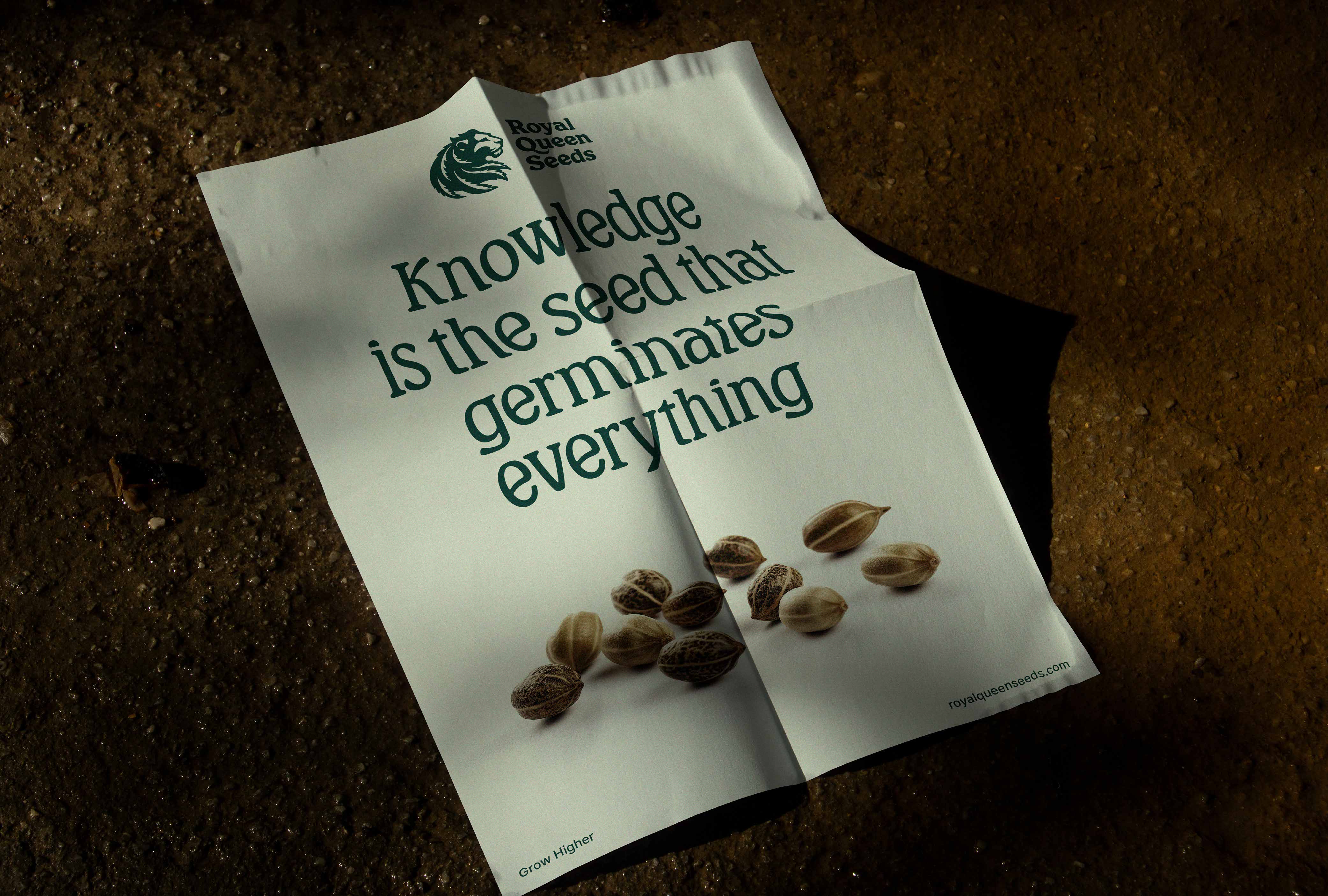
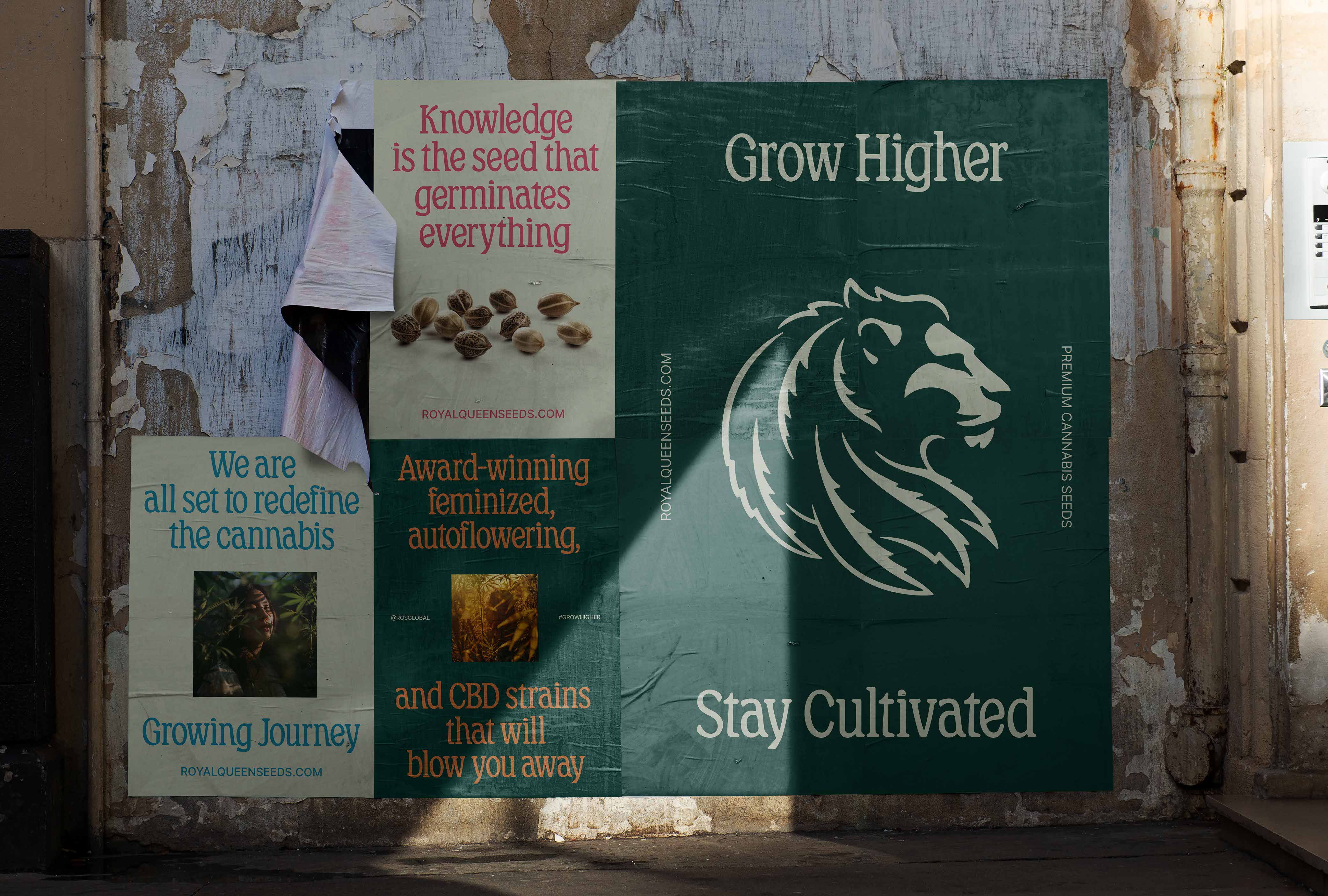
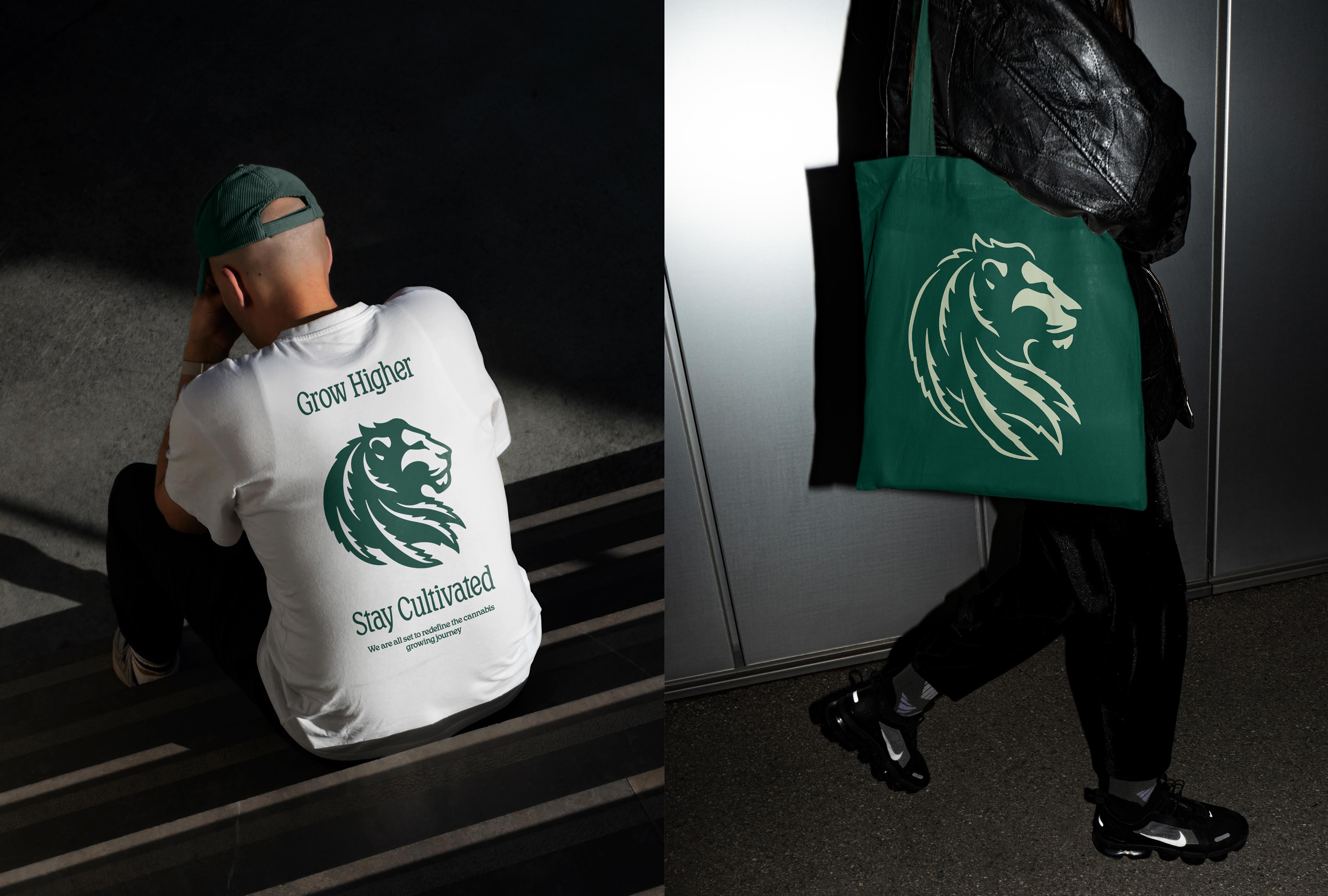
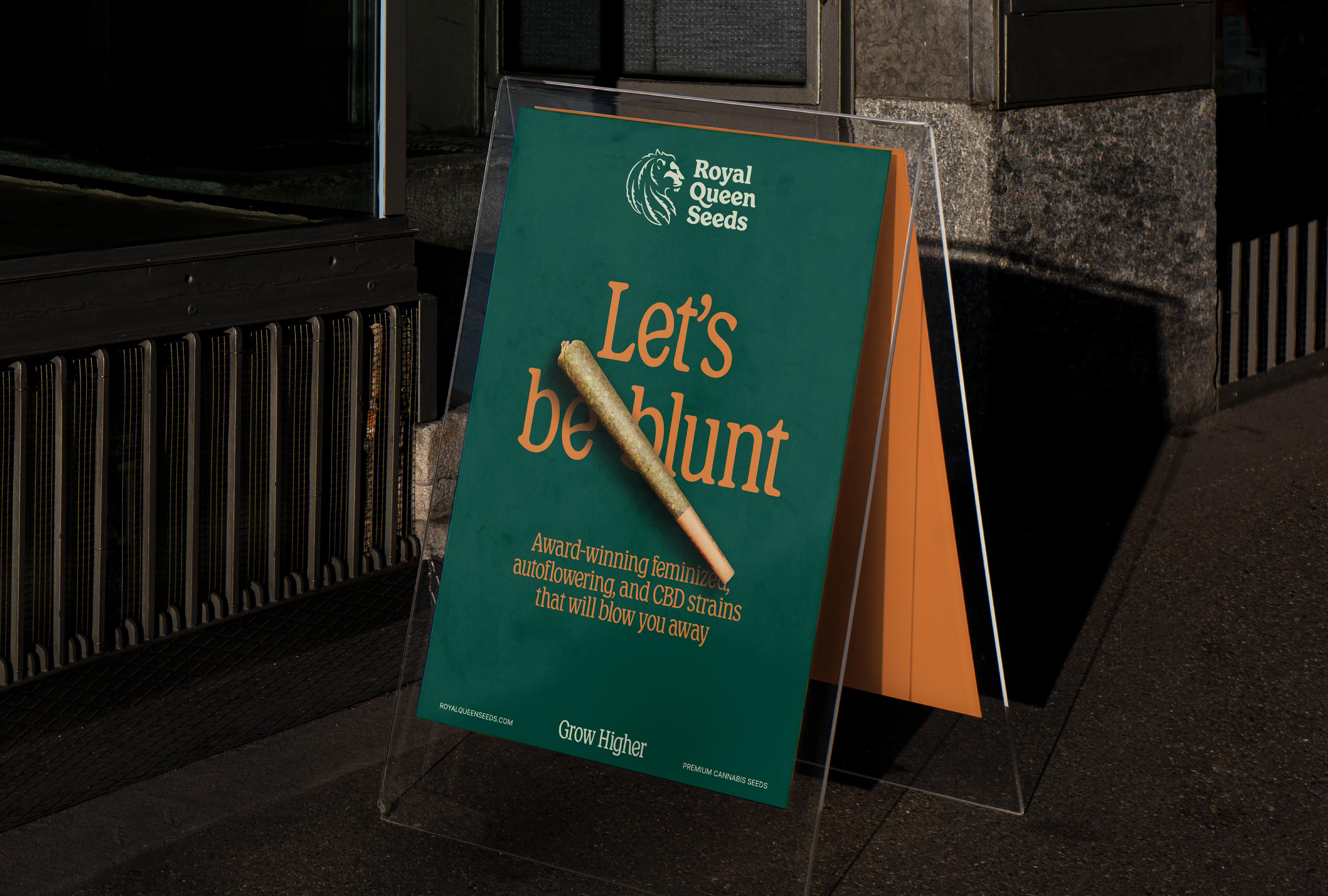
The positioning is encapsulated in “Grow Higher”, an inspiring and eloquent claim that calls on growers to surpass their own expectations, while embodying the brand’s “never stop evolving” philosophy.
Morillas’ proposal reflects the transformative culture of the company, a brand brave enough to cultivate change and transform the cultivation experience into an educational journey of growth.
Solution
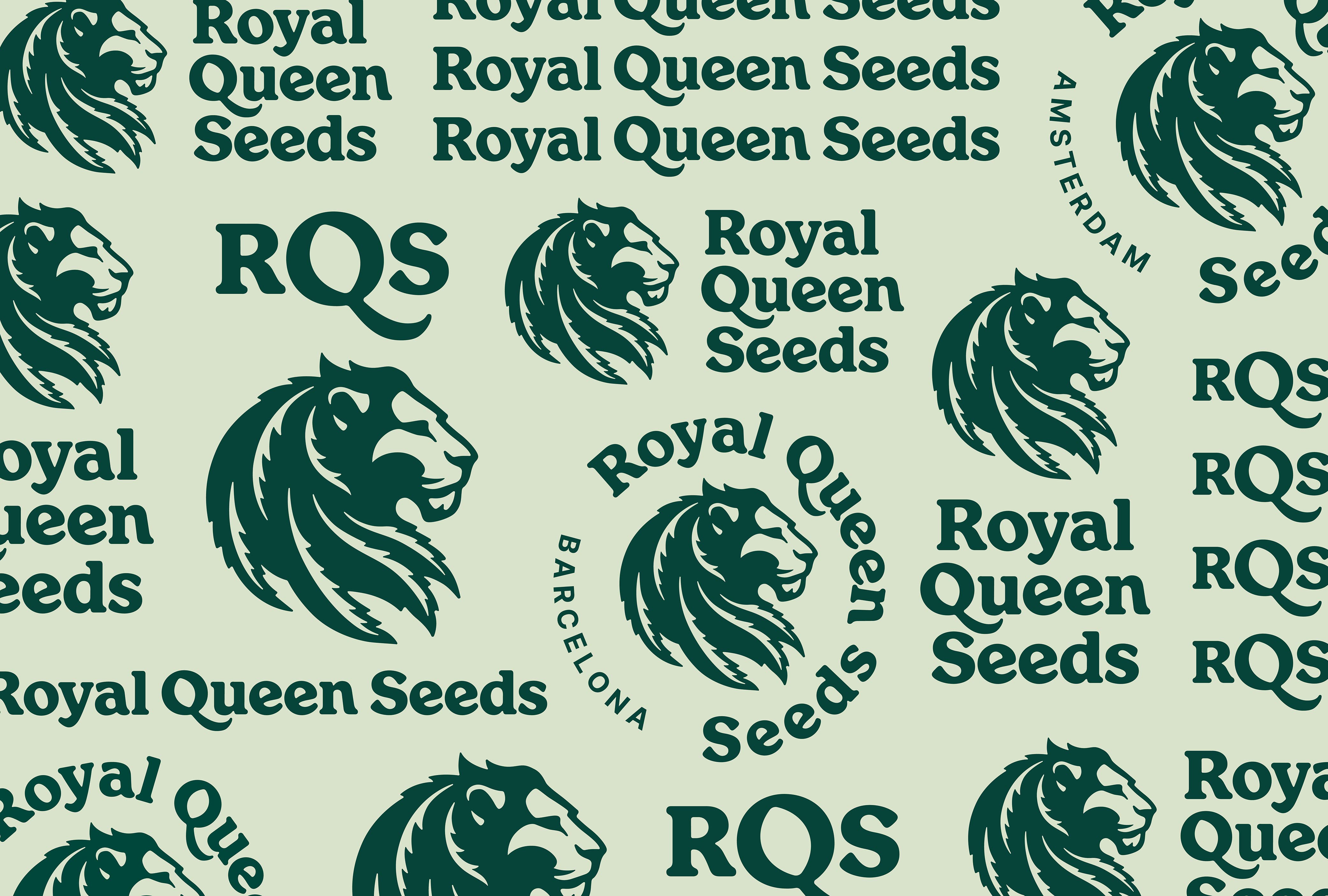
The “Royal Queen Seeds” name remains the same, but the graphic and visual realm has evolved to gain differentiation, relevance and a boatload of personality.
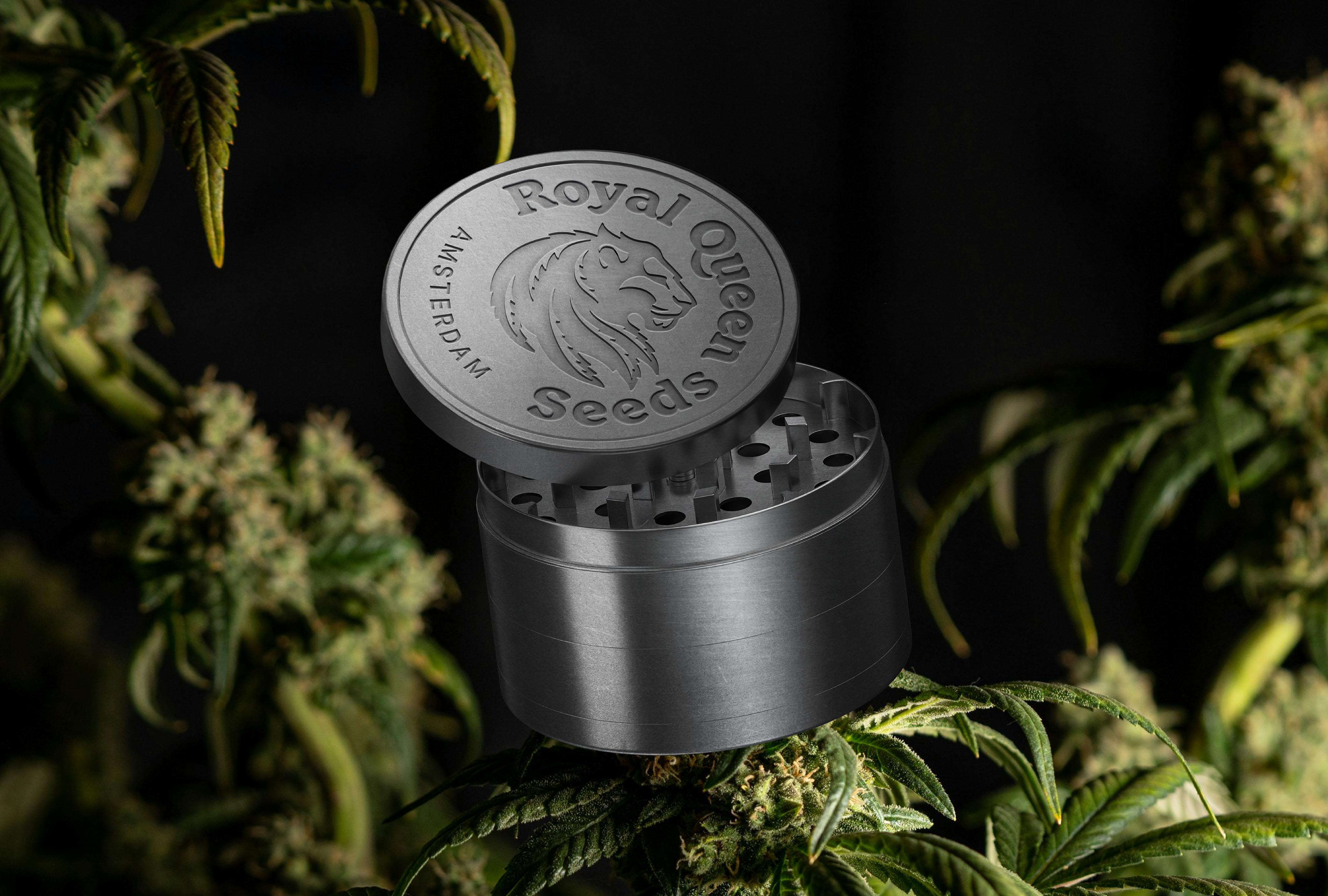
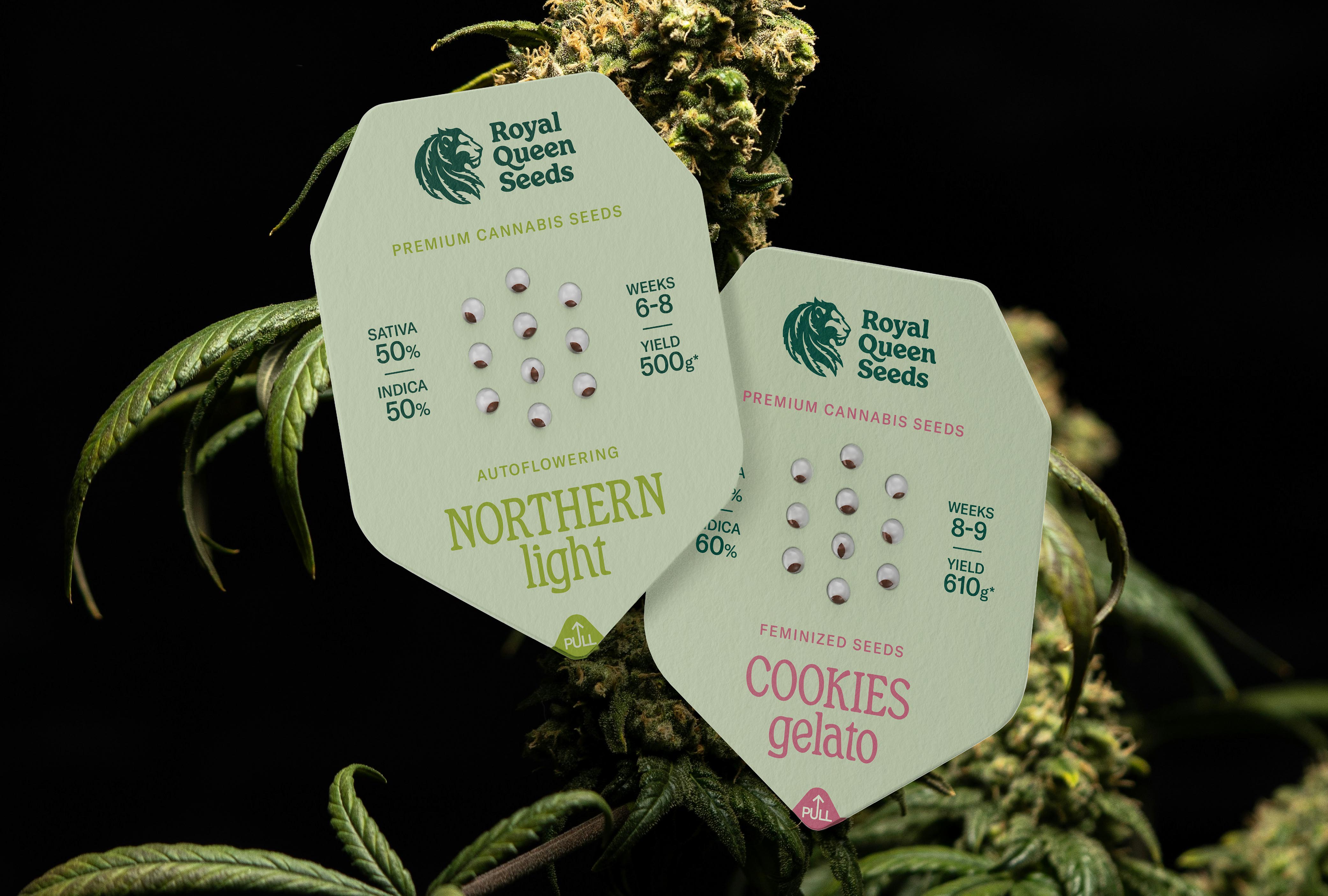
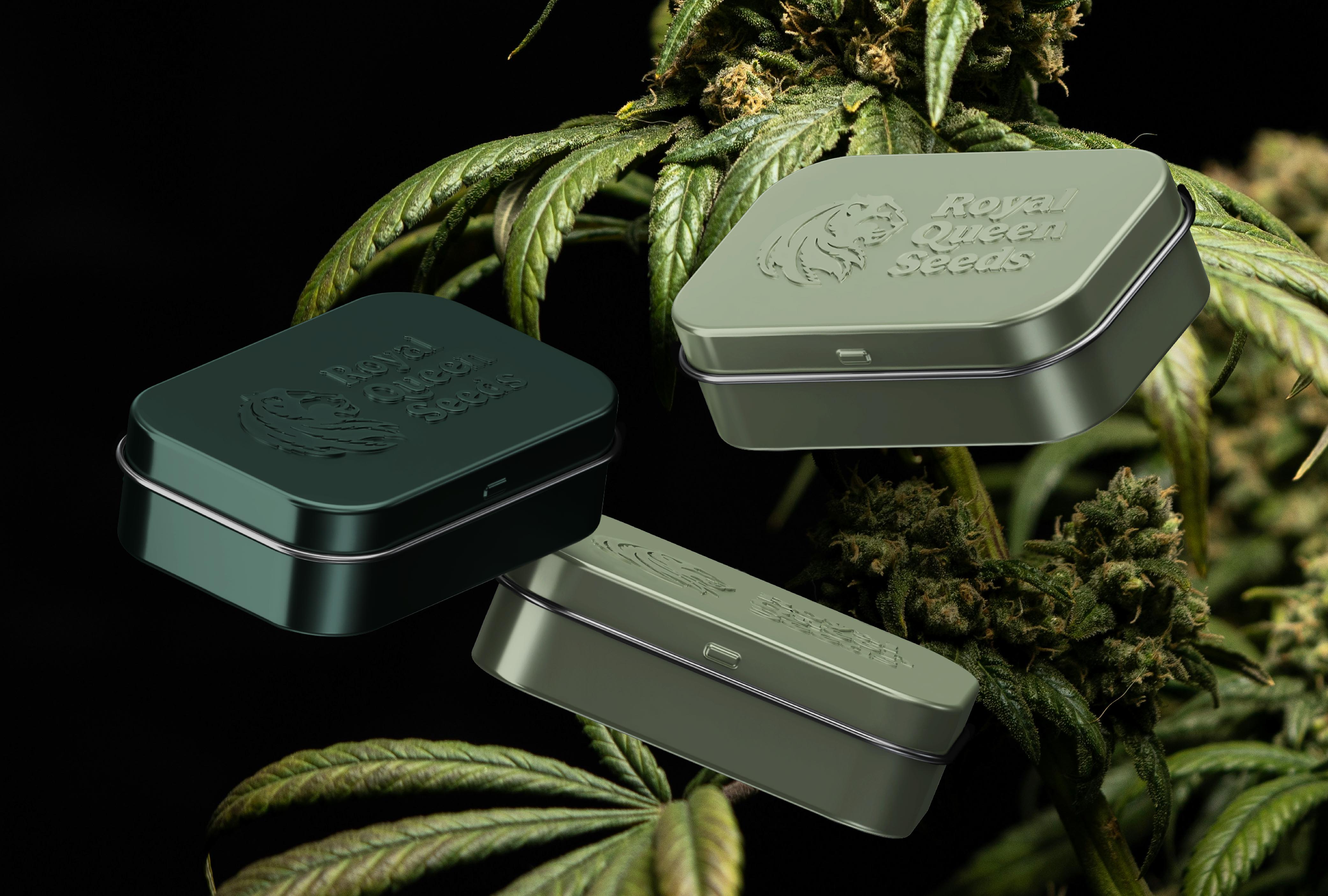
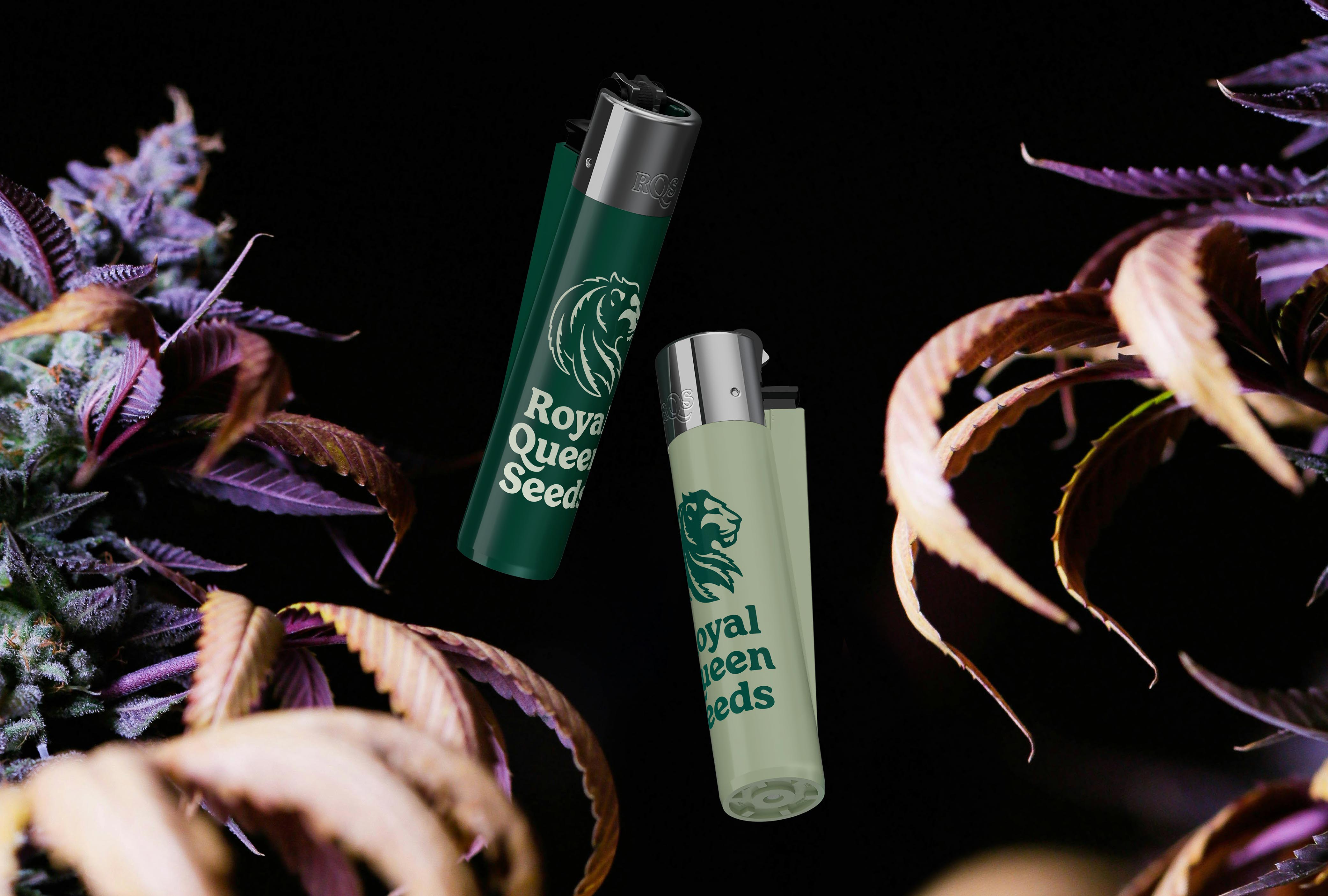
The new typography is more contemporary and organic, connecting the brand with its consumers in a playful, friendlier way. Infusing the lion emblem with brand attributes, its mane is intricately crafted from cannabis leaves, showcasing the flagship product in a detailed illustration work. In the same vein, the counterform of the Q in the logo symbolises a seed, and the colour palette softens the formerly green tones, delivering serenity, prestige and freshness.
With a newly crafted identity aligned with its core values and distinctive personality, Royal Queen Seeds is poised to set the industry standard and emerge as a global leader in its field.

CREDIT
- Agency/Creative: Morillas
- Article Title: Royal Queen Seeds: Redefining Cannabis Excellence for a Global Audience with the Help of Morillas Branding
- Organisation/Entity: Agency
- Project Type: Identity
- Project Status: Published
- Agency/Creative Country: Spain
- Agency/Creative City: Barcelona
- Market Region: Global
- Project Deliverables: 3D Design, Advertising, Animation, Art Direction, Brand Design, Brand Guidelines, Brand Identity, Brand Mark, Brand Redesign, Brand Strategy, Brand Tone of Voice, Brand World, Branding, Creative Direction, Graphic Design, Icon Design, Identity System, Logo Design, Motion Graphics, Packaging Design, T-Shirt Design, Tone of Voice
- Industry: Retail
- Keywords: WBDS Agency Design Awards 2024/25 , #morillas #createsomethingextraordinary #royalqueenseeds #cannabis #rqs #rebranding #brandstrategy #design #packaging #visualidentity #brandpositioning
-
Credits:
Illustration: Alex Ferreiro


