


Chaatery: A Celebration of India’s Street Food Culture, Reimagined
In India, chaat is more than just a snack—it’s a cultural experience, a shared memory, and an everyday indulgence wrapped in crunch, spice, tang, and warmth. It’s the sound of vendors calling out their specials, the sight of hands assembling with practiced speed, and the smell of tamarind, coriander, fried dough, and mint wafting through bustling lanes. Chaat is an emotion—immediate, expressive, and deeply rooted in the subcontinent’s culinary heritage.
Chaatery was born out of this emotion. It is not just a food brand but a vibrant tribute to India’s rich and diverse street food tradition. Located in Goa, Chaatery reimagines this beloved culinary genre in a modern QSR (Quick Service Restaurant) format—bringing together authentic recipes, regional favourites, and a design system that mirrors the chaotic, joyous nature of the chaat experience itself.
A Contemporary Take on Tradition
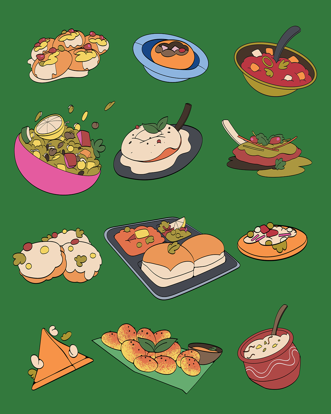
While chaat is omnipresent across Indian cities, every region has its own version—subtly or significantly different in taste, style, and assembly. Chaatery’s core offering celebrates this diversity. From the spicy aloo tikkis of North India to the tangy puchkas of Bengal, from the cool dahi puri of Mumbai to lesser-known delights from small towns and street corners—Chaatery brings these varied forms under one roof.
But Chaatery does more than serve chaat. It curates a story of regional flavour, craft, and community, with a sharp focus on authenticity, freshness, and a fun, modern presentation. The brand makes the traditional accessible, and the local feel like a global treat.
Designing the Experience: Branding with Texture, Layers, and Flexibility
At the heart of Chaatery’s brand identity is a strong desire to translate the chaat experience visually. How do you capture something so layered, noisy, colourful, and spontaneous in a visual system that can work across touchpoints, from high street stores to food trucks and delivery packaging?
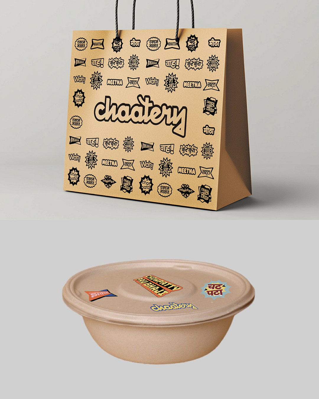
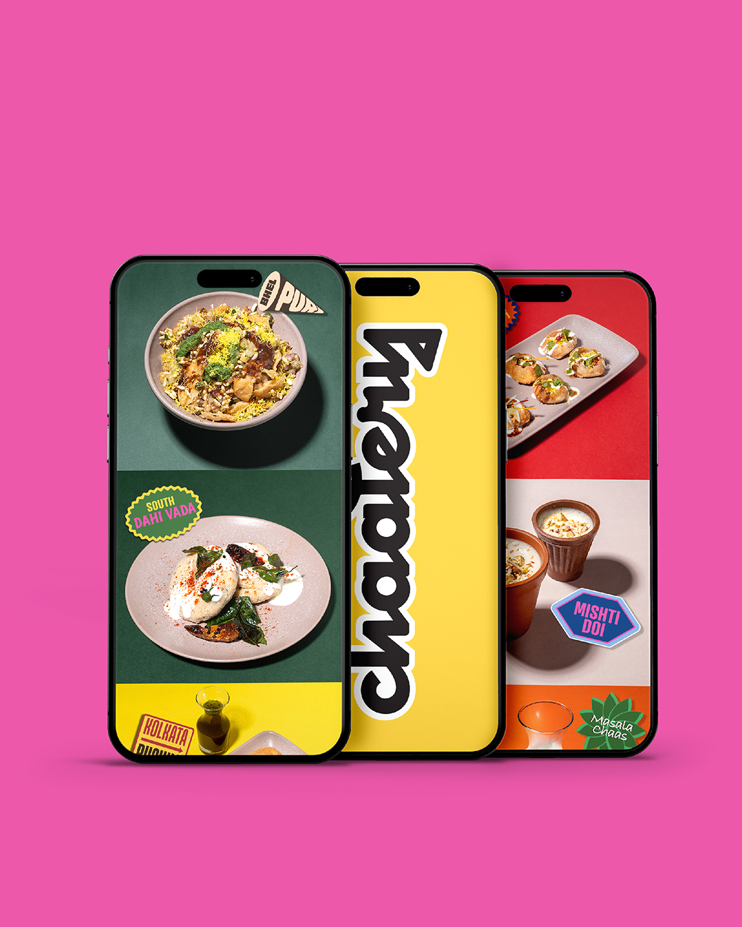
The answer lay in an idea that feels just like chaat: stickers.
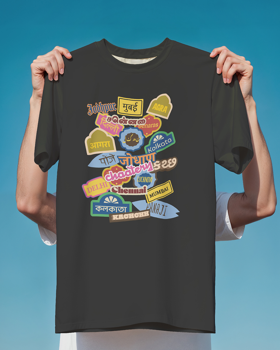
We developed a dynamic, modular identity system built around a library of stickers—each one acting like a visual ingredient in the brand’s personality. These stickers are playful, bold, and highly adaptable. Some carry typographic expressions, others feature icons, illustrations, or short phrases. They can be rearranged, overlapped, resized, and applied in countless combinations.
Just like assembling a chaat dish, the identity system is designed to be layered, mixed, and reimagined based on context and mood. This modular approach ensures that the brand remains flexible across different formats while still retaining a distinctive personality.
The sticker-based language also serves a deeper purpose. Chaatery, by its very nature, is meant to be expressive, warm, and a little over-the-top—in the best possible way. The sticker system embraces this energy, allowing for experimentation while keeping things recognisable and coherent.
Typography: A Typeface Buffet
The visual identity also draws from the variety and spontaneity of Indian street life. The type system features a curated selection of fonts—each bringing in its own tone and weight. From bold, blocky display faces to narrow, handwritten styles, the combination evokes the layered chaos of hand-painted signboards, paper menus, and vendor carts seen across Indian cities and towns.
This type palette was used not just in English but also adapted across regional scripts to bring in multilingual relevance—important for a brand that celebrates India’s linguistic and culinary diversity.
Colour and Visual Style
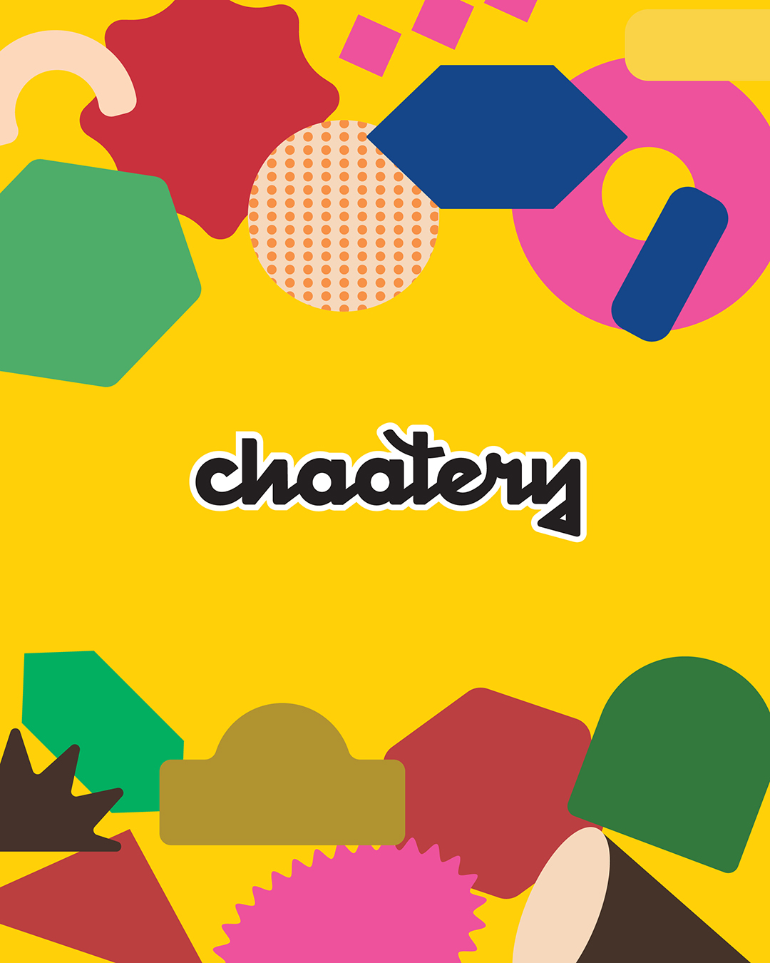
Chaatery’s colour palette is as lively and vivid as the food it serves. Bright reds, zesty greens, turmeric yellows, and cool blues form the backbone of the system, often layered or contrasted to evoke the vibrancy of street stalls and snack carts. Rather than relying on a minimal or premium aesthetic, the brand intentionally leans into the maximalism of Indian street life—messy in the most delightful way.
Textures, halftones, grain, and layering techniques add a tactile quality to the visuals. There’s an intentional rawness in the design that mirrors the unpredictability and soul of chaat itself.
Across Touchpoints: From Food Trucks to Packaging
One of the biggest challenges—and opportunities—was designing an identity that could flex across multiple formats. Chaatery isn’t a single-location brand. Its QSR model includes high street storefronts, compact takeaway kiosks, food trucks, and even pop-up carts. Each of these formats required the brand to adapt while maintaining coherence.
Here’s how the sticker-based system came alive across different brand touchpoints:
• Packaging: Chaat is often served deconstructed, especially in takeaway and delivery formats. We designed packaging where stickers could visually indicate the contents of each box, making it easier to identify the different components of a chaat meal. The stickers added clarity, personality, and a touch of playfulness to the functional elements of packaging.
• Storefronts & Interiors: At physical outlets, oversized stickers were used as murals, wall graphics, window displays, and signage elements. Some even featured QR codes, interactive stories, or rotating catchphrases—keeping the space constantly alive and engaging.
• Menus & Signage: Modular menu boards used stickers and iconography to highlight spiciness levels, ingredients, and regional origins. This helped even first-time chaat eaters navigate the variety with ease.
• Digital & Social Media: The visual system extended naturally into digital platforms. Social posts, announcements, and brand storytelling were all expressed through the same language of bold typography, sticker overlays, and graphic layering. The digital expression felt just as joyful and chaotic as the real-world experience.
Building a Brand That Feels Like Chaat
At every step, the design team focused on a single core question: how can the brand feel like chaat? Not just in name or visual cues, but in spirit.
Chaat is social. It’s best eaten with others. It’s casual, messy, and full of personality. And so is Chaatery.
The identity encourages play—both for the team managing the brand and the customers engaging with it. The sticker system allows for endless reinvention, making the brand feel alive, adaptive, and human. It can be celebratory during festivals, cheeky on social media, or informative in packaging—all while staying true to its core flavour.
Beyond Food: Culture, Memory & Joy
Chaatery doesn’t stop at food—it creates a cultural experience. By drawing from regional stories, street culture, and the visual vocabulary of Indian cities, the brand aims to tap into memory and nostalgia while offering something new and accessible.
It creates a space where a college student can rediscover a version of their hometown chaat, or a tourist can experience the diversity of Indian street food in one sitting. It’s a brand that brings joy, familiarity, and surprise in equal measure.
For the Chaatery team, design is not just a layer added to the food experience—it is integral to how people connect with the brand. From the first glimpse of the store to the last bite of a golgappa, the brand narrative is consistent, expressive, and rooted in storytelling.
The Outcome
Since its launch, Chaatery has received enthusiastic responses from both locals and tourists in Goa. The brand has quickly carved a space for itself not just as a food destination, but as a visual and cultural one. Customers frequently share photos of the playful packaging, interiors, and illustrated menu elements on social media, organically amplifying the brand’s presence.
The team behind Chaatery—designers, chefs, brand managers, and storytellers—continue to evolve the system. New stickers are regularly added to reflect seasonal specials, local events, or playful cultural commentary. The modularity of the identity ensures it remains fresh, expressive, and easy to scale as the brand expands.
In Conclusion
Chaatery is a brand built from emotion, storytelling, and strong visual thinking. It reimagines Indian street food for a contemporary audience without losing the soul of what makes chaat special. By anchoring the identity in a flexible, sticker-driven system, the brand captures the energy, chaos, and delight of the street food experience—making every chaat moment not just delicious, but memorable.
Through thoughtful design, Chaatery turns every touchpoint into a celebration. It’s not just about food—it’s about how food makes you feel. And at Chaatery, that feeling is unmistakably Indian, incredibly fun, and always full of flavour.
CREDIT
- Agency/Creative: Roy Studio
- Article Title: Roy Studio Reimagines Indian Street Food with a Sticker-Led Identity for Chaatery
- Organisation/Entity: Agency
- Project Type: Identity
- Project Status: Published
- Agency/Creative Country: India
- Agency/Creative City: Goa
- Market Region: Asia
- Project Deliverables: Brand Creation, Brand Experience, Brand Identity, Branding
- Industry: Food/Beverage
- Keywords: India, Chaat, Street Food,
-
Credits:
Creative Director: Saurav Roy
Associate Designer: Smita Sohoni
Associate Designer: Akanksha Goyal
Illusrator: Taher Kapadiya
Motion Design: Upasana Nattoji


