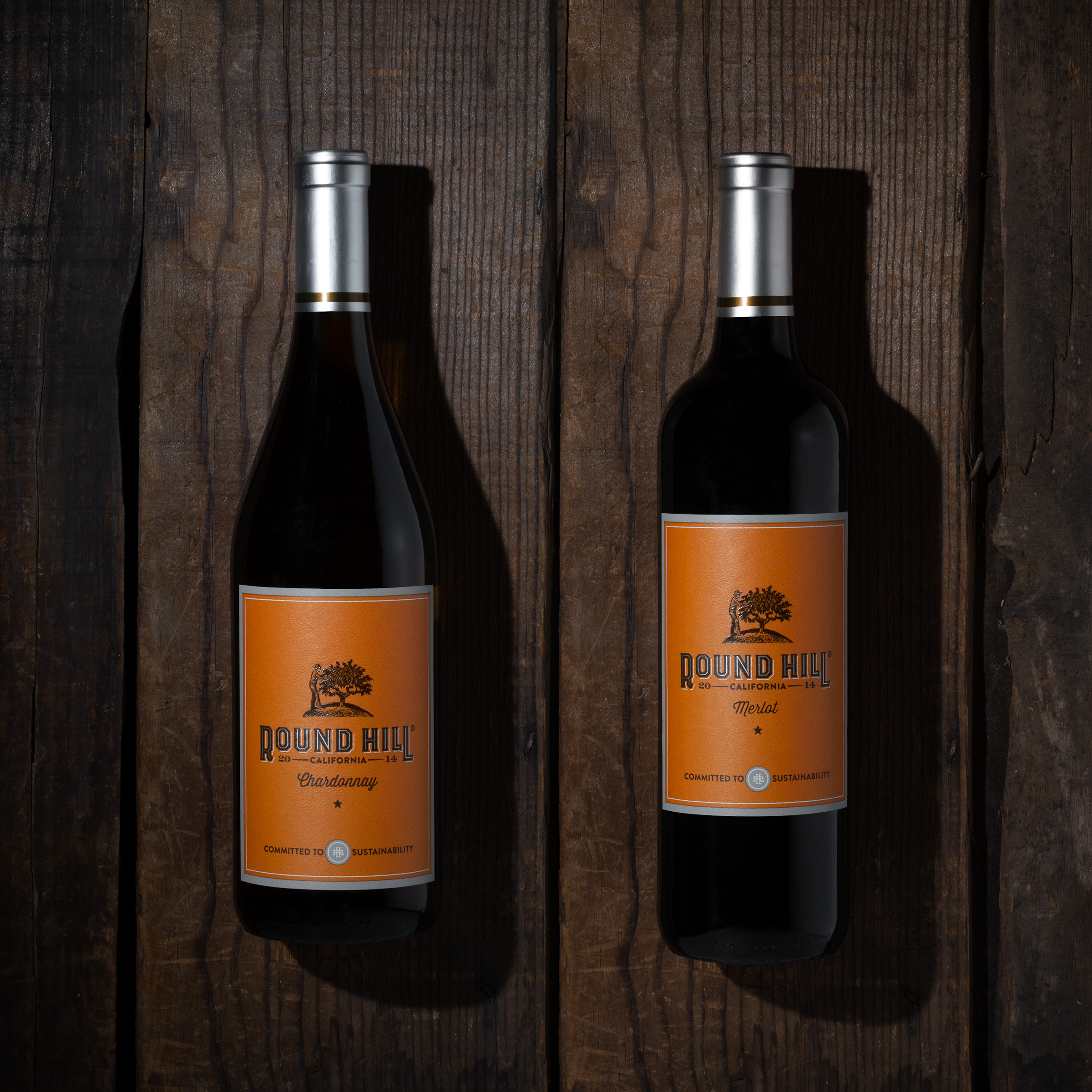
A century ago, California was home to hundreds of structures operating as wineries. Prohibition and the Great Depression would claim almost all, but a handful of these buildings survived, cherished today as “Ghost Wineries.” Round Hill had its humble beginnings in such a structure and this heritage story inspired the creative direction for our refresh of the brand.
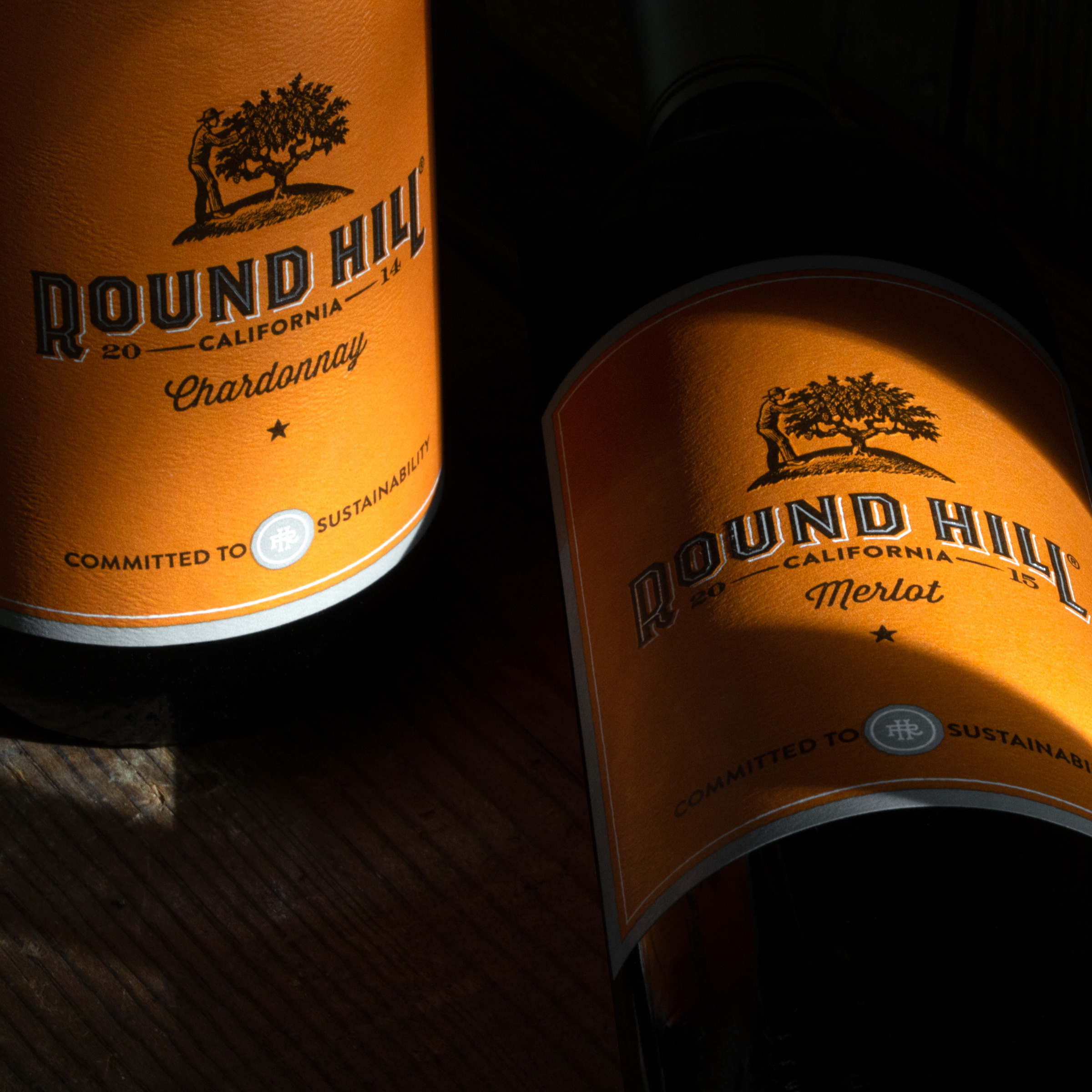
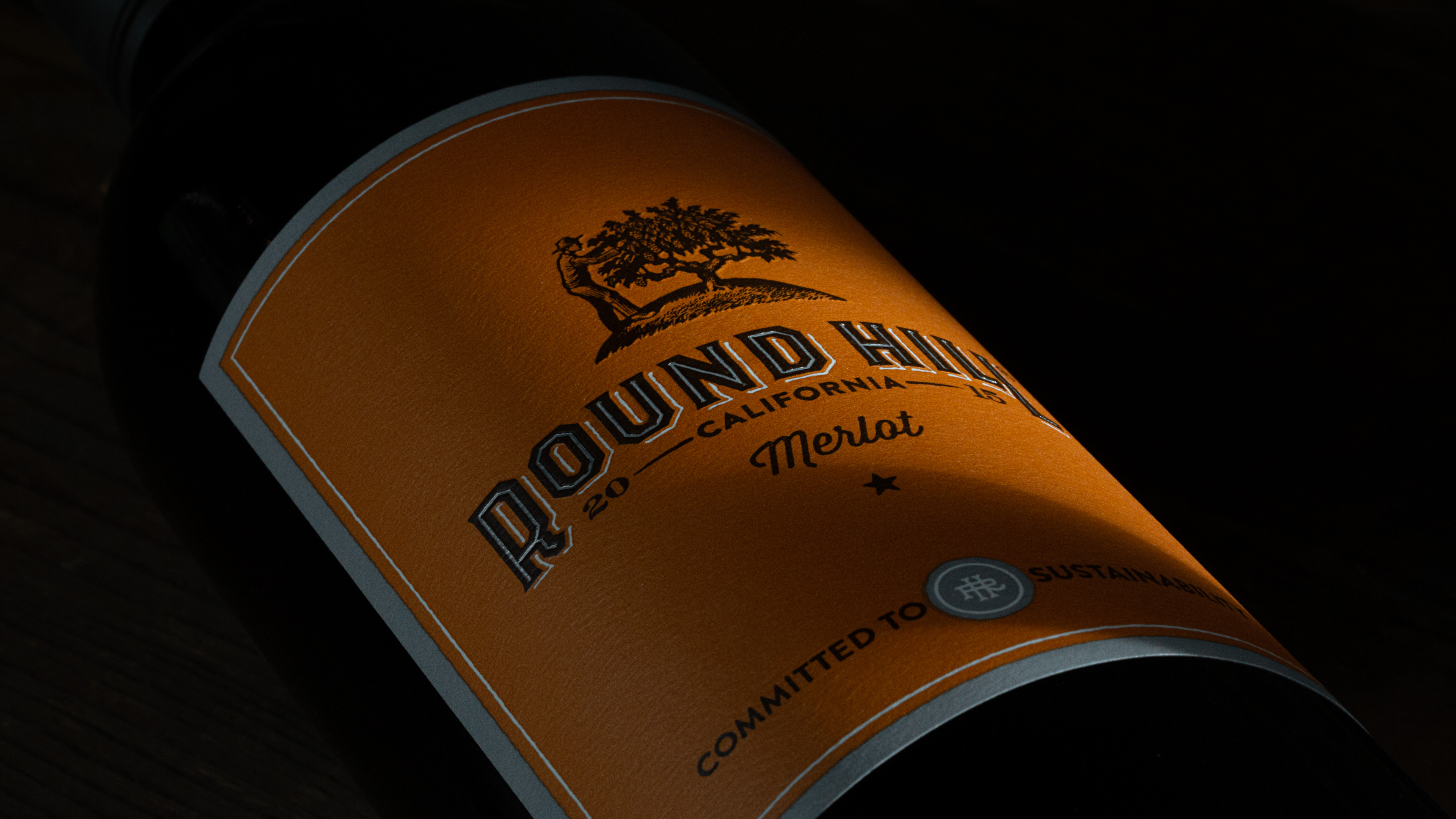
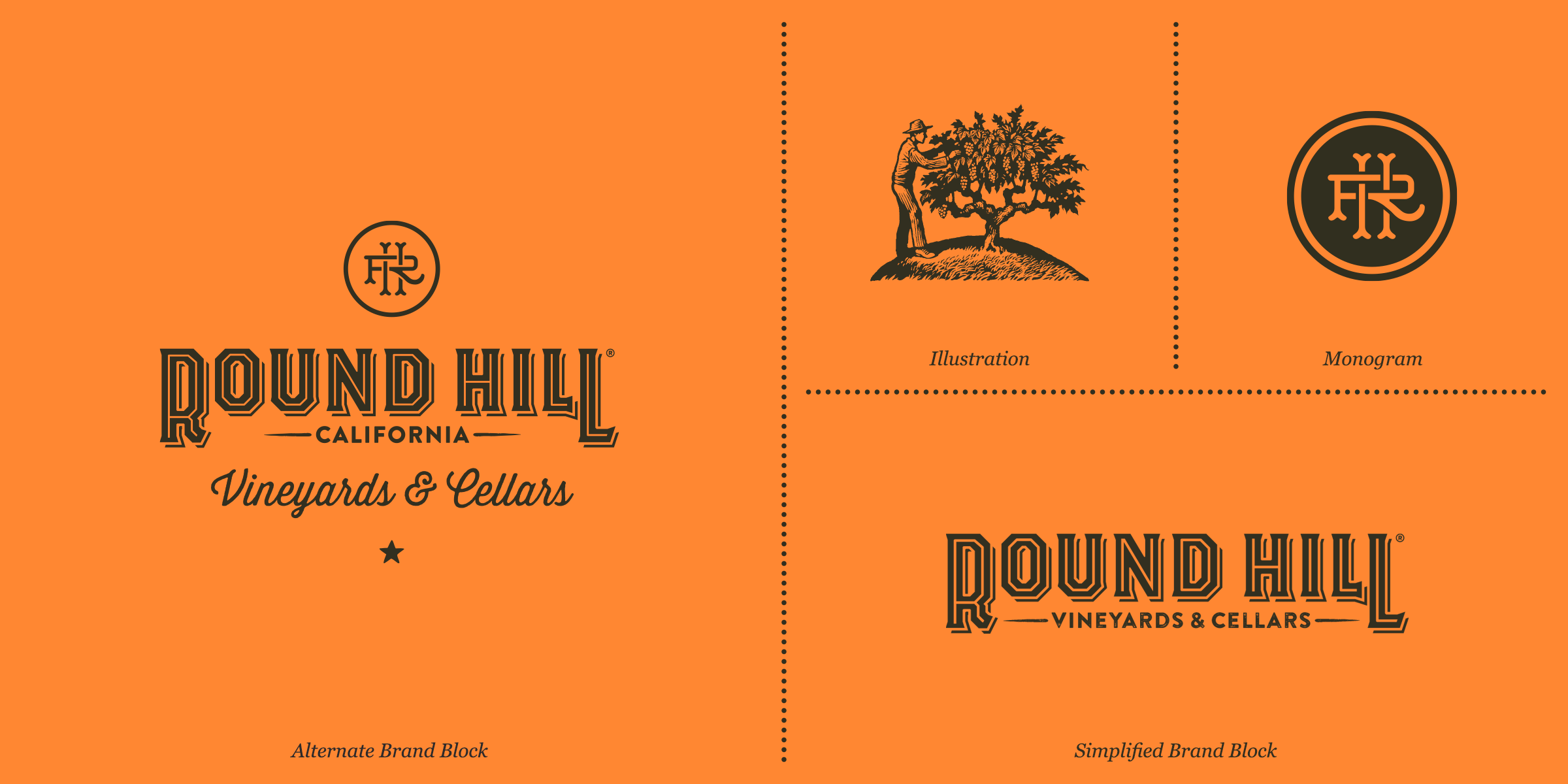
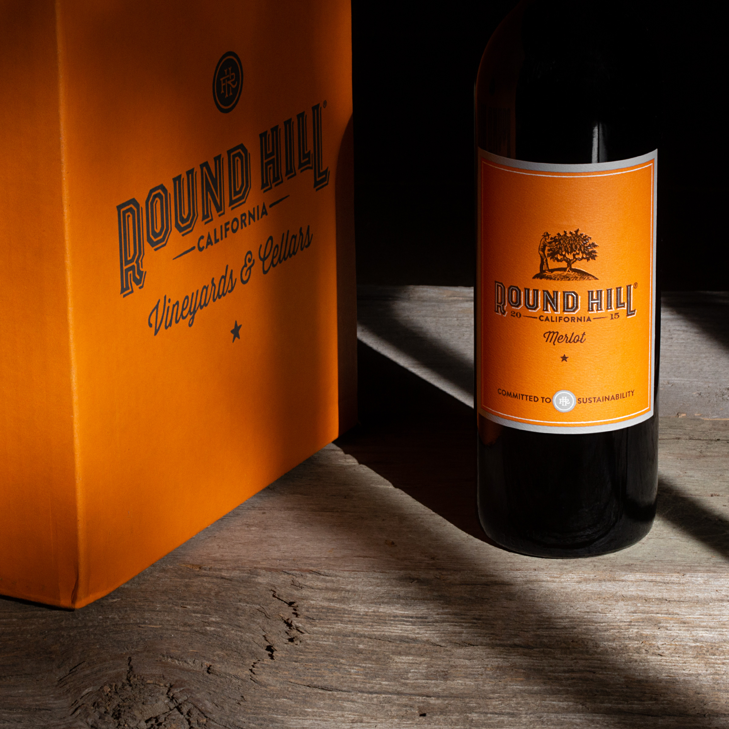
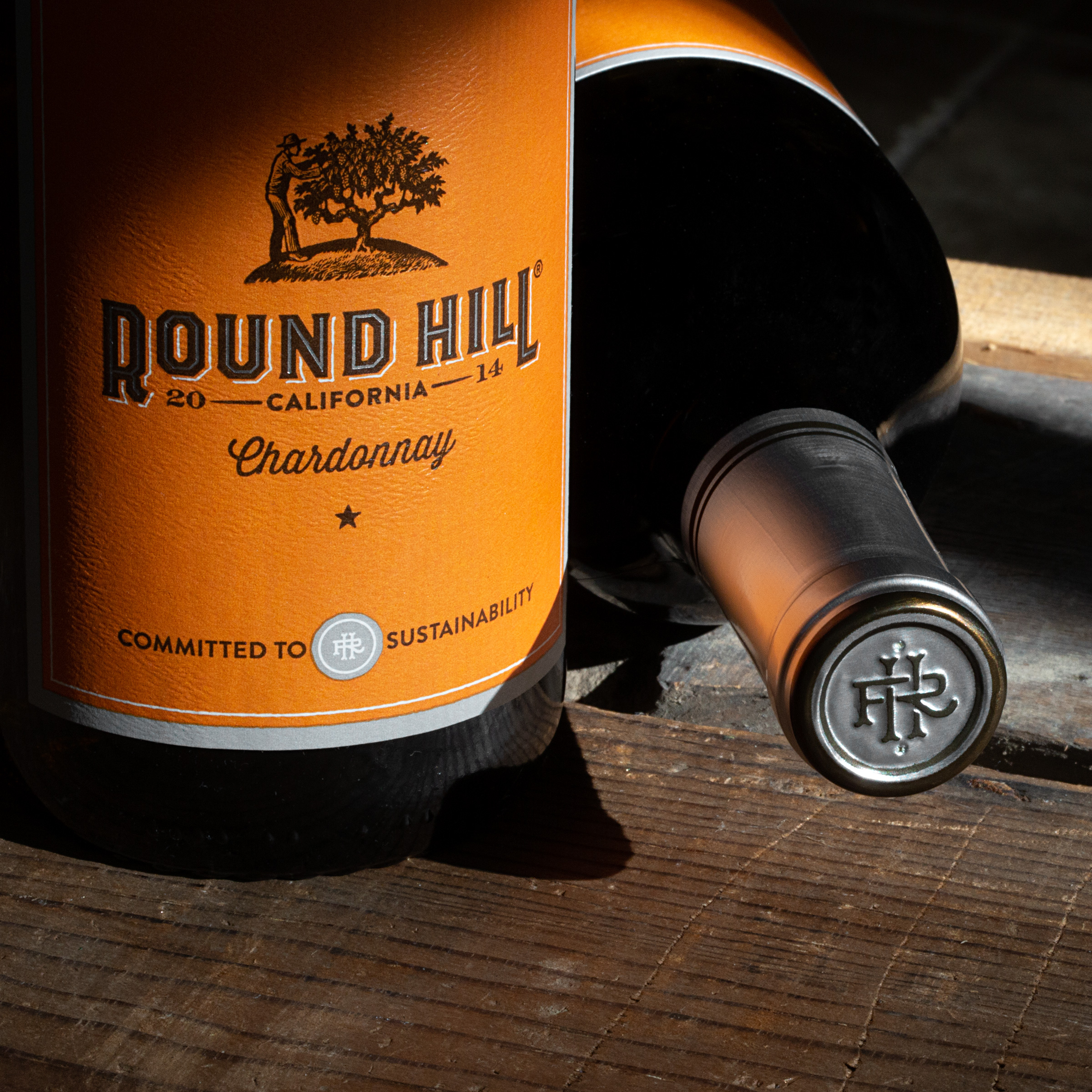
Inspired by early Californian wine and dry goods packaging, the refreshed Round Hill harkens back to simple times and old-fashioned ways of living. The results are a bold and eye-catching family of wines that are just as comfortable on your local grocer’s shelf as they are resting next to your rocking chair on the back porch.
CREDIT
- Agency/Creative: Force & Form
- Article Title: Round Hill Vineyards and Cellars Packaging Design Refresh by Force & Form
- Organisation/Entity: Agency, Published Commercial Design
- Project Type: Packaging
- Agency/Creative Country: United States
- Market Region: Multiple Regions
- Project Deliverables: Brand Identity, Brand Redesign, Brand Refinement, Branding, Graphic Design, Illustration, Packaging Design, Rebranding, Tone of Voice
- Format: Bottle, Case
- Substrate: Glass Bottle
FEEDBACK
Relevance: Solution/idea in relation to brand, product or service
Implementation: Attention, detailing and finishing of final solution
Presentation: Text, visualisation and quality of the presentation


