


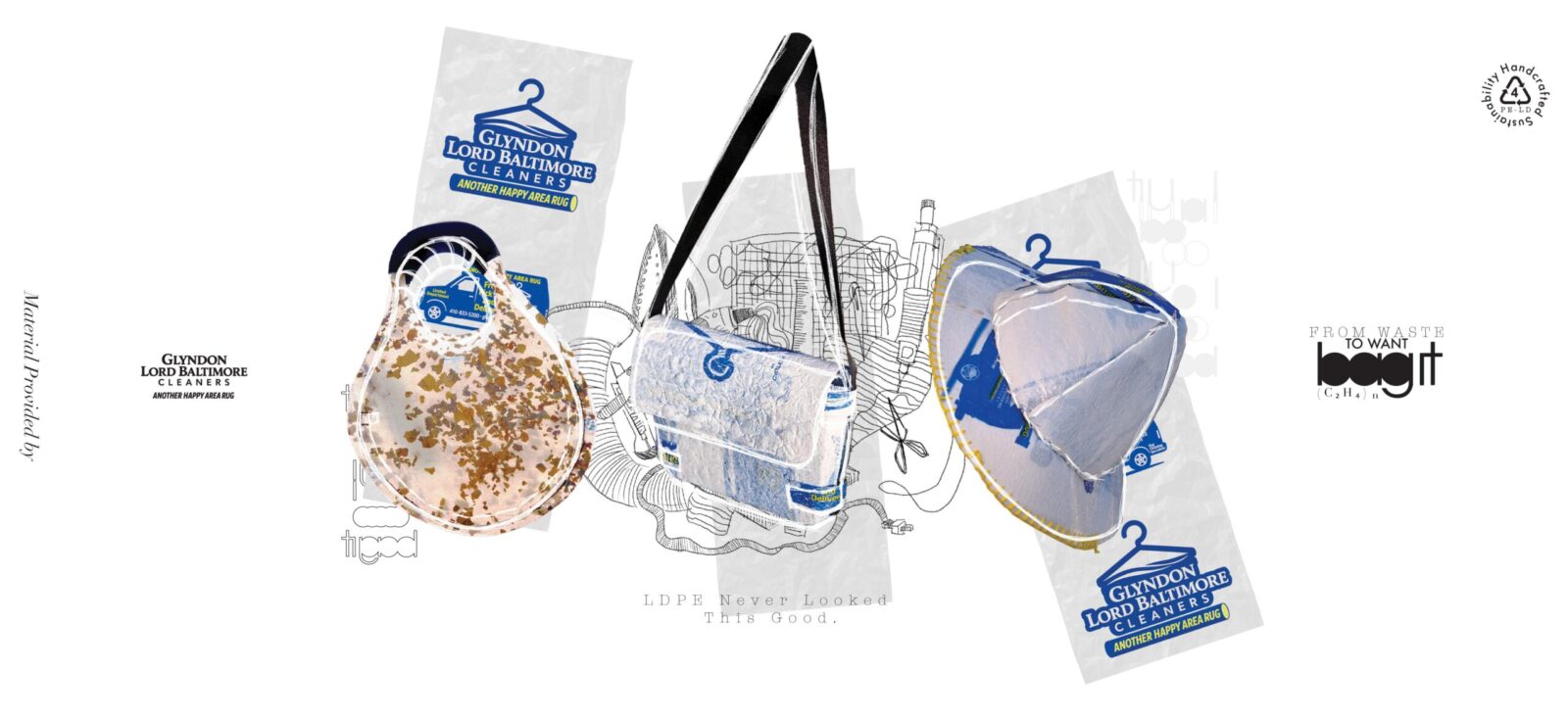
This is a real-world project centered around sustainable design and environmental consciousness. Our team aimed to explore the possibilities of upcycling waste materials into meaningful fashion objects. We began by collecting a substantial quantity of discarded LDPE (Low-Density Polyethylene) plastic bags from Glyndon Lord Baltimore Cleaners, a local dry-cleaning business in Baltimore. These plastic bags, typically used once and then thrown away, are non-biodegradable and contribute heavily to long-term pollution. Instead of allowing them to end up in landfills or oceans, we set out to transform them into something that could be appreciated, kept, and redefined in purpose and form.
Through an entirely manual and hands-on process, we experimented with heat-fusing layers of these plastic bags, manipulating them into flexible yet durable sheets that could be repurposed into functional fashion pieces. The final result was a collection of three unique items: a handbag, a bucket hat, and a crossbody bag. Each item was crafted with care, attention to detail, and a deep respect for the material’s history and environmental footprint.
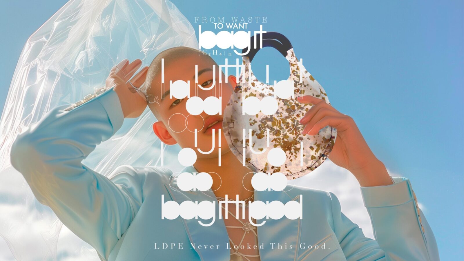
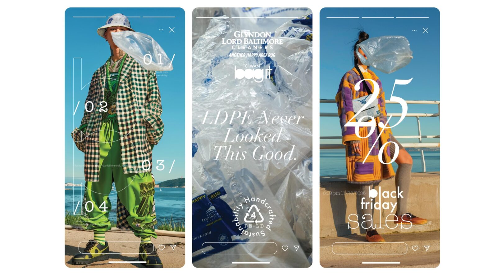
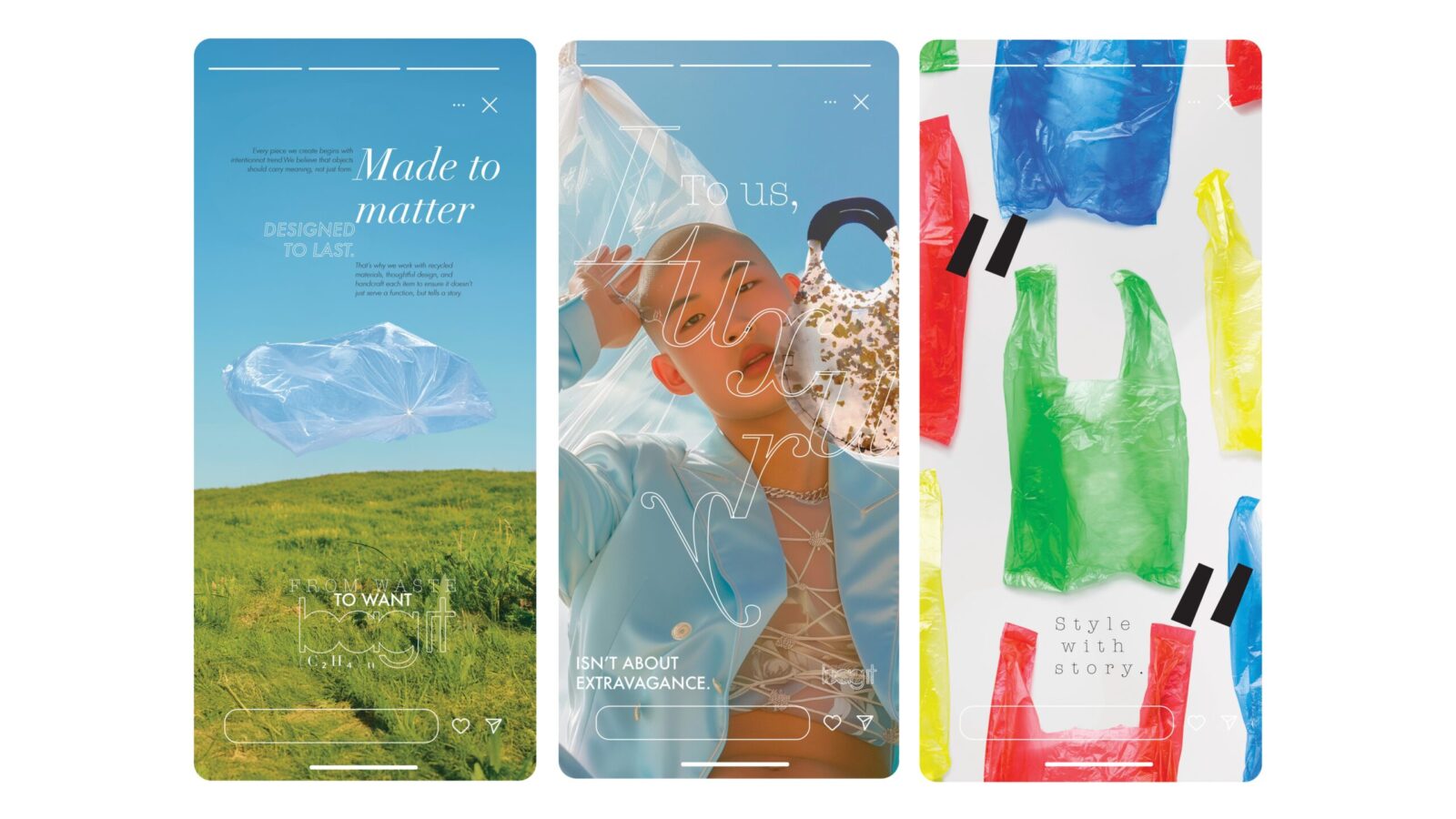
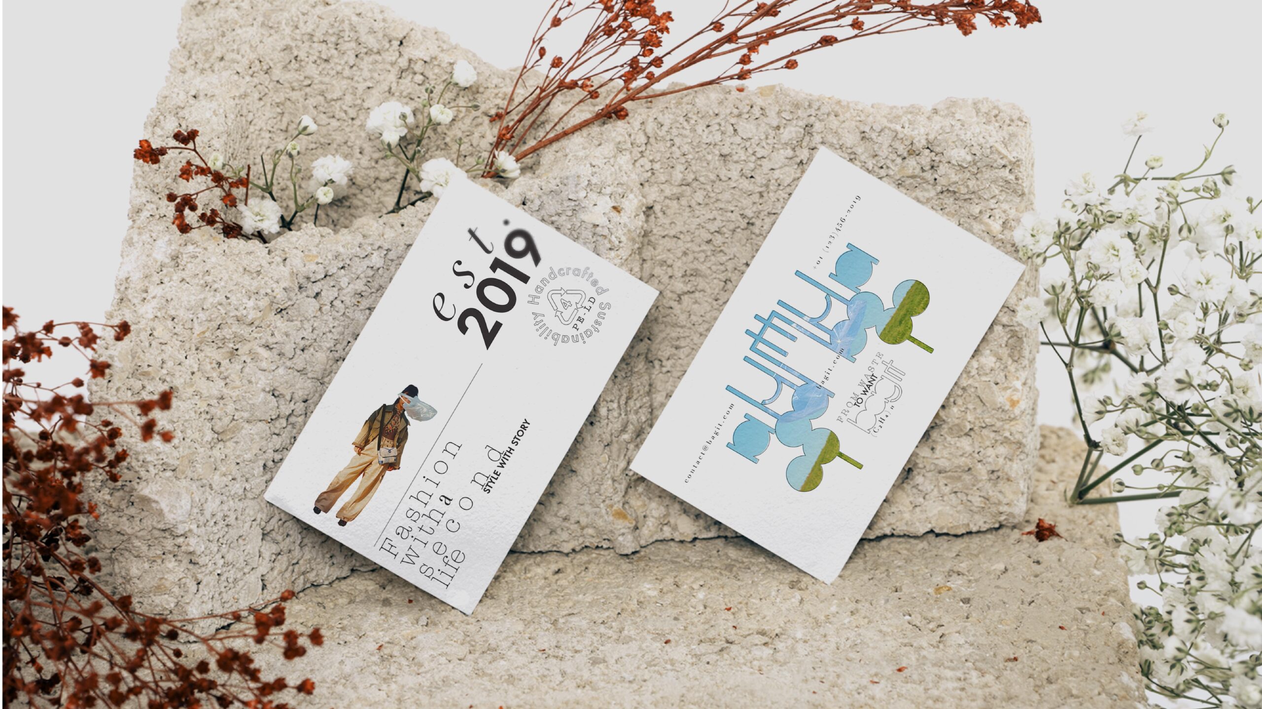
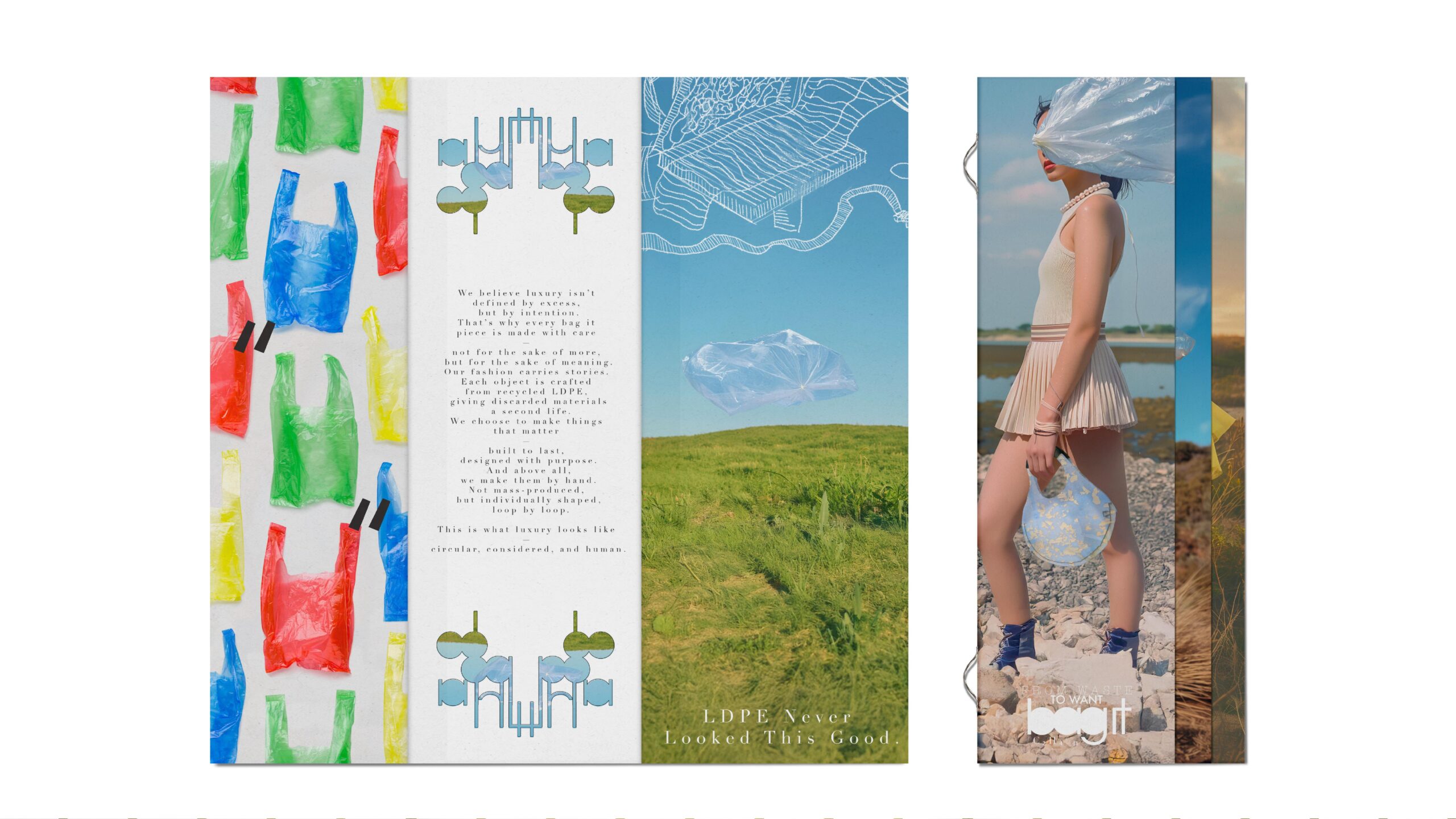
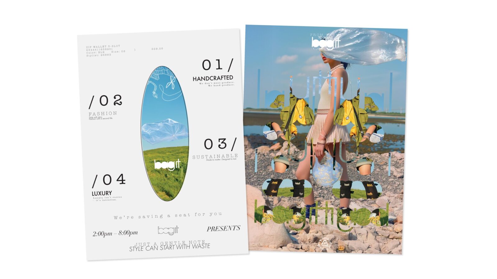
I led the branding direction for the project and titled it bag it. The name plays on the idea of both “owning” the bag and reclaiming the disposable plastic bag as something valuable. One of our primary goals was to shift the perception of these objects: instead of being seen as disposable, we wanted them to be cherished. Therefore, we deliberately framed the products as luxury goods. Because in our philosophy, sustainability doesn’t succeed on function alone — it must also evoke emotional attachment and aesthetic longevity. As we put it: sustainability fails when beauty is short-lived.
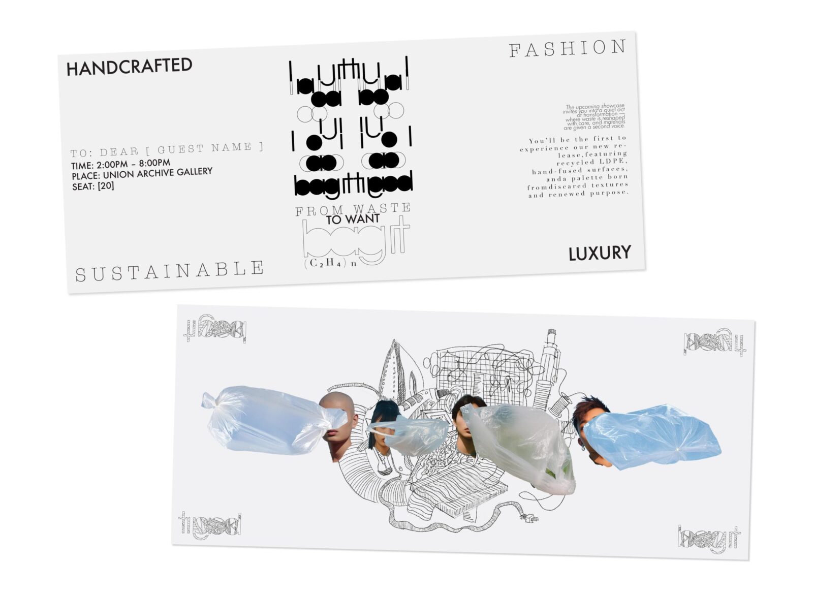
From this idea, we defined four core brand values to guide the entire visual and conceptual system: HANDCRAFTED, FASHION, SUSTAINABLE, and LUXURY. Each of these values needed to be reflected not only in the products themselves, but also in the brand’s voice, visual identity, and storytelling.
I began by establishing a visual direction rooted in a black-and-white color palette — a minimal yet timeless scheme that allowed the material’s texture and photographic imagery to stand out. I deliberately avoided overly bright or saturated colors, which often feel artificial or trendy, and instead let the contrast and depth in photography convey emotion and tone.
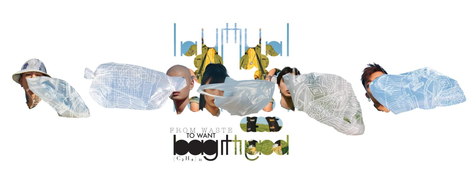
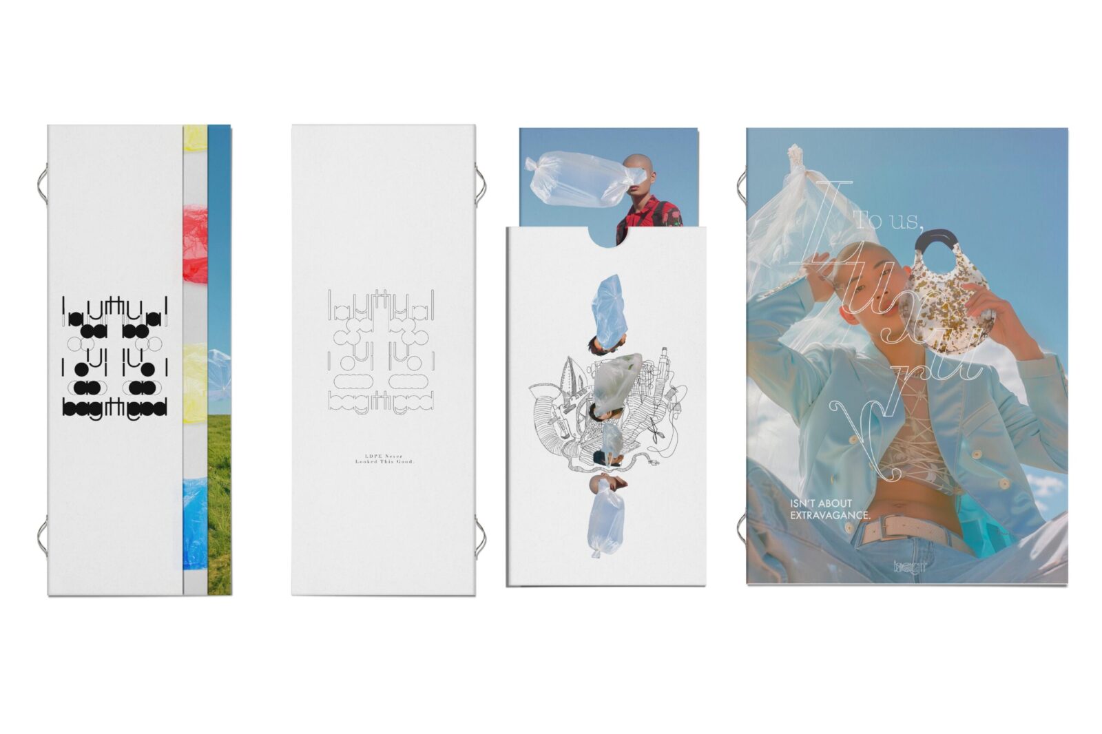
Next, I developed a series of visual patterns using the bag it logo itself, transforming typography into a central graphic language. This approach not only reinforced the brand identity but also aligned with our sustainable ethos — limiting unnecessary visual elements and using what already exists. The repetition of the logo in pattern form became both a signature and a subtle commentary on consumerism and branding culture.
To highlight the handmade nature of the products, I integrated hand-drawn motifs and textures throughout the visual system. These elements softened the overall tone and emphasized the care, time, and effort behind each piece. At the same time, I paid close attention to elegance and visual harmony, ensuring that the roughness of craft did not compromise the sense of luxury. The result was a balance between raw and refined — expressing that something handmade can still feel premium.
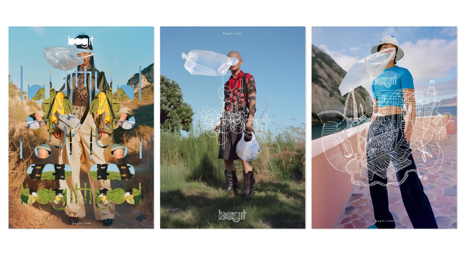
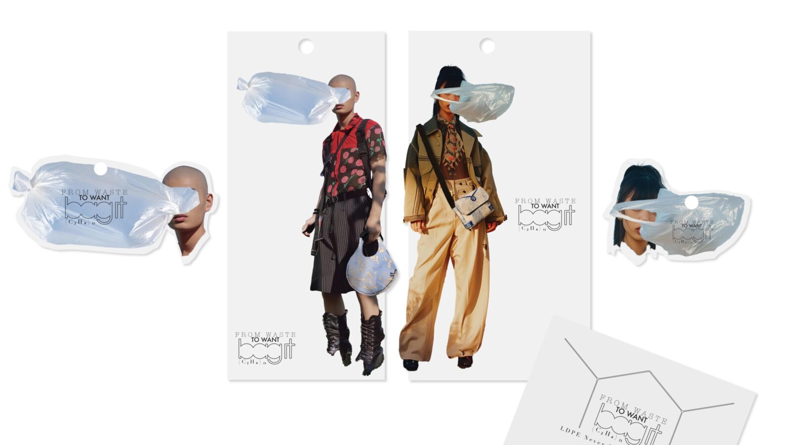
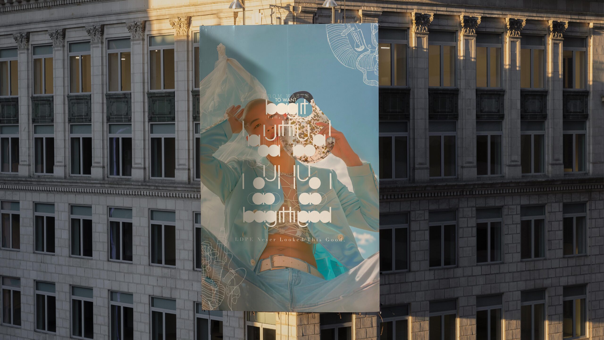
One of the most impactful aspects of the project was the model imagery, which played a key role in establishing the brand’s tone and visual storytelling. While all product photography was shot in a real studio setting — showcasing the handcrafted pieces in carefully lit, high-resolution detail — I faced budget constraints when it came to casting professional models and organizing a full-scale fashion shoot.
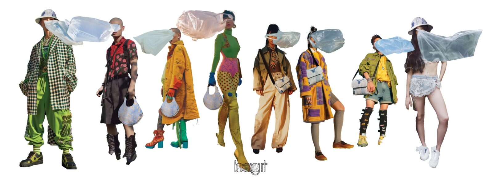
To overcome this limitation without compromising the brand vision, I turned to AI-generated visuals to create a series of fashion-forward, editorial-style model images. These AI-generated portraits allowed me to express mood, styling, and positioning with remarkable flexibility and control, aligning seamlessly with the rest of the campaign.
In a symbolic and intentional design choice, I photoshop the model’s face with a flying plastic bag — a gesture meant to draw attention to the often invisible yet persistent presence of plastic waste in our environment. This visual metaphor reinforced the project’s conceptual core and created a striking connection between identity, material, and message.
In sum, bag it is not just a fashion experiment, but a design statement about perception, transformation, and environmental accountability. It invites viewers to reconsider what we throw away — and what beauty can emerge when we stop treating materials, and objects, as disposable.
CREDIT
- Agency/Creative: Rou Jiao
- Article Title: Rou Jiao Introduces bag it as a Luxury Fashion Collection Reimagining Discarded Plastic
- Organisation/Entity: Creative
- Project Status: Non Published
- Agency/Creative Country: United States of America
- Agency/Creative City: HARRISON
- Market Region: NJ
- Project Deliverables: 2D Design, Advertising, Brand Creation, Brand Design, Design, Identity System
- Industry: Fashion
- Keywords: WBDS Creative Design Awards 2025/26 , AI-generated model, fashion editorial, hyperrealistic, urban style, soft lighting, cinematic, East Asian, neutral tones, full-body shot, front-facing, soft expression, minimal background


