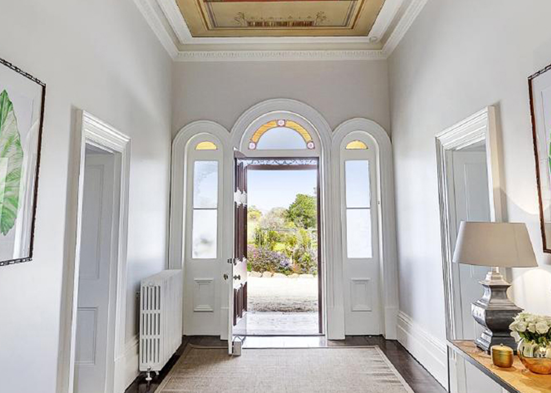
Built in 1873, Mt Rothwell Homestead was the northern most home on a large property of 90,000 acres in Victoria, Australia. The house and gardens are heritage listed to this day.
Within the estate is Rothwell Distillery – housed in the repurposed, original, rustic, shearing shed. The distillery is a true ‘paddock to bottle’ production. The pure spirit is made on the premises, using a base alcohol made from Sugar Beets grown on the property and an orchard full of indigenous and introduced botanicals are used to infuse the flavours.
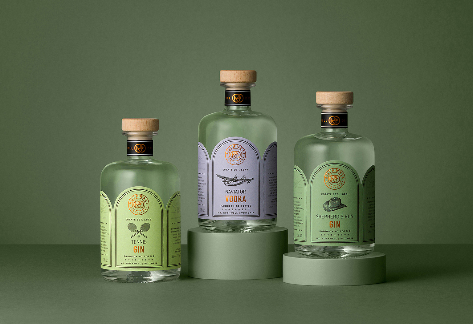
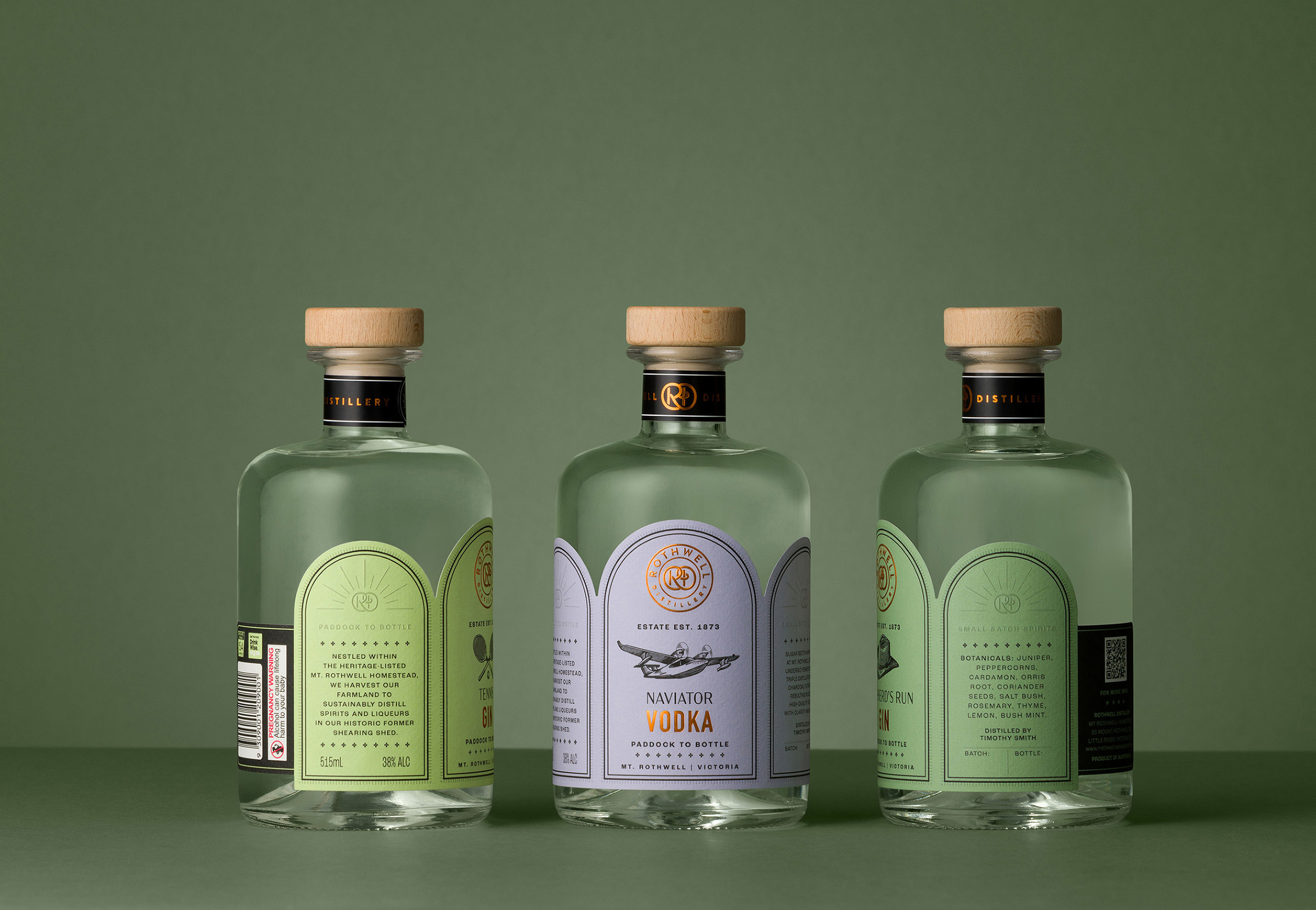
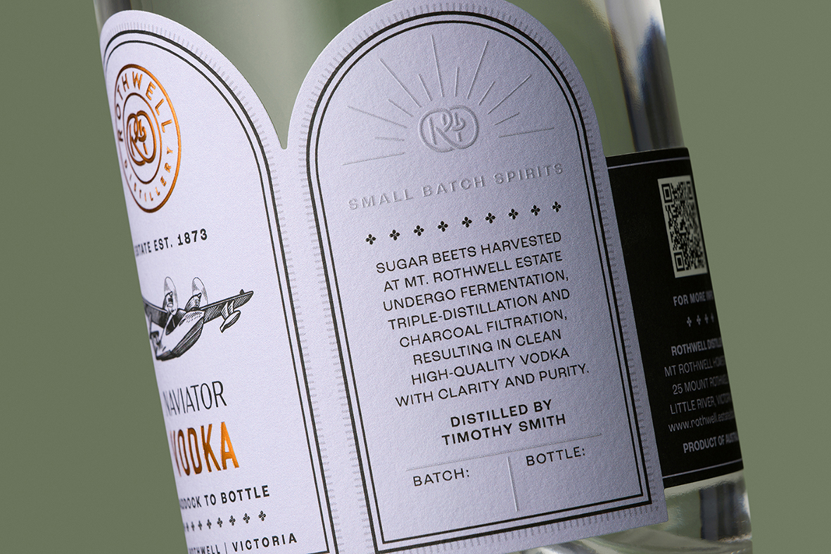
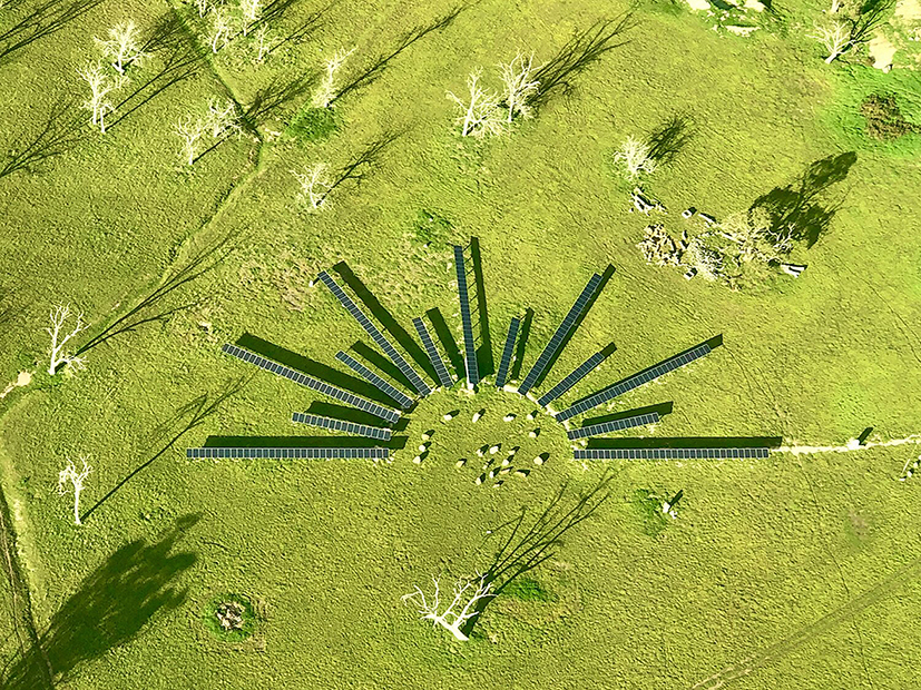
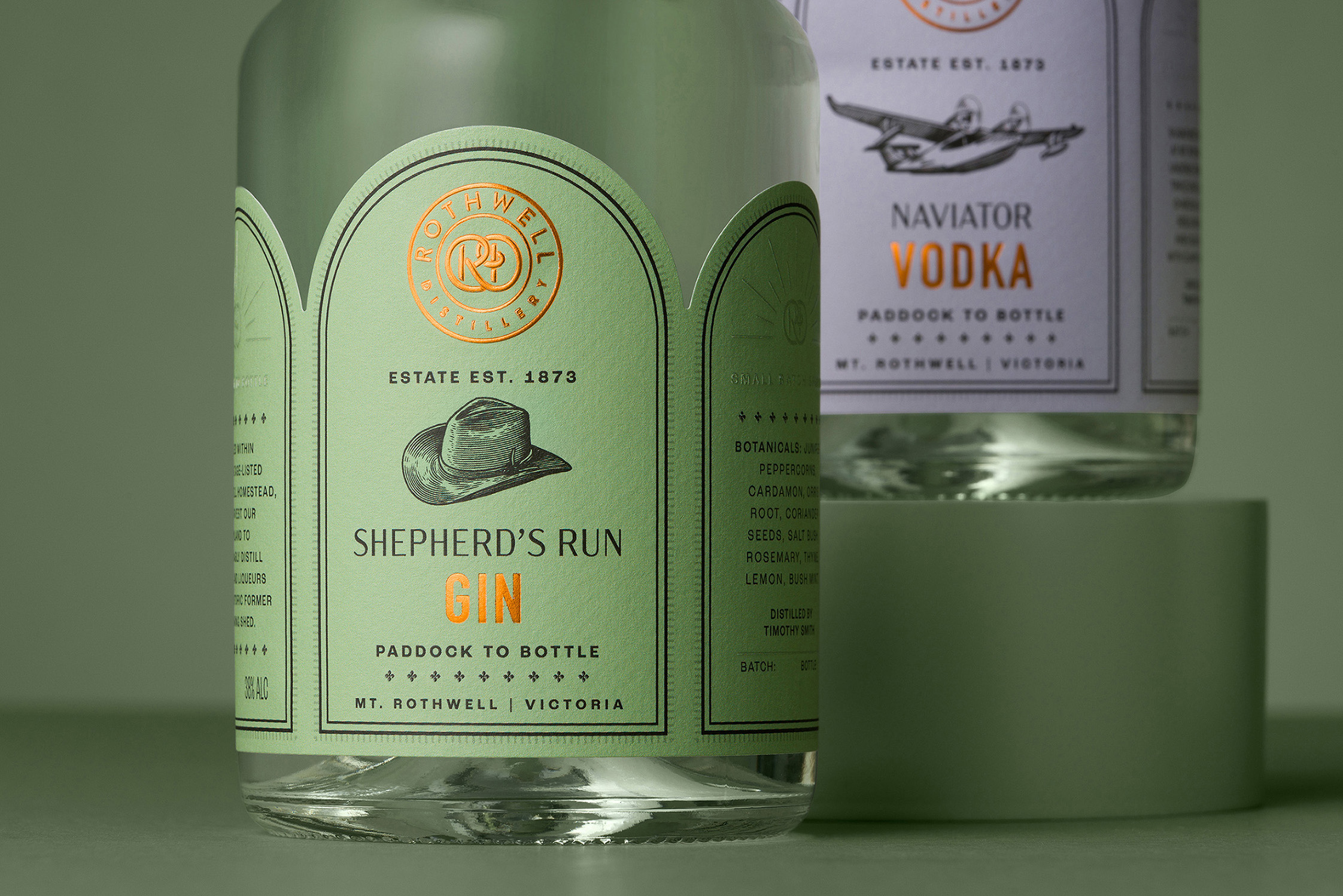
The inspiration for the branding and packaging, comes from the many details of the historic homestead. The arched doorway entrance and windows, which are reflected in the shape of the label. The ornate plaster trims and decorative finishes, included as borders on the label. The solar panel grid in the shape of a sun (called Solar Henge by the owner), which powers the property, features on the side of the label.
The embossed copper foil logo lock-up reflects the copper still and it’s winding pipes, whilst adding a sensory, tactile experience for the consumer.
The addition of the illustrations for each of the flavours is a nod to the traditional engraving style of product catalogues from a bygone era when the homestead was built.
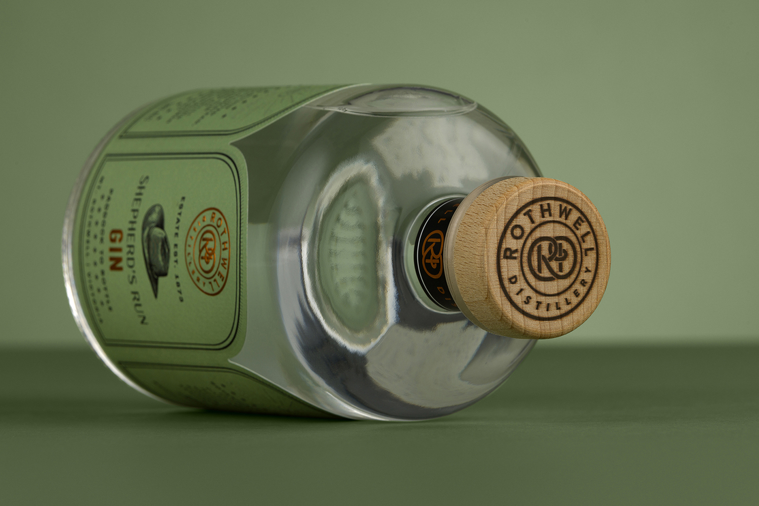
The unusual arched, label shape creates a point-of-difference to engage with the consumer to create a memorable brand, whilst wrapping around the bottle creating an interesting meeting point at the rear of the bottle. The top of the wooden stopper has been finished off with a ‘branded’ logo as though straight from the shearing shed.
The colours are muted, but reflective of the flavour cues, to create a cohesive connection with each other bringing the whole range together. The client has been overwhelmed with the response from both direct-to-consumer and trade retailers.
CREDIT
- Agency/Creative: Studio Guild
- Article Title: Rothwell Distillery’s A Paddock to Bottle Journey with Heritage-Inspired Branding and Packaging by Studio Guild
- Organisation/Entity: Agency
- Project Type: Packaging
- Project Status: Published
- Agency/Creative Country: Australia
- Agency/Creative City: Fitzroy
- Market Region: Oceania
- Project Deliverables: Brand Architecture, Brand Creation, Brand Design, Brand Mark, Brand Redesign, Branding, Creative Direction, Design, Label Design, Logo Design, Packaging Design
- Format: Bottle
- Industry: Food/Beverage
- Keywords: WBDS Agency Design Awards 2023/24
- Keywords: packaging, design, branding, drinks, spirits, gin
-
Credits:
Photograghy: Mark Lobo


