To strengthen Gallo’s presence in the super-premium segment in Brazil, we were challenged to develop a new concept with strong visual impact—one that broke away from traditional “Reserva” or “Superior” cues and instantly conveyed both functional and emotional attributes to the consumer.
Our creative direction was inspired by the rich legacy of Casa Gallo, founded in 1860 by Victor Guedes, a passionate pioneer in the art of olive oil making. The goal was to craft a collection that poetically and sensorially expressed how the moment of harvest influences the olive oil’s flavor profile.
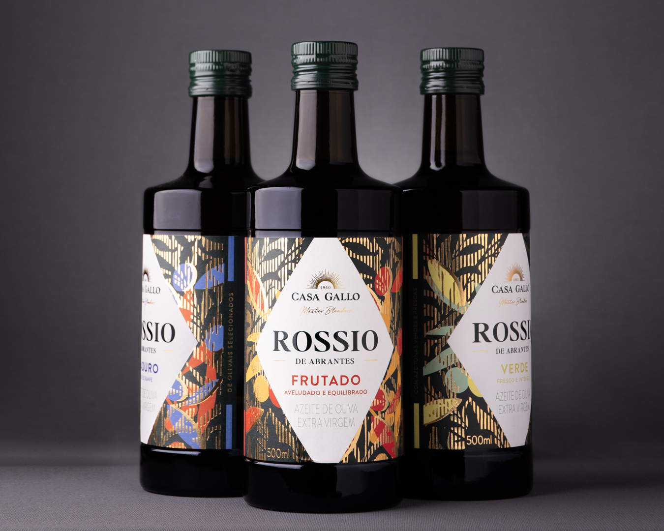
Knowing that harvest takes place between October and January—and that the olives evolve in ripeness during this time—we used this natural progression as the foundation for the range. As the fruit matures, the oil shifts from being fresh and pungent to more rounded, fruity, and smooth. This evolution guided the creation of the three distinct blends: Verde, Frutado, and Maduro.
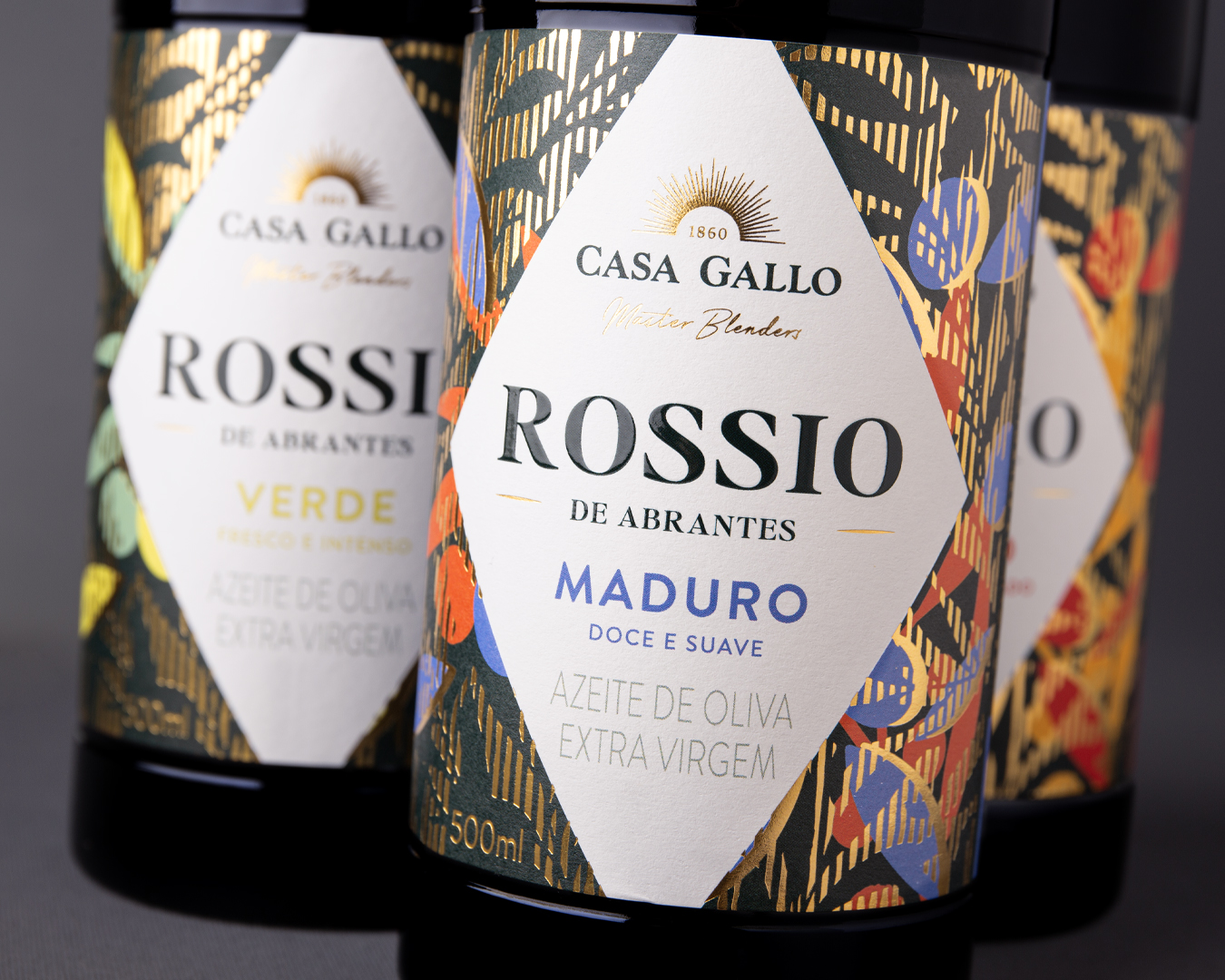
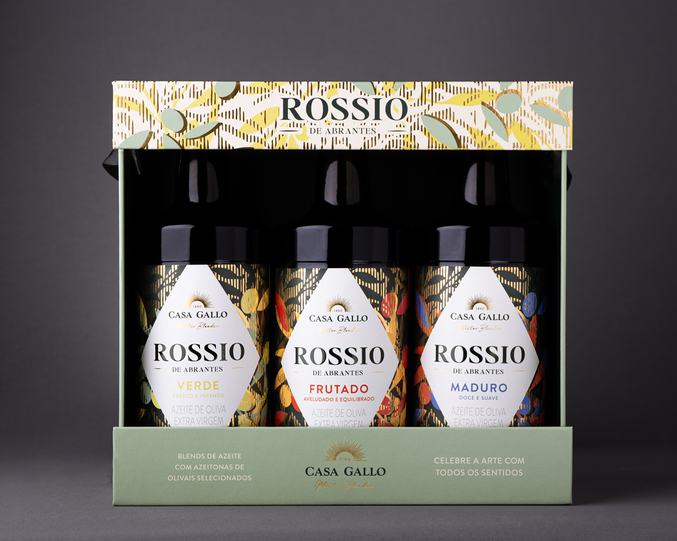
Each blend is visually interpreted through a chromatic system inspired by abstract expressionism—particularly the work of Mark Rothko—where color plays a deeply sensorial role.
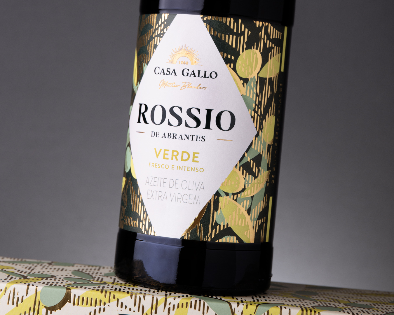
Verde: Two vibrant acid greens reflect intensity, energy, and freshness—electric tones that seem to pulse with the lively, vegetal character of a young olive oil.
Frutado: A warm blend of yellow and orange evokes floral and fruity notes. A sunny palette that communicates balance and the harmony of mid-ripeness.
Maduro: Deep blues and reds merge in an emotional and unexpected fusion, evoking softness, depth, and sweetness—tones that resonate with the complexity of a smoother, more mature olive oil.
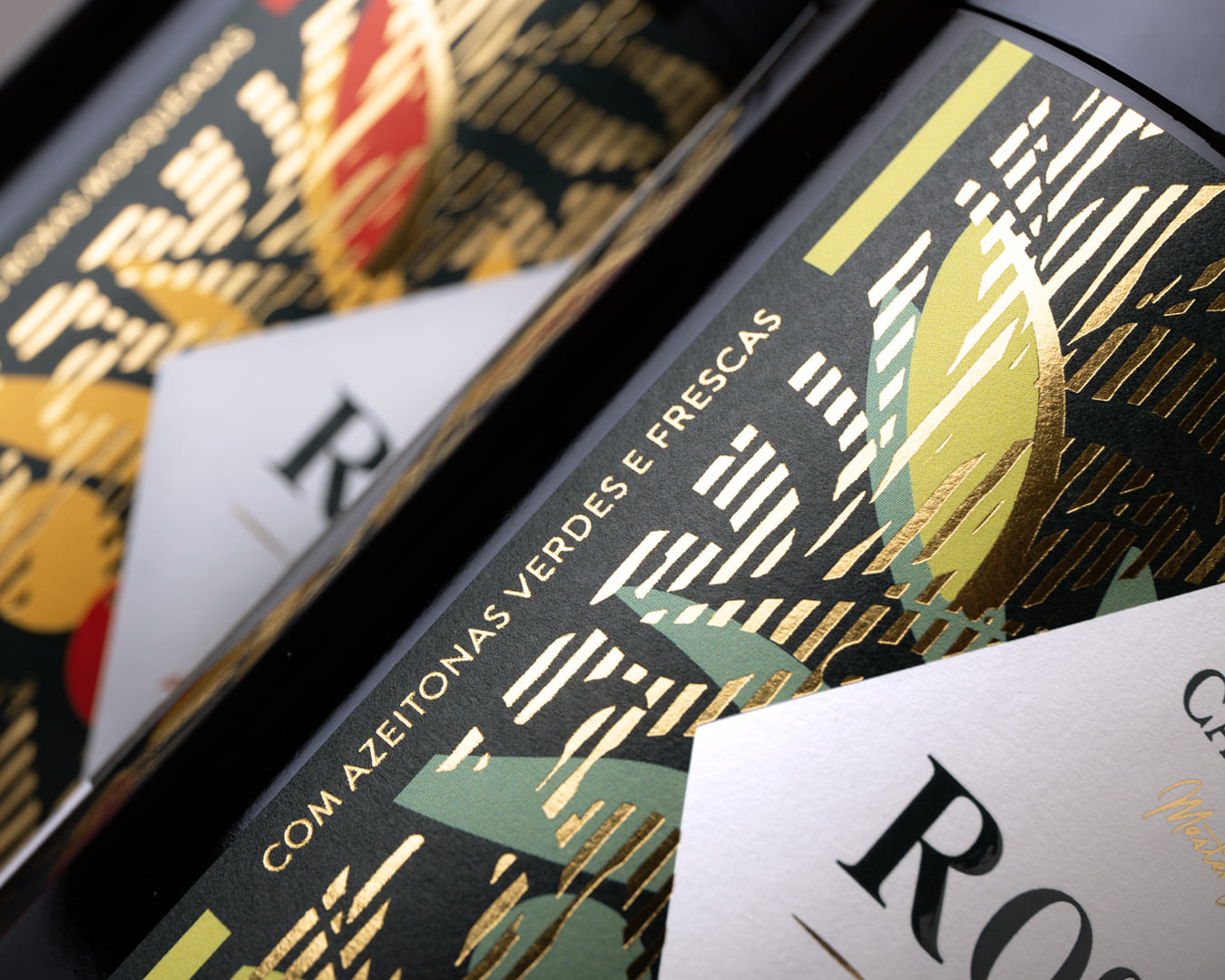
Color in this project goes beyond aesthetics. It becomes a visual extension of flavor, a chromatic translation of the olive oil’s organoleptic journey. The use of gold foil adds a layer of sophistication, brilliance, and tactile richness to the packaging.
The result is a striking collection that stands out on the shelf and invites consumers to discover, in an intuitive and emotional way, the sensory world of olive oil—elevating the brand’s premium positioning and reaffirming Casa Gallo’s expertise in the category.
CREDIT
- Agency/Creative: RitaRivotti®
- Article Title: Rossio de Abrantes: The Art of Olive Oil, Crafted by Casa Gallo, Designed by RitaRivotti
- Organisation/Entity: Agency
- Project Type: Packaging
- Project Status: Published
- Agency/Creative Country: Portugal
- Agency/Creative City: Lisboa
- Market Region: Europe
- Project Deliverables: Brand Design, Brand Identity, Label Design, Packaging Design
- Format: Bottle
- Industry: Food/Beverage
- Keywords: Oilve Oil Label
-
Credits:
CEO & Creative Director: Rita Rivotti
Creative Director: Rita Rivotti
Designer: Pedro Roque


