


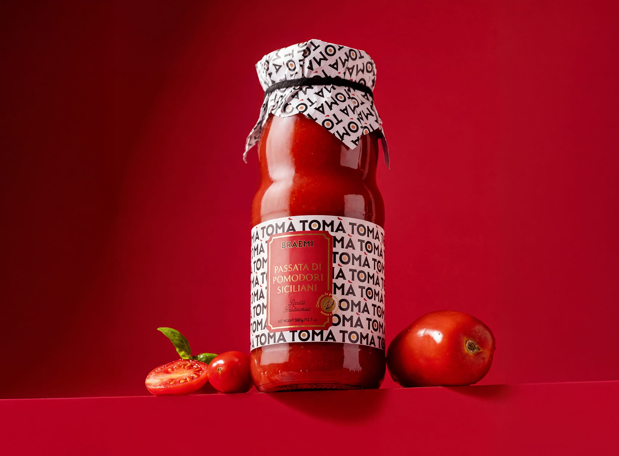
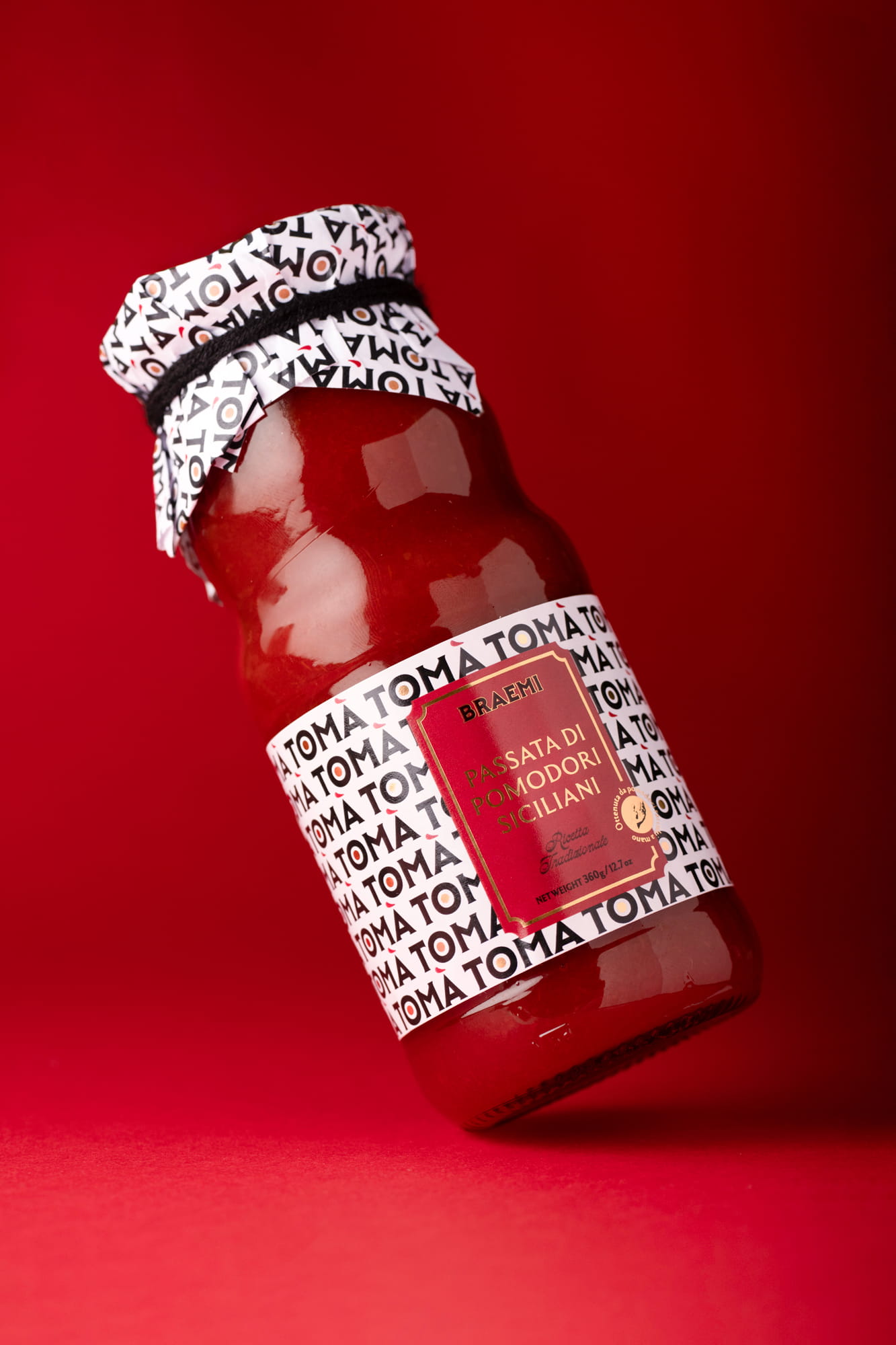
TOMÀ is a tomato sauce brand built on a simple but distinctive linguistic insight. The name works on two levels: when repeated, TOMÀ naturally reads as “tomato”, making the category instantly recognizable. In Sicilian dialect, “tò mà” also means “your mum”, evoking a sauce made the way your mum would at home.
This dual meaning is translated into two complementary design directions.
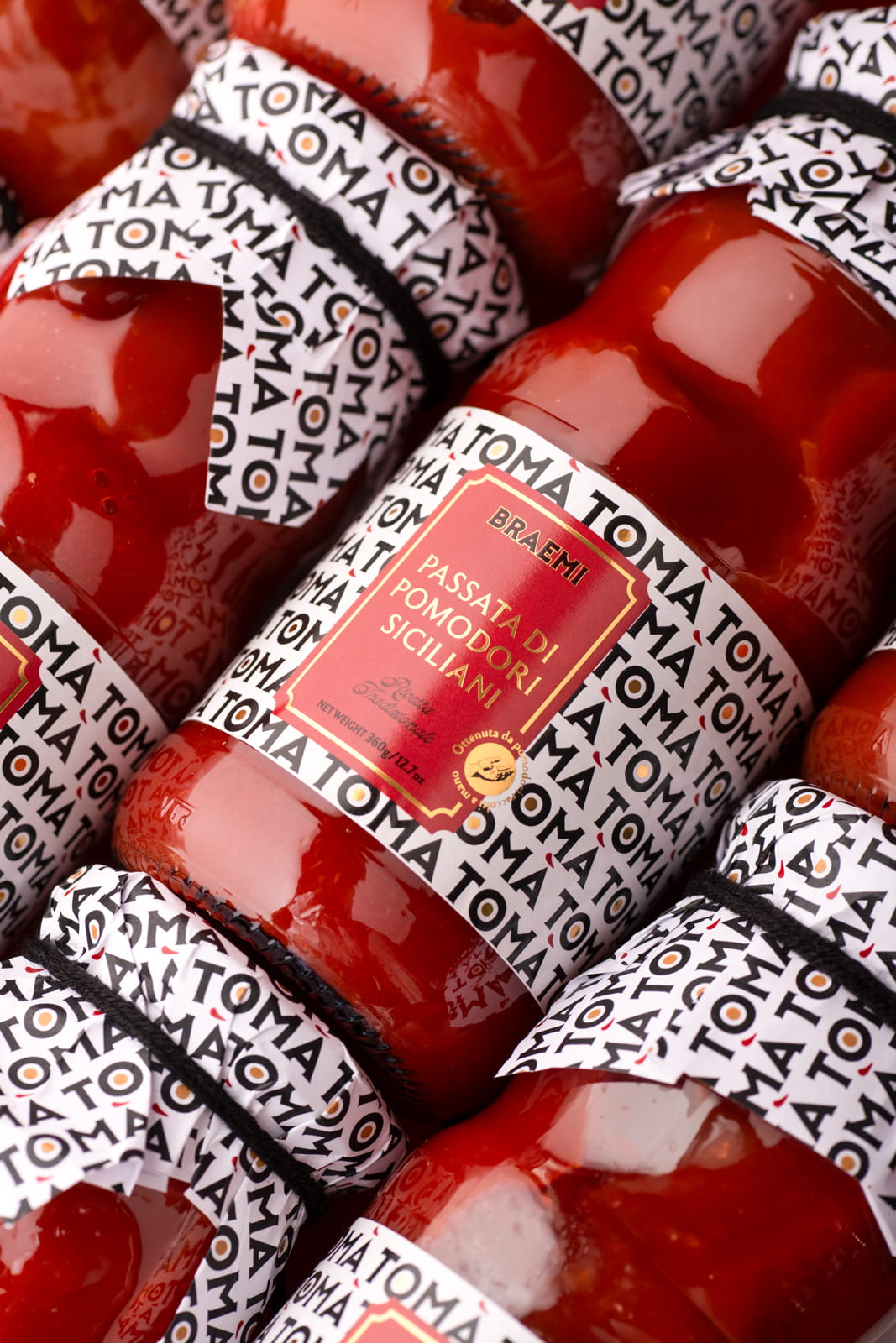
On one side, the logotype becomes a visual system. Designed to be repeatable, it forms a rhythmic pattern that subtly spells “tomato”, creating a strong and ownable graphic identity that enhances memorability and shelf impact.
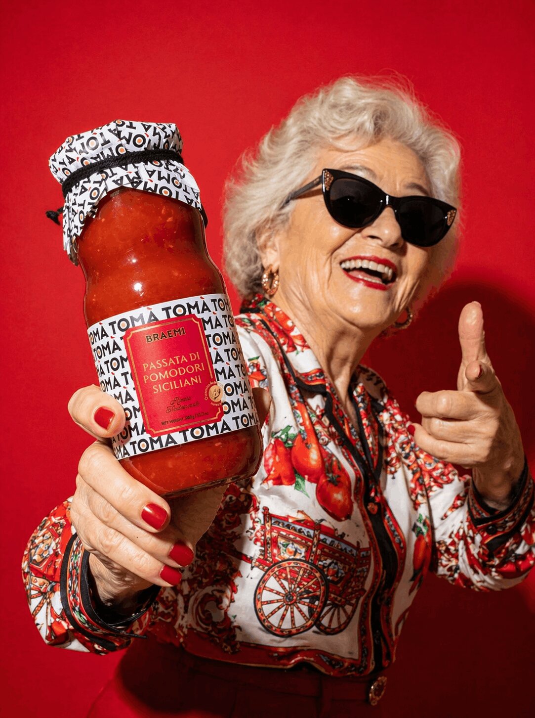
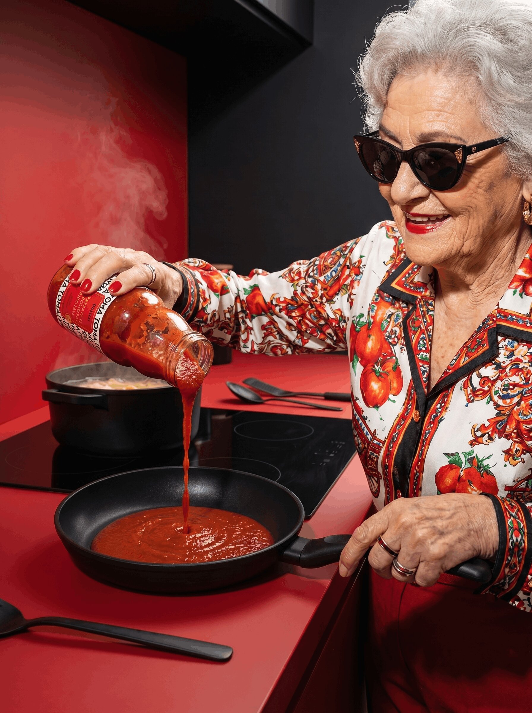
On the other, it informs the brand’s visual direction. The idea of “your mum” is reinterpreted through the figure of the grandmother transformed into a bold and unexpected character. Styled in a vibrant Sicilian shirt and portrayed with a confident, almost iconic attitude, she becomes a “pop grandmother”: a symbol of authenticity translated into a contemporary visual language.
The design balances two visual languages. The repeated logotype generates a contemporary background pattern that conveys rhythm and modernity, while the central label adopts a more composed and apparently classical layout that reassures and structures information. This contrast creates both impact and familiarity.
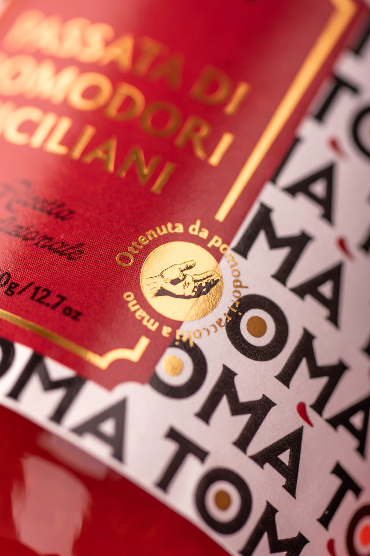
A key detail is the accent mark, interpreted as a brushstroke of sauce. This transforms a typographic element into a sensory cue that connects directly to the product’s texture and essence.
In a category dominated by traditional and nostalgic codes, TOMÀ takes a contemporary approach. Instead of relying on clichés, it communicates homemade quality through language, rhythm, and visual simplicity.
CREDIT
- Agency/Creative: Rosario Lo Iacono design
- Article Title: Rosario Lo Iacono Design Shapes Tomà With a Packaging Approach Where Language Drives Visual Recognition and Shelf Impact
- Organisation/Entity: Agency
- Project Type: Packaging
- Project Status: Published
- Agency/Creative Country: Italy
- Agency/Creative City: Gela
- Market Region: Europe
- Project Deliverables: Advertising Photography, Brand Creation, Packaging Design
- Format: Jar
- Industry: Food/Beverage
- Keywords: italian tomato sauce
-
Credits:
Graphic designer & Art director: Rosario Lo Iacono
Still life ph: Andrea Ventura


