


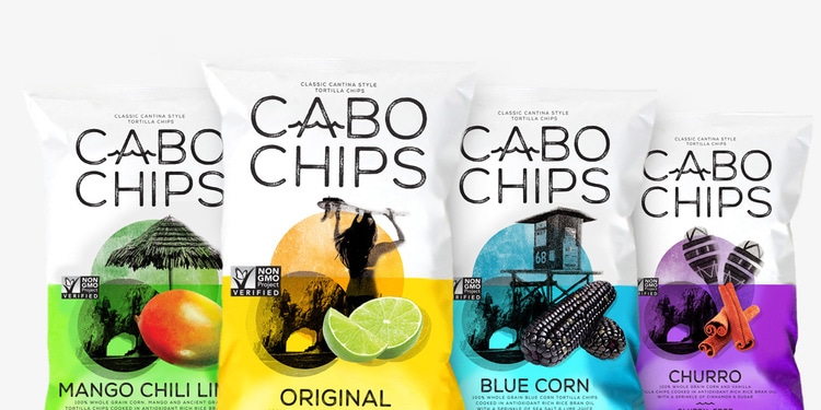
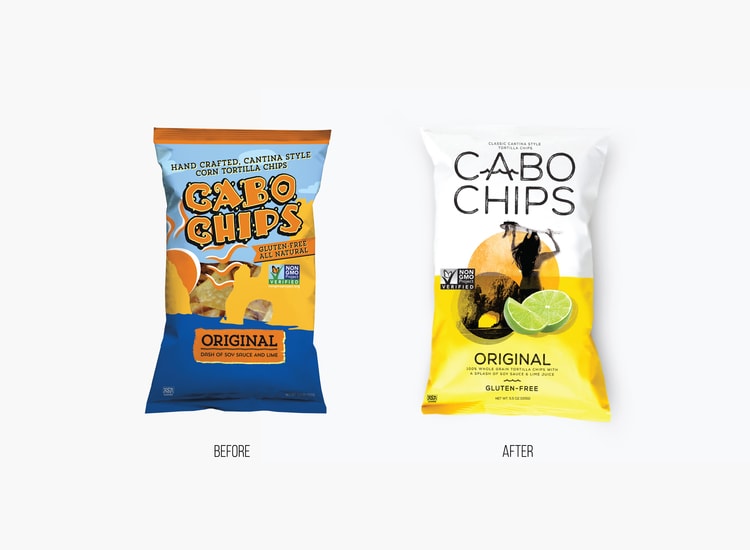
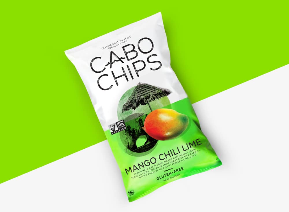
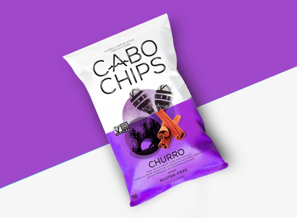
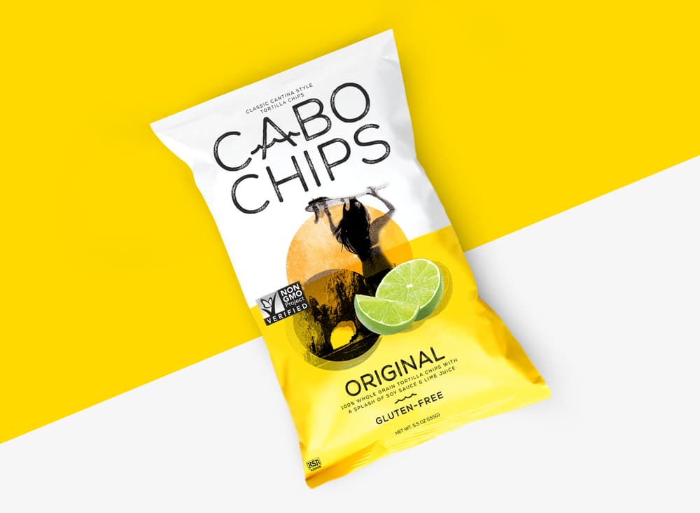
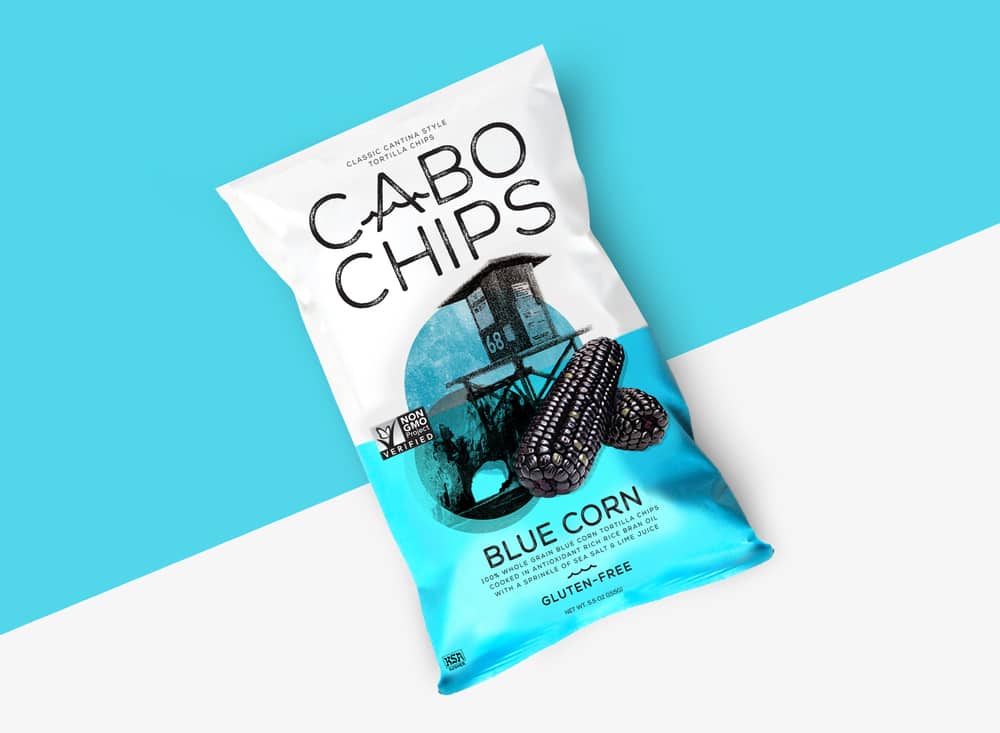
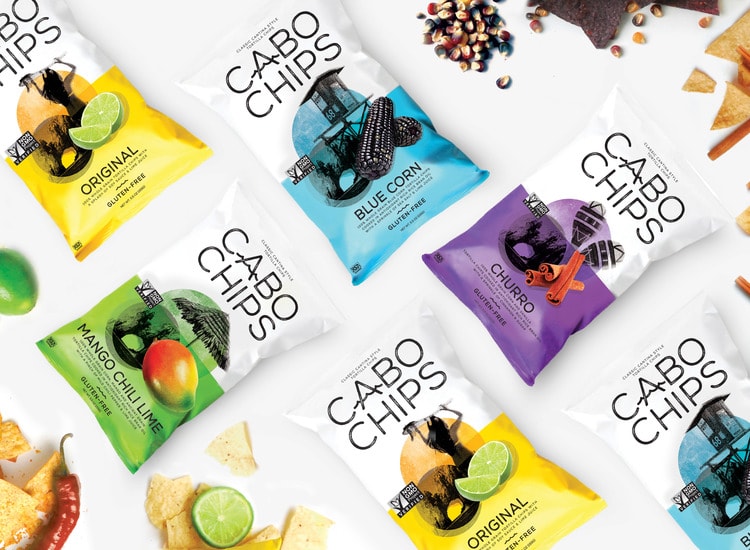
“CHALLENGE. Create a compelling visual identity and packaging design for Cabo Chips to better express the brand’s provenance, personality and taste. Virtually every tortilla chip attempts to communicate Mexican provenance in one way or another. The opportunity was to find a new way to reflect location; one that’s compelling, contemporary and born out of a genuine story. The approach needed to be different – not stereotypically authentic, not symbolic, but expressive!
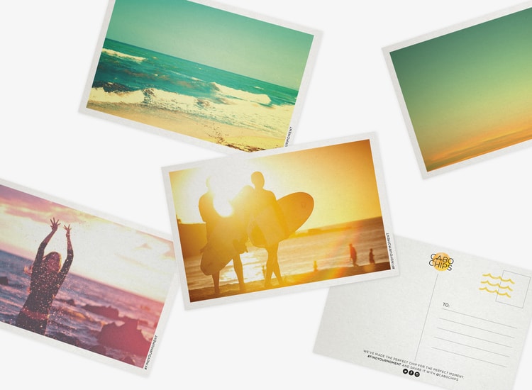
SOLUTION. We created a sense of place for Cabo Chips that reflects the experience of Baja through lifestyle, emotion and energy.”
CREDIT
FEEDBACK
Relevance: Solution/idea in relation to brand, product or service
Implementation: Attention, detailing and finishing of final solution
Presentation: Text, visualisation and quality of the presentation


