


Radiant Health represents a holistic reimagining of healthcare branding, rooted in Asia and driven by the belief that design can support true well-being—physical, mental, and spiritual. Originating in 2019 in Kuching, Malaysia, Radiant Health began as a single clinic and has, over a few short years, flourished into a leading, multi-location healthcare group with a clear purpose: to make accessible, integrative care the gold standard. This rapid growth, bridging East and West Malaysia with eight clinics, speaks to a deep commitment—one that deserved an identity system equally committed to transformation, inclusivity, and clarity.
At the core of Radiant Health’s brand identity is the fusing of modern medical advancements with time-honored healing philosophies. The brand not only integrates state-of-the-art medical practices and pioneering AI technology for diagnostics and treatment, but also carefully embraces traditional approaches, underscoring preventive care, mental health, and compassionate service. The design response was to create a visual language that would encapsulate this duality, amplifying both innovation and empathy, science and heritage, all while communicating a universal sense of warmth.
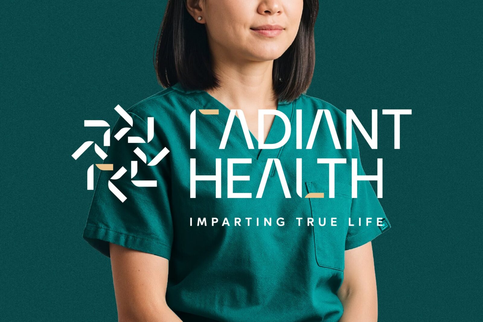
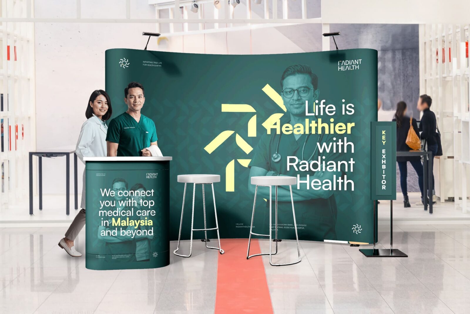
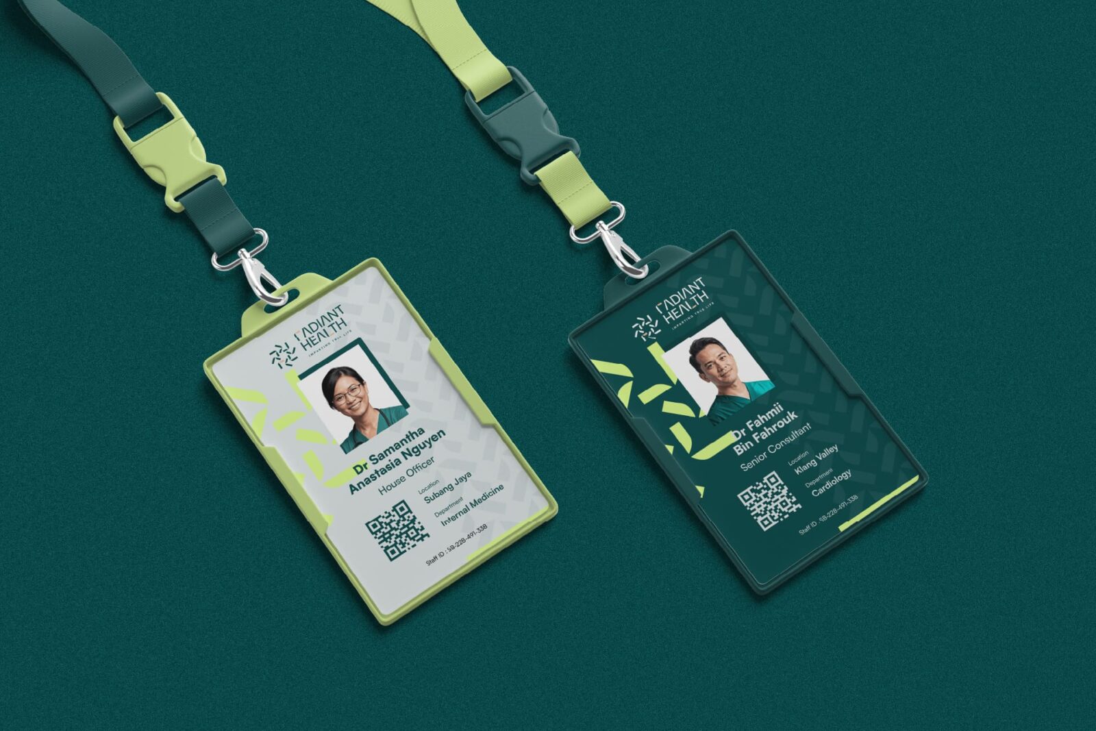
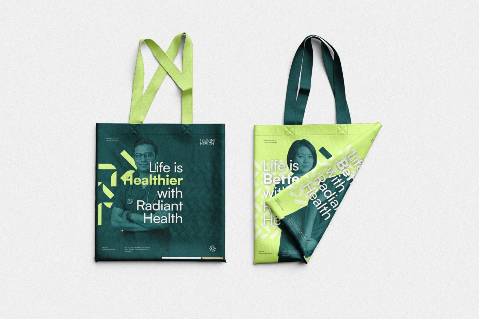
The logo is central to this effort. Its form draws upon four distinct concepts: the radiant sun’s spinning rays, radiating positivity and energy; the strong, resilient bamboo, long regarded within Asian cultures as a symbol of life, health, and growth; the cross, representing the founder’s faith and the brand’s moral grounding in Christian values; and the initial “R” monogram that personalizes and anchors the identity. Together, these ideas spin into a mark both energetic and soothing, modern but deeply meaningful, with each element supporting the other.
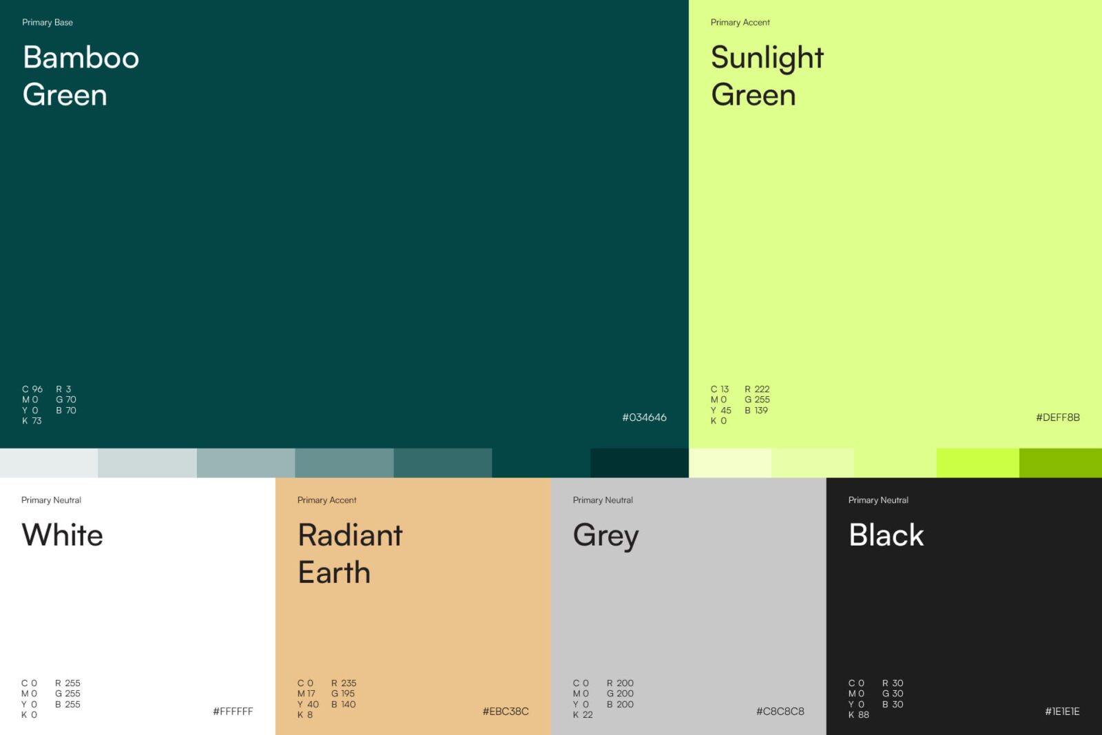
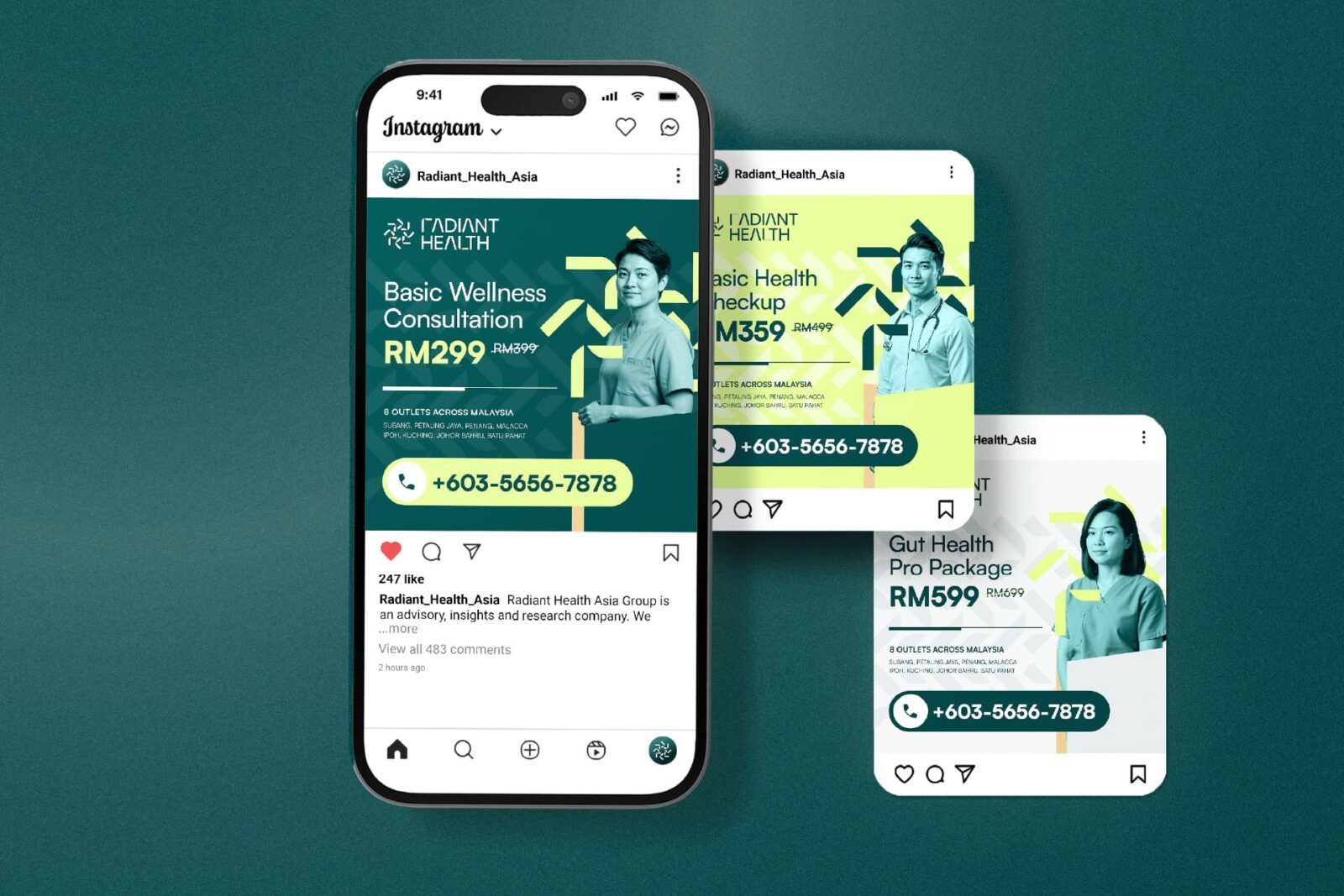
Color becomes an essential part of Radiant Health’s identity. Warm yellows and golds nod to sunlight, invoking optimism, healing, and renewal—characteristics vital to patient recovery and well-being. These are paired with calming greens, echoing bamboo forests and the natural environments that foster peace, resilience, and sustainable growth. The resulting palette is bright without feeling sterile, comforting without feeling subdued. It reflects a carefully considered balance between clinical credibility and approachability.
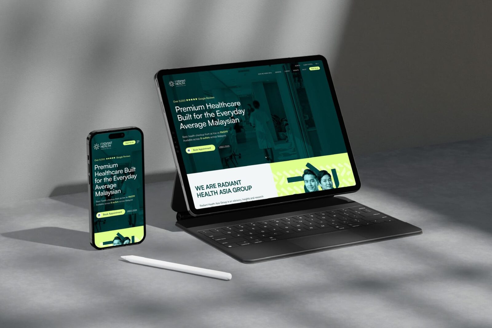
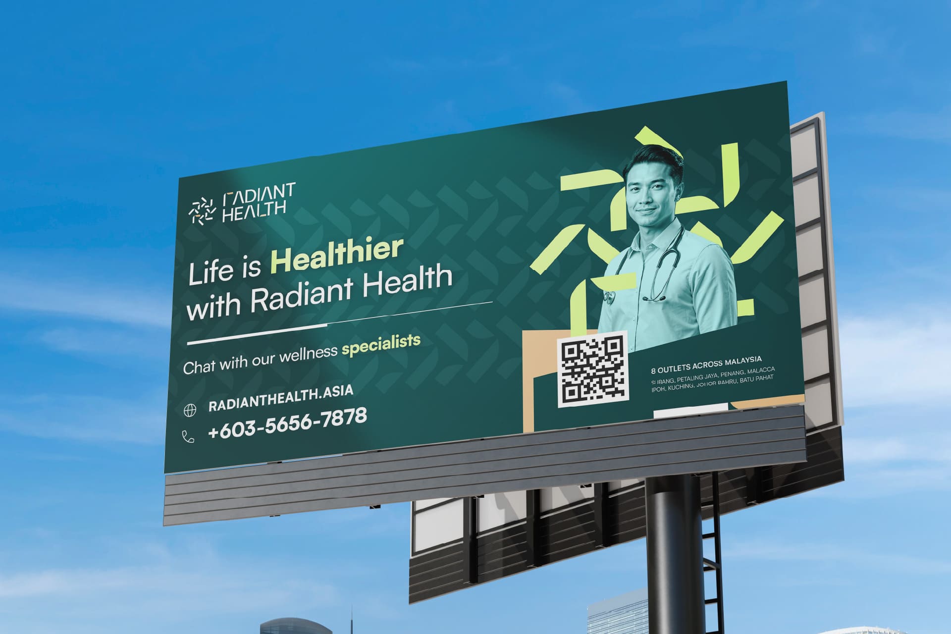
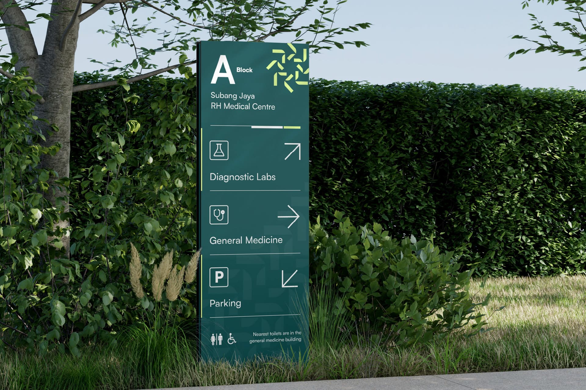
Typography is also a strategic focus. Clear, approachable letterforms are chosen for their legibility in both digital and print contexts, enhancing navigability and wayfinding across every brand touchpoint. This choice is vital for serving a multicultural clientele across Malaysia, ensuring that every communication—whether a billboard, clinic sign, wellness guide, or prescription card—is accessible and friendly.
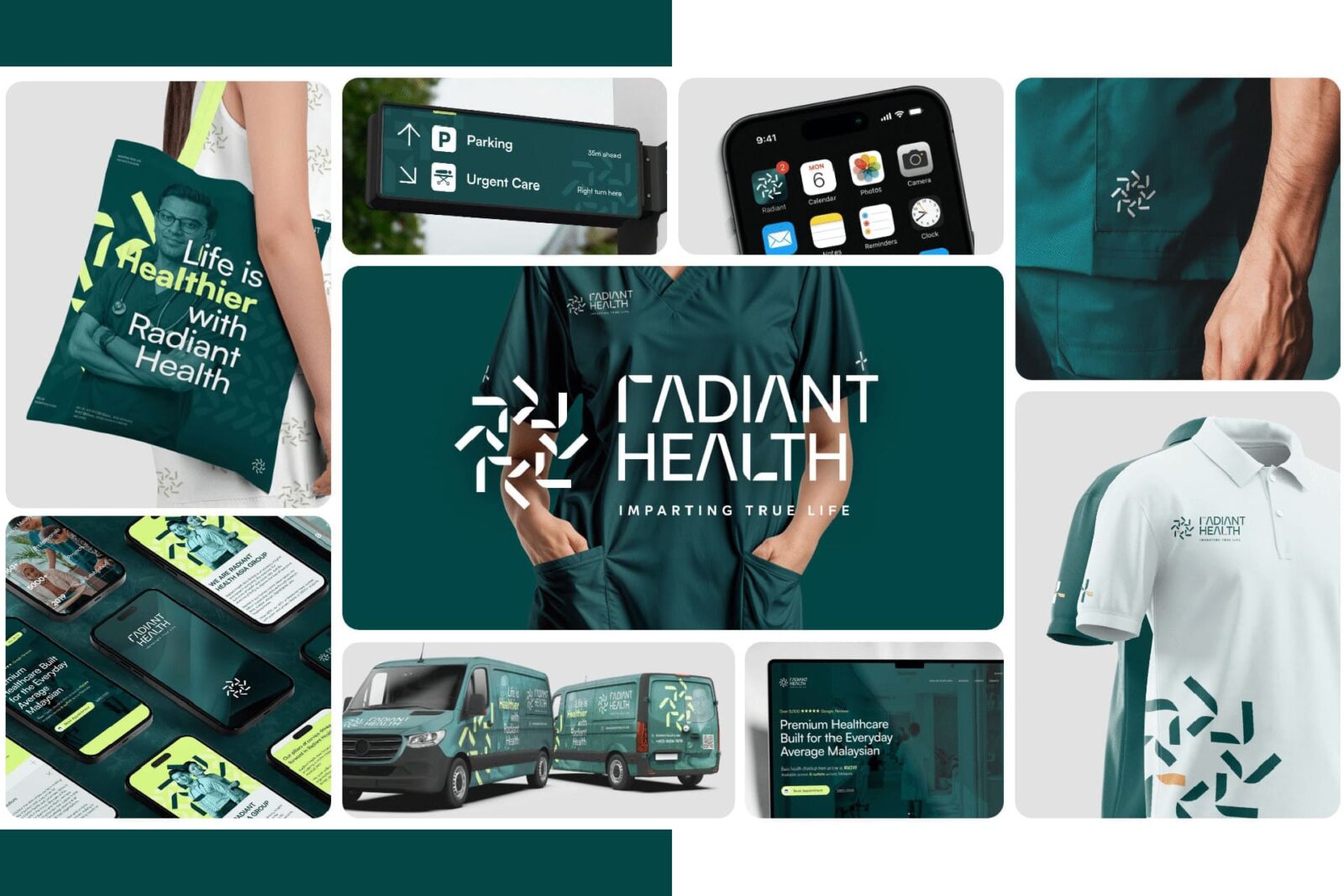
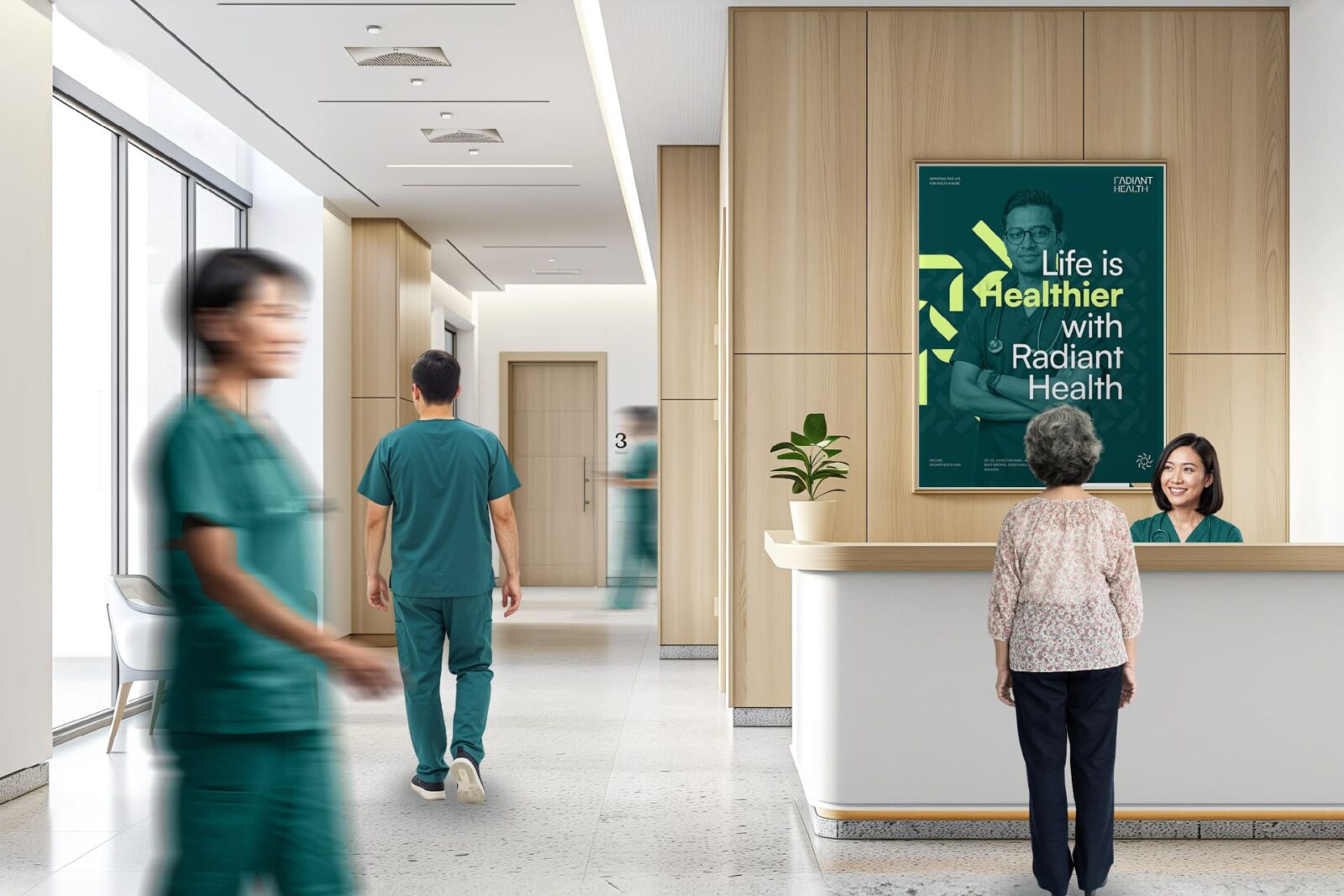
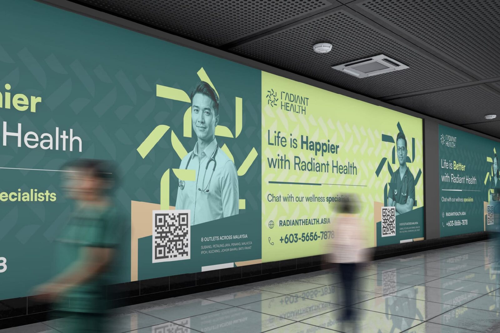
The identity system is intentionally modular, allowing it to flex smoothly between physical and digital settings: from clinic environment graphics and uniforms to medication packaging, digital appointment cards, educational materials, and social media campaigns. Custom iconography extends the visual language, reinforcing core values and guiding users through information with clarity and ease. Signage and printed collateral feature generous use of white space, supporting calmness and mental clarity in often stressful health environments.
Radiant Health’s brand narrative is informed by Proverbs 4:23, where “radiant health” is understood as a gift that reaches to the core of one’s being. This guiding principle manifests in the brand’s tone, which avoids the coldness sometimes associated with clinical care and instead projects sincere compassion, welcoming all patients as whole individuals. The overall design system is not just aesthetically pleasing or technically efficient—every detail is rooted in an ambition to genuinely uplift and nurture the communities served.
Brand applications are purposefully designed with user well-being in mind. Environmental graphics in clinics use biophilic design cues, reinforcing a calming and natural atmosphere. Digital touchpoints simplify process flows, using brand colors and imagery to provide reassurance and consistency. Wellness program materials are similarly patient-centric, using approachable layouts and positive messaging to encourage engagement and trust.
In sum, Radiant Health’s identity is more than a visual refresh; it serves as a catalyst for changing perceptions of healthcare in the region. By merging advanced technology with enduring values and regional symbolism, the brand reframes care as both state-of-the-art and deeply human. It positions Radiant Health not just as a healthcare provider but as a point of transformation—where clarity, kindness, and cultural resonance empower healthier individuals and communities, now and for years to come.


CREDIT
- Agency/Creative: Ronnie Chan
- Article Title: Ronnie Chan Designs Radiant Health as a Human-Centered Healthcare Brand
- Organisation/Entity: Creative
- Project Status: Non Published
- Agency/Creative Country: Singapore
- Agency/Creative City: Singapore
- Market Region: Asia
- Project Deliverables: Art Direction, Brand Creation, Brand Design, Brand Guidelines, Brand Identity, Brand Mark, Creative Direction, Identity System, Packaging Design
- Industry: Health Care
- Keywords: WBDS Creative Design Awards 2025/26 , radiant health, holistic wellness, healthcare branding, brand identity, visual identity, logo design, resilient bamboo, radiant sun, Asian symbolism, typography, color palette, brand system, compassionate care, wellness, clinic branding
-
Credits:
Digital Lead: Jeow Shiping


